NEGATIVE WATERCOLOURS – FILAMENTS AND MAPLE LEAVES
I’ve been busy with my negative painting again, with two very different paintings.
Filaments
This one was inspired by a drawing exercise I found online, to develop skills with values. I decided to adapt the idea for watercolours as it seemed to lend itself well to the negative painting style.
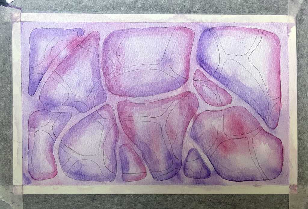
The initial drawing
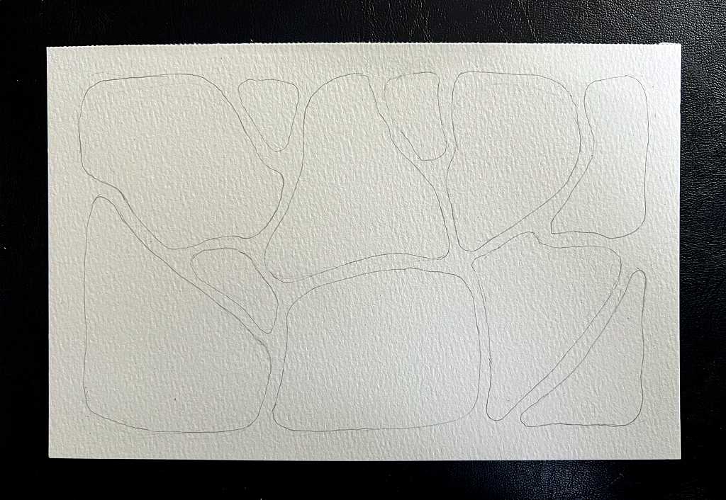
Several large rounded shapes, with little space between them.
The first wash and shadows
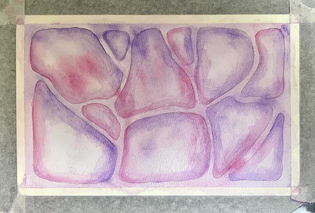
To add a little variety into my collection of negative watercolour paintings, I chose pink and purple as a colour scheme for this one. The idea was to make the shapes the negative space, and the narrow divisions between them the positive part. To create the illusion of depth, I added some drop shadows.
The second layer drawing
I drew another layer of shapes behind the first layer, slightly smaller.
Painting the second layer
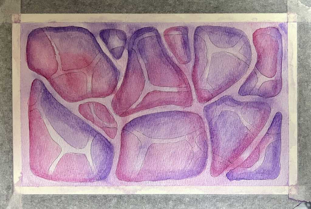
I filled the second layer shapes with paint, omitting the filaments separating them.
Further work on the second layer
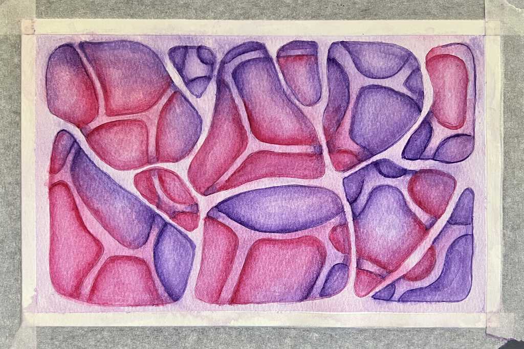
I darkened everything, and emphasised the shadows with heavier lines.
Layers 3-5
I didn’t photograph every stage, but continued to work until I had enough layers. The final layer, layer 5, was painted freehand in black, as it was difficult to see any pencil lines at this stage, and I could add the black shapes randomly.
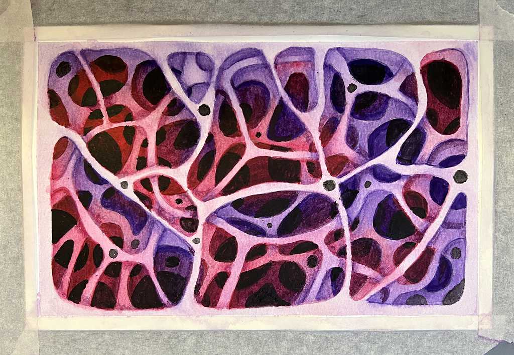
Nice and dark, giving an illusion of depth. I also added some black spots at the junction of some of the filaments.
The finished painting
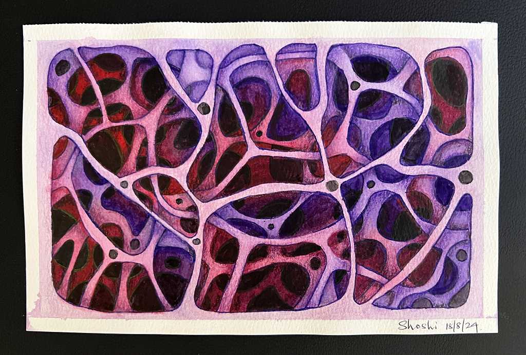
To complete the painting, I added some further shading with coloured pencils, blending them with a blender pencil and a blending stump. Even so, the texture of the paper was still visible. I don’t think it matters, because it adds textural interest. I went around all the edges with a fineliner water-based pen to tidy everything up and give the painting a nice crisp look. On the first (top) layer I also added a bit more colour with a pink coloured pencil.
When you start a painting like this, the initial layer can look quite dark, but as you add darker values, it does appear lighter, and sometimes it is necessary to darken it a bit at the end so that it doesn’t look white.
This one came out a bit different from the drawing in the values exercise, and I think I may draw it again, this time with wider areas between the initial shapes.
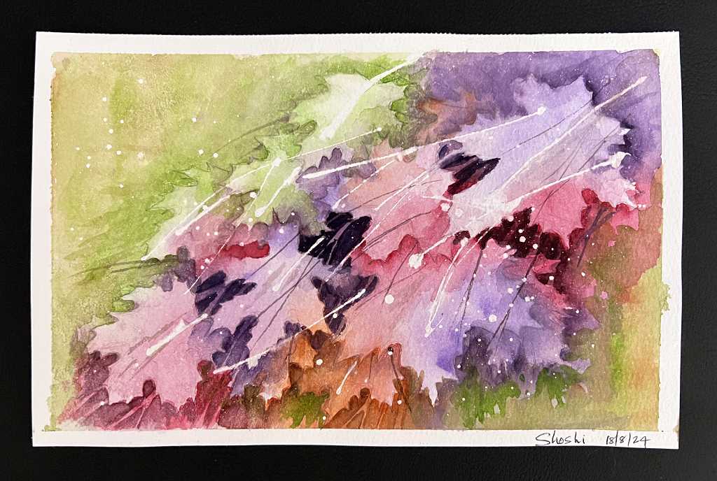
Maple leaves
The second painting is completely different. I have had a lot of practice now, working with distinct layers, usually in a fairly abstract style with repeating patterns.
I have started following Rick Surowicz on YouTube. This artist is an absolute master of the negative painting style, and I felt I had reached the stage when I could attempt a more advanced level of negative painting without the strictly distinct layers, and in a more realistic style. I followed along with one of his excellent video tutorials, drawing a collection of maple leaves in rich colours.
This was a challenge, but an extremely enjoyable one! The result was better than I expected.
The initial drawing
I began by drawing the collection of maple leaves, overlapping them as I went. I really should have sketched them out on scrap paper first, and not directly onto the watercolour paper, as there was a lot of erasing and this can damage the surface of the paper. However, all was well. I began by drawing simple circles and ovals to place the leaves, and then worked on their basic shapes and finally the detail of their indentations. This took quite a long time.
When it was done I removed a little of the graphite with a kneaded eraser, and then added some random stems with masking fluid. This is the first time I have used this medium, and I can see how useful it will be, even though it is rather difficult to handle. I poured some into my spare fineliner bottle but even with its very fine tip, it was quite hard to control. In future I shall probably use a dip pen which is easier to control, and very easy to clean afterwards. Masking fluid can ruin brushes.
After adding these stems, I took an old toothbrush and added some spatters with the masking fluid. Here is the drawing at this stage. The masking fluid appears yellow when it is dry. You can see the spatters, some of which are very tiny.
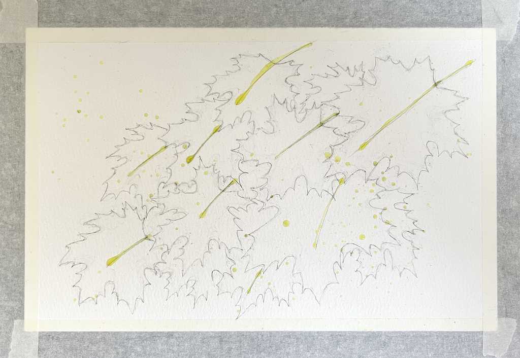
Before beginning the actual painting, I added a few more lines with the masking fluid.
The colour wash
I wet the whole surface of the paper with a flat brush, and added colours fairly randomly over the leaf areas, dropping the paint onto the damp paper. To blend them together I misted the paper with a fine spray bottle of water, mopping up any pooling of paint.
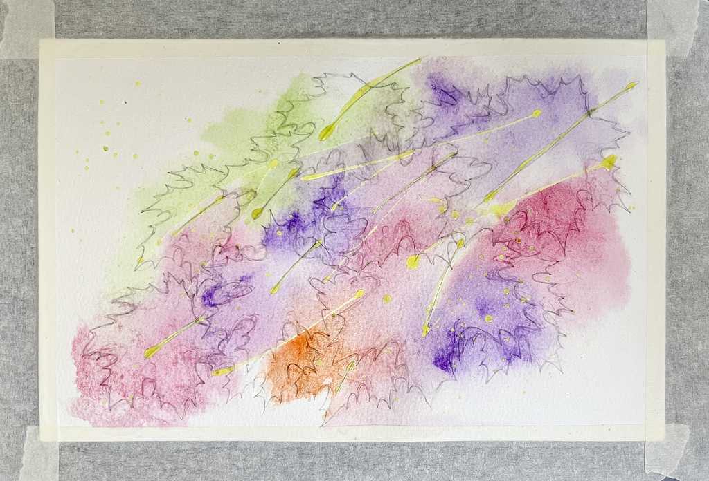
Later I added some more colour to balance the colours a bit better.
The negative painting
I didn’t photograph every stage of this. Using a stronger version of the colours of the wash, I painted around the edges of the leaves. Where they overlapped, I painted the negative space around each leaf to indicate its shadow cast on the leaf underneath. This got fairly complicated as the work proceeded, because it became less easy to see the pencil marks. I did have to do a bit of lifting off of the paint in certain areas.
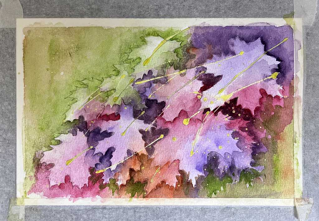
Following the tutorial, I was careful to add dark values in the spaces between the leaves. I also added some suggestions of leaf shapes particularly on the bottom edge, in an impressionistic way to indicate more depth. Further washes provided a background.
Completing the painting
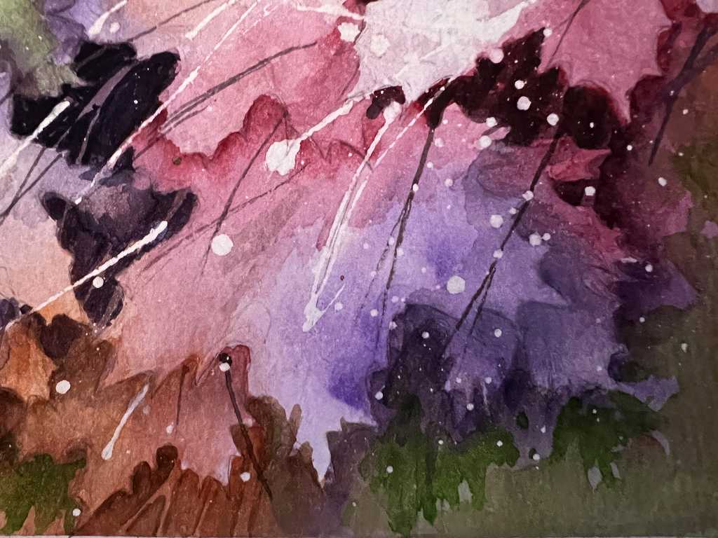
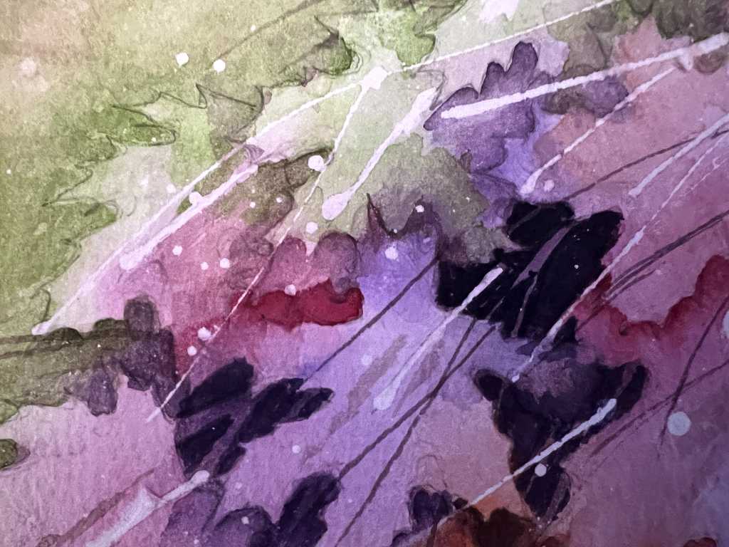
At this stage, I removed the masking fluid from the random stems, but left the spatters. I darkened the areas between the leaves still further, but painting negatively around suggestions of stems and branches behind the leaves. I also darkened the shadows of the overlapping leaves in places, and finally added more detail with a rigger brush – these fine lines provided a sense of movement and life to the picture, just as Rick Surowicz had done in the tutorial.
Once everything was completely dry, the final step was to remove the masking fluid from the spatters. I think this was one of the most fun parts of the whole project! The spatters really added something, and it was great seeing them appear as I gently rubbed away the remaining masking fluid.
The final result
Here are a couple of detail shots.
As Rick said, this is not a botanical study, but an impression of autumn leaves. I am very thrilled with how this turned out, and I am keen to use this style again. He has plenty of other tutorials on his YouTube channel. The sense of depth one can achieve with negative painting is quite remarkable. I am also very pleased with how the colours worked out. Definitely a winner!