ONLINE ART COURSE – A GROUP OF CYCLISTS IN PASTEL PENCIL
Warming to pastel pencils
After completing my recent nude figure study in pastel pencils, I found myself definitely warming to the medium. I’ve had good success with it, but didn’t really want to pursue it. This was mostly because the pencils are such a pain to sharpen. The leads are fragile, and they recommend we sharpen them with a knife, paring the wood away and then sanding the lead to a point. I really don’t enjoy doing this as it takes far too long when one wants just to get on with the art!
I recently found a sharpener dedicated to pastel pencils and charcoal pencils, made by Derwent, so I decided to buy it. It wasn’t expensive and I had nothing to lose by trying!
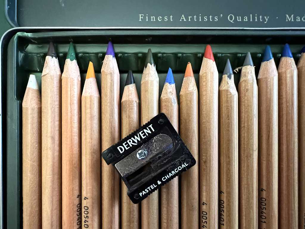
This is the result. The wood on some of the pencils looks a bit lumpy, but this is the result of my previous sharpening with the knife. With the sharpener, the leads are not as long, or as exposed, and they will probably need sharpening more frequently, but this is worth it for the time I shall be saving. Also, the length of lead exposed cannot be so long, so it won’t be so easy to cover large areas by laying down material with the side of the lead. I am generally very pleased with the result so far, though, and the sharpener seems to do a good job, sharpening this rather difficult medium.
For the nude study, I used a piece of card from my stash which I had previously coated with gesso and then sanded lightly. It was cheap printer card, about 160 gsm as I recall. I had prepared a number of these sheets for other projects, and thought I would try one with the pastel pencils, and the result was excellent. I actually preferred working on this surface to the much more expensive dedicated pastel papers.
Another advantage is that I can use any paper – printed or coloured, or even coffee-dyed. I’d have to paint it with clear gesso, which is a lot more gritty than the regular white, and requires more sanding to produce the desired surface.
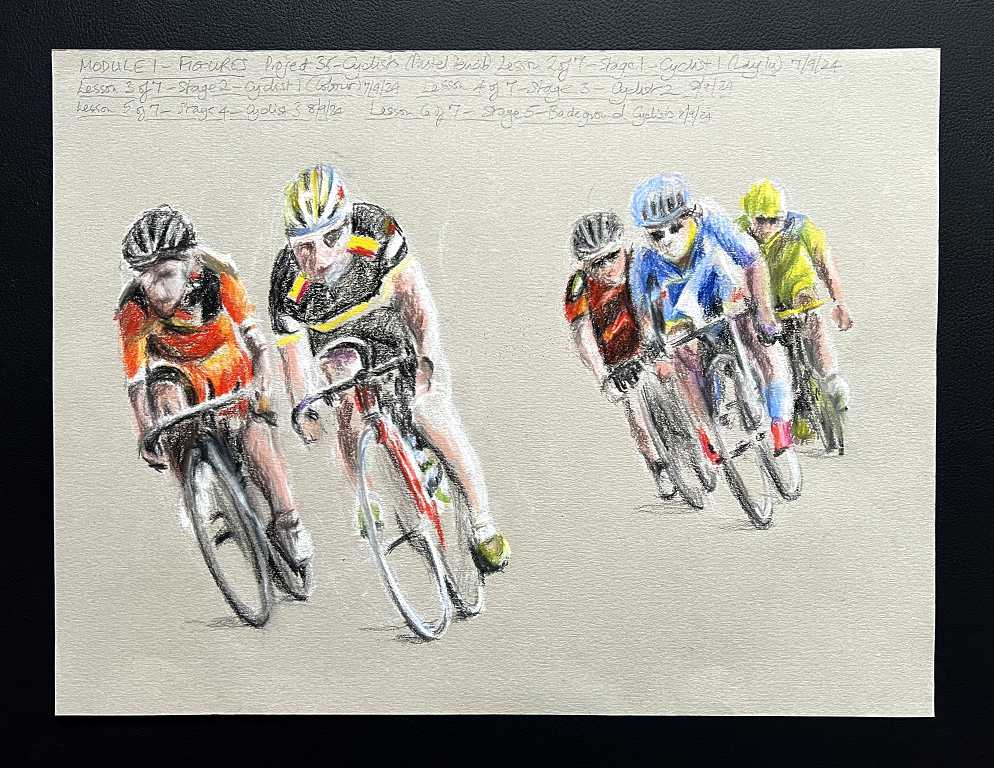
The art course project – cyclists
This was worked on Canson Mi Teintes pastel paper, following the instructions for the project.
Stage 1 – the lay in and beginning work on the first cyclist
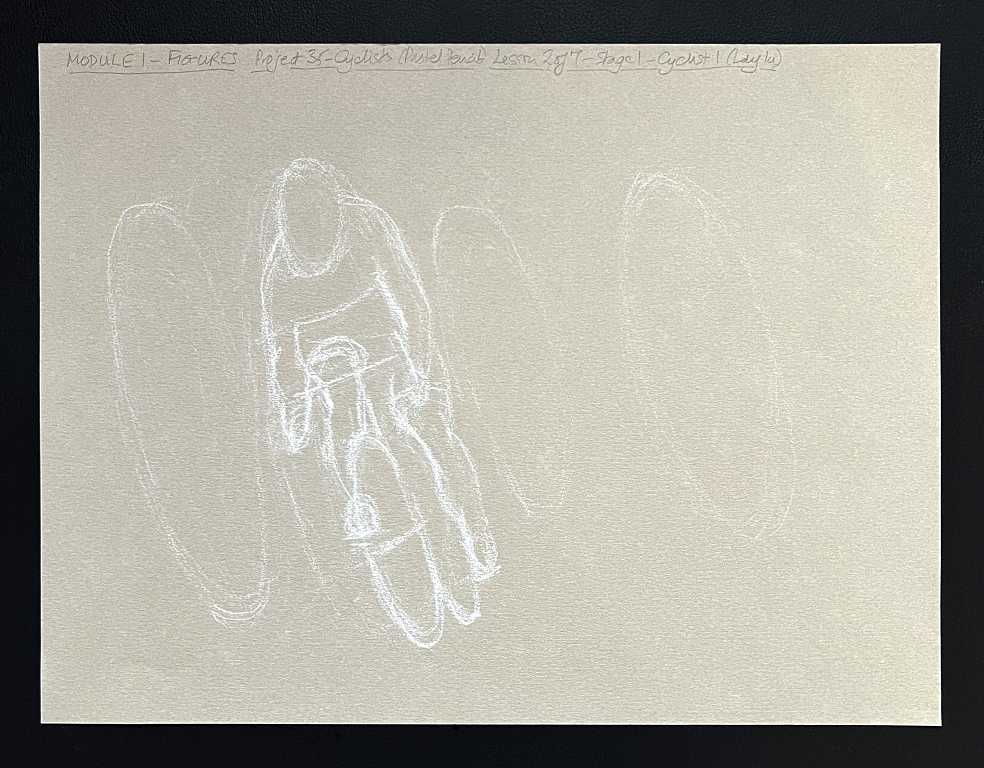
Phil, our teacher, had provided several reference photos. One of these had ovals drawn around the four main cyclists in the picture, to help with placing the figures, and getting the angle correct. We began by roughing in these ovals, and then getting the basic shape of the first cyclist done.
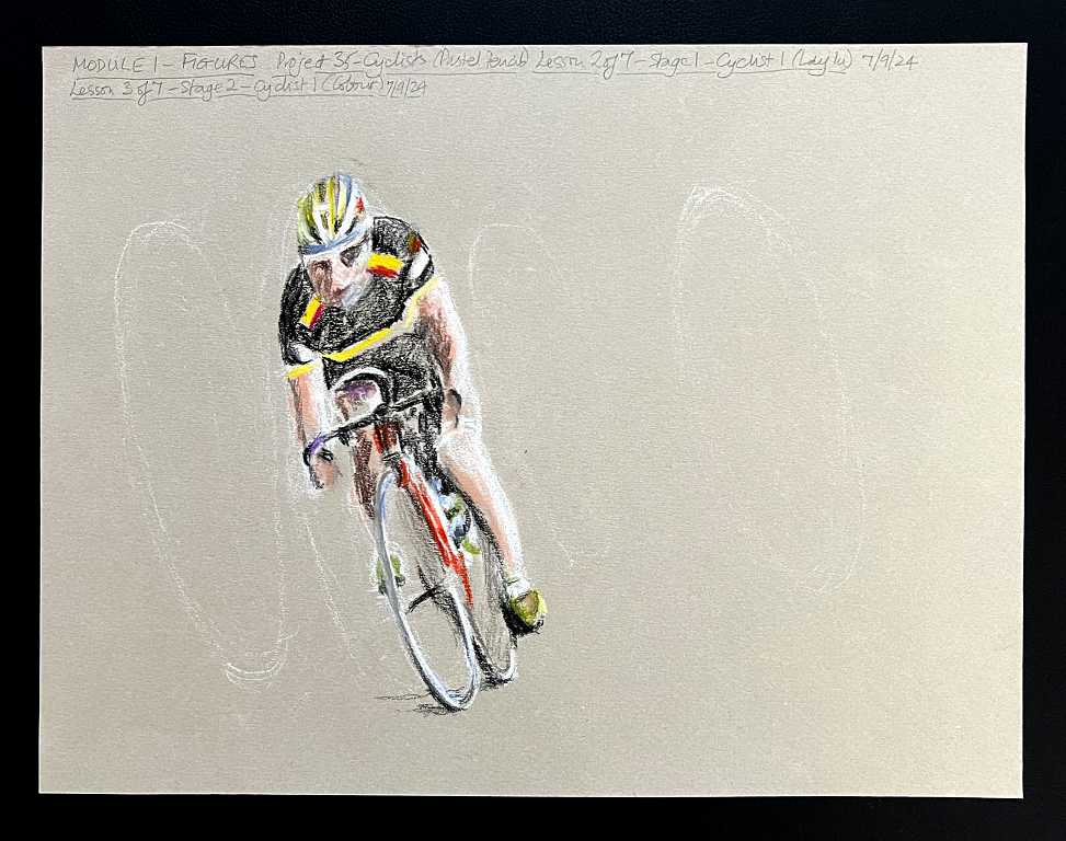
Stage 2 – Colouring the first cyclist
The next stage was to block in some colour. Phil had provided a very useful blurred reference photo. This prevented us from getting too bogged down with detail in what is a very detailed and complex original reference photo.
Stage 3 – Adding the second cyclist
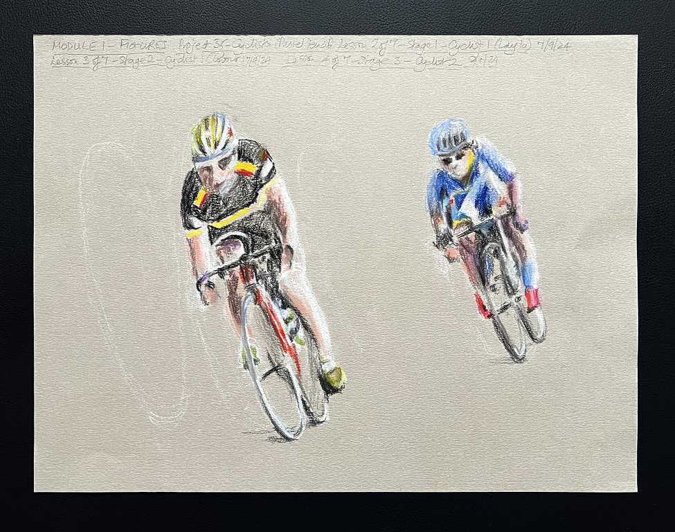
We used the same method, with the basic oval, and eyeing up the proportions.
Stage 3 – the third cyclist
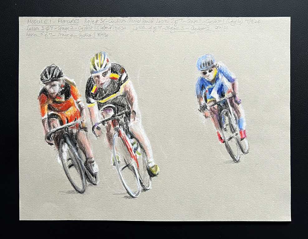
Stage 4 – Adding the background cyclists
The whole style of the drawing is supposed to be sketchy, so adding the subsidiary cyclists in the background was not difficult. Here are the first ones.
Stage 5 – Completing the drawing
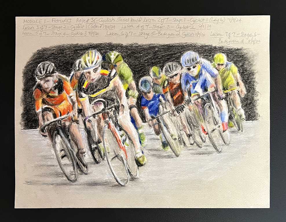
We completed the drawing by adding more background cyclists, and finally a background.
After all the cyclists were in, we began with the road, blocking in grey, white and a little blue, and adding some longer shadows.
Phil completed his drawing by putting in quite a bit of detail in the background from the reference photo. However, by this stage, I didn’t think I wanted to spend a lot more time on this drawing in this way, so I simply blocked in the background with black, to bring the figures forward.
Some comments
This was one of the least enjoyable projects in the whole course for me. My hubby and I agreed that we didn’t like the picture much, and it wasn’t one that either of us would want to hang on the wall. I said that left to my own devices, if I was looking for a reference photo to draw, this would not be it! He agreed. However, it’s part of the course and I signed up for the whole thing, so it’s a bit unreasonable to omit the projects you don’t like. I didn’t like some of the projects in the charcoal module either, and actually I didn’t enjoy that whole module as I really dislike working with charcoal, but I persevered, and was very happy to move on to another module which dealt with a medium I was happy with. On a year-long course like this, you cannot expect to like everything! I am glad to have tried everything set before me, though. Each module is long enough, with three set projects and a self directed one, to enable one to immerse oneself in a medium or subject, and gain more than a passing acquaintance with it. This way you have enough experience to decide what you like and what you don’t.
As well as teaching us how to handle and use the various media to the best advantage, and to become familiar with them so that they can be added to one’s arsenal of materials, the course’s overarching aim has been to teach us how to observe, and see things as they really are and not as we think they are. In each module, we have consistently been taught how to see things in terms of shapes rather than outlines, to judge angles and proportions, and to look at the negative spaces around and between elements of a subject. These are absolutely invaluable lessons for anyone learning to draw, which is the basis for all further art. Generally speaking, people who only want to paint make far better artists if they have mastered the art of drawing first. I am very thrilled to have had the benefit of this teaching, which is opening up so many vistas for me, and I am delighted to have stumbled across the course in a YouTube ad all those months ago – nearly a year now!
Moving back to the dedicated pastel paper for this drawing, after having used my gesso-coated card, I was again not so happy with the pastel pencils. There is something about the way they feel slightly sticky on the paper that I find unpleasant to work with. In future, I think I shall work on my own papers. The pencils seemed to glide effortlessly over the gessoed surface in a way that I much preferred.
In the end I was reasonably pleased with this drawing, but it’s not one of my best efforts, probably because my heart wasn’t really in it. I am very happy to have completed this project now, and am ready to move on to the final project in the module, the self-directed challenge.