ONLINE ART COURSE – PORTRAIT OF A YOUNG BOY
The portraits module
We are rapidly approaching the end of this course, with the penultimate module which is on portraits. Hard to believe we are now at this stage! The time has raced by.
Introducing portraits
We have done some portraits earlier in the course, but the emphasis then was on the medium and not the subject. We were able to trace the outline to get a good likeness. Phil didn’t want us to spend all the time working on observation and getting a correct likeness, but to concentrate on the rendering or colouring of the image.
In this module, however, the emphasis is definitely on attaining a good likeness through observation. He gave us three points to look out for in portrait drawing: Size, Position and Proportion. In the first video, which is always the introductory video for the module, he showed us a drawing he had done of Marilyn Munroe, and it was a very good likeness, despite being a quick sketch. He then showed us the same drawing several times, but he had manipulated it digitally each time, altering those key points one after another. It was clear that although the drawing was still recognisable as Marilyn Munroe, it was definitely “off.” This was a fascinating study. In portraiture, the smallest error in the size of a feature and its position on the face, and the general proportions of the head, make a huge difference, resulting in failure to produce a decent likeness.
He then went on to say that in this module, with each project he would teach us a different method. In each case the three key points would be correct.
Partial tracing
This is the first method Phil taught us. He told us to print out the reference photo the size that our final drawing would be. We had to make a small mark at key features on the face to get them in the right position. Turning over the paper, we scribbled with some graphite where these marks were, and then we traced the marks onto the drawing paper. The initial marks on the paper were minimal, not like a full tracing. This meant that we still had to use considerable observational skills to get it right.
The first project – portrait of a young boy
I wasn’t sure I was going to enjoy doing this because initially I didn’t like the reference photo at all. However, just like before, as I worked on it, I came to enjoy it very much! I also didn’t think it would be easy and that it would be a huge challenge to get a good likeness, but as always, Phil led us through step by step. We worked the portrait in graphite pencils, and I was able to try out my new Faber Castell matte graphite pencils for the first time. Graphite is quite shiny and reflective, and this can be a problem, but the new pencils are defintely matte and will photograph a lot better. I’d seen reviews of them and was tempted to buy them but they were quite expensive. Then, when I was shopping on AliEress for some other things, I came across a set for a very good price, so I bought them. They had no case, but I found a small plastic box which is ideal. They are lovely to work with and keep a nice sharp point as well.
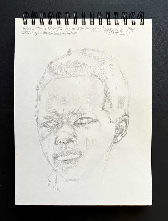
Stage 1 – the basic layout of the face
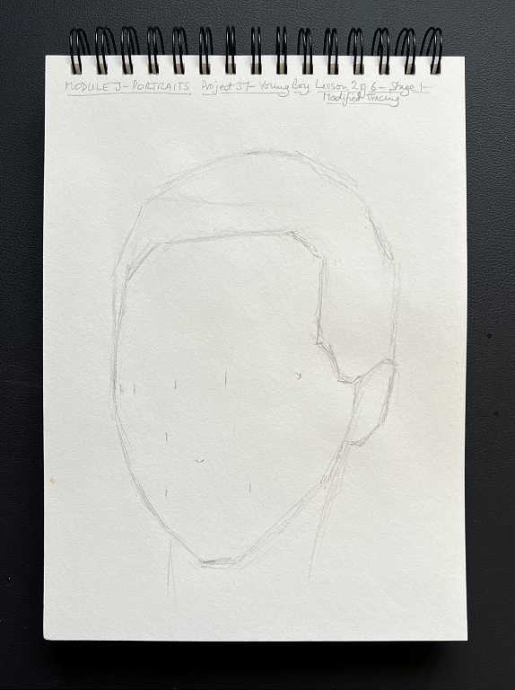
You can see that I have drawn the basic outline, using straight lines wherever possible. The small marks show the position of the key featres of the face.
Stage 2 – adding the facial features
In addition to drawing the features, we also began to add a little shading as a foundation for later work.
Stage 3 – light shading
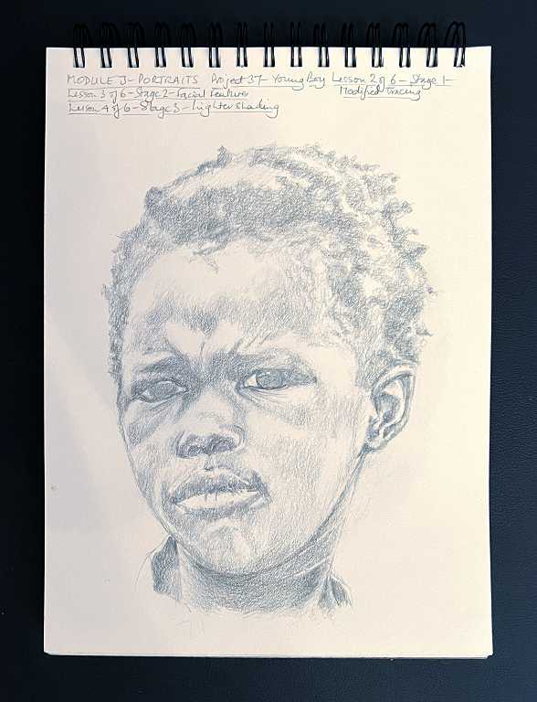
At this stage the drawing was really beginning to take shape. I propped it up on the mantelpiece till the next day, and could almost consider it finished! However, as with every drawing, it is much improved with the addition of darker values which really bring it to life.
Stage 4 – darker shading
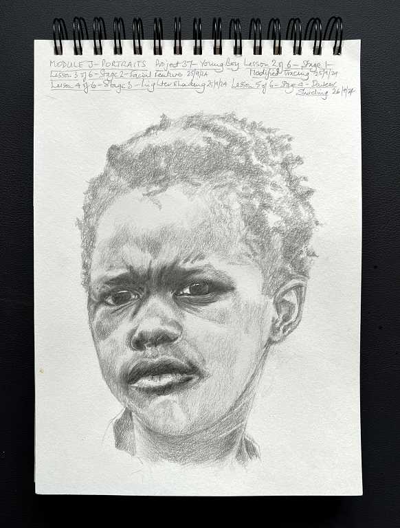
It was great, getting out the softer pencils – 4B and 6B. The matte graphite set goes up to 14B! What a difference it makes, adding these dark values. We began with the eyes and worked down through the nose to the mouth, and also darkened some of the shadows on the face, hair and neck.
Stage 5 – The hair and finishing touches
The final stage, to complete the drawing.
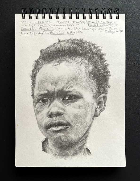
As you add darker values, some of the lighter ones which looked OK earlier, suddenly appear too light in contrast. This is when we go back over the drawing and adjust the values accordingly.
Phil, as always, favoured the loose, sketchy style. He added shading with a lot of cross-hatching. I am not keen on this style and prefer a smoother, more photo-realistic style. I therefore used a lot of small circular strokes with my pencils, working gradually in layers, building up the graphite until I got the desired result. This obviously takes a lot longer, but in the end I prefer the result.
As the drawing progressed, I added a bit of the boy’s shirt so that I could get his neck right. Phil went ahead and drew quite a bit more of his clothing. My portrait was already quite low on the paper. I did this to allow room for the details to be written at the top. I was therefore unable to add much more, but in the end, I really liked the result – just a suggestion of the neck of the shirt at the sides with the high contrast with his neck as it disappeared inside, and I am very glad I made this decision.
At the beginning I didn’t like the look of this extremely discontented young man! Drawing him, I’ve got quite fond of him, and named him Grumpy Graham. I wish I could cheer him up a bit! I think perhaps he’s not actually grumpy, but trying to look really tough and street-wise, maybe to impress the older boys.