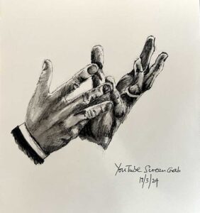
ONLINE ART COURSE – PORTRAIT OF A MAN IN A HAT
For the second project in the portraits module, we had to draw a man with ink pens. This was a real challenge. With the first portrait in the module, we used “partial tracing” to get the proportions right, tracing small marks at strategic points on the face. This time we were not allowed that luxury, but had to do everything by observation alone, with some measuring, using a stick or card to mark off relevant points.
Problems with tracing
At the beginning of the project, Phil spoke at some length about an experiment he had run a couple of years ago on the art forum. He posted a reference photo of a face and challenged any members to draw this, using the direct tracing method. Only three of the almost fifty applicants produced a true likeness! This was not to judge people’s artistic ability, but to prove that even with direct tracing, it is not easy to achieve a good likeness of a face. There is so much more to it than that. One of the problems is that when you start adding detail and shading, your initial traced lines tend to disappear, and it’s as if you are starting from scratch without any help. The tiniest variation in size, position or proportion, the three keys he mentioned in the last project, can prevent a true likeness, and even make the face look less than human! He said that ultimately, it’s all about shapes and their relationship to each other.
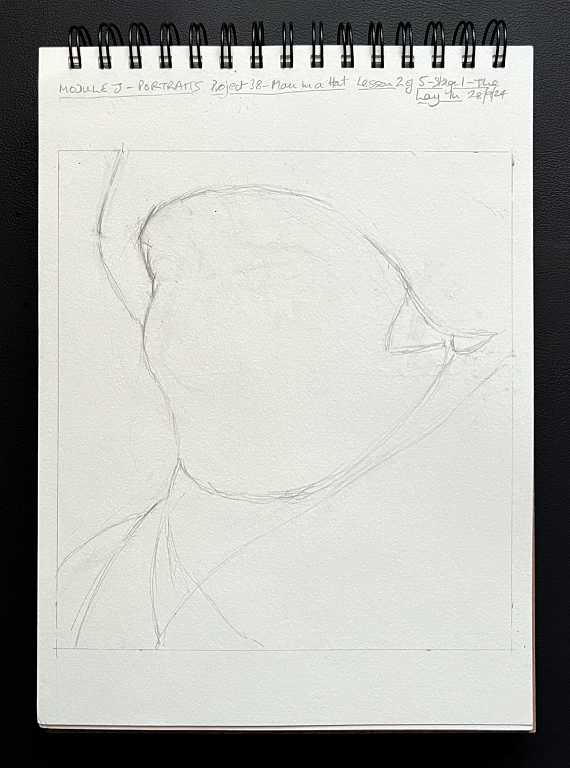
Stage 1 – the lay in
Most of the work on this picture was done with a standard HB pencil. The ink work came only at the end.
As always, this was the most difficult part for me, and I actually had to erase everything and begin again! By the time I got to the eyes, I realised that the whole head was too far over to one side. Nothing for it but to start again.
We began by getting a basic outline of the head down on paper. Rather than concentrating on the shape of the head, Phil instructed us to look at the negative space to the left of the head and try and replicate that. At this stage, my drawing reminded me of Gort, the giant robot in the classic sci-fi movie “The Day the Earth Stood Still”! Throughout this drawing, we had to look at abstract shapes rather than the shapes of facial features. This requires a different way of thinking, and a different way of looking at things.
Stage 2 – the eyes
Phil said that adding so much detail at the beginning seemed to contradict everything he’d taught us thus far in the course. Before, we have always added the basics first, and the detail came later. With portraits, though, as long as you have got the position of the facial features right, the detail can help a great deal with positioning other things.
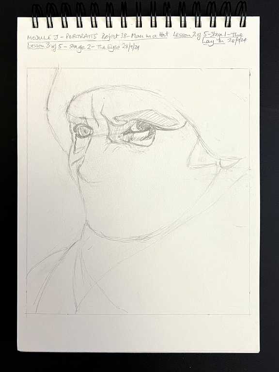
Blocking in some of the darker shadow areas helped get the details correct.
Stage 3 – other features
The eyes are always the most challenging, so we didn’t need to spend so much time on the other features. This particular face had lots of landmarks with all those lines and wrinkles! An old or characterful face is a lot easier to draw than a fresh young one with no distinguishing marks.
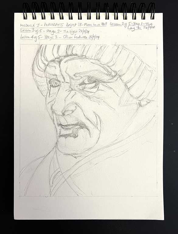
This completed the pencil drawing stage of the picture, with lots more detail added, including his hat and scarf. As Phil said, it still doesn’t look like a decent portrait at this stage! It is only with the addition of all the subtle shading and texture that the face springs to life.
Stage 4 – the ink work, to complete the portrait
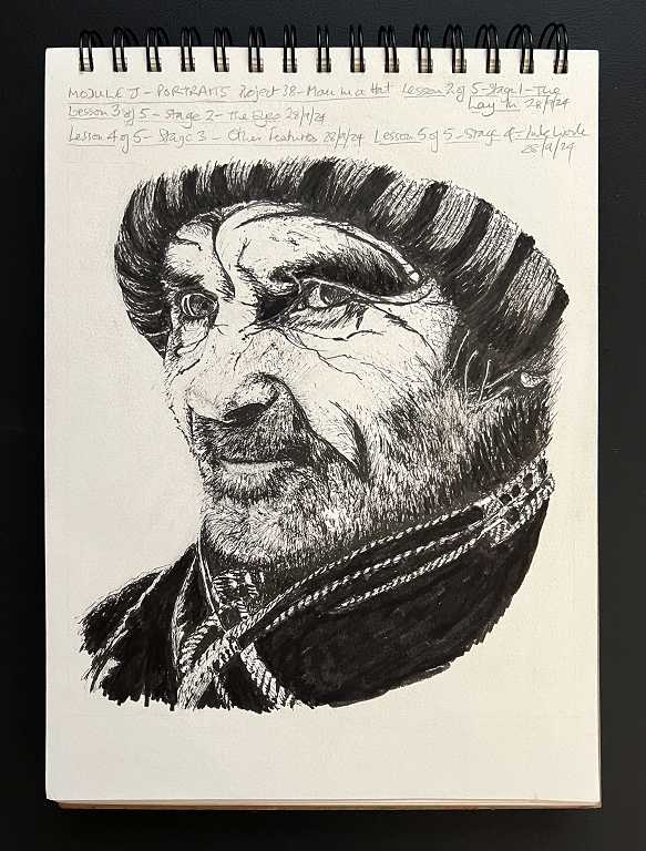
What a transformation.
With Phil’s expert guidance and a great deal of attention to detail, I think I have achieved a reasonable likeness to the reference photograph.
I did this in a much less sketchy style than Phil had done, as I prefer a more photo-realistic finish. It does take longer, but worth it in the end, I think. He did a lot of hatching for his shading, and more of a suggestion of beard and other detailing, but the effect was great – it certainly looked realistic!
For the few stray white hairs coming out from under his hat in my drawing, I carefully drew around the white of the paper. For the stray hair from his eyebrow, I used the tip of a sharp blade to scrape back the ink. I also used this on the bottom lip and part of the beard just under his mouth, which I realised were not quite correct in my drawing, and added a bit more ink work to touch it up. This scraping technique is often used in coloured pencil drawings of animals, to add fine whiskers.
Conclusion
This was certainly a challenge to do, and I always struggle with proportion and angles. Every drawing I do is good for gaining more experience, though, and I doubt I could have done this at an earlier stage in the course.
The way Phil has designed the course is excellent. At the very beginning, he said that the decision to make each module available only when you reached that stage was deliberate – there is no opportunity to download the whole course, or pick and choose which modules you want to do. Each one builds on the experience and skill learnt on previous ones. If it were otherwise, it might be easy to become completely overwhelmed! He is such a good teacher, and knows exactly how to lead us step by step, developing our skills as we go.
As for this particular picture, I am pleased with it in that I have managed to achieve a good likeness of the subject, but I do not actually like it very much. I know that characterful faces are easier to draw but there’s something a little sinister about this one. I don’t think this is helped by the stark black of the ink pens – we used two thicknesses, the .3 and the .8, and a brush pen for the larger areas of solid black – I am wondering whether the effect might have been gentler with a different medium, such as graphite. Anyway, it’s going in my course portfolio to be bound with the rest on the completion of the course, and maybe I’ll get to like the old fellow a bit more as time goes on!
It has been a very useful exercise, anyway, and I am pleased to have achieved this level of success with it.