VINES AND TRELLISES IN UFO – A NEW ZENTANGLE
I am currently working on some interactive elements – pop-ups and pop-outs, and decided to decorate one of them with Zentangle. Browsing around I came across a very attractive new (to me, at least) grid pattern called UFO by Ginny Lu, and thought I might use it. It’s been a while since I visited the Tangle Patterns site (link in RH sidebar of this blog), where I found how to draw this.
Learning to draw UFO
I have to admit to struggling a lot with this one initially, until I’d got the steps straight in my mind! I don’t think it’s one for beginners! Before putting it on my pop-out project I thought I’d better practise a bit.
As always with a new pattern, I drew it on an ATC-sized card to go in my reference album, with the step-outs on the back.
The initial version of this tangle is based on triangles, but Ginny Lu has also developed it based on squares and hexagons. You can see examples of this via the Tangle Patterns link above. I therefore made three small cards for my album, putting the step-outs on the back of the triangles one. Here are the cards.

Squares on the left, triangles in the centre, and hexagons on the right. Adding the shading makes it a lot clearer how the under and over weaving pattern works. It’s really pretty.
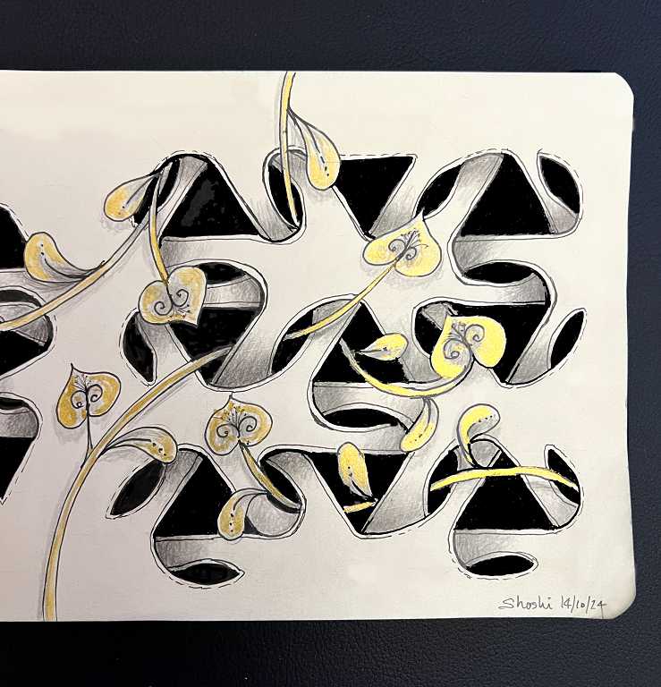
I absolutely loved the way Ginny had intertwined some foliage through her lattices, so I decided to do likewise in my drawing.
Drawing UFO in my Rhodia drawing book
My beautiful Rhodia drawing book with its black padded hard cover and gorgeous smooth creamy pages is where I do my ink pen drawings. Lately I have departed from my strict black-and-white rule with the addition of some gold highlights and I’m loving the results. The book is a real joy to draw in. I’m delighted to say that there are still loads of pages to work on! Sometimes I skip a page if the drawing I have done is excessively dark. The black ink doesn’t bleed through the quite thin pages, but you can see a shadow on the reverse sometimes.
For this drawing, I chose to draw three lattices across a whole double-page spread, and to add the vines to connect them.

I liked the way Ginny didn’t outline her drawings. This made the lattices appear to be an integral part of the paper! This effect is even more apparent when the drawing is photographed against a black background, as I have done.
The vines
This drawing took a lot of careful planning. I mapped out where the initial shapes would go and there were a lot of pencil construction lines before I began the drawing. Zentangle patterns are usually drawn direct with pen but in this case I had to do it in pencil first so that I could decide how the vines would weave in and out. I drew the vines over the top of the pencil grids and then erased the parts which would be underneath.
I added the ink to the vines first, so that I would get the weaving correct. Then I added the lines for the lattices. The next step was the colour in all the shapes with solid black. Finally, the shading which always brings these drawings into glorious 3-D life! This time I used my Faber Castell matte graphite pencils, starting with the 4B and then further darkening the values where the lattice went underneath, with the 12B. Graphite pencils don’t blend very well on this paper as it is very smooth, so I took my time, gradually building up layers of graphite with a very light touch, using small circular movements. I went back over the 12B with the 4B pencil to smooth everything out.
When the drawing was finished, the vines didn’t really stand out very clearly against the lattices. There didn’t seem to be enough contrast, and they were getting lost amongst the lines of the lattices. What was the answer? Add some gold!
Perfect Pearls
This time I decided not to use my fine gold acrylic marker as it is opaque and a bit too strong, and I wanted a more subtle result. Instead, I got out my Perfect Pearls palette and chose the gold one, which I painted like watercolour with a fine brush. I was able to avoid the shading and just paint the gold to accentuate the highlights.
My Perfect Pearls
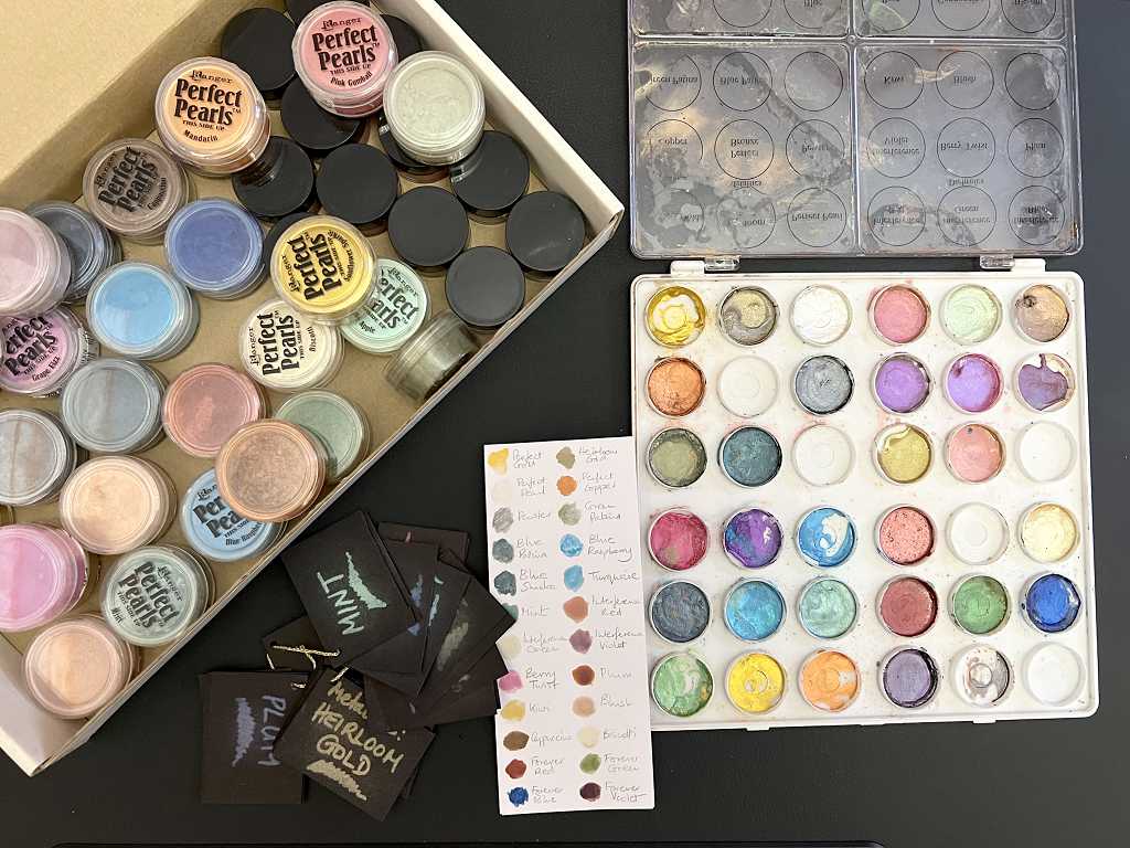
These little mica powders mixed with gum arabic are so versatile! You can see the little pots in the box. Beside them is my small black card swatch. They show up beautifully on black. You can stamp with embossing ink (sticky, colourless) or use an embossing pen (filled with the same stuff) as I did in this case. You then brush the dry powder over the top with a soft brush, and it sticks. A very light misting of water activates the gum arabic and prevents the powder from rubbing off.
To the right of the black swatches is the swatch I made for the watercolour method of using them. You can simply dip a damp brush into the powder and paint with it, or you can sprinkle a little powder into a puddle of water and paint with that. I think the best way is to put the powders in the sections of an empty palette and carefully drop water onto them. You mix it up and let it dry, and hey presto, you’ve got watercolour pans! You use them in exactly the same way as you would normal watercolours. Another way to use Perfect Pearls is to put a small amount of powder into a spray bottle and add water. You then have instant DIY Glimmer Mist which looks gorgeous sprayed on many projects for a bit of shimmer and bling.
Such versatile and pretty little pots of delight! I love ’em.
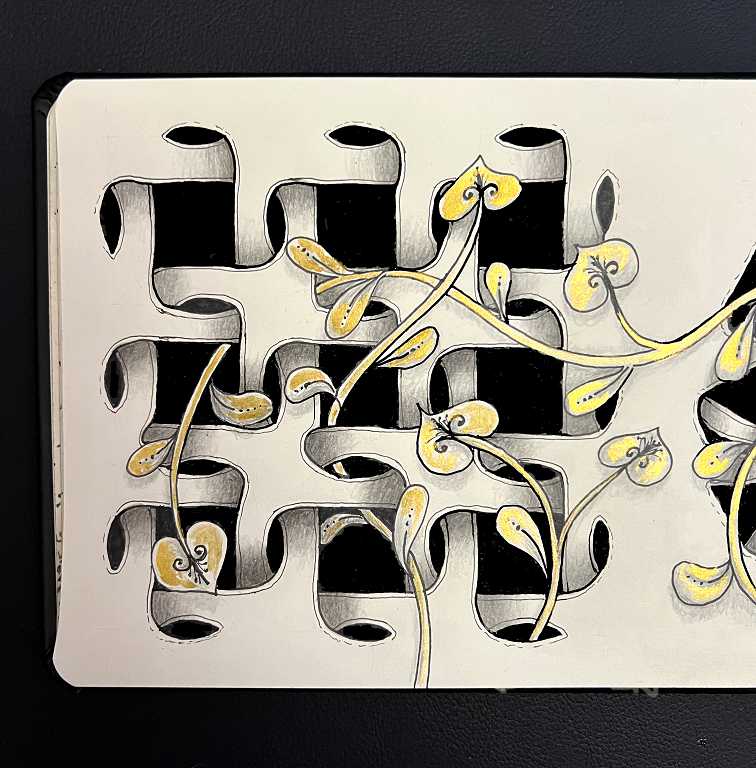
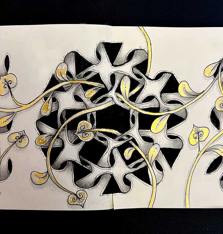
Close-Ups of the Lattices
The lattice based on squares, on the left.
The central lattice. I followed Ginny’s pattern on the Tangle Patterns site, starting with a hexagon in the centre, surrounding it with a ring of squares, and a final outer ring of triangles. I got my overlappping hexagon parts a bit too narrow which was a shame. You can see the black hexagon shape in the centre, the six black squares radiating from it, and finally the twelve triangles forming the outer ring. The triangles in this Zentangle pattern alternate, base and tip, to form the pattern. When you draw it, you begin by drawing the negative spaces – the basic shapes, and the lozenge-shaped parts which eventually form the space between the overlapping bars. I think my recent negative painting adventure has helped me to visualise this better.
Finally, the triangles on the right.
These Zentangle patterns can look extremely complex, but when they are broken down into individual steps, they are actually not too difficult to draw once you get the hang of it. This pattern did prove difficult at the beginning but once I got the hang of how to link the shapes with the lozenges – which way the lines went – it fell into place. When you start drawing, a Zentangle pattern often looks nothing like the finished result! Looking at the result, it is really hard to see how you could begin to draw it. It’s so exciting when the final pattern begins to emerge and everything makes sense!
There are literally hundreds of different patterns on the Tangle Patterns site, all with links to the artist’s page where the instructions can be found. I have a couple of patterns on there which I have designed, which you can see on this page, and also a few more that have not been published on there.