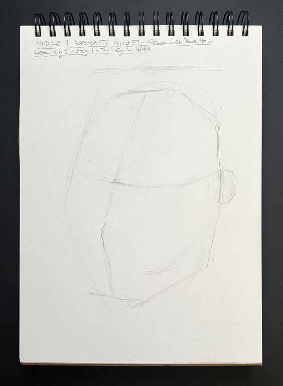
ONLINE ART COURSE – PORTRAIT OF A WOMAN WITH DARK HAIR
This was the final directed project of the Portraits module, which Phil told us would be the most challenging project of the whole course.
Methods of drawing portraits
In the first project in this module, the portrait of a young boy, we used the partial tracing approach. This involved tracing marks which showed the position of key elements of the picture. It wasn’t a full tracing but it was a good starting point for getting the features in the right position, and still involving us in a lot of observation.
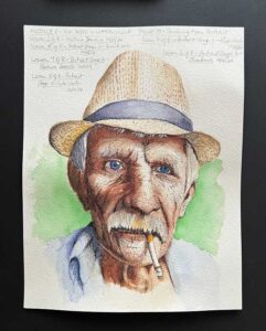
In the second project, the man in a hat, we used a measuring stick to get everything in the right place, matching our drawing size-for-size with the reference photo. This did not involve any tracing at all.
For this one, we used comparative measuring, a method which enables one to draw the subject at any size, and not be tied to the exact size of the reference. To do this, we had to work out the relative distances and sizes on the reference photo, and then transfer these proportions to our own drawing, which was larger than the reference. The distances were larger, but the proportions were the same.
Stage 1 of this project – the lay in
We began by drawing a very simple oval shape to represent the head. Phil then explained the difference between drawing a face looking straight ahead, and one which was either rotated, tilted or tipped, which would alter the size and distance of various elements because of perspective. Our subject for this project had her head rotated slightly to her right, and slightly tilted. It was surprising how much larger this made her left eye. A casual look would assume the eyes were the same size, but if one were to draw them like that, the picture would look very odd.
Our basic lay in consisted of the oval shape for the head, and a few lines to indicate the position and relative distance of the key features.
Stage 2 – the eyes
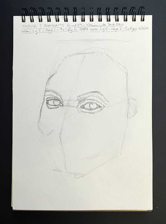
At this stage it was just a question of drawing the eye sockets and the basic shapes in the eyes. The detail would come later with the shading.
Stage 3 – the nose and mouth
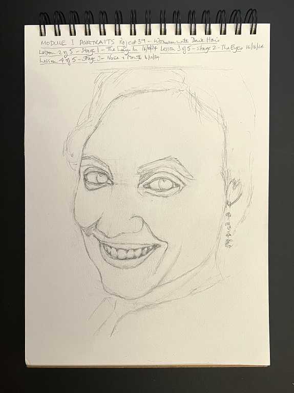
This was quite definitely the “ugly stage” of this drawing! It looks quite grotesque!
Phil taught us how to draw teeth. He said you don’t draw the actual teeth, but the spaces between them – those little triangles. We had to count the teeth so we gave her the correct number, and we had to make sure the little triangles at the bottom lined up correctly with those at the top. I said to my hubby that if we didn’t get this right, the poor lady would be in serious need of radical orthodontic treatment!
At this stage we also added a few more details, such as her smile lines, her earring, and a suggestion of her clothing.
Stage 4 – the shading
For this, we used a coloured pencil. Phil used a blue one, but I decided to use a rich brown from my Amazon Basics set – simply called “Brown,” as I wanted a sepia effect. Again I wondered if I’d be sacked for departing from the brief, but at the beginning of the video for this stage, Phil said we might prefer to use brown, or some other colour, and he showed us some examples of family portraits he had drawn, in both blue and brown.
Obviously with a single coloured pencil, one wasn’t going to achieve the full range of values, so we had the make the darkest areas, in this case the eyes, as dark as we could, and there was a certain amount of white page left, with maybe the lightest of shading to give the face a realistic rounded appearance.
It was interesting, in this project, to be drawing a portrait of a woman. I think it is probably more difficult than drawing a man because the skin is generally smoother and with fewer distinguishing features to act as landmarks for the lay in and later shading. The young boy had lots of frown lines because of his expression, and the man in the hat had a very weather-beaten looking face with lots of lines and wrinkles to hang one’s hat on (pun intended)! A smooth, relatively young face, seems a lot more tricky to draw.
This is the finished portrait, once the shading was complete.
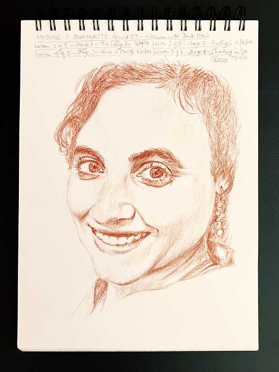
I am reasonably satisfied with this, but I don’t think I got her mouth quite right.
In the reference photo, I think she’s got some lip liner on because there is a fairly harsh line around her mouth. Most people have drawn this in their portraits, shared on the group forum, and I really didn’t like this look. I decided to give her mouth a softer look by not adding any outline at all, except at the corners and on the inner edges of the lips where they met the spaces between the teeth which were in dark shadow. I prefer this look. Also, Phil used his customary sketchy style with hatching for shading and so on, but I opted for the smoother, less sketchy finish which I prefer. It does take longer, but I think it’s worth it in the end.