ONLINE ART COURSE – FOREST ANIMALS ON GREY PAPER
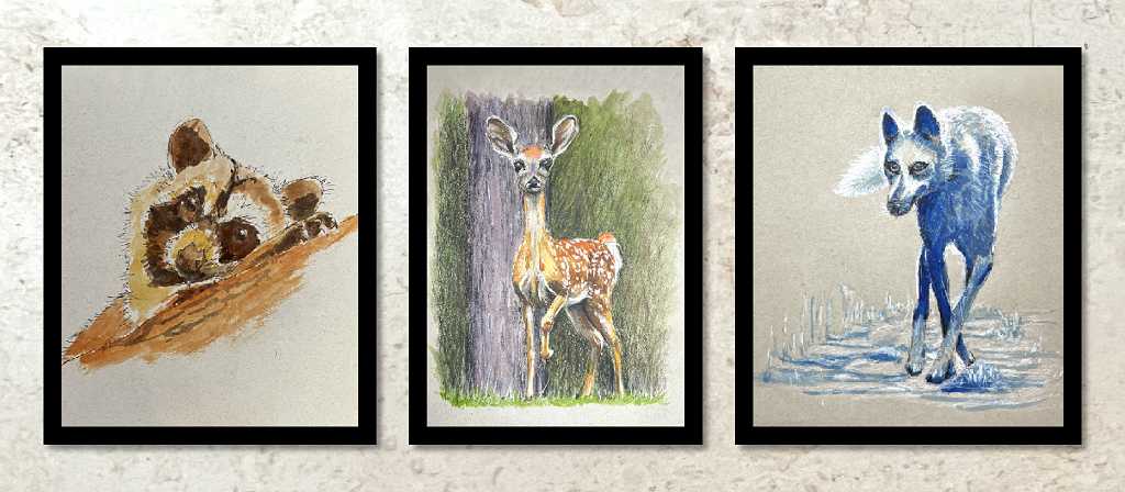
For the second project in this final module of the course, we had to draw three different animals, using different mixed media for each. It was quite an interesting challenge, and I was quite pleased with my first two drawings but less satisfied with the third.
Raccoon
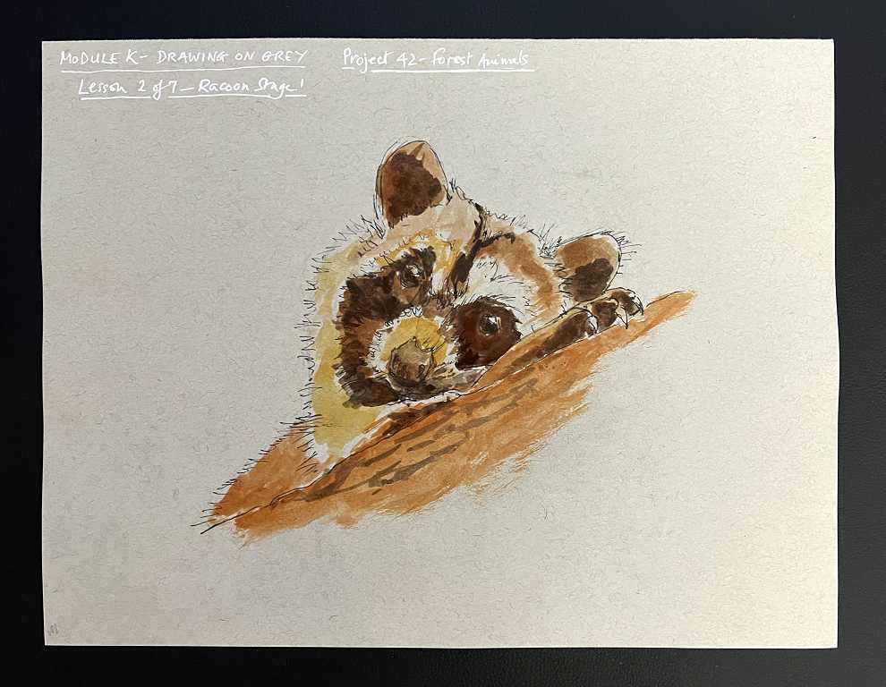
This picture was worked in watercolour followed by ink pen. We began by mapping out the basic shape with graphite pencil and then adding ink. The final part of stage 1 was the addition of watercolour.
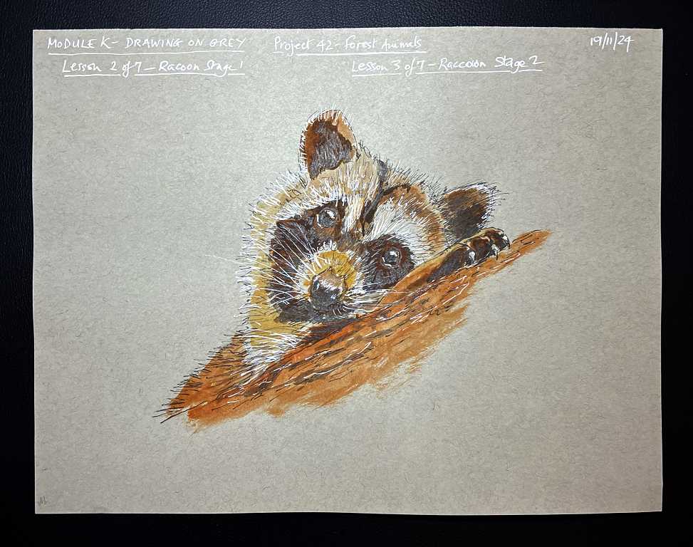
For the second stage we added further ink work, including working with the white pen. As before, I used my fine white acrylic marker rather than a white gel pen, as I don’t find I get on very well with those.
Wolf
Our second animal was a wolf, which we worked with ink pen and monochrome watercolor, and finally picking out the highlights with a white pastel pencil. Again we began by drafting in the basic shape with graphite pencil followed by the black ink pen. Phil showed us how to draw only the dark outline with the ink pen, and where the lighter fur was, to outline it with the white pastel pencil. This was because we didn’t want a hard black outline in those areas.
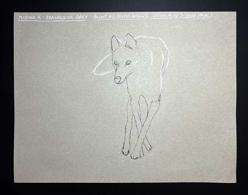
This was an interesting picture to draw because of the extreme foreshortening, and the fact that the legs all seemed to be in a tight jumble!
Phil chose a blue monochrome to colour it. This was great as it gave it a suitably cold feel. We mixed ultramarine with a little phthalo blue to get a nice cool shade, and also added a small amount of burnt umber to dull it down somewhat. We blocked in the darker areas and faded out the colour for the lighter parts. When it was dry, we went back with the black pen and added some darker shading. The final step was to add the white pastel pencil which really brought it to life.
I decided to add to the darker values with a black pastel pencil. I also added some touches with the white acrylic pen – lots of contrast. The result was that my wolf looked pretty menacing, with a lean and hungry look! Here’s the finished result.
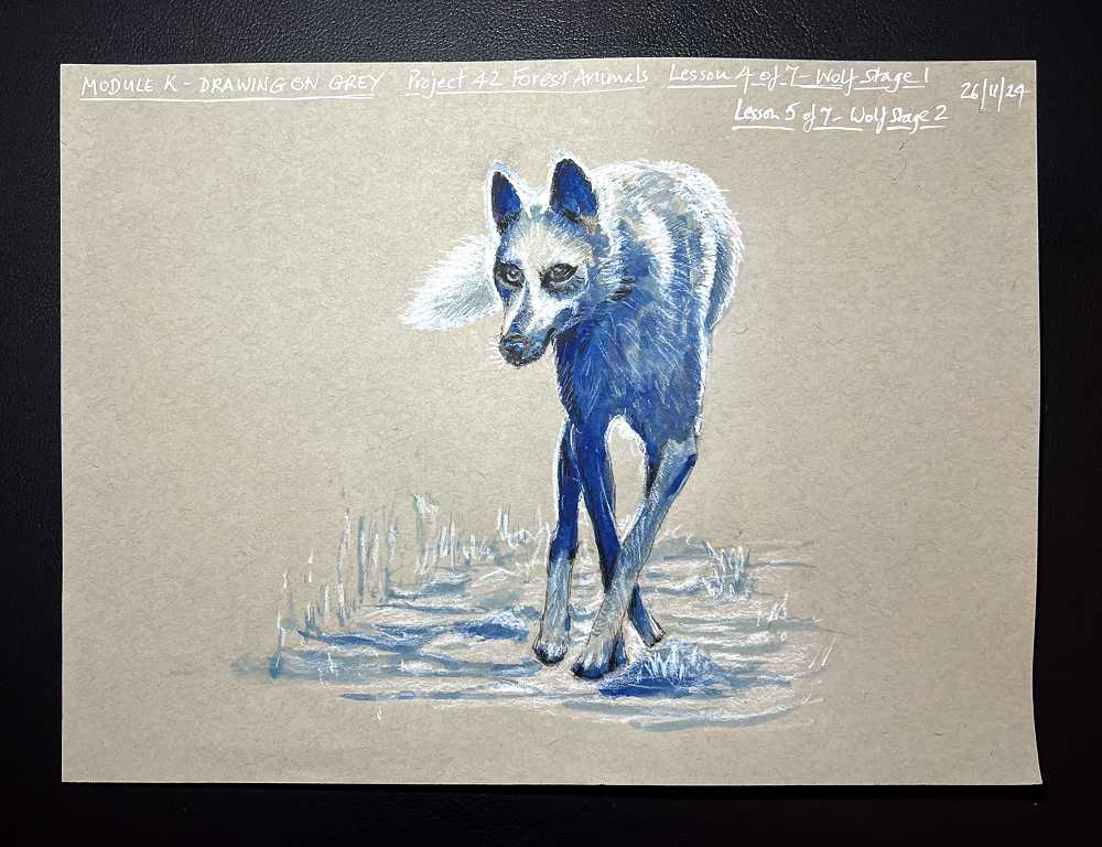
This was probably my favourite of the three drawings. I enjoyed working with the monochrome watercolor. It’s an interesting effect.
Deer
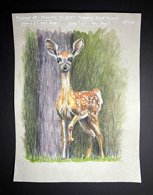
This was my least favourite of the three drawings, and the least satisfactory as far as my drawing was concerned. I spent ages trying to get the proportions correct, and in the end I think I still got the head too big. Also, I preferred the minimal background in the first two pictures. For this one there was a full background with a tree trunk, and I think I would have preferred to keep this to a minimum.
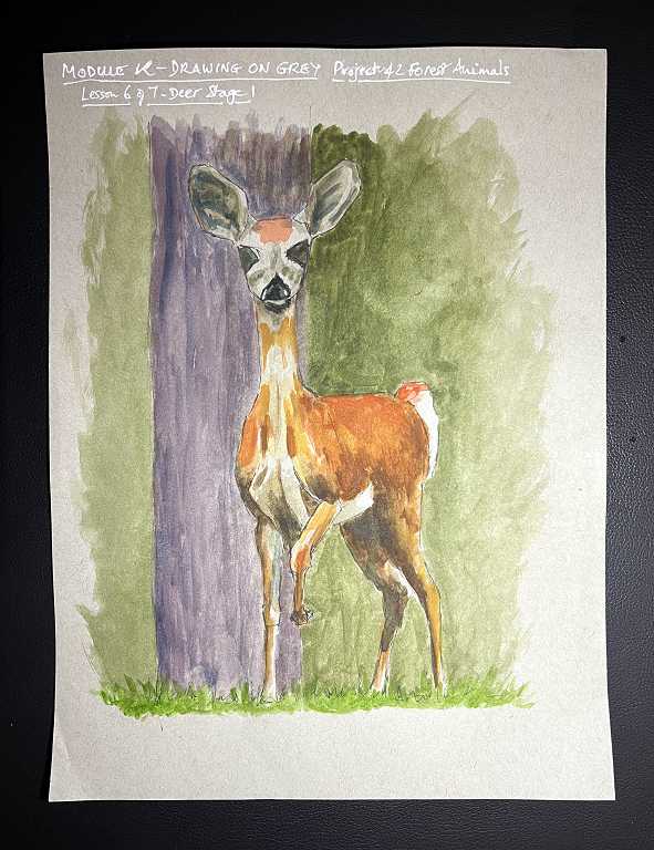
This picture was worked with graphite pencil and ink pen initially, then watercolour, and finally with pastel pencils to smooth out the watercolour and add detail. The shading of the fur and the addition of the white dapples was great fun to do and I was pleased with the results of this.
Here is the initial mapping out with the ink pen and the addition of the watercolour.
Here is the finished drawing with the addition of the pastel pencils.
I am pleased to have finished this particular project. I can’t say I enjoyed it 100 percent – I had thought I would enjoy working on the grey paper more than I have so far. I have plans for using it in different ways after the course is finished. The first two animal studies were OK, but even so, I think our earlier project dedicated to animals was a lot more fun and my results were better. Pastel pencil isn’t my favourite medium, but it wins hands down over charcoal, so it can’t be bad! It does build up a lot more quickly than coloured pencil, and blends well, and it works very well over watercolour too, as Phil has proved to us in our various drawings using these two media. Definitely something to explore further. The pastel pencil smooths out any imperfections in the watercolour, and the underpainting seems to add extra tooth as well, which is a great advantage, especially when working on this relatively smooth drawing paper. I dislike the sensation of drawing with pastel pencil on dedicated pastel paper. It has a slightly sticky feel which I find rather unpleasant.
Working on the grey paper, I think my preference is working in monochrome. It has a really stylish look. Definitely something to pursue further!
Here’s a montage of my three animals drawn in this project.
