MARK MAKING ON THE ABSTRACT WATERCOLOUR MINI-ALBUM
Shoshi’s gone marking mad!
I had soooo much fun with this latest project. It wasn’t a lengthy project – I could do a page or two per session and just bung stuff down and see what happened. Quite different from my recent highly disciplined projects. Nice to let one’s hair down once in a while.
Materials
I’ve used a selection of markers and ink pens, and a bit of acrylic paint, some stencilling, and touches of gold. You’ve got to have a bit of bling somewhere!
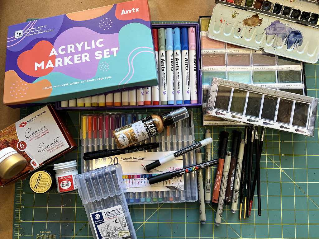
The box at top left is my new set of acrylic brush markers. These are absolutely brilliant. You do not need to pump them to prime them. They work straight out of the box. The colours are simply gorgeous, and of course opaque. They are perfect for mark making for a project like this.
Also in the picture is the pot of gold gouache on top of its box, which contains five other metallic colours. Treasure Gold gilding wax (not actually used), Dr. Ph. Martin’s Bleed Proof White. (I also used his gold acrylic ink.) Seth Apter’s Izink gold spray ink. (This is one of two bottles that I have of this – both have clogged nozzles! If I want to spray with them, I have to decant a little into a mini-mister with a pipette.) Various ink pens and acrylic markers, and brushes. The plastic box underneath is my set of Staedtler water-based fneliners.
After beginning work on the pages, I also got out my Stabilo Woodies and used a couple of those for mark making as well.
For some metallic accents, I put out a few of my absolute favourite acrylic paints. Being metallic, they tend to show up better on dark paper.
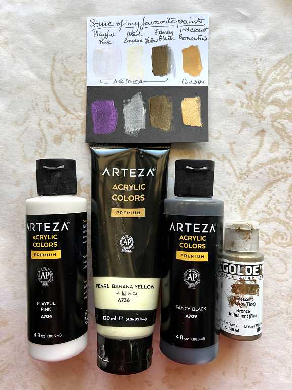
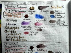
Here’s the little swatch I made. I had to tilt it at an angle to show the shimmer.
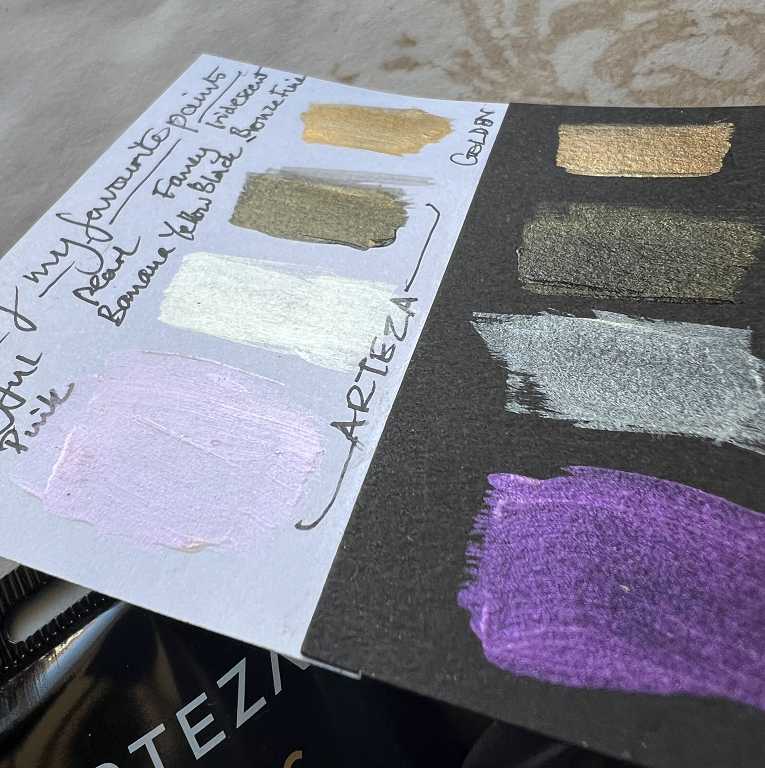
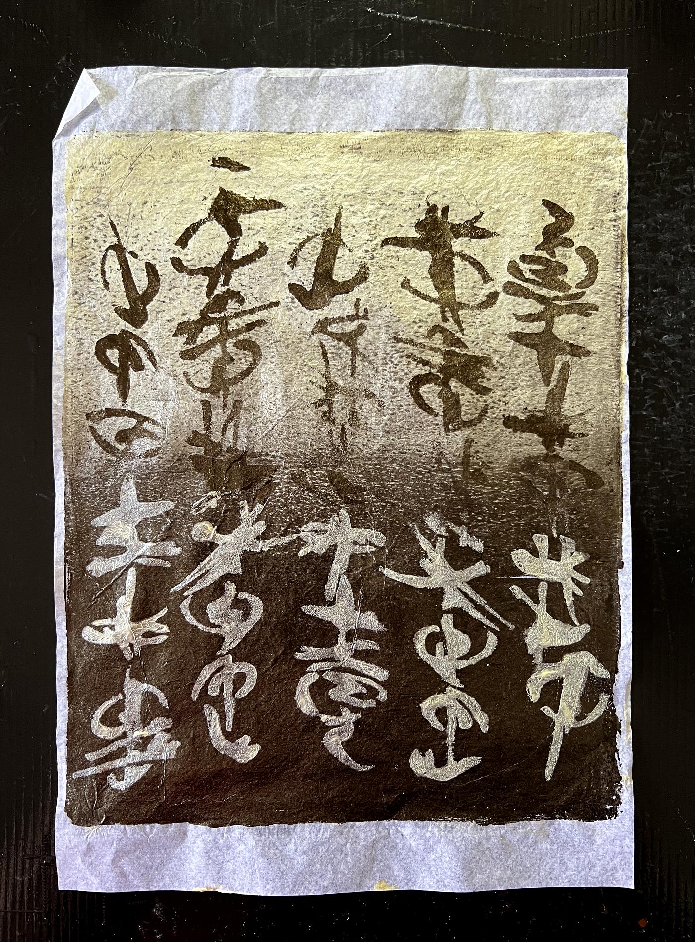
The Playful Pink is gorgeous. It’s really hard to photograph this kind of thing but it is more visibly pink in real life on the white paper. It is almost dichroic. When not held to the light to reveal its shimmer, the Fancy Black is actually a brownish-black. Not being a single pigment, it’s a lovely lively almost black colour and it goes beautifullyl with the Playful Pink. The Pearl Banana Yellow is a fabulous yellow-cream, a bit like clotted cream, with shimmer. I’ve used all three of these colours to great effect on the gel plate. Here’s a sample. (My own intuitive Oriental script – I just hope I haven’t written anything rude by accident!!)
The final paint in this line-up has to be my absolute favourite gold paint of all time – with a price tag to match! Golden’s Iridescent Bronze Fine fluid acrylic. I need to replace this tiny bottle with a larger one…
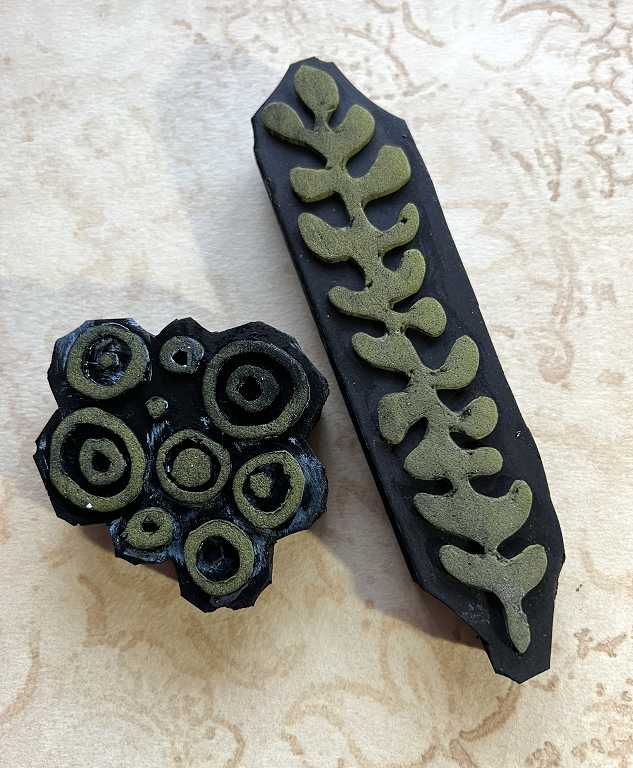
Finally, to add some accents to the final page and back cover, I got out my home-made foam stamps and selected a couple. I painted on a little acrylic paint and stamped it on the page. These foam stamps were made from self-adhesive fun foam stuck to pieces cut from a thick rubber yoga mat I bought for the purpose. I’ve got a box of these stamps, and still acres of yoga mat to use up!
On a couple of the pages, I also used a piece of punchinella (sequin waste – the metallic plastic sheets they cut sequins from) as a stencil. Simple, but effective.
Method
I love how the pages have turned out, after folding up the large sheet of random watercolour on the tea-dyed paper. The folds bring out portions of the patches of colour and it’s a lot less daunting to approach than a huge piece where you don’t know where to start.
I went a bit over the top with the mark making, especially on the final two pages. One of the problems with a project like this is knowing when to stop. I tend to fiddle, never quite happy it’s enough. Sometimes, the addition of some white acrylic marker and/or some bold black, perhaps a bit of stencilling or stamping, and some swirls of gold ink, bring the whole thing together and you can consider it done. Just go with the flow! If it works, great. If not, it’s not the end of the world. It’s only paper, after all, and this project is more about having fun than producing a serious masterpiece!
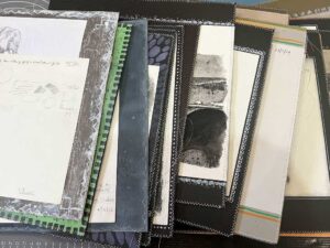
The pages
There are eight double-page spreads. I glued the folded pages back to back so the book wouldn’t try and unfold itself. Adding the cover also stabilised the whole thing.
Front cover
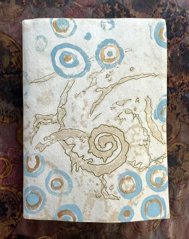
This is simply a piece of card with some of my recent tea staining efforts with lace. I laid the book on the paper and rolled it over and marked where to cut – the simplest cover ever. I glued the backs of the first and last pages to the inside of this cover. It’s cut slightly larger than the pages. The blue circles were done with the foam stamp and matte acrylic, and I added some doodles with an ink pen, and some gold accents on the circles with the Golden acrylic. A relatively simple cover design that hardly prepares you for the chaos within!
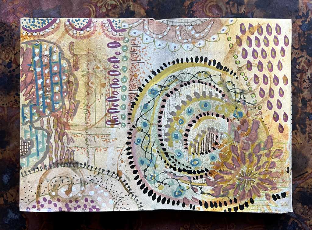
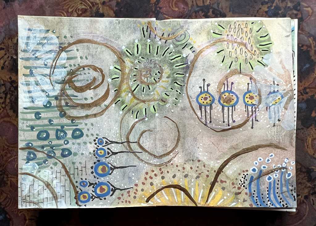
Page 1
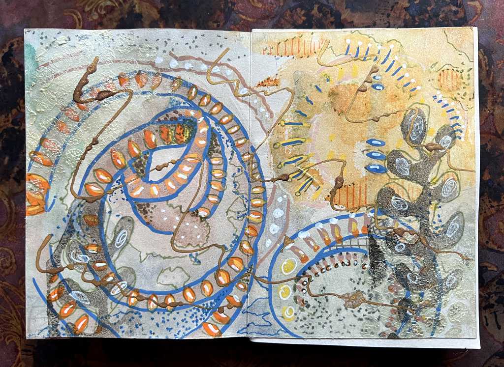
This was probably my most cohesive page, done while I was still feeling somewhat tentative with the technique, before I relaxed into it and let it rip!
On each page, I tried to be governed by what was already there from the initial watercolour doodling. I love how the colours of the watercolour and the various markers have been muted by the tea-dyed background paper.
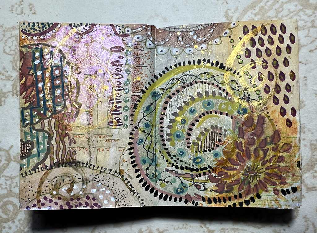
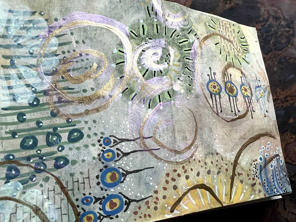
Page 2
Fancy Black acrylic paint stencilled through punchinella.
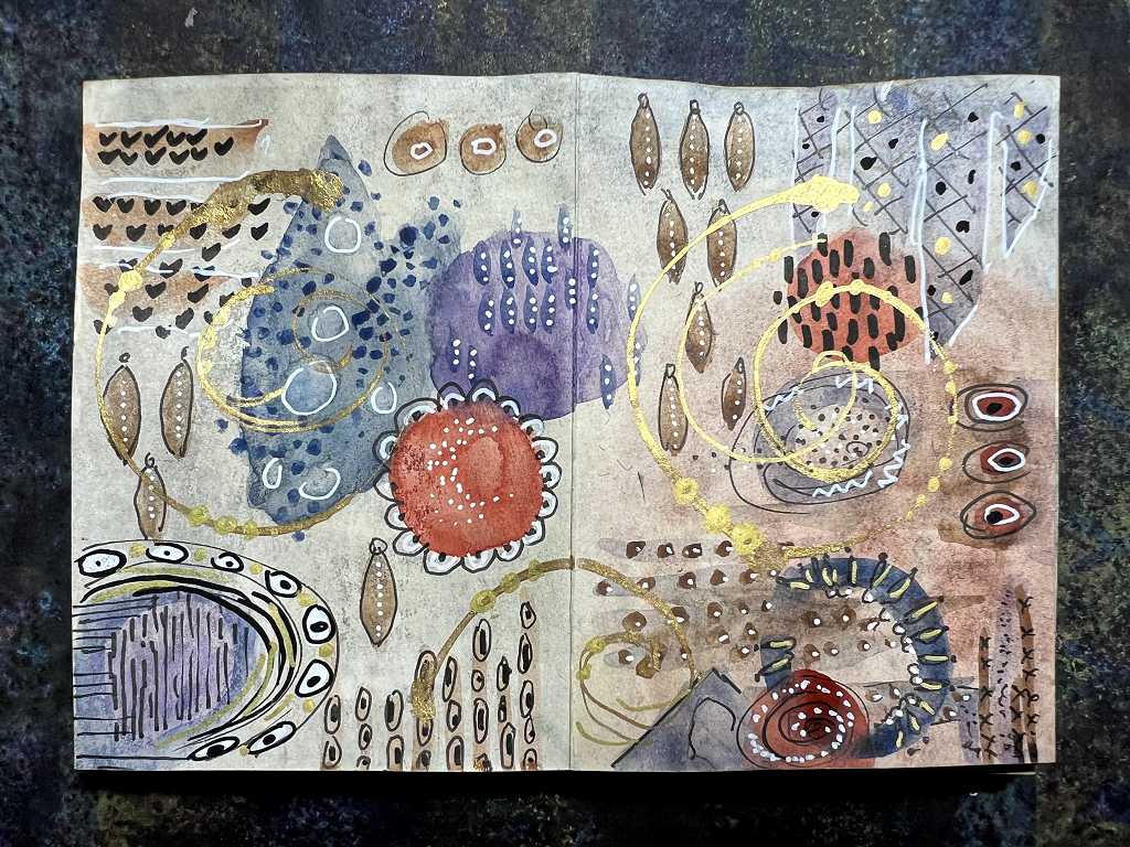
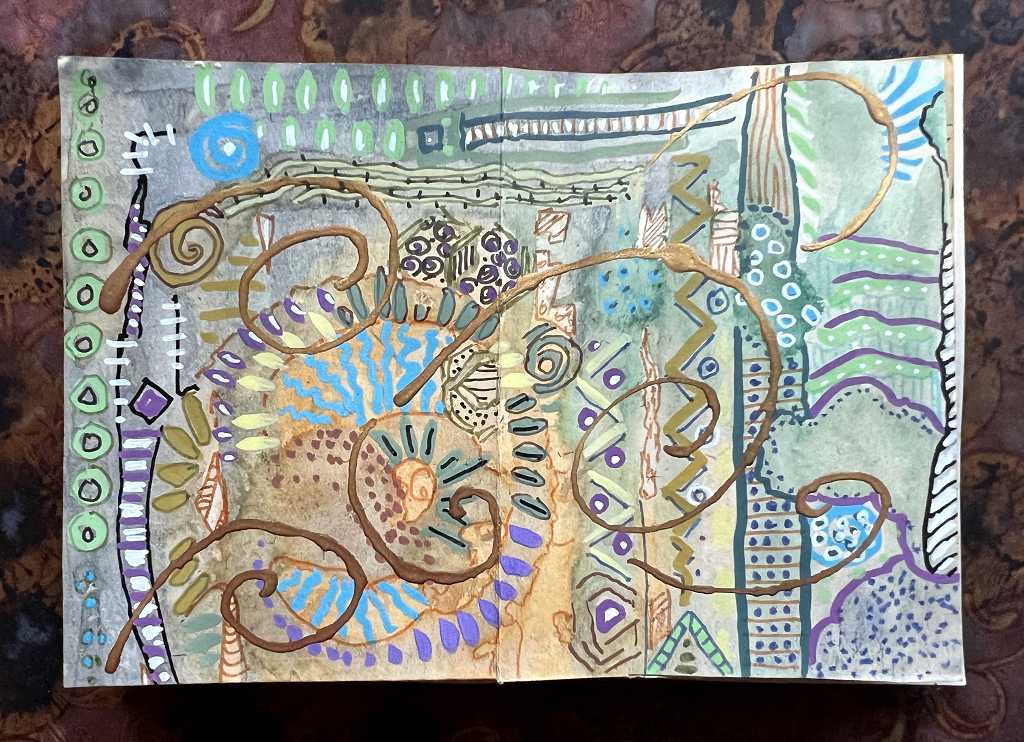
Page 3
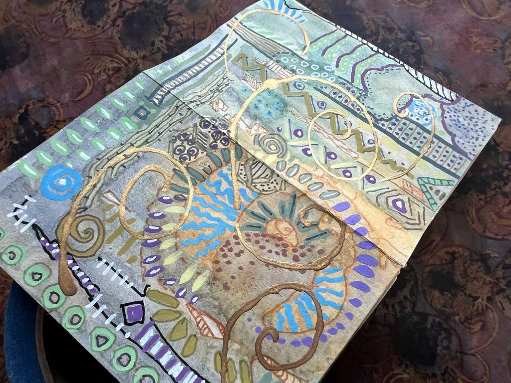
Page 4
Different lighting, to accentuate the metallics. Playful Pink through the punchinella.
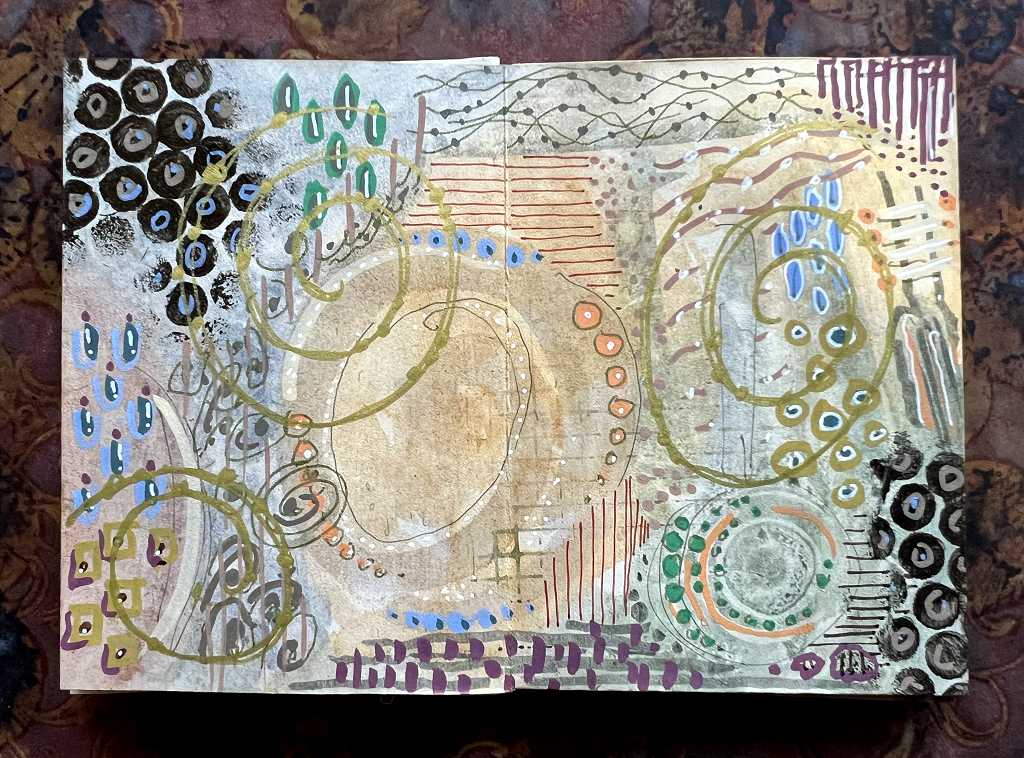
Page 5
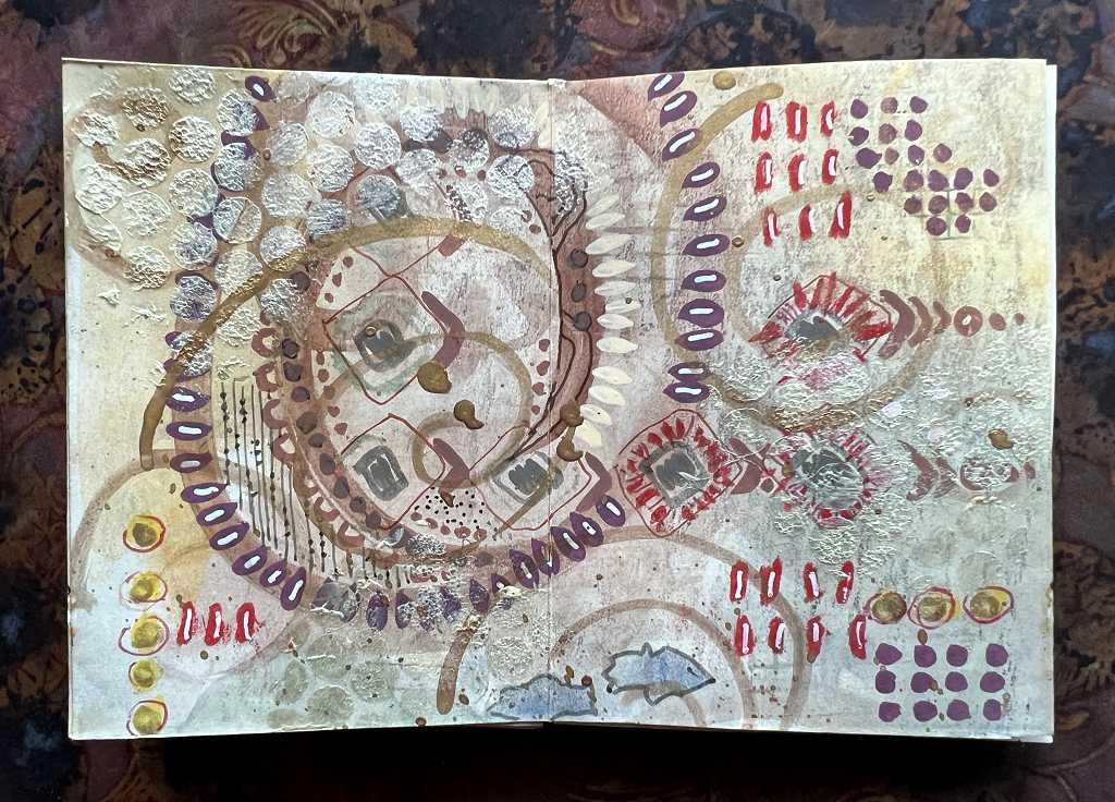
More punchinella stenciling in the corners, using the Pearl Banana Yellow. Lots of shimmer at the correct angle to the light.
One thing I love about the new acrylic brush markers is how you can lay down petal-shaped marks so easily, with the brush on its side. You’ll see this motif liberally scattered all over this project! With the markers, you can also add layers of embellishmnet to the marks you’ve created.
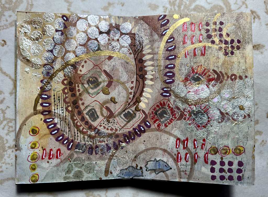
Page 6
I did some simple stencilling on this one, using Golden semi-translucent Zink White acrylic paint. Playful Pink in evidence too.
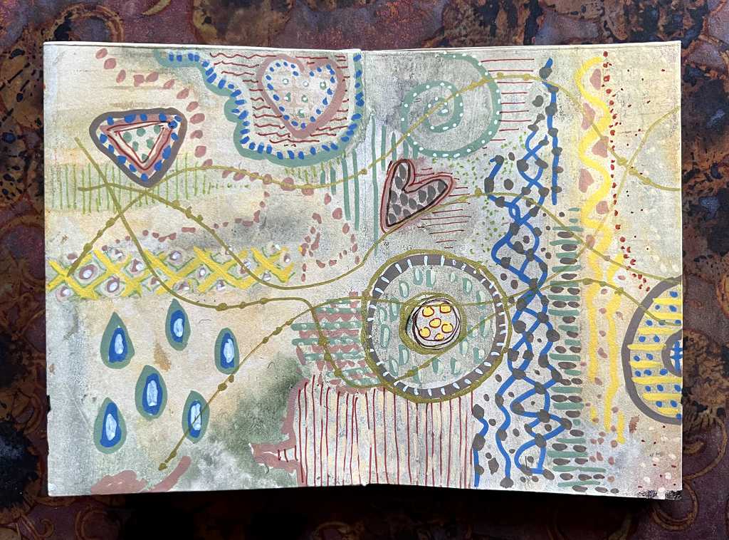
Page 7
Page 8
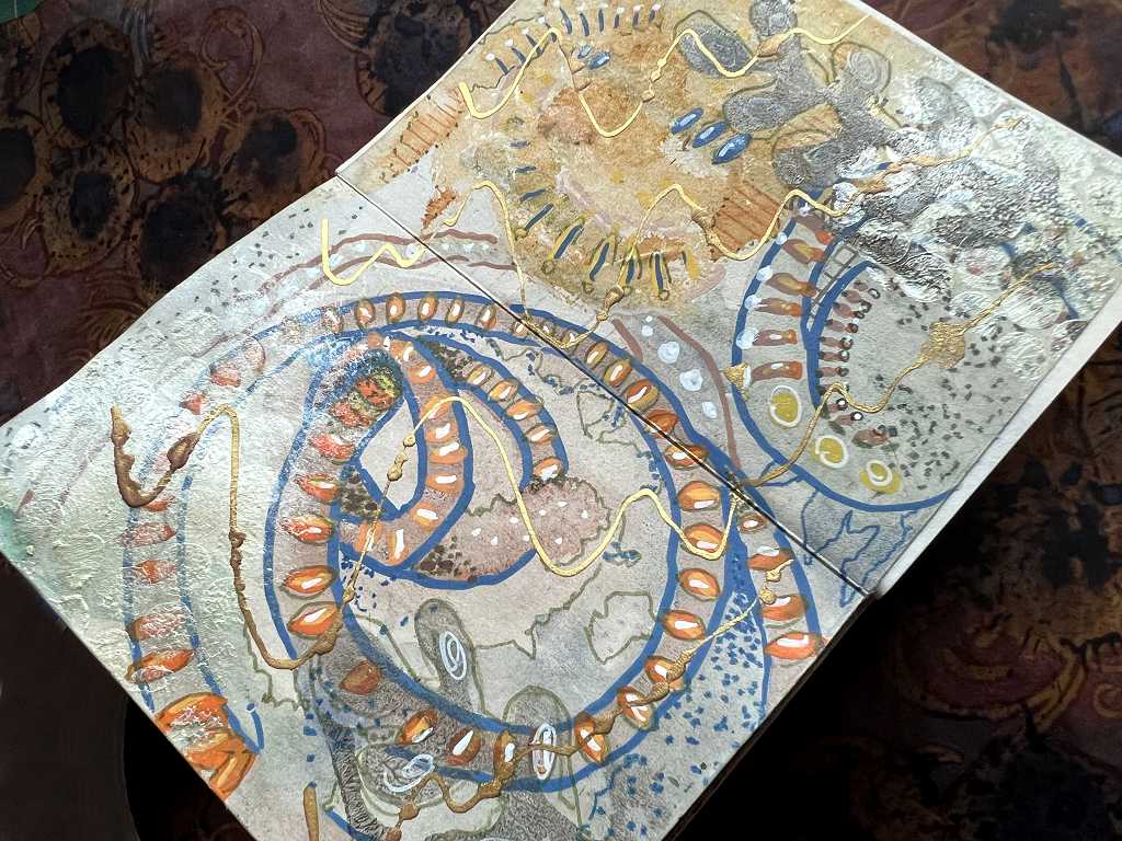
The final spread. Chaos seems to be reigning supreme by this stage! Note the DIY foam stamp in evidence.
The back cover
Pretty plain really, after what we’ve just endured!
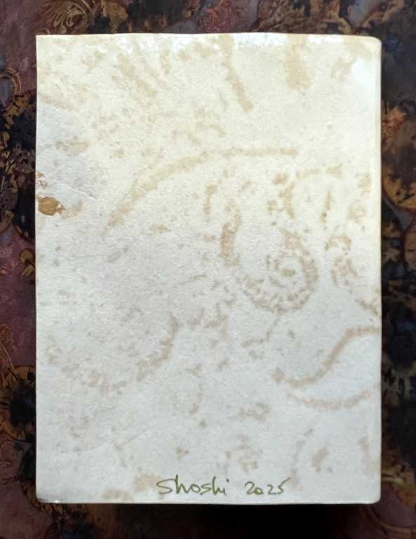
No embellishment at all. I just let the lace-imprinted tea-dyed paper speak for itself.
Scratch paper
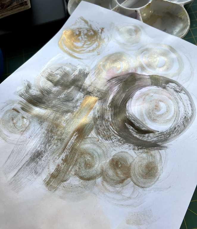
Whenever I’ve got my acrylics out, I always use a scratch paper – often just a piece of scrap printer paper, to clean off my brush. No point wasting all that paint down the sink! I swirl the brush around and make random marks. I often try and keep to a particular palette of colours on each one to retain some sort of cohesion. Once the paper is sufficiently covered, it’s brilliant collage fodder. I also use some of them as background sheets for photographing work if they aren’t too chaotic and distracting. I also do this with kitchen paper that I’ve used for mopping up. I’ve got a whole box of pieces maturing, and once they are covered, they get flattened out and stored in a pizza box. Being two-ply, you can separate the layers and get double for your money! Not much waste chez Shosh.
Watch this space…
…for the second origami booklet, this time on a Klimt theme. Can’t wait to start on that one.