DOMESTIKA COURSE – ENGLISH CALLIGRAHY – CONNECTING, AND ALTERNATIVE FORMS
Another successful session in the studio today as I completed another module in this course.
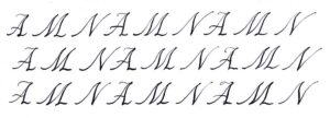
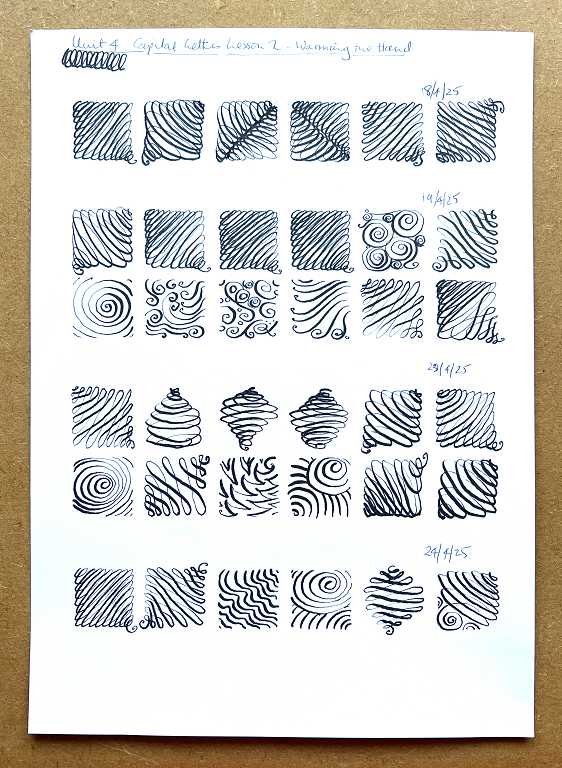
Warm-Up
Just one line of boxes today, as I wanted to get on.
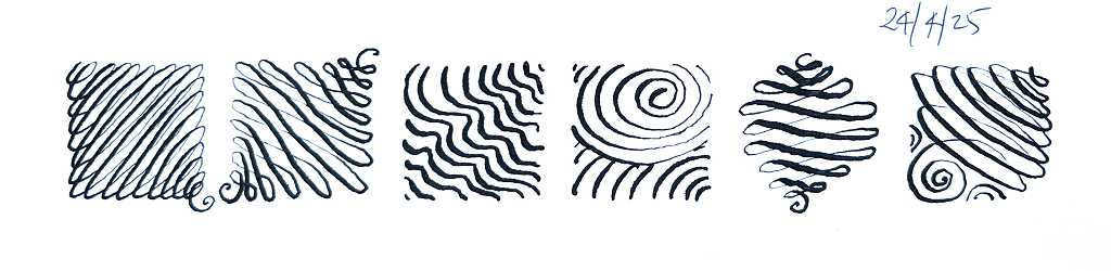
My favourite this time is the one second from the right.
Here is the complete sheet of warm-ups.
Connecting the letters
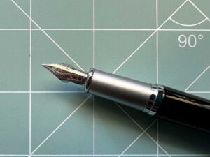
For this lesson, I used the small layout grid with the light panel.
The purpose of this lesson was to show how to connect a capital letter to a following lowercase one. Not all capitals are able to be joined, so you have to simply leave a small gap and write the next lowercase letter.
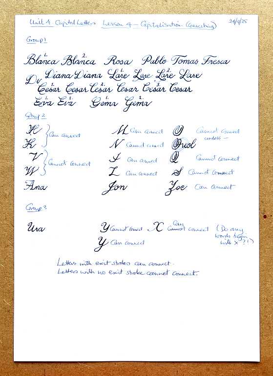
Because the teacher is Spanish, the example words are also in Spanish! Some of the connections have an alternative version.
It is easy to tell which letters will connect – if the capital letter has an exit stroke, it will, but if not, then it won’t.
Exercises at the end of this module
Each module always ends with one or two exercises, and an invitation to share certain exercises on the forum for the course.
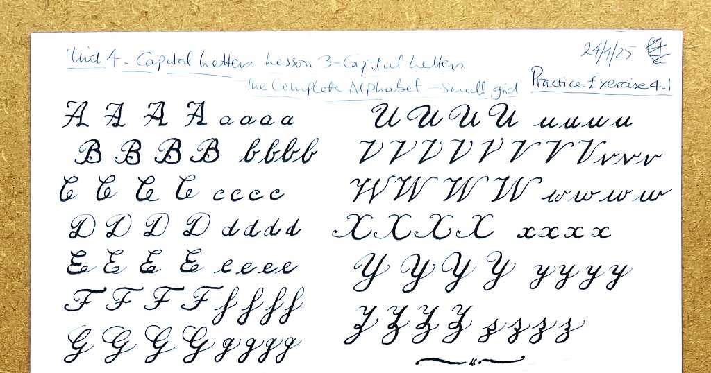
First practice exercise: The complete alphabet
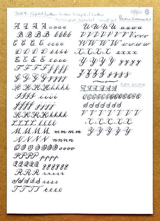
I still struggle with certain letters, so I added a few more lines of practice in the unoccupied part of the sheet. This is the image which I will upload to the forum, but I do not expect any feedback because nothing much seems to happen when you upload anything!
Finding other forms
Second practice exercise
For the second and final practice exercise, the teacher encouraged us to search for different forms for the letters to take when writing this form of calligraphy. I didn’t get further than Pinterest in my searches. There’s a wealth of information on there for anyone looking for inspiration!
There are many variations in the forms of the English calligraphy letters, some more plain, and some highly elaborate with swirls and flourishes.
I made a sheet of examples. Not all of them are strictly speaking copperplate, or English calligraphy, but I couldn’t resist imitating some of them. They are none of them perfect, but if I was hung up about that, I could have simply downloaded the images!
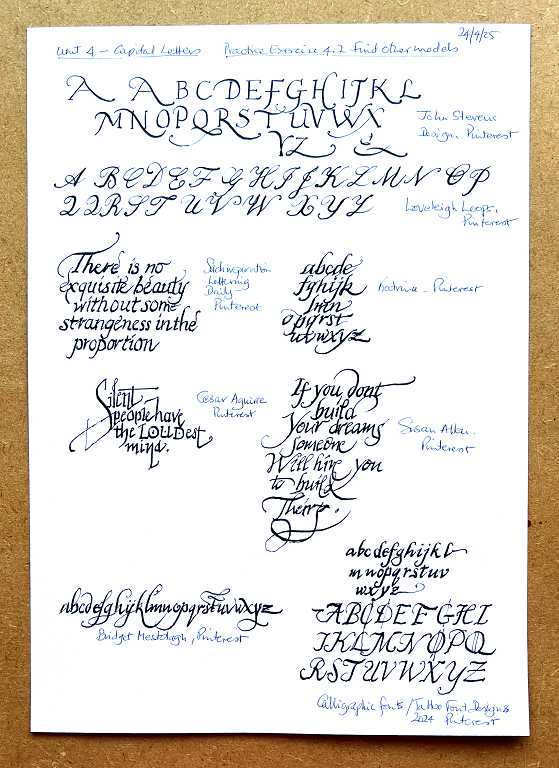
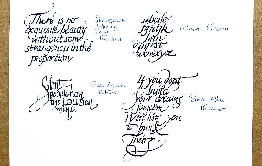
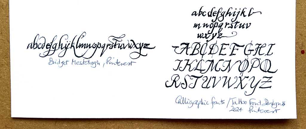
These were all great fun to do. Here are some close-ups.
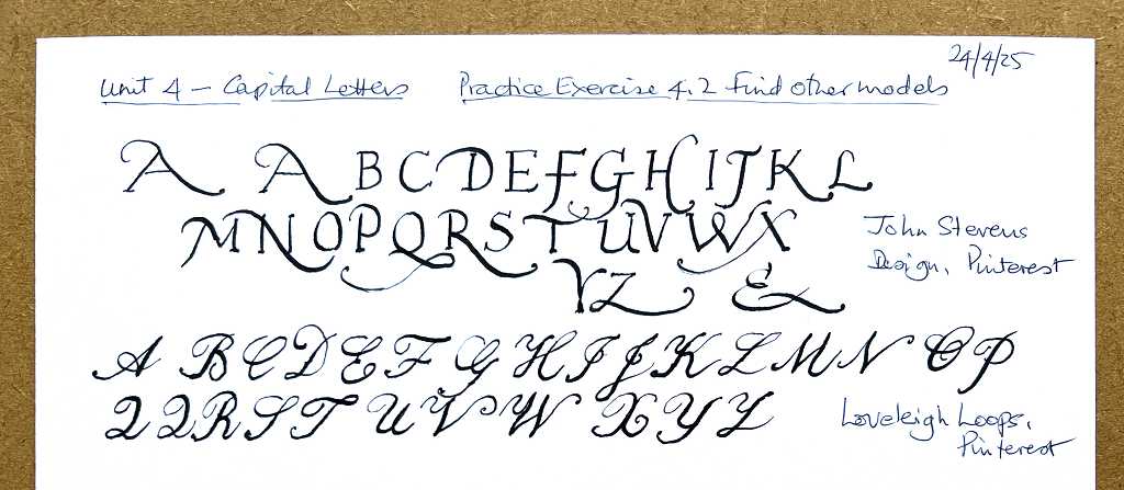
I really like the swirling extensions on the capital letters in the first example, which are beautiful. You have to remember to extend them down far enough to allow any following letters. In the second example, my favourites were “A”,”F,” and “O.” I prefer the “H” to the one we have been taught, as it is simpler and less cluttered looking, as is the K. I have continually struggled with the “O” and “Q” and prefer this “O,” although I have reservations about the “Q” which looks a bit like a “2,” even with my second attempt. As with the teacher’s version, the “Z” is unconvincing, so I need to find a better alternative.
Some of the samples in the next section are a bit uneven because I was still working on the light panel over the grid, and the lines didn’t exactly match. This means that some of the letters were larger or smaller than they should have been, if I’d been doing this properly. To do this structured sort of work with a definite layout, I think you probably have to make a custom grid, like we did with the Hebrew calligraphy project.
In the final example, I really like the lowercase alphabet on the left. Some of the x-height letters are quite angular, but the ascenders and descenders are full of curves and flourishes. This is definitely an alphabet I would like to use, or something similar. It has an almost Mediaeval Italian script look about it.
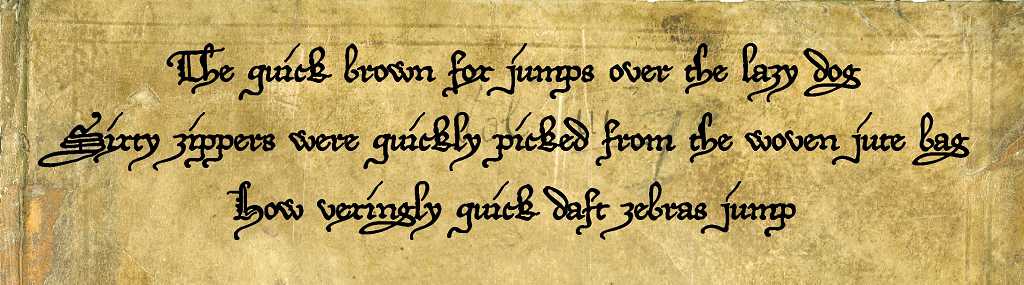
It reminded me slightly of one of my favourite decorative fonts on the computer, called DeiGratia. In the following example of several pangrams, to emphasise the vintage look, I have put it on a background which was a photo of an ancient 17th century book (parish records going back to the 1600s).
As fonts sprang to my mind, it made me think that perhaps I could use them as inspiration for calligraphy. Many of the script fonts on my laptop have a distinctly calligraphic appearance. It would be fun to try.