NEGATIVE WATERCOLOUR – COLOURFUL FISH
This negative painting was inspired by a YouTube video. She did something I hadn’t done before, which was to put the smallest elements as the top layer, and increase the size with each subsequent layer. This meant that more of the colours of the layers showed through, and I really liked the effect.
For this painting, I used the Kuretake Art Nouveau set almost exclusively, but added some of the Kuretake Graphite Colours set for the darker shadows.
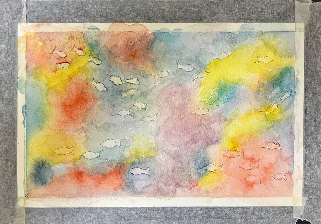
The first wash
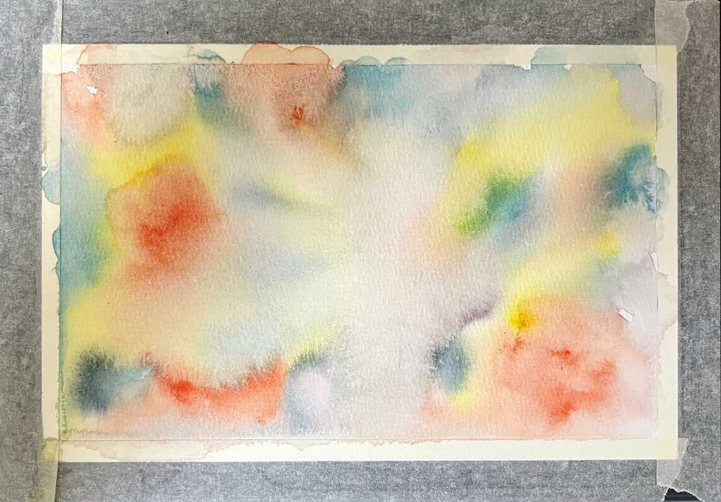
Lots of colours, very wet, very loose. Plenty of gorgeous cauliflowers but these tended to disappear as the work progressed!
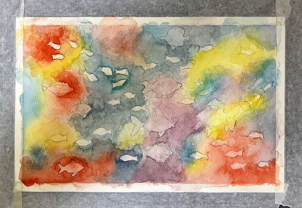
The second wash
Shoals of tiny fish to paint around on this layer.
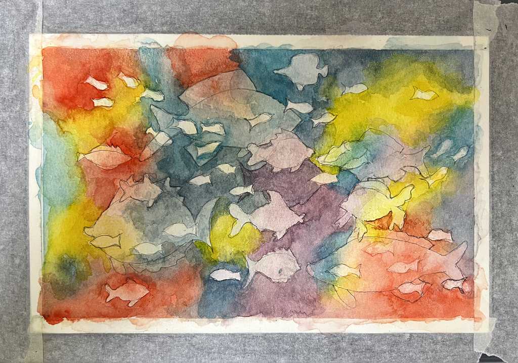
The third wash
Starting to add some larger fish, and darkening the colours. I did try to blend in the harder edges but in the end I wasn’t too bothered as everything blended in OK, and it was quite nice having the divisions of colour on some of the fish.
The fourth wash
Definitely getting darker, and this aquarium is getting a bit crowded! It was becoming more difficult to see where the outlines of underlying fish were, and I made a few mistakes that I had to correct as I went along. Fortunately it’s not too difficult to lift off watercolour.
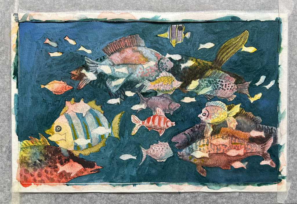
The fifth wash
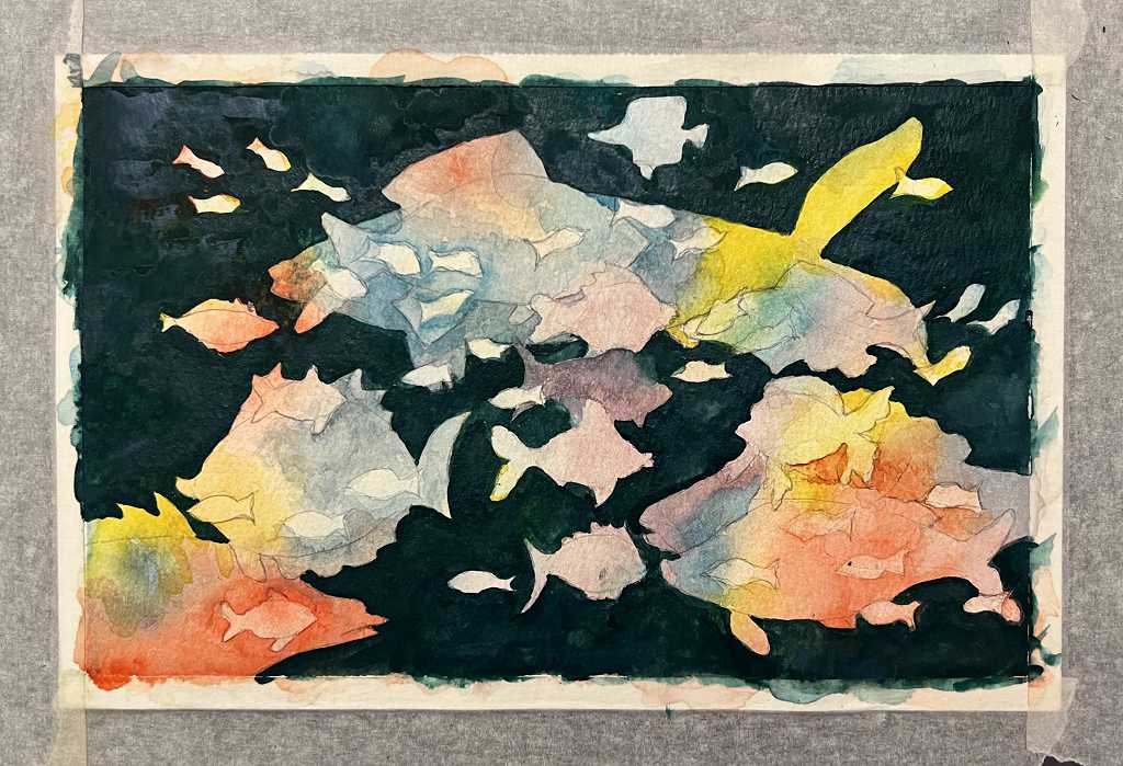
The largest fish now added. I made the background very dark. It was then that I remembered I wanted it to be lighter in this one, and I attempted to add some lighter blue Kuretake Art Nouveau paint, without a great deal of success. I mixed some blue from the Kuretake set and also from my regular watercolours into some Dr. Ph. Martin’s Bleed Proof White, and redid the whole background at the end. This did pick up some colour from underneath, resulting in a dark teal colour, but this was acceptable.
Painting more colour on the fish
I needed to add some shading and extra detail to the fish. I did this first with more paint. Some fish in the background definitely needed to be darker, to create more contrast and sense of depth.
They also needed to be better defined, and further fine detail to be added.
Completing the painting
I used a combination of Faber Castell Polychromos (coloured pencils), Staedtler fineliner markers (non-waterproof) in various colours, and some fine black permanent Staedtler fineliners to complete the detail on the picture.
It was possible to push the background fish further by darkening them with the coloured pencils. This made the foreground fish stand out a lot better. The tiny fish needed quite a bit of work to add detail to them.
I used a fine white acrylic marker for the eyes and for some highlights. Here is the finished result.
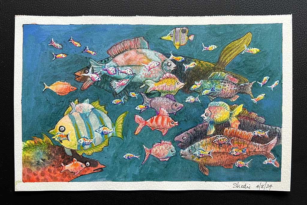
There was quite a bit of positive colouring involved in this painting, but I used the colours from the initial washes as a guide. I love how multi-coloured each fish has come out as a result of this. I also like how the foreground fish are the small ones, and the largest ones are in the background. This is a change from the normal way of doing negative watercolours.
This has turned into quite an interesting mixed media piece.