DOMESTIKA COURSE – HEBREW CALLIGRAPHY
For this course, we need a flat-ended calligraphy pen. I used to have a calligraphy fountain pen, and also a fibre-tipped Italic marker but they seem to have vanished without trace, so I bought some new ones.
New pens
Italic markers
This set of four range from 1.4 – 4.8 mm in width.
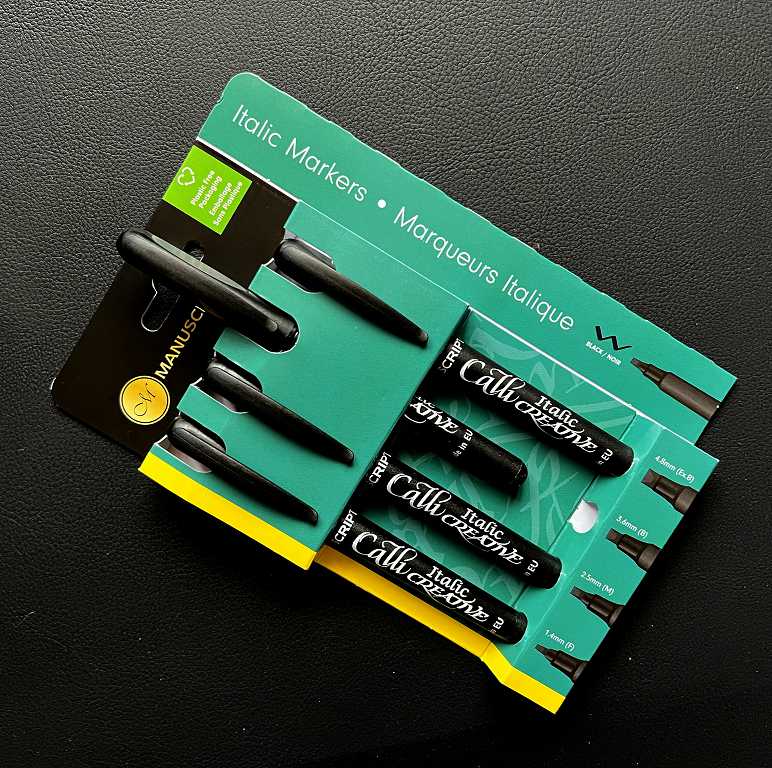
I’m not very keen on the “eco-friendly” plastic-free cardboard packaging which isn’t going to last very long, and it is also very bulky. I prefer the plastic wallets or cases that pens usually come in.
For the moment I am using the 3.6 mm one, which is the nearest equivalent to the teacher’s suggestion of 3.5 mm.
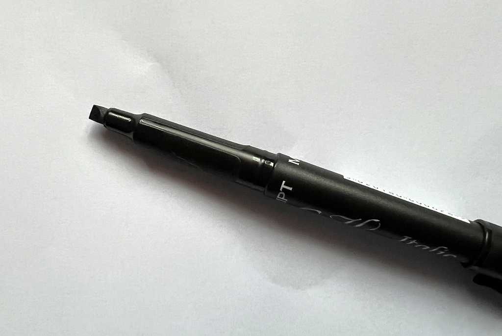
Pilot Parallel pen
After I’d bought these, I came across the Pilot Parallel pen on the internet. I decided that this would be even better for my purposes so I ordered the third of four available sizes, again being the nearest equivalent to the suggested 3.5 mm, at 3.8 mm.
This is an extraordinary fountain pen, quite unlike anything I’ve seen before. Instead of a regular nib, it has two flat metal plates, and the ink flows between them.
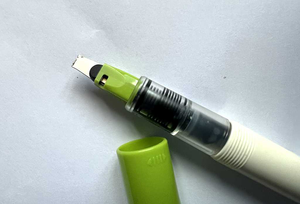
Here is the extraordinary nib, consisting of the two parallel metal plates, hence the name.
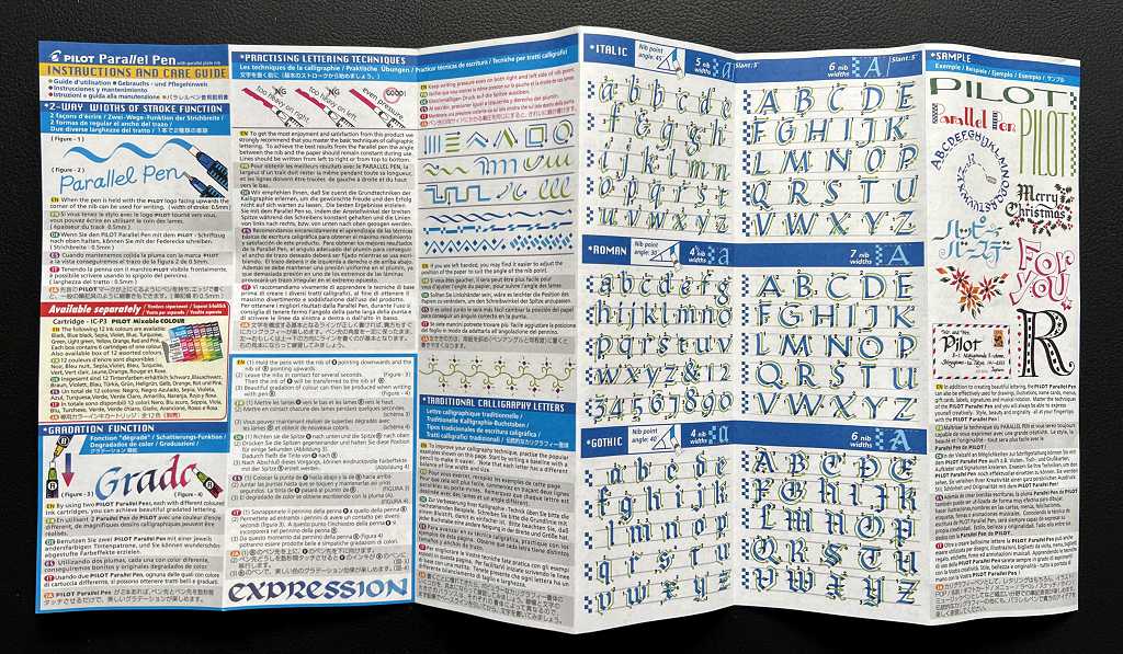
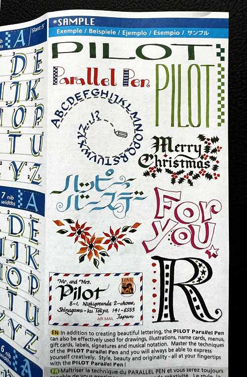
It comes with quite a compehensive leaflet:
and also a nice little cleaning kit, consisting of a squeezy bulb and a thin plastic shim for cleaning between the plates.
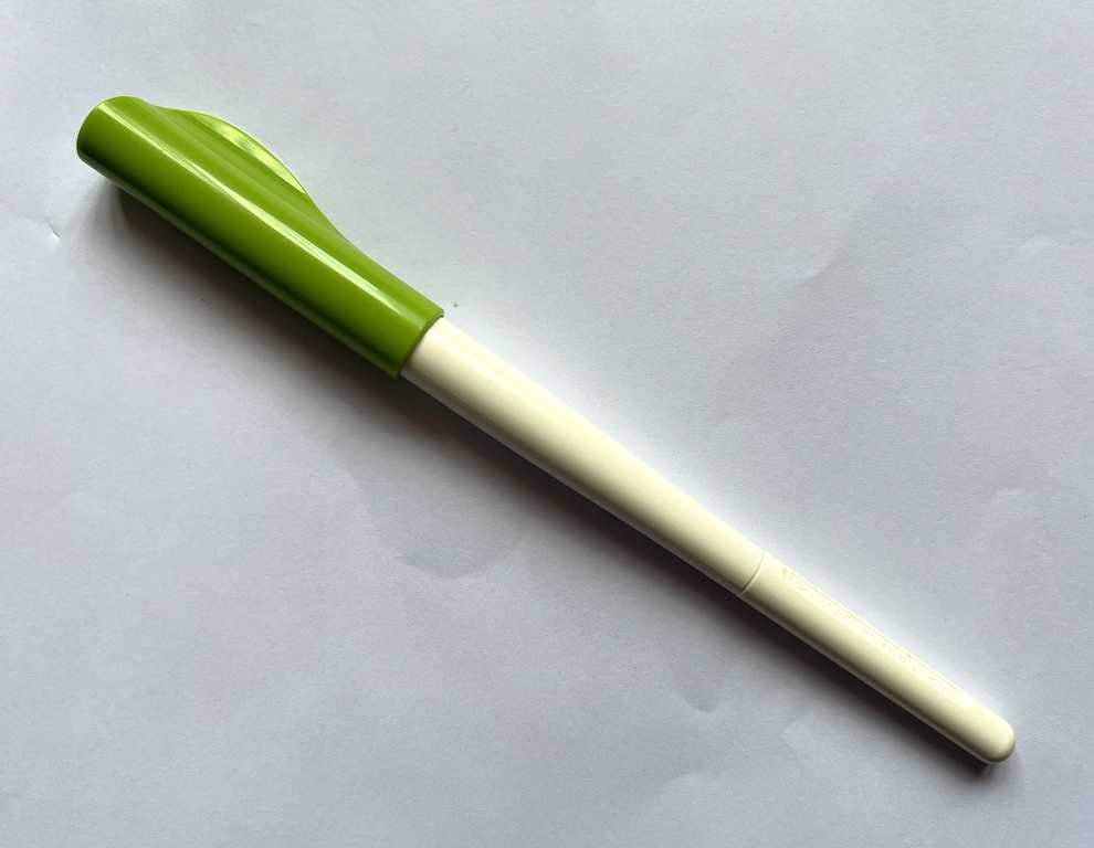
Despite its several disadvantages, this is a great pen, and not expensive.
The pen isn’t very preposessing. It looks cheap and plastic-y, and its long narrow shape means it often won’t fit in boxes with other pens, and it also doesn’t hold much ink. I’ve done a lot of research online and many people have recommended removing the nib unit and placing it in another pen. There are various different brands that it will fit. The Pilot does have a converter that you can use instead of its own ink cartridges, but this holds even less ink. You can refill the cartridges with a syringe. The barrel is opaque so you can’t see how much ink is left, which is another disadvantage. The whole thing seems to be designed to look more like a brush marker.
This is a fountain pen I’ve found on Amazon which apparently can be used with the Pilot nib. It is the Asvine Jinhao 9019 Fountain Pen. I haven’t ordered it yet but have it in reserve. For the moment I’m going to use the Pilot as-is and see how I get on, but I think this fountain pen will be a good investment. If I like the pen as it is, I may buy another one for use with the Pilot nib. It’s a long time since I’ve owned a real fountain pen and they are much better writing implements than our usual ball-point pens! (I remember at school, Biros were banned. We were forbidden to use them because the teachers believed they ruined one’s handwriting!)
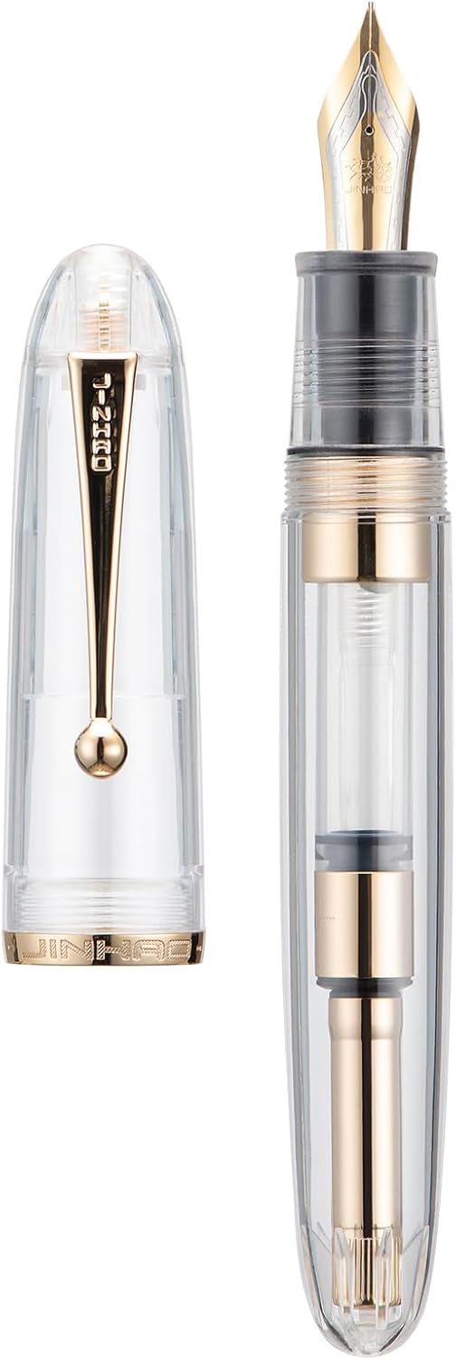
It is available in different colours and this transparent one will be good for seeing how much ink is left. As you can see, it is fitted with a converter, which apparently holds a lot more ink than the Pilot one. You can also post the cap when the pen is in use so you don’t lose it. You can’t do this with the Pilot.
Converts to the Pilot Parallel pen appear to own many of them – several in each different size, filled with different coloured inks. This is serious calligraphy business! For now I shall stick with my single 3.8 mm one.
Practising the Aleph-Bet
Our word “alphabet” comes from the first two letters of the Greek alphabet. In Hebrew it is known as the “Aleph-Bet,” being the two first letters of the Hebrew alphabet.
The second module of this course is “Learning the Basics,” and involves practising shaping the letters. A prior knowledge of Hebrew is not required.
The teacher is using half-centimetre squared paper as a guide for these initial steps. I am using my Rhodia A4 design and pattern book for this. This book is where I usually try out different patterns such as mandala motifs, and collections of things such as houses or fish. It’s really a resource library for when I’m working on drawing projects. This course work doesn’t really have a place in this book but the squared paper is perfect.
Large letters
The letters we are practising initially are very large, occupying squares of 3 x 3 of the squared paper. This has proved more difficult than I expected!
Mono-line script
This is the “bare bones” of the letters. As you can see, the Hebrew letters are a square script.
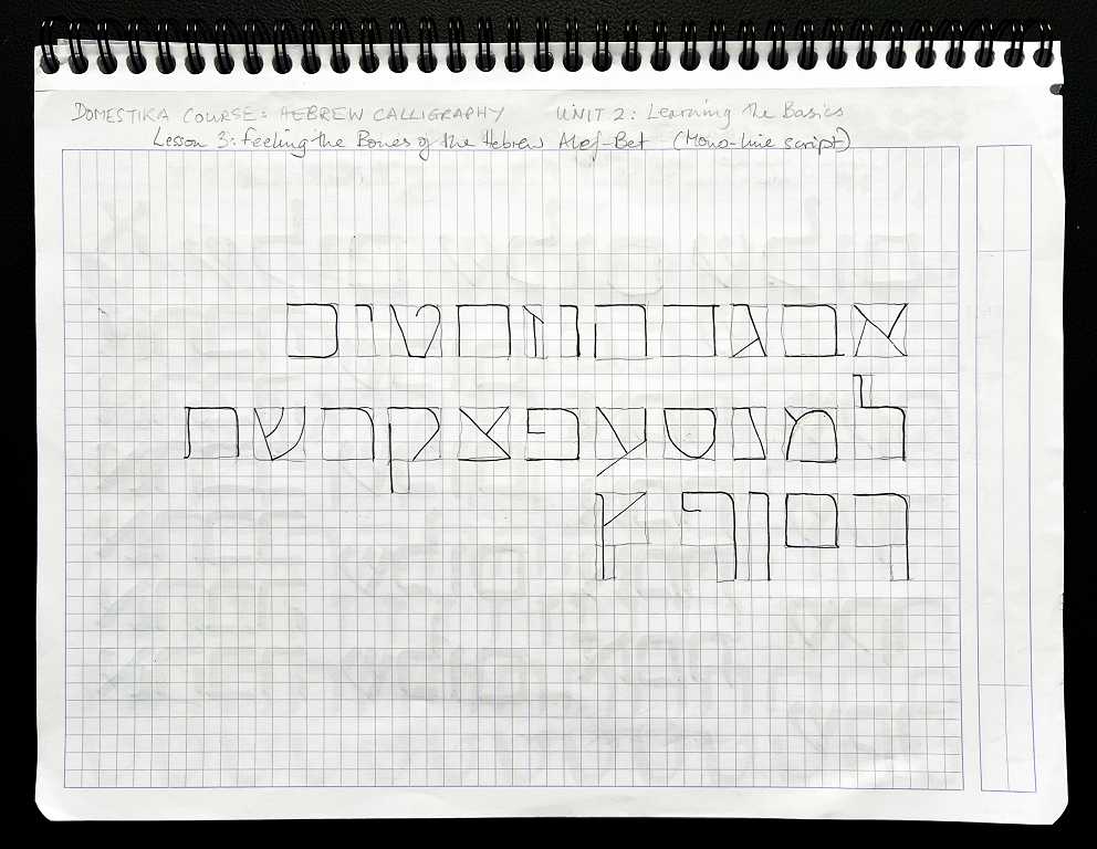
Moving on to the calligraphy pen, we practised writing a few letters and words.
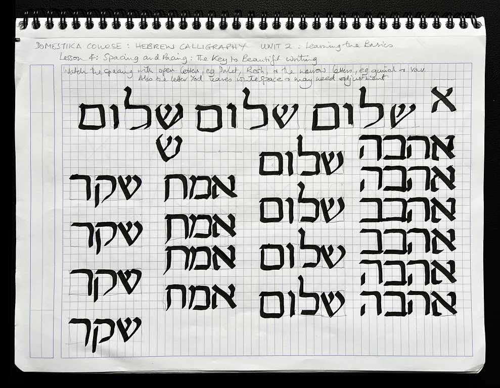
The words here are “Shalom” (peace), “ahavah” (love), “emet” (truth) and “sheker” (falsehood).
I’ve done a lot of Hebrew writing in the past and never experienced difficulties like this! I struggled to control the large pen. Being such large letters, any imperfections stick out like a sore thumb!
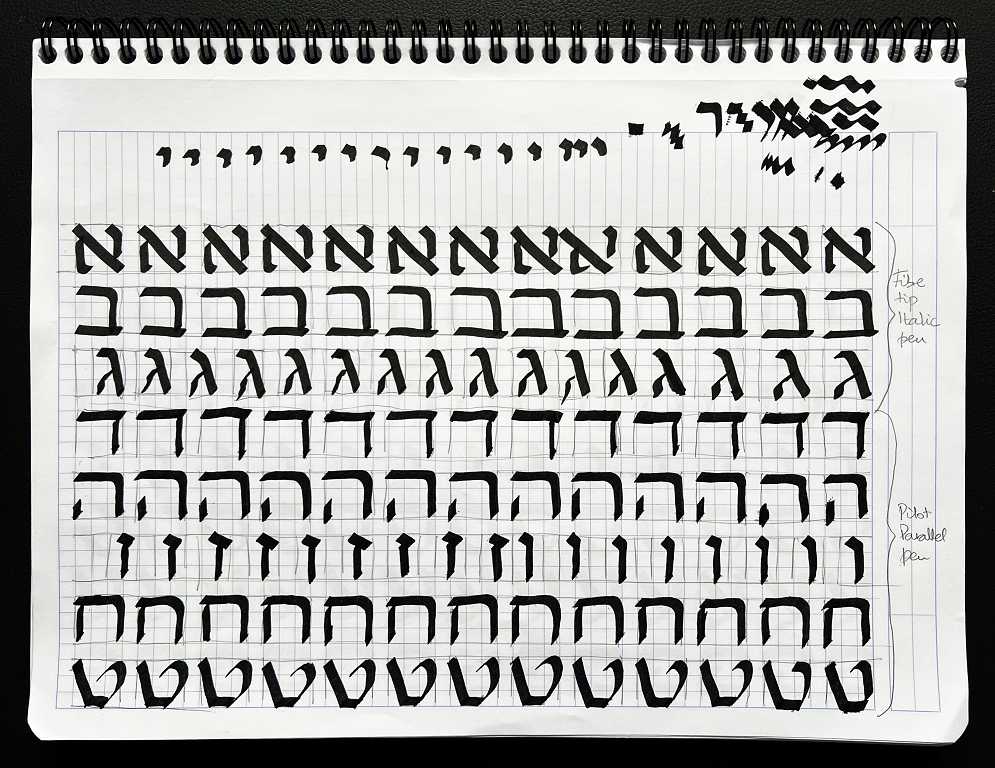
Moving on, another exercise was to write the letters repeatedly. This is like the old school punishment of “writing lines” – “I must not be a naughty boy” 100 times haha! When I was first learning Hebrew, I did this with the letters, so that I could form more beautiful script with my then calligraphy pen.
Here are some examples. I wrote the first ones (letters Aleph, Bet and Gimel) with the fibre tip pen, and the remaining ones (Dalet, Heh, Vav, Zayin, Chet – gutteral sound, and Tet) with the new Pilot Parallel pen. The scribbles at the top were to get the ink flowing with first use, and experimenting with how it felt in my hand. I wrote the letter “Yod” (smallest letter) across the top. It looks like an apostrophe. I have a set of Hebrew Aleph-Bet fridge magnets which I used to have on the fridge in the old house, and one of the cats pulled the Yod off and played with it, and it ended up getting stuck on the bottom of the fridge! It took me ages to find it.
In Matthew 5:18, Jesus said, “For assuredly, I say to you, till heaven and earth pass away, one jot or one tittle will by no means pass from the law till all is fulfilled.” The word “jot” is from “Yod,” and the “tittle” is the little serif found on many of the letters, called the “kotz” in Hebrew (thorn).
Some more examples.
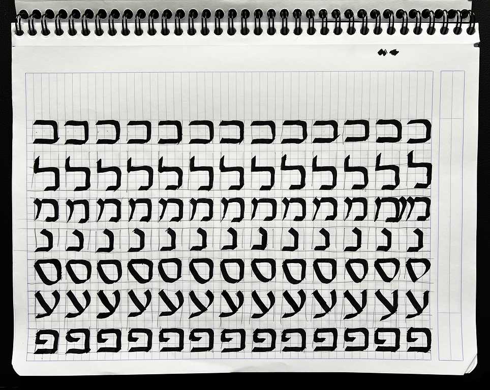
There’s another sheet completing the Aleph-Bet and including the five final forms. The letters Kaf, Mem, Nun, Peh and Tzade each have a different shape when they appear at the end of a word.
Here is an example of the Hebrew script I was writing when I attended evening classes in Biblical Hebrew. This was a homework sheet. I cannot believe that this was 30 years ago!! Looking back through the file of my work, I realise just how much Hebrew I have now forgotten. Maybe it’s time to get the books out again…
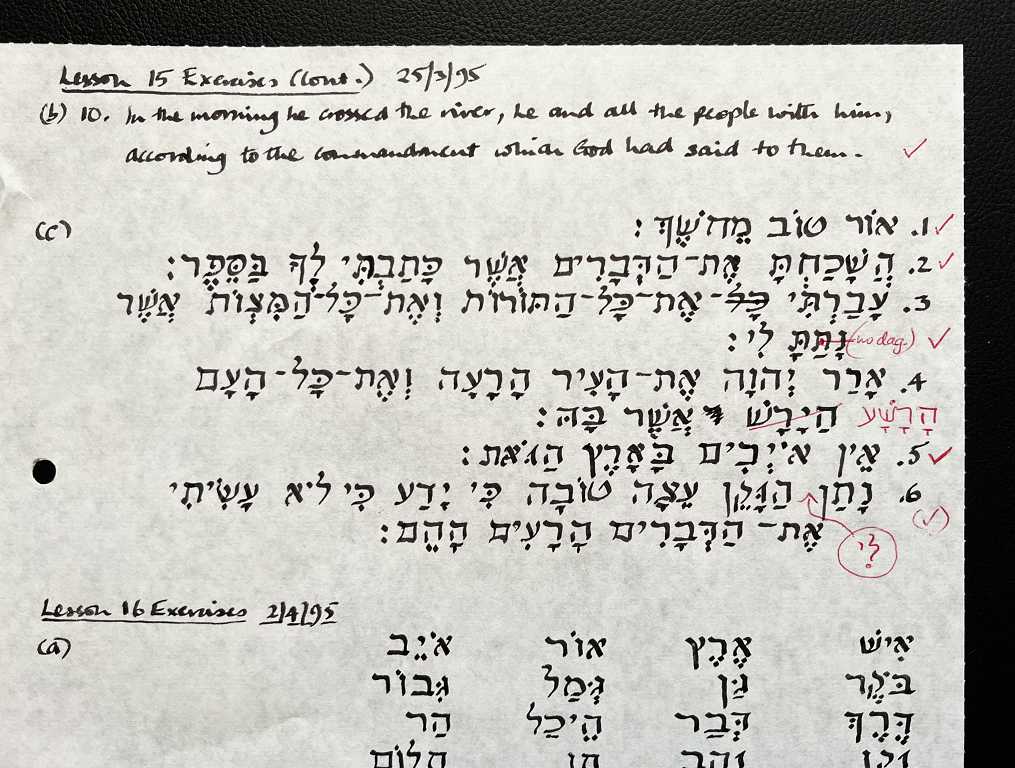
This Hebrew is “pointed,” i.e. it has the vowel points added.
So far I am not very keen on the very basic square script we are learning in this course, especially at such enormous size! Looking at my own early work I realise my spacing could be improved upon, and this is something she is tackling in the course. Also, the final piece will be drawn on a grid, so that the letters will be more evenly sized and spaced. I am very glad I have signed up for the course, because I know this will help to improve my existing style.
Beautiful. Something so special about the Hebrew alphabet. No wonder the Scribes love their job!