RECYCLED PAPER-GLASSINE BAG ALBUM – THE FIFTH FOLIO
The fifth folio of this recycled album has a botanical theme.
Choosing papers
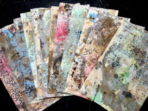
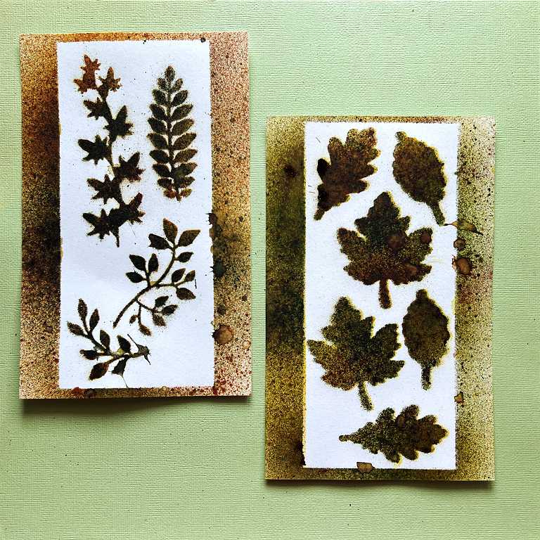
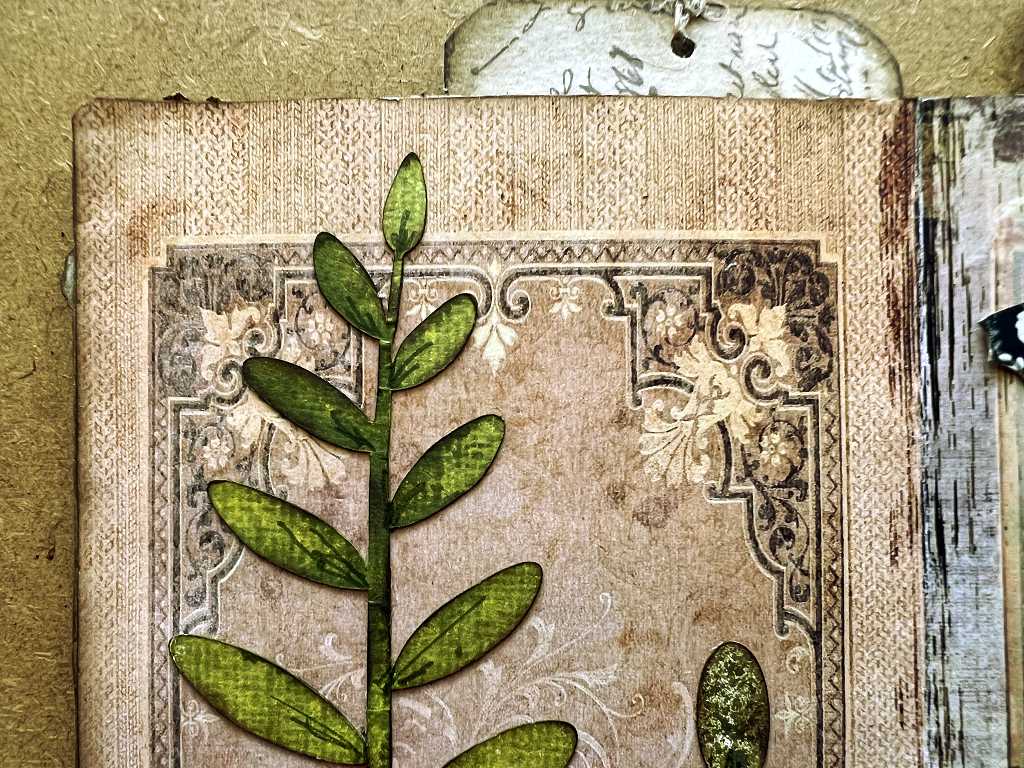
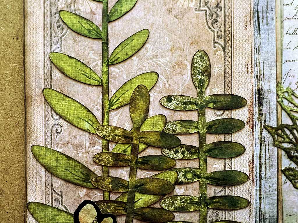
A few days ago, I die-cut a lot of leaves and coloured them with Distress Spray Stains, and made different backgrounds, negative spaces and stencilled pieces in the process.
These two backgrounds were probably the least satisfactory, and I ended up using both of them in this folio, to great effect.
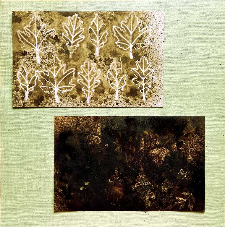
The dark one was particularly unprepossessing. While choosing the papers for this page, I dug out a piece of my punched medication leaflet paper which had been partially inked and which was a bit dull. I decided to spray it with Tarnished Brass Distress Mica Spray, which is not such a bright and dominant gold as Seth Apter’s Gold Mine. As usual, I wanted to place the punched paper over something else so that while spraying it, it could act as a stencil, and what better than to add something to that dark background piece?
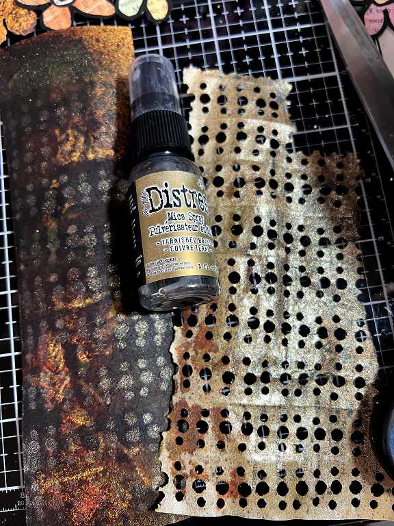
I was very pleased indeed with the result. Not only is the medication leaflet paper much improved, but the background piece is now interesting and very useful!
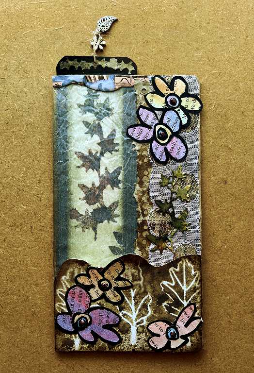
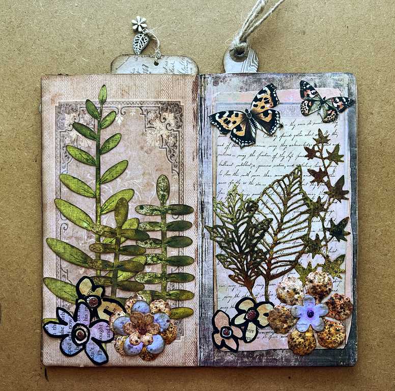
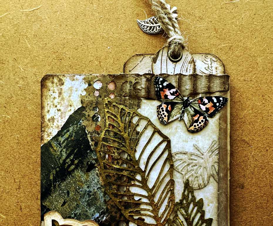
The completed front page
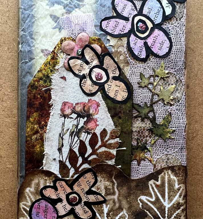
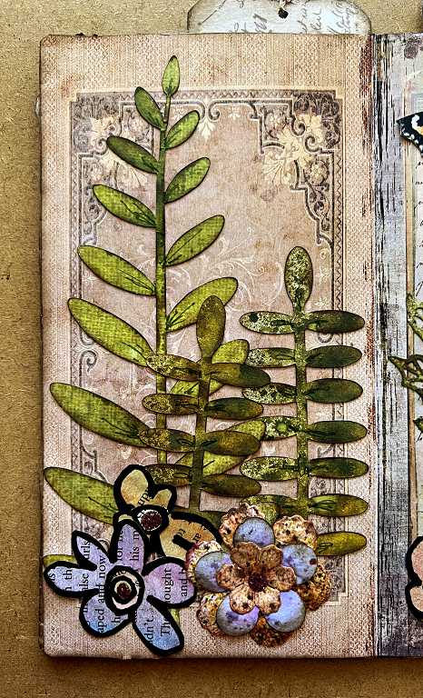
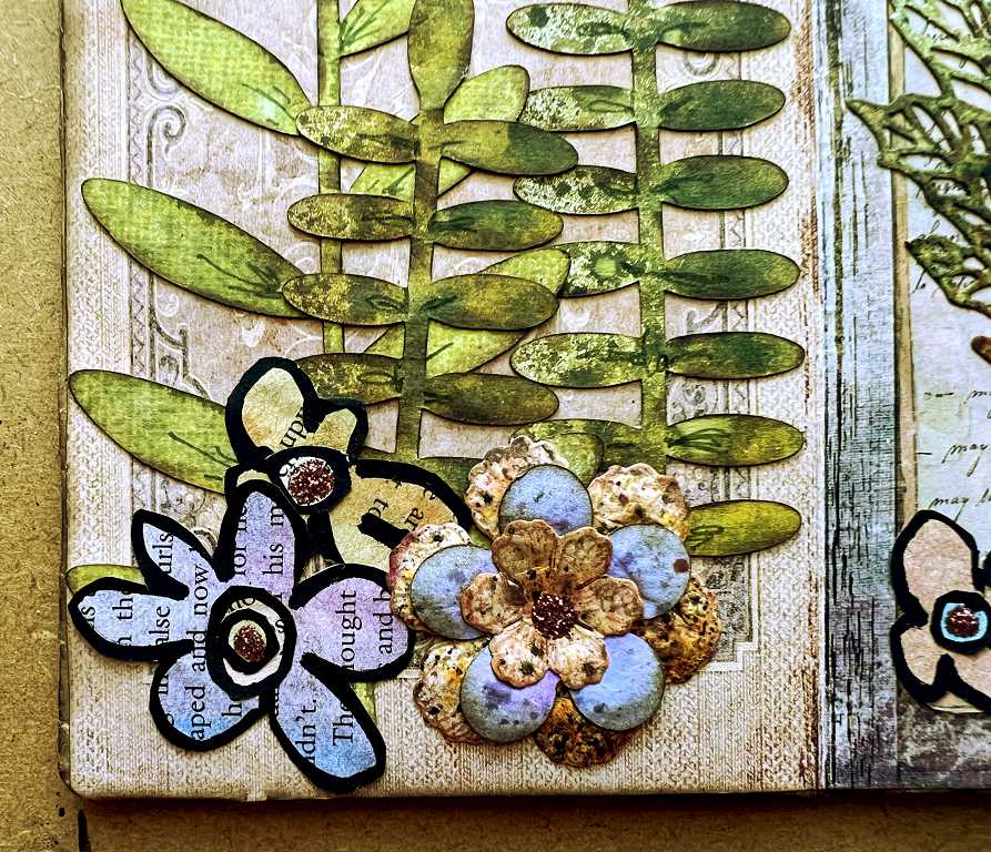
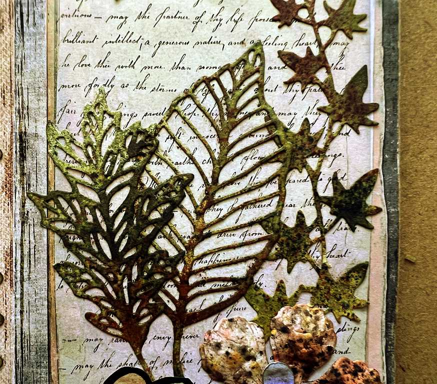
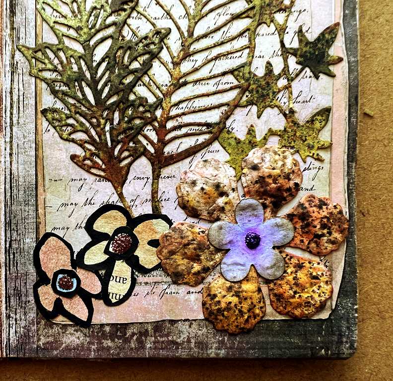
There are quite a few elements from the marathon session in the studio, using die-cut leaves and stencilled pieces. There is a tall narrow tag in the glassine pocket and a smaller, wider one in the bottom pocket of the page. I dug out my watercoloured book page flowers which I made several months ago and selected a few of the smaller ones with colours which I wanted to emphasise on this page.
 This wasn’t in my original plan at all! However, wanting to introduce some pink/purple into the page, I remembered about these flowers and decided they were ideal. The page therefore ended up looking a lot different from what I originally envisioned.
We will deal with the separate elements as we zoom in on the page.
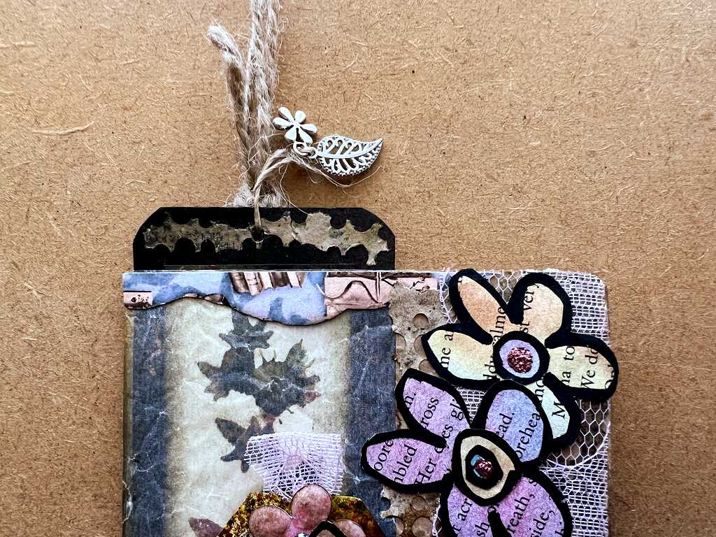
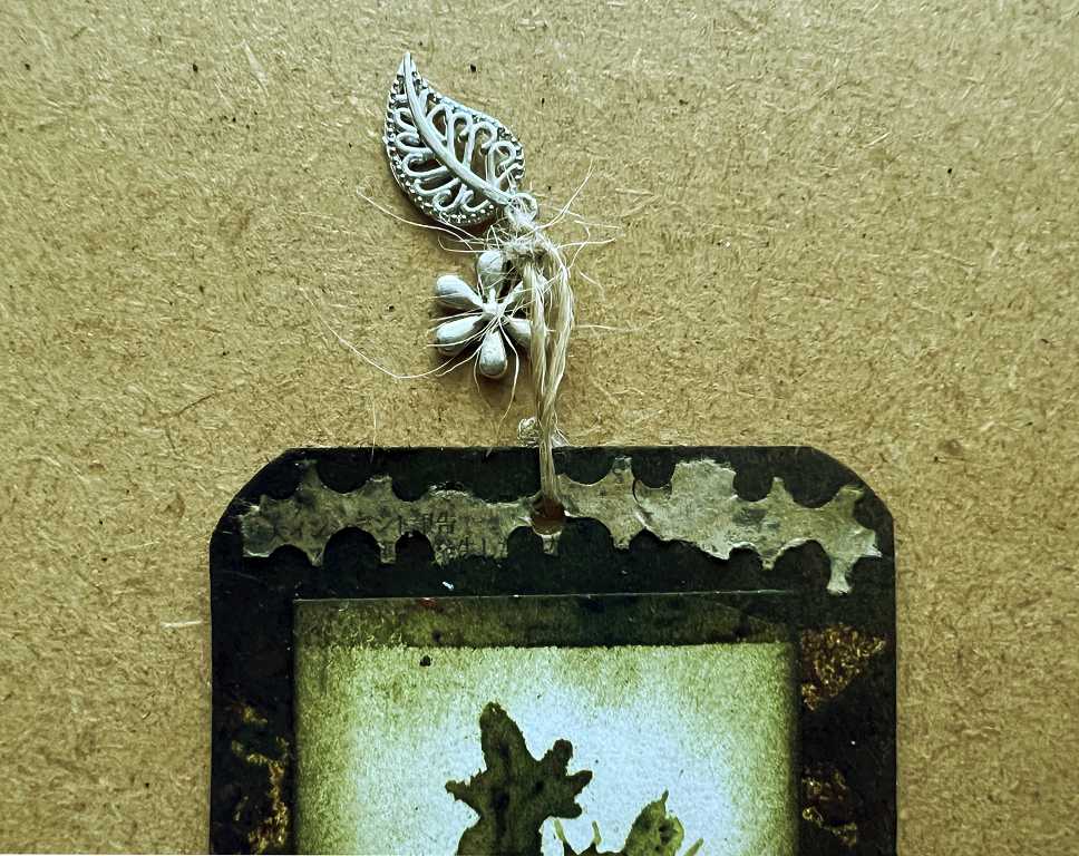
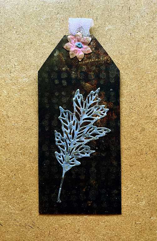
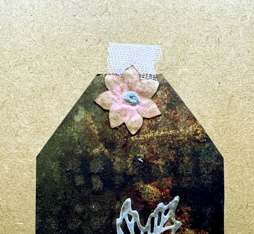
As usual, I added a dangly embellishment on the top of the tag sticking up above the page. In this case, I used one of several of the little silvery metal leaves and a small flower charm. The leaves used to come tied around the top of a bottle of an ancilliary product I used to buy to help manage my stoma in the early days. They were so pretty that I couldn’t possibly throw them away, so they went into my Charms box to await The Call to a Higher Purpose. I used the same piece of fibrous jute string that was attached originally, untying it, adding the flower charm and attaching it through a punched hole in the top of the tag.
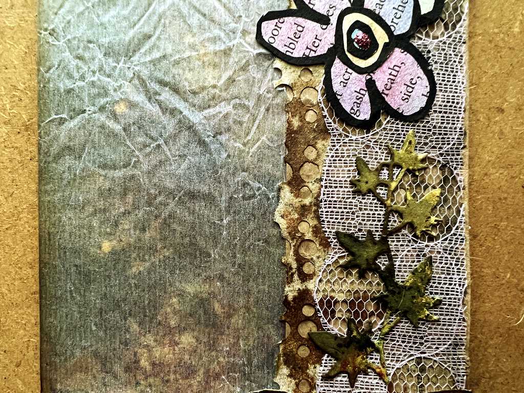
Across most of the top of the page is a tiny fragment of the VectoriaDesigns collage strip paper which I mentioned in my previous blog post. This serves to reinforce the delicate edge of the glassine which needs to be protected as the large tag will be pulled in and out.
 I used one of my leaf backgrounds to line the glassine pocket. It is certainly much easier to glue this lining piece inside the pocket before the various pockets are glued into place, and while I can still open the folio out flat and access the whole area of glassine.
 Down the right-hand side, covering the brown paper panel, I glued the piece of gold-sprayed punched medication leaflet paper. I tore the edges along the perforations, which gives a much nicer finish than that straight cut edge. I made sure this piece came right up to the join between the paper and glassine and overlapped it slightly, so that the ripped edge could be clearly seen. I needed to make two attempts, tearing off a single row of holes in each case, before I was happy with the width of the piece, and these slivers of paper went into the scraps pile I am using for the project, and one fragment of this was used along the top of the large tag. It has a really organic feel to it – it reminds me a bit of seawed.
I overlaid most of the right-hand side of this panel with a piece of pink lace-like stuff from the Paperlogy bundle I ordered last year. This is rather strange stuff and appears to be made from paper but it may be plastic. Anyway, the subtle hint of pink, beautifully downplayed by the brown/gold of the medication leaflet underneath, which shows through the holes in the “lace.” After so much of this album has been pretty strong and masculine, I thought it was high time to introduce a feminine element, which would also co-ordinate well with any flowers I might add.
Over the top of this, I glued down one of the longer small leaf trails – this was a real afterthought!
The pocket at the bottom of the page
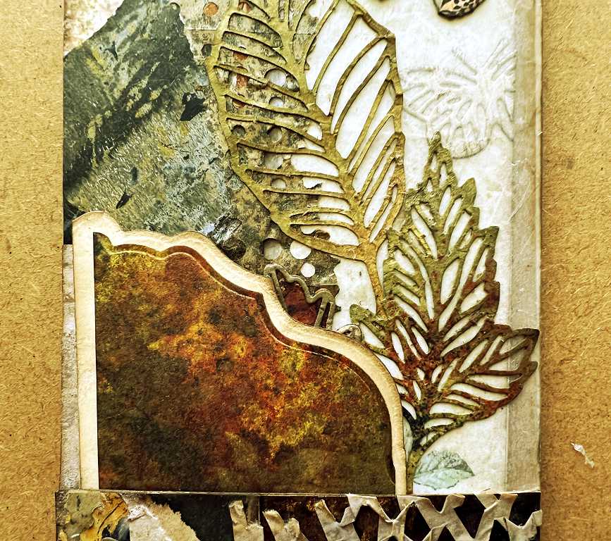
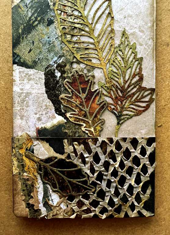
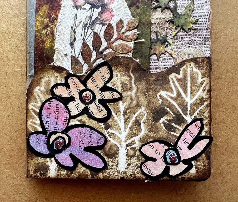 I covered the folded-up bottom of the paper bag with some of the brown background piece I made when I sprayed the “skeleton” leaves. As you can see from the first photo in this post, the two rows of leaves do interlock a bit, so I had to cut between them. I really liked the wavy line that resulted, giving the top of the pocket a more organic look than the straight top that the other pockets in the album have.
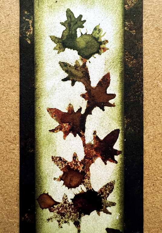
With the removal of the small tag from the pocket, the leaf background is revealed through the glassine panel. I was very pleased with how this particular piece turned out, using the negative space from the die cut as a stencil. Some of the fine detail around the base of the leaves was cut out completely, leaving a larger hole, and I wasn’t sure if this would look good, but in the end it looks almost like berries on the leaf trail!
 You can see this more clearly on the original – top left on the left-hand piece in this next photo.
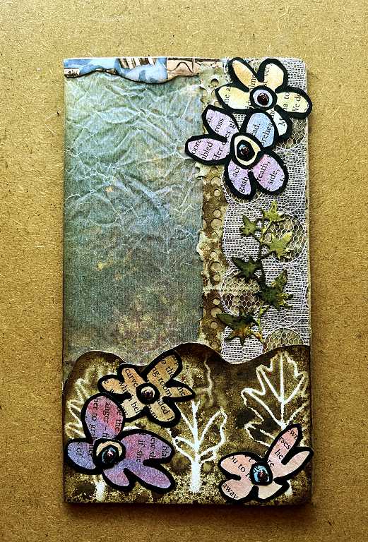
 This is the front page of the folio with both tags removed. Unfortunately the glassine does tend to reflect in the photos, but in real life you can clearly see the improved dark background with the gold stencilling. I have added a fragment of the VectoriaDesigns collage strip across the top to reinforce the edge of the glassine.
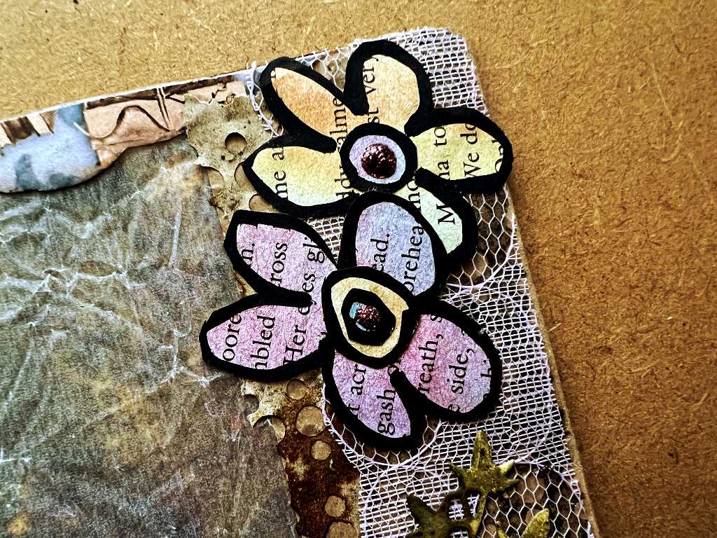
 This is the top right-hand corner of the page with the tags removed. You can see a bit more of the background behind the glassine in this one, and also the edge of the sprayed punched medication leaflet, and a detail of the pink lace-like papery stuff on the right-hand panel.
 The middle section of the tag. Hard to see the detail of the background behind the glassine panel, but the details on the right-hand panel are clear. I like the addition of the leaf trail overlaying the pink lace.
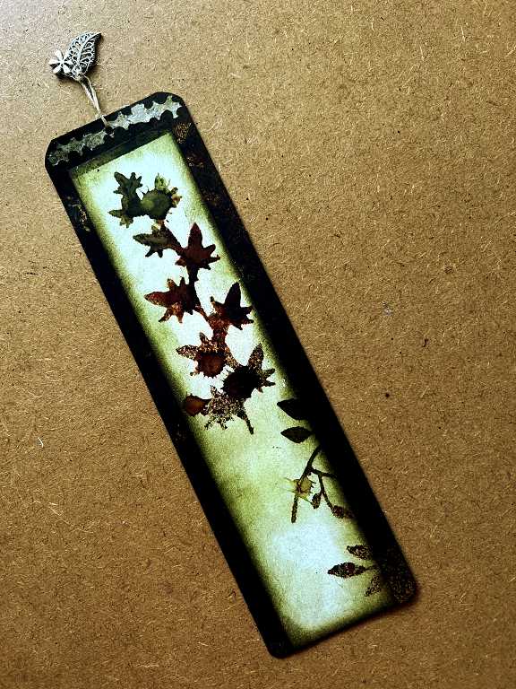
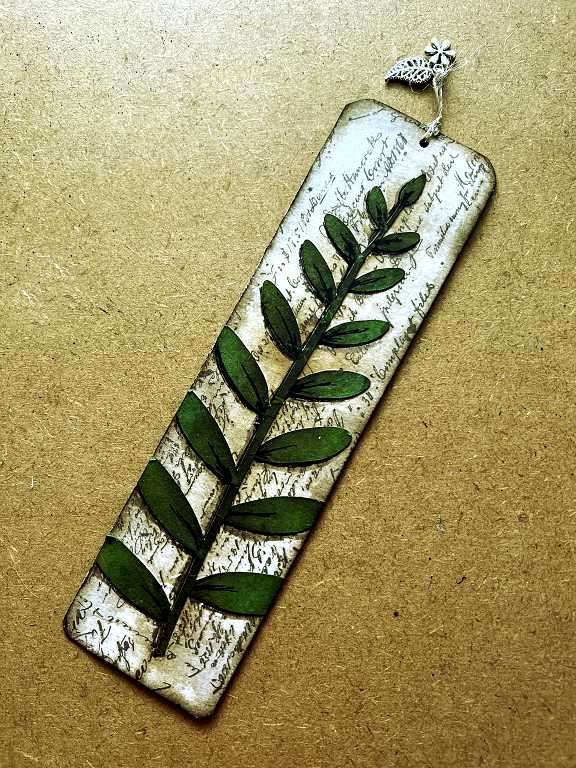
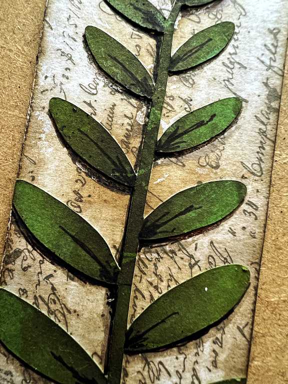
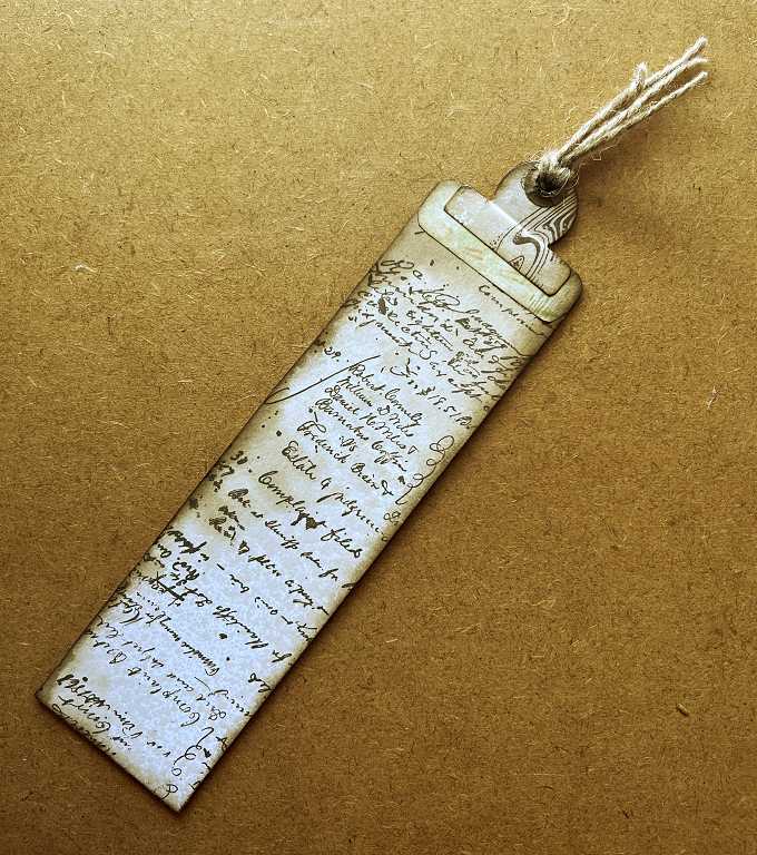
 The large tag from this page. The “berry-like” appearance of the blobs on the stencilled leaf trail are quite clear here. The addition of the sliver of medication leaflet at the top, complete with the metal charms, sets it off well.
 On the reverse of the tag, I stuck down one of the stamped and coffee-dyed strips, overlaid with one of my large leaf stems which I had cut on the electronic cutting machine, with additional detailing added afterwards, including a drop shadow. I cut off the leaves which stuck out beyond the edge of the tag and I like this effect.
 It is very difficult using a normal blending pad to add ink into little crevices like the raised edges of leaves. A while back, I bought a cheap pack of egg-shaped foam pads for make-up application, and in the set was a tiny one. This is perfect for this, and it is now living permanently on my desk, ready to be used with brown Distress Inks to add drop shadows to collaged pieces. It’s really handy and has a very small point. It has a life of its own, though, and rolls around everywhere, so I shall have to think of a way to store it so it’s always visible and available!
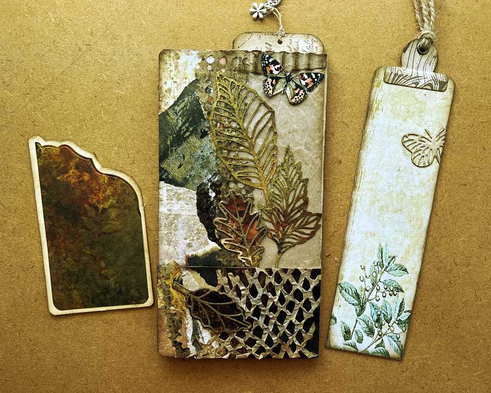
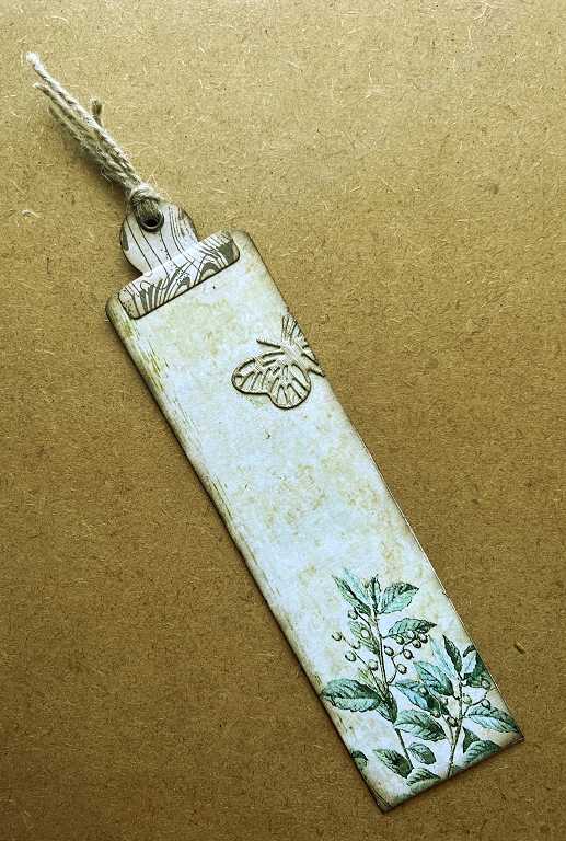
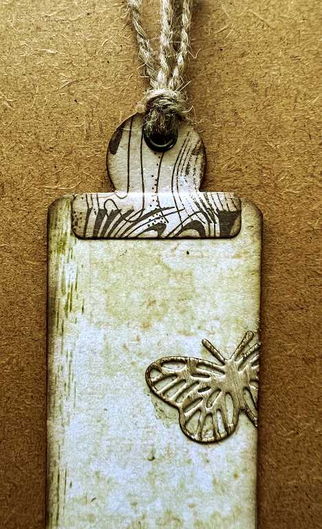
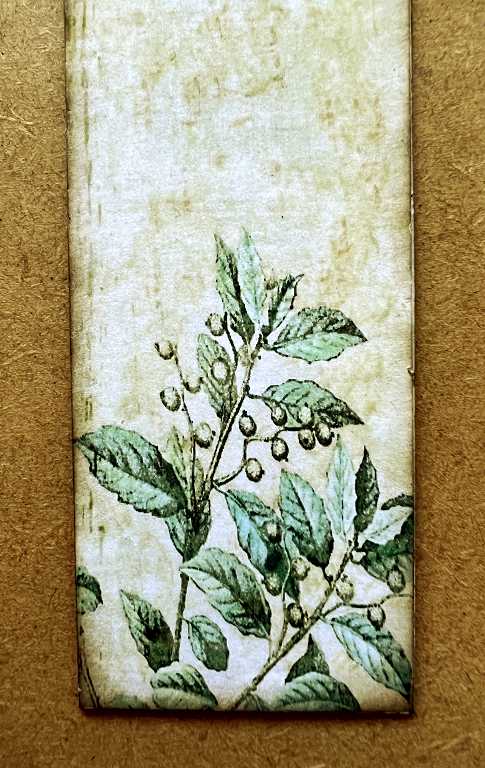
The tag from the front pocket.
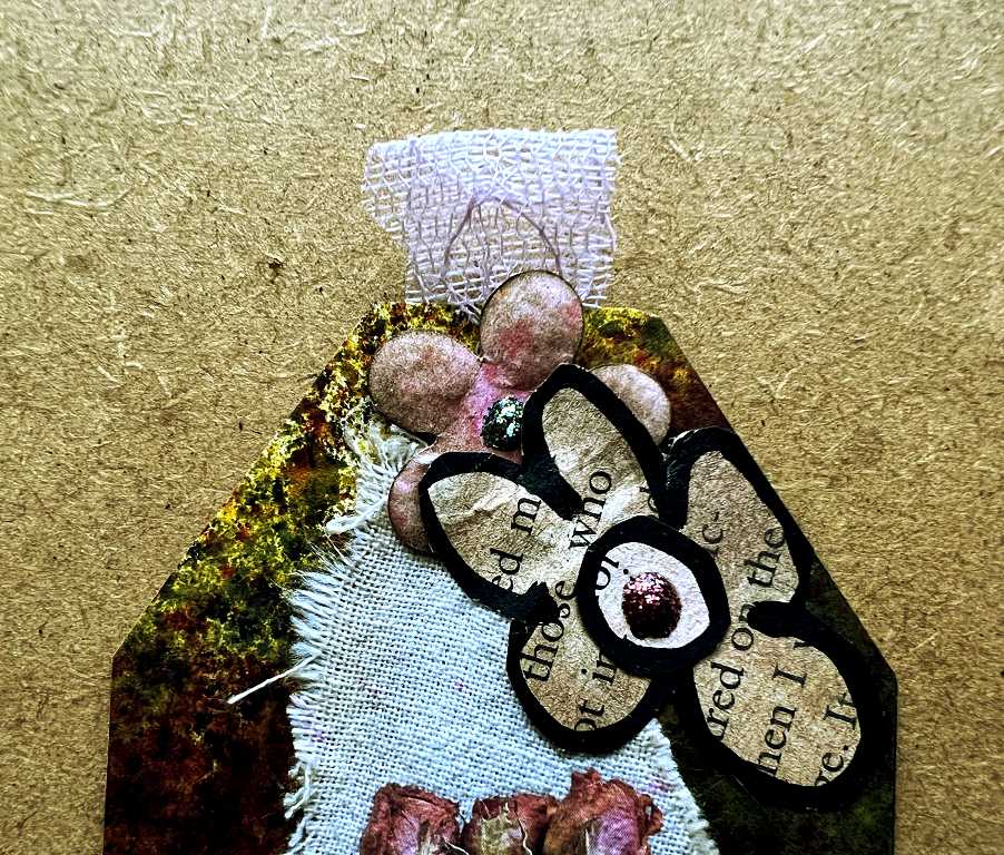
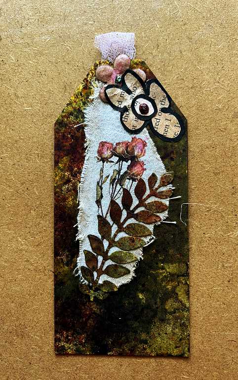 I stuck down a fragment of the pink lacy-effect paper on the top, and covered the edge with a small embossed flower I made ages ago and which was in my stash. This is partially covered with a water-coloured book page flower.
 The background is some more of the grungey dark background made when I sprayed the leaves. Another leaf trail is stuck down over a scrap of calico on which I applied a Paperlogy rub-on. It’s the first time I’ve attempted to use one of these and the result is great. They work perfectly on fabric as well as paper.
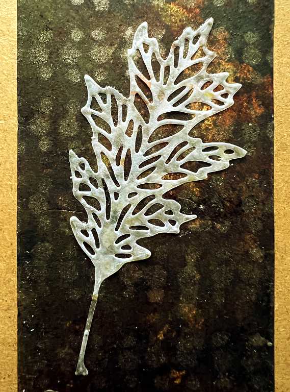
 The back of the tag is covered with some more of the dark background with the medication leaflet stencil on it, and another embossed flower covering the edge of the pink lacy tab on top. The focal point is a vellum die-cut leaf.
 The centrefold
 The background was created from Graphics Fairy journal pages, digitally altered and resized to fit the album. All the embellishments are self-explanatory really. The larger layered flowers were from my stash; the brown petals were done with inks and Infusions to give a grungey effect, and all the flower centres have Stickles glitter glue added, which of course doesn’t show any sparkle in the photo!

 The back page
 More corrugated paper, inked for emphasis, and punched medication leaflet, and a small butterfly in the corner are the main elements for the top of this page.
 Down the left-hand side (brown paper panel) I applied a piece of one of my collage strips created with torn up papers glued to a scrap strip of white card. Some more leaf dies in the centre, and showing through the glassine panel on the right, a subtle butterfly attached to the tag inside.
 I had some fun with the tag in the pocket. I wanted to create an interesting shape for the top, and selected one of my new edging dies, all of which are too wide for tags in this project. Rather than laying it symmentrically across the top, I arranged it asymmentrically at an angle, to create the shape you can see.
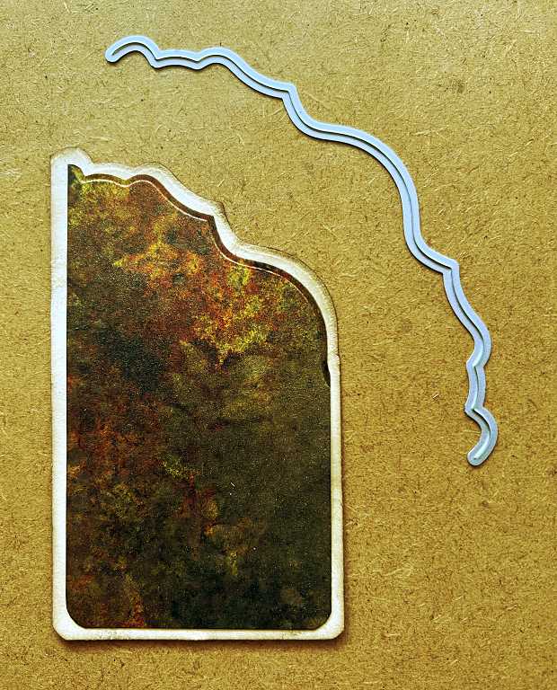 I wanted the shape to be the same on the tag and the mat layer, so I lined up the top right-hand corners before cutting them together with the die. I was then able to move the upper piece diagonally down into place so that it was centred on the tag, and the shape married up perfectly. I am pleased to see that the die has left an attractive embossed line along the edge of the darker piece which gives a nice finish. The top layer is cut from the leaf background created when I was spraying the die-cut leaves.
The page with the tags removed. I did not add a background underneath the glassine panel; it is just the brown paper of the bag. The butterfly on the tag came off something else and I lined it up so that it would show properly through the glassine window, trimming off the excess. The tab on top was cut from one of my random stamped and coffee-dyed strips.
 The paper of the background was from my first attempt at printing the background sheet for the centrefold of a previous page, which came out too large. I knew I could use it somewhere, so didn’t throw it away.
The pocket is embellished with gold-sprayed paper mesh (used for packaging), a double-layered die-cut leaf and more fragments of punched medication leaflet. You can see that I have cut the collage strip to match across the edge of the pocket. There is more punched medication leaflet going up the centre of the page to cover the join.
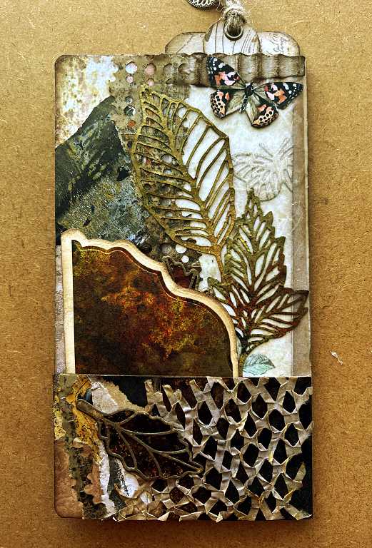
The tall tag.
 The tab has an eyelet inserted.
 The back of the tag is simply covered with one of my stamped and coffee-dyed strips. Before adding the tab, I turned over the excess of the front side background sheet to create a separation between the backing and the tab.
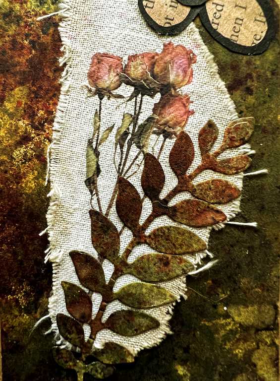
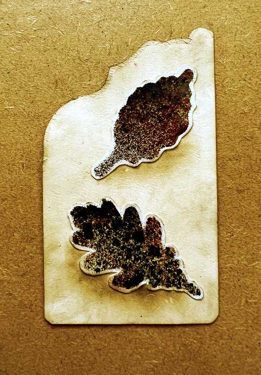
 On the back of the other tag, I stuck down some fussy-cut leaves which were the result of using the negative space from the die cutting as a stencil. I left a narrow white border, and added some inking to form shadows. The background is cream card.
 This completes the fifth folio with a botanical theme. The back page has very much a leaf-based theme, which segues nicely to the final folio which is based on trees.