ONLINE ART COURSE – PORTRAIT IN PASTEL PENCILS, AND ANOTHER UTI
The third project in the pastel pencil drawing module of the course was a charming portrait of a little girl blowing bubbles. When I first saw what we were expected to draw, as always, I thought it was much too hard! However, as ever, I managed it, under Phil’s expert tuition.
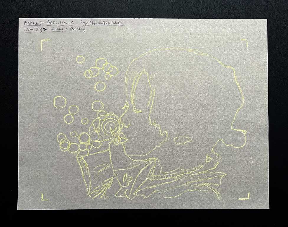
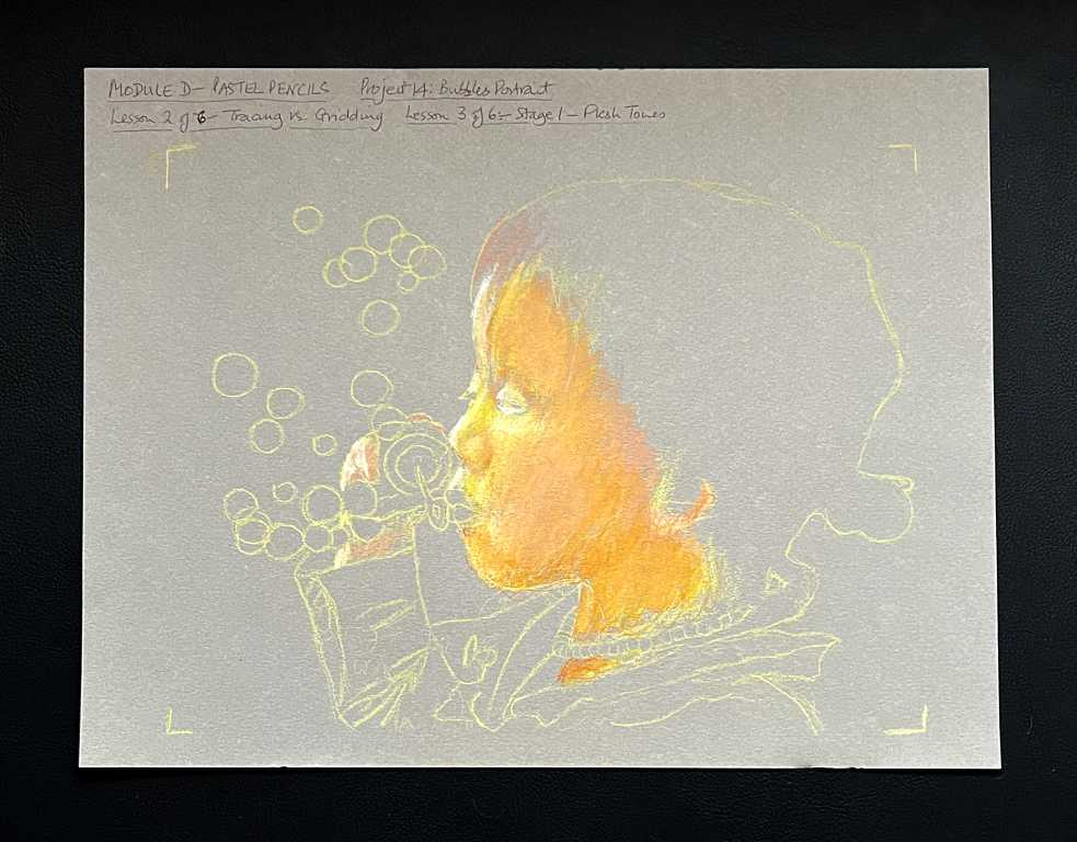
Tracing and gridding
In the back of my mind, looking at other people’s results with this, I was subconsciously impressed with how good all their proportions were, and knowing my weakness in this area, I thought this would be where I would fall down.
However, starting the project was an eye-opener! Phil actually told us either to trace this, or grid it!! He spoke at some considerable length on the project orientation video in preparation for starting work, and said that he expected that people would be horrified at this advice, since from the beginning he has been rigorous in training our observation skills. However, he said that at this stage, we were learning primarily how to use the materials – getting the medium down, blending, etc. etc., and that if we focused on the proportions, it would take far too long. Portraiture is a special case – we are so familiar with faces, and the slightest variation in the proportions can prevent one getting an accurate likeness. We have another couple of modules where one of the subjects will be a portrait, but we won’t be concentrating on pure observation in portraits until much later in the course, in a module specifically dedicated to portraits.
He also pointed out that most professional artists, who charge by the hour and whose time is precious, will resort to this kind of tool to start a project. To get a really accurate likeness, there is no shame in using these methods. This reminded me of my recent researches into historical drawing aids such as the camera obscura and the camera lucida. The artist David Hockney has written a book, “Secret Knowledge: Rediscovering the Lost Techniques of the Old Masters,” which has caused quite a stir amongst those who revere the old masters to an almost godlike degree as divinely gifted and never having to resort to such things, because he reveals how many of them used these tools, which some purists consider to be cheating, and Hockney is spoiling their mystique!
He gave us a couple of suggestions on how to prepare this particular drawing – gridding or tracing. One of the reference photos was already prepared with a grid, and all one had to do was draw a grid to the same proportions on one’s pastel paper and copy the picture square by square. The alternative was tracing. We would need to print out the reference for this, and in the downloads folder there are always “print ready” ones which are the correct size. This is the route I chose, and it seemed pointless printing out a high quality coloured image, as all that is required is the main shapes and outlines, so I printed a “toner saver” greyscale image. He suggested using a light-coloured pastel pencil to scribble all over the back of this image, but not the white one, as this gets more use than any of the other colours and it’s a shame to waste it! I have a small set of six pan pastels and decided to use the yellow one for this, applying it with a sponge. You then tape the printed image on top of the pastel paper and trace off the outlines, lifting it periodically from one side to make sure it’s transferring OK, and that you haven’t missed anything important. I found that my yellow didn’t show up that well when I tested it, so I added a layer of white pan pastel on top. This improved things somewhat, but I was able to emphasise the lines with the yellow pastel pencil, and keep a piece of paper under my hand while drawing, so that it would not get smudged away. You can see that I have marked the corners of the printed image on the paper – these marks served as a guide not to draw beyond them, and they were erased at the end.
In future, if I am doing any tracing, I shall probably use my light panel, if the paper of choice is not too thick.
Making the drawing
The next stage was to add some flesh tones, beginning with yellow, adding some pink and orange. Throughout this, I had great difficulty in photographing these different stages – some of the photos came out completely out of focus, and in those that were not, the colours needed a lot of adjusting in my photo editor later. The colouring and shading on the real thing are a lot smoother than on the photos. I don’t know what was going on with my camera phone.
Adding the dark features – eyes, lips and some shading, and beginning on the hair – you might be surprised at the use of purple on the hair, but this is the initial layer, and it adds richness to the darker layers added subsequently.
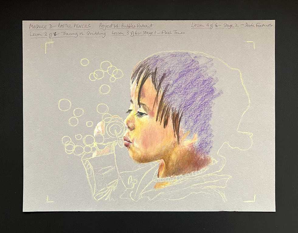
It was interesting working on the subtle shading around the cheeks, to give the impression of the little girl’s cheeks being puffed out as she blew her bubbles.
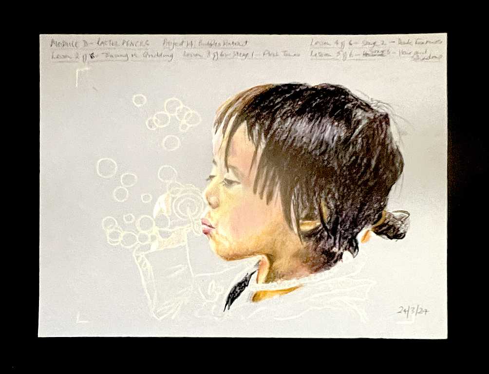
Working on the hair, and further work on the shadows. When you get into it, it’s surprising how many shades and variations there are in the hair – the first impression is that this little girl has black hair, but we worked with browns as well as black, and made sure we showed the highlight across the side of her head. We added some whispy fly-away hairs and a few lighter strands throughout.
For the final stage, I thought there was a huge amount of work to do, because we had not as yet touched the clothes or the bubbles! We did some work on her hand, and then working on the clothes was quite quick; the little shirt has Minnie Mouse on it but we just made suggestions of the coloured shapes against the blue background. The clothing was done fairly sketchily so as not to distract the eye away from the main focus, which of course is the little girl’s head. We added the pearl necklace with white, and shaded it with grey.
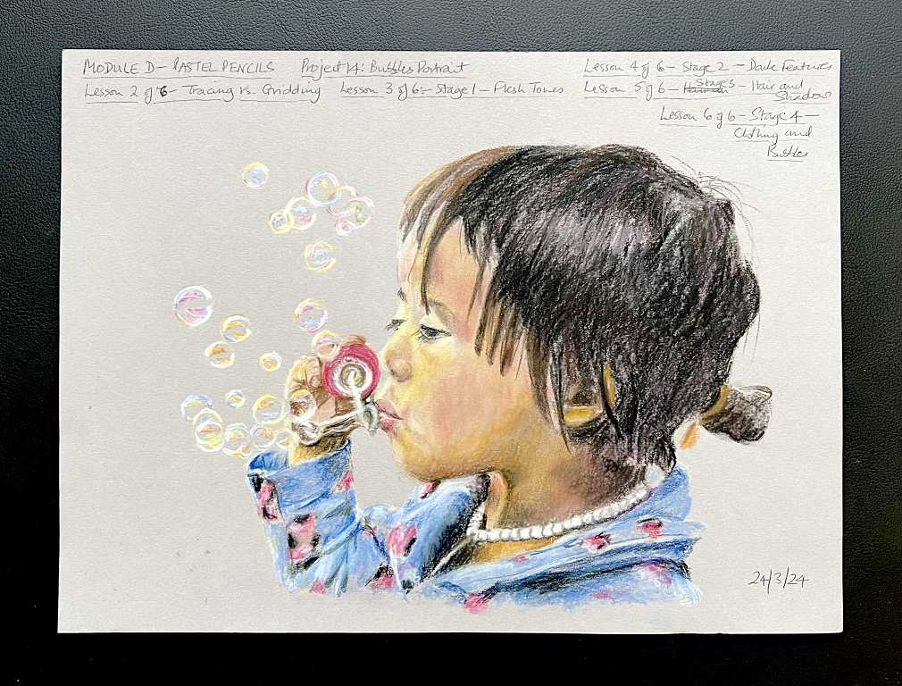
The bubbles were really fun to draw! We needed to sharpen our pastel pencils to a fine point. Someone on the forum complained that her bubbles looked like marbles, and she put this down to the fact that her pencils were not sharp enough. It is surprising how many colours there are in the bubbles. To keep them light, I laid the colour down and then added some white, and then here and there added more colour back in.
I think this is a very sweet and charming little subject. I always loved blowing bubbles when I was a child, and I actually still enjoy doing it! There is something so magical and ethereal about them, with their delicacy and rainbow colours, and how they float away, and pop silently and vanish.
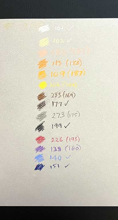
Finally, the colours I used. As before, the ticked numbers are ones recommended by Phil which I have in my set, and the ones in brackets are his ones which I do not have, which I had to substitute with others from my set.
Pastel pencils as a medium
I must say I am favourably impressed with pastel pencils. I had thought they would be as messy and difficult to use as charcoal, but this is not the case. There is actually very little dust, if you build up the layers gradually; any dust is worked into the paper with subsequent layers. Soft pastel sticks are a lot dustier, but the pencils are quite hard – they lend themselves well to blended backgrounds as well as fine detail. At the beginning of the module, Phil said that dedicating a whole module to this medium was unusual, as most people use them as an adjunct to soft pastel sticks, simply for adding detail, but they are a lot more versatile than that. The pastels blend beautifully and you can get a lot of variation through applying different pressure.
To fix or not to fix?
Opinion is sharply divided between whether or not to use fixative, and many people don’t go near it as they think it darkens the colour, but I haven’t found that to be a problem. They recommend framing your work behind a mount and glass, but one surely cannot do this with every drawing – not to mention the expense! Storing unframed drawings means layering them between glassine paper and wrapping in acid-free tissue paper, and on and on… I want to look at my art, not store it away in an inaccessable way! The fixative is working fine for me, and I shall continue with it.
Pros and cons
While I am delighted with this medium for all the above reasons, the one drawback I can see with pastel pencils is that working with them is quite expensive. The pencils get sharpened down fairly rapidly (you have to use a knife for the wood and sandpaper to get a point on the pastel), and the paper is certainly not cheap. I am looking forward very much to getting to the coloured pencils module as I think this will yield just as good results, and at a more reasonable budget. I have been watching quite a lot of videos on soft pastels, pastel pencils and coloured pencils, and earmarked quite a few as training exercises as an adjunct to the course. I am learning a lot about the different types, their properties, and how to apply them. People are getting absolutely astonishing results with all these media. One day I hope to be able to do pet portraits as these are so attractive, and bring a great deal of joy to people – so much more than a photograph.
Most of the work on the course so far has been in our drawing sketchbook, but these pastel drawings are done on tinted pastel paper which has a certain amount of tooth to hold the medium, and anything with added watercolour is being done on watercolour paper. When the course is finished, I shall most likely bind everything together in an album, in consecutive order, and this will be a nice record of all the work we have done. I am keeping my non-course work in separate albums.
I have another UTI
Unfortunately yesterday afternoon I developed another UTI and spent the evening in considerable pain. After we’d eaten, I took some paracetamol and went to bed, and I did feel more comfortable then. I always seem to develop these at the weekend… The NHS obviously doesn’t think it is right that people should get ill out of working hours. Anyway, my hubby took a sample down to the surgery this morning, and after a lot of messing around and waiting, he eventually came home with a prescription of antibiotics for me. This time it is only for 3 days, twice a day. I am hoping that will be sufficient. When I had the last one, I felt almost immediate relief after taking the first tablet, but I haven’t noticed any change yet. My bladder is painful and I’m feeling quite under the weather today. It’s taken me a while to get going and do all the things I need to do but I’m looking forward to a restful evening, and hope the antibiotics kick in soon.