ONLINE ART COURSE – SMOKING MAN IN INK PENS AND WATERCOLOUR
Old and young faces
Before we began this project, Phil (the teacher) showed us a few images of faces. He said that in this medium, it is much more interesting to draw older faces with plenty of lines and wrinkles, giving us the opportunity for lots of pen work. He showed a drawing he had done of a young child and there was virtually no pen work on the face at all, because the skin was so smooth and unblemished. I actually find old, lined faces fascinating – they show the wear and tear of life, and tell a story of the individual’s life experience, especially through the expression in the face and eyes. I remember many years ago, my cousin had a poster on her bedroom wall of a very old Greek gentleman who had so many wrinkles that there was virtually no smooth spot anywhere on his face. It was a face in repose, full of weariness and telling of a life full of struggles and hardships. It was the most beautiful picture of one human being and I have never forgotten it. I would love to have heard his story.
Many people today do not appreciate the beauty of naturally aging faces, and spend a fortune trying to hold back the clock and retain the appearance of youth through expensive cosmetics, treatments and surgery. The result, especially of the latter, is an artificial mask-like appearance which tends to obliterate the character of the face, which is such a shame. There is such a thing as growing old gracefully, and it is a sad reflection of our culture where youth and beauty are worshipped and the elderly are cast aside as no longer useful. I find this deeply saddening.
A portrait in watercolour with pen work
On Thursday, my hubby and I began a new project in the Ink Pens and Watercolour module of the art course. This time it was a portrait of an elderly man in a hat, smoking a cigarette. When I first saw the reference photo I didn’t like it much and didn’t think I would enjoy doing it, but as we worked on it, the old fellow really grew on me! Although I did thoroughly enjoy doing this project, and gained a tremendous sense of achievement at the end of it, it had its moments of extreme frustration, and I think it was the most difficult project we have done to date.
Tracing the outline
For some of our watercolour projects, I have been using a block of watercolour paper. The sheets are all glued together to prevent warping and buckling in use, and there are slits along the bottom edge for the insertion of a knife to slice the page away from the block once the art work is completed.
As with the portrait of the little girl blowing bubbles, the object of this project was not to learn how to get the proportions of a face correct in portrait drawing, but to work on the particular medium in the module. I find the easiest way to trace a picture is to print out a black and white version of the image to the correct size (no need to waste colour toner on this) and to tape it onto my light panel. Then I can tape the sheet of watercolour paper over it, just on the top edge, so I can “hinge” it open to check I’ve got all the relevant details. Obviously I could not use the light panel method with a page that was attached to the block, even if I were to detach three sides of it, so this is why I decided to use a separate sheet.
I like to keep the art work attached to the block along the top so I can flip through the pages, and they are kept safe in one place. Anything needing to be traced has to be done on a separate sheet.
Paper problems
I had found a stack of loose sheets of unused paper in my watercolour paper scraps box, and selected one of these for my picture. I thought this was regular watercolour paper, but it seems to have some sort of a glaze on it and it is impossible to move the paint around and blend it. My only option was to begin again, and this time my hubby provided me with a sheet from his watercolour pad.
I have discovered that one of the sheets I am using for my teabag stain experiments is from that same stack of loose sheets, and this paper does seem to work very well for this, so I shall set it aside for that purpose. I shall be blogging about this in due course because I have been getting some fascinating results.
My hubby was out yesterday morning, and I was able to re-trace the image onto the fresh sheet of paper, and work on the first colour wash before his return. When we sat down together in the afternoon, I was therefore at the same stage as him and we were able to continue to work on the project as normal.
Before beginning the drawing
The warm up exercise for this project was all about rendering skin tones.
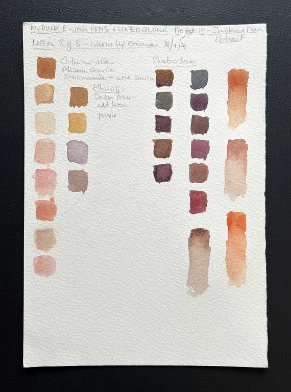
As we saw in the previous project, drawing buildings, it is amazing that you can produce such subtle greys and beiges, and now, skin tones, using just the primary colours with the watercolours. We used cadmium yellow, alizarin crimson and ultramarine blue in varying proportions to produce an amazing range of colours. The yellow and red, being adjacent on the colour wheel, will mix to produce a good vibrant orange, and we were able to make this pinker with the addition of more crimson. Adding the blue, on the opposite side of the colour wheel from the orange and being its complementary colour, dulled it right down and turned it brown. We could make this more grey with the addition of more blue. This colour mixing is quite fascinating – it is truly amazing the number of subtle variations of colour one can get just from three primaries. Phil did say that we could use an existing brown and change it with the addition of red and/or blue but he preferred to mix the primaries – this way you can get a more subtle and lively variation.
Skin tones of different ethnicities
Asian skin tones can be created with the addition of more yellow, and African skins with more blue to make the mix more brown. Caucasian skin tones are paler and have more pink. We painted a series of swatches experimenting with this in the first half of the lesson, and then created swatches to represent the shadow colours. On the far right, the colours were swatched and then diluted with water to show the gradations you can get for light and shade, simply by making the paint thinner and more transparent.
I’ve been looking into colour mixing a bit recently, especially in connection with coloured pencil drawing, and the principles are pretty much the same as with watercolours.
These are the skin tone samples I made, following a Kirsty Partridge video on YouTube, using coloured pencils.
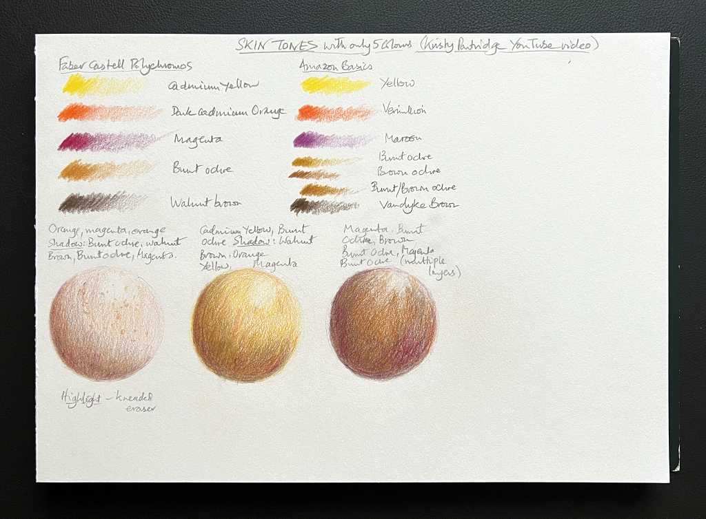
In this case she chose five different colours, and instructed us to draw three spheres of each of the main ethnic skin tones – this way one could show the base colour and the shadows and highlights in one sample. She chose Faber Castell Polychromos for this – I have the set of 24 and all the colours she used are in that set. Being oil based, these pencils probably don’t blend as well as my other wax based ones. I thought it would be interesting to choose the equivalent colours from the Amazon Basics set, which are wax-based and therefore softer, and I shall probably also do the same with the very soft Derwent Coloursoft pencils. In the Amazon Basics, there wasn’t the exact equivalent to the burnt ochre in the Polychromos set, but a mix of burnt ochre and brown ochre was a pretty good equivalent. However, I think either would do on its own if I use thin layers and blend carefully. There isn’t a great deal of difference.
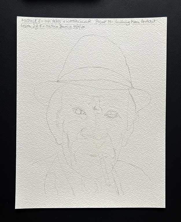
Drawing our smoking man
As usual, we began with a basic pencil outline. This photo is my second attempt, on the decent paper. It is rather faint, despite my increasing the contrast, but I think you can just about make out the face, with the most important features picked out.
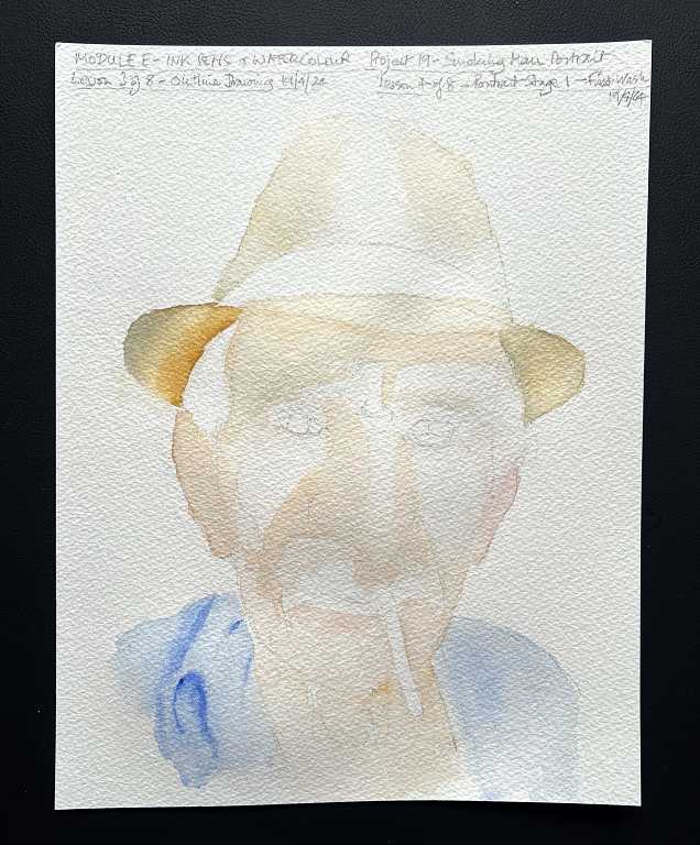
We then proceeded with a series of washes, darkening the colours as we went. Dampening the various areas with clean water first and then adding the paint gave a smooth result. We deliberately avoided wetting areas we wanted to remain white for highlights.
The first wash, which I photographed in two stages. A very light wash on the shadowed areas of the face and on the hat, and also on the blue shirt.
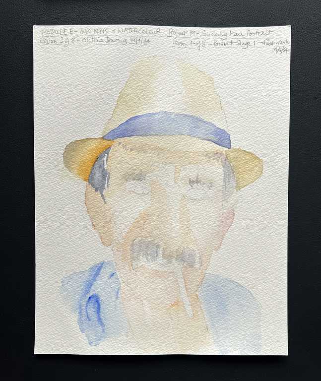
The second wash, with the colours being intensified, once the first wash was completely dry.
You can already see the three-dimensional nature of the face beginning to emerge. We were careful to avoid getting any paint on the cigarette, and the line of light along the bottom of the chin which is reflected light.
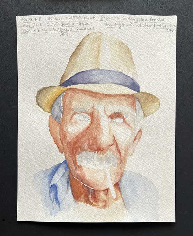
Moving on to the shadows. We made up a mix of paint that was much darker and stronger. On the reference photograph there are some areas on the left side of the picture which are in very deep shadow. Phil did not want to copy the photo slavishly and just block these in with black, but to add some subtlety with a lighter shade of brown, to allow for any pen work to be visible; this would also darken the shadows.
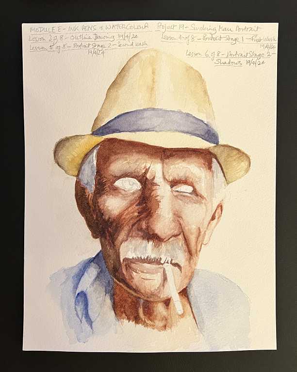
The poor chap has the look of the Stepford Wives with the absence of eyes!!
I really struggled with this stage of the drawing because I could not seem to get the nose right; I am still not convinced it’s as good as it should be. Also there seemed to be too much space on the left side of the face and I had to put our poor old gentleman through some radical facial surgery, excising some flesh from that side of this face and re-doing the edge of the face and the shirt, but in the end it seemed to be a lot better. We picked out the major wrinkles with the shadow colour.
The final painting stage was the addition of the facial features and other details. He certainly looks a lot better with eyes!
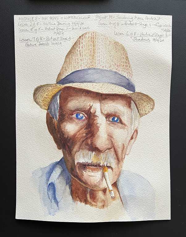
After this was all completely dry, we were able to move on to the final stage of this project, which was the addition of the ink work. This really brought the picture to life, and there were endless lines and wrinkles to have fun with! We also had the option to add a bit of background, and I think this does enhance the finished result.

Definitely a challenge, this project! But we got there in the end, and on the whole I am pleased with it.