ONLINE ART COURSE – TREE FROG IN INK PENS AND WATERCOLOUR
Starting a new module
I have just begun a new module on the art course – watercolour with ink pens. This is a development of the earlier one on ink pens, which also included the use of a black watercolour wash.
Ink pens and watercolour is my hubby’s favourite medium, and he was looking forward to my reaching this stage in the course so that he could join me once more. We did the warm-up exercises together, and yesterday we completed the first project in the module, which was to draw and paint a colourful tree frog.
My warm-up exercises were not a great success! I put it down to my being cheapskate and not wanting to waste watercolour paper, and using my regular course sketchbook instead! However, later on in the main project, I realised that the set of watercolours I am currently using (a cheap Amazon set) don’t actually behave in the expected manner a lot of the time, and some of the blending wasn’t that great, but no matter, the result turned out OK in the end. My dear hubby has just given me one of his many sets of watercolours in a lovely tin, and with room for plenty more half-pans to be added if I want.
The tree frog
We began in the usual fashion, by mapping out simple shapes in pencil, to get the position, proportions and angles down as a starting point. I think I’m getting a bit better at this now… At any rate, I didn’t have to use my proportional dividers for this.
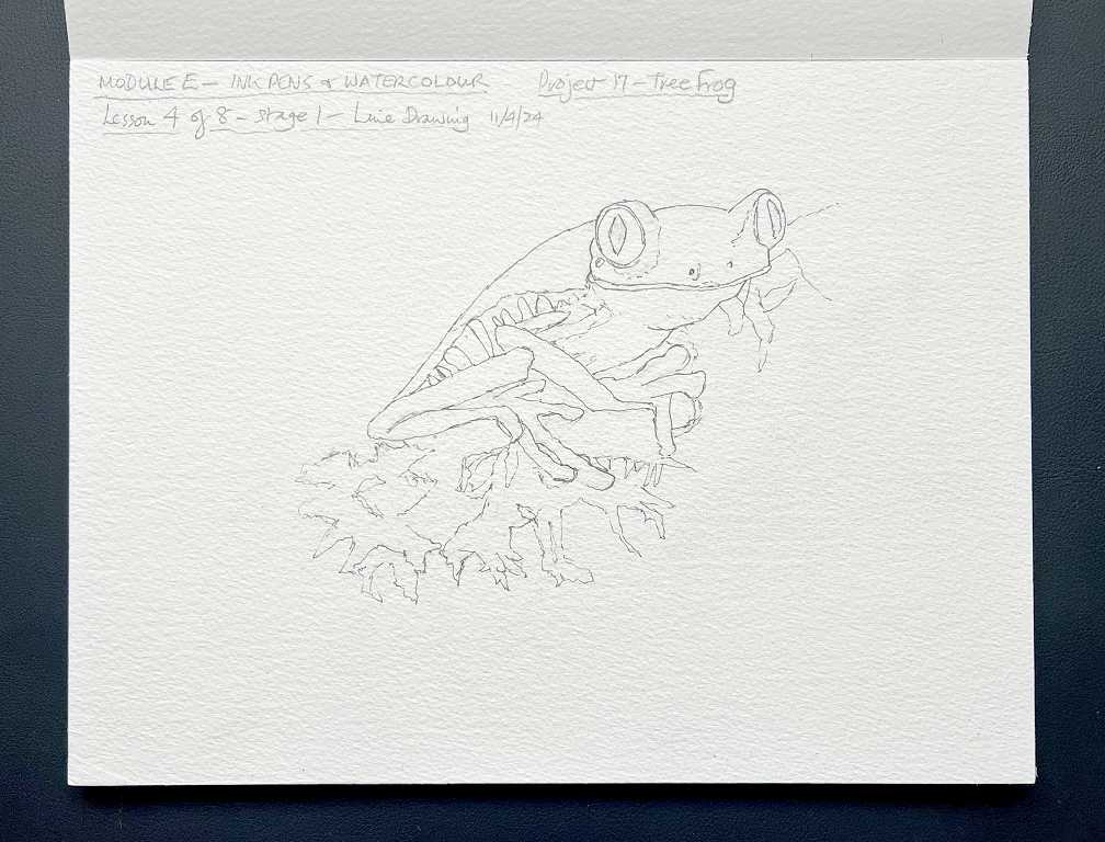
When we were happy with it, we went over it with an ink pen, paying close attention to the reference photo.
Adding the first washes.

It was surprising to me that we coloured the eyes with yellow, since on the reference, they are bright red! However, when at first glance something looks like a solid colour, this is not usually the case, and on closer examination one can see subtle variations. Painting with a solid colour would result in a flat and unlifelike result. The eyes of this frog actually have little flecks of yellow in them, and as it is impossible with watercolours to add lighter colours on top of darker ones, it is best to paint the light colour first, and then leave gaps in the darker colour so that the lighter colour will show through.
One thing I loved about this project was the dripping of the paint from the washes! This, combined with the later ink work, added to the impression of the very humid atmosphere of the rain forest, and also produced the effect of mossy vegetation hanging down from the branch. This technique is totally random and you just have to go with the flow! Tapping the paper pad sharply on the table caused the really wet paint to run down. I put some kitchen paper along the bottom of my easel to catch any stray colour.
Adding the second washes, after the first had dried.
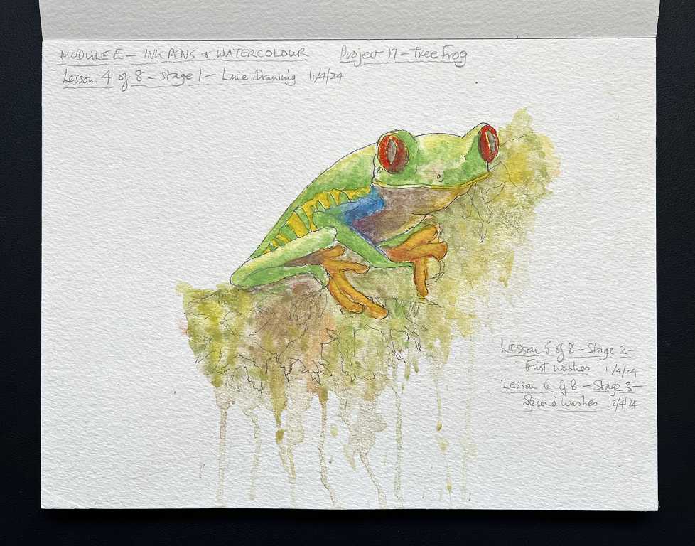
This added more depth of colour and more detail, including the red eyes!
The third layer added yet more detail, including skin texture and deeper shadows. Using a stronger paint mix than for the initial washes, these stood out nicely against the existing background colours.
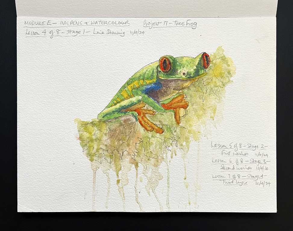
To complete the drawing, we added more ink work to bring out the details of the features of the frog, his skin texture, and the foliage on the branch. Phil, the teacher, suggested adding paint spatters, which I did, and as always, this was a very hit and miss affair – I’ve never been very good at paint spattering, and I seem to have gone a bit overboard with the orange – far too many rather small spatters which covered up the written details of each stage! No matter – the end result of the painting was pretty much OK!
Phil offered us two alternative backgrounds; to add more paint spatters to the top of the picture against the white background, which created a more light and airy effect, or the addition of a lot more dark paint to this area. I preferred the second alternative, which evoked the atmosphere of the rain forest more powerfully for me. The very dark values along the back of the frog really make him stand out. Phil suggested adding some patches of very watery pigment to this background once it was dry, in order to produce that “cauliflower” effect that watercolourists are usually so keen to avoid – he said that it really added something to this project. However, my paints being what they are, they did not produce the desired effect, but just remained as added green splodges. The effect is good, though, because they add another layer of depth to the background.
He also suggested using only vertical hatching lines with the ink pens to shade the background, to keep it less busy and less likely to draw one’s eye away from the central subject. I thought this also added to the effect of the moist drippiness of the rain forest!

As instructed for this additional background, I also added some dark values in and around the vegatation hanging down from the branch, which produce more depth.
My hubby and I had great fun doing this project. His result was very differet from mine, as always! I love comparing our work, both during the process and on completion.
I love the bright colours of this fascinating little creature – I suppose in the riot of colour in the rain forest, he would be pretty well camouflaged! – or perhaps his bright colours are a warning to predators that he is highly poisonous? Who knows…. His bright red eyes are intriguing, and his lovely orange feet. It’s amazing the depth of pigment you can get with watercolours, with the application of several layers, drying in between. The pen work really adds definition and brings the whole thing to life. Very satisfying! I think I shall definitely pursue this medium.