ONLINE ART COURSE – ANIMALS MODULE SELF-DIRECTED CHALLENGE – ANOTHER TIGER
When we did the final directed project in this module, the tiger in pastel pencils, I said that I wasn’t that keen on pastel pencils, and really wanted to do it in coloured pencils. This was the golden opportunity to do just that.
The self-directed challenge
The instruction for this challenge was either to do a pet portrait for someone, or to do any animal from a reference photo. Phil, our teacher, often recommends we trawl through Pixabay or Unsplash for royalty free photos, and after a lot of searching, I found exactly what I wanted.
I didn’t want to do another profile picture of a tiger, but a full-face version, perhaps in an unusual pose.
Working with the reference photo
Here is the reference photo I found on Unsplash. What a magnificent tiger!
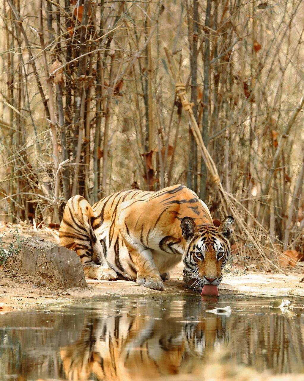
I knew this would be a complicated drawing, but I wanted a challenge!
I thought that the image would have more impact if I cropped it down. I removed the upper part of the picture. This brought the viewer eye-to-eye with the tiger.
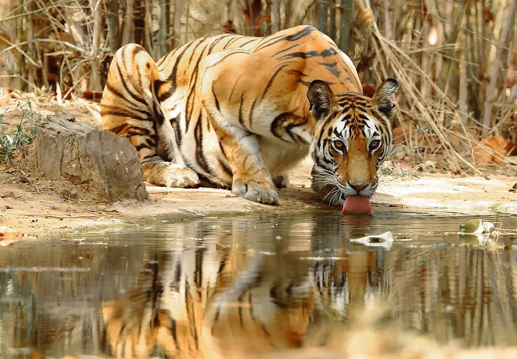
This was much better.
My initial drawing. I managed to do this without the aid of the proportional dividers or tracing etc. To scale it up, I drew a rectangle exactly the same size as the reference, at the top left-hand corner of the page. Then I drew a diagonal line from top left to bottom right, and extended the frame to the right-hand edge of the paper. This kept the proportions the same.
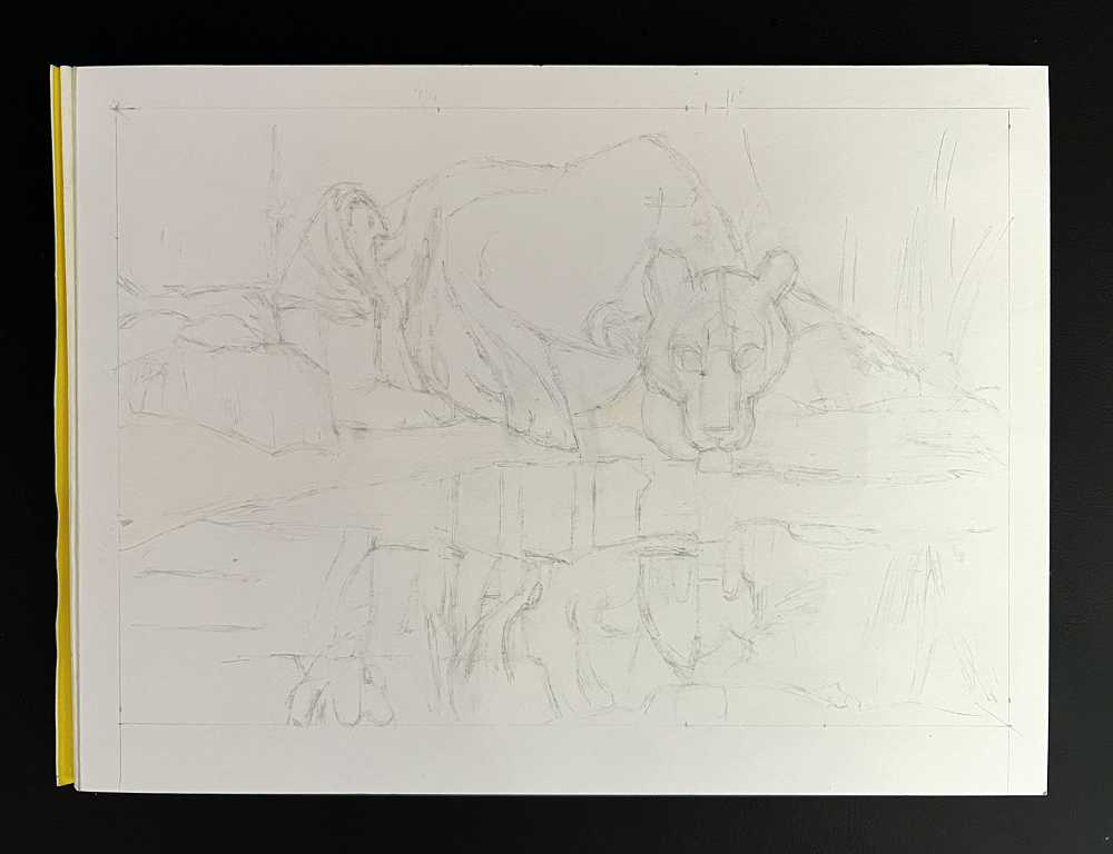
Blocking in the initial colours
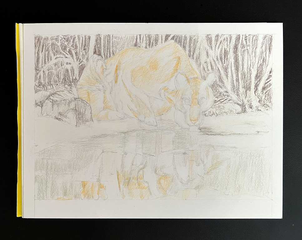
I began with a very light application of a pale cream colour, leaving the paper white for any obvious highlights. I put a bit more detail in the background than I originally intended. It was fun practising my negative colouring skills, to fill in the background behind the tree trunks.
Rethinking the colour
When I chose the reference photo, I noticed that it was predominantly brown in colour. I wasn’t sure I really liked this, but pressed on for a while. I wondered if I could do something to add a bit of contrast. Then I watched a very interesting video about the use of colour in watercolours. The artist emphasised the colour of the focal point, and then used the complimentary colour for the background. She pushed it back with the addition of some greys. This made the main subject positively glow!
I hadn’t done too many layers on the background, so I went back in with some purple, magenta and pink colours, working over the brown. To start with, I thought it all looked a bit too purple, and toned it down with some grey. I shaded the tree trunks with the same colours. You can see that I have also begun mapping out the stripes on the tiger, and adding a bit more colour. This is giving him more dimension.
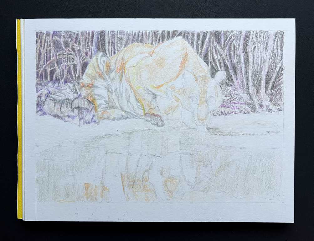
The paper seems to have changed colour in this photo – something to do with the time of day and lighting, I think!
Tiger stripes
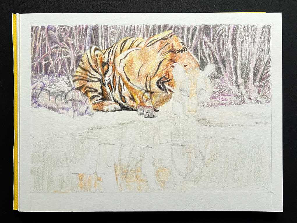
There are a lot of subtle variations in colour on the tiger’s coat, involving many layers lightly applied and blended. The work was very time-consuming, but also very satisfying.
Working on the head
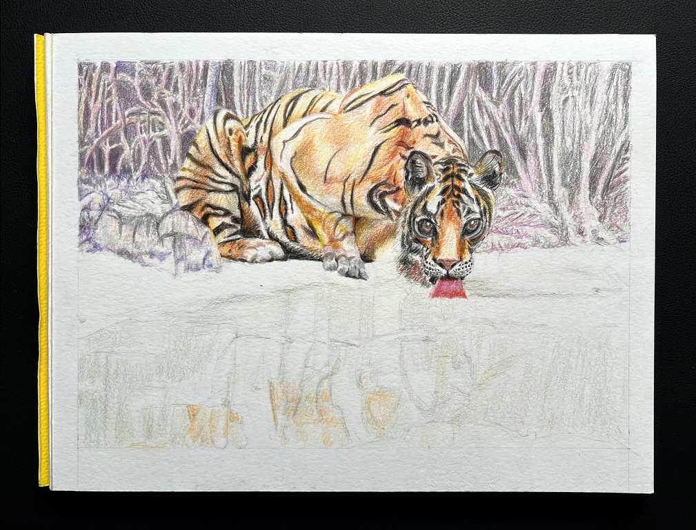
I didn’t get the proportions of the head exactly right according to the reference photo, but it looked OK. After I’d finished, I noticed that I’d spoilt the eye on the right as well, and put this right the next day. This completed the tiger.
Beginning work on the reflections
I knew from the outset that this would be the most challenging part of the drawing, and I wasn’t wrong! I struggled to get all the elements of the reflection in the right place, and spent several hours on it. Eventually I was happy enough with the layout, that I could proceed with the colouring.
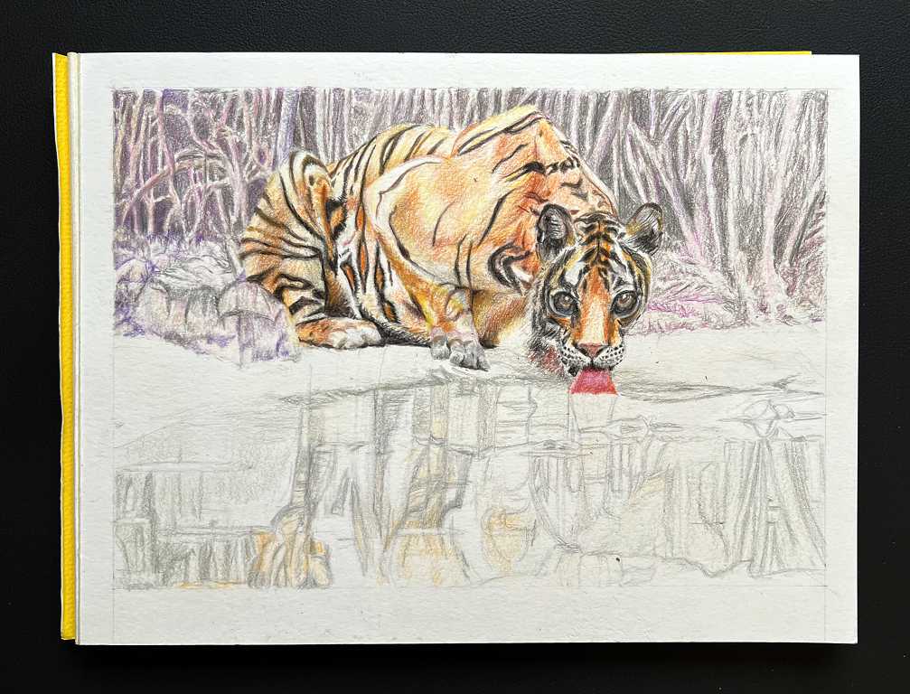
Even at this stage it was starting to look like water, which was very satisfying! You can see that I also fixed the tiger’s eye and both eyes were now the same size, and the face was more symmetrical.
Completing the tiger reflections and darkening the background
I did a little more work on the tiger. I darkened the neck slightly, and tidied up the left side of the face. I also added more colour to the trees and darkened the background.
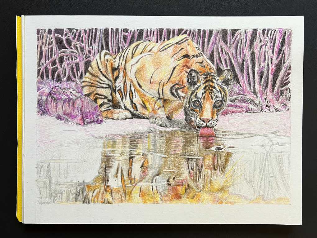
The reflections were coming on quite nicely by this stage.
The completed drawing
To complete the drawing, I darkened the background some more to make the tiger stand out. I completed the reflections, and the final touch was to add highlights with a fine white acrylic marker. Here is the result.
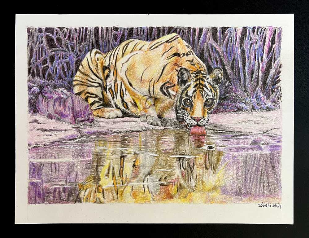
I am glad that I made the choice to change the background colour. The original photo was too uniformly brown. I think the complimentary colour adds contrast and takes the drawing to a different level, because it is unexpected.
This tiger is on the alert, ever-watchful as he drinks. Cropping the picture right down emphasises his intense gaze, putting the viewer right in his line of sight.
