DOMESTIKA COURSE – ENGLISH CALLIGRAPHY – CREATE AN INVITATION
At the beginning of this year, when I started a series of Domestika courses, I decided that I would attempt to complete one course per month. So far I have managed this, but with this course the end of the month came and went, and I had not finished it. This particular course has quite a few modules, and I have needed a lot of practice along the way, and it all takes a considerable time. I’ve now decided not to try and complete a course per month and then move on, because I need time to consolidate what I’ve learnt, and have fun making more projects.
Final project?
I am not sure whether this should be considered the “final project” as we have another module to go, which involves writing on dark paper. However, there doesn’t seem to be a project to complete apart from this one, but I may be mistaken in this.
Anyway, the challenge is to create an imaginary invitation, putting into practice everything we have learnt about writing the letters and thinking about the composition. I wondered what kind of invitation to write, and decided that it should be an invitation that I would be very happy to receive myself. There now follows a little explanation for my choice of subject for this project, in case anyone hasn’t a clue what I’m talking about!
The ultimate invitation
The ultimate invitation anyone can receive is to be taken up into heaven to be with the Lord Jesus Christ. This event is known as the Rapture of the Church, and it will occur immediately prior to the great Tribulation period of seven years, when the wrath and judgement of God will be poured out on the whole earth, on all those who have rejected His one way of salvation – faith in Jesus, who paid the price of our sin, the death penalty, by dying on the cross as a substitutionary sacrifice. The true Church, which the Bible refers to as the Body of Christ, cannot therefore be subjected to judgement because we have accepted that this has already been put on Jesus in our place, so we must be removed before it begins. We can all agree, I think, that the world is becoming more and more unstable, and those of us who study the Scriptures can see that it is all falling into line with what was prophesied thousands of years ago in the Bible. It is clear that we are rapidly approaching the denouement of this current age.
To accept this invitation, one must have already repented of one’s sin (turned from it), and received Jesus as Lord and Saviour, believing in His saving death and resurrection. Many current unbelievers will come to faith after the Rapture, but it will carry heavy penalties, and they will have to endure the worst conditions the world has ever known, so it is much, much better to make the decision to follow Jesus now, while it is still easy, and escape the wrath to come.
Inspiration for the design
In the course, the teacher recommended some calligraphers she admires, for inspiration and to broaden our knowledge. One of these is the Irish calligrapher Denis Brown, who has completely blown me away with his outstanding and very unusual work.
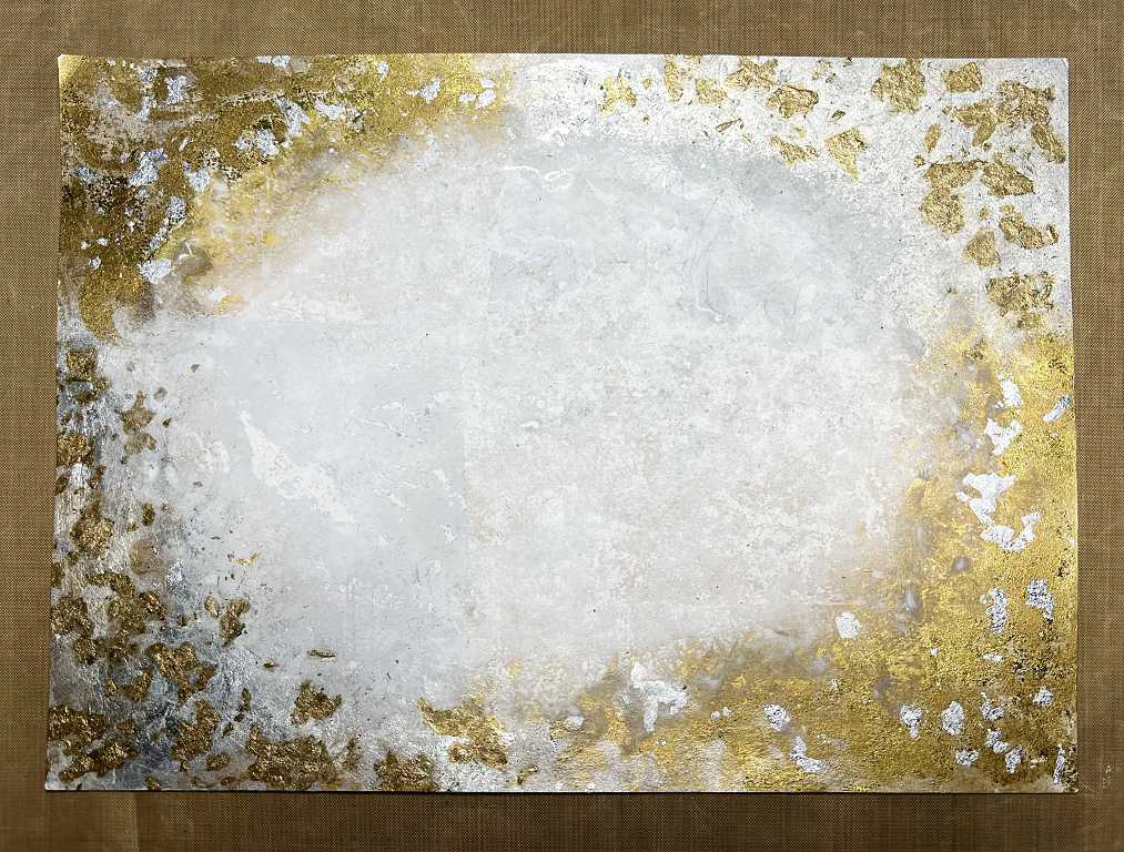
One of his favoured techniques is to prepare the substrate with gilding and ink spatters and diluted gesso. This is so beautiful, catching the light and adding depth and richness to the work. I have already made a post showing how I created my version of this background. I was concerned about the gold gilding flakes reacting with the other media and turning dark, and once I removed the piece from being flattened under a pile of heavy books, I could see that I would have to do something about this, as they had turned almost black.
I painted over them all with Golden iridescent bronze fine fluid acrylic, but they were still a darker gold than I wanted. When they were dry, I added another coat of a lighter gold acrylic paint. I was happy at this point.
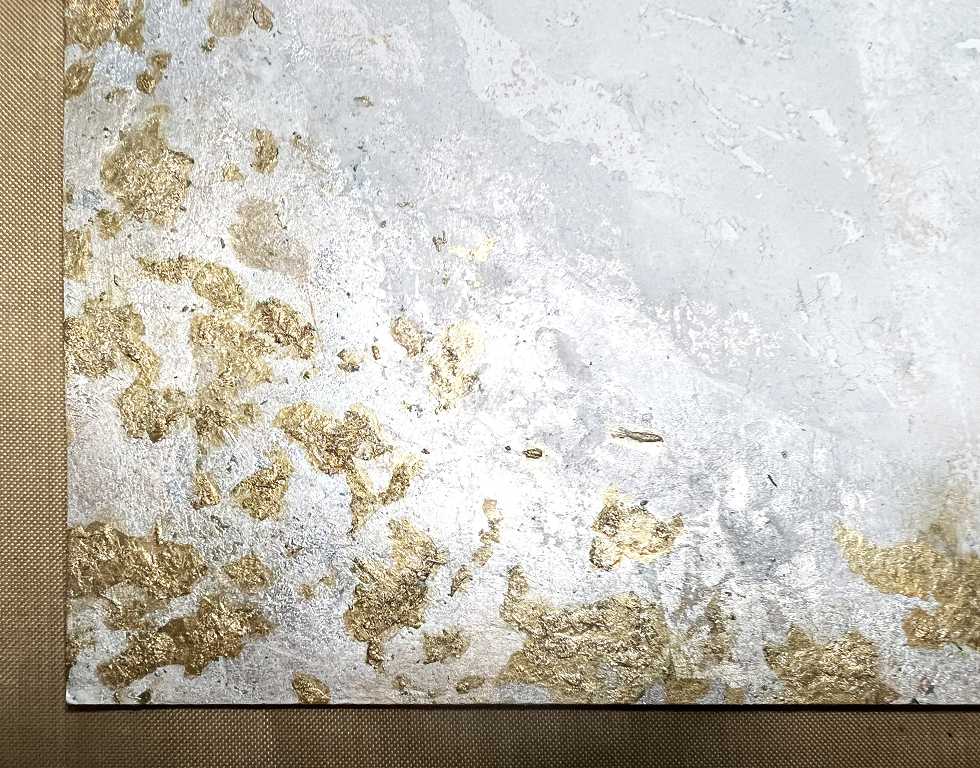
Here is a detail shot of the gold gilding flakes after I’d applied the paint. This is the effect I was after. It is odd that the silver gilding flakes were not affected.
Drafting the script
As I begin to work on specific calligraphy pieces, the layout and composition is the most challenging part, and requires the most time. I find my light panel to be invaluable when it comes to laying out the design. For this project, I used both sizes of grid provided by the teacher. When the final draft was complete, I used this to trace from, as we did with the Hebrew calligraphy course. This way I could be sure that the lines were correctly centred. There is always the problem of clashing descenders and ascenders and this can be dealt with at the pencil drafting stage by manipulting the spacing without compromising the letter forms unduly.
Transferring the design to the actual background, I had to use the traditional tracing method, because the light from the light panel wouldn’t pass through the gesso and gilding. Scribbling on the back of the draft with a soft pencil, I was able to transfer the lettering with ease onto the gesso backround and it came out very nice and clear.
My new calligraphy pen
I have done a post about this flex nib fountain pen, and was keen to use it on this project. There was a bit of a delay in getting started, as the pen took a while to arrive from the USA. In the meantime I continued with my studio tidying.

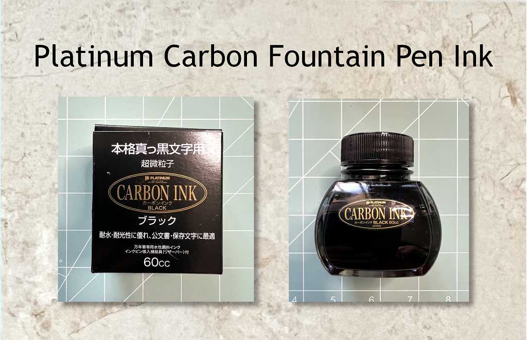
The fountain pen ink
The calligraphy
The moment of truth! I was so looking forward to taking advantage of this ultra-flex nib and getting my “thicks and thins” with it, but unfortunately, every time I applied any pressure with the pen, the nib dug into the gesso background and threatened to lift it. I don’t think Denis Brown has this problem because he does broad nib calligraphy which doesn’t require any variation in pressure. I therefore had to apply light pressure, resulting in a thin line, and then go back over it and fill in the thicks and thins. This didn’t result in as natural and flowing effect as it would have done, had I been able to use the pen properly, but it’s not too bad.
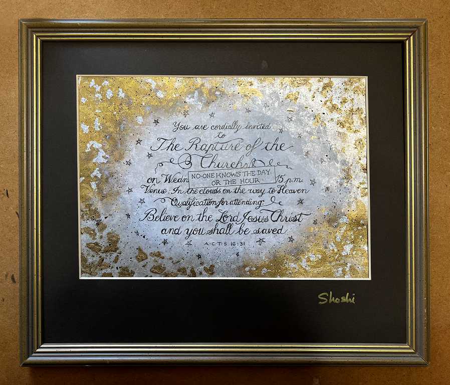
The finished project
I found the frame, complete with mount, in my stash, and was delighted to find that it fitted my project exactly.
Some detail shots.
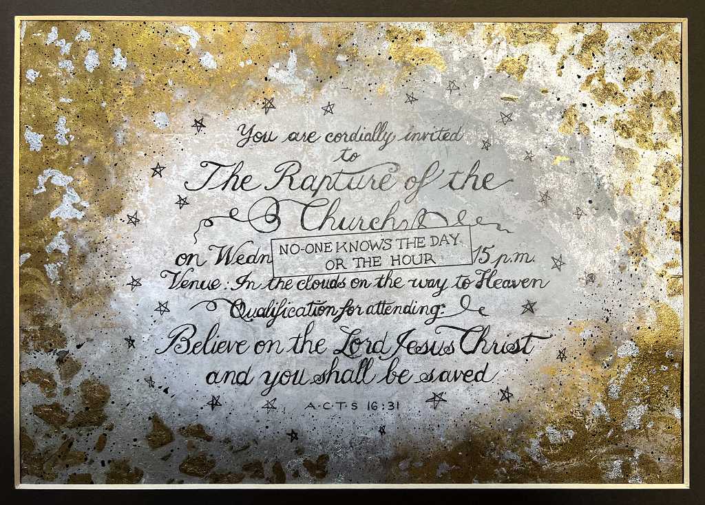
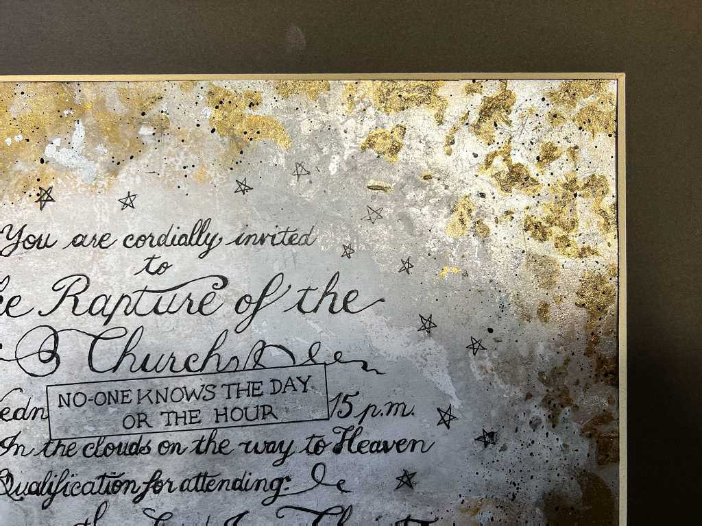
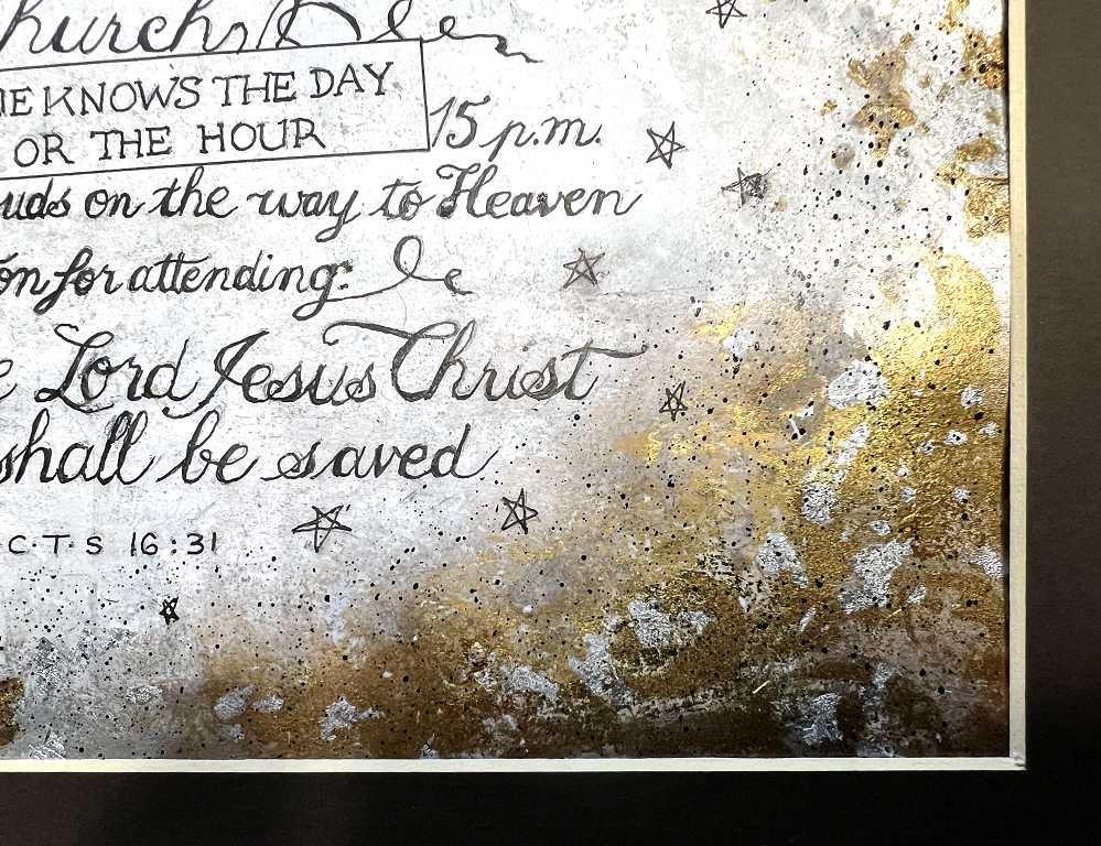
The addition of the little stars ties the calligraphy well into the background. I also added some black ink spatters to the background, masking off the centre with the oval cut from the original sheet of printer paper.
The project in situ
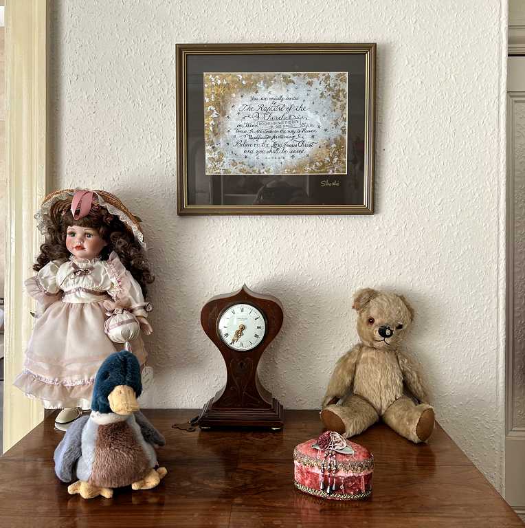
On the whole I am quite pleased with how this project turned out. I realise I need more practice. To get to the level of the course teacher will probably take many years! There are so many projects that I would now like to attempt, with beautiful words to beautify further with calligraphy.