JUNK JOURNAL – MAKE A JOYFUL NOISE PART 8
Beginning work on the cat page
The subject for this page just happened and wasn’t planned. It came about because I see art potential in the most unlikely places.
Food packaging for art
In a recent grocery delivery I had a multi-pack of baked beans.
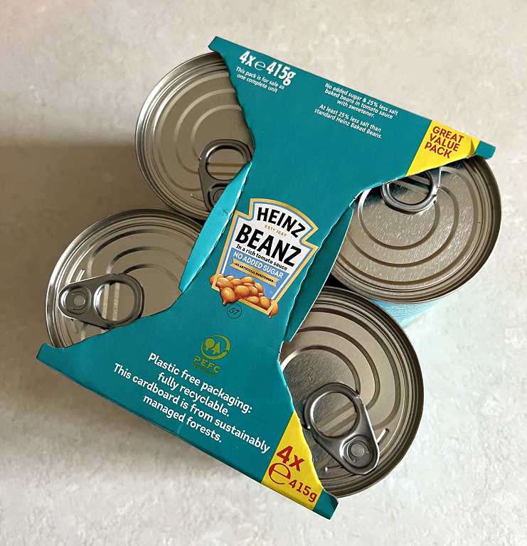
Someone on the Heinz Beans team is extremely clever. They have devised this packaging to hold four quite heavy tins, with no glue or staples. The tins do not fall out, and in fact without cutting the packaging, they are really difficult to extract. It is all done with clever cuts and folds, and the piece at the top with its curved score lines, provides a handle for lifting the pack.
I examined another four-tin pack that I had delivered at the same time – of tinned tomatoes. This was a more basic packaging and was glued at the bottom, and a lot less interesting. I believe there are people who make a living designing 3-D packaging like this, for regular food and for Easter eggs and things. A lot of this packaging is extremely clever and it’s always fascinated me – like pop-up books – designers thinking in 3-D! How many people, I wonder, simply rip off this clever packaging and throw it away without a second thought. It must be pretty demoralising for the designers after all their hard work, but I suppose they recognise that their products are purely functional and ultimately ephemeral. I recognise them, at least, and greatly admire their skill! In this poject, I pay them tribute.
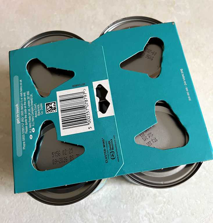
This is the underside of the beans packaging. The black bow-tie shaped piece is actually a partially cut and folded tab which holds the packaging together at the bottom. There is no glue. The holes under each tin have folded back pieces inside, which catch on the bottom edges of the tins to stop them falling out.
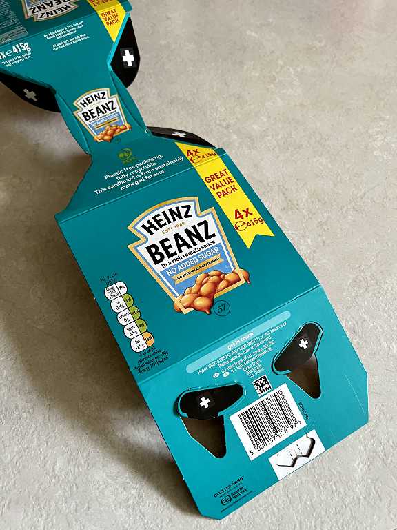
Here is the packaging removed and mostly flattened out.
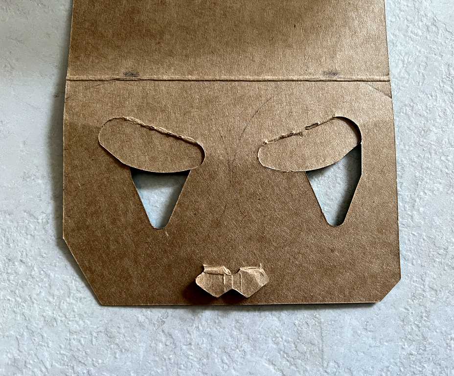
Looking at the bottom of the piece in this picture, I couldn’t help thinking that it looked a bit like a cat’s face with the eyes and mouth. Could I make art out of this? (This is my constant question when I spot something interesting!!)
The unprinted back of the card makes this a bit clearer.
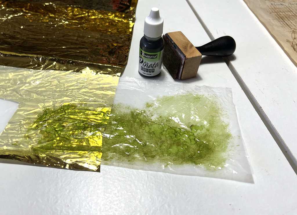
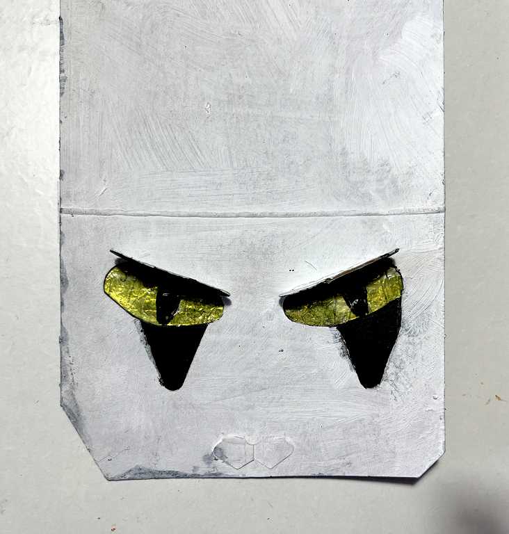
I decided to leave the oval flaps and turn them into eyelids, and make some nice shiny eyes to show through underneath. I took some of the crinkly gold foil that I’m using elsewhere in the album, and also some cereal box liner. I painted the cereal box liner with some green alcohol ink and laid it on top of the gold foil to see how it would look.
In the meantime I had painted the packaging piece with gesso – white on one side and black on the other. I cut a strip of the gold foil and painted cereal box liner and taped them onto the back across the holes. This shiny stuff doesn’t take glue very well. I added the black pupils with a Posca pen. This tended to scrape off so once it was dry I painted the eyes with some soft gloss acrylic gel medium to stabilise it. I taped another piece of black card across the openings under the eyes.
I cut two triangle shapes above the fold line to form the ears, and added some fur detailing with a mixture of Black Soot Distress Ink, a grey Tombow Dual Brush Marker and an 8B graphite pencil. I also trimmed one of the angled edges at the bottom so that the two sides were symmetrical.
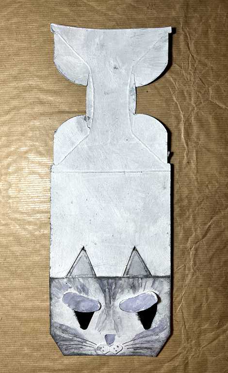
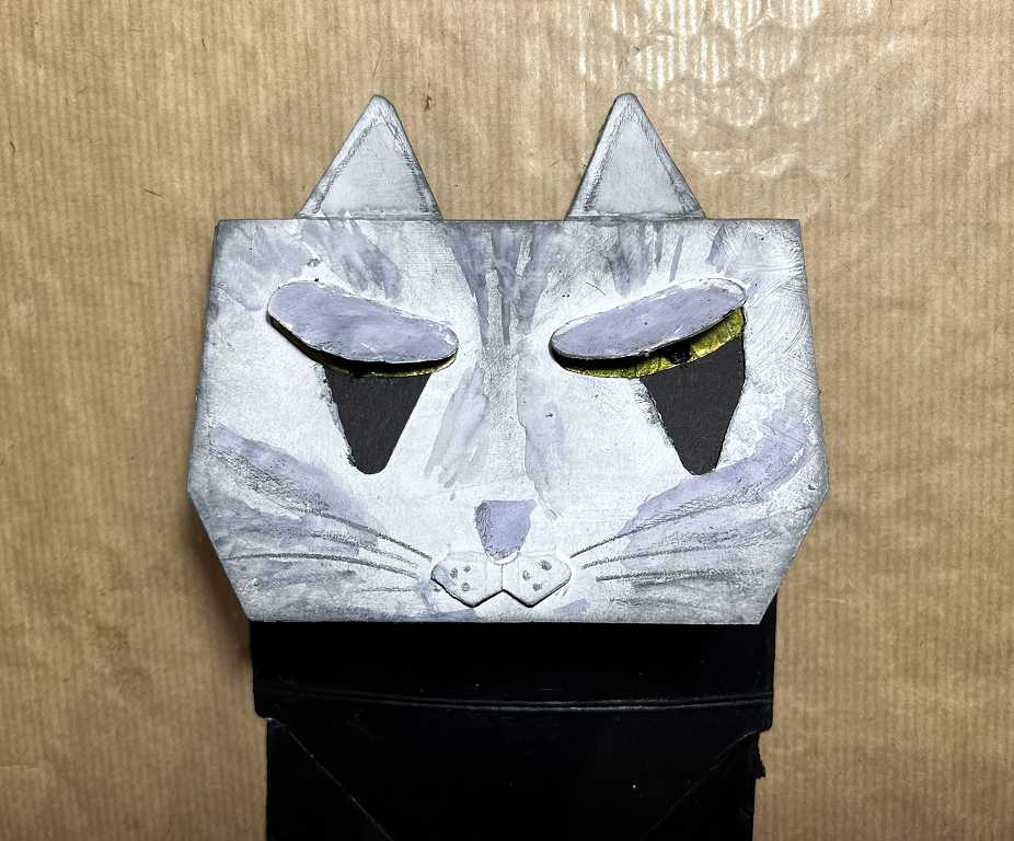
When the card is folded down, the ears project above the fold. Here is the face with the eyes closed.
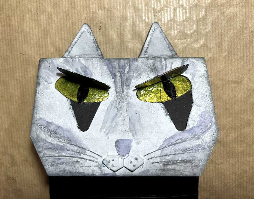
Here it is with the eyes open.
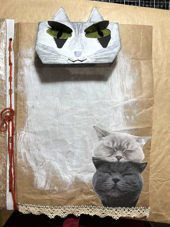
Tuck spot
I’d painted the centre of the brown paper page with some white acrylic paint. I added an image of two cat faces cut from a greetings card and glued this down to form a tuck spot at the bottom corner. I also machine-stitched some lace along the bottom of the page. With the weight of the embellishments, this brown paper was proving a bit flimsy and I thought some edgings might strengthen it a bit.
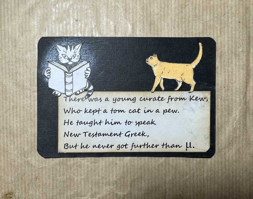
Cat Limmerick
I printed out one of my favourite Limmericks about cats, and glued this onto a scrap of black card along with a cat cut from another greetings card, and a little drawing I did of a cat reading. To make this stand out, I rubbed some white gilding wax onto the card before sticking the drawing down.
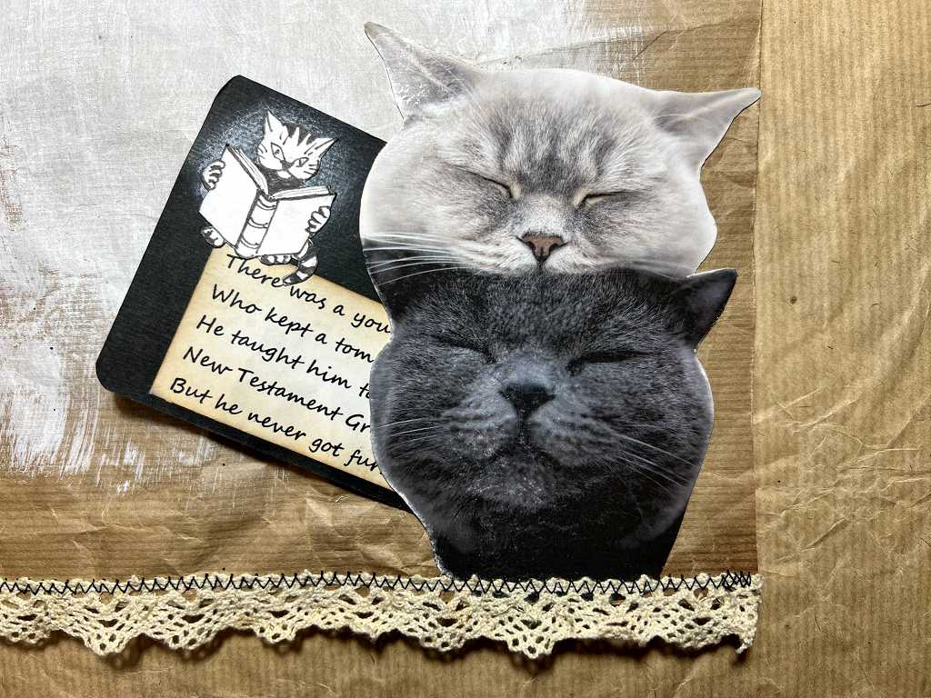
The cat poem in the tuck spot.
Frottage cat
After making my frottage sampler sheet, I selected a couple of grey painted envelope liners. I added a litle Hickory Smoke Distress Ink onto one to darken it a bit.
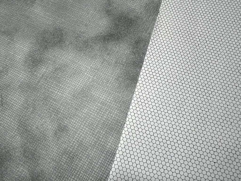
I added some frottage with various bits of metal mesh, pierced medication leaflet and drywall tape, using the black ArtGraf Tailor Shape block. This was very messy and needed fixing once it was done.
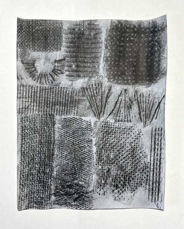
I drew a rough cat shape on a piece of scrap paper and proceeded to tear up the frottage pieces and glue them down. This idea was inspired by the work of the German Dada artist Max Ernst who popularised frottage in Western art in the early 20th century. I attempted to follow the contours of the cat. The whiskers, from the fan-shaped frottage pieces, were a bit fierce even after cutting them down a bit! There is a gap on the right to fit around the tuck spot piece. I should have made the frottage cat first but didn’t think of it. The facial features were added with some acrylic markers and I also used a black acrylic marker and an 8B graphite pencil to add some shading, to produce a bit of contrast on the cat’s body, to bring out the paws and tail.
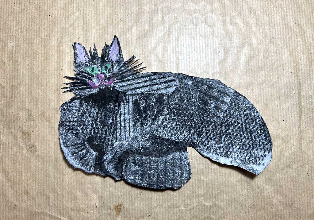
This cat will go in the centre of the page with other elements on top. At the moment I think it looks a bit too dark so I may overlay it with some sort of translucent material.
A charm for the deer page
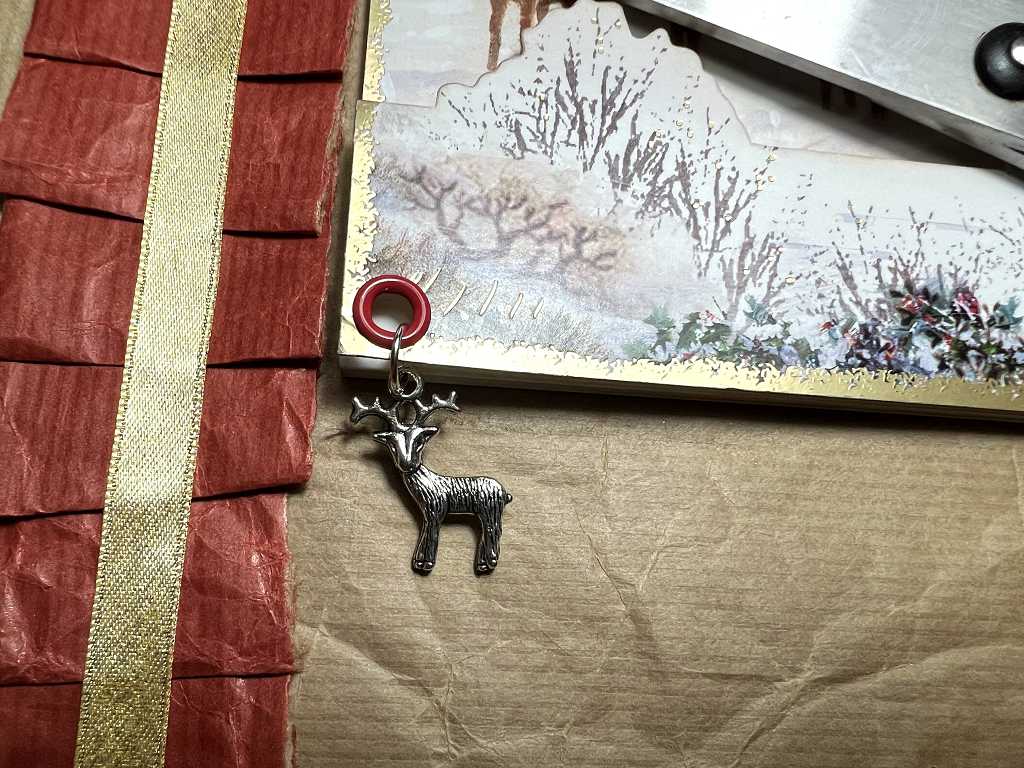
While rummaging through my charms stash for some cat charms, I came across a little deer charm. This simply had to be added to the deer page! I added a red eyelet to the corner of the 3-D greetings card, to tone with the paper ruffle, and attached the charm with a jump ring.
More on the cat page in a future post. Still quite a bit of work to do.