JUNK JOURNAL – MAKE A JOYFUL NOISE PART 11
Red Sounds page – 6 different sounds!
This is the other side of the cat page, and the final page of the folio made from the packaging paper which is red on one side and brown on the other. It features the bulk of the baked beans packaging, folded over the top of the page, and it incorporates quite a few interesting sounds.
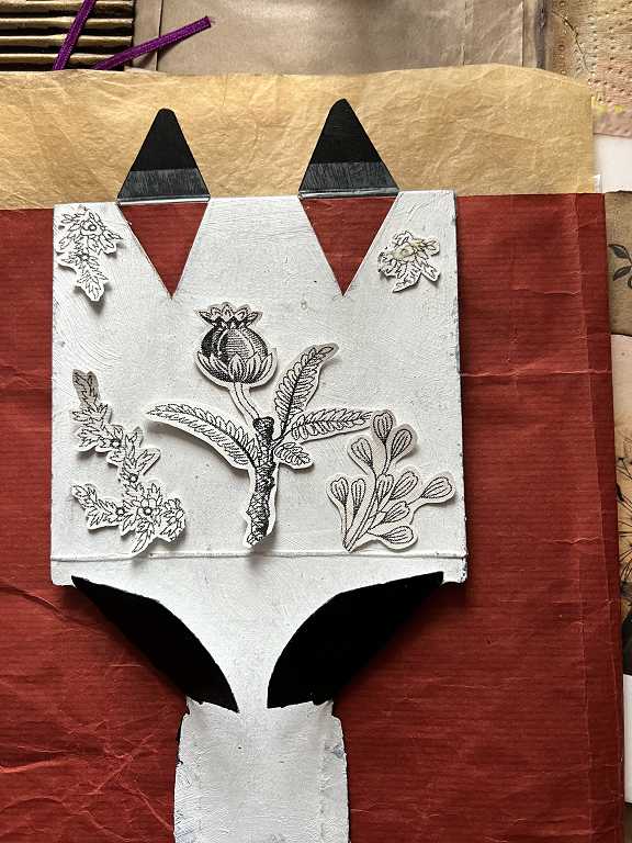
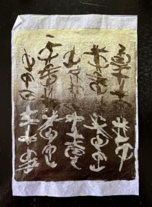
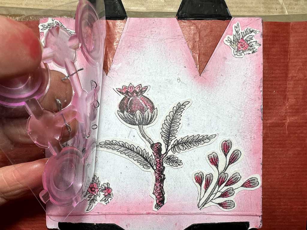
I have quite a collection of pretty gift and clothing carrier bags and pulled one out the other day in order to carry something, only to discover that it was badly damaged and ripped down one side. This bag was made of thick white paper with black floral drawings all over it, with the brand name of the shop in a green rectangle on the front and back of the bag. Taking it apart, I was able to cut it up so that quite a few of the floral images were usable, although unfortunately many were not, because they were cut off by the edges of the bag and the shop logo. In the above picture you can see a mock-up of my planned layout for several of the floral images which I fussy-cut from the pieces I managed to rescue from the bag. I took this photo so that I would remember where to place the elements once I’d coloured them.
The completed layout
This is fairly complex so I shall break it down as much as possible.
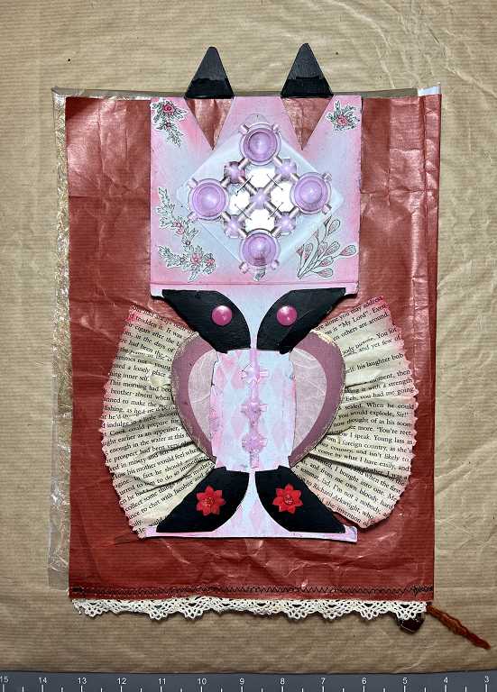
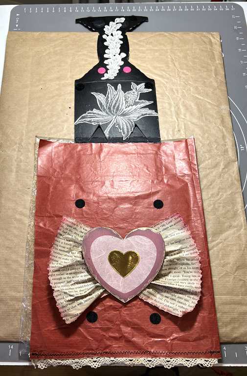
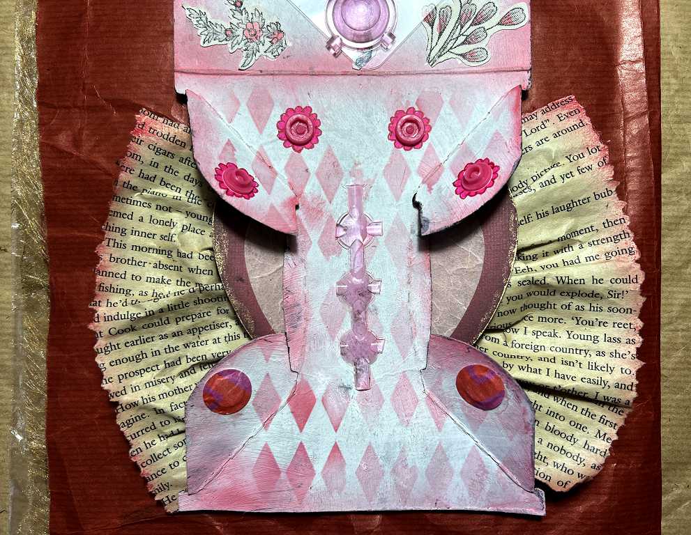
Working from the top down, you can see the backs of the cat’s ears projecting above the top of the page. Underneath you can see the holes left when I cut the ear shapes, exposing the red page background. The remaining baked beans packaging is in two parts with a fold in the middle. I had previously painted the top surface of this with white acrylic paint, and the underside with black. I inked the edges of the white upper side with Festive Berries Distress Ink, and added some Harlequin stencilling to the bottom half with the same ink and a blending brush.
Slapping acetate and suction pops
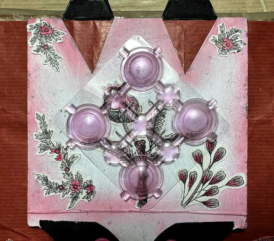
I have coloured the floral images to embellish the top part of this, and glued them into place.
The element topping this is great fun. When I was doing a lot of work on my gel plate a couple of years ago, I bought a cheap plastic bath mat from Ebay to create the most gorgeous texture with its suction pads:
I had cut the bath mat down so that I had a manageable sized piece for printing on A4, and there were quite a few offcuts left over. I took one of these and cut it down so that there were four suction pads, and stapled this onto a small square of the stiffest acetate I could find in my acetate scrap box. Staples are the best fixing for this as any plastic stuff is very difficult to glue down, and I also needed the bath mat scrap to be attached in the centre only.
I stapled one corner of the acetate to the baked beans packaging. In the next photo you can see it being peeled back to expose the floral image underneath. (Note Shoshi’s inky fingers. Occupational hazzard.)
The idea is to peel it back and release it, and it makes a slapping sound as the acetate hits the page. Sound #1.
It was the bath mat that determined the main colour scheme of this page – pink, co-ordinating with the dark red of the page background.
If you press down on the domed suction pads of the bath mat scrap, they will stay stuck down on the acetate for a short while. You can pull them off by lifting the edges of the bath mat scrap and they make a nice little popping sound. Sound #2.
I like the appearance of this element, quite apart from the sound it makes. It makes a nice diamond-shaped 3-D feature, partially obscuring the floral image underneath. When I bought the bath mat I absolutely hated the crude transparent pink and would never use such a thing in my bathroom. For gel printing it doesn’t matter what colour it is, and anyway the piece is now quite stained from the acrylic paint I’ve used with it. However, its appearance for this project is perfect, and anyway it’s only a small fragment. I don’t think anyone would know it was part of a bath mat! (I’ve experienced this with other materials too. I have been given a lot of fabric trims over the years and have some that I consider to be pretty horrible, but used in the right context, they become beautiful! Motto: never throw ANYTHING away, even if you don’t like it.) (Note to self: Shoshi needs to get the builders back to install a reinforced floor to her studio.)
The bottom part of the page
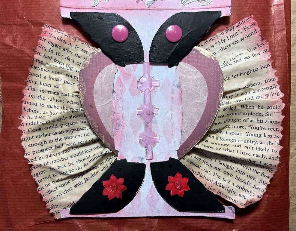
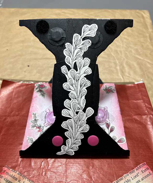
I had tremendous fun with this. This is the part of the packaging which was folded underneath the four tins of beans. I cut off the part below this. That part was pretty much a duplicate of the cat face but the little tab part which clipped into the cat’s mouth was a different shape. The four black painted flaps (folded up, exposing the black-painted reverse of the piece) were made to fit underneath the tins, catching on the raised edge of each tin, to stop them falling out of the packaging. They were already scored and folded, so I decided to make a feature of this.
The central part, where you can see the Harlequin stencilling, has curved score lines on it. I glued down an offcut from the bath mat for a bit of added texture. This part was the handle on top of the beans packaging. It made this element on my page very narrow, exposing too much of the red background paper. My original thought was to make it a belly band with something to slide underneath, but since I wanted this to hinge upwards, I decided to glue something down onto the page, which would be fully exposed when this flap was lifted up.
Heart element
The next photo shows the page with the whole of the beans packaging part lifted up.
This is all a bit difficult to explain, and would be much easier to see in a video. This will be done when I make the flip-through video once the book is finished. Meanwhile I’ll continue to do my best.
I took two book pages from a trashy romantic paperback book I got in a charity shop which I use for art projects, and tore them to size using my deckle-tearing ruler (a DIY job – using a file to destroy the edge of a perfectly good plastic ruler!!). The pages are a bit flimsy and poor quality so I painted them with soft matte gel medium to reinforce them a bit after I had sprayed them with tea to age them. I inked the edges with the same Distress Ink used throughout. I laid two small lengths of double-sided tape down onto a piece of waxed paper and removed the backing. I ruffled the book pages to fit the double-sided tape and peeled it off the waxed paper. For security I added some tacky glue top and bottom, and pressed these ruffles onto the page background. They make a pleasant rustling sound when you run your fingers over them. Sound #3.
To cover the unsightly join, I found a couple of die-cut hearts in my die-cuts stash and glued these down. I edged the large one with some gilding wax. The textured tissue layer is perfect for the colour scheme. I didn’t have a gold heart for the centre, so I cut one with a die from the same set I used for the cat page, and glued it down with tacky glue, pressing it down well into the slightly concave centre.
The black spots you can see on the background are Velcro dots to hold the beans packaging flap in place. You know the sound Velcro makes! Sound #4. (Afterthought: to make these look more intentional, I think I might add some more black dots onto the background, using a Posca pen.)
The underside of the flap
This is the black-painted underside of the beans packaging. You can see the curved score lines of the handle. I have added some more of the floral elements from the damaged bag but this time I have not coloured them. At the very top of the flap in this photo you can just make out the two black Velcro dots, and there are two more at the top of the other part of the flap just below the fold. More about the other black and pink circles in a moment.
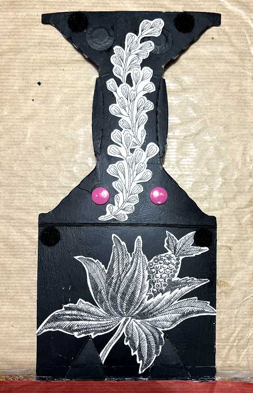
The next picture shows the top part of the flap held in place with its Velcro, and the bottom part of the flap folded back, giving a bit more detail. You can see its black Velcro dots at the top.
The top two small flaps
This photo shows the whole of the large flap back in place, secured with both sets of Velcro dots, and the four small flaps opened up. Here is the explanation for the other black circles and the pink ones on the underside.
The two top flaps are held closed with plastic snap fasteners. I bought these on Amazon and they arrived today – such a fun parcel!
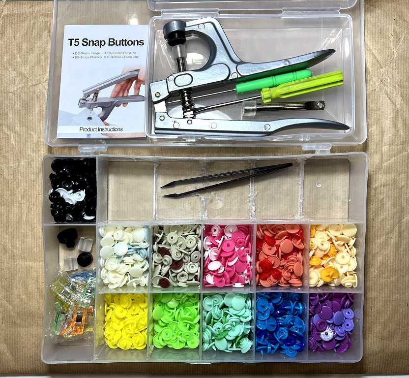
They provided a small sectioned box for all the snap fasteners but the compartments were much too small, so I used one of my embroidery thread storage boxes instead. This is the one I mentioned in a previous post where I had attempted to remove some of the divisions with my Dremel. A bit of a mess, but perfectly fine for this. The tool for attaching the snap fasteners came in its own box and unfortunately it’s too big to go in with the snaps.
I chose two pink ones and attached them to the upper two small flaps. They make a fantastic clicking sound when you close them! Sound #5. On the underside of the flaps I drew flower petals around them with fineliner marker pens to make them pretty.
The bottom two small flaps
I chose an alternative form of closure for these: magnets. These are glued on and covered with larger circles of thin card – black on the back of the main big flap, and red on the underside of the small flaps. These latter ones were cut from a bit of scrapbook paper in my scraps box.
When you close the flaps, they click shut with that satisfying magnet click – quite different from the snap fasteners. Sound #6.
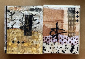
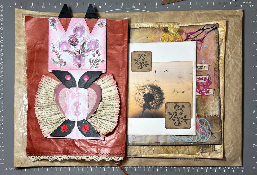
That about wraps it up for this page. Here is the mock-up of the page spread – not finalised yet, but the probable layout. I think the colour scheme works well with what follows.
I think this is one of the most fun pages so far. I really love this one and so enjoyed making it!