CATCHING UP WITH THE ONLINE ART COURSE; OTHER DRAWINGS, AND ART IN GENERAL
I’ve had a very busy time lately, and as a result getting pretty tired, which means I’ve been getting behind with drawing course.
Online Art Course – Module 3 – Ink Pens
Completing Project #1 – Six Small Sketches
This was six small sketches of eclectic objects, each with its own challenge. I was surprised at which ones proved more difficult; I thought the hammer would be easy, and it proved to be one of the more difficult ones! The bee and the glass jar looked well-nigh impossible at first glance, but they turned out to be fairly easy.
It’s all a question of learning really to look and observe, and breaking the drawing down into basic shapes, and adding the detail only at the end. This seems to be the formula for all the projects we have worked on so far, and it bears out what Phil, the teacher, has said at the beginning of the course, that if we follow through with each module, eventually we will be able to draw or paint anything we want, and in any medium we choose. This is a far better approach, in my opinion, than a course which concentrates on one medium only, such as watercolour painting. If one wants to pursue this and ultimately specialise in it, at least one will have all the basic drawing skills under one’s belt. Drawing is the basic skill on which everything else is built.
The final sketch of six small sketches – cloth
A lot of course members struggled with this but if one followed the instructions and broke it down into stages, it really wasn’t too bad.
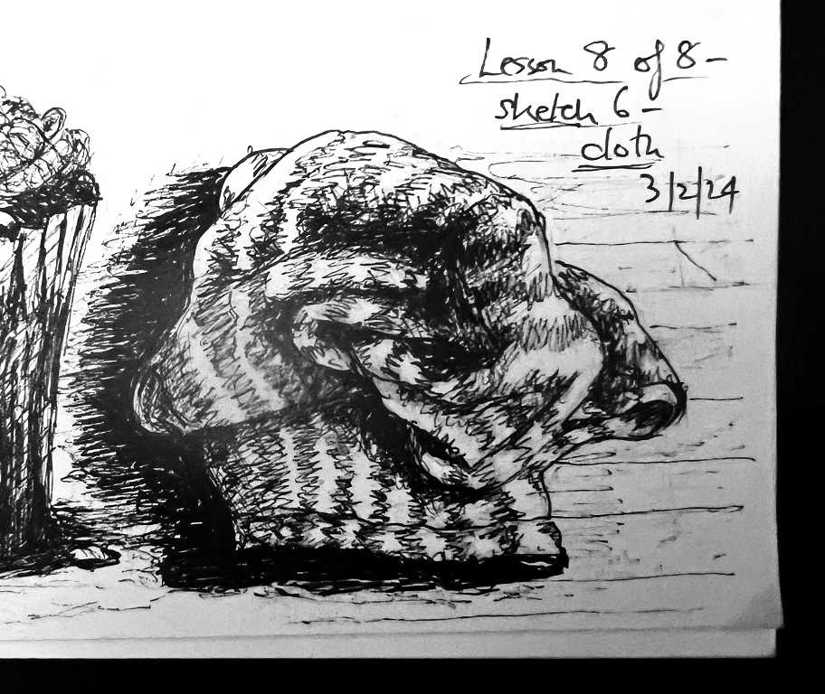
The stripes in this dishcloth really helped with the drawing as they provided a bit of an anchor, helping us not to get lost with all the complicated folds!
Here is my final page of the six small sketches. The re-done banana was done on a separate page. I did not manage to place these small drawings very well on the page, so some are too close together. As usual, it was the proportions and angles which I found the most difficult, and even though I drew a rough square or rectangle for each one, I found them straying beyond those bounds!
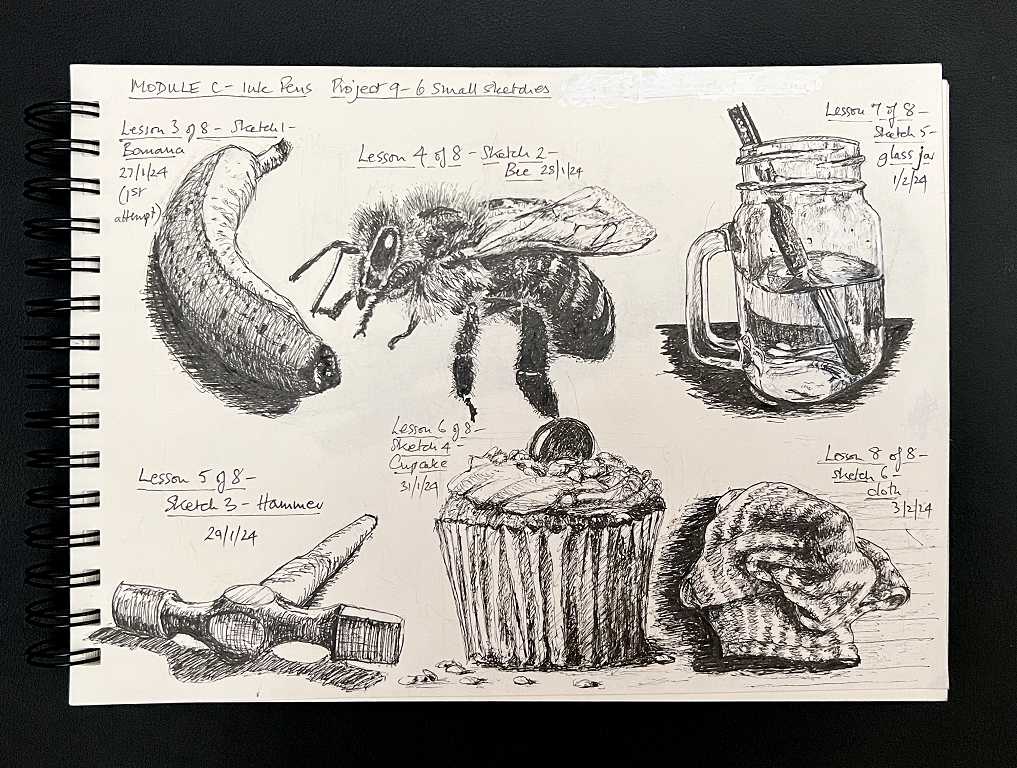
On the forum, one lady took the cupcake drawing and made several versions of it, adding pastel colours and turning them into greetings cards – they looked so attractive and appetising – and all completely calorie-free and healthy!
Project #2 – Old Car
To begin this more complex drawing, Phil led us through some watercolour exercises. The drawing was an ink drawing with added black watercolour. My hubby has been joining me in this module and was really looking forward to this stage, as his preferred medium is pen and wash.
Watercolour can be a very unforgiving and difficult medium, due to its translucency and uncontrollability until you master it. I’ve dabbled a bit in the past without too much success, and in the meantime I have sometimes used it for colouring designs of a more stylised and less “fine-art” style.
For this stage, we have abandoned our drawing sketchbooks and are using cold pressed watercolour paper. My hubby has given me a watercolour block – the pages are glued together around the edges and this really helps with the buckling problem you get when working with wet media.
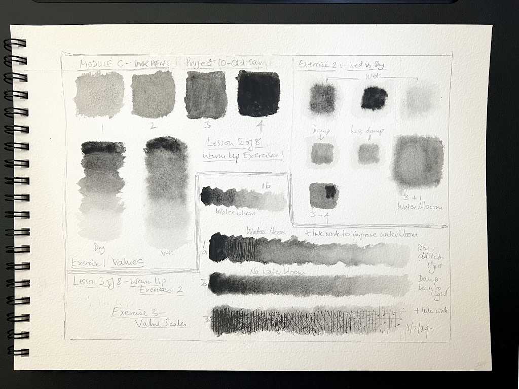
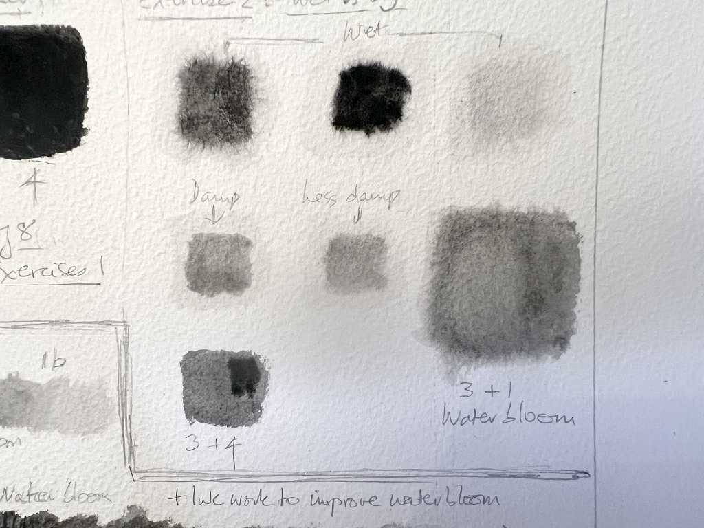
Warm up exercises
Phil took us through some interesting exercises, producing swatches varying the concentration of paint, and whether the paper was wet, damp or dry, which affects how the paint flows, and also why we should work from light to dark to avoid the “water bloom” that watercolourists seek to avoid. We did some test swatches to producd this effect deliberately, as it does have its place, and also to learn how to avoid it, but I was not able to produce the effect at all, and put it down to the paper I was using.
This is the full page I produced, followed by some more close-up images.
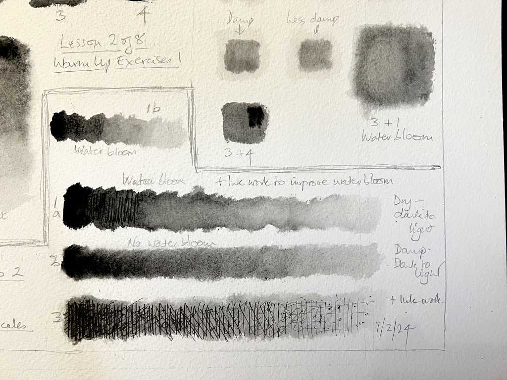
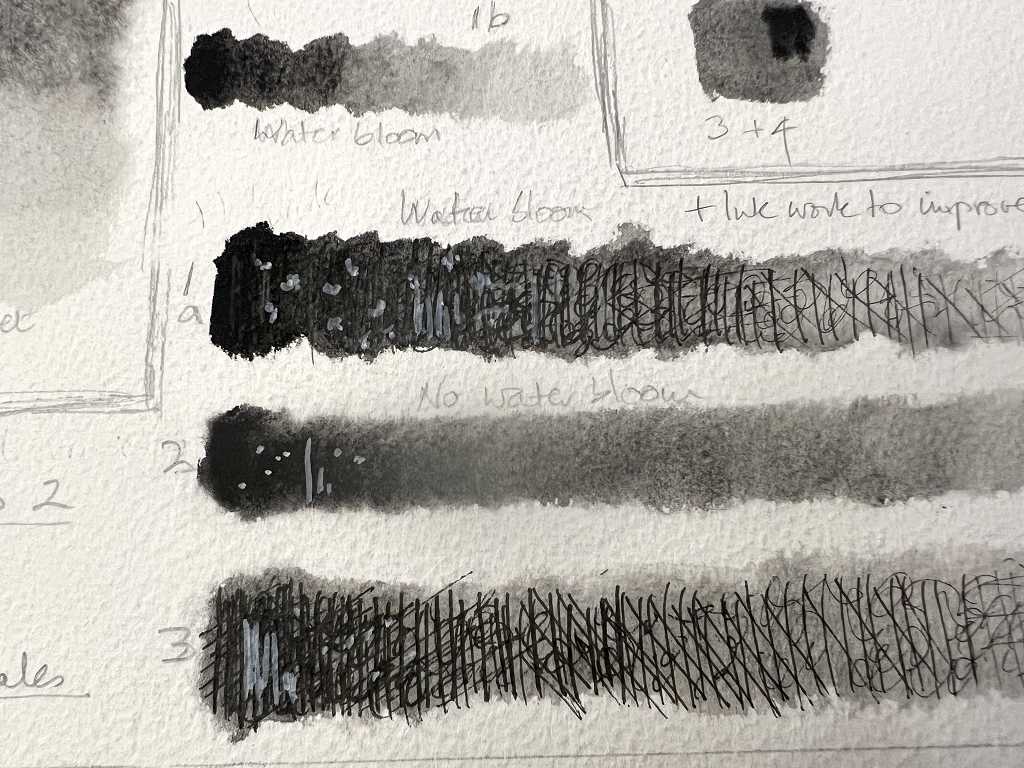
My hubby got some simply delicious examples of water bloom on his paper, and said these lovely bubbly shapes can be very useful when painting clouds.
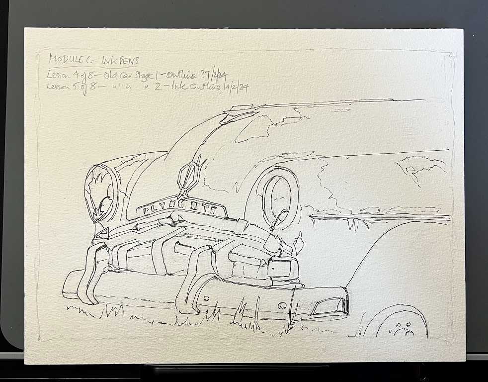
The old car
This is the project we were eagerly waiting to begin. The reference photo made me feel very sad, seeing such a beautiful old car in such a sorry state, rotting away. At one time this 1952 Plymouth would have been someone’s pride and joy, but death is inevitable, even for cars!
My hubby’s ink drawing produced a major problem later, because he had used water-soluble pens by mistake, but he managed to work around the problem admirably, and he produced a very good drawing. So fascinating to compare our efforts – his style is very different from mine!
So far we have worked through all the stages bar the final one, which is adding further ink work to the picture.
We began by making the outline drawing in pencil. I have discovered that I much prefer working with a harder pencil for this – 2H or above – I find the softer graphite pencils get blunt too quickly and they smudge a lot.
I had my usual problem with proportion. My initial drawing looked more or less OK to my eye, but when I used the proportional deviders on it, I discovered it was way out – a good thing I checked at that very early stage, or my whole drawing would have been “out.”
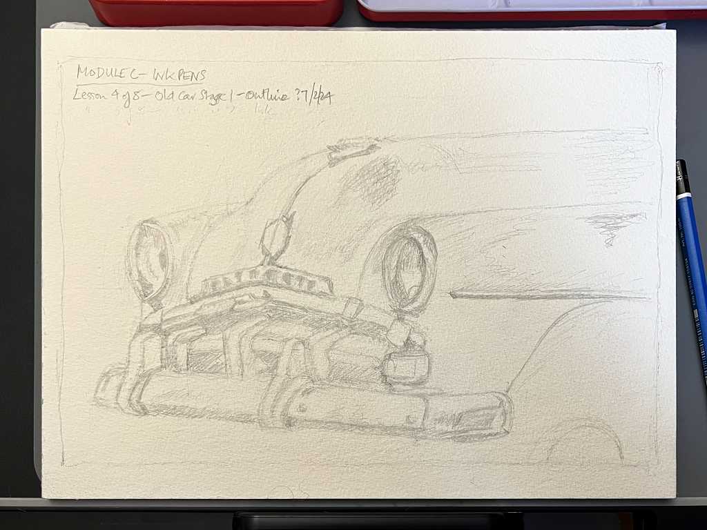
As usual we began with the basic shapes, and then added some detail. Adding darker values where appropriate with some shading helped keep on top of the detail, and all these pencil marks would eventally be erased away.
The next stage was to ink the outlines. As always, Phil instructed us not simply to slavishly trace what we’d already drawn, but to keep our eyes on the reference as much as possible, and correct any errors in the pencil drawing as we went.
To bring us up to date so far, the next stage was to add the black watercolour, putting what we’d learned in the exercises into practice as much as possible. It’s amazing the different values one can achieve with a single colour paint, according to how much water one adds. It’s quite a transformation at this stage, isn’t it.
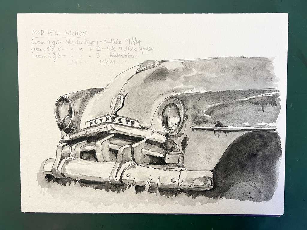
Phil added a lot of background as per the reference – another wrecked car behind, but I decided I would omit all this, as I wanted my poor old lady to stand alone without any competition! I may add some more foliage.
The final stage will be to add more ink work to bring out any further detail. This is proving a most interesting subject. I have been avidly watching Art Prof on YouTube and they had a livestream where two of their team members were drawing simultaneously (something they freqently do) and on this occasion the subject was old cars – from the reference photos it looked as if they had been taken at a vintage car rally. The cars were all in great condition, beautifully restored, unlike our poor old Plymouth. Makes you want to weep to look at it, doesn’t it! Anyway, there was a lot of discussion about the problems people have, drawing cars, with all the different shapes, curves, perspective etc. One person took a more linear, outline approach, while the other emphasised the blocks of different values, working with Tombow brush markers. I am following quite a few of their videos at the moment, using this medium, as I have a set of them and have never used them in a “fine art” way, so it’s very interesting. The artists at Art Prof really love these pens which have so much potential.
I have been doing some other drawing as well, to keep my hand in. Because of being so busy recently, many days have passed between the stages of the ink drawing projects, especially as we are doing it together so both have to be free at the same time, and it’s good to keep one’s hand in.
Following on from a previous blog post where I tried to alter a small storage box, I have now acquired two further ones, which have removable compartments in them, and I am now storing my art materials in those. They work very well.
Work in my Coptic bound sketchbook
This is one of a pair of new sketchbooks which I got on Amazon recently, on the recommendation of Martin Lachmair who I follow on YouTube. The paper isn’t great quality, but there’s a lot of it, and these books are ideal for trying stuff out and doing exercises etc.
When I get time to sit down and draw along on Art Prof, it’s a great chance to practice. Most of the time, however, I watch these videos while eating my breakfast, and I can’t draw then!
The other day, Prof Lieu, who heads up the team, was doing one of her timed sketches videos – drawing rapid gestural sketches in 2 minutes – she draws very fast, and it’s a very good discipline to prevent one getting bogged down with detail, and the drawings are highly dynamic. I’m not at that stage yet, but decided to take one of her references and do a graphite rendering of it.
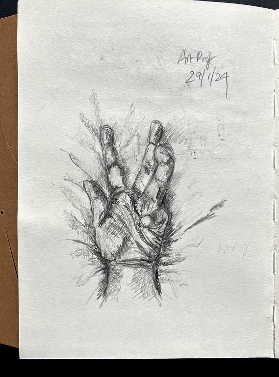
Interesting foreshortening in the little finger! All the reference photos she chose were of hands in extraordinary positions. I am currently working on one of my own – a screen grab from an interview on YouTube (non-art related) – the interviewee was speaking a lot with his hands, and this still picture showed a very expressive gesture, and I thought this would be an interesting subject. When I’ve finished it, I’ll upload it.
Art Prof Crit Clashes
A fun, and very informative, feature on Art Prof is their Crit Clash – a debate between two members, over the merits or otherwise of an artist or a particular work of art. In the spirit of all good debates, each person does not actually have to believe the point of view they are putting forward – all that is required is that they make a good case! On Art Prof, the livestream audience cast the vote for the winner. The first one I watched was on Bob Ross – was he a good artist or not, and is his work worthwhile? Poor Prof Lieu had the task of taking the “con” side and she later admitted that it was like tearing down the Easter Bunny!! The general concensus was that his work did have value because he opened up painting to the wider world and enabled absolutely anybody to be able to paint. OK, his work is pretty kitch and samey, and one contributor to the live chat said it was the sort of art one would expect to find in a dentist’s waiting room! For myself, I am grateful to Bob Ross because he got me painting back in the 90s. I moved on from this as I don’t like working in oil, but it was good fun and I learnt a lot.
The second subject was Gustav Klimt’s “The Kiss,” a famous and very hackneyd painting. I learnt a huge amount about this painting from watching this debate, and followed it up by watching further videos about the work of Klimt and his contemporaries. It’s funny that this particular painting is his most famous and ubiquitous work as it’s really not that good from many points of view, and most of his other work has more merit.
Sketchbook Skool
Another YouTube channel I’ve started following is Sketchbook Skool – he’s doing a series of shortish videos taking us through a basic drawing course and some of his exercises are really fun to do.
These were some exercises I did at the beginning of the month. The continuous contour exercise is interesting – you draw an object with a single line, not removing the pencil from the paper until you’ve finished. Good for hand-eye co-ordination and observation. The objects on the left were his subjects, and the box on the right is one of my new art storage boxes.
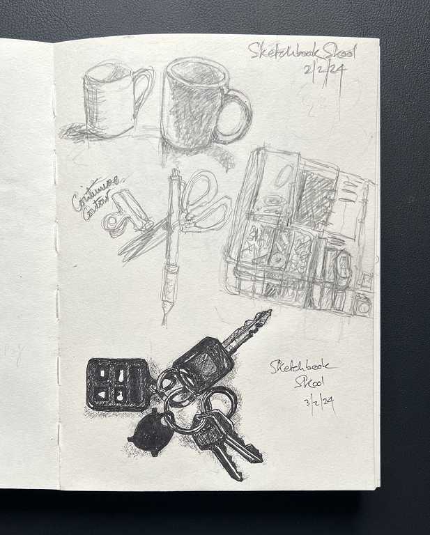
I did a more detailed drawing of his bunch of keys.
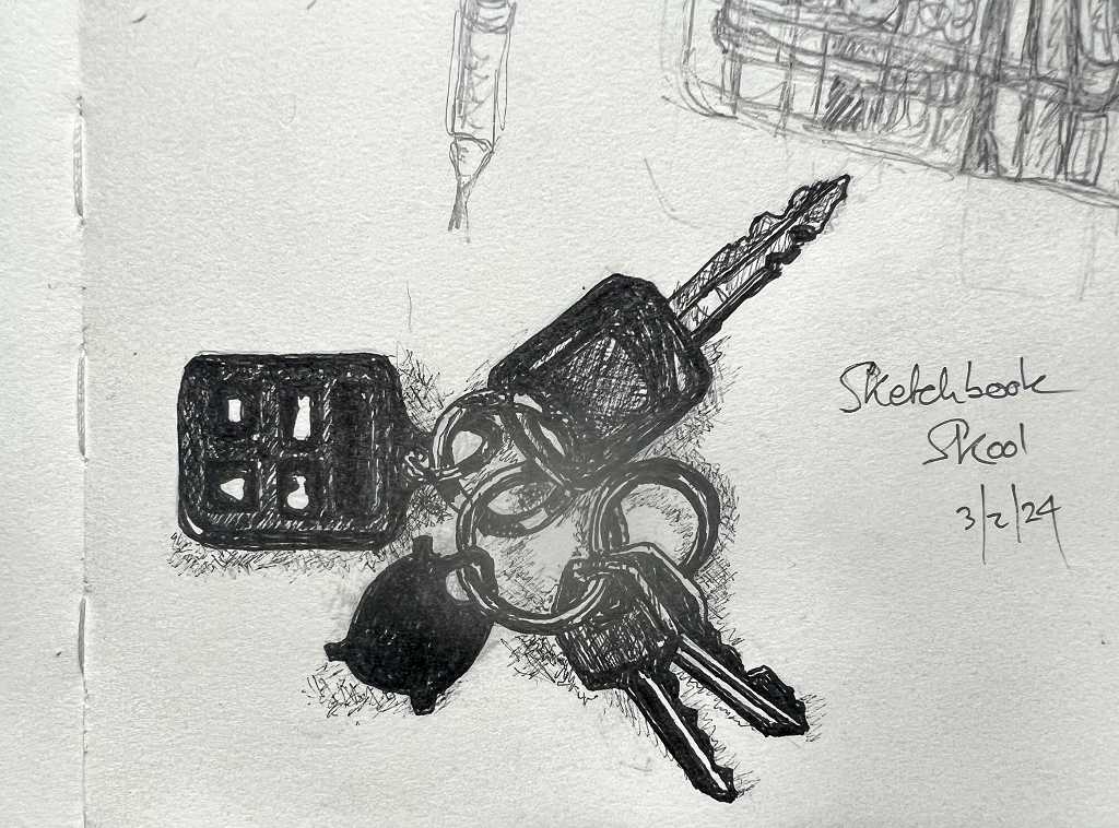
Graphite, followed by ink pen.
Blind Contours
Another exercise he encouraged us to do is something they were doing on Art Prof the other day – blind contour drawing! I’ve come across this before – it’s the weirdest idea and initially seems to be utterly senseless! You look at the reference (either a photo or real life) and keep looking at it while you draw it, never once looking at what you are actually drawing! Of course, the results are bizarre to say the least! Here are my first attempts at drawing the outline of our Art Deco style lamp.
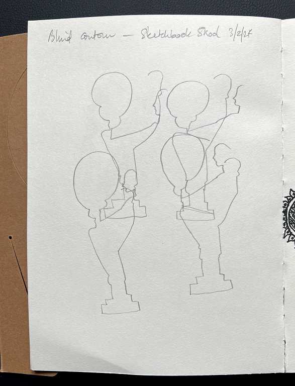
It’s interesting that in every single case, I squashed it horizontally.
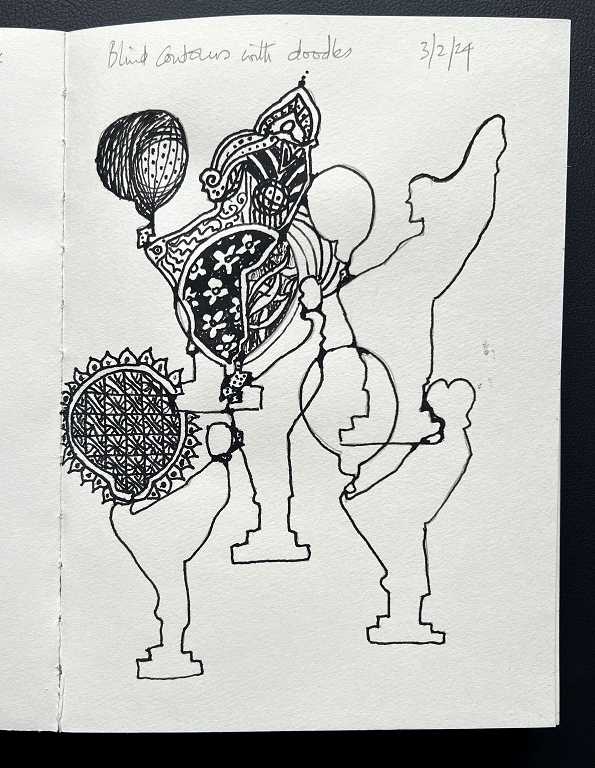
I made a second attempt on the next page, and suddenly the drawings seemed to improve! I liked the shapes, so I’ve started doodling in them. When it’s complete, I’ll upload it.
A portrait of Ruby
My hubby was out today, and I wanted to do some drawing this afternoon. I came into the sitting room to find Ruby sitting on the back of my hubby’s chair and she looked so adorable – I took a photo and decided to draw her portrait!
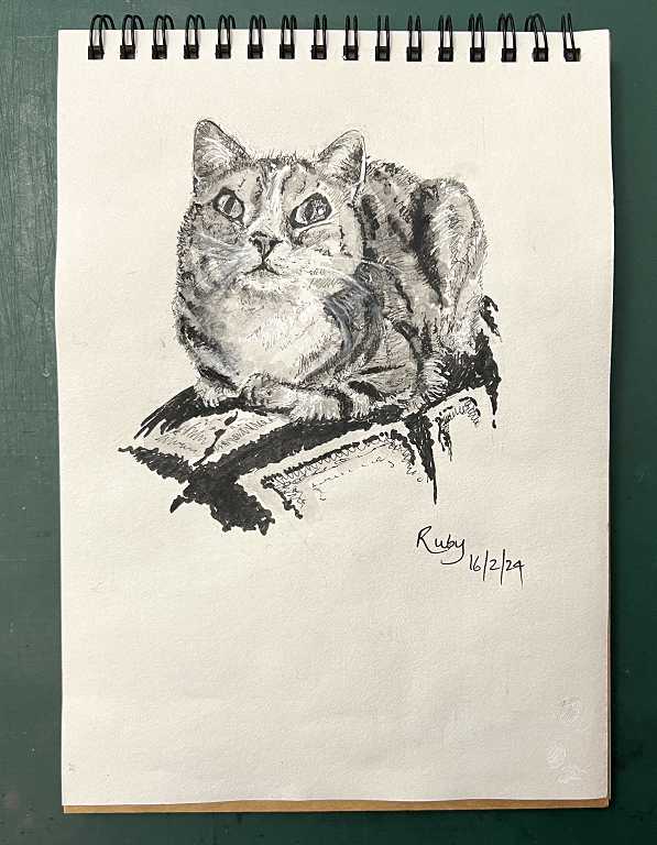
It was interesting to do because of the foreshortening of her body. I began with a 2H pencil and the proportional dividers to get the proportions right, and added quite a bit of detail before continuing with my permanent ink pens, and finally adding some black watercolour washes. I think I’ve got a reasonable likeness, although the more I look at it, the more things I see that are wrong with it! Here’s the comparison with the photo.
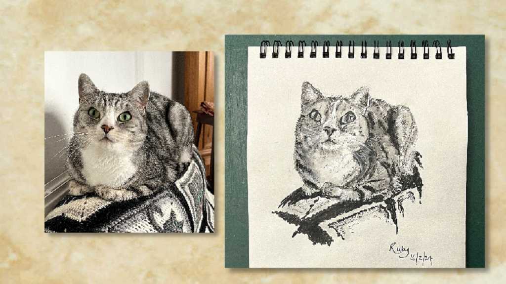
One thing I found fascinating was that my brain was telling me that her eyes were almond-shaped – pointed elipses – but when I came to draw them, I bypassed my assumptions and let my brain see exactly what my retinas saw, that they were actually more rectangular! This drawing lark really is ALL about observing…
So much has been happening recently and if I put everything in this blog post it would end up far too long, so I’ll do a separate one.
Wonderful progress Shoshi – I love the portrait of Ruby! All your sketches are very lifelike (and I love the elephant in particular in one of your earlier blog posts). Well done to you for persevering with this course, your tutor must be over the moon! Fabulous results. And great that Nicholas is resurrecting his artistic gift of pen and wash – I always remember when he did a lovely pen and wash of Thomas the Tank for Tim many years ago (he still has it!).