GREEN MARBLES IN COLOURED PENCILS
My third post today!
Shiny, transparent and/or reflective surfaces
I’ve always been fascinated by these. I know that all that glisters is not gold, but I do love a bit of bling, and I love the play of light in and around transparent objects. For years I have struggled to draw these but I think I am finally getting to the point when I can more or less faithfully render them – at least from a reference photo if not yet from my imagination.
The secret seems to be to get maximum contrast between the different values. Make the shadows too light, and the highlights not bright enough, and the object will look dull and unreflective. Also, the shinier the object, the sharper the delineation between the light and dark areas.
For example, I recently drew this KitchenAid food mixer from ArtProf’s Flickr – she has thousands of ready-to-use free downloadable reference photos which she has taken herself, specifically designed for this purpose – I chose this image because it contains both a brushed steel and a highly polished steel surface.

I am also improving in this area of my drawing as a result of following the Draw Awesome online art course, which has certainly sharpened my observation skills, enabling me to look more closely at objects and see them as they actually are, rather than how my brain thinks they ought to look.
Marbles
I thought it would be a great challenge to attempt to draw some marbles. I have some photos of a friend’s little collection of marbles but looking at these again, I didn’t think they lent themselves to the purpose I had in mind. I therefore searched on Pixabay, a very useful site for royalty-free images, to see if they could come up with anything, and they did. Not only do they have quite a number of images of marbles, but of other glass objects, and things with metallic and reflective surfaces too, so plenty of grist to the mill there.
I’ve downloaded a number of images of marbles, and chose the predominently green ones to start with.
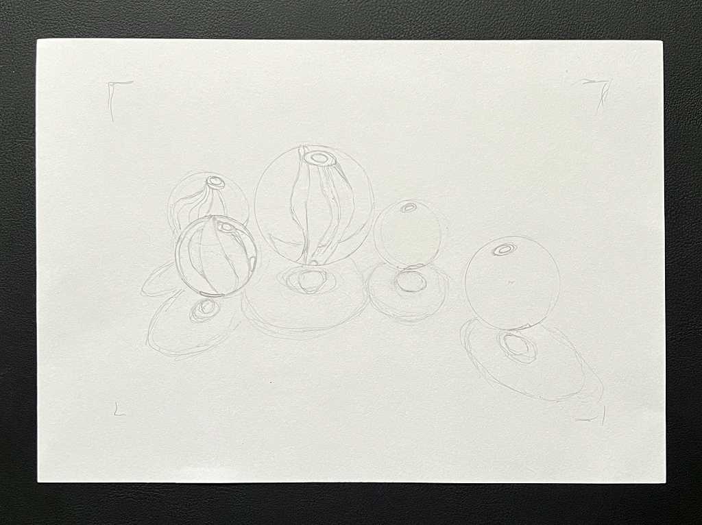
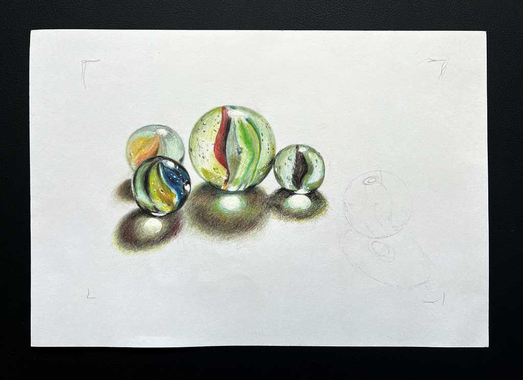
The initial sketch
I began by drawing the basic outlines of the shapes of the marbles and their shadows and internal structures with an HB pencil. Once I’d sketched this out, I went over the marbles themselves, using my recently acquired Helix Angle and Circle Maker tool, using the circle template to ensure that the marbles really were round.
Adding colour
I worked this drawing using my new set of 72 Amazon Basics coloured pencils. These are extremely good value and having read many very favourable reviews of them, I decided to purchase the set. They are wax based pencils but they are quite a bit harder than my very soft Derwent Coloursoft pencils which I think are too waxy and soft, although they have their uses. The Amazon Basics are not as hard as the set of 36 Faber Castell Polychromos that I also bought recently in anticipation of an upcoming module in the art course on coloured pencil drawing – these pencils were recommended by Phil, the teacher. Anyway, the Amazon Basics fall somewhere between the ultra-soft Derwent Coloursoft and the harder, oil-based Polychromos so I have all bases covered now.
When I began to add colour, I wasn’t very happy with the result and wondered if I had begun with too ambitious a project. The first marbles didn’t look very marble-like or transparent.

I continued to work on them, and added another couple of marbles along the way, completing the grouping of four.
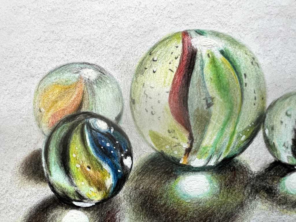
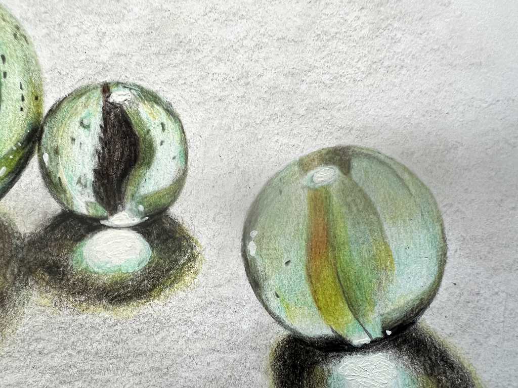
As I intensified the colours and really darkened the shadows, they suddenly became more glass-like and reflective. Adding the numerous tiny bubbles and imperfections in the marbles also really helped with the realism.
Completing the drawing
Adding the fifth marble, sitting on its own over to the right, completed the composition.
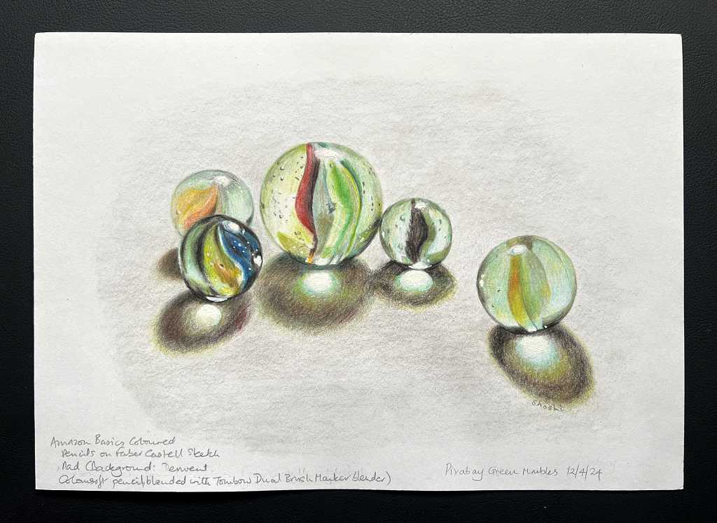
The background
The addition of a very light grey background also seemed to give them more depth. I worked this with a pale grey pencil from the Derwent Coloursoft range, working very lightly over the entire area using the side of the lead, and then went over it with the blender pen from my set of Tombow Dual Brush Markers – this blender seems to work very well with coloured pencils. There is still some texture remaining but it is smoother than it was. For the marbles themselves, I didn’t use any blending agents or tools, but created the smoothness simply by working very lightly with the colours.
Colouring techniques – pressure, layers, multiple colours
Throughout the project I used minimal pressure on the coloured pencils, adding many layers in order to build up the colours and values, all the while keeping a very close eye on the reference photograph. Several adjustments were needed in order to achieve as close a match as possible with the colours in the reference. The only time maximum pressure was used was to darken the shadows at the end, and to add the finest of outlines with a sharpened coloured pencil. From the start of the work, I erased as much of the initial pencil sketch line work as I could without losing the information, erasing each line as I was working near to it, as I did not want any of these lines to be visible in the completed piece.
Highlights
From the beginning, I avoided adding any colour at all to the highlights on the marbles and in their shadows. However, the paper on which I was working (a page from the Faber Castell sketch pad recommended for dry media such as graphite, charcoal and coloured pencil) is not bright white, but slightly cream in colour. I therefore enhanced the highlights with the application of a small amount of white gouache paint, touching the surface of the paper with a Tombow blending pen specifically set aside for this purpose, dipped in the gouache. The blending solution helps the paint to flow, as well as the brush nib of the pen providing a very convenient application method. (I have also set aside other blending pens to be used exclusively with gold, silver and bronze paints respectively – all of these, including the white, are useful for text, or fine outlining and detail in mixed media work.)
These bright highlights, combined with the pale grey background, have provided the effect I was after.
Final photos
Here are some close-up shots of the piece.

With all the light pressure and multiple layers, and selecting numerous subtle variations in colour from the 72-pencil set, this project took me many hours to complete.
To conclude – a final look at the finished drawing.
I am more than happy with the result, and this has boosted my confidence greatly in tackling these difficult subjects – shiny, transparent and reflective surfaces on objects. I am keen to do plenty more.