Teabags, doodles and inky backgrounds
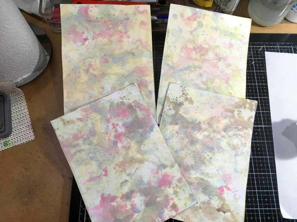
It’s so lovely to be back doing teabag art again – it’s been years, literally. I’ve decided to make some teabag mini-albums. I made the first lot of page backgrounds yesterday but forgot to photograph them – photo a bit further down this post. When I had made them I liked them so much that it seemed a shame to cover them almost completely with a teabag, so have other plans for them, and today I have been working on a larger set of pages.
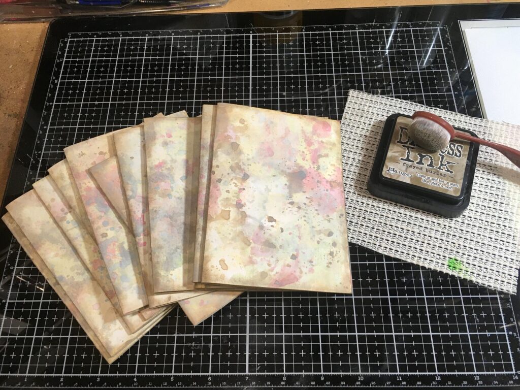
This larger batch of pages started out as plain white cardstock. I have used the “smooshing” method to add Distress Oxides to colour them – rubbing the ink pad onto the white media mat, the edge of which you can see on the right of this photo – that came with the glass media mat. The ink was then spritzed with water and the pages smooshed around. I heat-set each layer before adding another colour. The first couple of layers were smooshed quite a bit, and the subsequent layers were more dipped, so that I could get the spotted effect. I just love how these inks go on, and how when activated with water, they get that subtle chalky look. The paper feels almost velvety.
The above photo shows two pages with all the colours added apart from the Frayed Burlap, which I have added to the bottom pair. These are the colours I used, in order.
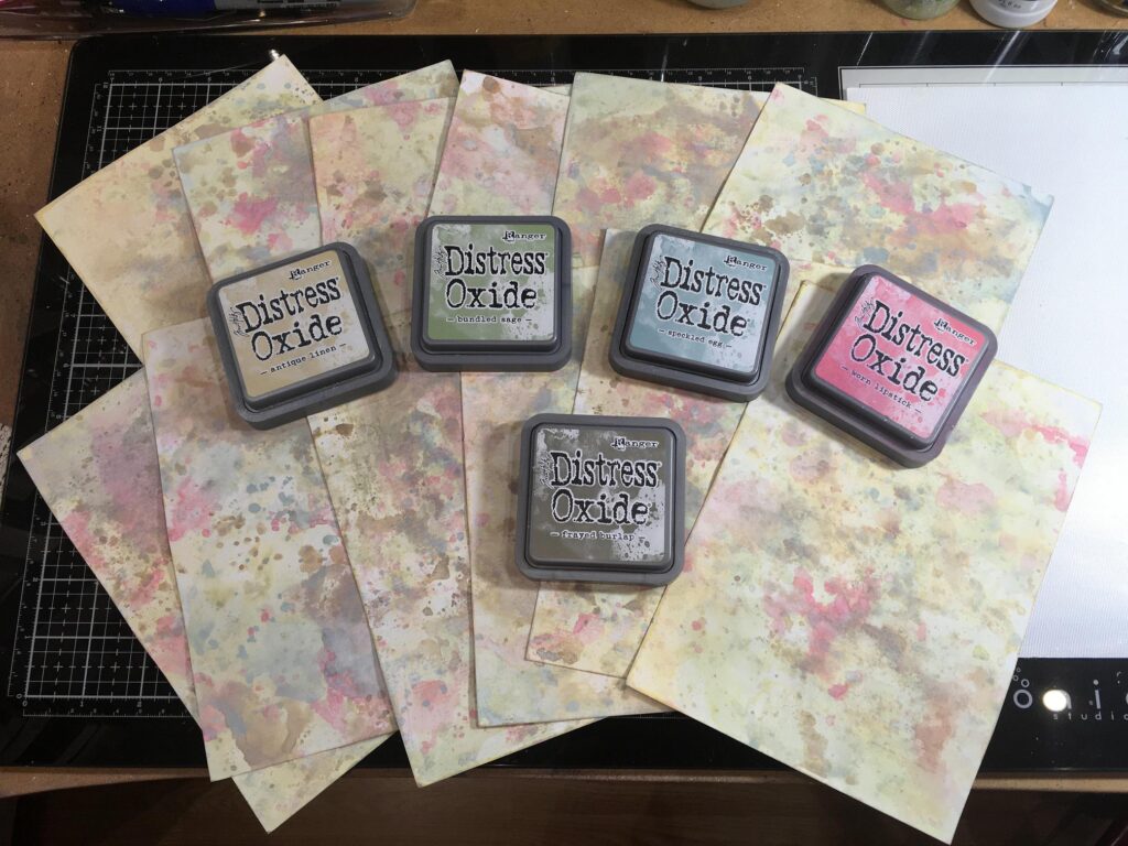
When I’d done the Worn Lipstick, I thought it needed toning down a bit so I added another layer of Speckled Egg – this has to be one of my all-time favourite colours in the range. The Frayed Burlap is nice and subtle and tones everything down so it’s not too pretty-pretty, and has more of a vintage look.
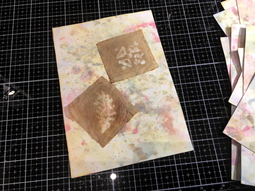
The next picture shows one of the pages with a couple of bleached teabags lying on it. These teabags were from my first batch of bleaching sometime last year, I think it was – some weren’t too bad but most of them didn’t come out well enough to be much use. The ones I did the other day were painted with bleach which worked a lot better but I would like to have been able to use some of the nice wooden printing blocks I’ve got, or even rubber stamps.
Anyway, the picture shows how well the background colours go with the teabags.
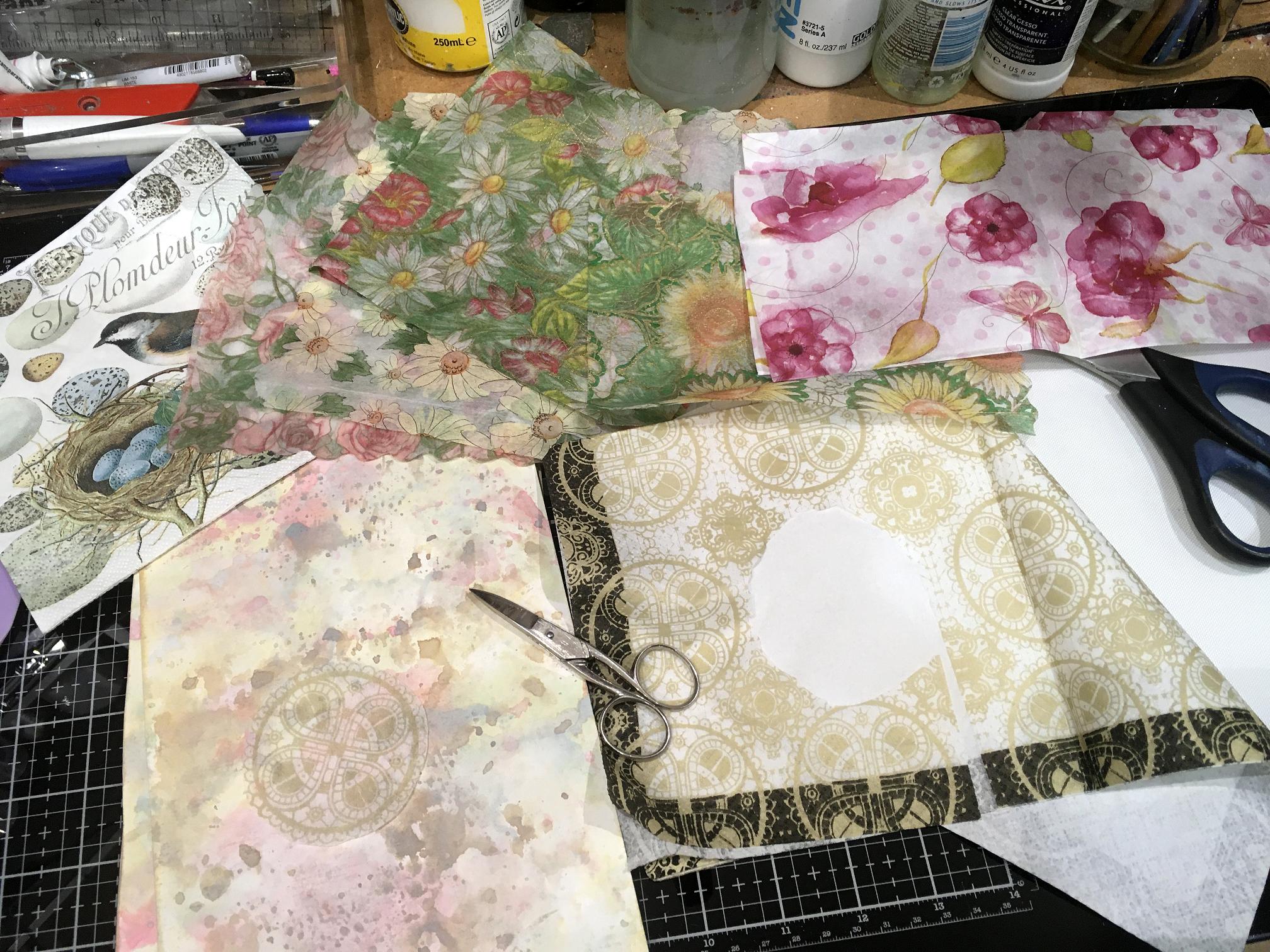
Having made larger pages, I thought I might also add some collage as well as a teabag on each page, so I had a rummage in my stash and found some gorgeous napkins and also some really fine paper which isn’t tissue but something else – it almost feels like fabric, and is printed with floral designs. I can’t remember who gave me these pieces but they are absolutely fabulous. I have a feeling they may be rice paper but not having any to compare them with, I can’t be sure. They are very flimsy and translucent, and I thought some of the flower motifs would be lovely to cut out and apply.

In the foreground of the picture is a gorgeous napkin with circular motifs and a dark border. I have peeled apart the two layers across one corner, and cut out one of the circles, which you can see laid on top of the background on the left. This is very thin paper, and I just love the subtle effect of it, I shall definitely be using some of these in the project.
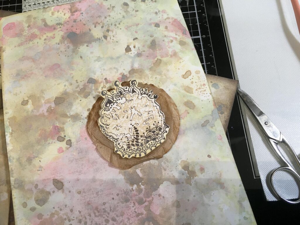
The next photo shows some of my teabag stain doodles. I have a lot of my hubby’s scrap watercolour paper (thank goodness he doesn’t think to paint on the back of his rejects – I rescued these out of the bin!) – Several years ago I dried a lot of used teabags on this paper. As they dry, over two or three days, they leave a tea stain on the paper. If you don’t flatten the teabag out too much but screw it up a bit, you get all sorts of interesting wrinkles and patterns, which form a fabulous guide for doodling. I did the square doodles at that time, and started doodling on the stains left by round teabags the other night. I’ve still got a lot of these sheets with the stains on them. I do the doodling with a sepia archival pen which I think looks a lot better on the tea stains (and also on teabags themselves) than black.
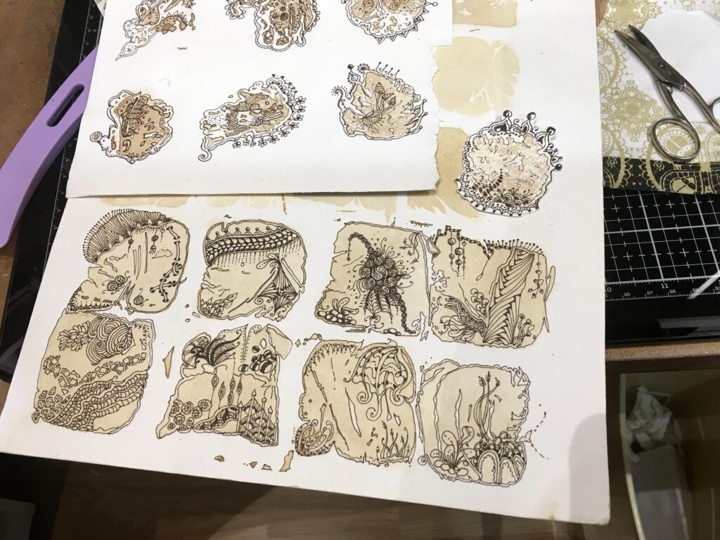
You can see on the right of the photo that I have cut out one of the round ones. I left a narrow white border all round and wasn’t too accurate with the fussy cutting because it would be impossible to cut around all the doodling. Later I applied some Antique Linen Distress Oxide around the edges with a blending brush, and this softened the harsh white outline. They look much better this way.
The next picture shows the small backgrounds I made the other day, with some of the round doodles cut out and laid on top of them. I think I am going to use these rather than actual teabags in the albums made with these pages, because they are smaller and cover up less of the background. These backgrounds are made from some existing backgrounds that I had, cut down to A6 size, with Distress Oxides added, and then folded in half to A7 size. They were distressed around the edges with Walnut Stain Distress Ink. The colours vary a little because of what was on the backgrounds previously. They are darker than the larger pages I made today.
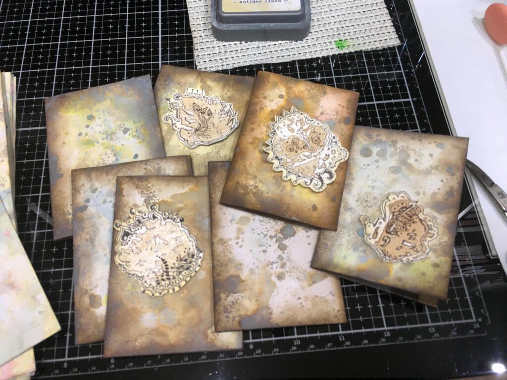
Here is one of the round tea stain doodles laid on top of a round teabag on one of the larger backgrounds. There are lots of possibilities for combinding different elements in thisi project.
Here is the complete set of larger pages (A5 folded to A6), having been distressed around the edges with Frayed Burlap Distress Ink. I decided to keep these lighter than the smaller ones – Walnut Stain would be a bit dark for these, I think.
You can see that my ink pad is resting on a piece of non-slip mat material. Without this, the plastic ink pad makes the most frightful noise if it moves on the glass media mat – it’s like fingernails on a blackboard! This little mat keeps it in place so it doesn’t slide all over the place when I’m using it, and spares my ears as well!
Watch this space for further progress on this project. I am not sure yet how many little albums I am going to be able to make, or what the covers will be like. All I do know is that I am pleased with how everything has turned out so far, and that I am enjoying myself immensely as I work on this! It’s been a while since I’ve sat down in the studio and got messy, and it’s nice to be back.
I also have plans for some different teabag art. I am not personally a fan of “herb teas” – first of all, they aren’t “tea” at all, and I like a nice cup of real tea (my favourite being Lapsang Souchong with its gorgeous smokey taste, closely followed by Earl Grey). Secondly, some of them taste like dead grass and are very unappealing! My only experience with fruit tea was equally underwhelming – far too sweet and fragrant for my taste! However, I have seen people online doing teabag art with the teabags that had this stuff in them, and the colours are simply gorgeous. I’ve never done it because I don’t drink the stuff, but it suddenly occurred to me that I don’t actually have to drink it at all! Especially as I could make up the “tea” and use it to dye paper with. I could dry the teabags on watercolour paper and get some different coloured backgrounds, and then I could make art with the bags. I am hoping that these bags arethe folded ones with a string, which can be made very nicely into little books because you can unfold them and get more teabag paper for your bucks. I was delighted, doing my online grocery order today, that they’ve got an offer on at the moment – 2 packs for £3 – not a great deal to spend on some new art stash, and using the liquid as well, I shan’t feel guilty about not drinking it! So I’ve got cranberry and raspberry, and blackcurrant and blueberry coming tomorrow. I thought a pinkish red and a purple would be a good choice to start with.
Fish Face-Off
I am continuing to draw in my Rhodia drawing book. Last night I did a fishy drawing, inspired by a lovely YouTube video I saw. I struggled with my drawing a bit and wasn’t terribly happy with the result – I think the bottom part is too busy and I had a job getting the contrast right so that the fish didn’t disappear! There are bound to be some drawings in my book that I am less satisfied with, and it’s all a learning curve.
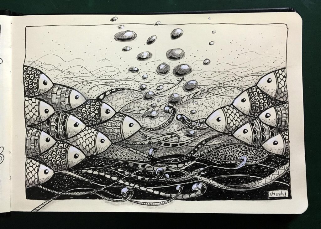
I added some highlights in this drawing – to the bubbles, the eyes of the fish and the tops of their faces, and to the tops of the “waves” in the foreground. I also added some shading with a dark grey coloured pencil from my Derwent Coloursoft set. Fish face-off.