TYPEWRITER ALBUM PART 4 – BEGINNING WORK ON THE PAGES
Another very fruitful session in the studio this afternoon. I began working on the pages for the album. I am not following any particular order but just going with the creative flow.
Signature 1 – blue text page
The blue text printout has been in my stash for ages and I was never that keen on how it turned out. The colour is too bright and not right for this project, so I altered it.
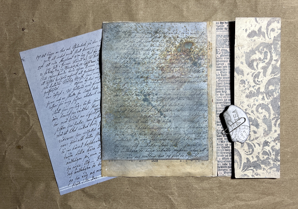
I’m still not 100 percent satisfied with it but it will be mostly covered in the end so it doesn’t matter. I sprayed it with Distress Oxide sprays, first with Weathered Wood which is a greyish-blue. This didn’t make it much less blue, so I added some Frayed Burlap which is the brown areas, and finally with some Lost Shadow, which is a very pale grey. Finally, I dry-brushed it over with a blending brush, using Hickory Smoke Distress Ink. All this has definitely muted the whole thing down but it is now quite dark. Nice and grungey, though.
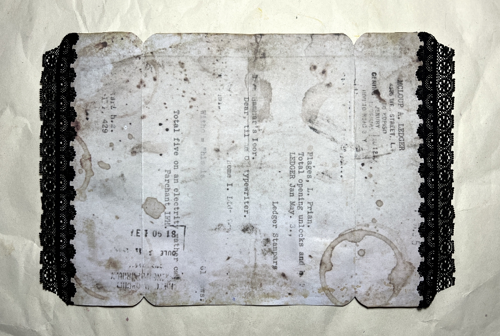
The paper tucked under the left-hand side is another copy of the original. You can see the printer error running across the bottom, from my old laser printer. This was going to be far too expensive to repair and it was a major pain because I couldn’t ever print out a whole page without it being spoilt.
Signature 3 – large butterfly
I took the complete Perspective Butterfly die-cut made from dark brown card which I created yesterday, and stuck it down onto the paper I made, using the smaller butterflies as masks. I trimmed this paper to size and stuck it down onto a page in the album.
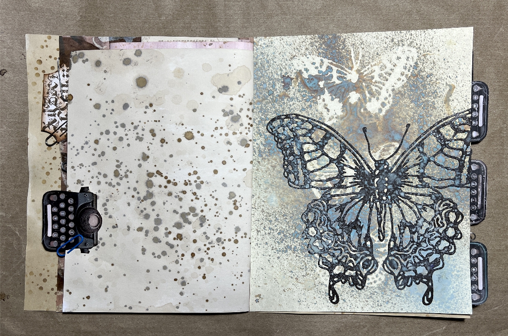
The butterfly is very large, and I didn’t want it dead-centre on the page. Also, I didn’t want it too far to the left or it would interfere with the binding and page turning. Situated where I wanted it, the edge of the upper wing stuck out, so I trimmed it off.
On this page spread, you can see how the page on the left tones very well with the butterfly page. I do not know yet what embellishments will go on there. Throughout the book now, I have paper clipped several of Luise Heinzl’s mini typewriter page tabs in place where I think they might ultimately go. You can see one of my whale tail tabs similarly clipped on a previous page.
The tabs on the right in the picture are all attached to one of the belly band pieces in the Typewriter Ephemera kit, and again this is clipped in place temporarily.
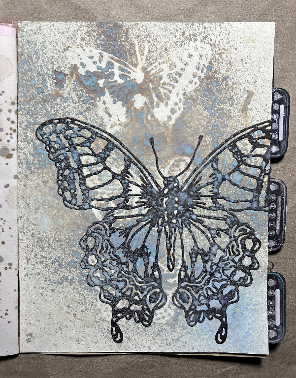
Here is a detail shot of the butterfly page. You can see the background through the die-cut pieces in the large butterfly.
Signature 2 – Centrefold
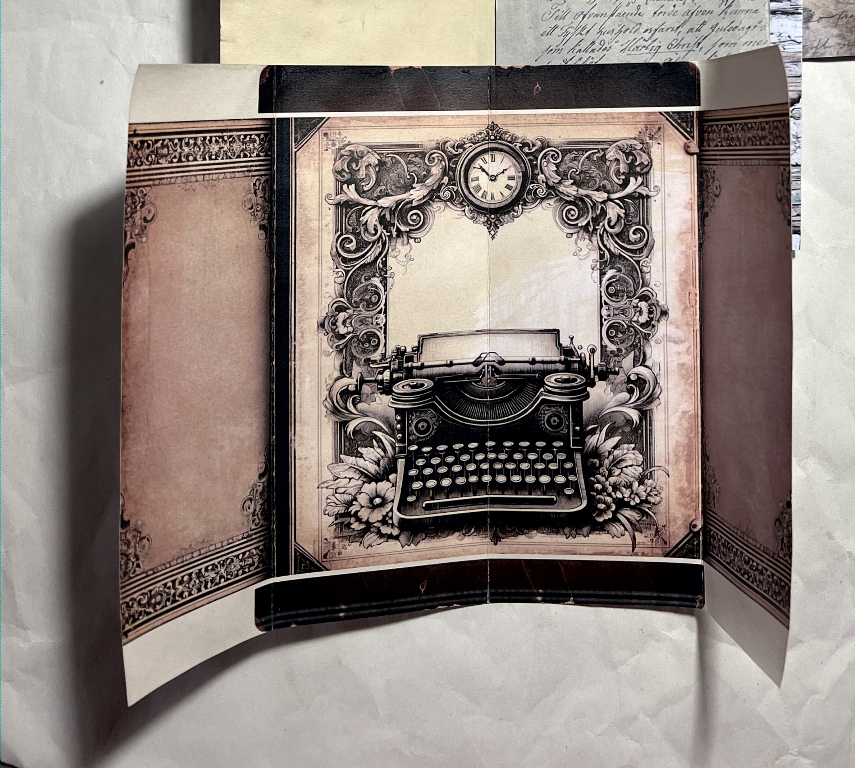
This is the page spread with Margareth of SevenPlaza’s typewriter digital with the two side wings. I had tremendous fun embellishing this.
From this:
To this.
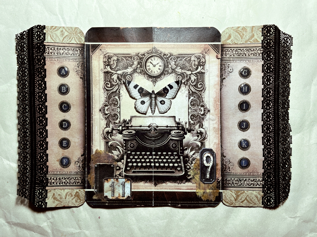
(Apologies for the colour difference – these subtle colours are so hard to get right especially when the same subject is photographed at different times of day and with different lighting. I think the second one is more accurate.)
First of all I added one of Margareth’s butterflies in the space above the typewriter. I glued it just down the centre of the body after folding it in half. Glueing it down completely would interfere with the folding of the page, and anyway I wanted a bit of dimension with the wings being free. The stitching of the binding will go through the centre of this panel.
Then I added a few of Luise’s faux distressed metal numbers at the bottom, sticking them down over scraps of a single layer of inked kitchen paper. I glued down some scraps of a strip cut from one of my gel prints at the top and bottom of both wings. Then I added the black lace to the edges of the wings. This lace has identical sides with a solid part down the centre. I lined this up with the edges so that one half of the lace would extend beyond the page. When the folio is closed, this lace almost closes the gap. It is not possible to make it meet completely because it would interfere with the folding of the folio.
On the reverse of the piece, I added some more lace, butting it up against the page edge so that it appears to be one with the other lace edge sticking out. I have not added anything else to these pages yet.
Here is a detail of the left-hand wing.
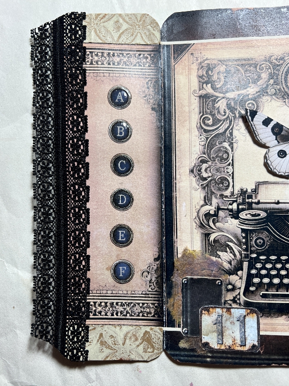
The typewriter keys were part of a digital download from Paper Peculiar. She designed two sets – one dark and one light, and they were each 1 inch in diameter, which was too large for this project. I have created new pages with the keys 1/2 inch in diameter, with four of the original pages on one page, and I can print these out when I need. It is a simple matter to punch out the keys with my 1/2-inch circle punch.
Once I had stuck them down, spacing them mostly by eye, I coated the centres of them with Glossy Accents for a nice shine, which makes them look more real.
A detail shot of the central panel.
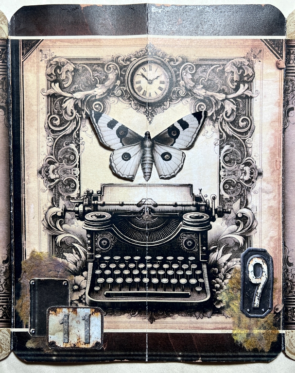
I am extremely pleased with how this spread has turned out. I love the translucency of the kitchen paper and the 3-D butterfly (who still needs some antennae! Note to self…)
A lot of time in this session was spent on editing and printing the typewriter keys, and also rummaging for lace and generally deciding what to do. When people make videos of themselves making stuff, I am sure they must stop the video for this, or it would go on for hours! They do seem to be a lot more organised than me!