ALTERED BOOK: “THE JOURNEY” – PAGE 3: FRANCE 2
I am working on the two French-themed spreads in parallel because I have so many collage elements that I wanted to decide which page they should go on.
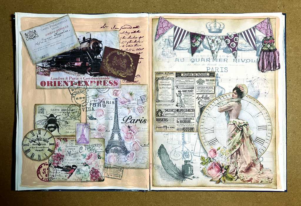
The second spread on a French theme
This time I was better prepared, and began by covering the printed pages with several coats of gesso to obliterate anything that might show through. The pages are also quite shiny, and the gesso would provide more tooth for my background colour, which is Windsor and Newton’s Portrait Pink. This is a useful colour – not really a pretty-girlie sort of pink, but a shade which goes well with many other colours.
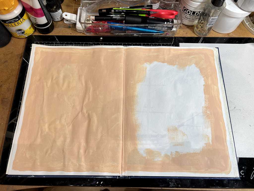
As you can see, I had some problems with air bubbles on the left-hand page. These are between the two pages which I stuck together when preparing the book initially, and the pages became quite wet with the gesso which seems to have exaggerated this. There wasn’t anything I could do about it, and once the collage elements were down, it wasn’t showing so much. I had the same problem with the right-hand page but it wasn’t so bad.
I got quite a few of the images for this French theme from The Graphics Fairy, which is a very useful site for free vintage downloads. Other pictures were gleaned from elsewhere on the net.
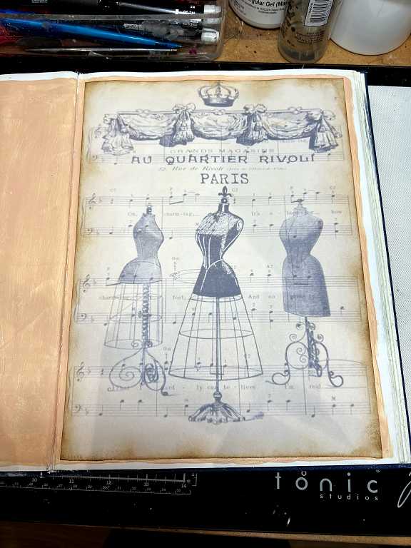
I enlarged the image for the right-hand page background, and increased the transparency so that it wouldn’t be too dominant, and then printed it borderless. Trimming a little off the bottom made it fit nicely onto the page which is slightly larger than A4.
I laid out the major elements on the two pages and photographed them as a reference. I glued each element down with my new Giotto glue stick, highly recommended by Robyn McClendon, and I quite agree with her – this Italian-manufactured glue stick has powerful sticking power! Having experienced problems with gel medium reacting with the inkjet fixative I’d sprayed on my printed collage elements, turning the colour slightly green, using a glue stick seemed to be the best way forward in this case. I have always used gel medium for collaging and when I first started watching Robyn on YouTube I was very surprised that she favoured the glue stick. Most office-style glue sticks aren’t permanent enough. The Giotto glue has done really well for me on this page and I shall definitely continue to use it.
Here is the page with the elements stuck down, during the process of which I also added some stamping.
Some time ago, also on Robyn McClendon’s recommendation, I bought a small clear stamp set from AliExpress, for mail art, with postmarks, which is ideal when doing a mail art themed project.
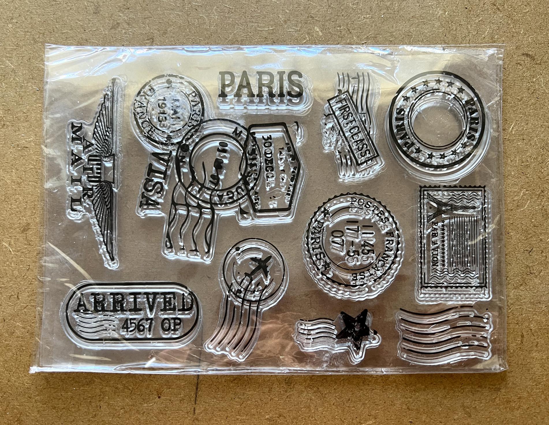
I was pleased to see that there were quite a few French ones in this set!
When doing mixed media, I prefer to stamp without a block. If you get a partial stamp, or if it smudges a bit, it all adds to the texture and general grungeyness and vintageness of the page! This is especially true with postmarks, which are very often somewhat indistinct, and this adds realism to the page.
I also added some text from my new Darkroom Door “Correspondence” stamp set which was featured on the first French-themed page of this altered book.
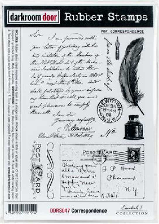
For this page I used a combination of “Watering Can” and “Plum” Archival Inks for the stamping, being less harsh than black. When we get to the detail shots of the pages, you will be able to see this more clearly.
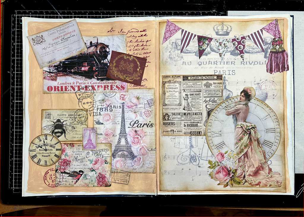
The completed spread, with a bit more stamping.
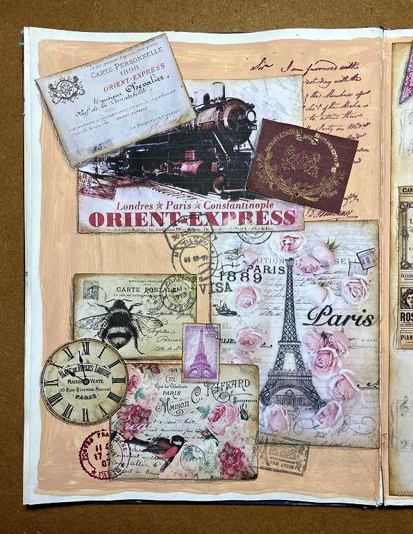
Now for some detail. First, the left-hand page.
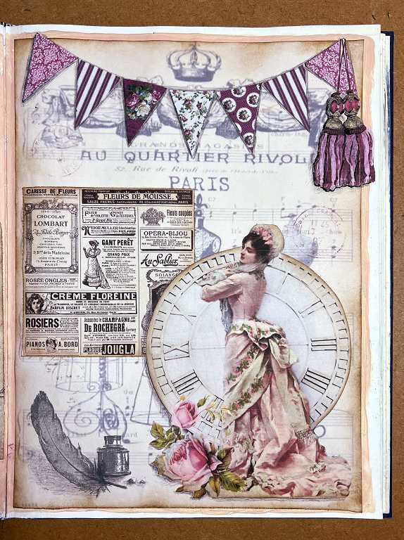
The right-hand page.
Now for a closer look, with some details of some of the collage elements.
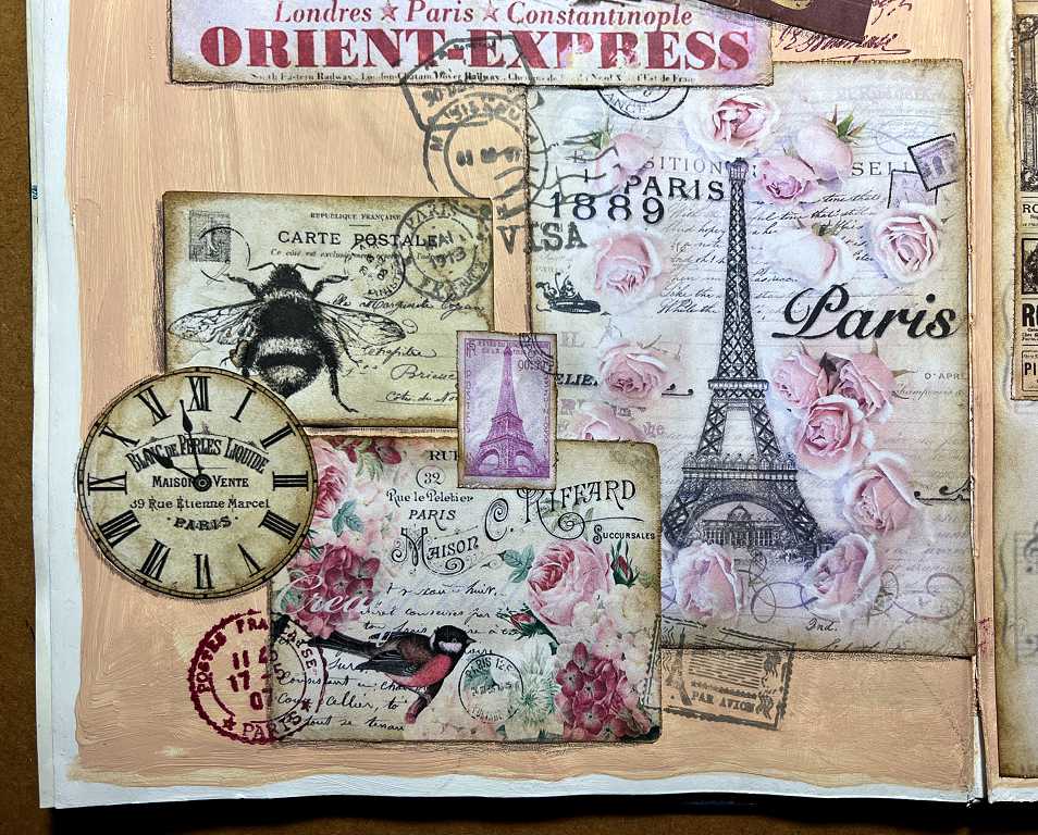
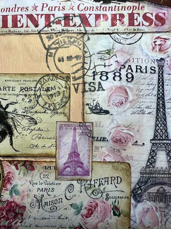
I thought it would be fun to bring in the Orient Express, since this book has a travel theme. This famous train has so many romantic associations with it, and was made famous by Agatha Christie’s Poirot mystery novel Murder on the Orient Express. I found an image of a ticket, and also the badge of the Orient Express – I altered the colour of this to dark red to go with my theme.
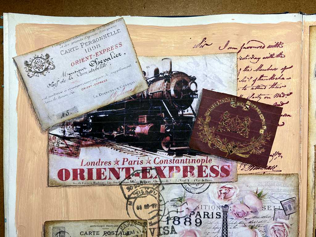
The days when travel was so much more romantic and exciting, and less about simply getting to your destination in the quickest way possible. The adventure was the train journey on this iconic train, not the destination.
The bottom half of the same page.
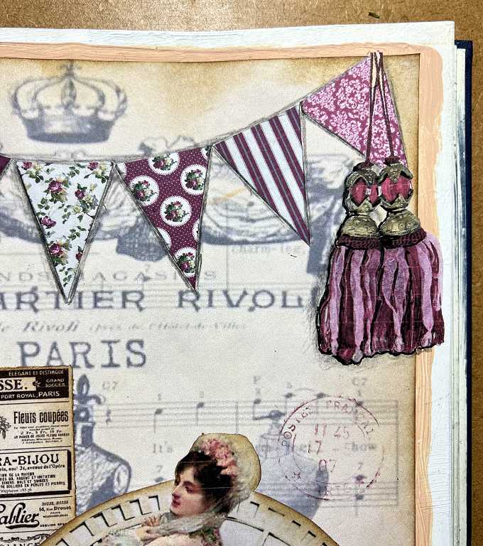
The top half of the right-hand page. I thought it would be fun to add some bunting to this page. I found some pink and dark red patterned paper images and reduced them to fit the scale of my design, and printed out small sections of the various patterns. I cut them into trianges which I glued down onto the page. Eventually, as with the other elements, I added some outlining and shading using grey and black coloured pencils for a bit more emphasis and to push the background back.
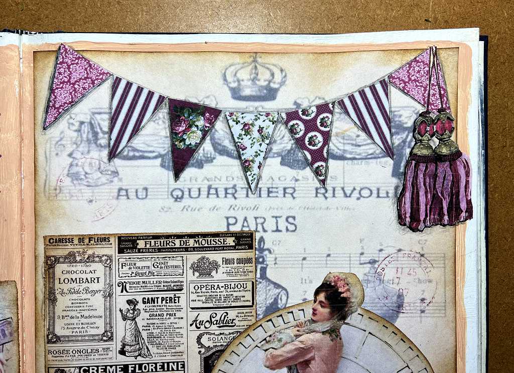
I found the gorgeous French tassels image and knew I had to use it! I scaled it accordingly, printed it and then fussy-cut it out before sticking it down on the page.
The bottom half of the right-hand page. I loved this image of the elegant 19th century French lady with the clock and roses, so I printed it and fussy cut it out. Before printing it, I darkened the bodice of her dress and some of the folds of her skirt as I thought she wasn’t showing up quite enough against the clock.
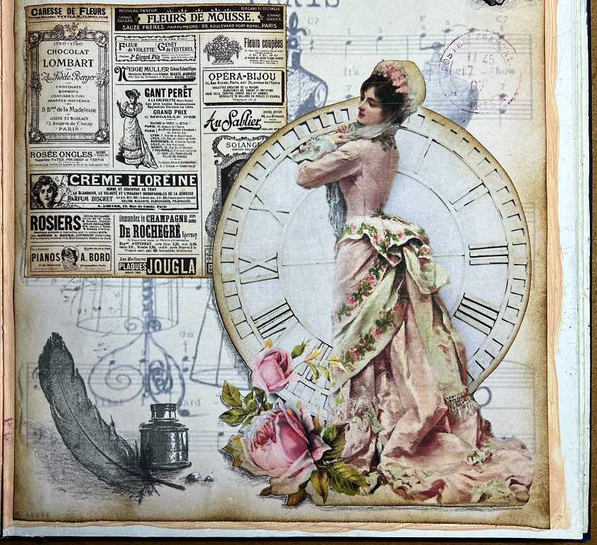
Here she is again in a bit more detail.
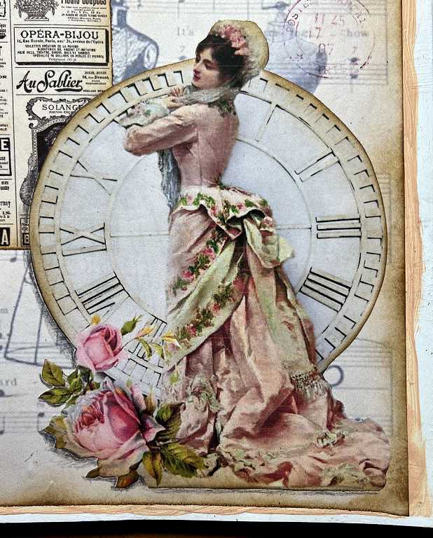
I love all the shabby chic pink French roses!
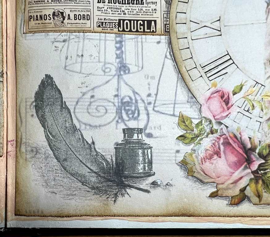
A detail shot of the bottom left-hand side of the page, showing the stamped inkwell and feather. I added a bit of shading with a grey coloured pencil to give it something to stand on.
Here is a closer shot of the bunting and tassels.
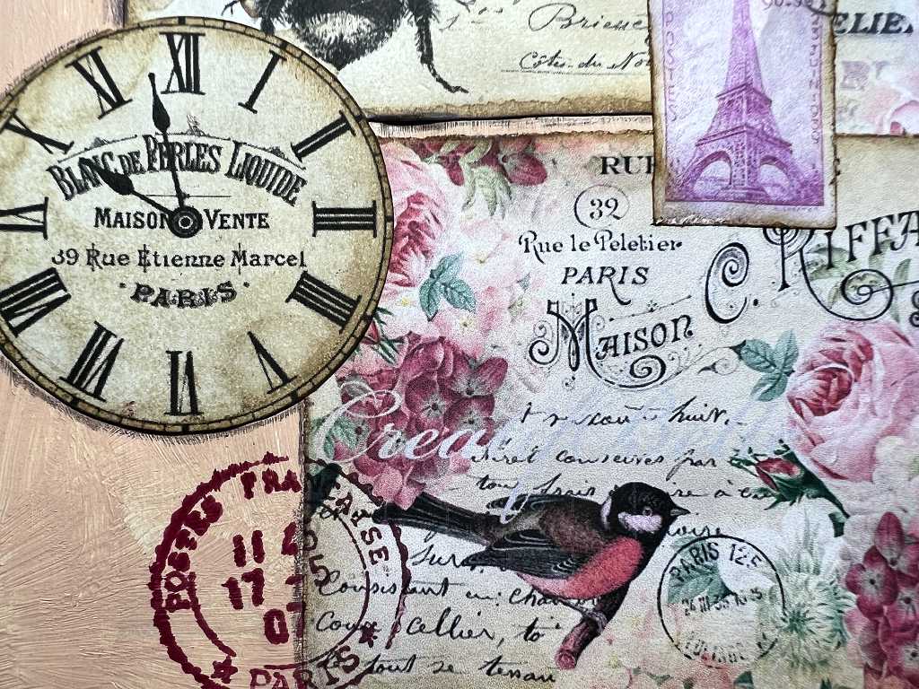
A detail shot of the centre part of the left-hand page, showing the added postmarks from the AliExpress stamp set, stamped in “Watering Can” grey (love that name!)
A final close-up shotof the left-hand page, with the clock and another postmark, this time stamped in Plum Archival Ink, and showing some nice authentic blurring!
A final look at the completed spread.
I am very pleased with how this spread has turned out. I’m not usually a pretty-pretty sort of person and haven’t done much with pink, but somehow this really appealed to me for the French theme. The “Portrait Pink” paint does reduce the overall pretty-pinkness of it, too, and I think the addition of the dark red makes it stronger. I hope you agree.