ALTERED BOOK: “THE JOURNEY” – PAGE 2: FRANCE 1
Today I began the next page in my altered book. I didn’t get very far because I spent the earlier part of the afternoon doing some organising – sorting through a lot of my background papers (gel prints, printables etc.) and ephemera, and filing them away in their respective polywallets. The studio is looking a bit (just a bit!) tidier as a result.
The theme of the new page in my altered book: France
I have made a list of different locations as themes for the pages in this book – I haven’t decided on all of them yet, or in which order they will eventually go, but it’s a start. Being the closest nation to our own, I chose France for the first destination, and rummaged through my papers to select various bits and pieces to incorporate into the spread.
As always, this is just a starting point.
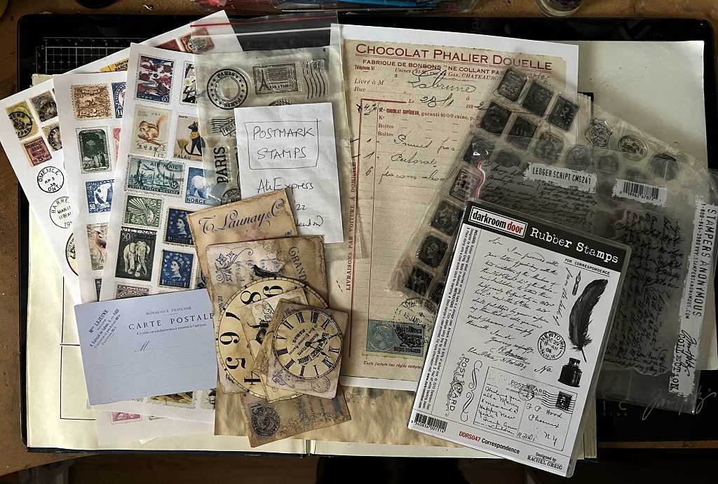
Ages ago I printed out some vintage printables of French postcards and other bits and pieces. Unfortunately the printer wasn’t working properly and the colourd ones came out a pale shade of lavender!
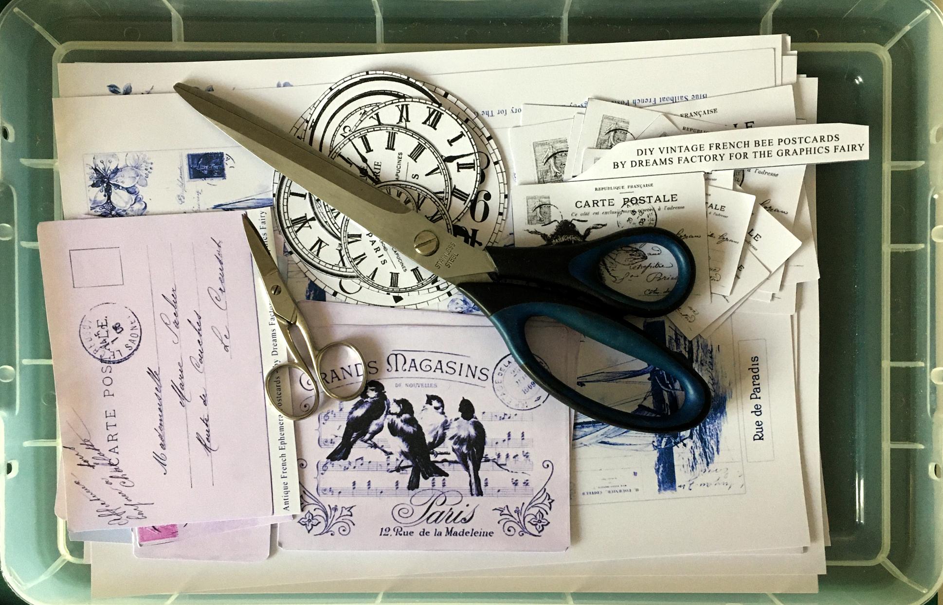
Today I made a selection, and coffee-stained them with my spray bottle of coffee.
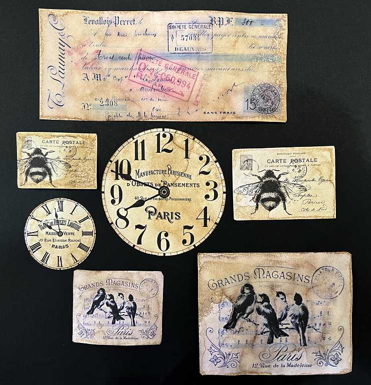
They look a lot better now, and are even further improved since I inked the edges with Vintage Photo Distress Ink.
Preparing the pages
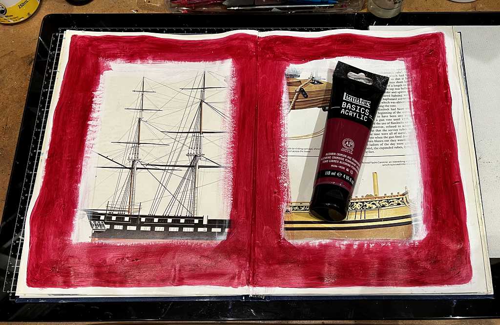
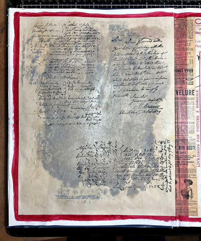
Turning to the book, I knew I would have to paint around the edges of the pages as the background sheets I had chosen were not large enough to cover the existing printing. Looking at my various elements I chose alizarin crimson as an accent colour and proceeded to paint the pages. Unfortunately the paint was translucent, and after three coats, the printing was still showing through. It all took a long time, even drying the layers between coats, using my heat tool, but in the end I painted over what I had done with a couple of coats of gesso and then added the paint, again using two coats. I think it will do now.
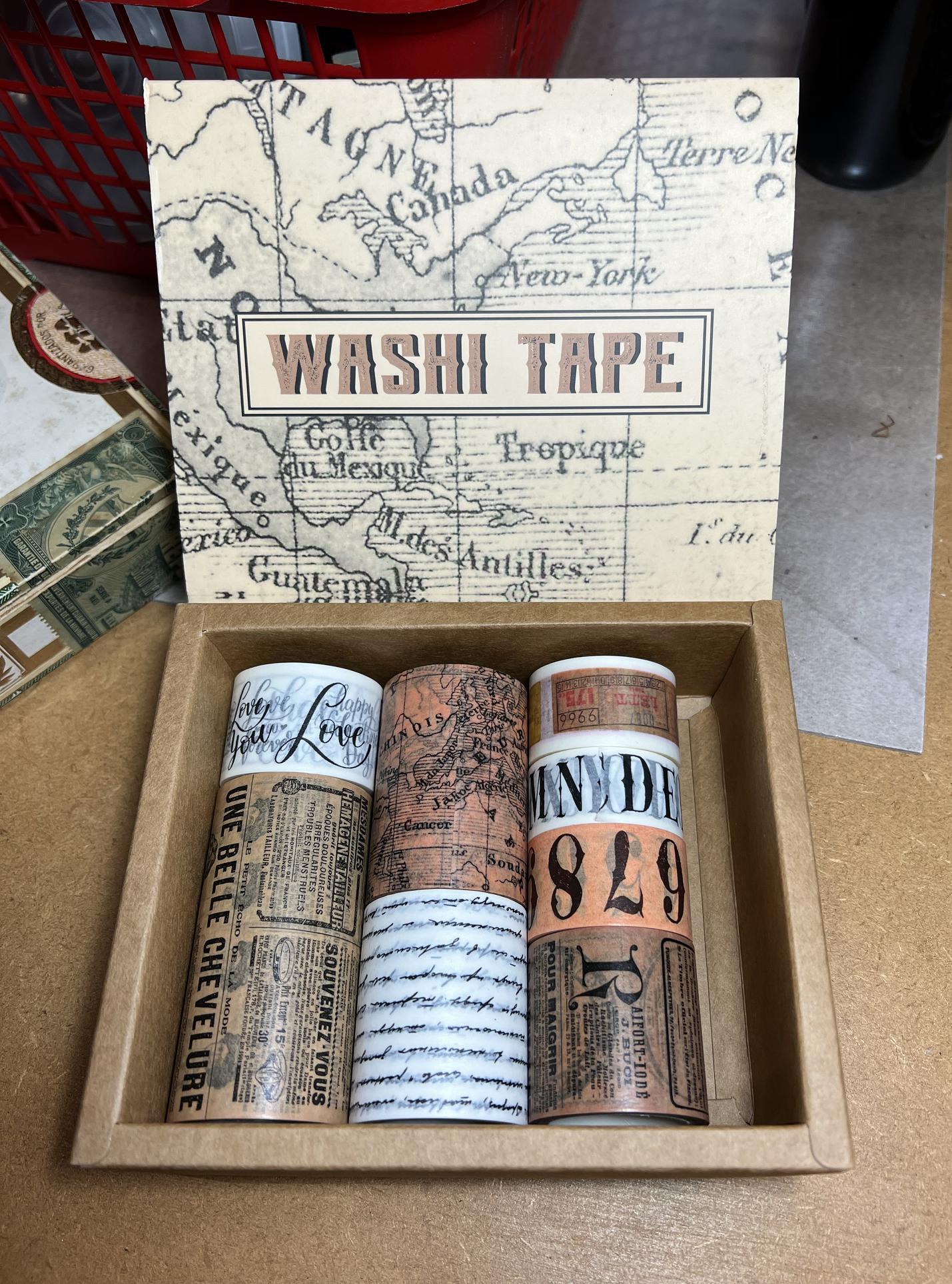
The background sheet for the left-hand page is large enough to reach into the gutter of the spread, but the right-hand piece is definitely too narrow. After photographing the papers, I remembered I had some French-themed washi tape and I thought I would use this on the right-hand page – I wanted to use it somewhere as it’s very much on point with the theme.
France is too big a subject, really, to do it justice – I have decided to concentrate on the shabby-chic look because it is vintage, with the addition of ephemera, travel, postcards and other mail art elements, and not even to think about the food or wine! There is a huge resource of images online with a Paris theme, particularly with a vintage vibe, as this is very popular with the creative community.
The background papers stuck down.
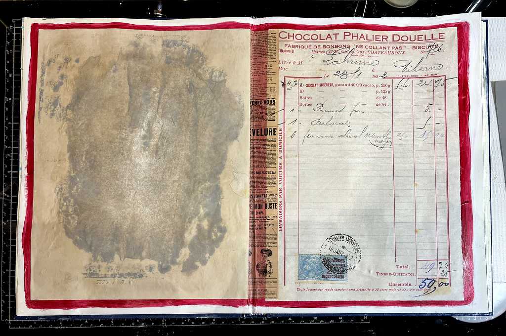
The reason I chose the red border was because of the printing on the invoice on the right-hand page. The background piece on the left is a blotting off sheet when I was gel printing, I think – I’ve got a lot of papers which either need further work, or are suitable for backgrounds which are largely going to be covered up.
I stuck the French-themed washi tape down the page gutter. The red paint shows through it, but I think it just adds further interest. I added some glue stick to the back of the tape before sticking it down, as the adhesive on washi tape isn’t that permanent. This particular tape was from the gorgeous box of washi tapes that I bought a few months ago and had not yet started. This particular roll is quite wide so I cut the piece in half lengthwise for this page. You can see it at bottom left in the photo of the box below. It divides very nicely down the centre.
I added some text stamping to this page, using Black Soot Distress Oxide ink. I used a combination of stamps from the new Darkroom Door “Correspondence” and my Tim Holtz “Ledger Script” stamp sets. Much of this will get covered up but what remains visible will add some textural interest.
I spent some time during the evening looking for further images and thinking a bit about the layout, and realised that I had far too much stuff already just for a single spread, so I have decided to do two spreads on the French theme.
I made a mock-up of the images for the second spread, using my desktop publisher. When I come to do it, I may make some changes, but this is the general idea.
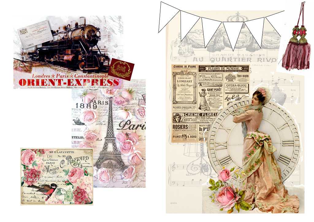
I shall be cutting the bunting pieces from some background papers with roses, with the scale considerably reduced to fit the triangles.
That’s all I had time to do today. I wasn’t able to do any yesterday because I had a bad day with my ME and had to rest all day. It happens…