ONLINE ART COURSE – PASTEL PENCILS – AVOCADO
Now that my pastel pencils have finally arrived, and I had a nice quiet day on my own today, I was able to settle down and work on the first project in the fourth module of the course, which is pastel pencils.
I had thought that as pastels were really dusty, they would be as messy and unappealing to me as charcoal, but this proved not to be the case. The pencils are quite hard and they do not make nearly as much mess as I expected. They are very forgiving, as long as you haven’t pressed too hard at the beginning and lost all the tooth on the paper, and they also erase quite well with the kneaded eraser.
We began as always with a rough sketch to map out the shape, size and proportions of the subject. In this case we did not use graphite pencil as this wouldn’t show up too well, and using a white pastel pencil with a light touch was ideal; most of it was covered up as the drawing progressed, and anything else was easily erased.
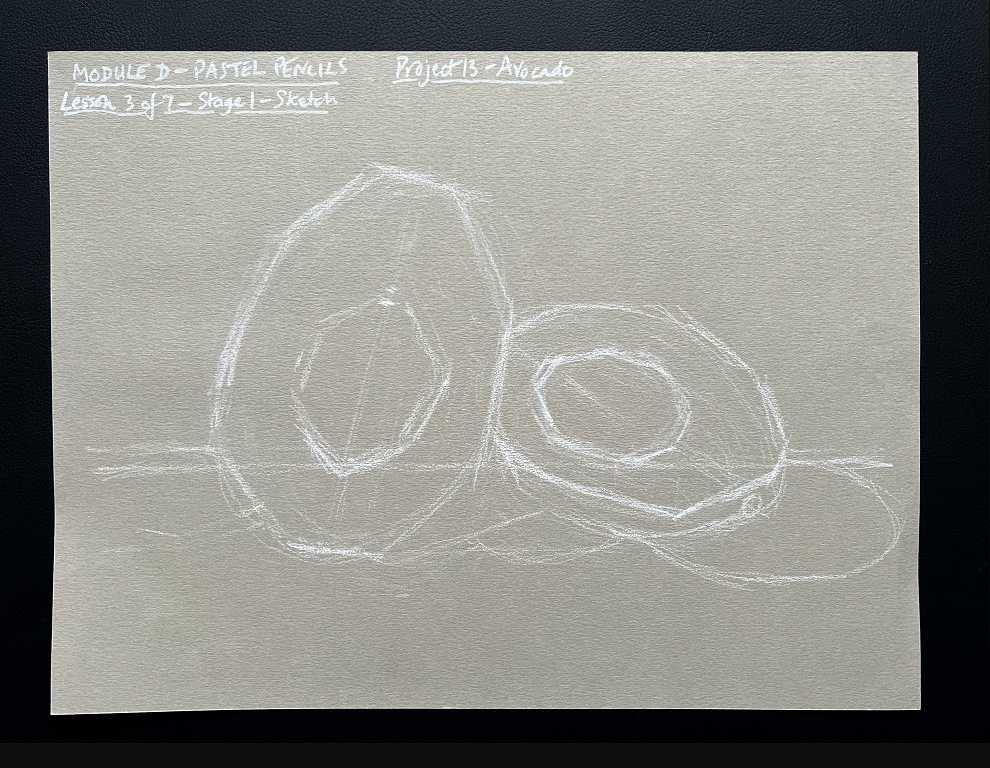
I chose one of the darker papers in the pad, a slightly olive green rather than the grey that Phil, the teacher, chose, as I thought this would co-ordinate nicely with the predominantly green scheme of the drawing. I can see now, looking again at this initial sketch, that I had got the avocado half on the left too fat at the top, but I didn’t notice this until I was well on with the drawing and it was too late to correct it!
You can see the axis lines I drew, to get the angles of tilt of the two halves correct with each other, and the horizon line for the background, and also the shapes of the shadows.
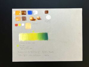
The next stage was to begin blocking in the colours. Working from light to dark, with a light touch, apart from the white highlight on the stone, which was drawn with maximum pressure, and no other colours were layered over the top.
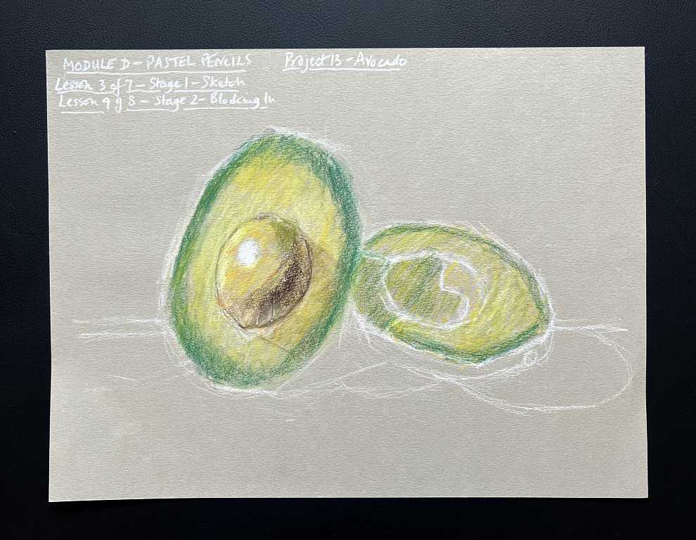
The colours blend beautifully together.
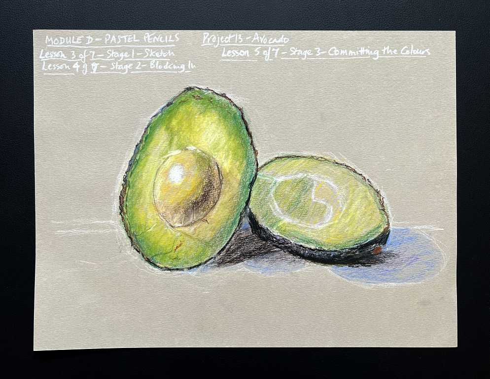
When you start to add more colour and increase the pressure, you are committing the colours to the paper, after which they can’t be altered that much, although more layers can be added.
At this stage we started adding some detail with the sharp point of the pencil, as in the cut edge of the avocado skin, and some little cracks and blemishes in the flesh.
We then moved on to the second half of the avocado, which we worked on with much less help from Phil, as it was pretty much a repeat of the first half. We also worked on the stone. You can see that the colours are now a lot darker and more intense, and the outlines are more defined, as we added more shadow and detail.
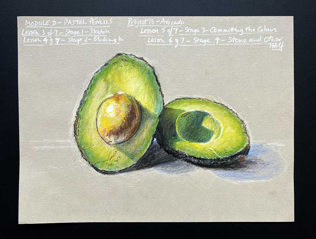
The final stage was to add some background so that the avocado wasn’t floating in mid-air!
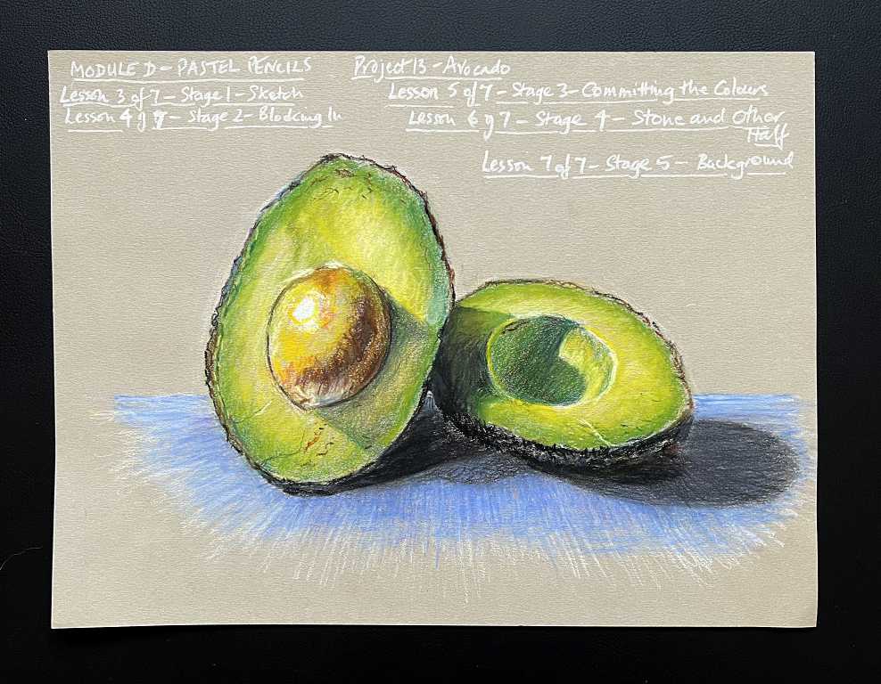
Phil made his background a lot more busy with horizontal lines as well as the perspective lines but I wanted mine to be more subdued. He chose a more or less complimentary colour to the main subject which really sets it off.
For my first attempt with pastel pencils, I am not unsatisfied! Looking at the work of some of the other students on the forum, mine is mediocre, but really not too bad! I shall be interested to see what feedback I get from them.
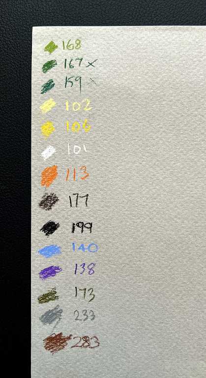
Regarding colours, all of us who have bought the Faber Castell set of pastel pencils have reported that the company has changed the selection of colours in this 24-pencil set. This means that Phil was selecting pencils from his set which we did not have, but as he said from the outset, if we were using a different set, this wouldn’t matter, as long as we had roughly the equivalent. My original old set of 12 (one missing) did not have more than one of each colour, which would have made life very difficult, and there were no browns – in this Faber Castell set there are two browns, two yellows, three greens etc. which gives one a lot more scope. Phil obviously got his set some time ago and since then, the selection has changed.
Here are the colours I used, with their respective numbers. I did this swatch on the back of the paper I used for the warm up exercises – you can see that this side is quite textured, which is not recommended for the type of drawing we are doing. The reverse side is smoother.
This has been an interesting exercise, and I am looking forward to moving on to the next project (a hen) which all being well, I should be able to work on tomorrow. I am keen to catch up, because the delay caused by the time it took for the pencils to arrive has made me fall behind quite a bit.
This is amazing Shoshi! What’s so pertinent is the LIGHT you have so beautifully captured in this drawing – you’ve made it look natural and it’s such a skill to do that, very well done! I love it.