PRAYER BIBLE – COMPLETING THE TABS AND EXPERIMENTING WITH DIFFERENT MEDIA FOR EMBELLISHMENT
The tabs
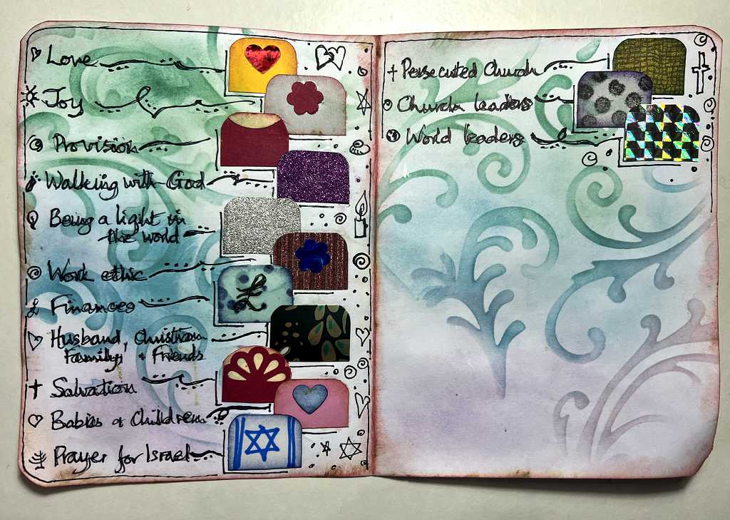
All the theme tabs on my Prayer Bible are now complete, and glued in place, with the verses highlighted and the respective theme written in the top margin. The Bible is now ready for use as a Prayer Bible, although I have already started using it, and referring to my list of Scriptures on the computer for the tabs I had not yet done.
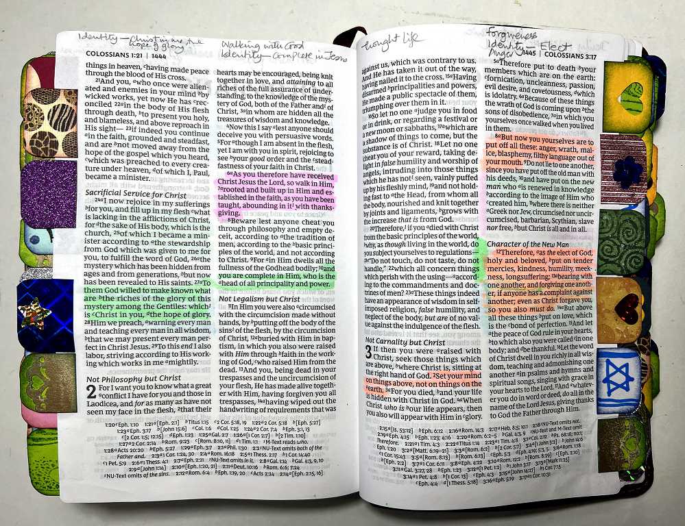
It is looking very colourful, and it feels lovely as you riffle through the tabs on the edges of the pages in order to find the themes you want.
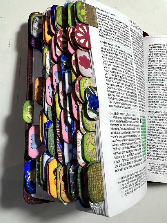
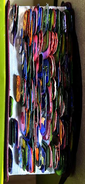
Chunky monkey!
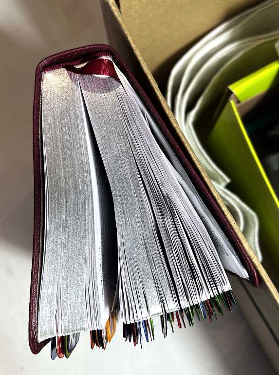
All those tabs have definitely created the “crocodile mouth” effect, but I don’t mind. It handles beautifully, and it still fits in the black case and the pink cloth bag which I use to take it to church (it takes up less room in my bag that way).
The key
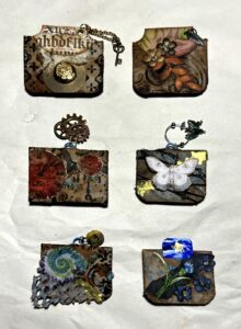
When I first started adding the tabs, and had begun using the Bible, I became pretty familiar with the tabs and the themes to which they related. However, as I added more, it soon became quite impossible to remember which tab applied to which theme, so it became necessary to create a key. When I made the tabs, I usually made one or two extra ones in case of mishaps, and these went into a pot. I was able to stick them down onto some card and write the theme beside each one, and I can refer to this as I pray the Scriptures.
I took a piece of ordinary printer card and cut it down so that when folded, it would fit neatly into the pocket in the back of the black case. I rounded the corners and distressed the edges a little. Once I’d stuck the tabs down and written the information, it all looked a bit bland, so I decided to add some stencilled swirls with Distress Inks, but I rather overdid this and the colour completely overwhelmed the text! I went back over this with a darker marker pen and then added some doodles – it became much more busy and OTT than originally planned but on balance I’m quite pleased with it! Of course, the photos don’t really show how shiny and glittery some of the tabs are, those which I cut from the gift carrier bags.
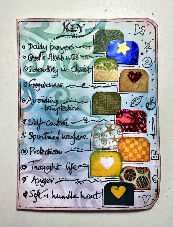
The only disadvantage is that the card isn’t very good quality and I can see it getting worn in time, pulling it in and out of the case, so I may laminate it. I’m going to leave this for a while, though, in case I think of further topics and need to add more tabs, but if I do this, my poor little Bible may protest and refuse to close at all! Chunky monkey X-treme!
Preparing to embellish the pages
A little while ago I tested various pens on a blank page at the back of the Bible, to see what would bleed through. It seemed that the only thing that did not was plain and simple pencil. I used this to write the theme at the top of the pages, and it was great because I could erase them as necessary and re-write them to make room for further themes.
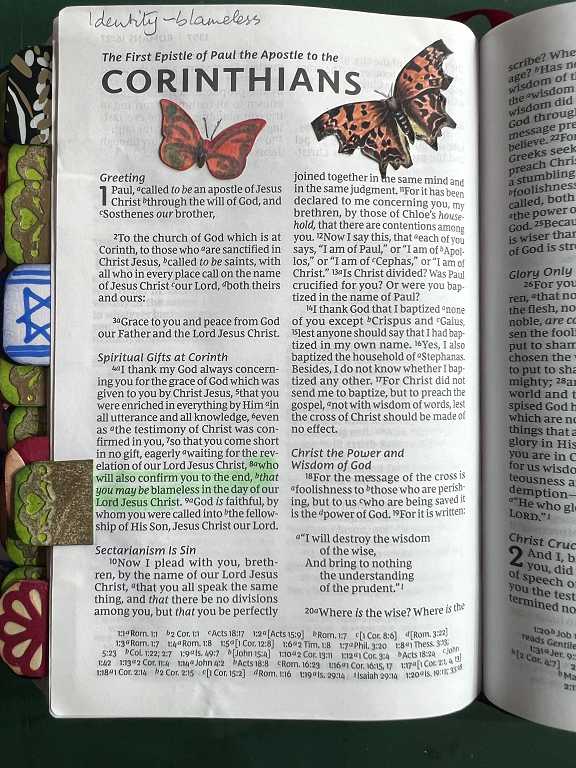
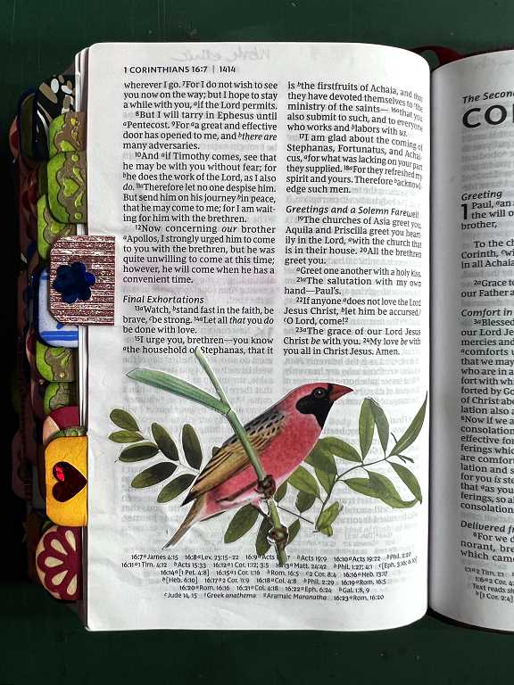
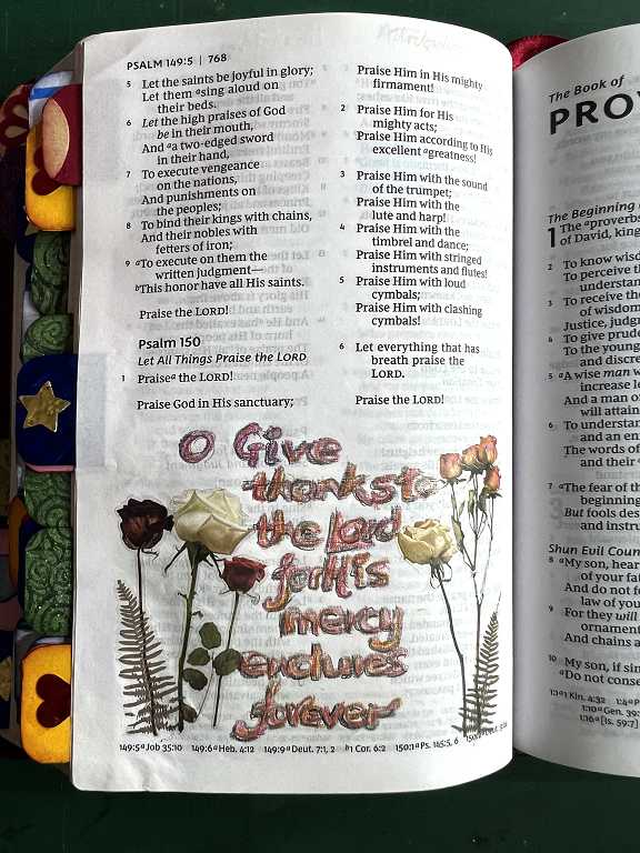
I have already embellished a few pages with rub-ons and some fussy cut images, which present no problem as far as bleed-through is concerned.
The only embellishment I did with added text had to be done with coloured pencils and I wasn’t that pleased with it as it lacked definition. I outlined the text with biro which helped a bit, but it wasn’t really the crisp look that I wanted.
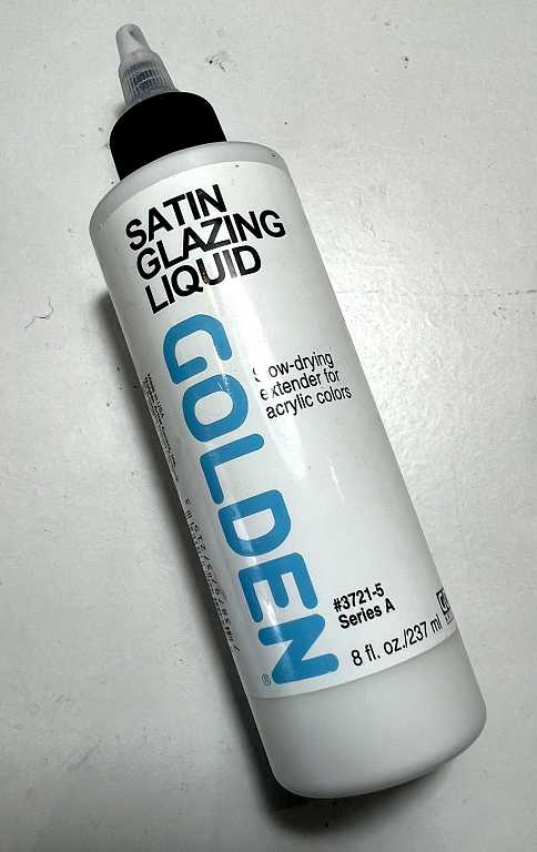
I then remembered I had some Golden Satin Glazing Liquid. Some time ago I had come across an adult colouring website where people were recommending using this to prep the pages of the colouring books which are often not made from the best quality paper – fine if you are using coloured pencil but not so good if you wanted to use water-based media. This fluid acts as a ground, smoother than gesso, and it seals the surface of the page. It enables better blending of colours with certain media as well.
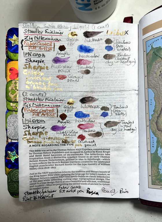
It is generally recommened to apply two coats, leaving the first to dry thoroughly before applying the second. This paper is so thin, however, that I thought I might get away with a single coat, so I divided the blank page at the back of the Bible into two and ruled a line across. I added a single coat of the Glazing Liquid over the whole thing and when this was dry, I added a further coat over the bottom half. I left the bottom margin untreated (where I had originally tested the pens).
It takes a long time to dry at room temperature, so I put the Bible in the airing cupboard with the page supported from underneath, and this speeded up the drying process. I was then able to test all lthe media I am planning to use, adding text with the pens and swatches with the various markers and paints, duplicating them on the bottom half of the page, and leaving them to dry. I was thus able to test for bleed-through and accept or reject the media respecively according to the results once they were fully dry.
From my experiments, it looks very much as if I am going to be able to get away with a single coat, which is good news as it’s going to speed up the process.
The details
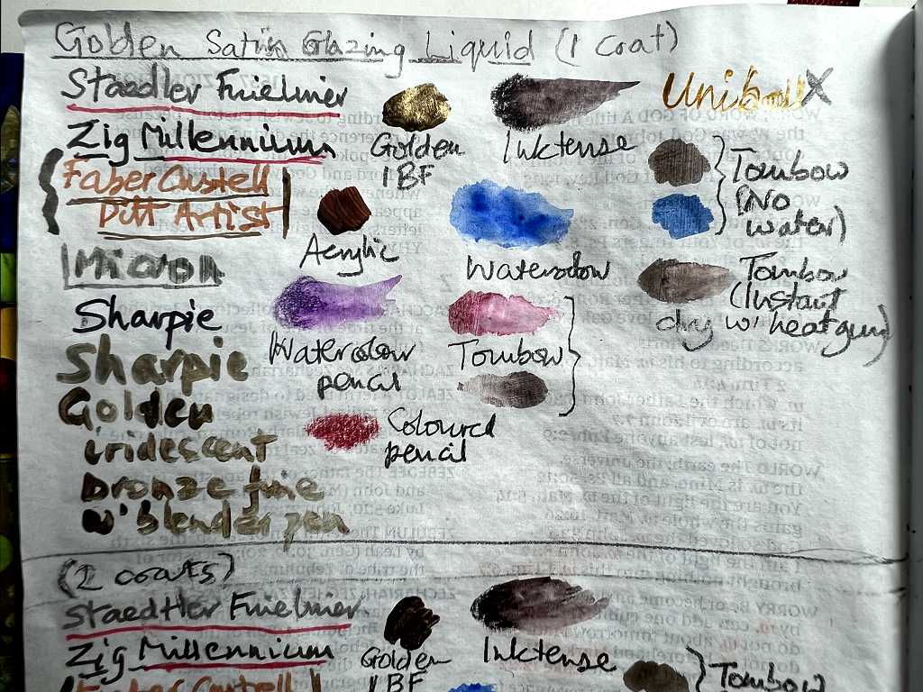
Working from top to bottom, you can see the pens I used in the left-hand column. In every case (pens and other media alike) I tried to choose the darkest, most intense colours I could, to test for bleed-through.
I wrote the name of the pen with that particular pen, and then added underlining either in a different colour or thickness to give more examples. Most are self-explanatory. The grey “Micron” one, underneath the Faber Castell Pit Artist pen, is the thickest one I have in grey. The fine black Sharpie seemed to be the best as an outliner or text pen for my purposes – unlike some of the other pens it did not tend to soak in or spread and become lighter in colour. The thicker pens didn’t do so well. The Staedtler Fineliners are water-based, whereas the Micron, Zig Millennium, Faber Castell and Sharpie are all permanent (some archival).
The “Golden iridescent bronze fine with blender pen” is my all-time favourite gold acrylic paint by Golden. It has the best gold metallic finish I have encountered in any gold paint. It’s main disadvantage is that it is extremely expensive! I wrote the text by dipping one of my Tombow blender pens dedicated to gold (I have others for silver, bronze and white) into the iridescent bronze fine. I wasn’t able to get as fine a line as I wanted. In the photos it doesn’t come out too well – you can see how gold it is in the first two photos but it looks dark in the close-up version. There is a little swatch of it at the top of the next column.
The swatches are mostly self-explanatory. The watercolour, watercolour pencil, Tombow dual marker and Inktense are all water-based, and with the exception of the Inktense which becomes permanent when dry, they are all re-activatable with water once dry. In each case I have pulled out a little of the swatch with a wet brush to show that you can do shading in this way.
At the top right, I tried a Uniball gold pen which initially wrote beautifully with a really good metallic finish, but I couldn’t even complete the word “Uniball” before it ceased to write. This pen has a ball-point and I don’t think it agreed with the Satin Glazing Liquid. I had to do quite a bit of scribbling with it on plain paper to get it to flow again, so unfortunately this pen is a no-no. It would have been nice to have a decent fairly fine gold outliner pen. I have a gold Sharpie (underneath the black Sharpie in the left-hand column) which is too thick, and it also doesn’t come out a very shiny gold but is rather dull. As I mentioned before, the blender pen dipped in the Golden iridescent bronze fine is also too thick to be much use. I have a WH Smith gold marker pen but I couldn’t get that to write at all; it is quite old and may have dried up. I shall definitely have to investigate fine gold pens further, but for adding detail in any painting, I can use a very fine brush with the Golden iridescent bronze fine. This looks like gold leaf – it’s fabulous.
The results
The acid test was to turn the page over and inspect it for bleed-through. I adjusted the levels when editing this photo to exaggerate the effect a bit because the unedited photo didn’t really show very much at all. With these very thin pages, it is quite hard sometimes to distinguish between true bleed-through and the ghosting effect you get simply because the paper is so thin – if you look at the bottom of this page you will see what I mean, where you can see a shadow of the printed text on the next page showing through, which is perfectly natural.
There was some bleed-through, and the worst offenders were definitely the water-based markers and watercolour, to which I had added water to pull out the swatch. Left to dry naturally, these bled through, but if I dried them straight away with the heat tool, the bleed-through did not occur. This is definitely the way forward. I am pleased with this result, because the main colouring medium I want to use is my Tombow Dual Brush Markers – I have a large range of colours of these and they work beautifully. The colour is easy to spread and blend with other colours on a coated surface – on untreated paper they tend to soak in straight away and it is not possible to move the colour even while still wet. (Unfortunately I cut off the bottom of this photo of the reverse side of the page, so you can’t see just how badly most of the black pens bled through on the untreated area.)
You can see that the paper is quite buckled. However, once everything as dry and I closed the book, I was able to put it in the cloth bag to take it to church, and at home later, I noticed that it had flattened out quite a bit. It’s never going to be as flat as an untreated page but that doesn’t worry me over-much. The paper has a slightly different feel to it than when untreated; it feels slightly rougher, but not nearly as rough and gritty as it would be if I had used gesso. Clear gesso in particular gives a very rough surface and this is not condusive to brush markers as it tends to damage the tips, and it wears down coloured pencils very rapidly too.
I am pleased that there was an almost completely blank page at the back of the Bible where I could carry out these experiments! It hasn’t interfered with the text at all, and is tucked away at the back, and will serve as a reference as I do the artwork.
I am intending to treat various blank areas of pages, notably at the end of a book in the Bible, and add various paintings and embellishments, which will appear throughout the Bible. This will be an ongoing process but I should end up with a beautiful, colourful and decorative Bible with all its colourful tabs and plenty of art work.
Many people buy a dedicated journaling Bible which has very wide blank margins for art work. These Bibles are quite large and bulky and were not at all suitable for my purpose, which was to have a compact Bible that I could use regularly, and also tuck into my bag for church. Some people cover the actual Biblical text with artwork but I really don’t like this. Any embellishment should be an adjunct and in my opinion should in no way obscure the actual text which is the main purpose of the book in the first place. Highlighting is different as it doesn’t obscure the words but draws attention to them.
Wow Shoshi this has blossomed since I saw it several weeks bag at Buckfast! What a great spiritual asset it must be to you now, and a boost to your prayer life. Not only that, it’s a work of art and so VERY pretty! (…a secondary strings I know, but still lovely!)