TISSUE BOX FOLIOS PART 3 – COMPLETION OF VINTAGE GRUNGE FOLIO
I have now completed the Vintage Grunge Folio and am very pleased with how this turned out. It has more elements to it than the Floral one and is pretty grungey. During the making of it, I incorporated a few ideas that were new to me.
The front cover
I am very happy with this. The project contains quite a few digital downloads and I can’t list where they all came from, but most of the contributors of these ingredients for album making come from Crafty with Toni, Margareth from Seven Plaza, Tracie Fox, Tracy from Art House Whimsy and Luise Heinzl – my apologies to any contributors if I’ve left anyone out! I also use images from the Graphics Fairy Premium Membership site. The cover of this album is made from a page from a paper pack I recently bought at The Range. The background and other elements in the window were all digital downloads, and the floral embellishment was made from my own paper flowers.
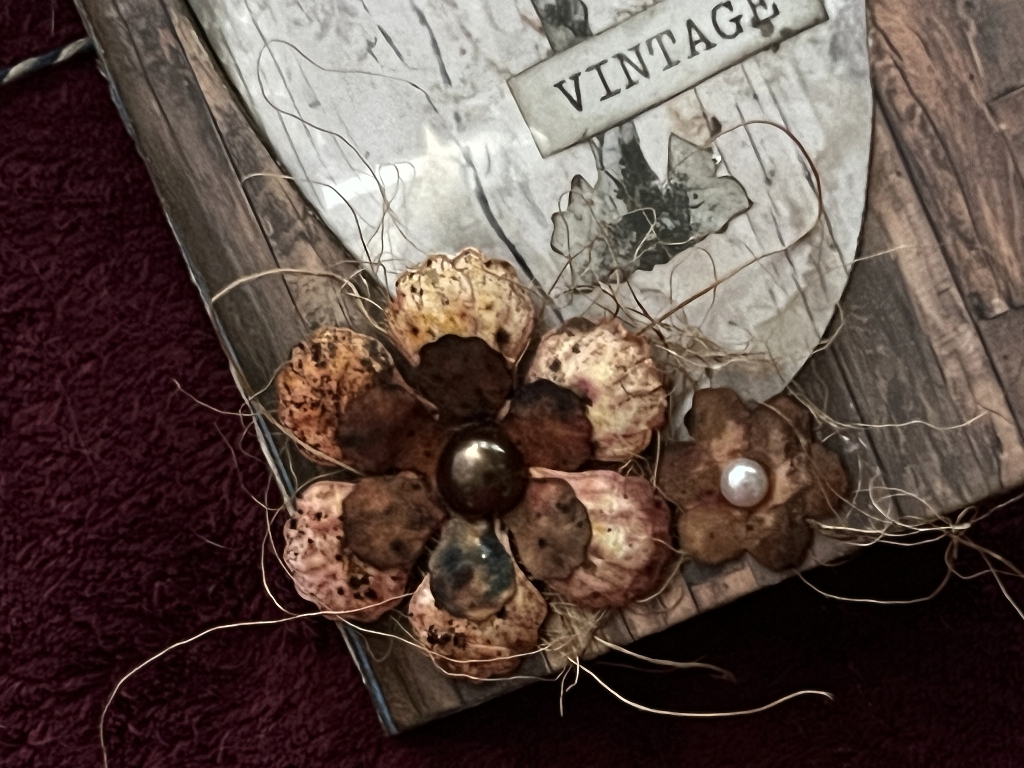
The fibres were a recent brilliant find! I have struggled for years trying to find that fibrous stuff that so many people use as an embellishment, and my problem was that I didn’t know what to search for. I came across this just the other day when browsing on Amazon – it is coconut fibre for birds’ nests!! I just love using non-art materials… the only problem with them is that they often come in much larger packs than you’ll ever need!
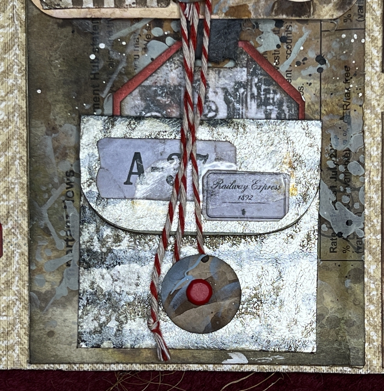
The small dangle is a little charm I made with a metal ring and a circular motif punched out from a digital download, and filled with UV resin. I am loving using this stuff.
The closure on the back
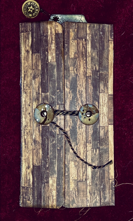
As with the previous folio, I cut circular pieces of decorative paper (in this case my own produce) reinforced with card and attached with brads. For this grungey version I chose screw-head brads. I darkened the blue and white butcher’s twine with brown ink to grunge it up.
Opening the folio
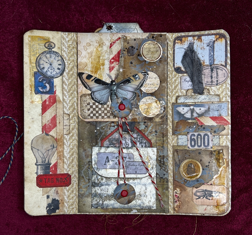
As you can see, this is a lot busier than the floral folio, with lots of labels and other ephemera. You just keep building up the layers and trying different things, and getting a sense that “that area needs something…” and trying different things. The colour scheme is mostly browns and greys, with red accents. I think these colours go so well together. The base paper which I used to line the whole interior of the folio is some vinyl wallpaper which I think came from the kitchen in my first place of my own, back in the early 1980s.
The left-hand panel
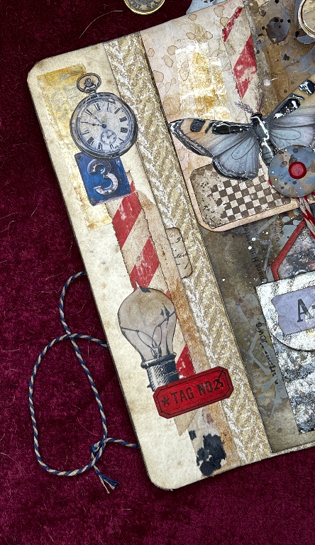
No surface belly band this time, but a series of embellishments.
Faux washi tape
I am thrilled with this. This candy stripe washi is really hard to find, although I did manage to get a few black and white rolls recently. I bought some red and white striped gift wrap from W.H. Smith a few months ago thinking it would be useful for art. I cut off a nice big piece and tea-dyed it. I then tore strips across it with the aid of a metal ruler, at 45 degrees so that the stripes would come out diagonal. The torn edge and tea-dyeing makes these paper strips look really grungey, and the effect is intensified when it is sanded after it’s been stuck down. I used bits of this throughout this project.
I have subsequently discovered that you can buy sheets of self-adhesive washi paper on a backing sheet, that you can print on, even with a laser printer! This opens up a whole range of new possibilities for me. I am in the middle of a Krita (graphics app on my Linux laptop) tutorial on how to draw parallel stripes, so I think my endless searching for candy stripe washi tape may be over! This is very exciting. I also have a lot of washi tape images from the Graphics Fairy Premium Membership site that will be much better printed on the correct paper.
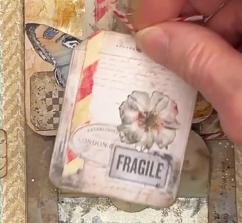
Small tag in the left-hand panel pocket
A series of small digital steampunk images arranged in a strip on some script paper, all done in my desktop publisher and printed out.
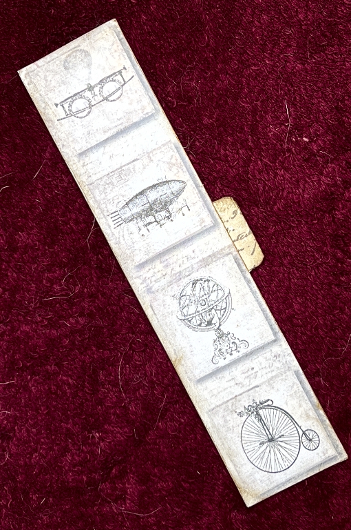
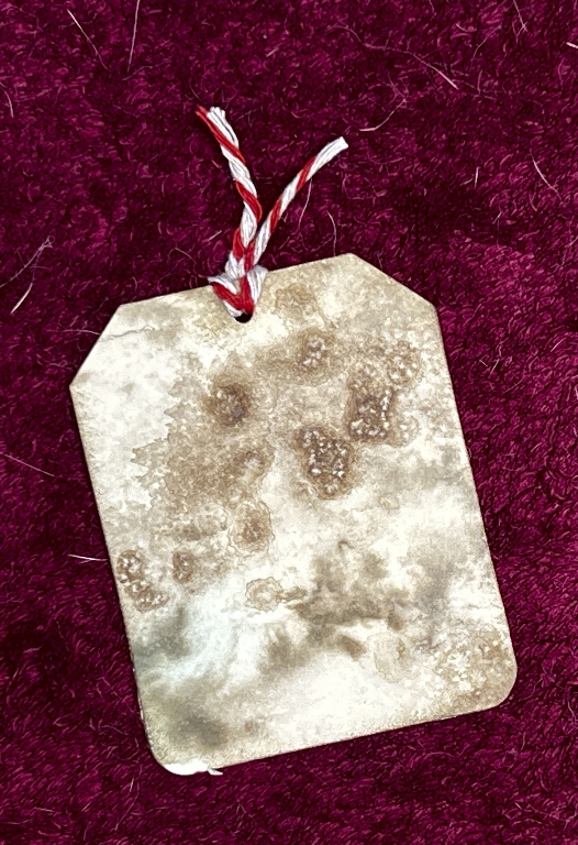
The back of the tag:
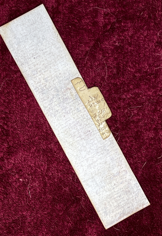
Some more script design paper. This time I ensured that I made the tag puller tab substantial enough.
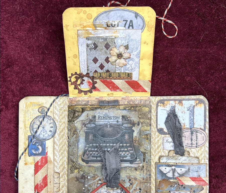
The centre panel
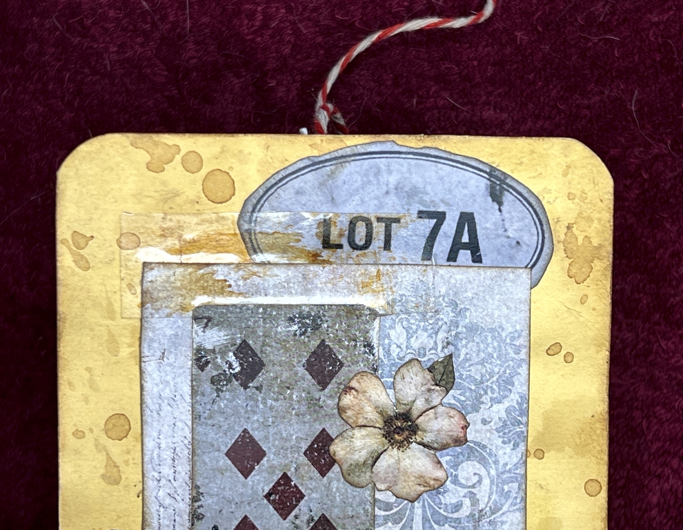
The top flap
Various bits and pieces of background papers collaged. I have a lot of papers like this in my stash, many of which have been condemned as failures but in the end nothing is a failure because when you use it for this sort of thing, it works just fine!
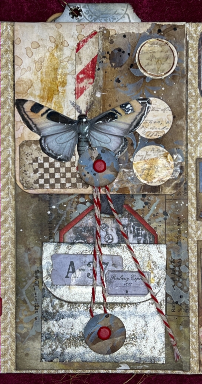
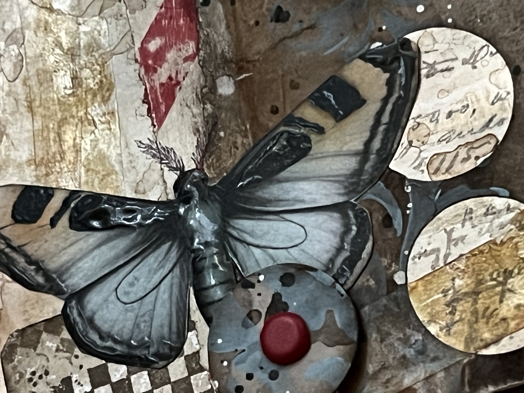
![]()
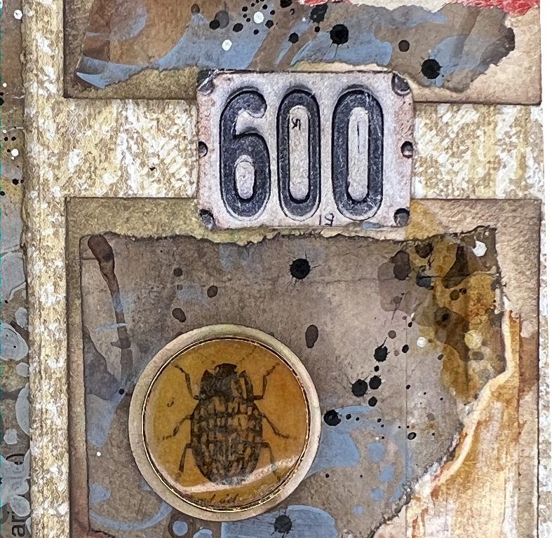
More of the faux washi tape, and also some of my new faux vintage Sellotape. I did a post about this recently. I love how it turned out in this project. The paper on the right was what I used to punch out the circles for the closure discs. Rather than throwing this scrap away afterwards, I decided to incorporate it, and added some different paper behind them. The top one is one of my new UV resin discs in a metal ring, glued down into one of the circular holes. After I’d done some more UV resin, I had a little bit left over, so I painted it onto the wings and body of the moth for a bit of shine.
The closure
For the closure on the inside of the folio, which holds down the flap at the top, and keeps the envelope at the bottom closed, I used the other two paper discs I’d cut, and some red and white butcher’s twine which I again dulled down with some ink. Originally I was going to use more of the screw-head brads but in the end decided that red ones would be better because they fit in so well with the other red accents.
This time I made sure the brad legs were well protected.
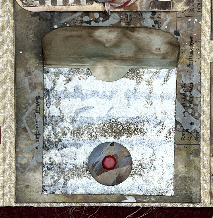
The envelope
This probably took me more time than anything on the page! the paper is cut from a sheet of gel-printed paper which I was never keen on – it was done with iridescent acrylic paints including some metallics. However, it’s all grist to the mill and it got stowed away with its equally unfortunate brethren in anticipation of being useful one day! I really like it in this project. As a small element with other embellishments, it makes a nice focal point. Shoshi’s Rule #1: Never Throw Anything Out.
I stuck the envelope down on three sides, so that it formed a pocket. I have just noticed how the border of the tag tucked in behind it almost looks like a handle for the envelope, turning it into a tiny handbag! Pure serendipity. That often happens with projects like this. Lots of unintended consequences, many of them delightful. The ones that aren’t either get ripped off, or covered up with more layers. Shoshi’s Rule #2: There are Never Any Mistakes. Just More Layers.
The tag behind the envelope
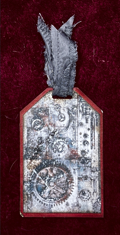
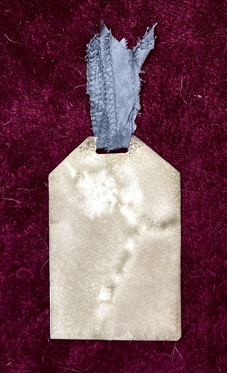
A nice grungey steampunky digital which I distressed with my little sander. It’s mounted on the red card as a reinforcement as well as forming a border. The tag pull at the top is part of a seam cut from a charity shop dress that I took apart. I love these scraps of fraying fabric for this kind of element. It is simply adhered in place through a punched slot with fabric adhesive.
The back of the tag was made from a scrap of a batch of papers I decorated a while back with (I think) tea or coffee and spatters of ink while it was all really wet. Glorious results!
I lined the envelope with more of the same.
Unfortunately I forgot to photograph the little tag which goes inside the envelope, so I made a screen shot from the video. The quality isn’t that great but you can get the idea.
The back of the tag. More of the tea/coffee/ink spattered paper.
The flap on the central panel
The flap at the top reveals more embellishments when it is lifted up. More of my faux washi and vintage tape with the digitals. The background paper for the whole centre panel is a letter I received from the bank, which rather than shredding, I splurged with all sorts of stuff like gesso and inks and stencilling and spattering. Some of the text is visible for extra texture but nothing confidential is discernable! I made a whole stack of these papers. Under the typewriter image itself is a scrap of baby wipe which had been used for mopping up. I distressed the edges by trying to fray it (it wouldn’t) so I pulled it about and stretched it and wrecked the cut edges as much as I could. That element was stuck down with acrylic medium.
A closer look at the underside of the flap. You can see some of the vintage tape.
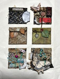
The right-hand panel
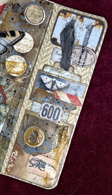
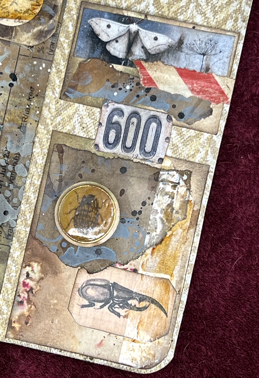
A pocket with a small belly band above, as with the previous folio, but this time with a lot more embellishment. More of the DIY tapes and another UV resin disc, this time with a bug in it.
The tag that goes in the pocket
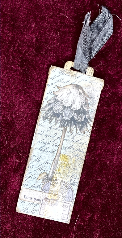
A fussy-cut digital stuck down on some more script paper with added ephemera and faux vintage tape. It has more of the dress seam on top to pull it out.
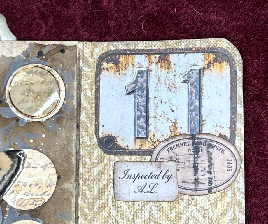
Other embellishments on the right-hand panel
Some of Luise Heinzl’s fabulous digitals of rusted metal numbers. There are tons of these in the collection. As Toni (of Crafty with Toni) always says, “Oooh! The Grunge!” and “Delicious!” A girl after my own heart.
The large tag for the hidden pocket
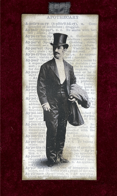
The centre panel, like that of the previous folio, has a hidden pocket the full height of the panel, with a large tag which shows through the acetate window on the front of the folio. This time I decided to make a double-sided tag so I could choose which to show through the window. This side depicts a gentleman against an inked dictionary page, and the tag has a scrap of the dress seam to pull it out. My hubby asked how I knew the man was a gentleman. I said “because he’s wearing a top hat” haha!
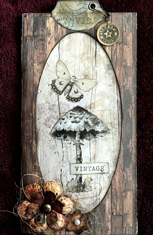
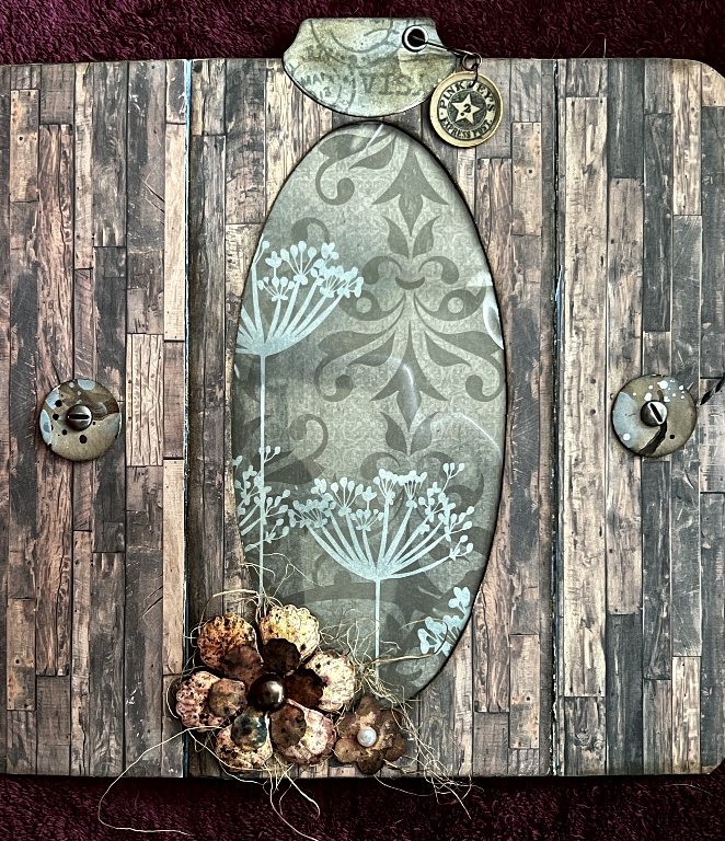
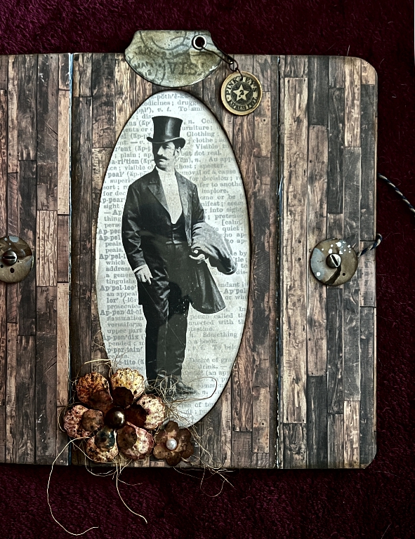
Views of the tag through the window
A selection of different choices to show through the acetate window! (Funny to think that tissues once came out through here.) Firstly, the floral background with no tag in the pocket. I inked the stark white flowers of this scrapbook paper with some pale turquoise ink to co-ordinate with the project.
Now, our gentleman.
My favourite has got to be the toadstool one, though. I love the wood grain paper which co-ordinates and contrasts so well with the paper covering the folio.
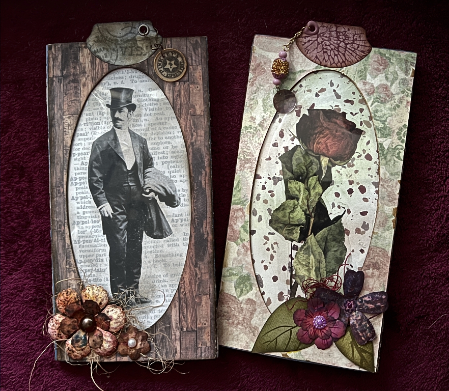
The two folios
Finally, a shot of the two completed tissue box folios. Quite different in style, but going together nicely.
The video
Now uploaded to YouTube and social media.