ISLAMIC ART – SHAMSA PART 2 – BEGINNING THE COLOURING
A very fruitful session in the studio this afternoon, when I began painting my completed drawing. Before I started, I did a rough digital mock-up on the computer, using the quarter-view photo of the completed drawing, to help me to decide where I wanted the various colours to go. My first result was too much colour, which did not allow for enough contrast, so I changed things a bit and chose to add more gold.
Ageing the background
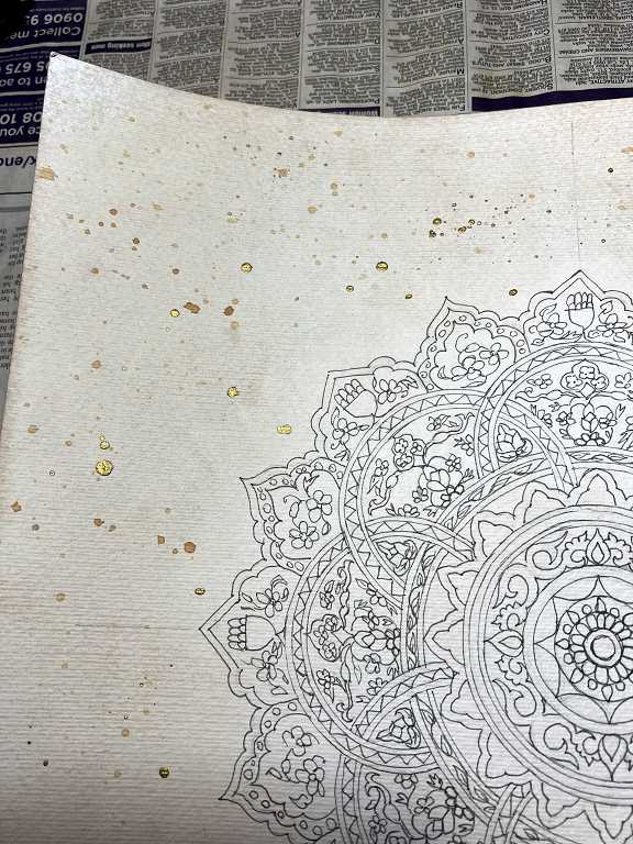
Having slept on my indecision regarding the background, and looking at it again, I decided it would definitely be improved by making it look more vintage. The paper is pretty stark white, and some tea-dyeing and spattering would help the background and the design itself appear more integrated.
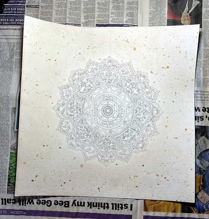
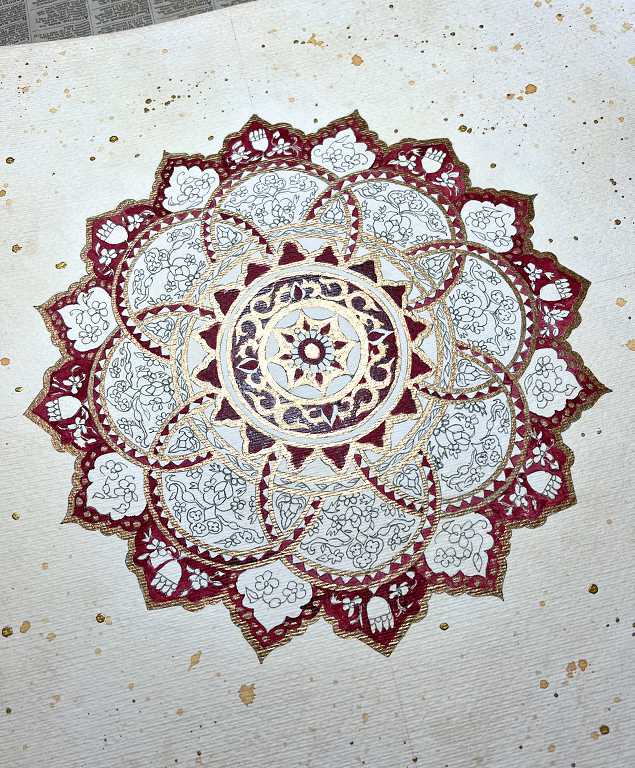
I made up some strong tea, some of which I left in the jar, and I put the rest in my spray bottle with some water to dilute it. I did a test run on the offcut strip from the picture, to check on the appearance and how much warping I could expect. As I thought, this paper is thick enough not to warp too much. I masked off the design with some scrap paper and sprayed two coats of the tea on the front surface, blotting it off in between, and dried it with my heat tool. Then I took the jar of strong tea and used a fan brush to spatter the surface. Once I had dried this, I repeated the process with some Dr. Ph. Martin’s gold calligraphy ink. In the above photo, you can see the difference in colour between the aged background and the design which had been masked. I did not want the new background colour to dull the colours I was going to add.
Painting the gold
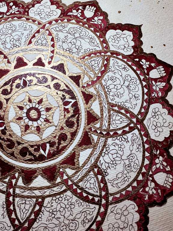
I used Golden iridescent bronze fine fluid acrylic for this (my favourite gold paint), using a fine brush.
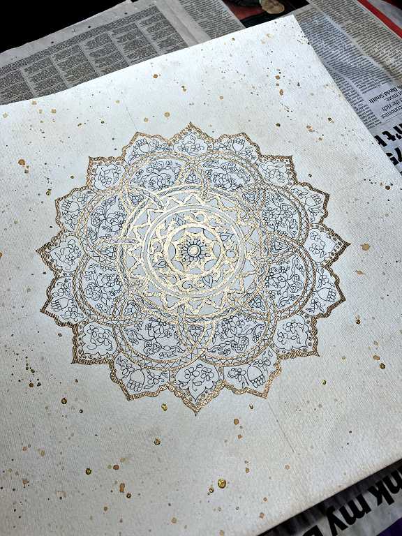
Immediately, I was really pleased I’d aged the background. The design sat really well against the tea-dyed background with its gold spatters.
There is still more gold painting to do, filling in some background, but that is a job for later on.
At this stage I was almost tempted not to add any more colour at all! However, the biomorphics looked rather unfinished and I decided to proceed as originally planned.
Choosing the colours
I got out my red and blue tins of Kuretake gansai Tambi paints and selected a few colours from each, and swatched them on the paper offcut.
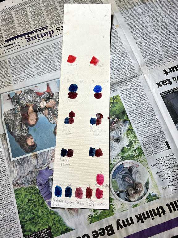
In the end I chose Maroon and Prussian Blue.
Beginning to paint
I started with the red, and when I had completed this, it took me up to the end of my studio session, when I had to go downstairs and do other things.
This is the result so far.
I propped the picture up on the other side of the studio for a more distant view.
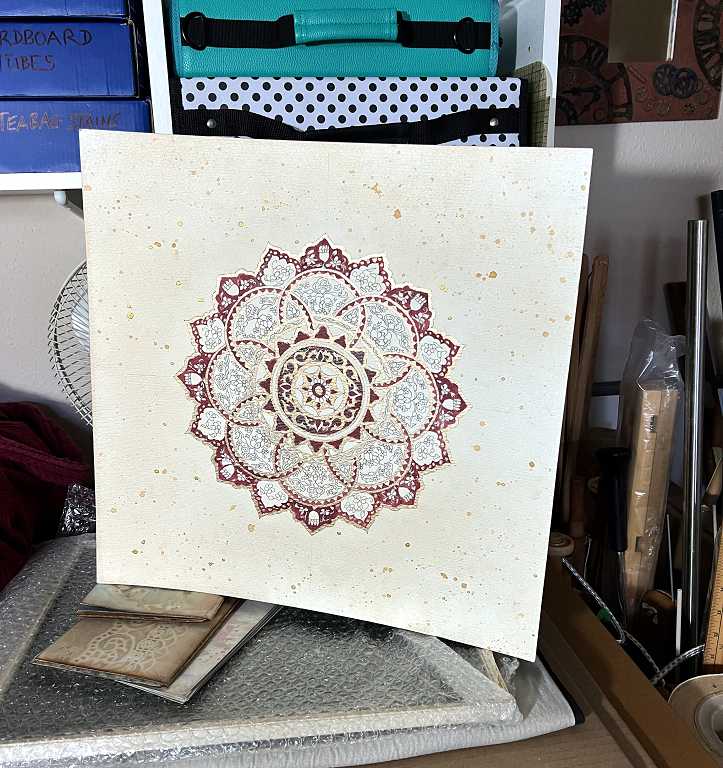
So far so good! It is also looking pretty good with the frame.
The next step is the paint the blue.