ISLAMIC ART – SHAMSA PART 3 – COMPLETING THE COLOURING
This stage of creating my shamsa took me a lot longer than I expected. Sometimes you don’t know how things will turn out until you actually do them and see the project as a whole, and what seemed like a good idea turns out not to be.
All was well to start with.
Painting the blue
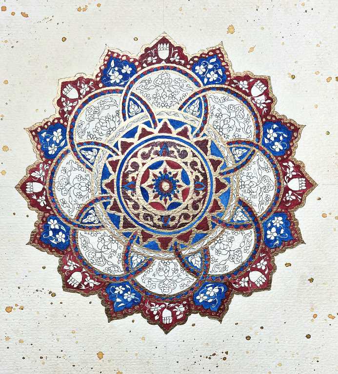
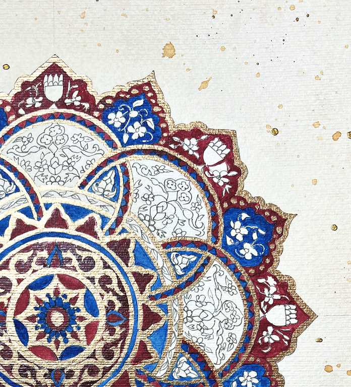
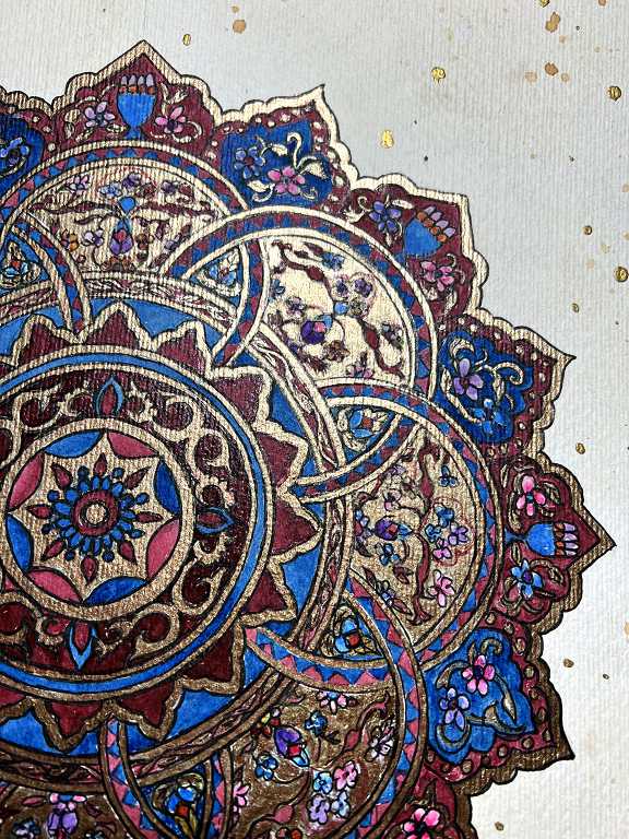
This completed the colouring of the main outlining features. Here’s a closer look at a quarter.
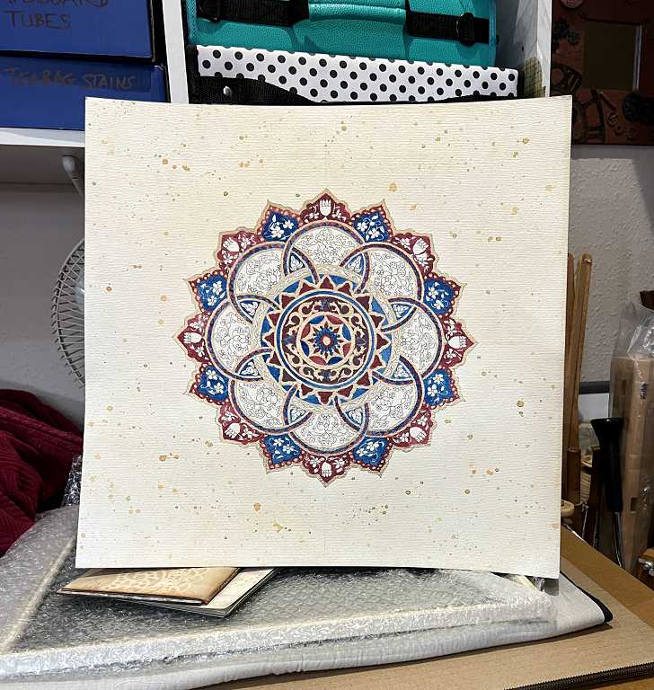
Another shot of it propped up on the other side of the studio. I find these distance shots quite helpful, to see the project as a whole.
Adding further gold
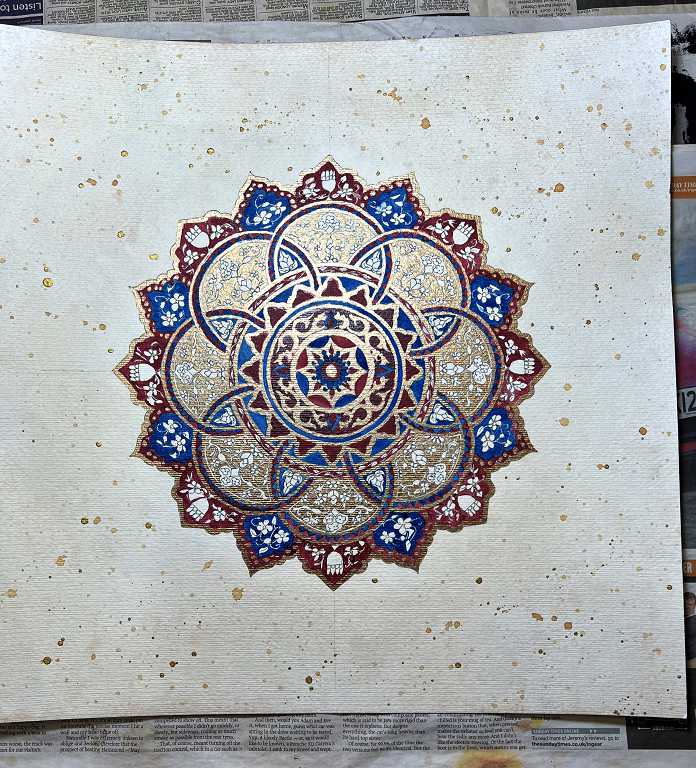
The background of the widest band, between the interlocking circles, needed to be painted with gold.
A closer view. As you can see, I also added some red to the narrow circular border with the leaves. Later I painted the leaves with gold.
At this stage I was finding the texture of the paper to be a bit of a pain. I would much prefer to have done this project on smooth paper, but this was the only paper I had which was large enough for the frame.
Propped up again for a general view:
Painting the biomorphics
This is where the trouble began. I selected several different colours from my Kuretake paints and everything seemed to be fine, until I had finished.
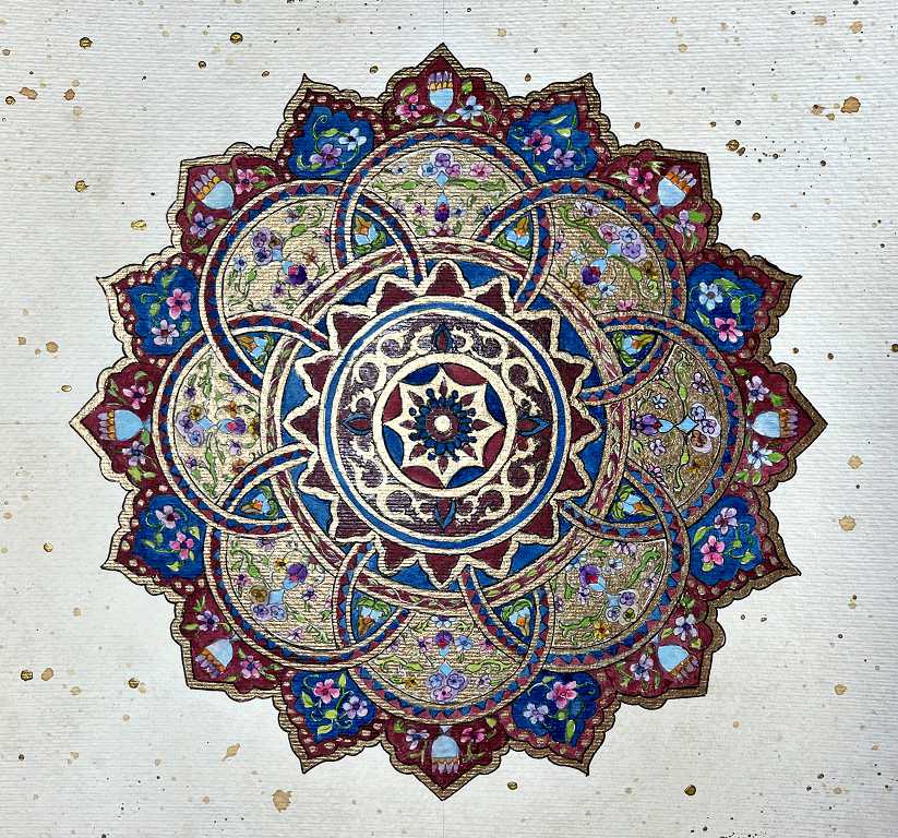
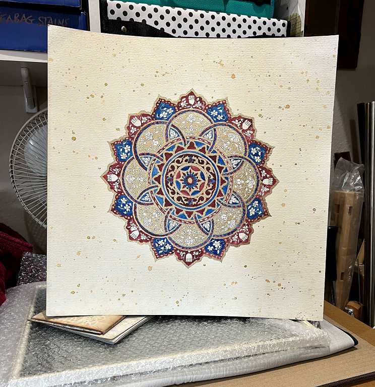
The whole thing looked far too multicoloured and the colours were generally too bright. The problem was mostly with the green which was really dominating, when my original intention was to keep the colours mainly to dark red and blue. The green seemed to tint the gold background and give it a greenish hue which I really didn’t like.
Here’s the general view.
Recolouring
There was nothing for it but to try and lift the offending colours and redo them. This involved lifting some of the dark red and blue from the outer border as well, which of course needed to be retouched. The gold wasn’t a problem, being acrylic and permanent once dry.
I did quite like the lightness of the main body of the picture, which I felt only needed a little darkening, and when I recoloured it it came out darker than I wanted, especially when I added the black outlining.
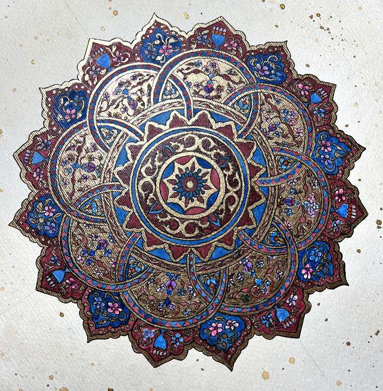
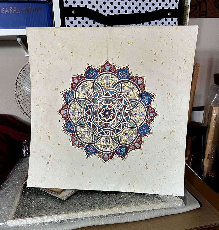
It does have more richness, though, and I am generally pleased with it, and consider it was worth the effort to get rid of all those colours. I replaced the green of the leaves in the outer border with gold, which was a great improvement. Most of the flowers were either pale blue, pink or purple here, and I got rid of the yellow and orange, and toned down the brightness of most of the flowers where required.
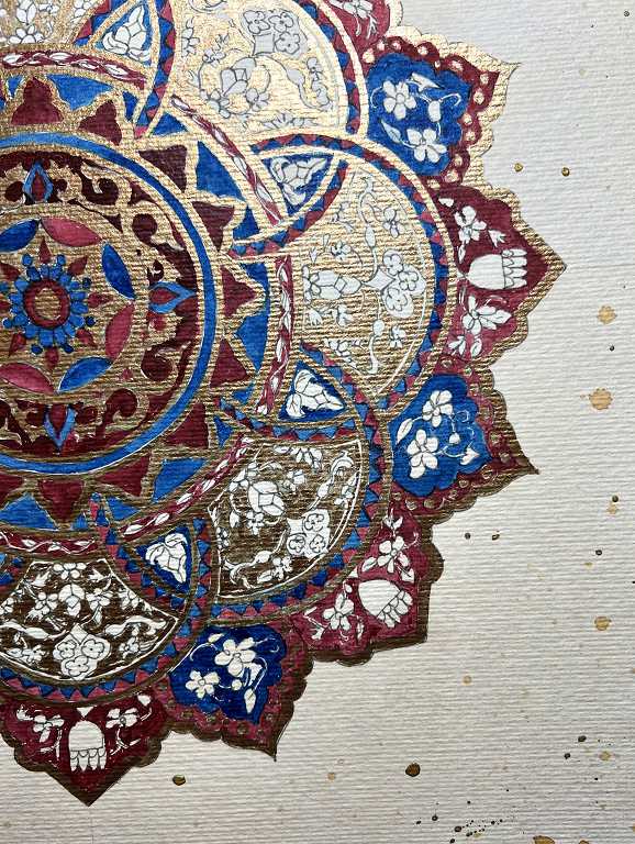
Some further views.
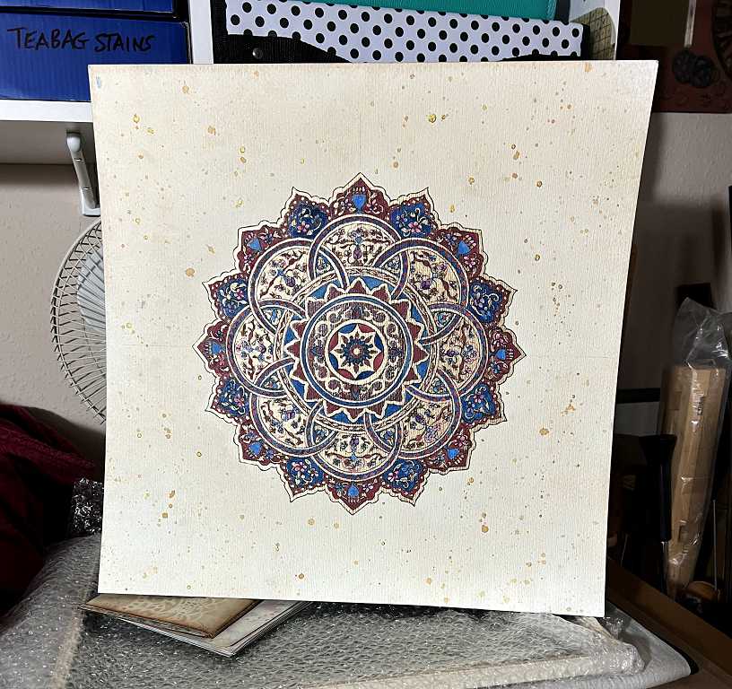
The final result is a lot more homogeneous and sophisticated, and more what I had in mind from the beginning.
All that remains now is to add the rays, and the picture will be complete.