TYPEWRITER ALBUM PART 2 – PLANNING THE SIGNATURES
Having selected the papers for the pages, the next step was to sort them and decide on the structure of the signatures. This is only a plan at this stage and changes will inevitably take place as the work progresses but at least I’ve got a foundation to build upon.
A4 and Letter-sized papers
I have an absolute aversion to our European standard paper sizes. OK, it’s convenient that when you fold them in half, the proportions remain the same, but even with metric measurements they are not a round number of millimetres. My main gripe is that I simply don’t like the proportions of A4. It is too tall and narrow. American Letter-sized paper, on the other hand, being 8.5 x 11 inches, is shorter and wider and much more pleasing to the eye. I work in inches whenever possible and don’t like the metric system we’ve had foisted upon us (but that gripe is another story!).
For a long time I have had a dilemma about the size of pages for album making. Print-outs will be on A4, but with laser printing it’s not possible to print edge-to-edge so you always lose a bit, trimming off the borders. To form signatures you have to fold A4 landscape into A5 portrait. Same horrid narrow proportion!!
The solution – a revelation!
Last week a video by Lisa Collins came up in my YouTube feed. She has devised a novel way of folding A4 in interesting ways, thinking beyond the standard centre fold. This can result in a wider album with various short pages, which form pockets or tuck spots, or the foundation for adding further papers. This is what I have decided to do with this album, and I am absolutely delighted to have learnt this new approach.
Planning the signatures
A signature in a book is a collection of papers folded together and bound as a unit. In junk journaling it is not obligatory to have all the pages in a signature the same size – in fact it’s almost required that you don’t! I don’t like too much randomness but as long as the basic size of the book (determined by the cover) is maintained, some latitude in page sizing is acceptable in my view.
Not all my papers are the same size. Some are cut down from 12 x 12-in scrapbooking papers, and some are trimmed A4. Sometimes this is the removal of the white border on laser prints, and also, some of my pages which were printed on my old laser printer, have a fault down one long side which needs to be removed or covered. Then there are always those extra, interesting papers one wants to include which are not standard size – doileys, coffee filters, ephemera etc. which all have their place.
My initial plan is to have three signatures, each with five pages. This may grow if I find more papers I want to include.
So far, this is what I have planned for my three signatures.
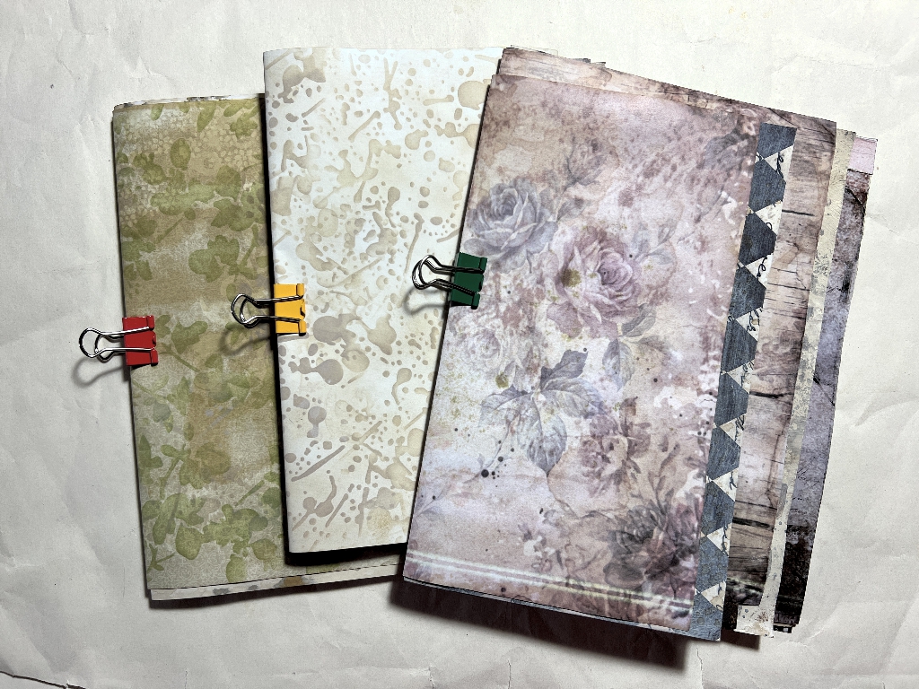
It is very hard to demonstrate anything book-related through still photos as my books especially are usually interactive. Videos are best! There will be a video flip-through at the end but for now, photos will have to do.
The first signature
This is the inside of the first signature, with the pages arranged so you can see each one. Several of them have additional folds, but the main fold runs vertically through them all, and this is where the binding will be.
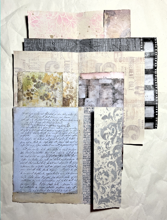
The randomly-stamped page is a standard A4 folded in half, and you can see how the other pages are either shorter or longer from the central binding fold, according to how they are folded. The widest page, the one with the film strip, determines the finished width of this whole signature.
Turning the whole thing over, this is what it looks like on the outside.
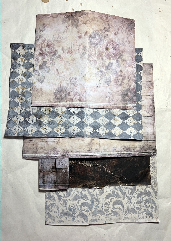
There are not so many interesting folds here. You can see, on three of the printed pages, the printing error along the edge from my old laser printer. Depending on whether or not I choose to add elements or embellishments to cover this, these edges may be trimmed off.
The second signature
As it stands, this will be the central signature of the book. It also has the most interesting folds, and therefore the narrowest pages. This is the inside view, spread out.
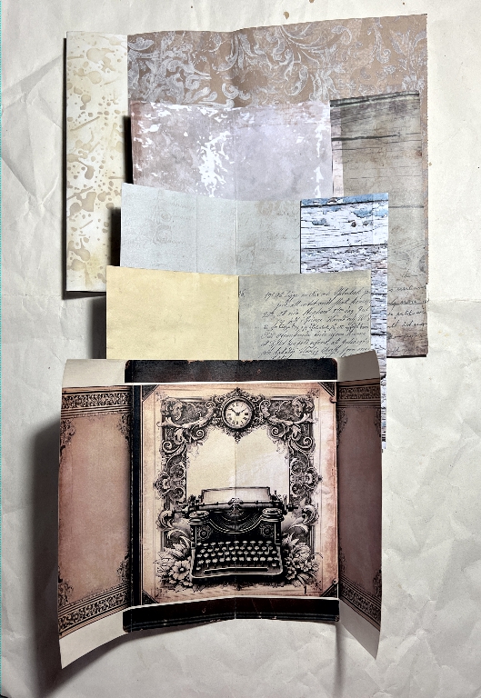
The central page of the signature is one of Margareth of SevenPlaza’s digital downloads, folded in the centre for the binding, with the decorative “wings” either side of the typewriter image, being folded in towards the centre. Again you can see how the other pages are folded, and the central fold line where the binding will be.
The third signature
This will be the final signature at the back of the book. Here is the inside view spread out, showing the various folds.
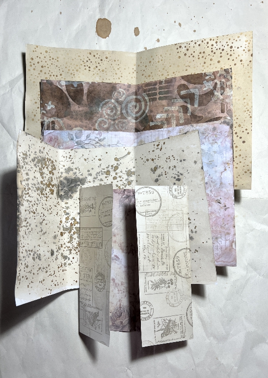
This is the outside view.
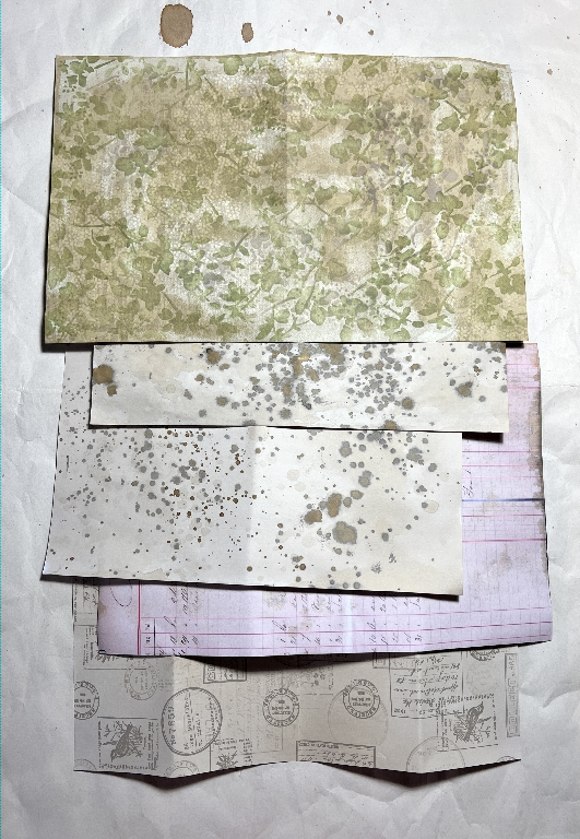
In each case I have tried to juxtapose pages so that their colour scheme co-ordinates. If this is not possible, any added elements will be chosen with this in mind, to produce a cohesive look. All the papers share the same muted colour scheme which co-ordinates pretty well from the beginning, and the decoration will bring the whole thing together ultimately.
Again, this is an early mock-up, and a lot can change in the interim before the book is finalised!