TYPEWRITER ALBUM PART 1 – CHOOSING THE PAPERS FOR THE PAGES
A new project which is also part of my scrap and stash busting mission.
I recently downloaded Luise Heinzl’s Typewriter Ephemera digital kit, which consists of various album elements such as tags, journaling cards and page tabs.
Over the past months I have been making a lot of different ephemera – hidden paperclips, tabs, clusters, tags and so on, and I am keen to start using them. I also have quite a collection of downloaded digital papers, some of which I have already printed. Then there are all the papers I have designed myself. There is therefore quite a lot of material to draw upon.
Some of the earlier papers were printed on the inkjet printer which I gave to my hubby when I bought my first colour laser printer. This recently bit the dust and I bought a new one. Some of the papers are showing the fault in the printing from the old laser printer and I can cut this off in most cases.
Choosing the papers
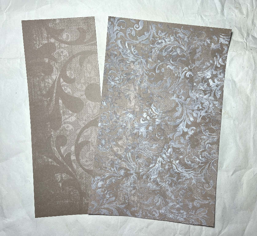
This is a page from a very old pack of 12 x 12-in scrapbooking paper. I like the muted colour and the swirl design but I prefer to add layers for depth and textural interest. I applied white gesso randomly through a swirls stencil. You can see the “before and after.” I trimmed the paper down to A4 width but left the 12-in height as this could be useful for forming a pocket or interesting fold on an album page.
The papers in this stack are plain white on the reverse. I used another stencil to add an overall pattern, using Pumice Stone Distress Oxide, and added further inking to cover the white background.
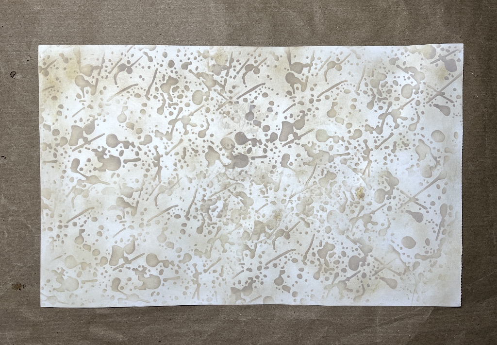
This is another paper from the same stack, trimmed as before.
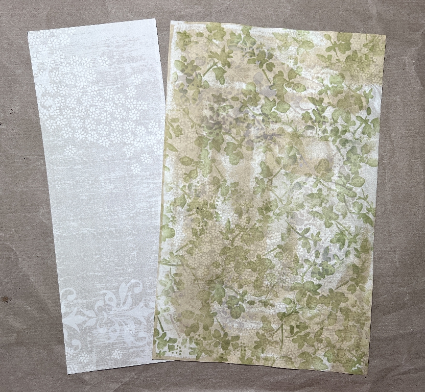
For this one, I used the Tim Holtz “Blossoms” stencil randomly, with Old Paper Distress Ink. I went over it with Pumice Stone as on the previous paper to cover the background. You can still see the texture of the original background showing through.
This is the reverse of the paper, again stencilling and inking the background with Pumice Stone Distress Oxide.
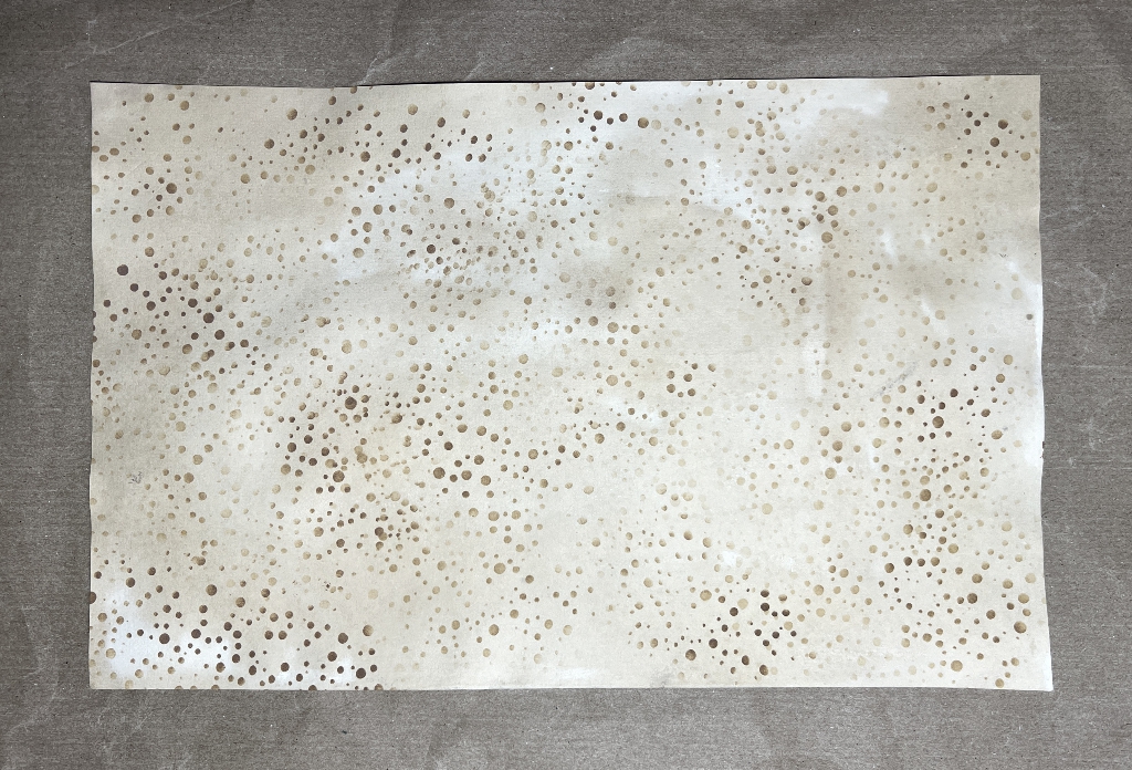
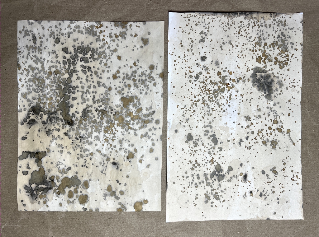
This is one of Crafty by Toni’s digital downloads which I printed out. I also printed another from that set, which is very similar, and the paper on the left is the reverse of this. I coffee-dyed it and spattered it with more coffee, and rust water, which goes black when in contact with organic material. Both papers have the same treatment on the back. It soaked through a bit, but it just added more grunge to the printed front side.
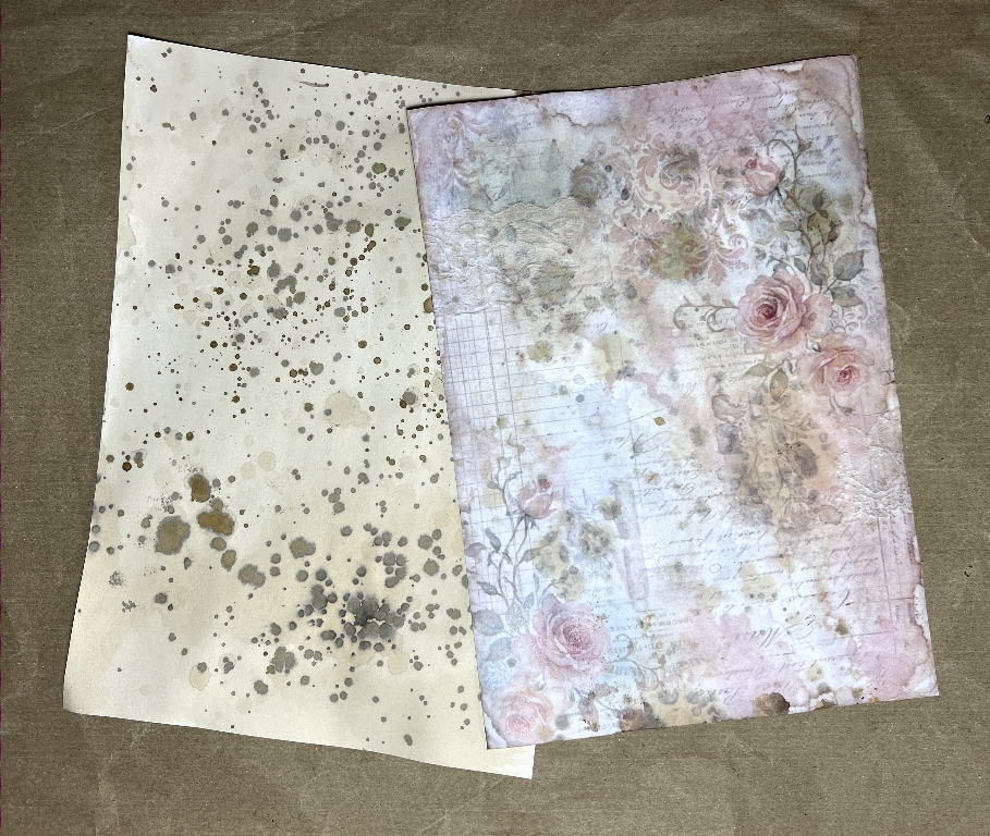
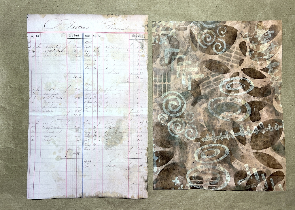
On the left in the next picture is another digital download (can’t remember the source). On the right is one of my own, which I created from scans of negative space paper from which I’d cut the mechanism for several copies of a volvelle, a revolving interactive paper piece. On the original scan I also added some white stamping using my DIY foam stamps.
These are the reverse sides of the above papers, again coffee dyed and spattered with more coffee and rust water.
The next picture shows a work in progress as I alter another paper. This is one of my own digitals, one of a set I created when I made a tiny steampunk album, a “one page wonder,” folded and cut from a single 12 x 12-in sheet.
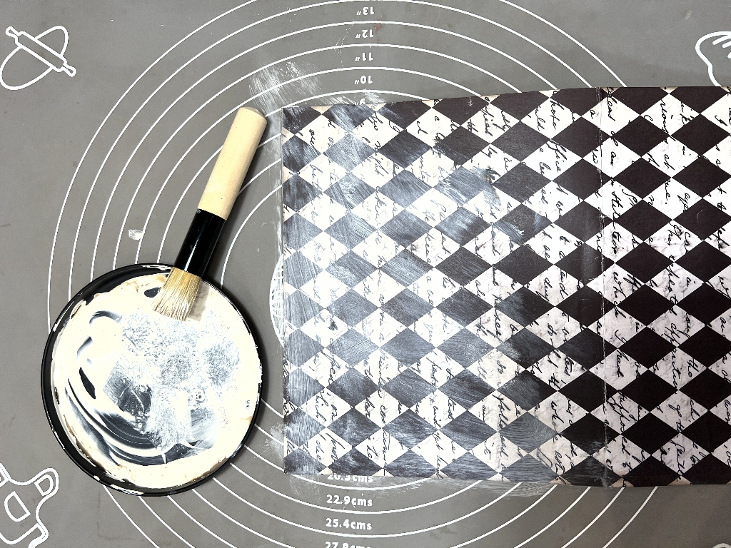
For this project, it was a bit too bold and contrasting, so I painted it with gesso to which I added a bit of coffee. This also served to reduce the slight sheen you always get from laser prints, which I am not too keen on.
This is how the paper ended up, with some coffee spattering after it was dry.
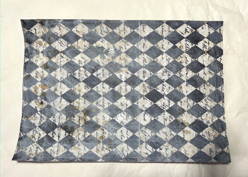
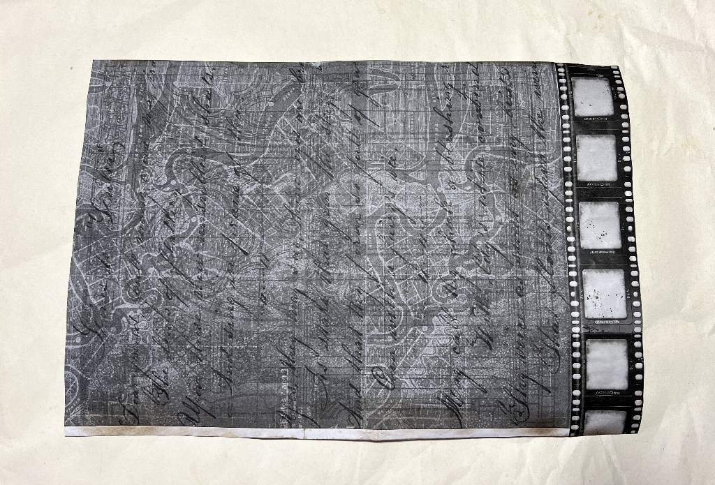
This digital was printed on 100 gsm paper which isn’t very robust for album pages, so I backed it with another printed digital (again, source unknown). There was a gap at the end, but one of my film strip printables from Margareth of SevenPlaza turned out to be exactly the right width, so I glued it down.
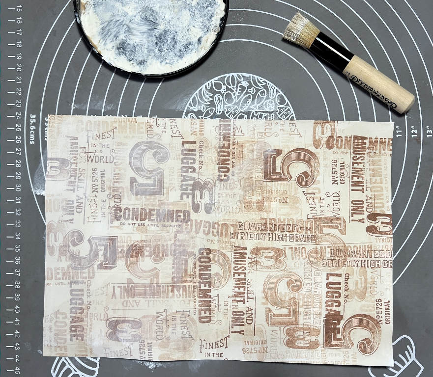
Another “before and after” work in progress shot. I did random stamping on coffee-dyed paper, using the “ghost stamping” technique where you continue to stamp after the first impression without adding more ink to the stamp. This gives a nice sense of depth. I used Sepia archival ink by Ranger for this (waterproof) but in the end it was a bit too definite, so I went over it with more of the coffee-tinted white gesso to tone it down a bit. These stamps were from some Tim Holtz stamp sets. I did another similar page, using (as far as I remember) Ranger’s Sand Castle archival ink but didn’t photograph it. The results are more subtle.
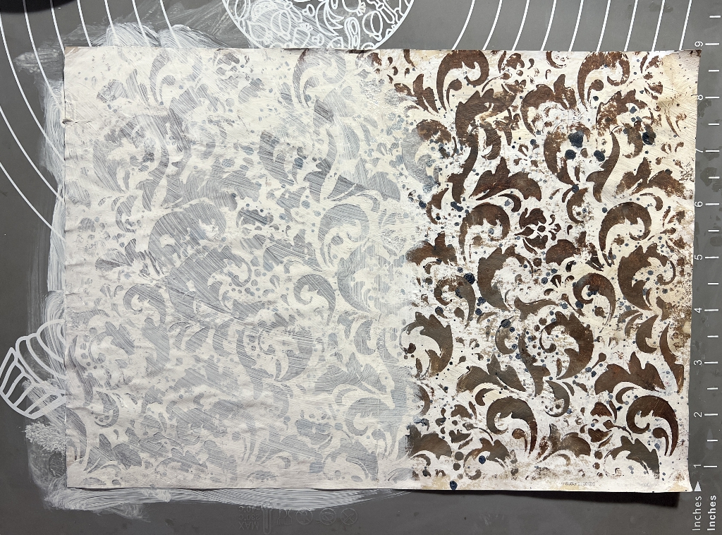
This is another paper from my stash which I’d covered with random stencilling. Again it was much to bright and contrasting, so again I applied the coffee-gesso which made it more subtle.
Much of this paper will be covered by added elements and embellishments. They are different sizes, and will also be folded in interesting ways to add an interactive element to the album after it is bound. Some will need to be trimmed, especially those where the printing fault is obvious.