INTERFERENCE PAINTS, AND PREPARING FOR THE ALTERED BOOK
Another session pottering in the studio.
New paints
I ordered this cheap set of 18 interference acrylics from Amazon and they arrived today.
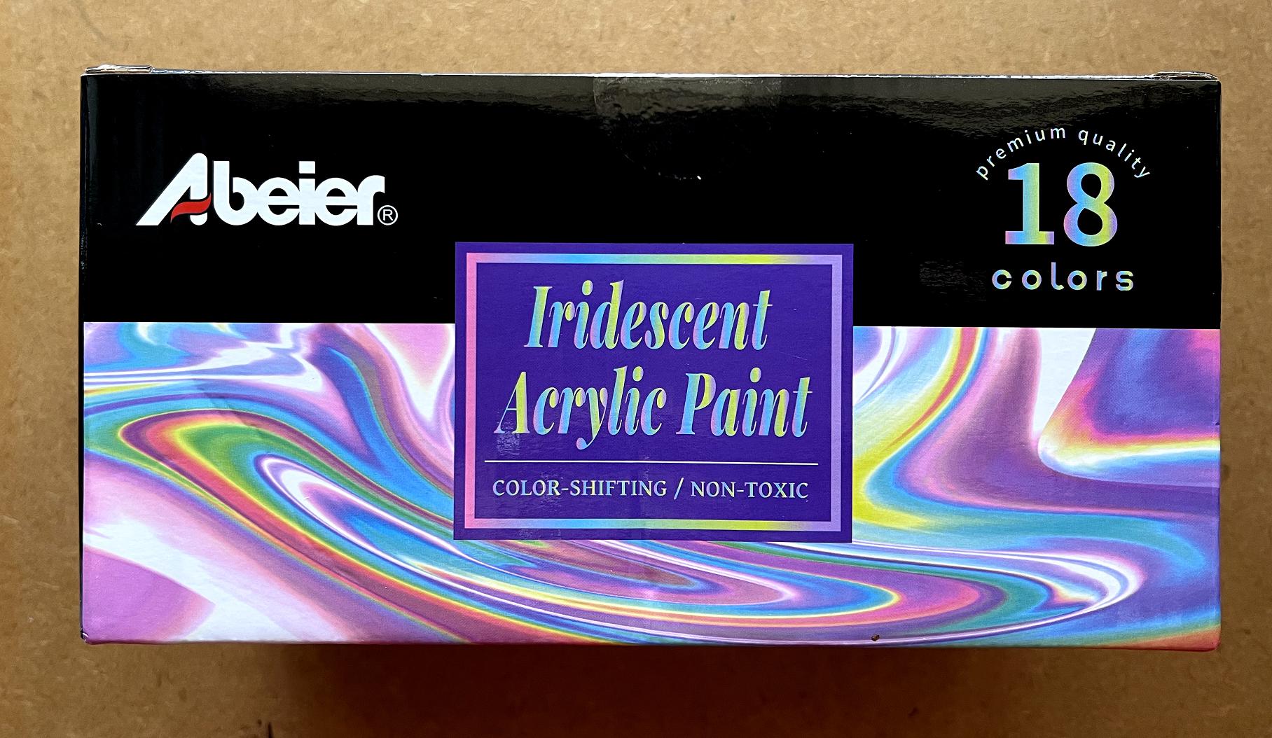
They are supposed to be interference colours, or as it says on the box, colour-shifting.
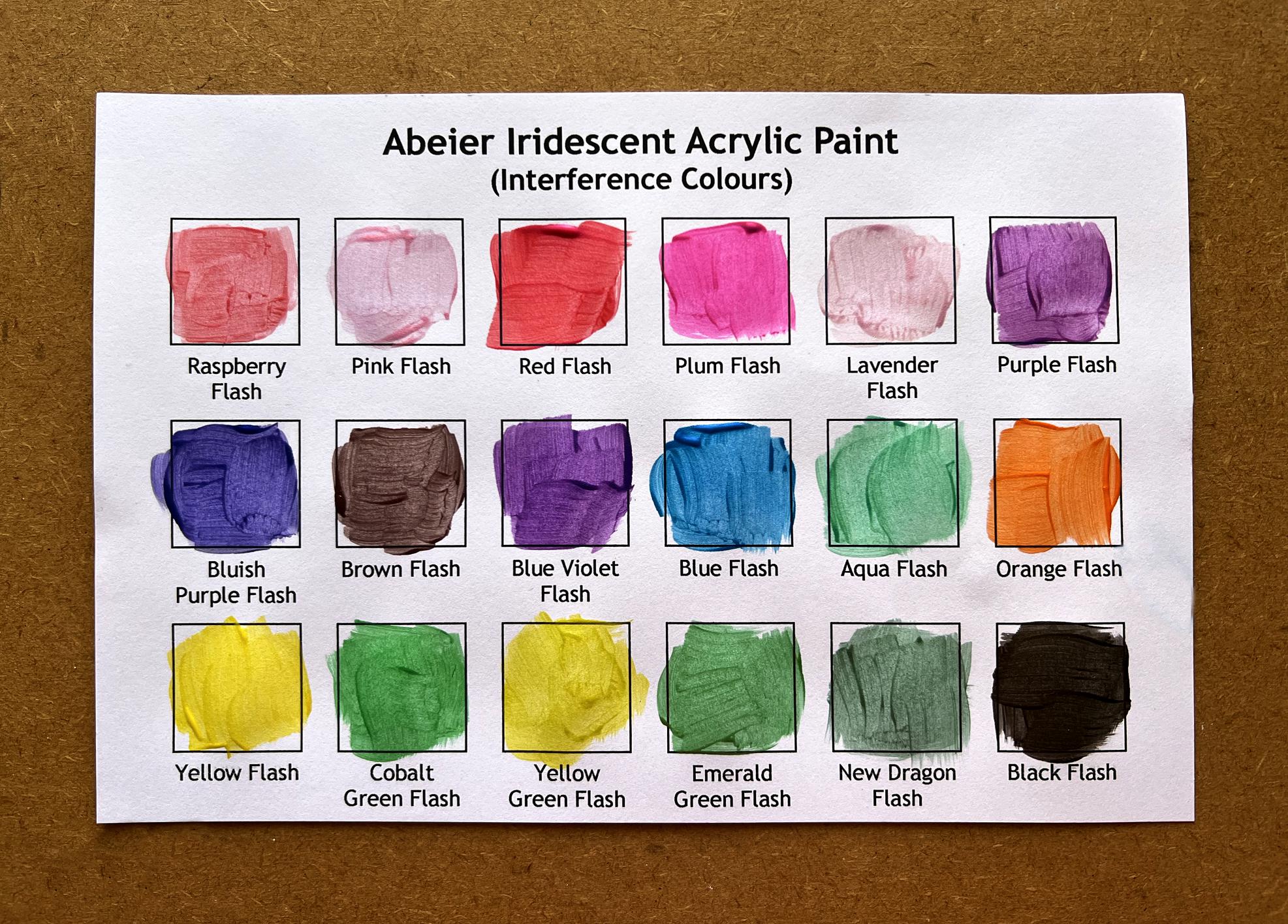
This is the range of colours.
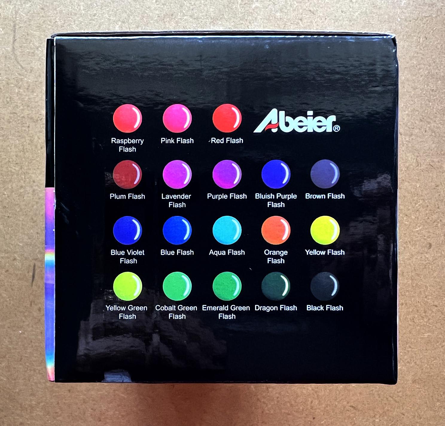
Opening the box:
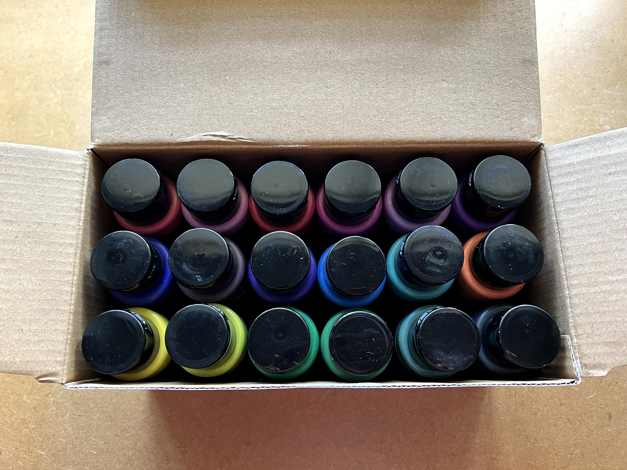
I was thinking of putting a dab of each respective paint on the lids but you can see the colour at the top of the bottles – at least for now.
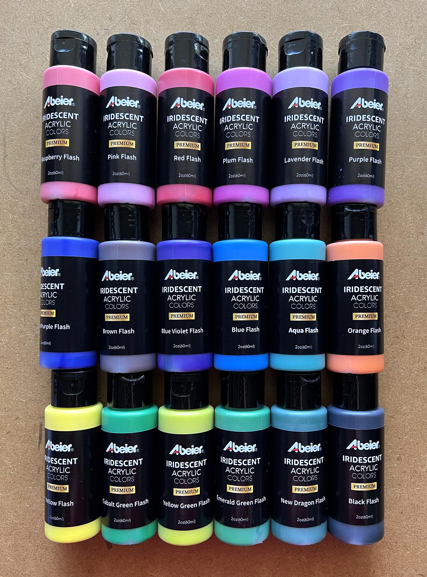
The full set of colours. The bottles are a decent size, and there’s quite a good range of colours.
This afternoon I designed a new template for swatches, and this is an adapted version with 18 boxes.
Eventually I shall be printing out further copies of the template so that I can make swatches of all my paints.
Each paint bottle had an inner plastic lid that needed to be prised off before you could access the paint. I put a few brush strokes in each square, and cleaned the brush off each time on a series of ongoing scratch papers that I’ve started – nice to add a bit of pearlescence to them!
Review of the paints
They don’t seem to be very thick, and while they are all nice and iridescent (which of course doesn’t show on the above photo), very few of them are what I would describe as interference colours. The pale pinks and purples seem to be the best, and the black one flashes to a coppery colour. Most of the others don’t seem to colour-shift at all, which is a bit disappointing.
However, the colours are vibrant and quite pearlescent, which is good, and given that each quite generous bottle cost only a little over £1, I can’t really complain! They are very cheap paints, and I suppose you get what you pay for. I might go for a better set of interference colours sometime. The quality definitely isn’t as good as the iridescent Arteza paints that I got recently. Arteza is a great brand – reasonably priced but very high quality for the money.
It will be interesting to see how these new paints behave on the gel plate.
Preparing content for the altered book
I pulled out quite a few of my printables for the book. As I collect material, it will all go in a polywallet. I’ve got to try and keep organised!
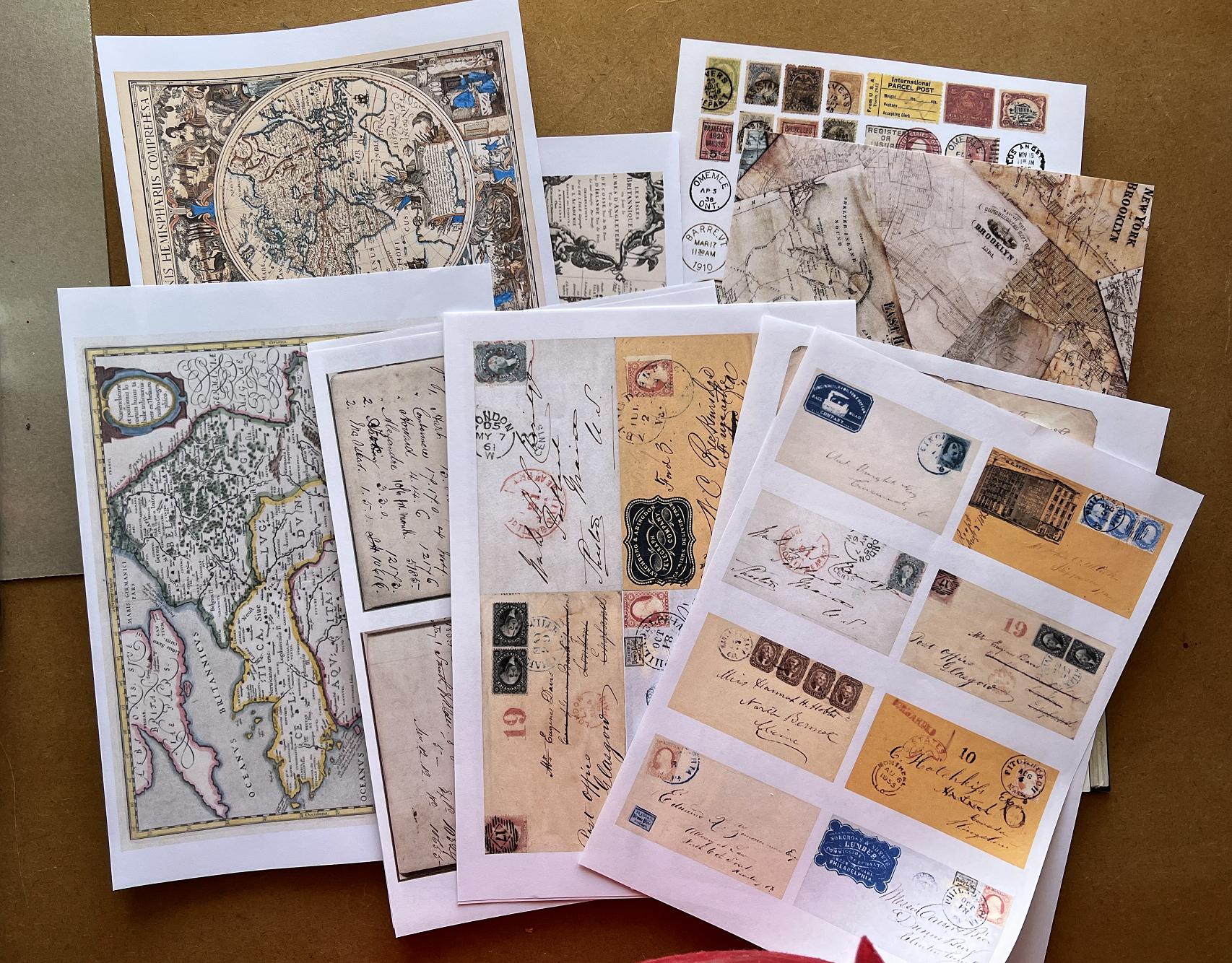
I went through my box of rice papers and napkins as well, and scanned and printed a couple of the rice papers.
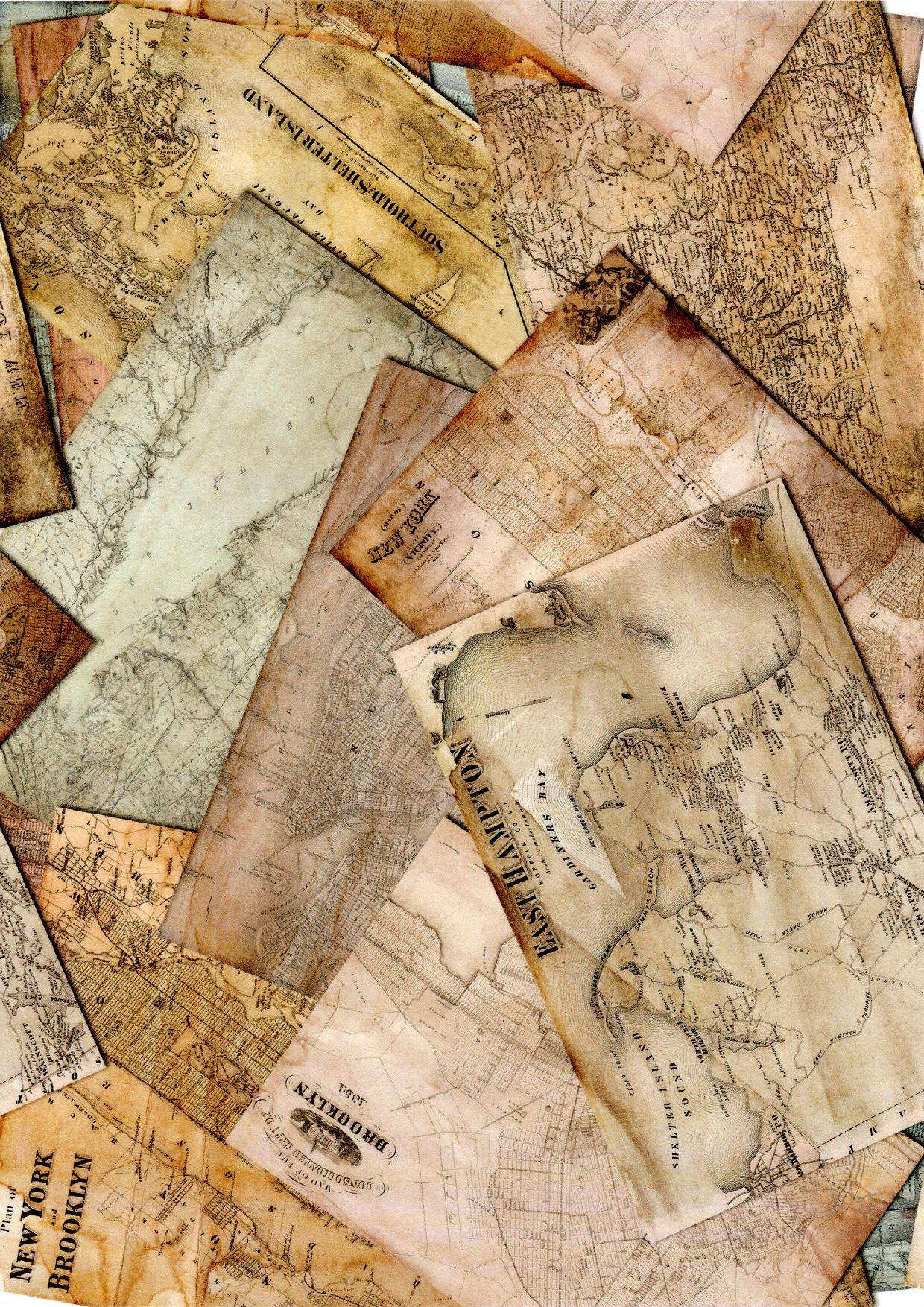
I love this montage of overlapping old maps. Now I’ve digitised it, I can print it out any size I want – this print-out is full A4, and of course I can cut or tear out portions.
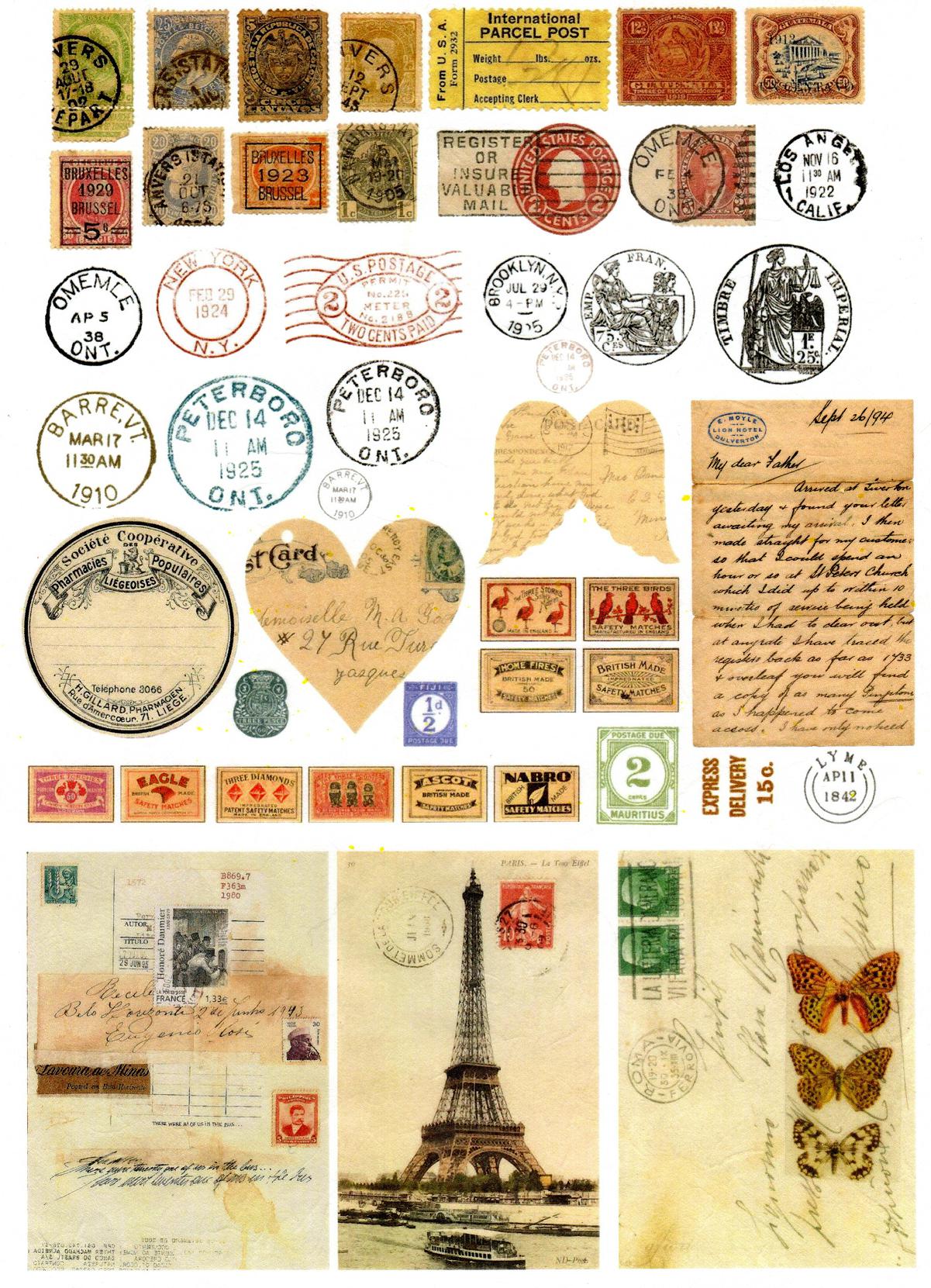
I’d forgotten I’d got this mail-art sheet of rice paper. Again, I can cut out separate elements. The resolution of the original rice paper print isn’t brilliant so I don’t think I’ll be able to enlarge the tickets much.
I need to go through my pictures and refresh my memory as to which napkins and rice papers I’ve already digitised, and get myself organised!
I also went through the pages I’d torn out of the book, to see if there were any images I might want to use, and chose a couple of pictures of old sailing ships and scanned them. I printed them out with a large one and two smaller versions, one of which I reversed right to left, to give myself some options when choosing my layouts.
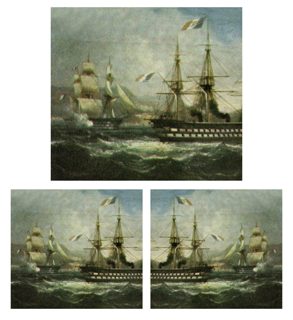
I really like this old engraving of a ship in full sail.

Coffee staining
The other thing I did today was to coffee stain a sheet I found amongst my scratch papers and unsatisfactory gel prints. I like the ghostly circles on this one. The dark parts down the edges are actually gold. There is a bit of bright colour in the centre which is probably from brush cleaning. I thought it might have a bit more potential if I coffee-stained it.
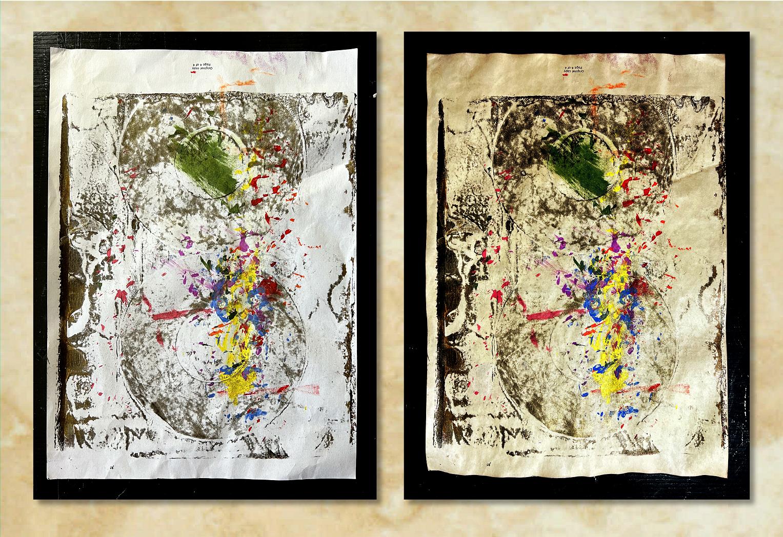
This definitely makes it more interesting! I may add further stuff to it later, or I may rip bits off to use. I keep an old spray bottle that had laundry stain remover in it, filled with coffee mixed with a bit of rubbing alcohol to stop it going mouldy, and this is very handy for treating individual sheets if I want to add some coffee staining. I also have a bottle of stronger coffee that I can draw up with a pipette and drip onto papers for a spattering effect. Coffee staining is fun! It really ages the papers and is much cheaper than inks!
So – another pottering session in the studio which didn’t result in anything earth-shattering creatively, but useful nevertheless. It’s always fun playing in there, whatever the result.
All lovely results Shoshi!! I love the effect of the coffee staining – who’d have thought it?!! I particularly love the rice paper prints. So let me get this straight – you can take, say, an old ticket or postcard, and transfer it onto rice paper and make a collage out of it? I love what you did with the stamps and postcards and post makes – so lovely. I wondered if you did commissions? Only I have some old stuff memorabilia and it would be nice to give it an airing rather than tucked away in a box.
The paints are very pretty colours, and you will find a good use for them I’m sure even if they aren’t quite up to your expectations!