ALTERED BOOK – BEGINNING THE FIRST PAGE, AND SOME STENCILLED BACKGROUNDS
Another enjoyable and fruitful session in the studio this afternoon.
Stencilled backgrounds
I selected some of my gel prints that needed further work, and included a couple of my Venetian Plaster ones, in order to add some stencilling. I was keen to use my new jewel-coloured iridescent paints, and to put to use one or two of the stencils and masks I made recently, which had not yet seen the light of day.
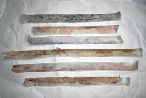
This first one was a rather dull background that I made on thinnish paper – I had added many layers trying to improve it, without success. An ideal foundation for adding some iridescents, using masks and stencils. The top portion is my second stacked journaling mask, and the bottom section my second Persian Tiles mask. I applied the jewel colours in graduating stripes, using a cosmetic sponge, and covering as much of the background as I could.
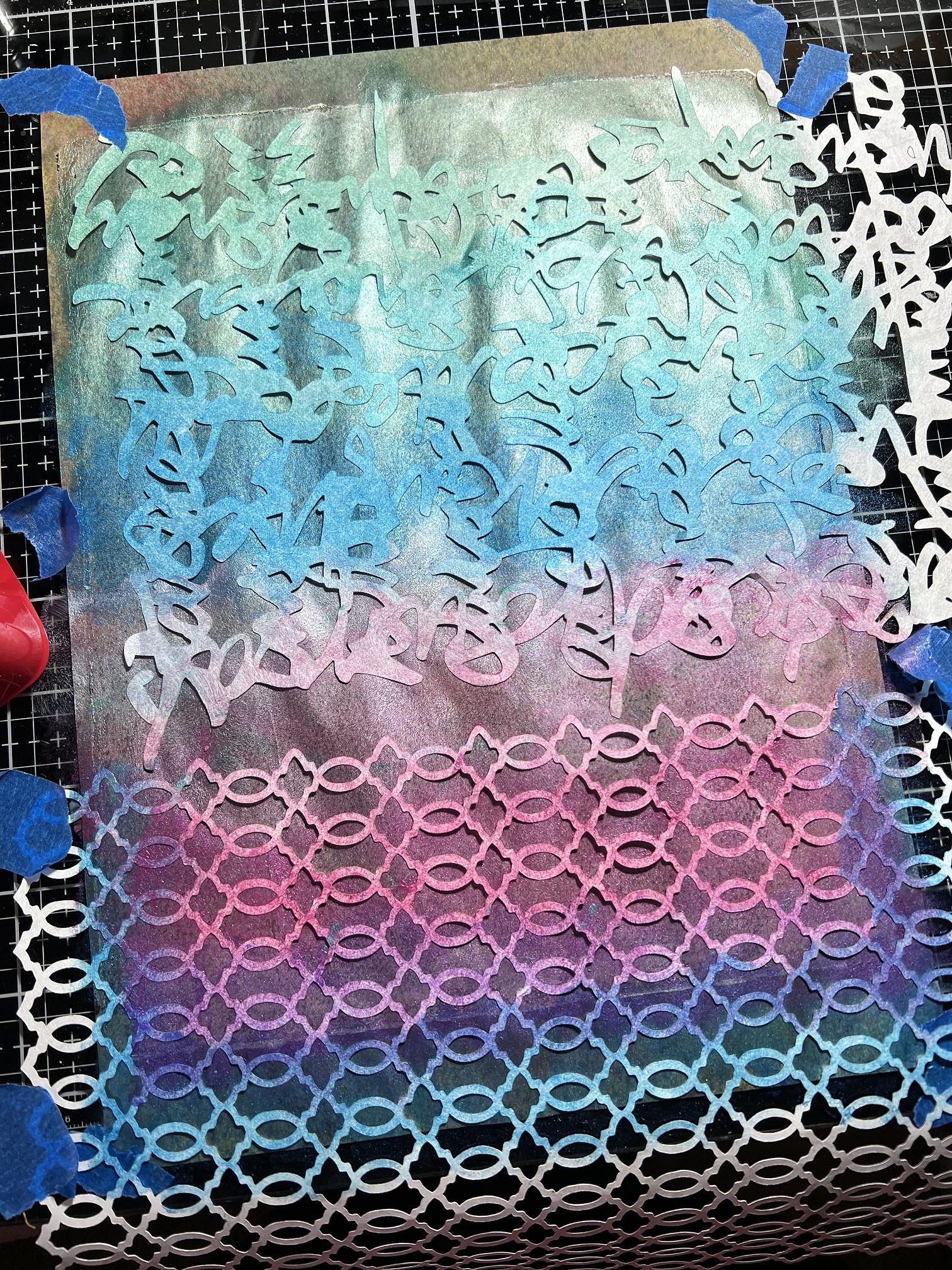
Several pictures of the results, after removing the masks. These shiny iridescent surfaces are fairly difficult to capture on camera, so I hope the series of photos together will give an impression of what they are like in real life.
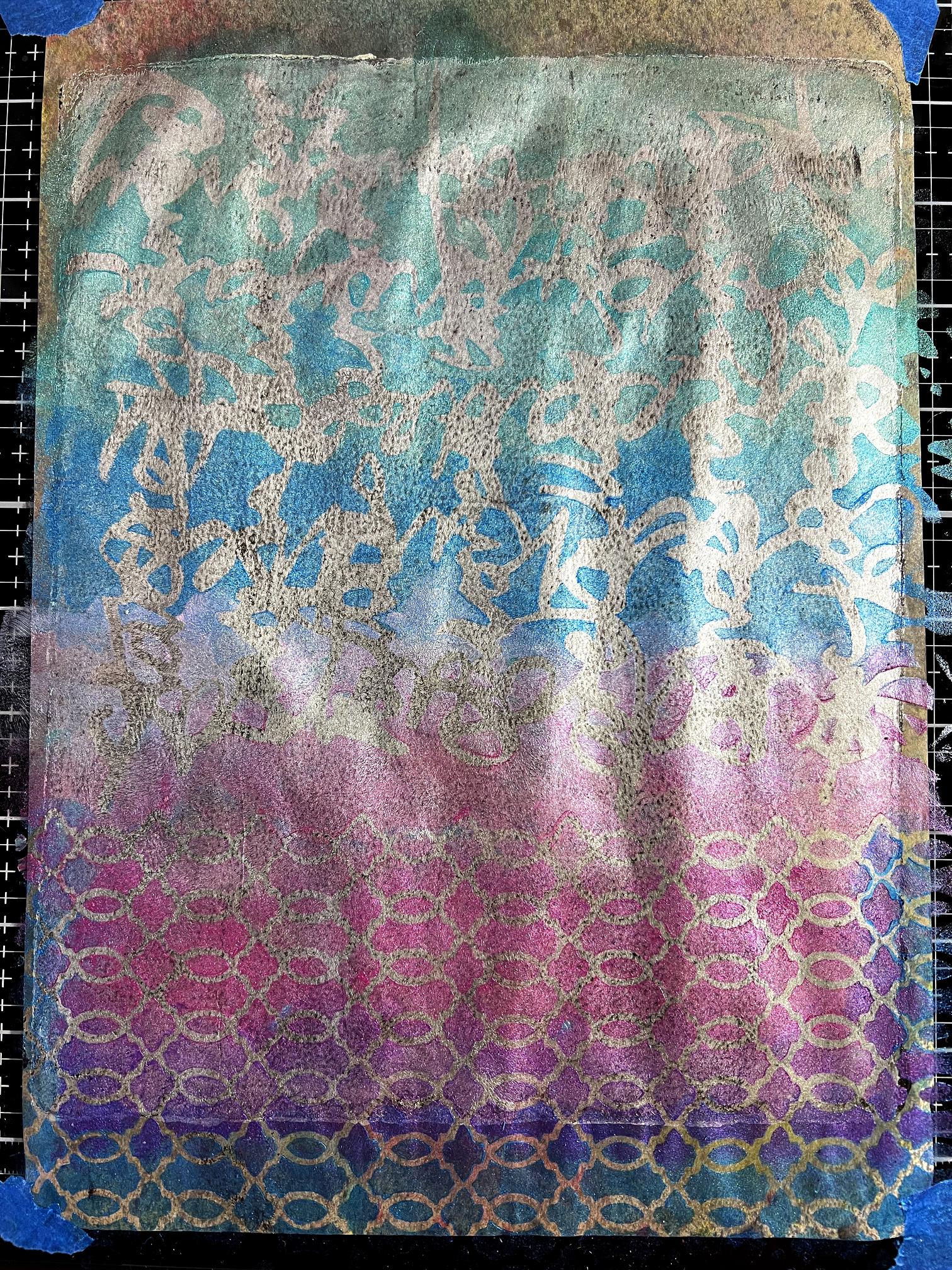
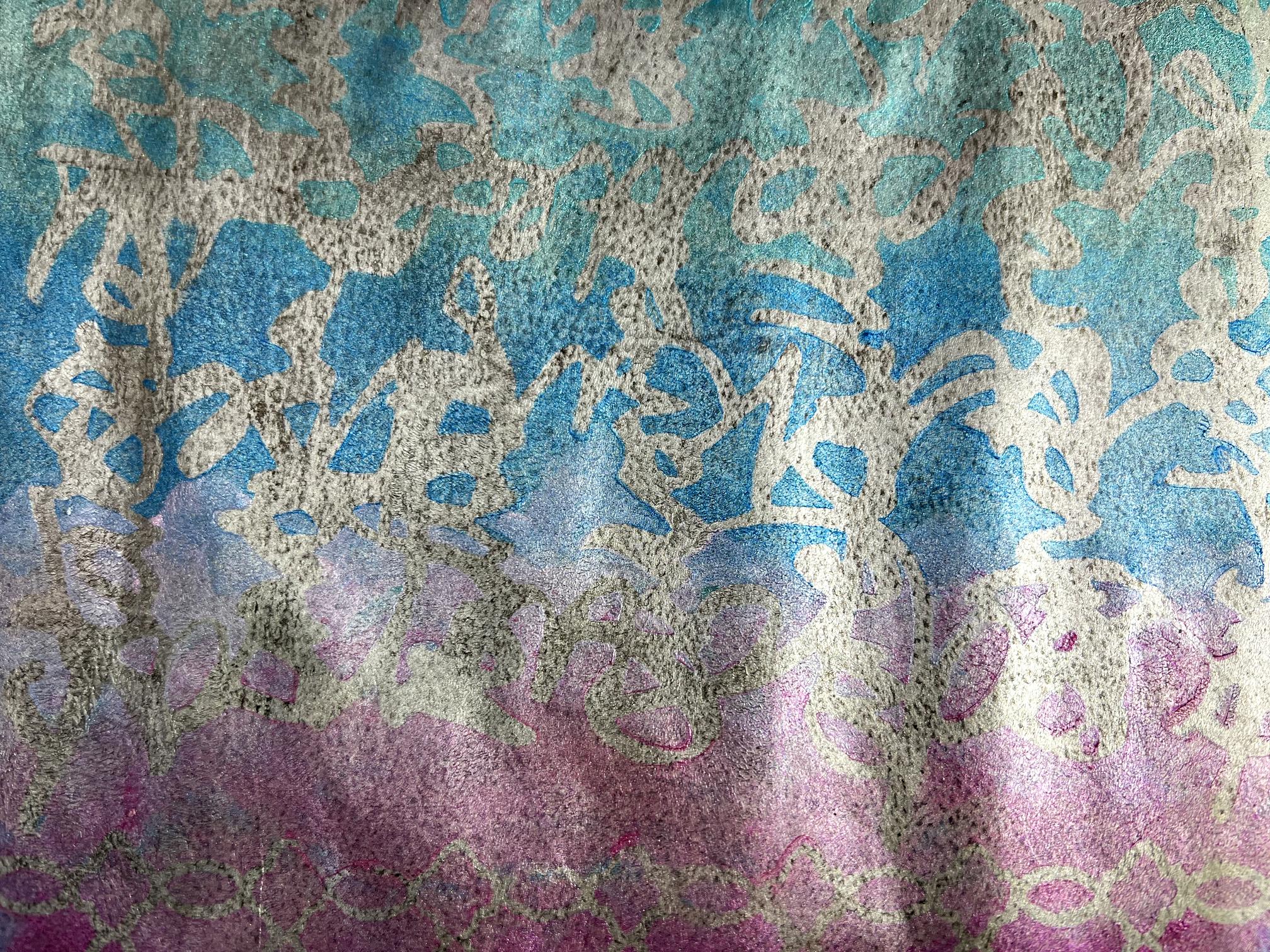
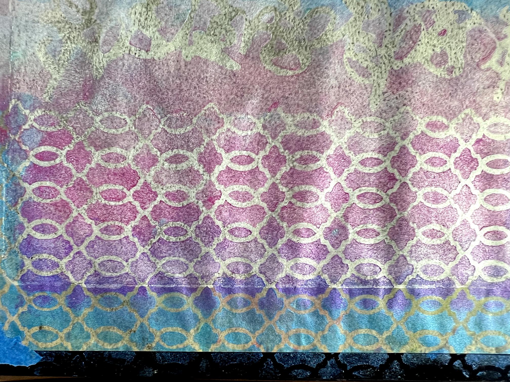
The results are quite subtle, which is what I wanted, as these will be used as backgrounds.
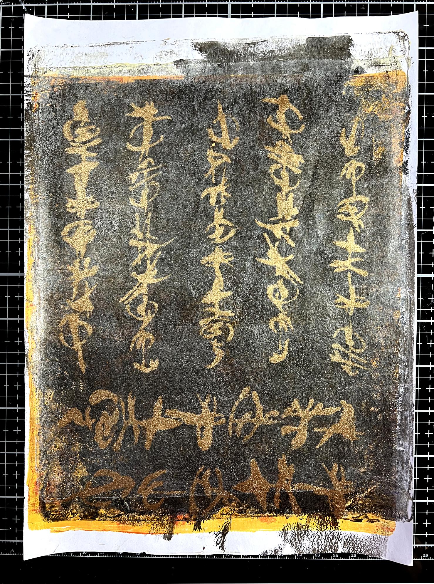
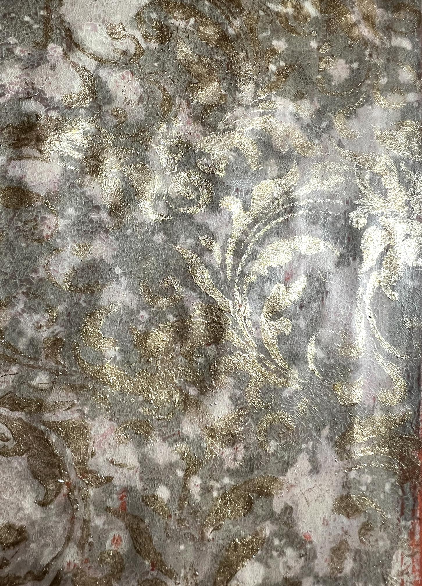
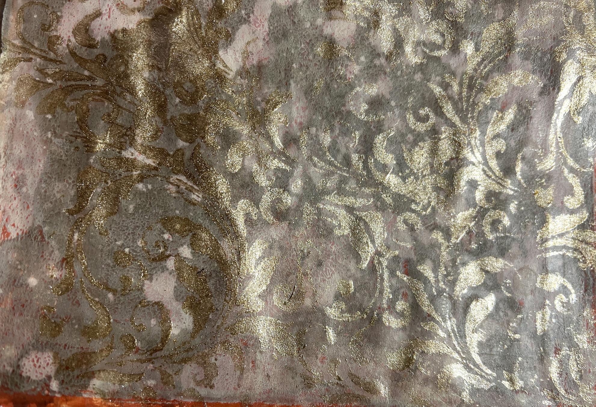
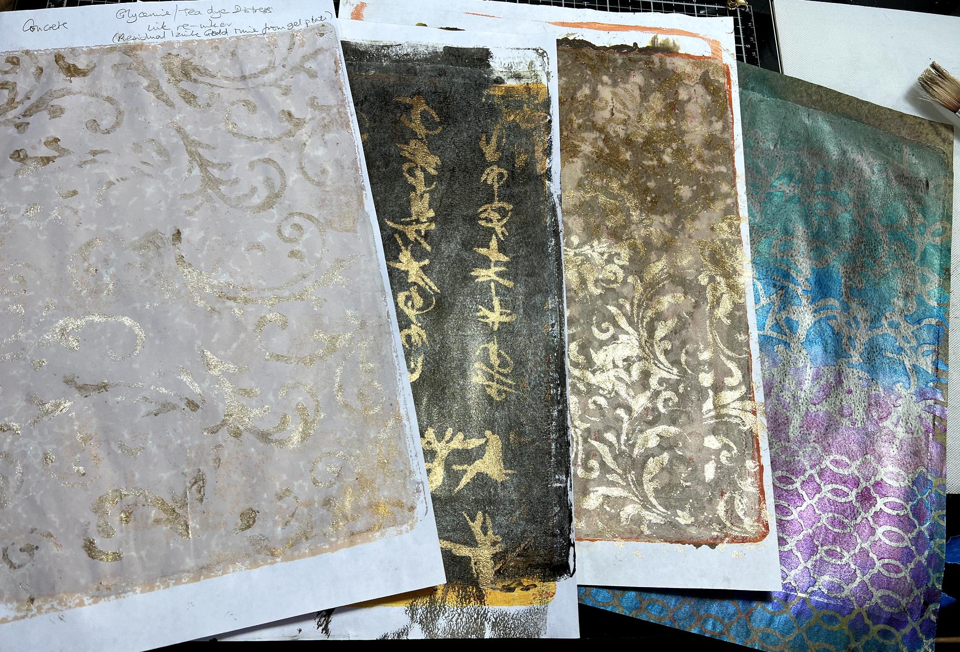
I then moved on to another very dark background which really couldn’t be improved by further gel printing layers. An ideal substrate for some more gold Oriental scripting, using some of my stencils. I made some of these before and am rapidly running out of supplies as I love using portions of these sheets as collage elements. The paint I used for this is my all-time favourite gold metallic paint, Golden’s Iridescent Bronze Fine, which is extremely rich in pigment (and very expensive!!) and which comes out looking like gold leaf. The photos simply don’t do it justice.
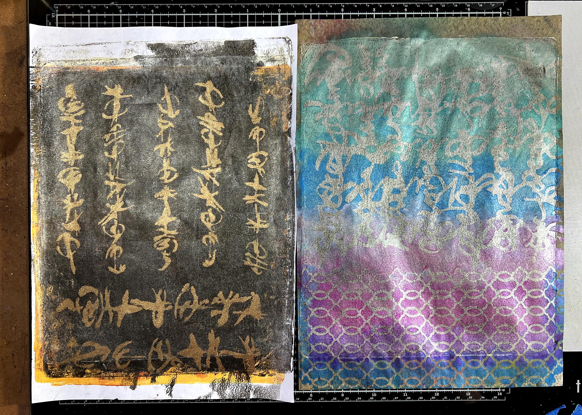
The first two sheets, side by side.
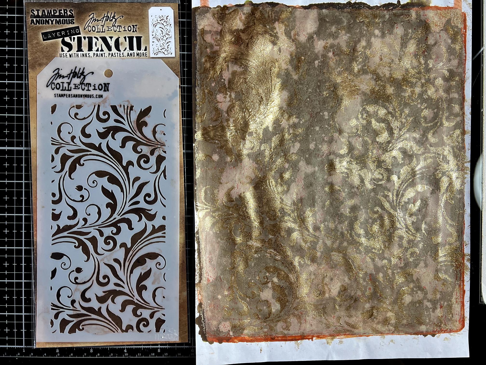
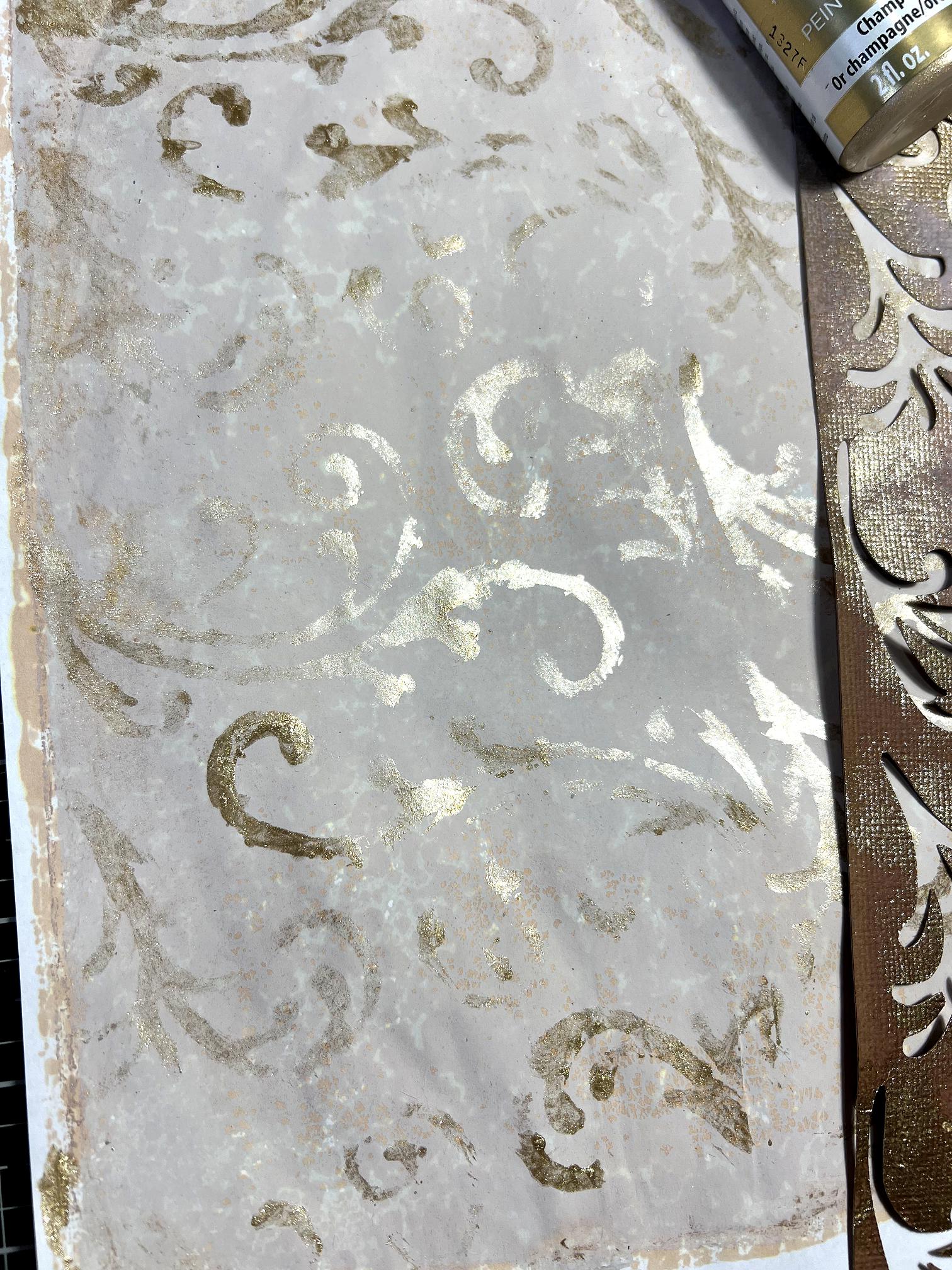
I selected one of my successful Venetian Plaster backgrounds created on the gel plate using matte acrylic paint and Seth Apter’s Izink sprays, together with some Tim Holtz Distress re-inkers (for revitalising ink pads). I found the best way to get the mottled effect was to mix the re-inkers with some glycerine. It does make the paper feel rather soft and floppy but once it’s down as collage, you don’t notice that.
For this one, I chose a gorgeous Tim Holtz swirly stencil and laid it down on the sheet. These stencils are quite narrow (designed for tags) so I was careful not to add the gold paint right to the edge as I didn’t want hard lines. I used a cosmetic sponge to add the gold, and then moved the stencil around fairly randomly, in order to produce good coverage over the sheet with no visible joins. I like the distressed look this provides, as if some of the gilding has worn off the old wall.
Some detail shots.
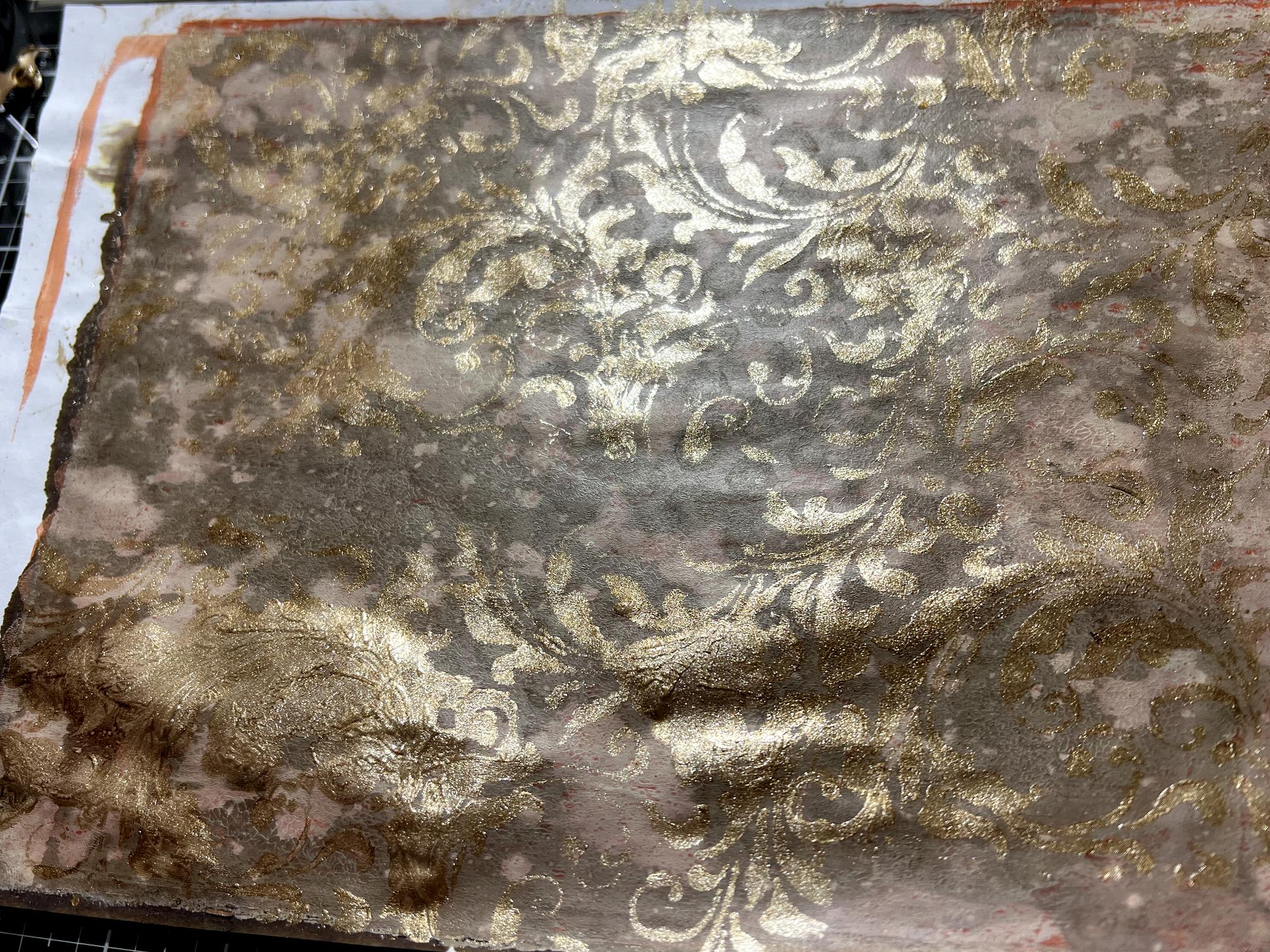
Again, quite hard to photograph. The result is quite subtle anyway.
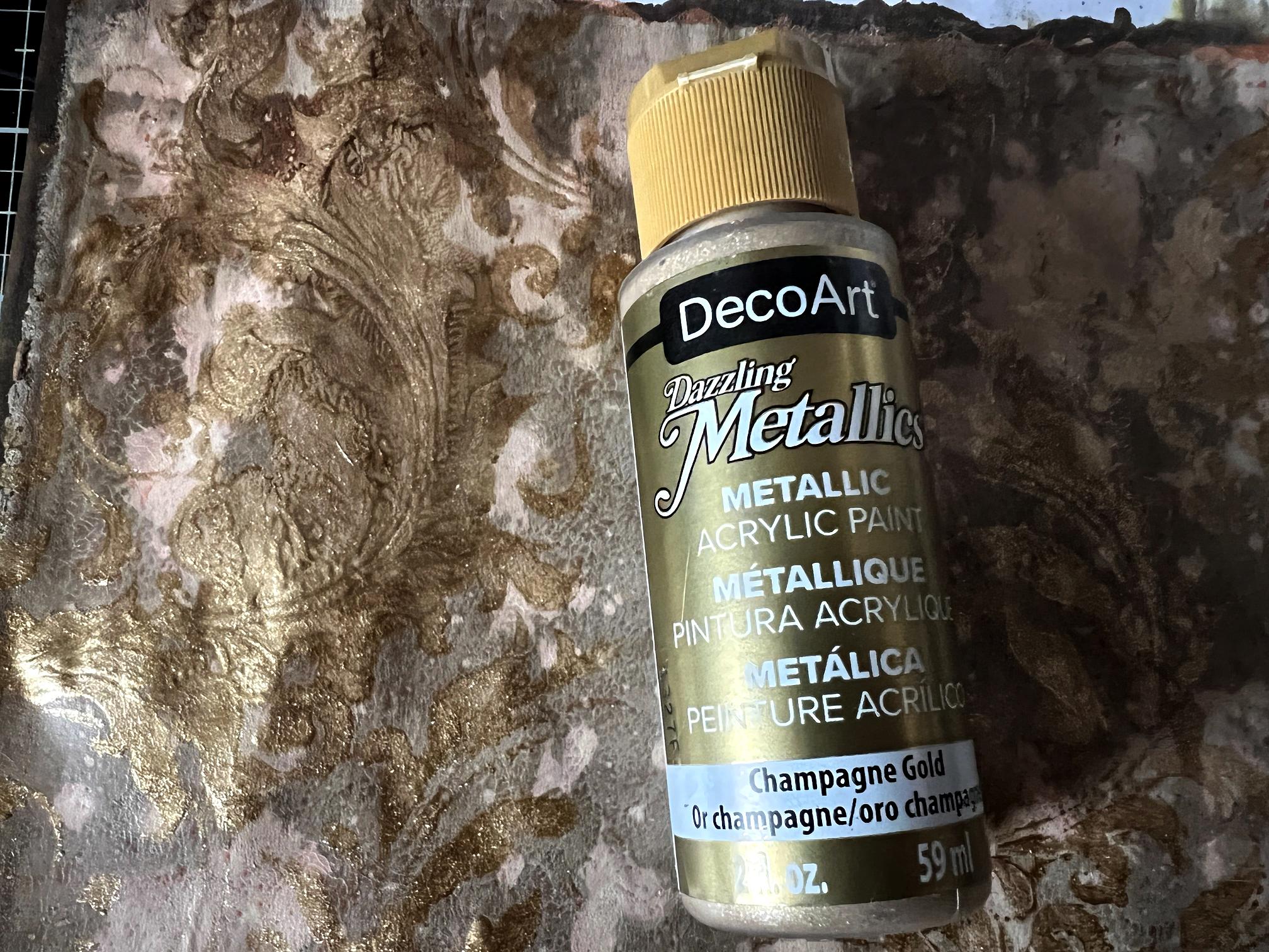
For this one, I didn’t use the Golden brand of gold paint, but my new DocoArt Champagne Gold paint, which is a lighter gold.
For my final sheet, I chose a lighter Venetian Plaster background which has some Seth Apter Goldmine metallic spray on it, giving it a gorgeous shimmer. The stencil isn’t really a stencil at all. Years ago I designed this sheet to cut on the cutting machine, to give me a series of cut-out swirls for a project, and I liked the piece that was left after cutting. It’s only fairly thin cardstock so not very strong, but with subsequent layers of paint on it, from using it as a stencil, it is gradually becoming stronger. There are one or two places where it has ripped so it needs handling with some care. Again, I placed this repeatedly, and randomly, on the sheet, and again, used the DecoArt Champagne Gold.
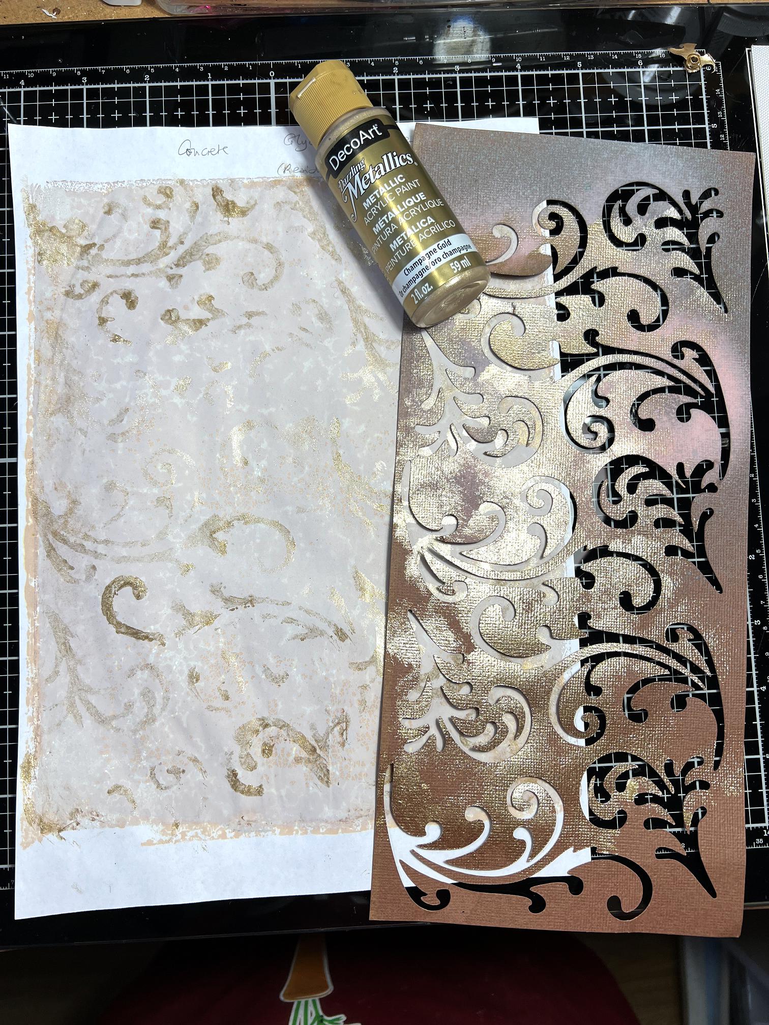
I love this result!
Here are all the four sheets that I added stencilling to in this afternoon’s session.
Altered Book
I haven’t yet decided on a final title for this book, but for now I am calling it “Mail Art Travel Book.”
I am working on this original book given to me by my hubby.
With the removal of quite a lot of pages and sticking together the remaining pages in pairs, the book was ready to work on.
The first page was prepared by spreading on a couple of layers of acrylic paint. This is another Golden paint, in Titan Green Pale. If you look closely at the bottle, under the “Golden” logo, you can see a little strip with diagonal lines on it. They print the label with this series of lines in black, and then paint over them with the actual paint, and this indicates the level of the translucency of the paint. This particular one is quite translucent. I wanted the original book printing to show through a bit, not so much that it is legible and a distraction, but adding texture. I had a job finding this particular green; Robyn McClendon, in the US, uses Blick matte acrylic in Celadon, but we can’t get that paint here in the UK. Celadon green is the most gorgeous colour, the famous glaze found on precious Celadon Chinese porcelain. This Golden paint was the closest match I could find.
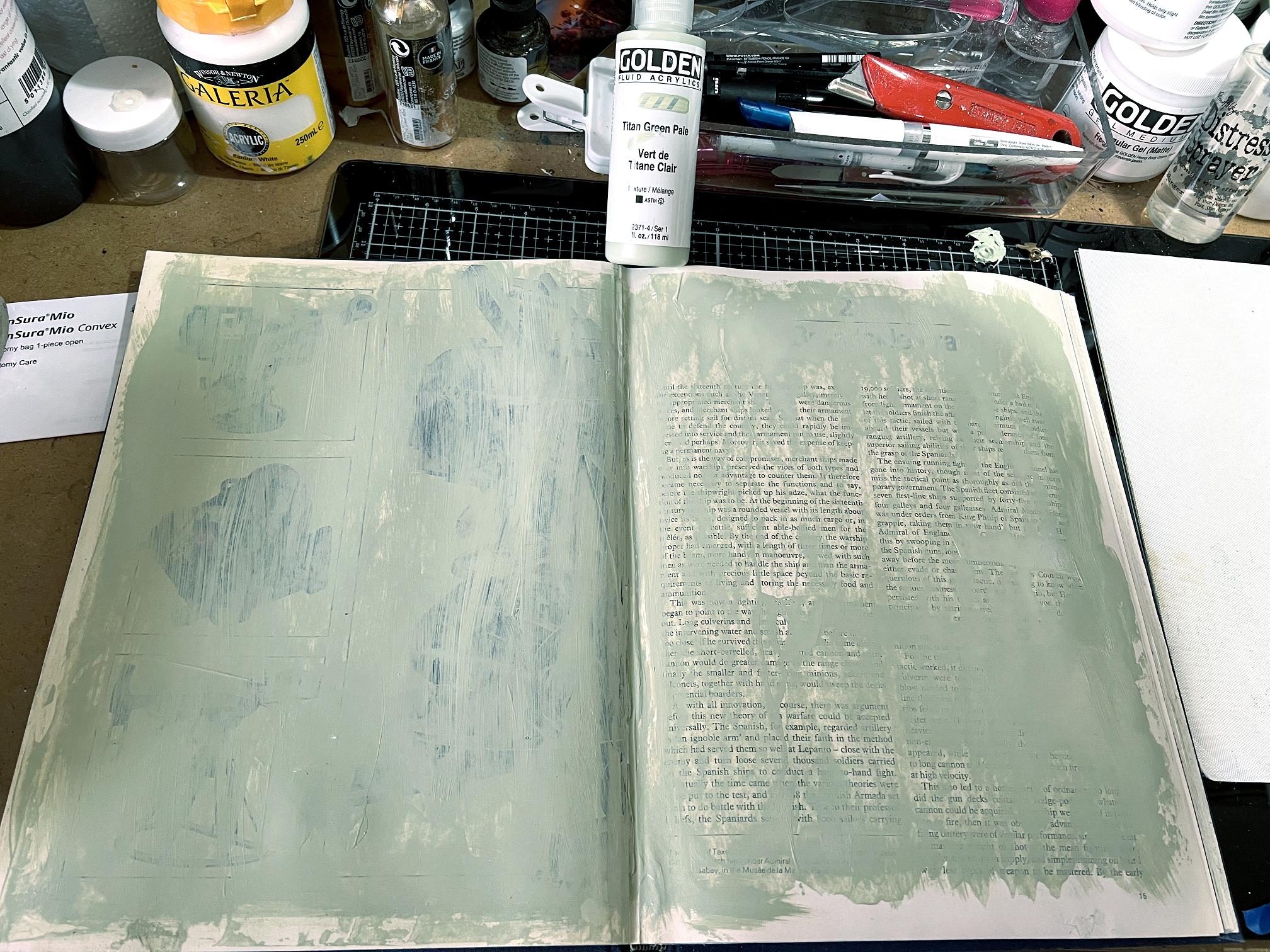
I had to put a second layer on the left-hand page as there were some quite strong images on the page. The pages feel slightly shiny so I am hoping the paint is going to adhere properly. If I find I am getting problems, I may have to prepare them with some clear gesso first.
That’s all I’ve done so far. I shall probably lay down a series of backgrounds on at least some of the pages before I begin. These will provide a good kick-off point for collaging, rather than being confronted by all that distracting print and illustrations in the original book!
Upcoming…
I have on order a set of iridescent acrylic paints in interference colours. I can’t wait to try these! The colour changes as you move it in the light, like the colour on certain butterfly wings or beetles. These pigments are becoming increasingly popular in the art world. The effect is apparently achieved by tiny mica flakes in the paint, coated with titanium oxide.
The stencilled backgrounds are stunning!! I love them, I think they’re my favourite, though all your backgrounds are lovely, but these have a a quality all their own. I also love the effect of the print in your final photo – very clever indeed.