ISLAMIC ART ALBUM – SECOND PAGE – TEZHIP 1
“Tezhip” is the Turkish word for illuminated art – artwork with gold. Today I drew a lozenge-shape illuminated with gold and incorporating biomorphics (small flowers and leaves).
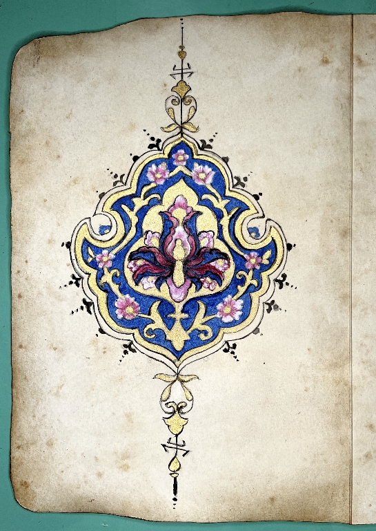
I drew it on the reverse of the first page, and distressed the edges with inks as before.
Method and materials
This time I did it right! With the shamsa on page 1, I forgot how to do the tracing method, and ended up having to do a lot more work, and the result was pretty messy. I also went over the whole thing with a fine grey permanent archival marker. The design was divided into eight sections so there was a lot of tracing to do.
This time, I only had to draw half the design, and trace a mirror image, which was simpler and quicker. First of all I traced off the design onto a piece of printer paper so that it was as clear as I could make it. I taped this down on the light panel and taped the tracing paper over the top. I traced the left-hand half of the design using a 3B pencil and then removed it from the light panel. I folded the paper in half vertically, with the traced side on the outside, and taped it down, folded, onto the light panel again. I took the 3B pencil and traced the half design. When unfolded, I had the complete design traced with the soft pencil all on one surface of the tracing paper.
I no longer needed the light panel so I turned it off. I lightly marked the vertical centre of my page, and taped it down onto the light panel as it has a hard, smooth surface. I lined up the fold of the tracing paper with the centre mark, laying it down so that the traced line was in contact with the page. I took a burnishing tool and carefully rubbed over the whole thing, using small circular motions and pressing quite hard. Periodically I lifted the tracing paper from one side to check that the design was transferring well onto the page, and going over the faint parts again with the burnishing tool until I was happy with it.
Removing the tracing paper, I had very little tidying up to do on the transferred design. I referred back to the original picture to get some of the finer details more accurate. This time I did not use the grey marker pen but worked from the transferred lines.
Painting
Looking up some instructions, I found that the best way to proceed was to add the gold first. I do not have shell gold (gold leaf ground up in gum arabic) and this time I decided not to use my Golden fluid acrylic, but some gold gouache paint instead. This isn’t quite as shiny as the Golden, but the colour is excellent, and it has a nice shimmery surface. The main benefit was that this is water-based paint, and would therefore be the same as the Kuretake Gansai Tambi watercolours I chose for the coloured areas. Any touching up would be easy to do.
I painted the small flowers initially with Dr. Ph. Martin’s bleed-proof white diluted with water – I have some white gouache somewhere but couldn’t find it. I added pink and dark red shading to the petals, and added some tiny highlights with the white here and there as required.
I also decided to do the outlining in the correct manner too, using a very fine brush, and this time I used black Indian ink with a little water to make it as fluid as possible.
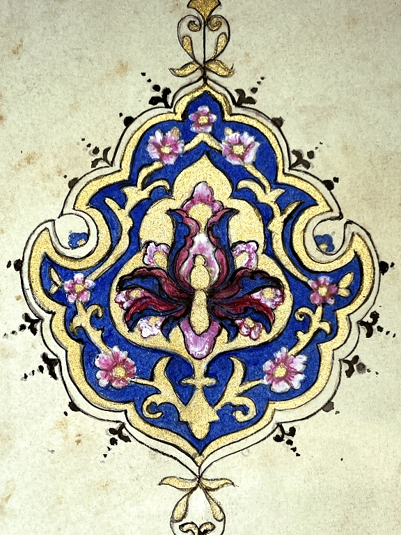
The outlining isn’t 100 percent perfect but it’s better than I’ve managed to do before with a brush. It’s slow and painstaking work and takes a steady hand and good light. I did a bit of touching up with the colours and the gold afterwards. Looking closely at the detail photo, I notice I have left off two of the small black balls at the bottom of the border, and also I need to erase any transfer lines that are still visible. I wanted to make sure the whole thing was completely dry before attempting this. Once done, the final result will be cleaner.
Looking at it closely, I can see loads of things wrong with it, and wonder how people get their drawings so absolutely perfect! I suppose it’s years and years of practice and doing nothing else!! Generally, though, I am reasonably satisfied with it.
Here’s a short video to show off the gold a bit better than I can achieve in a photo.
I am aware that there is a problem with the video, and I will try and sort this out tomorrow.
Binding ideas
This is going to be a very slim little volume once it’s finished. I have decided to make two signatures, each consisting of two folios (4 pages in each signature). I found an image on Pinterest of a beautiful cover in the Metropolitan Museum of Art in New York which I have taken as my inspiration, but each signature will be bound separately, so that when the cover is opened, it will reveal the two signatures side by side. Since this book will be so small, I thought it would be fun to go to town on the cover a bit, and make it more of an interesting interactive element showcasing the art inside. The first folio will consist of the Arabesque style, and the second the geometric style. Rather than attempting to draw and paint a design for the front and back covers, and for the endpapers, I have decided to use digitals for this, but probably adding some gold.
It’s gorgeous Shoshi, i can see how painstaking the work must be. I love the gold (reminds me a bit of Kintsugi). Well done and look forward to seeing more!