ONLINE ART COURSE – THE FIRST OF SIX SMALL SKETCHES WITH THE INK PENS – BANANA
Bananas again!
Today my hubby and I sat down together to do the first project in the ink pens module – six small sketches of various objects. We did the first one, which was of a banana.
Before starting this, we were encouraged to divide the page into six sections and make a very rough pencil outline of the shapes of all six objects from the reference photos, so that the overall composition of the finished page would be good. You can see these light pencil lines in the photo below.
This particular banana had been photographed from a different angle, to produce a more interesting image with some foreshortening. We began by using a pencil to map out the angles of the banana, what Phil (our teacher) called a “wire frame banana”! We fleshed it out with the outline and a small amount of detail before moving on to using the pens.
When I had drawn the inked outline, I realised that my banana’s proportions were off. Nothing to be done about it because you can’t erase the ink! Getting the initial proportions right in a drawing is the part I find the most difficult. I persevered with it, and ended up with a banana which didn’t have sufficient foreshortening because I had made the top part too long. Adding the shading, I made the darker left-hand side too dark, and I said to my hubby that at this rate, I would end up drawing a bad banana that had gone completely black!! The final step was to erase the pencil lines carefully with a kneaded eraser.
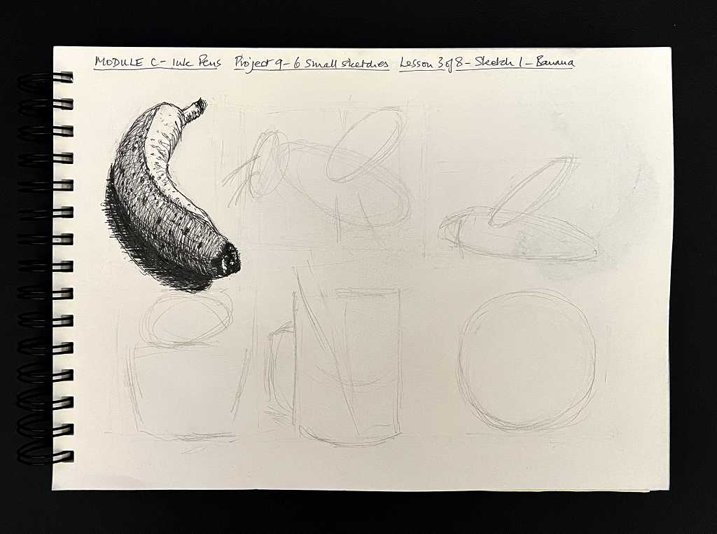
He did pretty well with his, but like me, he didn’t quite capture the foreshortening.
Later, I sat down and drew it again. I really wasn’t satisfied with my first attempt. This time, I made extensive use of the proportional divider which really helps. I am hoping that in time, I shall train my eye to see the angles better, and be able to dispense with this helpful instrument. People do say that using it doesn’t prevent one from learning to do it by eye, and gradually one moves from using it as a first resort, to an aid to check that what one has done unaided is correct.
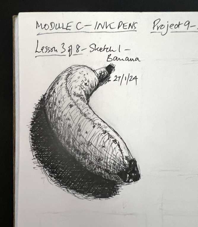
I was very much happier with my second attempt, which looked a lot more like Phil’s drawing. It also took considerably less time. I did it without replaying the video, just using the reference photo, and at the end, looking at Phil’s completed drawing just to check any additional shading and details of the spots on the skin of the banana.
We are hoping to sit down together again tomorrow afternoon, to work on the second of the six sketches.
This is an interesting experience for me, never having drawn with my ink pens in this manner before. I am not sure I like the sketchy result particularly; I think the hatching and cross-hatching would be better kept to a minimum and just be used for the darkest values, and all other shading added with ink or watercolour wash. I know we are coming on to that in a future project in this module. For now, these exercises are good practice in achieving different values simply by applying lines of differing thickness and/or density. Good observational practice, and good for learning to discern the different values in a picture. It is probably not a technique I would use for a finished picture on a larger scale, although if you scale up a drawing, the thin hatching lines are going to be relatively less significant than on a smaller drawing. It wold be interesting to experiment with this.
My hubby’s main black shadow to the left of his banana was much lighter than mine. He has not sat in on the earlier modules of this course, where we have learnt that it is a very common mistake not to be bold enough with the dark areas of a drawing. I certainly learned this in the graphite module, and when you make the shadow areas really dark, it gives much more depth to the image and makes the object really stand out.
Glass pens on order
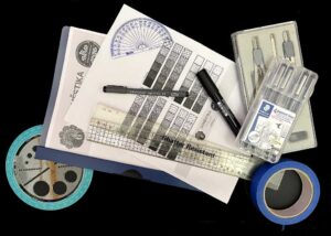
I have ordered three glass pens from Amazon, all from the same manufacturer. Very pretty hand-made glass with different coloured inclusions, and this time with longer nibs with spiral grooves. Each one comes in a box with a very small bottle of ink, and a matching glass rest to lay the pen onto when not in use, to prevent it rolling off the table. They should be with me on Monday. I have an idea that they will produce a thicker line than my Moonman one, which is ideal for detailed work. The nibs are certainly very much longer, and with the spiral grooves rather than the straight ones, they should hold a lot more ink and require less frequent dipping.
I have been thinking quite a bit about the potential advantages of dip pens in mixed media work. I can’t tell you how many archival black marker pens I have ruined by drawing with them over acrylic, which seems to clog the tip and render them completely useless, despite the fact they are still full of ink! Using a dip pen should completely solve this problem.
Also in the same order is a small set of dip pen nibs which were labelled as very flexible. I want to be able to create the spatter effect which Martin Lachmair (the Austrian artist I follow on YouTube) achieves with a flexible nib. The original ones that I bought are fine for regular drawing, but are too stiff to create this effect.