Another session in the studio this afternoon began somewhat unpromisingly, but it redeemed itself in the form of “practice makes perfect,” and another page in my Organic Journal.
Ink dipping
I’m not sure what this technique is really called, because I couldn’t find the video I saw several months ago. Froyle was doing it, inspired by Robyn McClendon. I couldn’t remember the exact technique so my first attempts didn’t work!
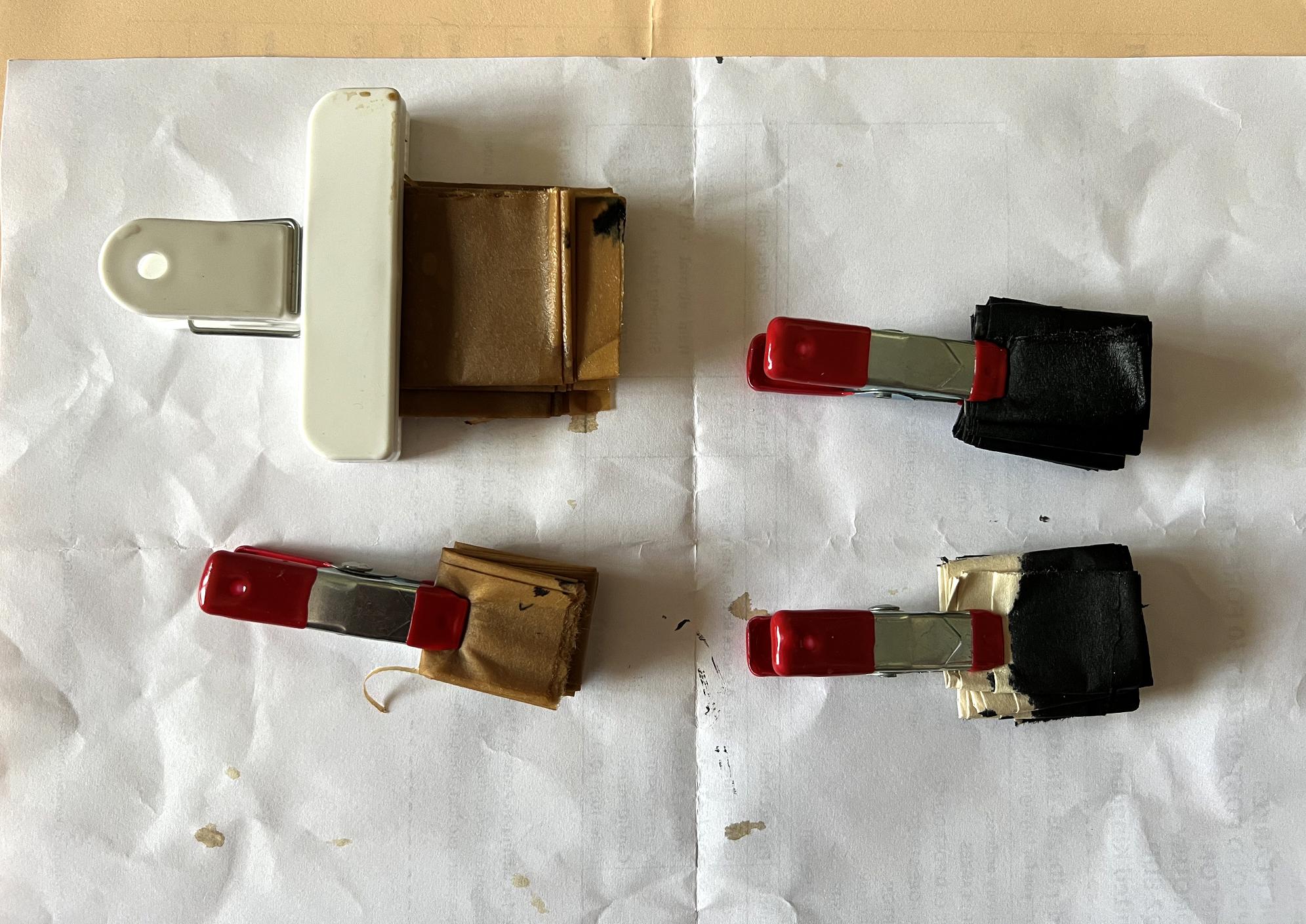
What you do (which I do remember) is to fold a piece of paper accordion-style, and then, if memory serves correctly, you fold it again the other way, accordion-style. You then dip the piece into some ink and let it soak into the paper, and when you unfold it, you are supposed to get these interesting patterns. It seemed to me you would have to clip the piece at the top because otherwise it would just spring ondone.
My first attempts failed because I left the paper standing in the ink for too long, and the whole thing got covered. You can see these at the top of the next photo. The black one was with drawing ink and the brown ones were dipped in strong coffee. I didn’t attempt to unfold them further at this stage as they were very wet and fragile.
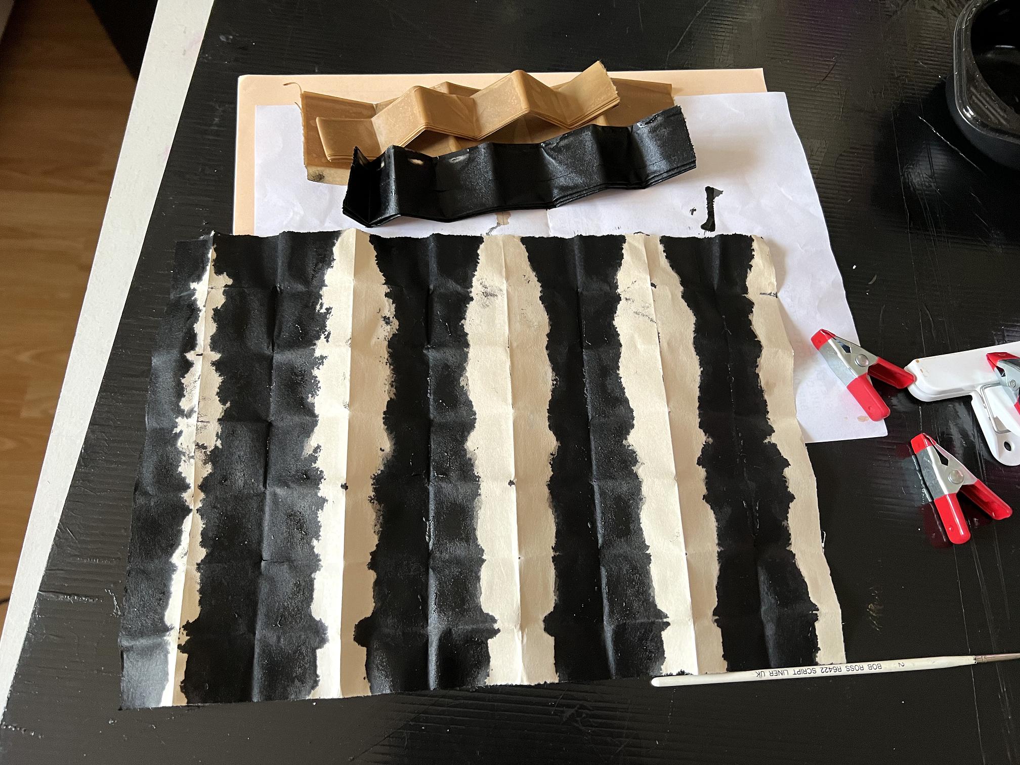
The one underneath was a bit more successful but still too much ink, and not a very interesting pattern.
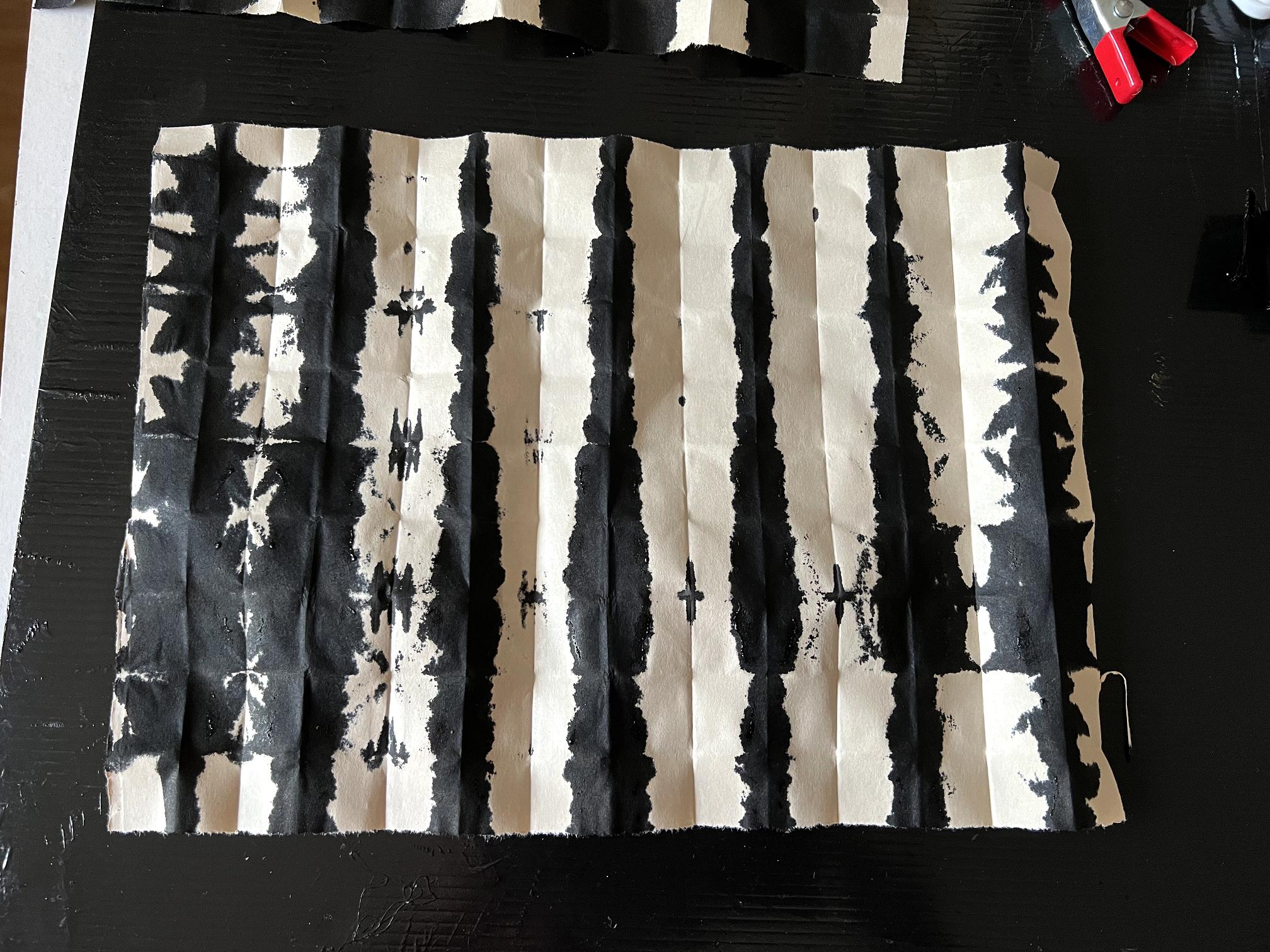
My final attempt was a definite improvement. There are certainly some more interesting patterns emerging.
I wish I could find that video…
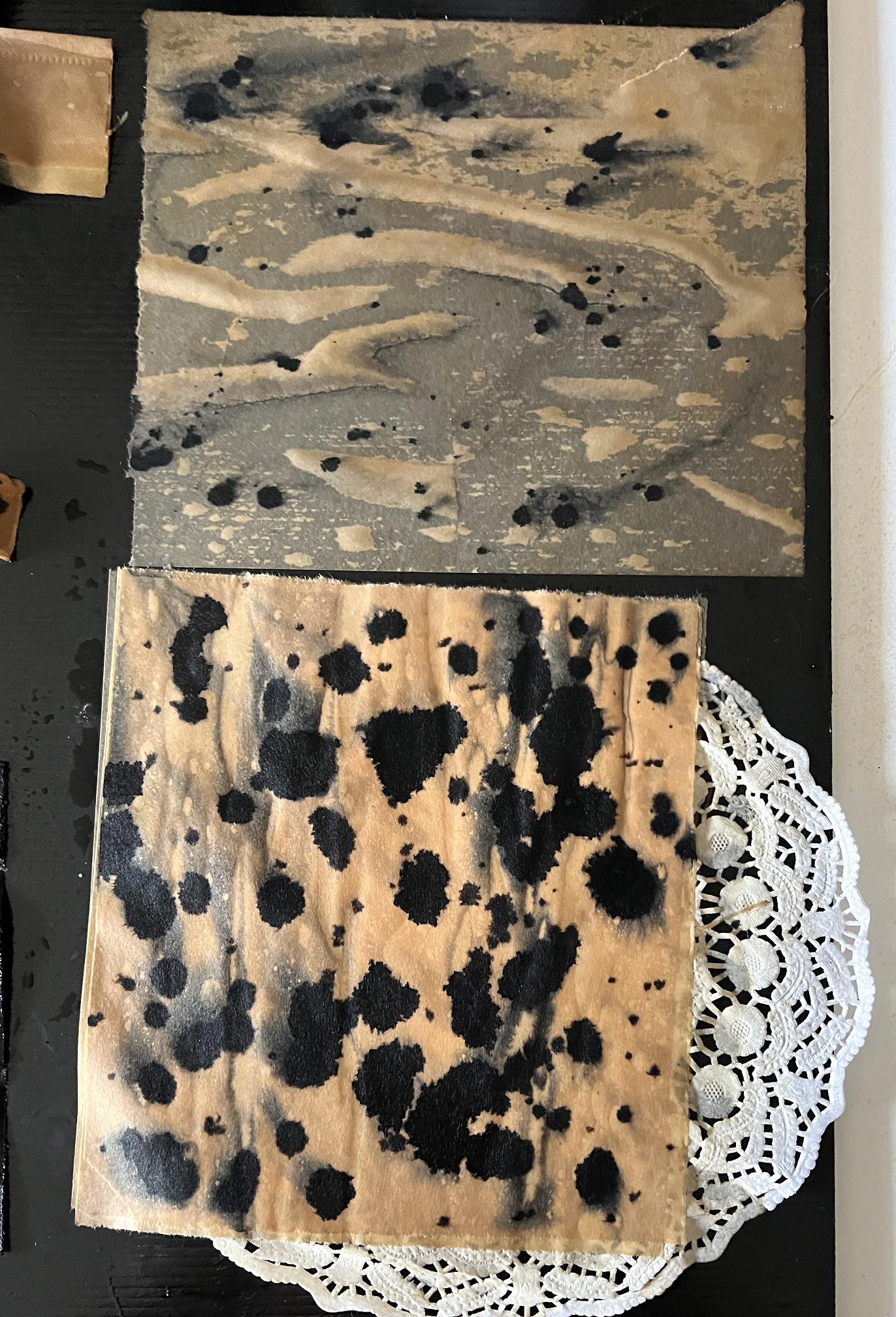
Coffee staining and ink spattering
I also laid out a few pieces of newsprint paper and sprayed them with coffee, and then spattered them with the drawing ink. The one at the bottom of the picture is actually several pieces, with a doyley in between, in the hope that it would generate a pattern. These were still drying when I took the photo. The pooling in the top one has generated some interesting patterns, but whether or not these will be retained when the paper is dry remains to be seen.
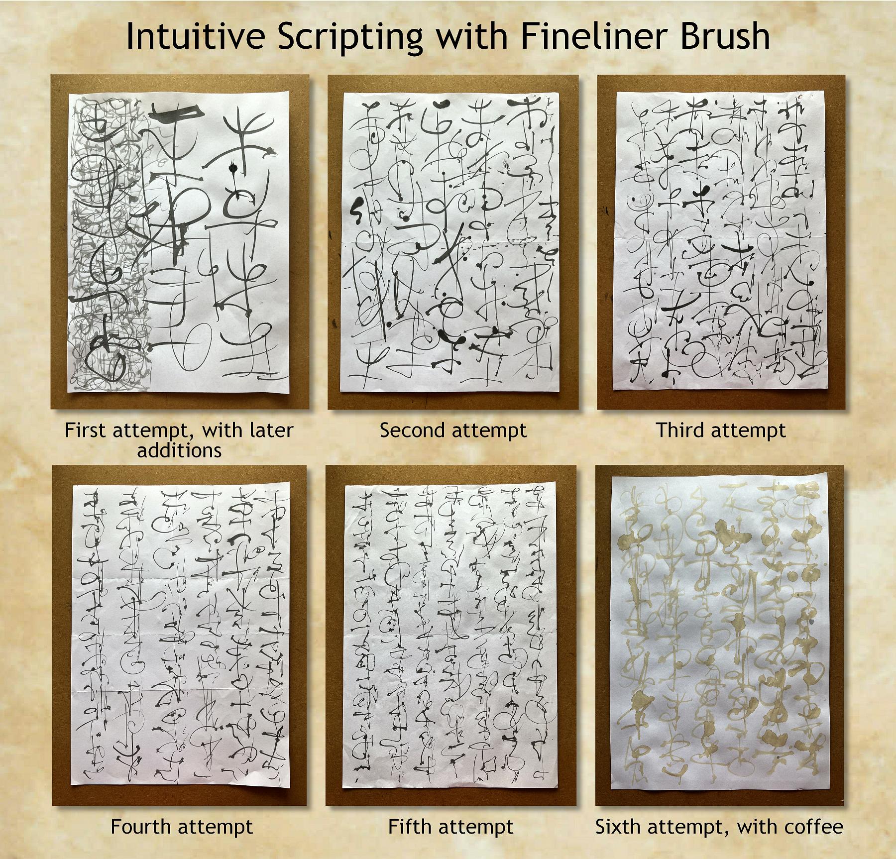
Intuitive brush scripting
Robyn McClendon does this all the time, using Japanese Sumi ink and various hand-made brushes which are extremely expensive. She gets the most beautiful results, and I love the style of her scripting, which is very fluid and delicate.
I have done a fair amount of this scripting, mostly in the form of mock Oriental characters, which I have subsequently turned into a series of stencils and masks, all of which are on my OneDrive for free download (svg files for cutting). They can also be printed out. I have always done these with a black Tombow dual brush marker.
Today, I used a fineliner brush, and found that it was a very different skill. I worked on scrap A4 printer paper that had printing on the other side. On my first attempt, the scripting was very large.
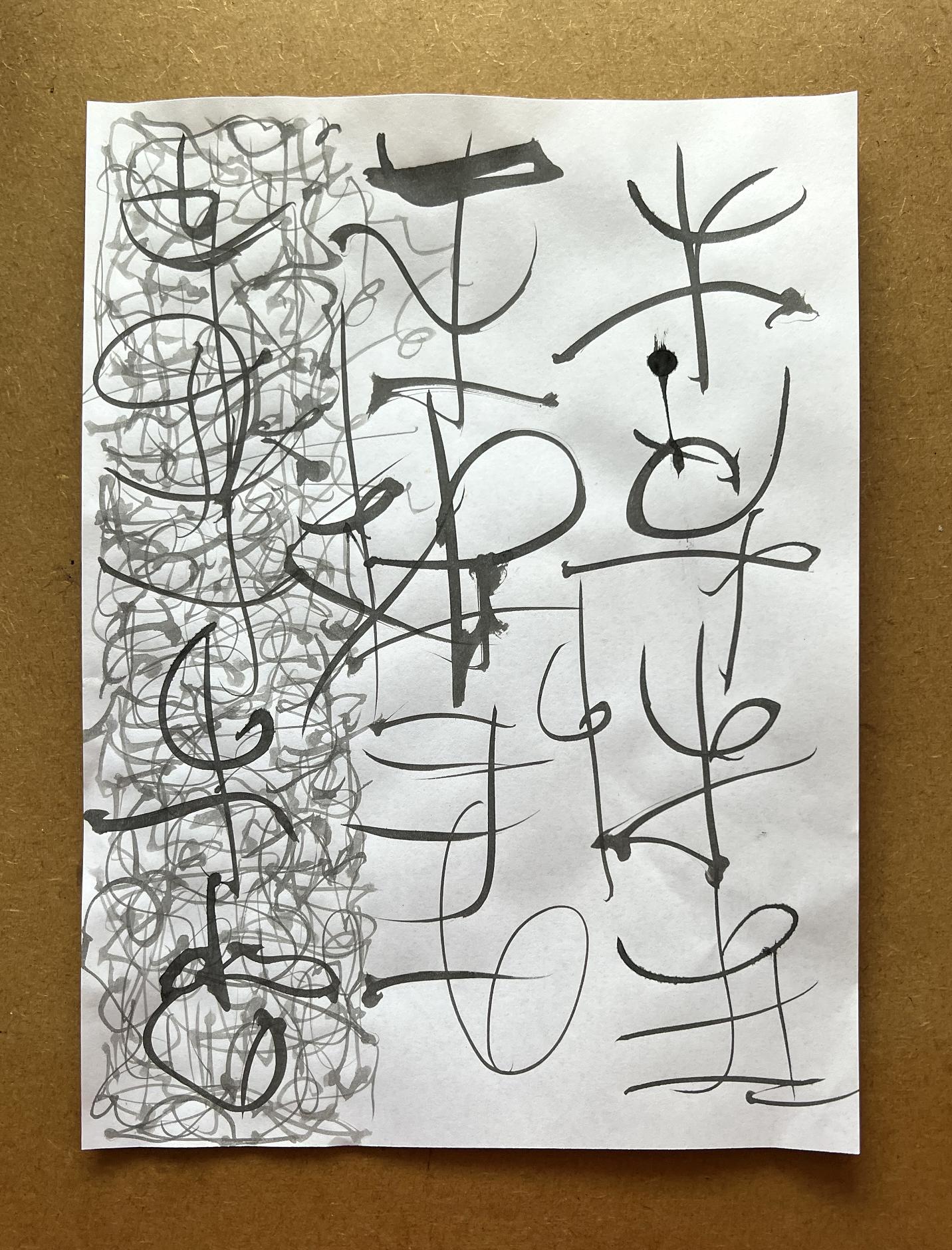
At the end of the session there was a small amount of ink left in the bowl, and rather than wasting it by washing out the bowl, I spritzed in a little water and continued working with it, adding layers of random scripting at a smaller scale over the left-hand side of the large scripting.
When this was done I really didn’t think I would bother to keep it, but on second thoughts it grew on me, and I ended up using it in my collage (see below).
My final attempt with the ink was quite pleasing. I managed to scale the scripting down to a much smaller size.
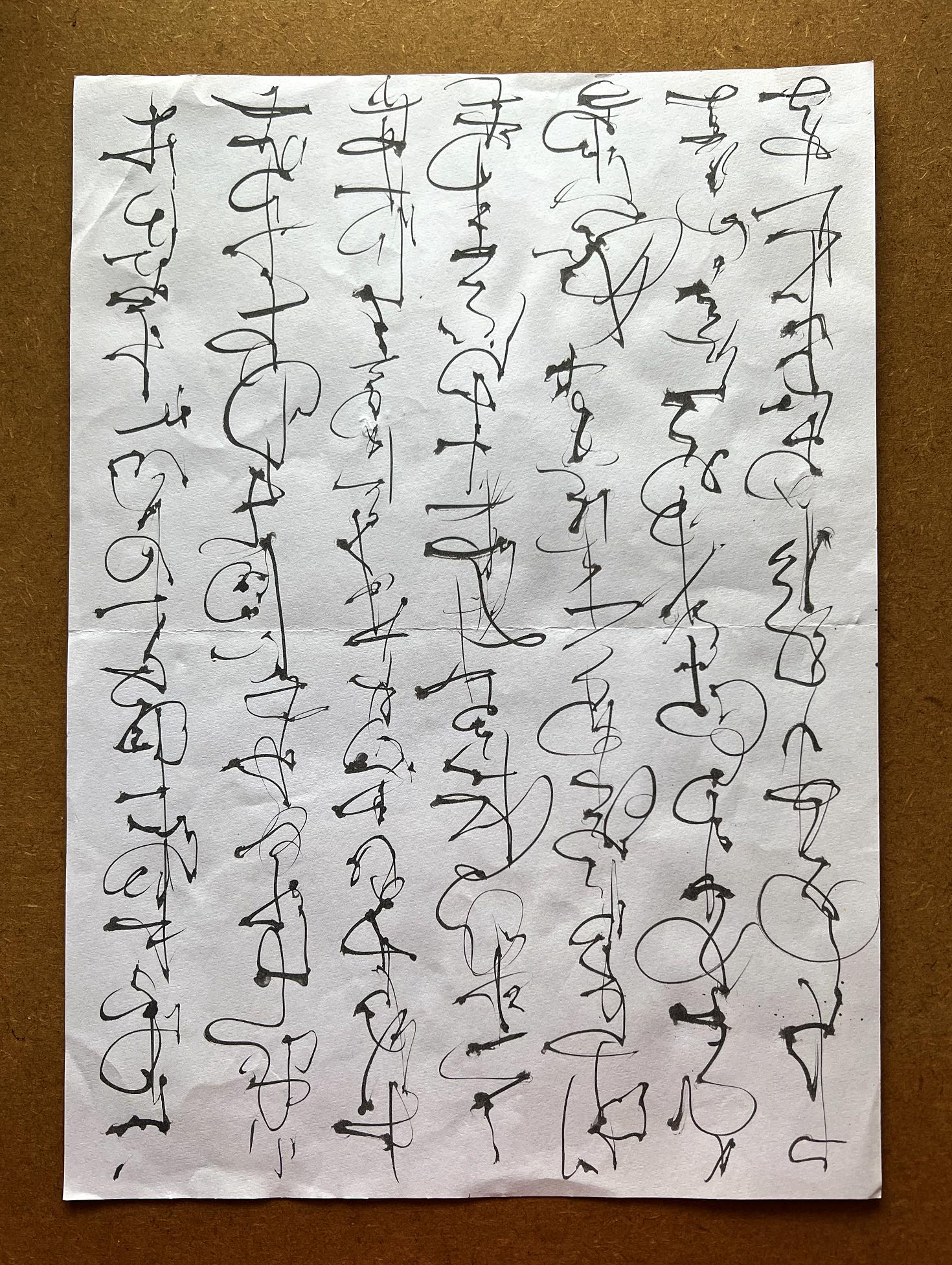
I discovered the secret was to work fairly rapidly and not put too much pressure on the brush, which would result in thicker lines.
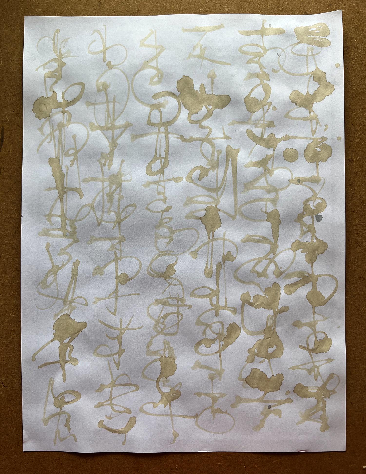
The final piece was done with coffee. Not very distinct, but quite interesting. It was much wetter and more difficult to control than the ink, and had a tendency to bleed into the paper more.
Here is a montage of all of the sheets, showing my progress.
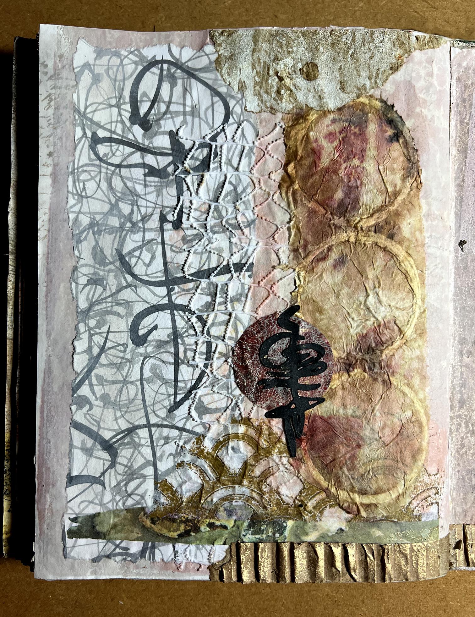
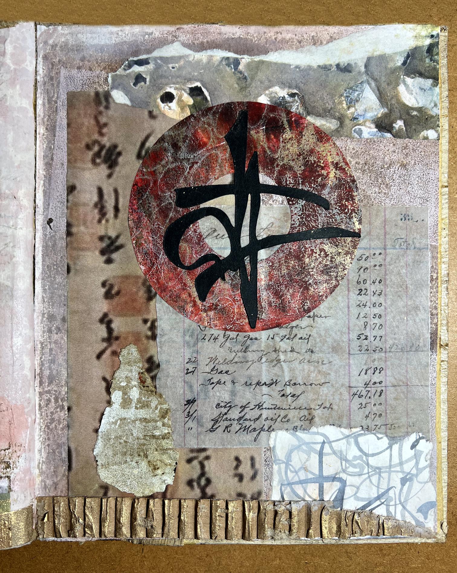
Organic Journal – Intuitive Collage 4
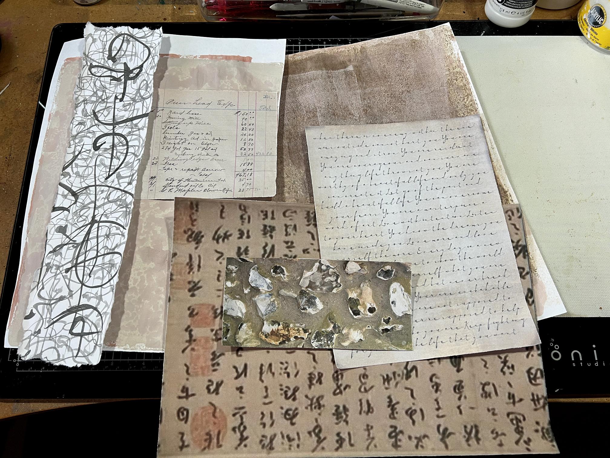
Selecting the papers. As usual, some were used, some were not, and others were added subsequently.
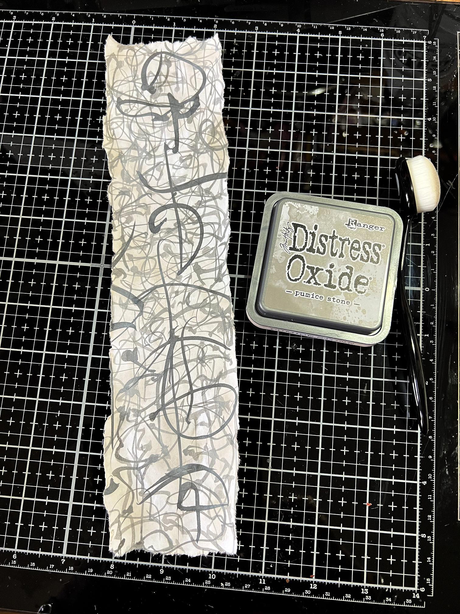
I began by adding some Pumice Stone Distress Oxide to the layered scripting piece. I had torn this from the larger sheet, using the wet brush method – painting with water along the line you want to tear, and the paper then tears in a much more controlled way,and with a pleasant deckle or feathered edge, depending on the paper. The inking dulled down the stark white of the paper.
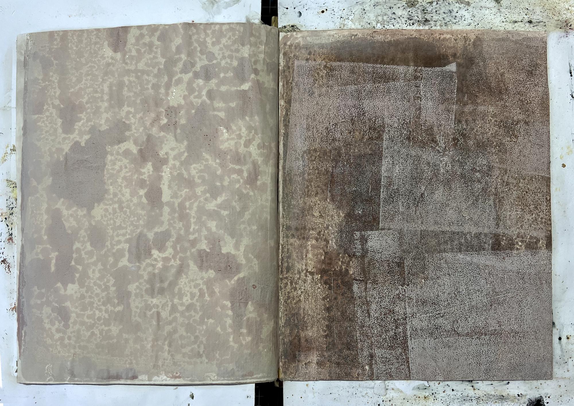
Laying down the backgrounds for the spread. On the left, I used one of my recent successful Venetian Plaster pieces, created on the gel plate. The background for the right-hand page was the brayering off sheet from that session.
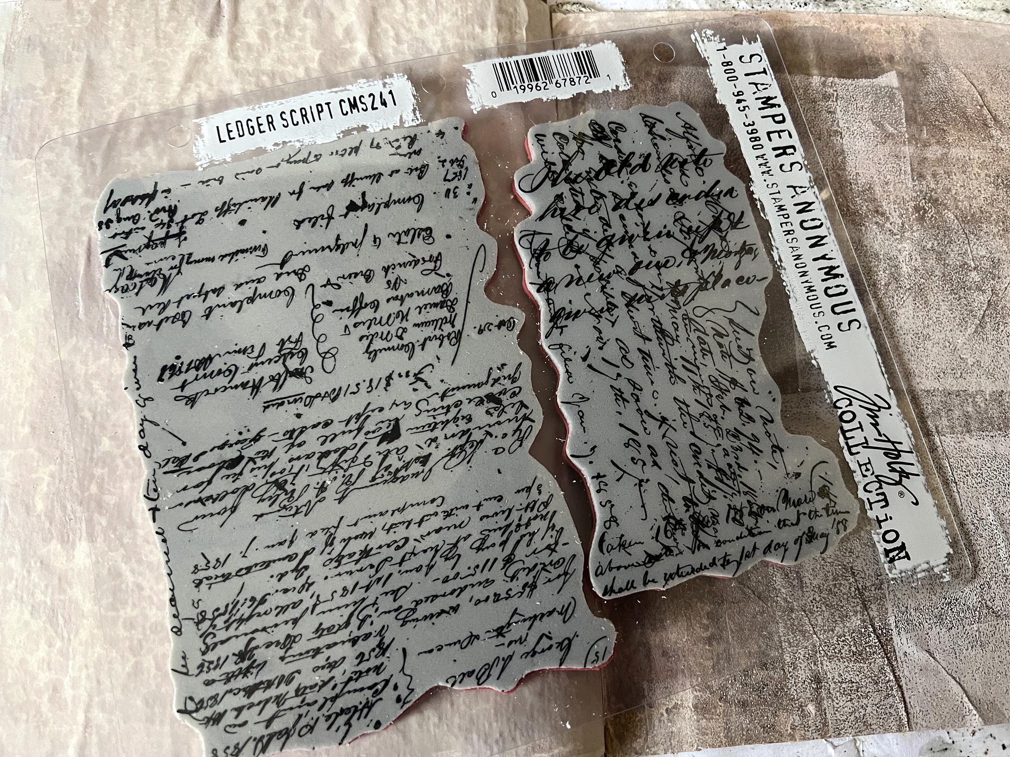
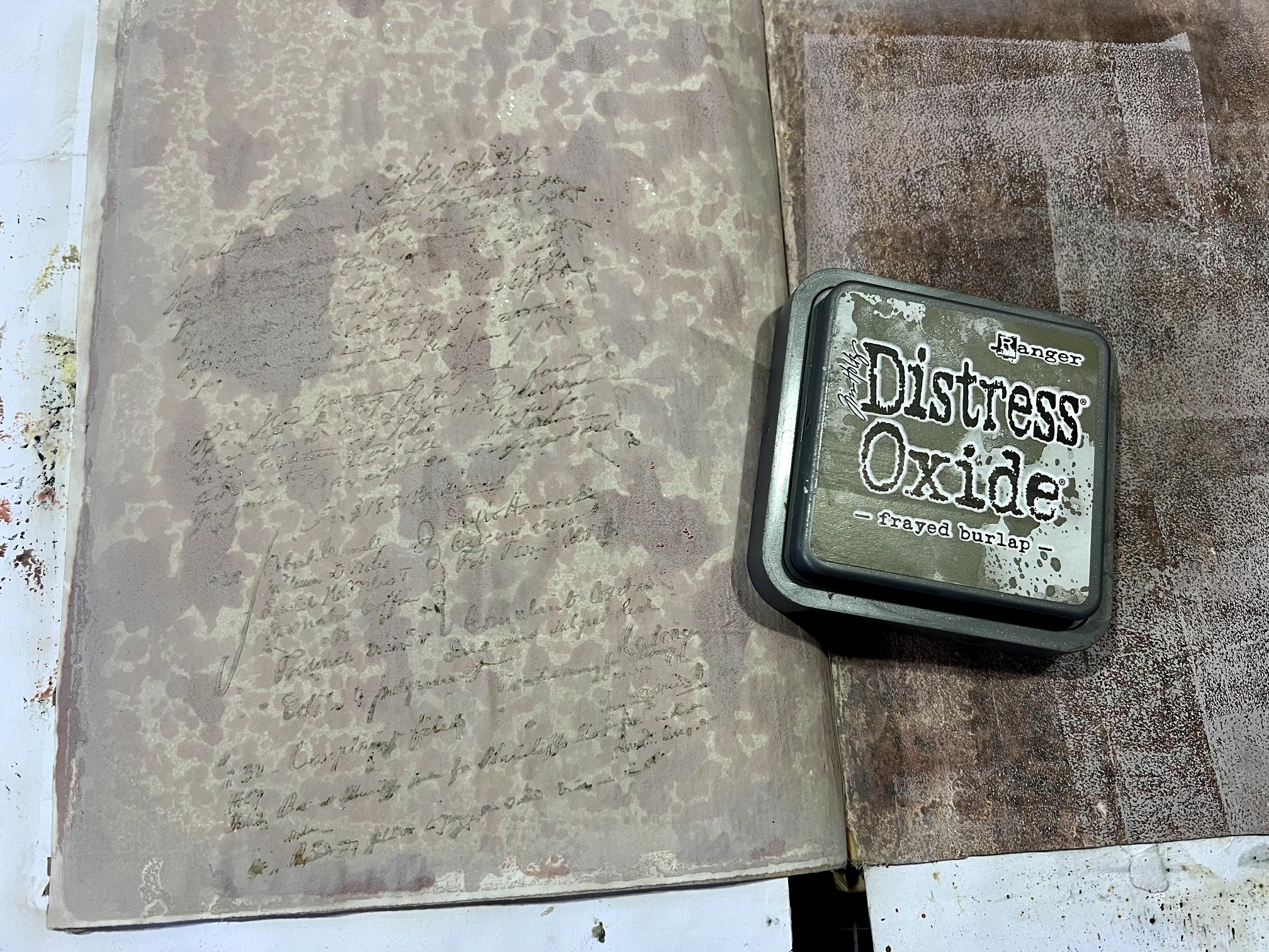
I used the larger stamp from this Tim Holtz stamp set, “Ledger Script,” with Frayed Burlap Distress Oxide, to add a bit of extra interest to the left-hand page. It was very subtle and I knew that much of it would get covered in the end, but worth doing.
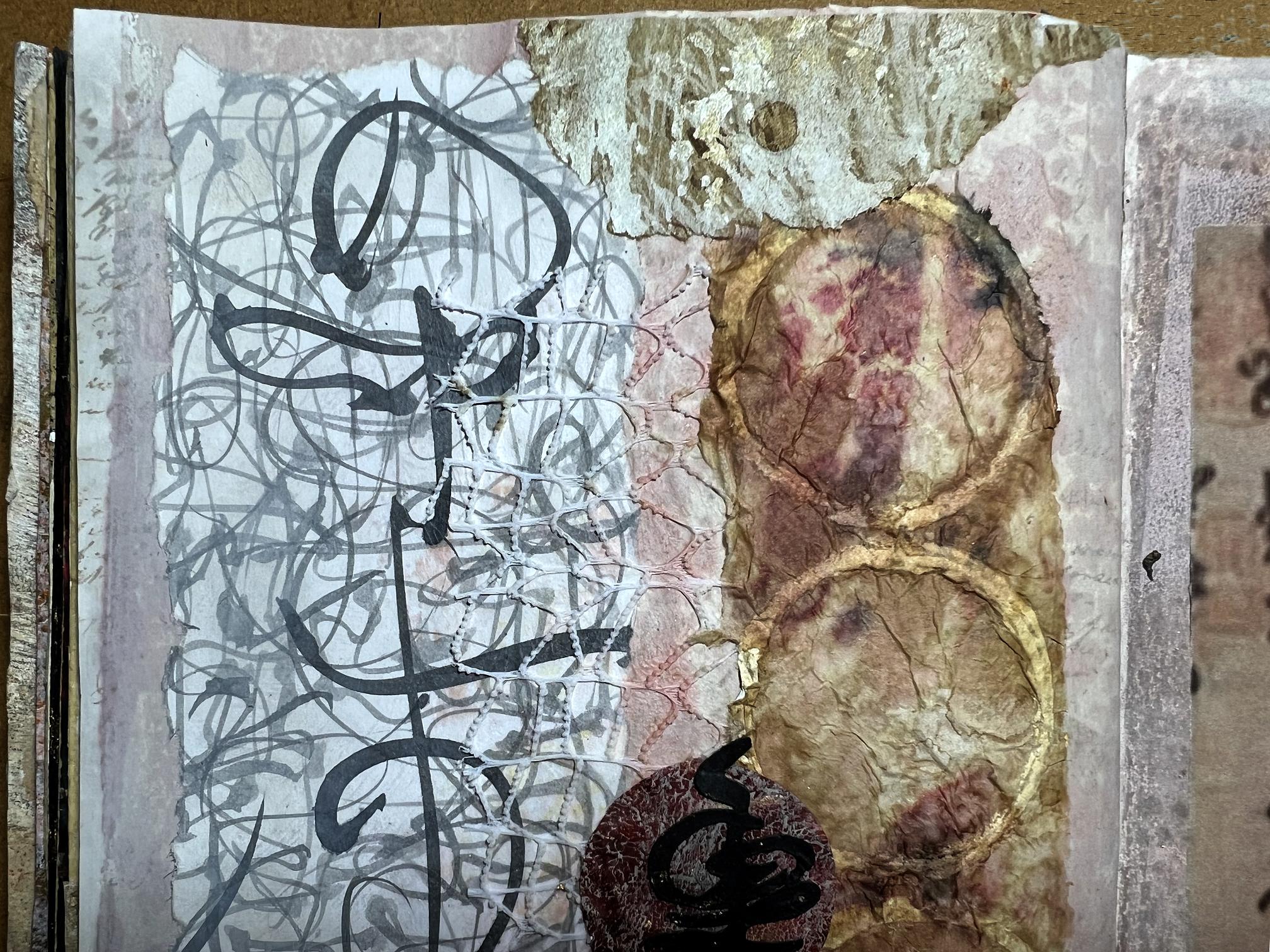
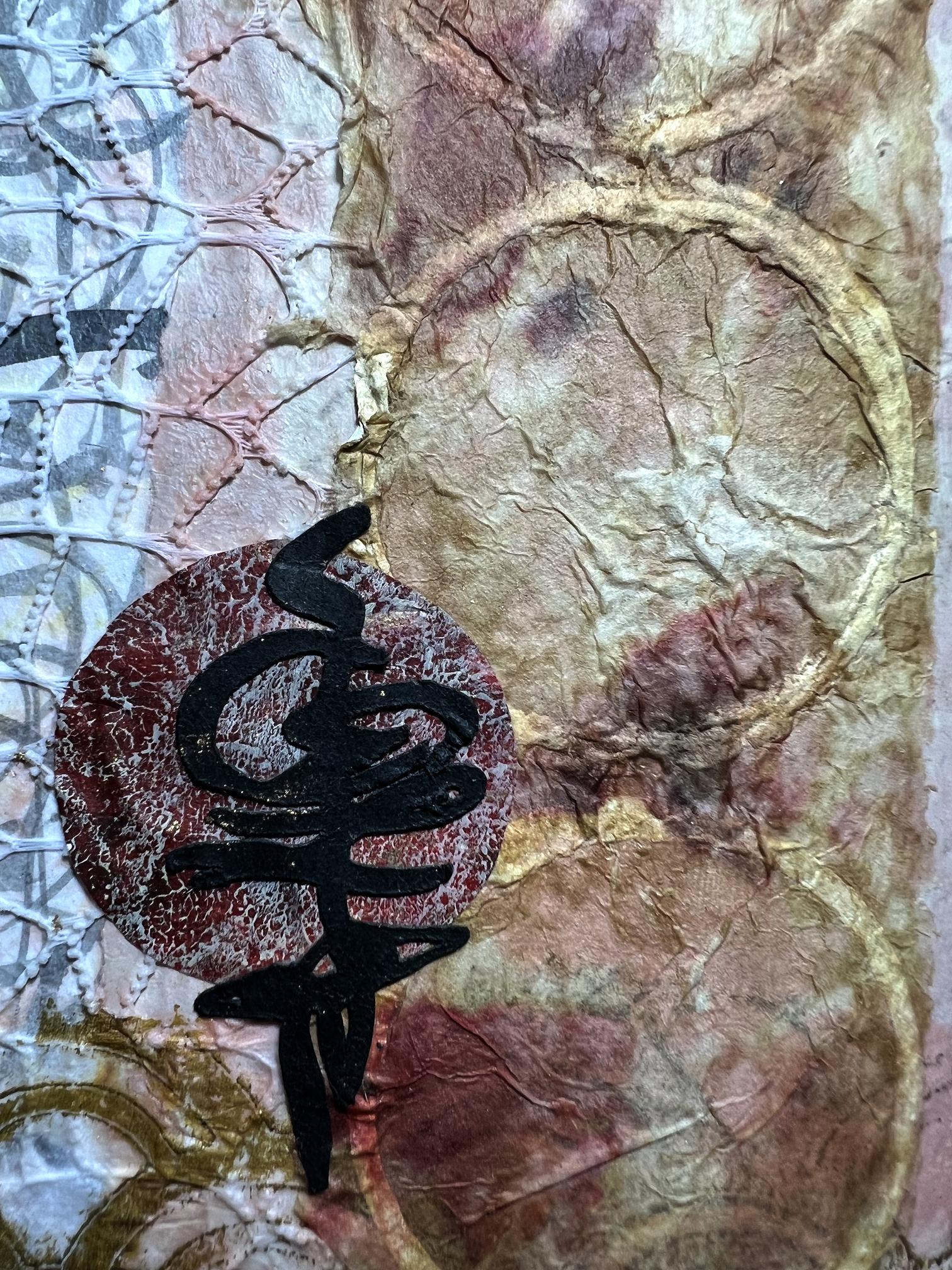
Adding the collage elements. I didn’t photograph every stage because I got “in the zone” and forgot! At the bottom of the left-hand page is a scrap of gel printed tissue paper using my scallop stencil, and a scrap torn from the flint wall printable on the right-hand page. I added three of my DIY Beehive Paper circles (made on tissue paper by stamping white acrylic paint with the lid of a jar). I had put this sheet in my splat box and sprayed it with coffee, which activated the residual inks on the kitchen paper in the box. I loved the result! Not intentional but a happy accident. Wabi sabi!
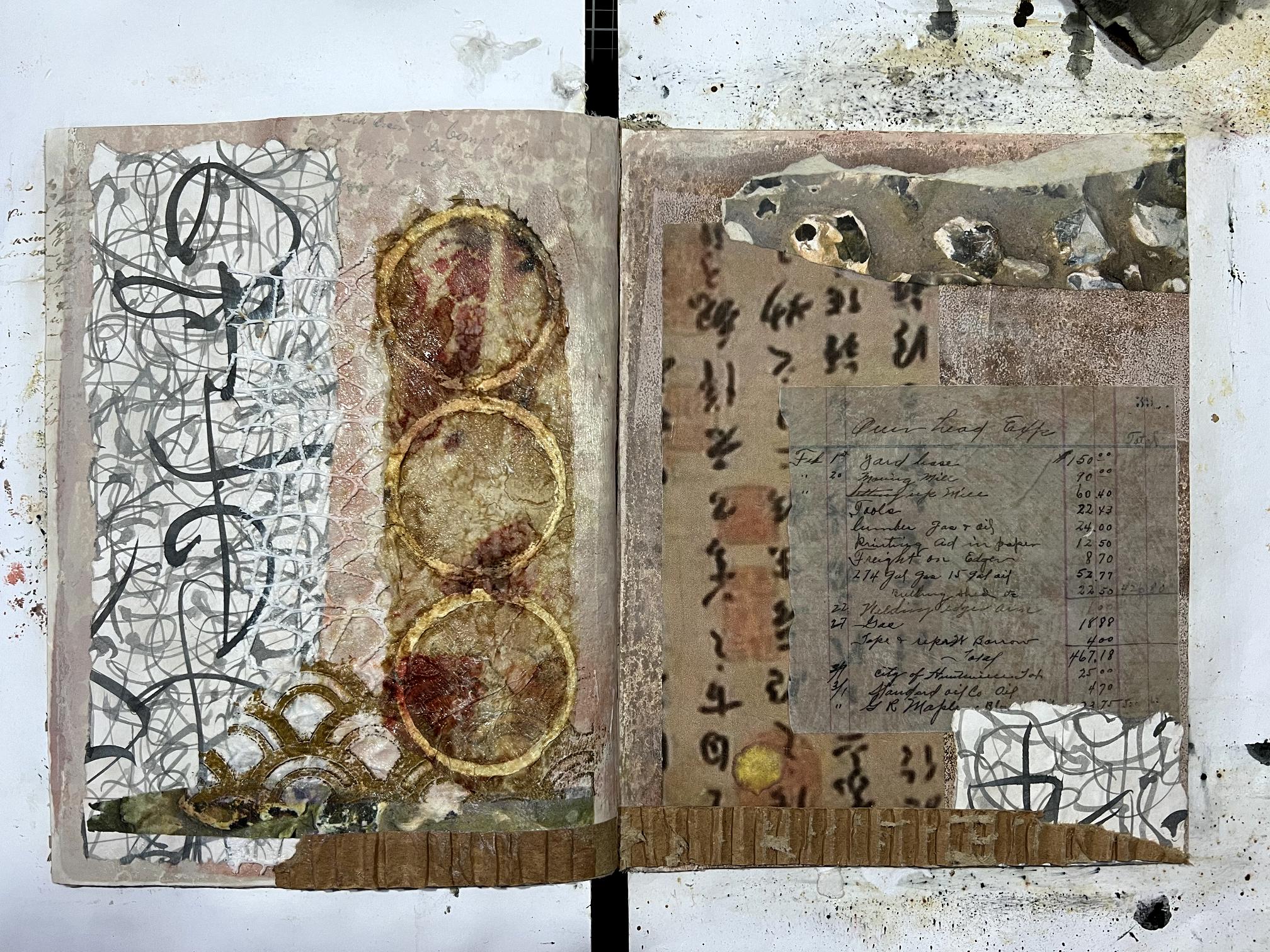
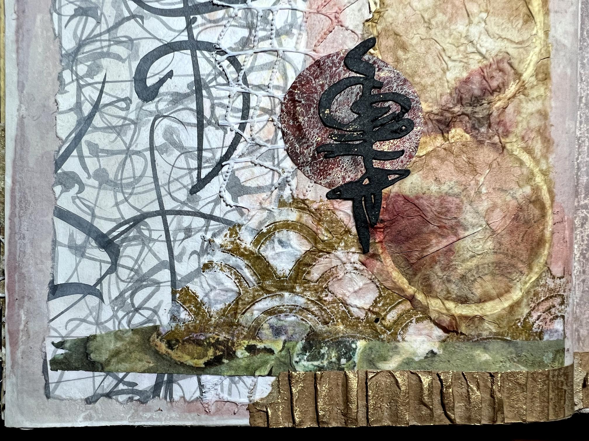
I added some of the floral gift wrap that I got from AliExpress last week, over the intuitive scripting strip for added texture. I love how it complements the watered-down grey ink of the subsequent layers of scripting on the piece.
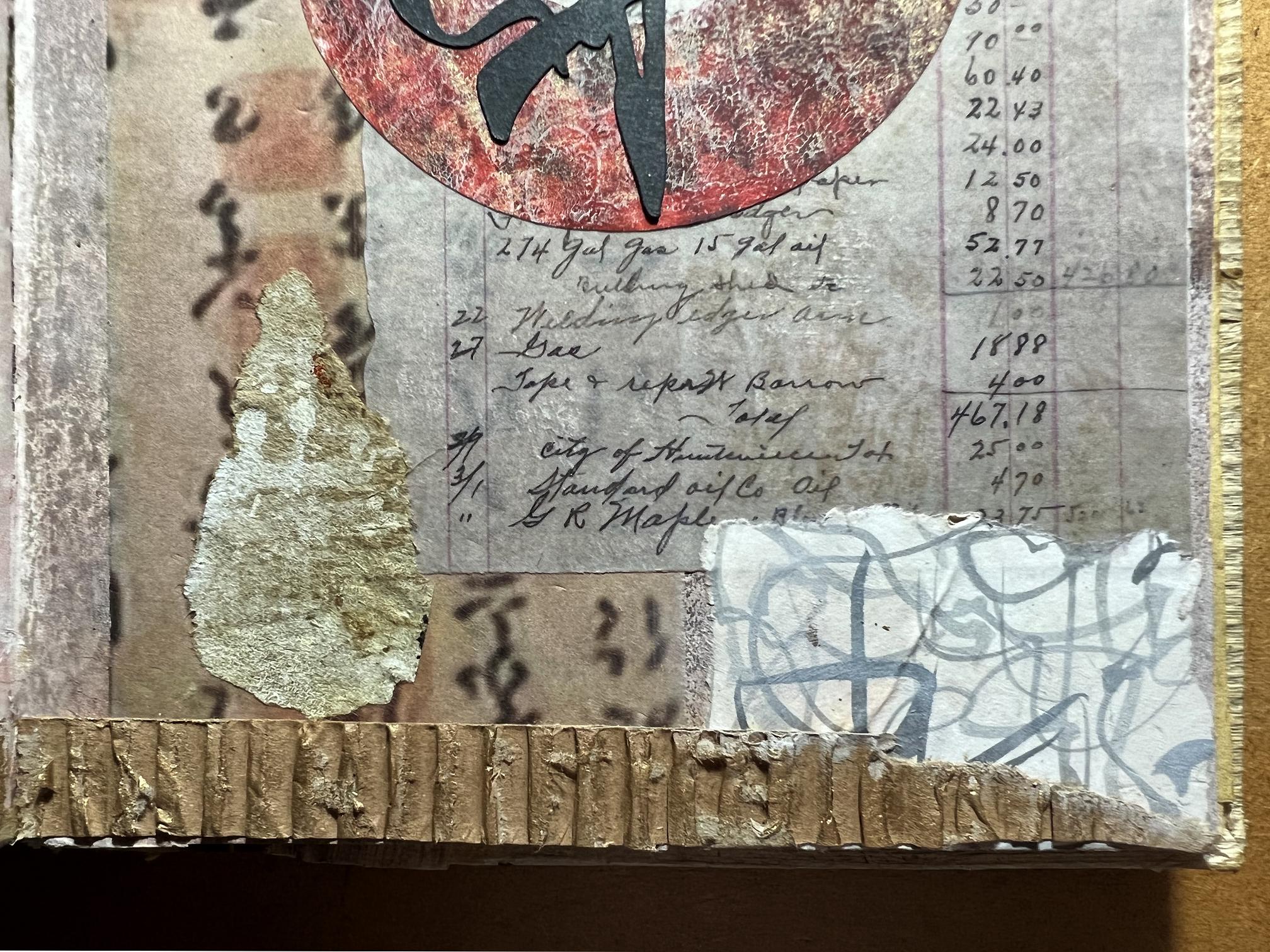
Along the bottom of both pages were scraps of corrugated cardboard with the top layer stripped off. These were eventually highlighted with gold gilding wax.
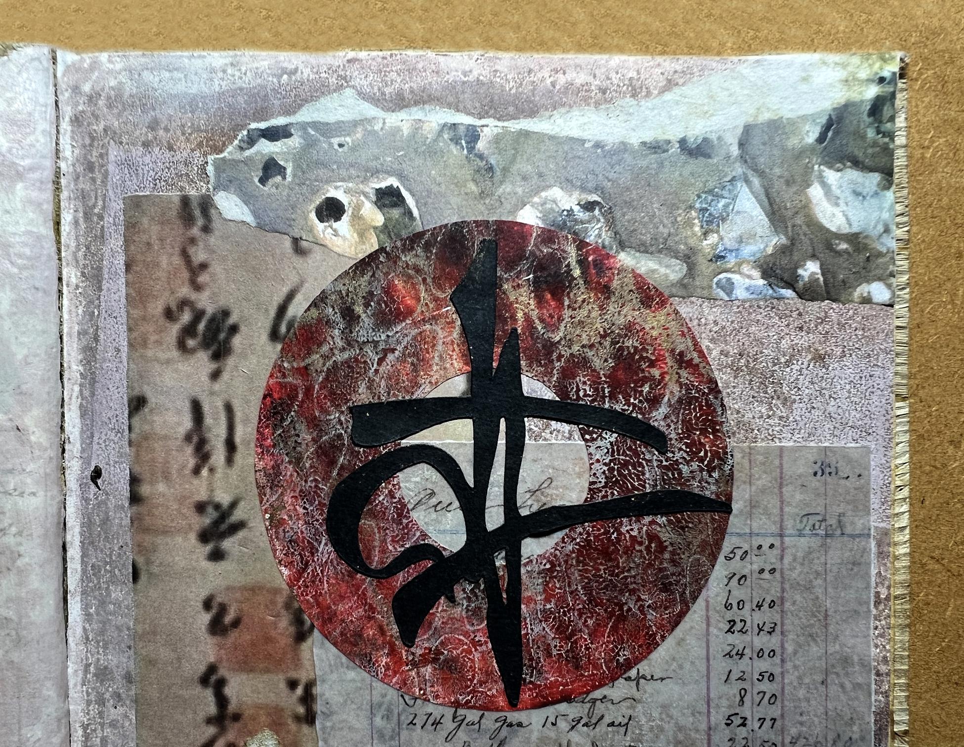
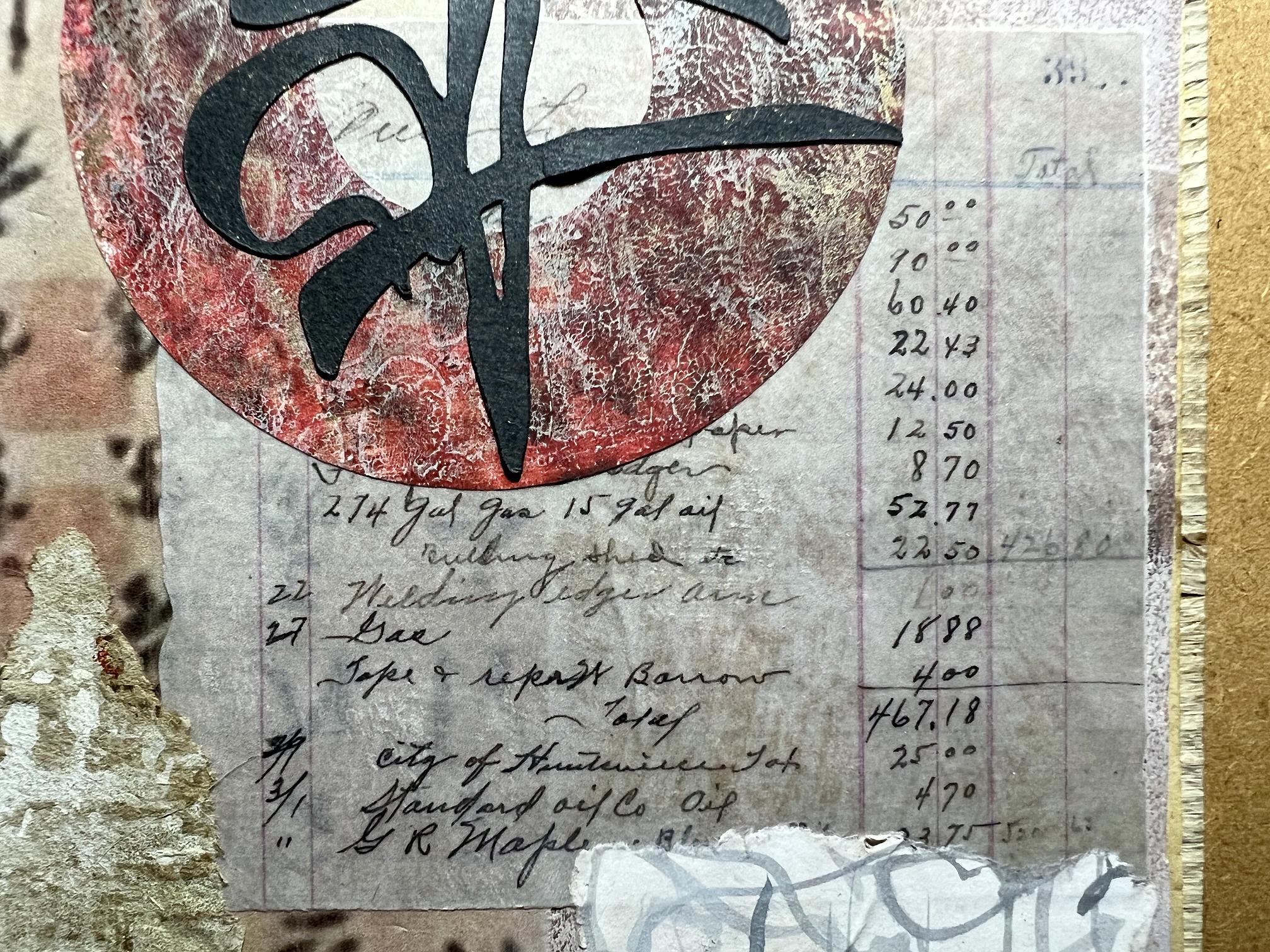
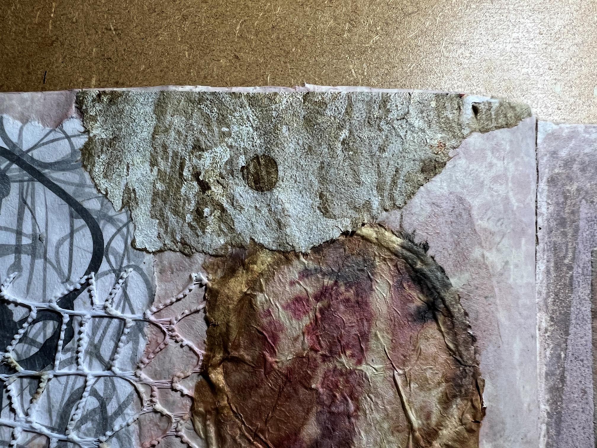
For the right-hand page, I used a torn off piece of the flint wall printable I made recently. I also used a strip of Chinese calligraphy from another printable. You can see hat there is a yellowish stain at the bottom where some water reactivated the printer ink, and I eventually covered this with a small piece from my scrap bag. To balance the page with the left-hand page,I added ascrap of the intuitive scripting piece.
The ledger piece was an experiment. I have not yet attempted printing on tissue paper, and doing some research into onion skin paper, I am horrified at the cost of this and have decided not to go for it, at least for now. I wanted to achieve a translucent effect, so I looked up how to make paper translucent, and there were various ways suggested. I did test runs on another scrap, and initially tried acrylic wax, but this didn’t make any difference. Neither did Vaseline. Eventually I used baby oil, massaging it well into the paper with a paper towel, and it became quite translucent – propbably more so if the paper had not been fairly dark to start with. I wasn’t sure whether the greasy surface would take the gel medium and remain stuck down, but I kept rubbing off the excess oil, and it stuck down like a dream.
In this photo, you can see the underlying pattern showoing through the piece.
![]()
This is definitely a technique I shall be using again.
Here is the completed spread drying. You can see I have added a scap to cover the blemish (clearly seen in the bottom left corner of the photo above), and also balanced this with another scrap at the top right-hand corner of the left-hand page. This was part of that packaging paper with the mark making on it, which I used in the previous layout.
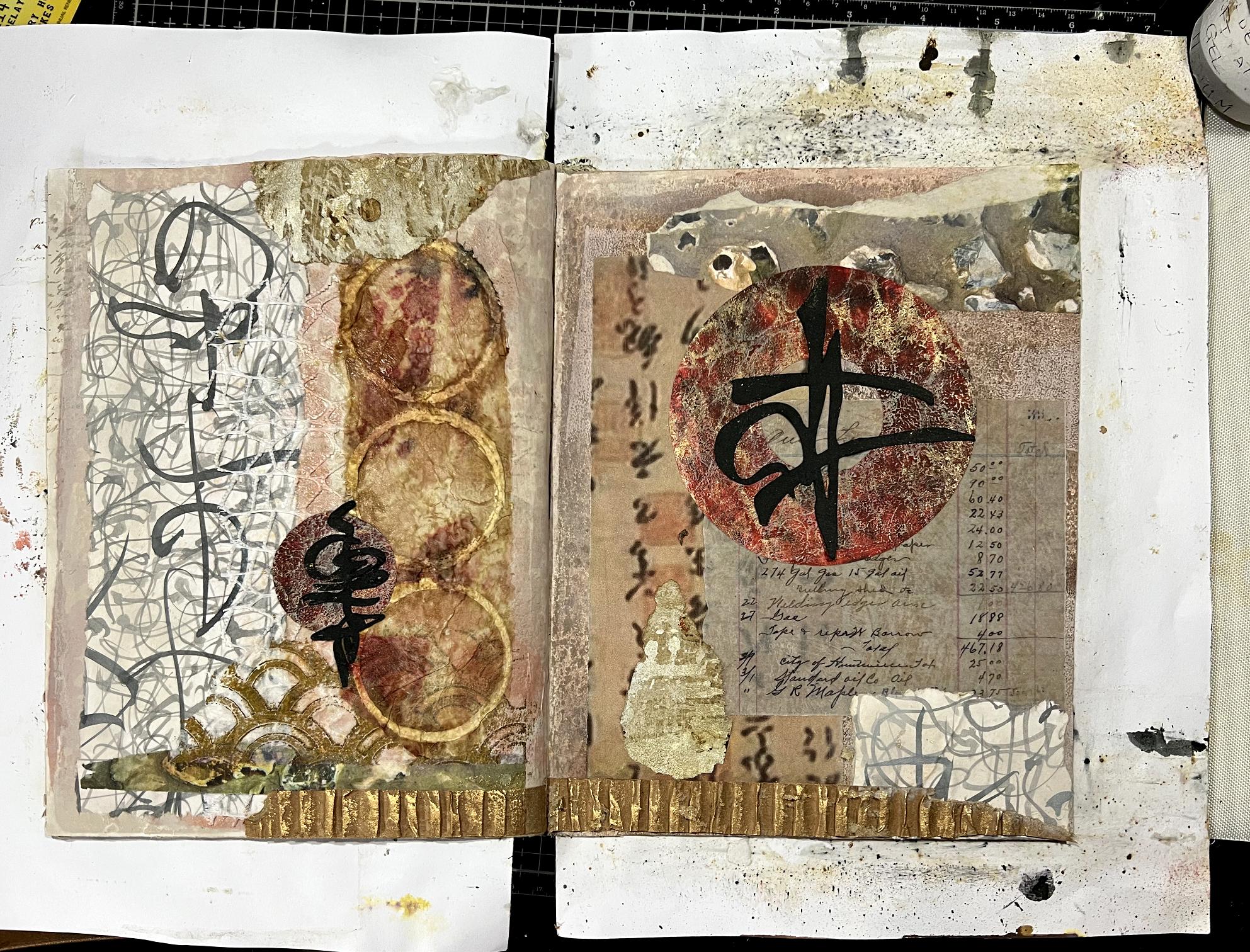
For the focal point on the right-hand page, I cut a circle from one of my gel prints created with my radiating ovals stencil, with red and gold. I stuck the small circle cut from its centre onto the left-hand page,and over both, I stuck down some of my Oriental Script motifs cut with my cutting machine from black cardstock.
Here is the completed spread.
Now for the detail shots. First off, each of the two pages.
You can clearly see the floral gift wrap on this photo.
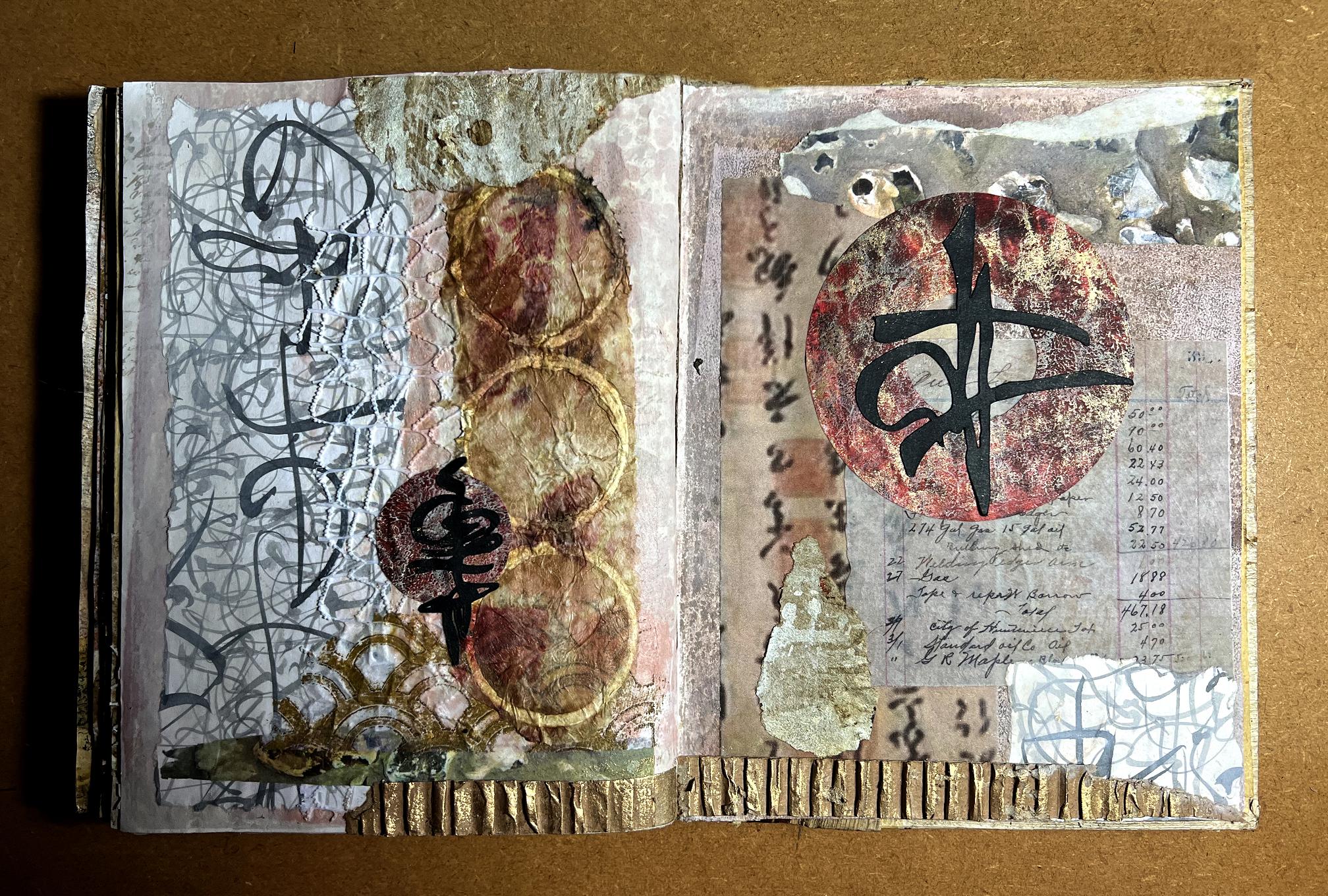
I am pleased with how the pink tone of the Venetian Plaster background is picked up by the red in the circles, and the little seals in the Chinese calligraphy printable on the right-hand page.
A final look at the completed spread once more.
I can’t believe it, but there are only three more pages to complete in this album! Once it is done, I shall move on to an altered book project I have in mind.
Stunning results as always Shoshi – love that it’s “intuitive” – so expressive and it must be very therapeutic to do this.