It’s been several days since I’ve been able to get in my studio and actually create something. We went out for the day on Friday (I will be blogging about that as soon as I’ve sorted the photos) and yesterday I was too exhausted and headachy to do anything at all. Apart from that there has been the usual round of cooking, laundry and other stuff that uses up my energy and keeps me from my Fun Room. We are also now in full swing with the apple harvest, which looks like being a bumper one again this year – my hubby does the peeling and chopping, and I am hard-pressed to keep up, alternating between stewing large pots of them and making apple juice with my juicer. As anticipated, this juice is quite delicious!
Today when I eventually got into the studio, rather than creating more papers (which I always want to do!), I sat down and used some of them, creating a new page in my Organic Journal. I have called this…
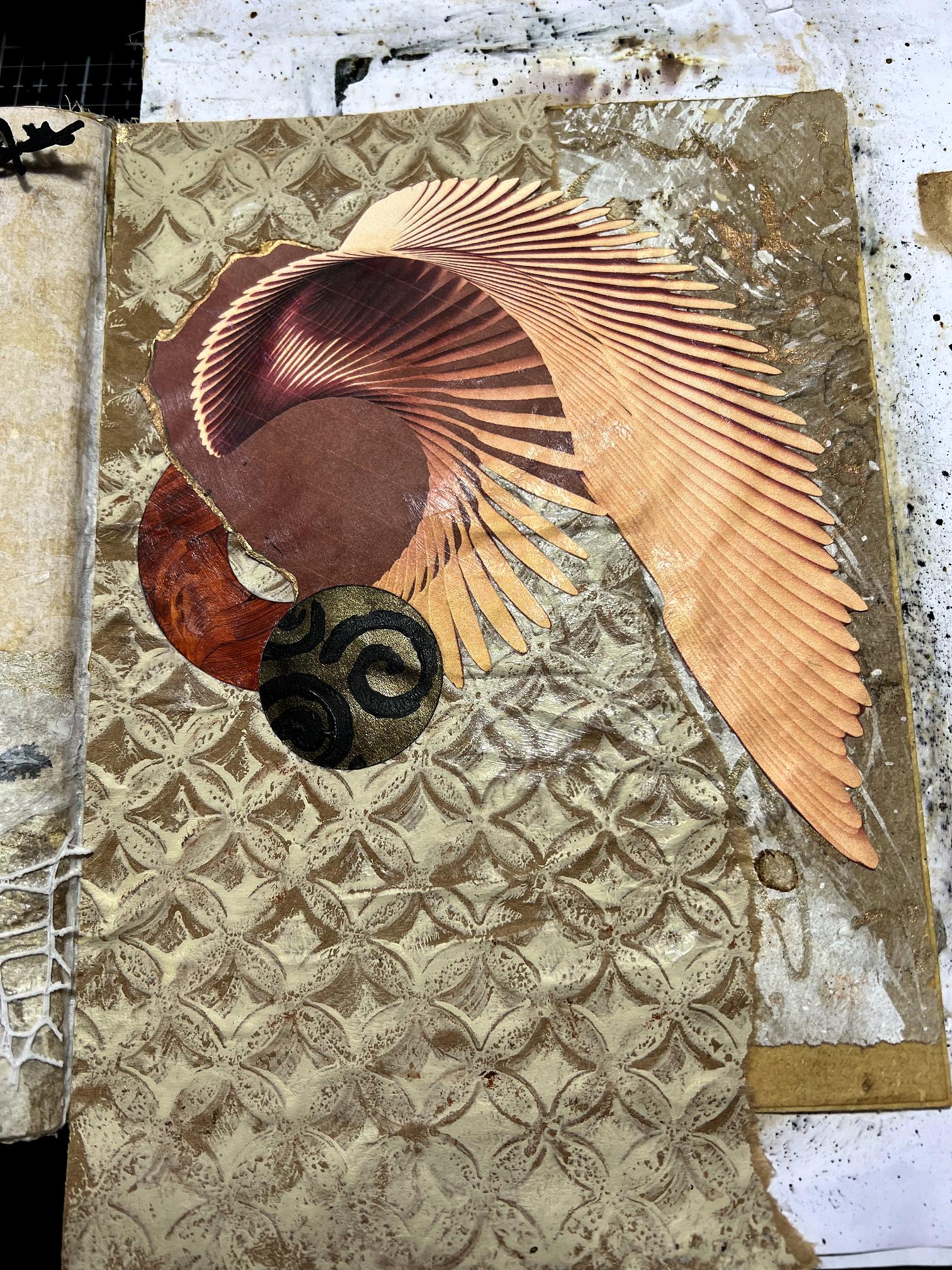
Wings
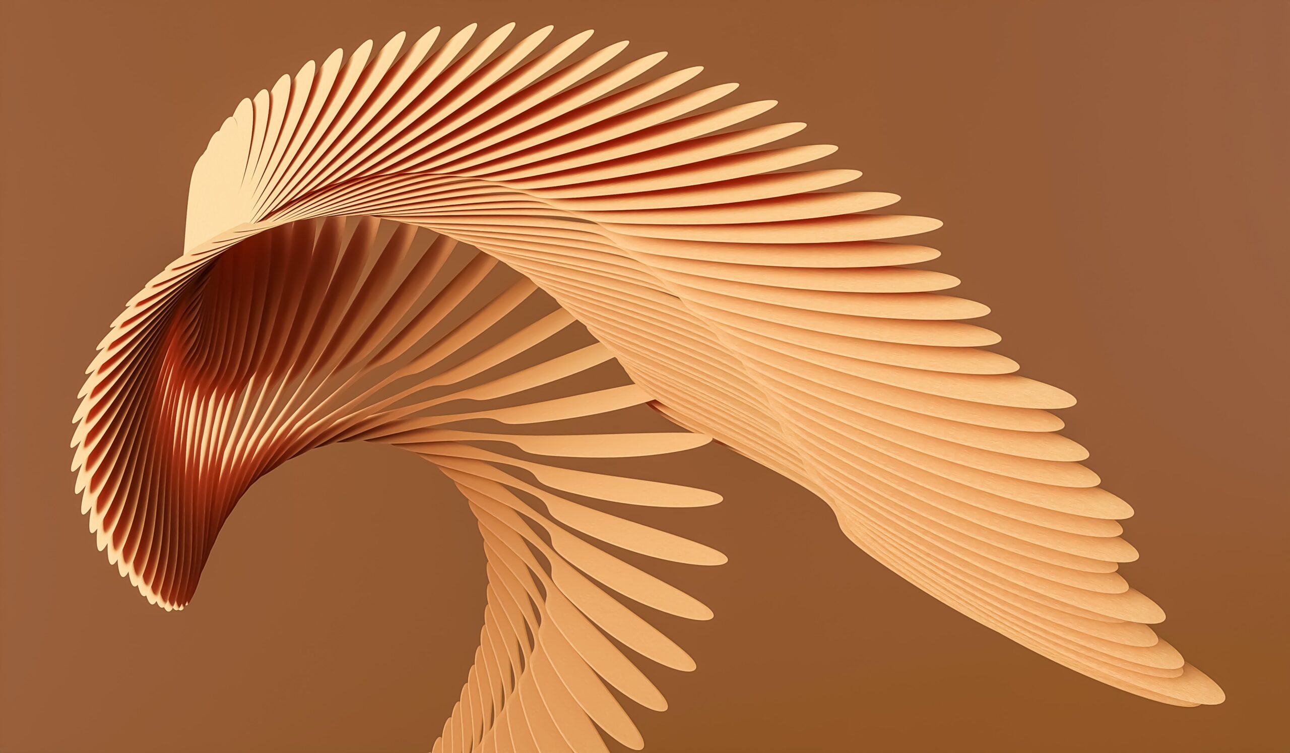
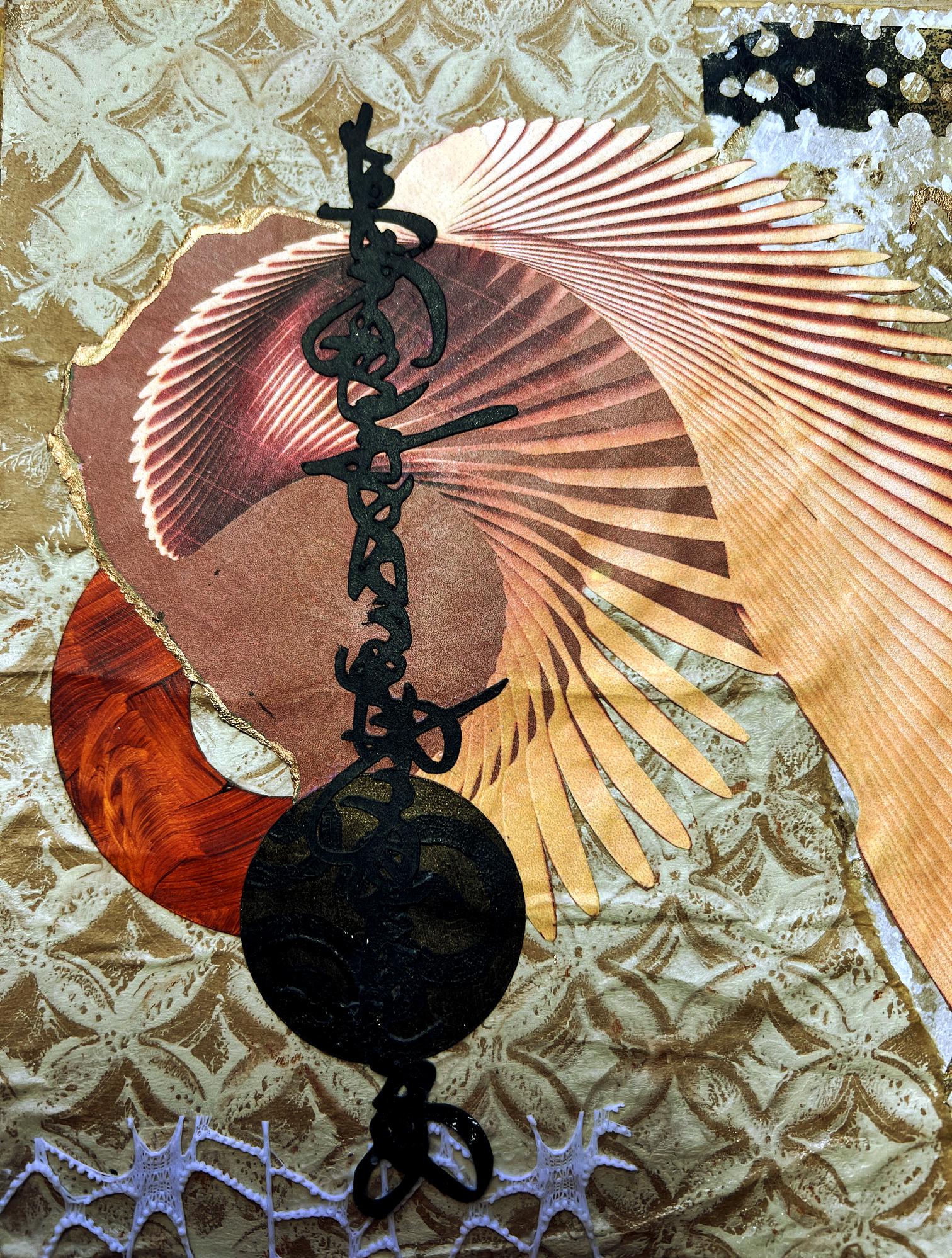
I recently found an excellent site full of royalty-free downloadable images, recommended by FroyleArt, called Unsplash, and discovered some beautiful digital art images which I downloaded. This one particularly intrigued me, and I chose it for the focal image of my new spread.
Choosing the papers
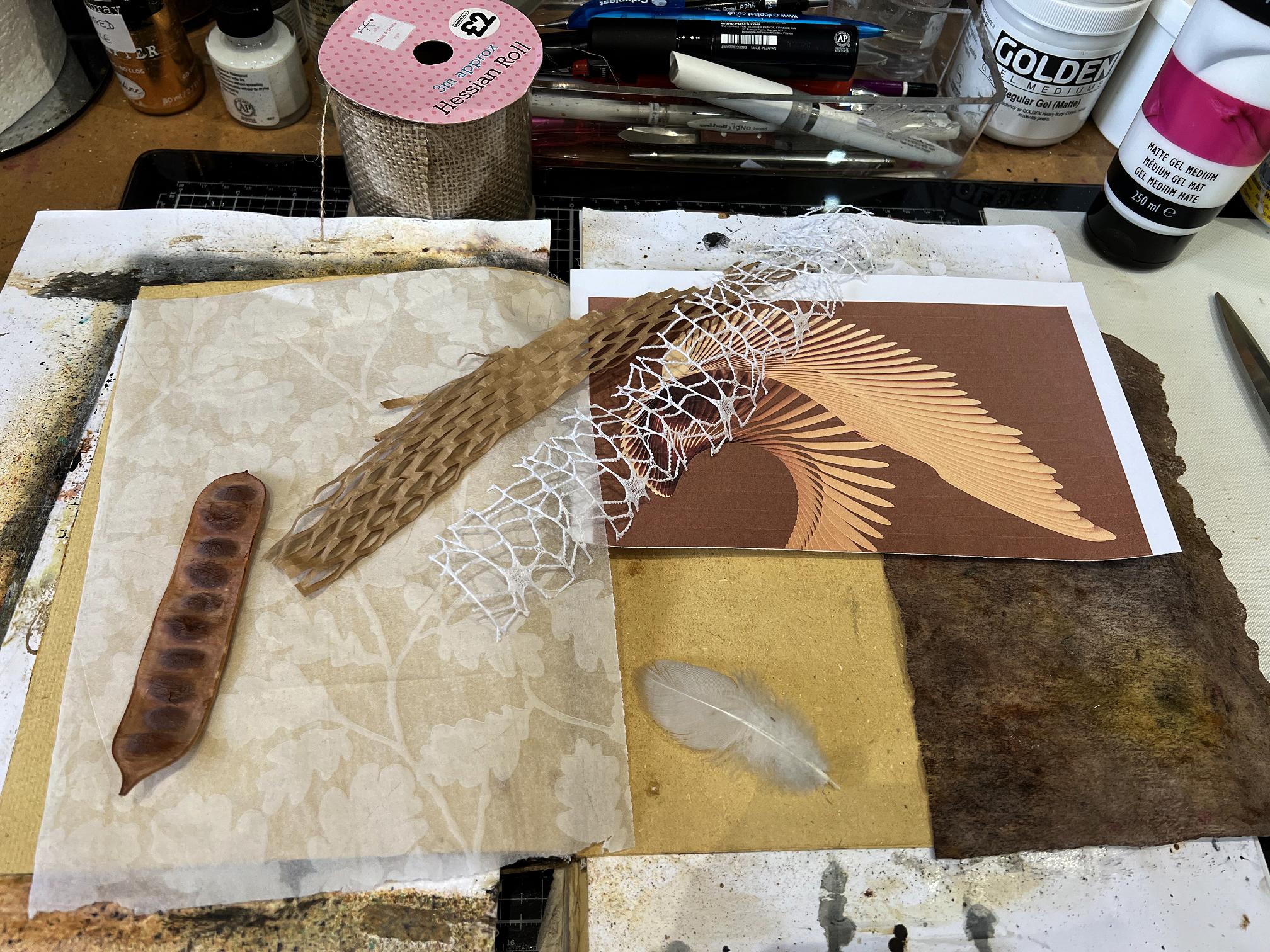
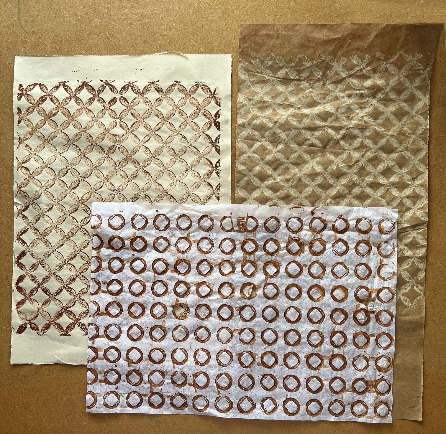
As usual, I began by digging out a selection of papers, and ended up not using some of them, and adding to the selection later. This was just a starting point to get the creative juices flowing.
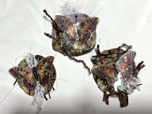
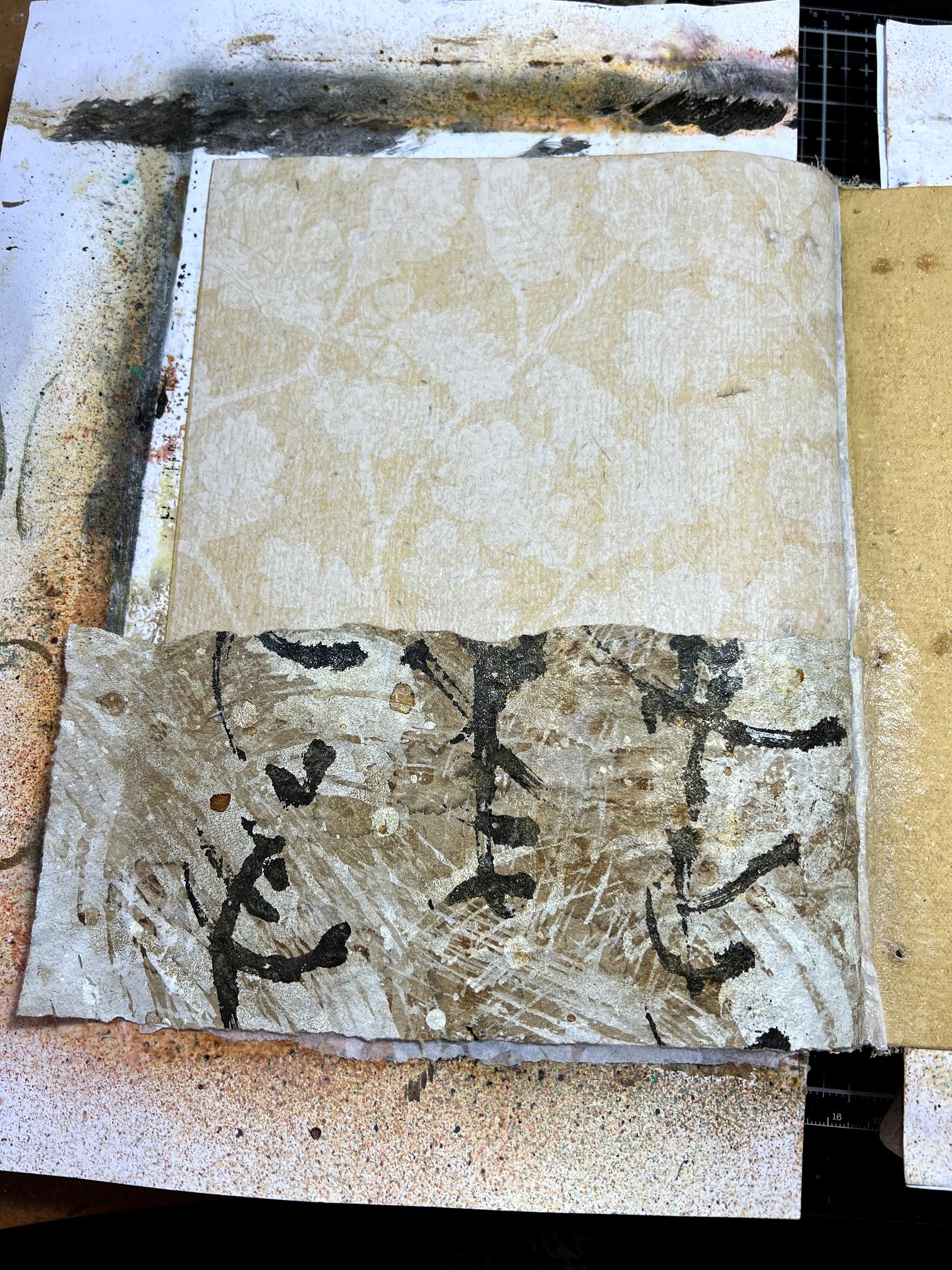
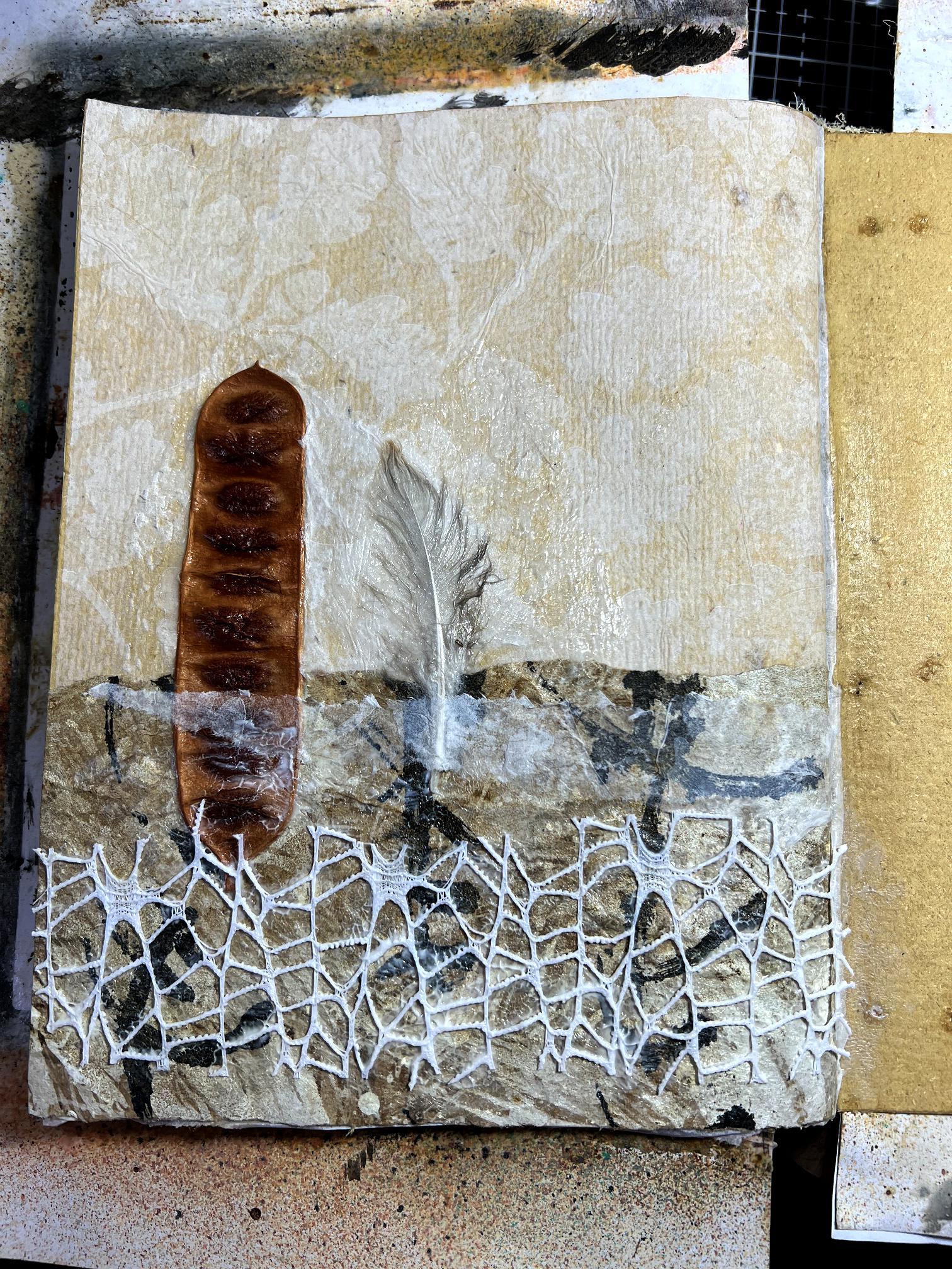
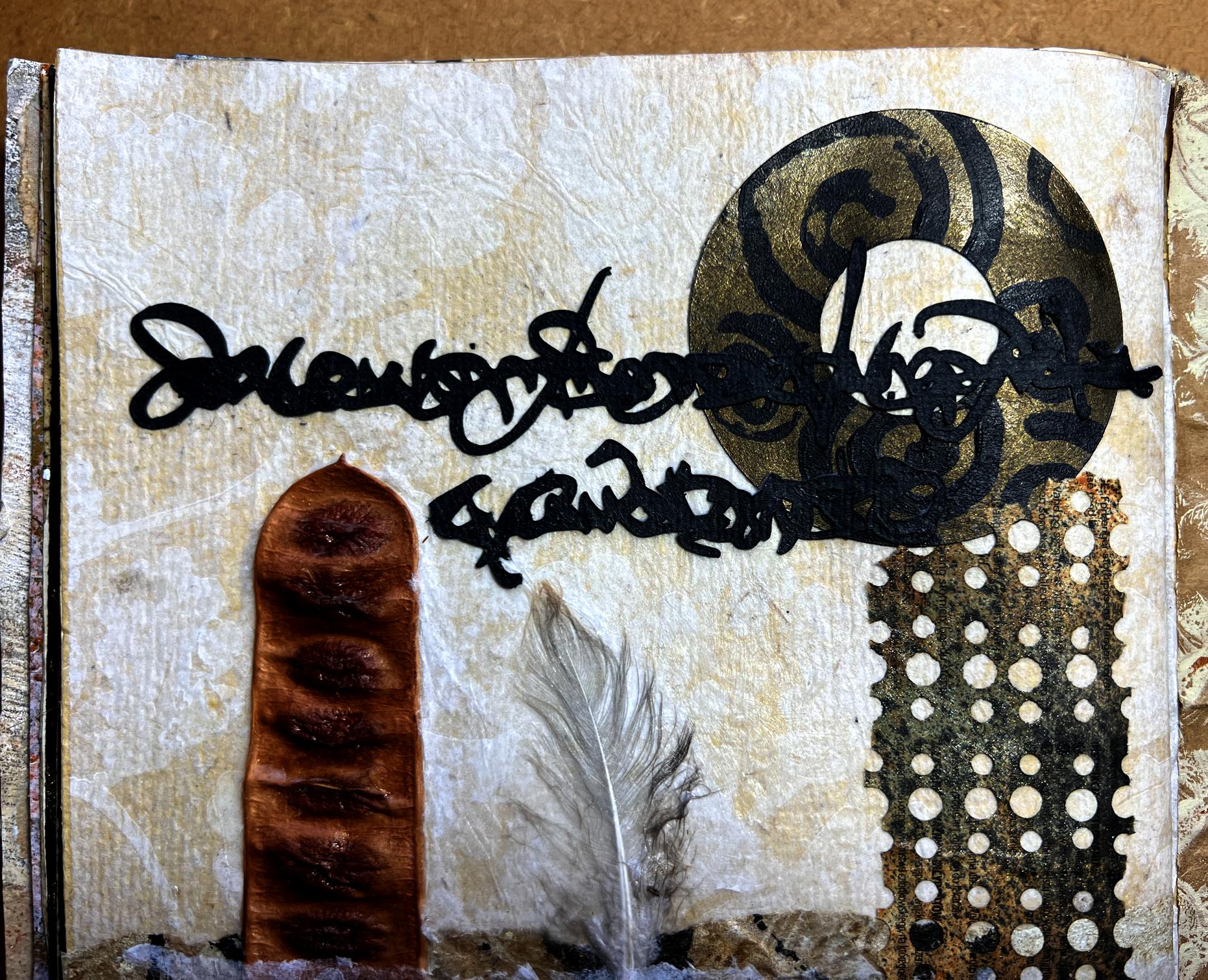
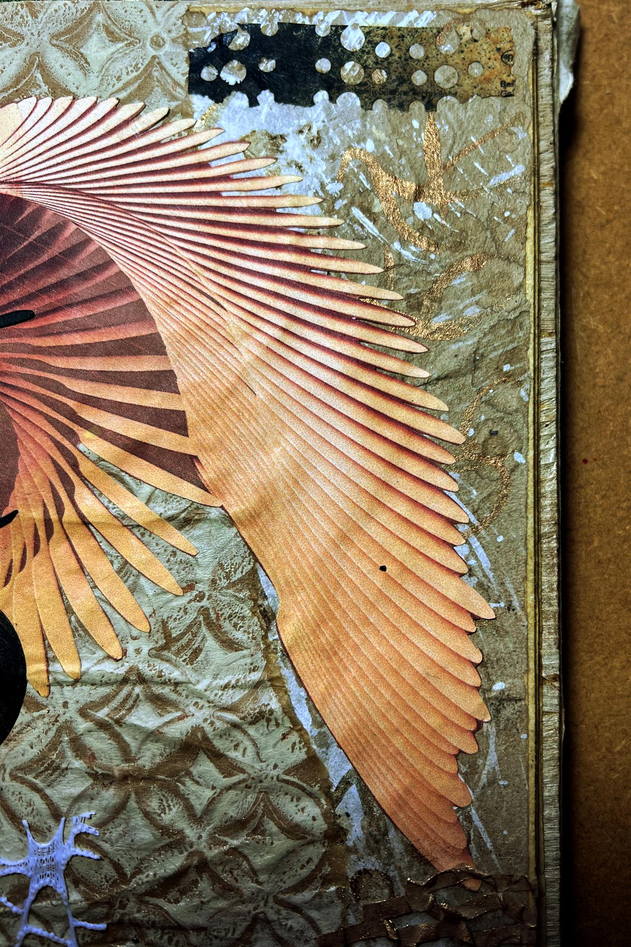
Before I did anything else, I tore away some of the background from the wings printout, and fussy cut around the feathers. Where the paper was torn, I covered the white edge with some Golden Iridescent Bronze Fine fluid acrylic.
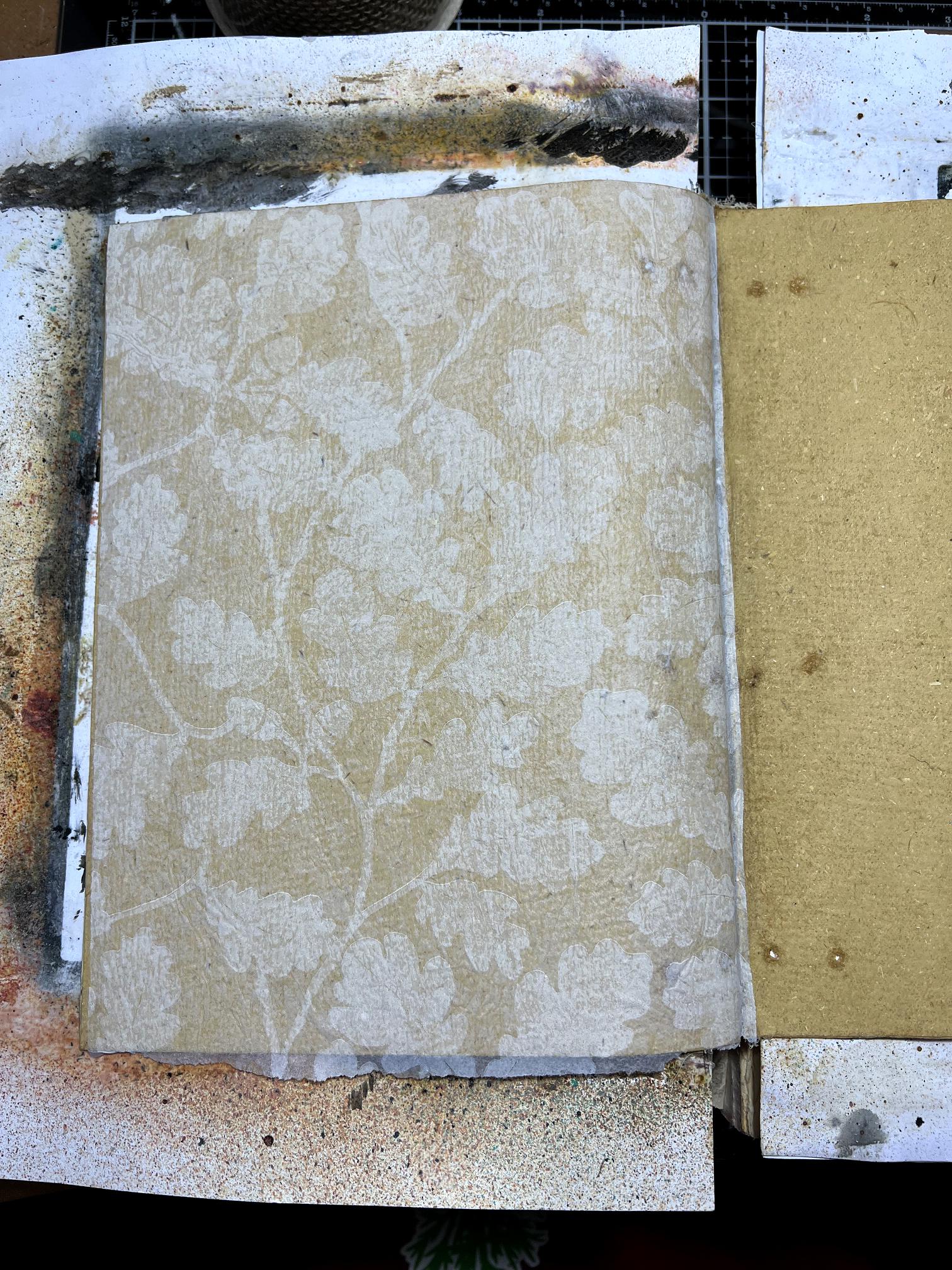
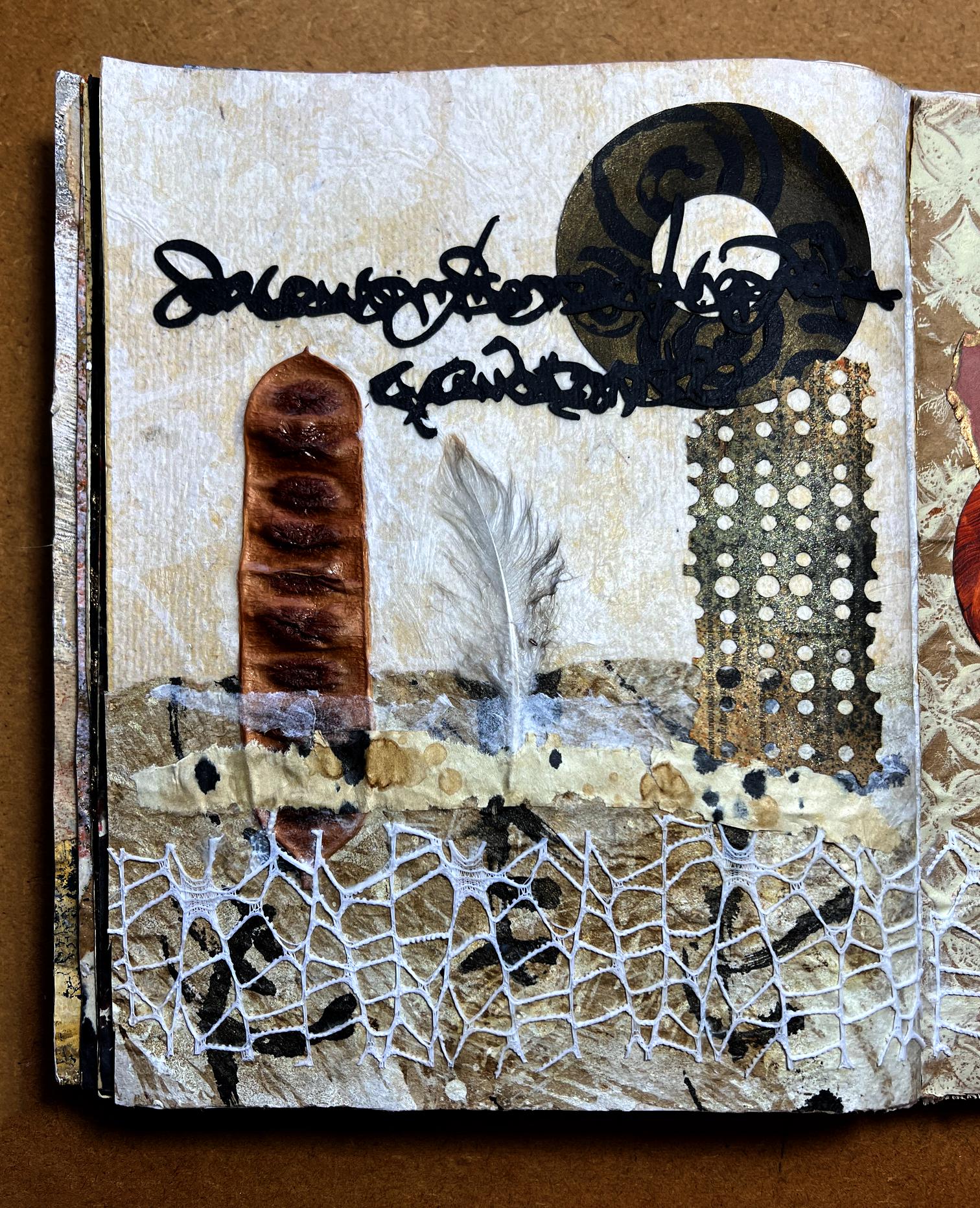
On the left of the above photo, you can see some tissue paper decorated with oak leaves. I got this on Friday in the National Trust shop at Coleton Fishacre, wrapped around my new Erte art book. A small oak leaf cluster is the logo of the National Trust. I loved this paper on sight! Laid straight down over the original hand-made paper page, it would provide a subtle background as the paper would become more translucent when stuck down.
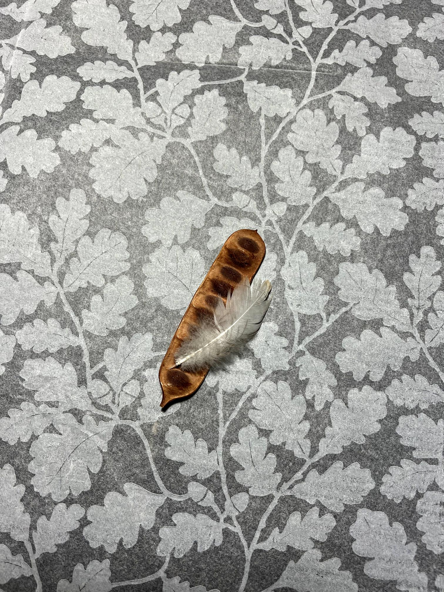
Laid on top is a dead seed pod that my hubby picked up for me in the gardens, after we had explored the house in the morning. I also picked up the small feather, which I wanted to use.
On the bottom right of the “choosing the papers” picture above, there is a dark coloured baby wipe that I thought I might use, but in the end I used other things. I was also intending to use some of the roll of hessian at the top of the photo, which I bought at the recent art sale at The Works, but again decided against it.
I began by sticking down a piece of the oak leaf tissue paper to the left-hand page.
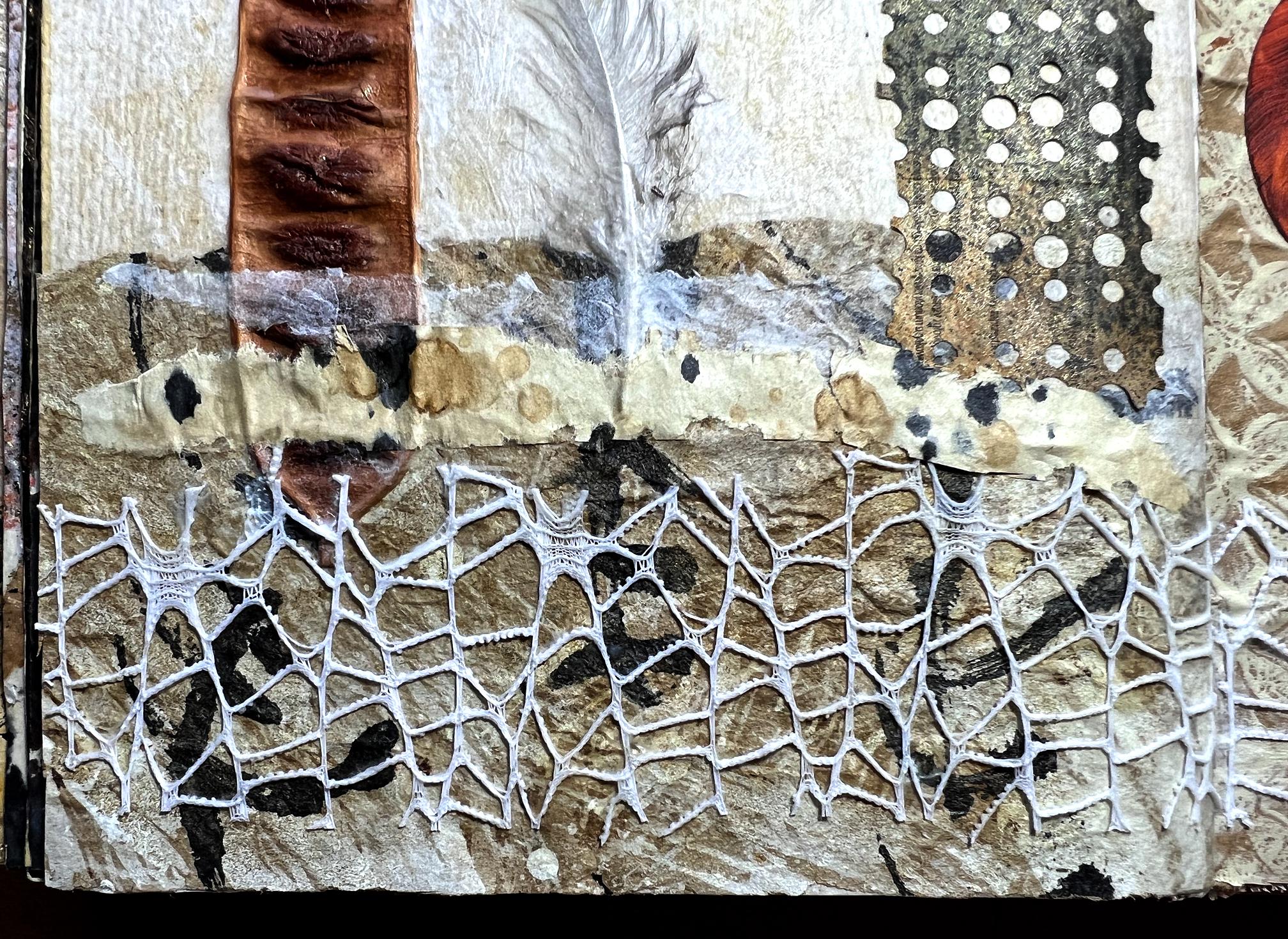
Some time ago I used a piece of Amazon packaging paper to clean off my brush with some white acrylic, and then added some large intuitive scripting to clean black acrylic off my brush. Later I added some coffee staining to this paper.
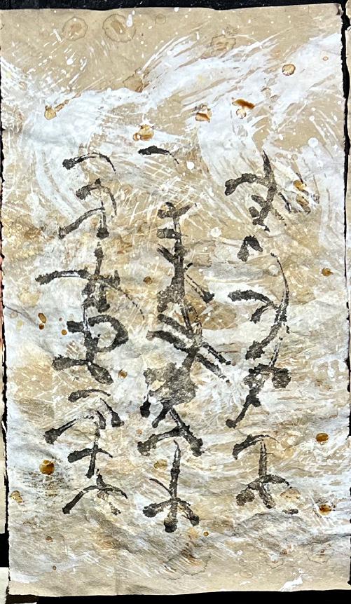
I tore off a small section of this to add to the bottom of the left-hand page.
Sticking down the seed pod and feather was a bit of a challenge, but I managed it in the end using heavy body acrylic gel medium. Unfortunately this dried with a fairly gloss finish which I didn’t want, but I was able to add some matte gel medium over the top later, which solved the problem. The pieces were quite thick and bumpy so I laid a piece of plastic over them and then some heavy books on top and left it to dry for a while. When I removed the plastic, unfortunately some of the oak leaf tissue paper also lifted, but I was able to repair it with another small piece.
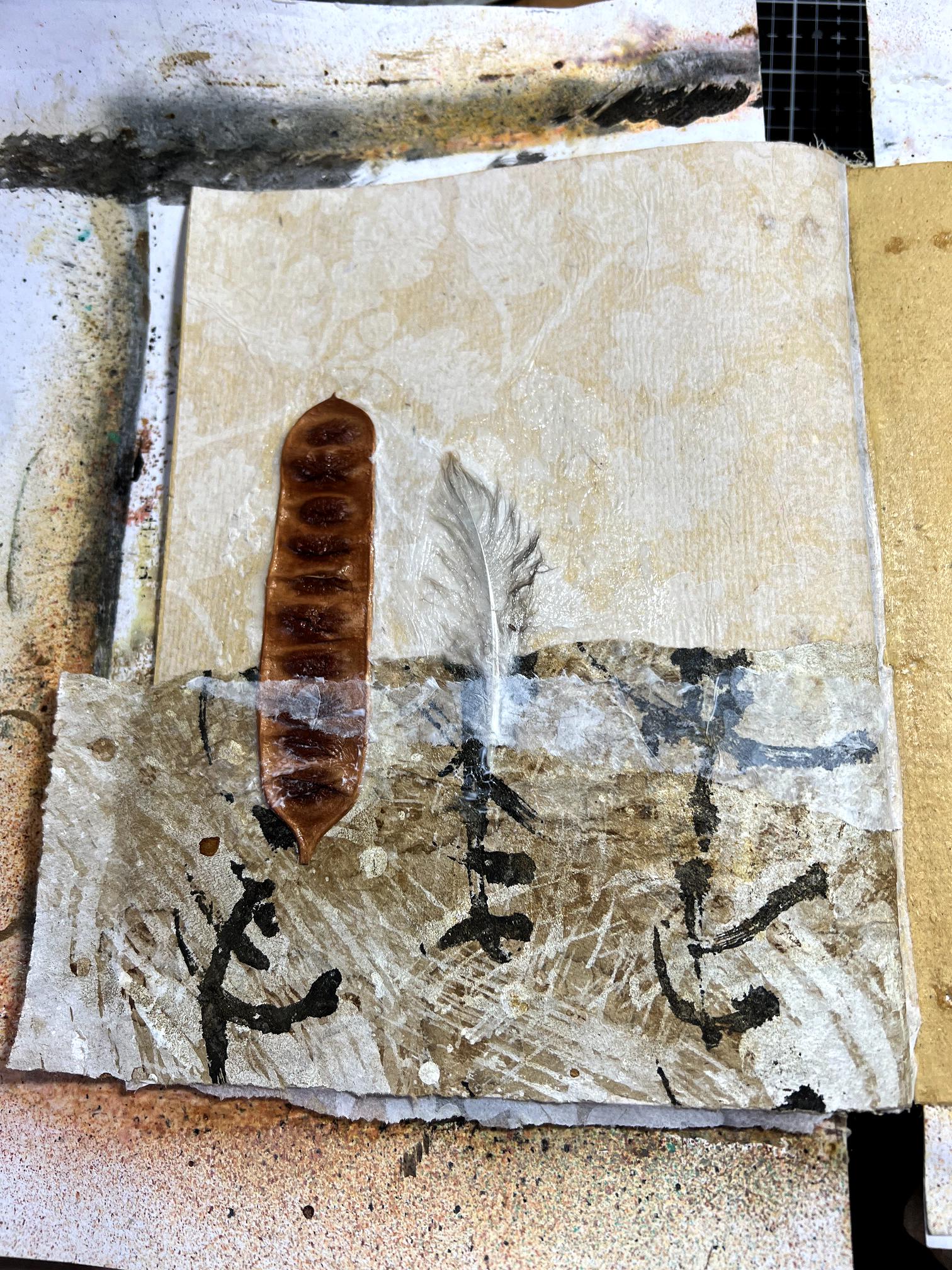
I laid a small strip of the oak leaf tissue over the top of the paper at the bottom of the page, covering the stem of the feather and part of the seed pod. Not only would this help keep them in place and prevent them from lifting, but it added another layer of texture, adding some translucency over part of the scripting.
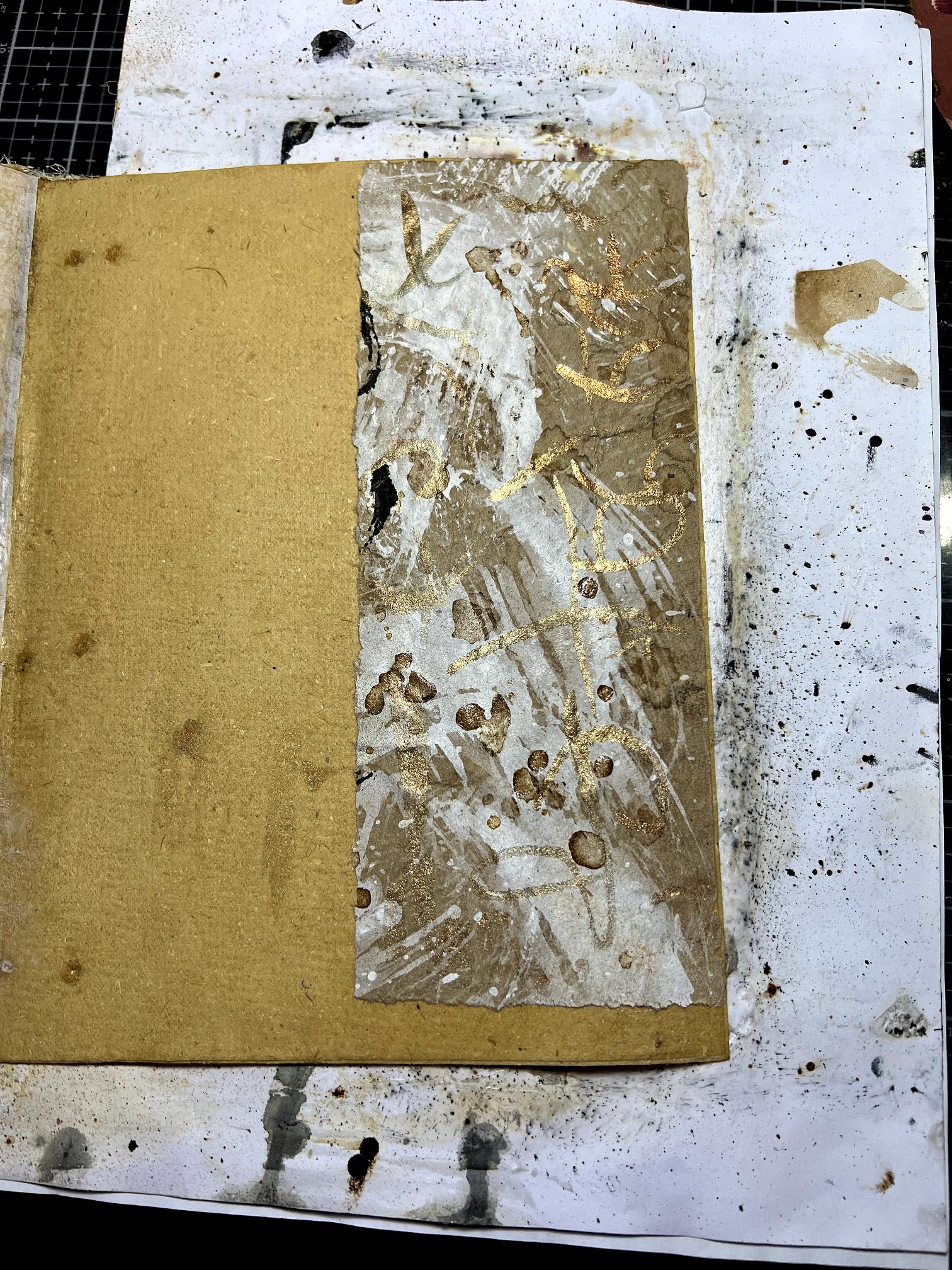
Moving over to the right-hand page, I used some more of the packaging paper. There wasn’t so much mark-making on that part, so I added some intuitive scripting in gold, using up what was left from painting the torn edge of the wings printout.
I was thrilled when my floral gift wrap stuff arrived from AliExpress the other day.
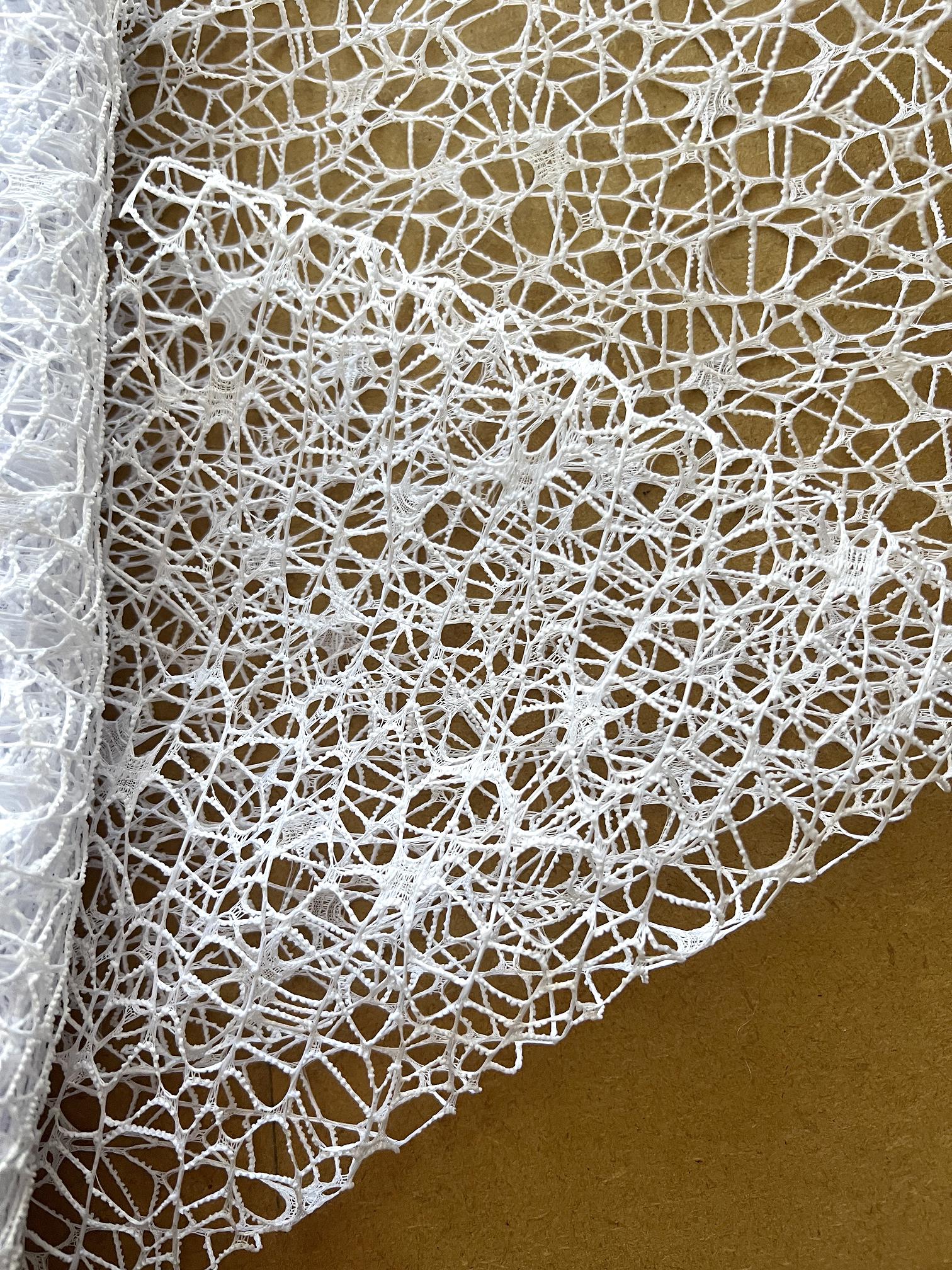
I spent the first part of my session in the studio layering 3 pieces of it and sticking them together with acrylic polymer on a plastic sheet. This is now being pressed under a pile of heavy books and I am hoping they will stick together, and I will end up with something resembling the beautiful Ogura Lace Japanese paper. I ended up with a couple of small offcuts and decided to incorporate them as a single layer into this current collage.
Going back to the left-hand page again, I took one of these scraps and laid it down across the bottom of the page. This proved quite difficult to stick down, but with liberal amounts of gel medium I succeeded in the end. I love how the scripting shows through, and how it complements the small strip of tissue above.
I had to make a decsion about how to complete the background on the right-hand page, and I chose another piece of Amazon packaging paper which I had used to print off a ghost print from one of my sink mats. This is the paper on the right in the next photo.
I spent a lot of time messing around, trying to decide how to place the wings print-out, and it definitely needed something more, especially as there was a hard edge from the bottom of the print which I wanted to cover. I pulled out some circles cut from white card, which I had made with my cutting machine, and experimented with laying them out, and also one for the left-hand page. I also decided to add some scripting cut-outs as further collage elements.
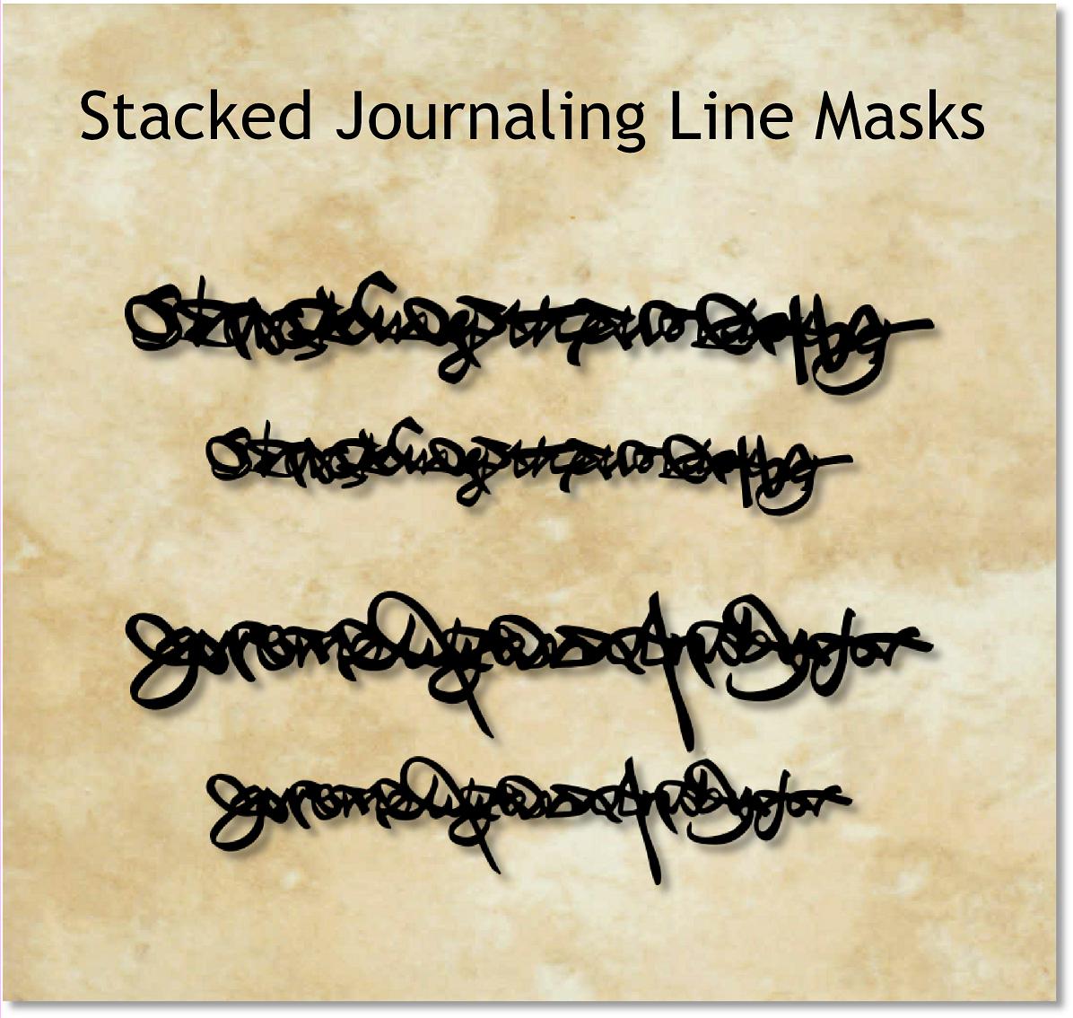
When I was making my stencils and masks, I did some test cuts on cardstock, and amongst these, were some of the Stacked Journaling text lines cut from black cardstock. I selected some of these for the project.
The following photo shows a mock-up with all these elements, held in place on the right-hand page with my large scissors! I also decided to add a bit more of the floral gift wrap to carry that theme over onto the right-hand page.
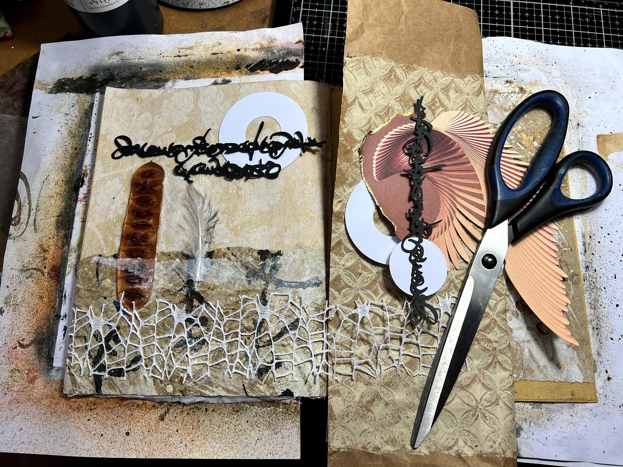
Obviously I didn’t want the circles to remain white. Taking the larger one, placed under the wings print-out, I painted it with a couple of layers of Golden Quinacridone Azo Gold, but it looked far too orange. After I had dried it, I painted a layer of burnt umber, and it looked like polished walnut! For the other large circle, for the left-hand page, and for the small solid circle, I chose Arteza Fancy Black paint which is iridescent and has a brownish tinge. I luurve this paint!! I decided to stamp these circles with black acrylic paint, using one of my DIY foam stamps (I promise I will do a post about these soon!!) and really liked the effect.
Here is the right-hand page with the scripting added.
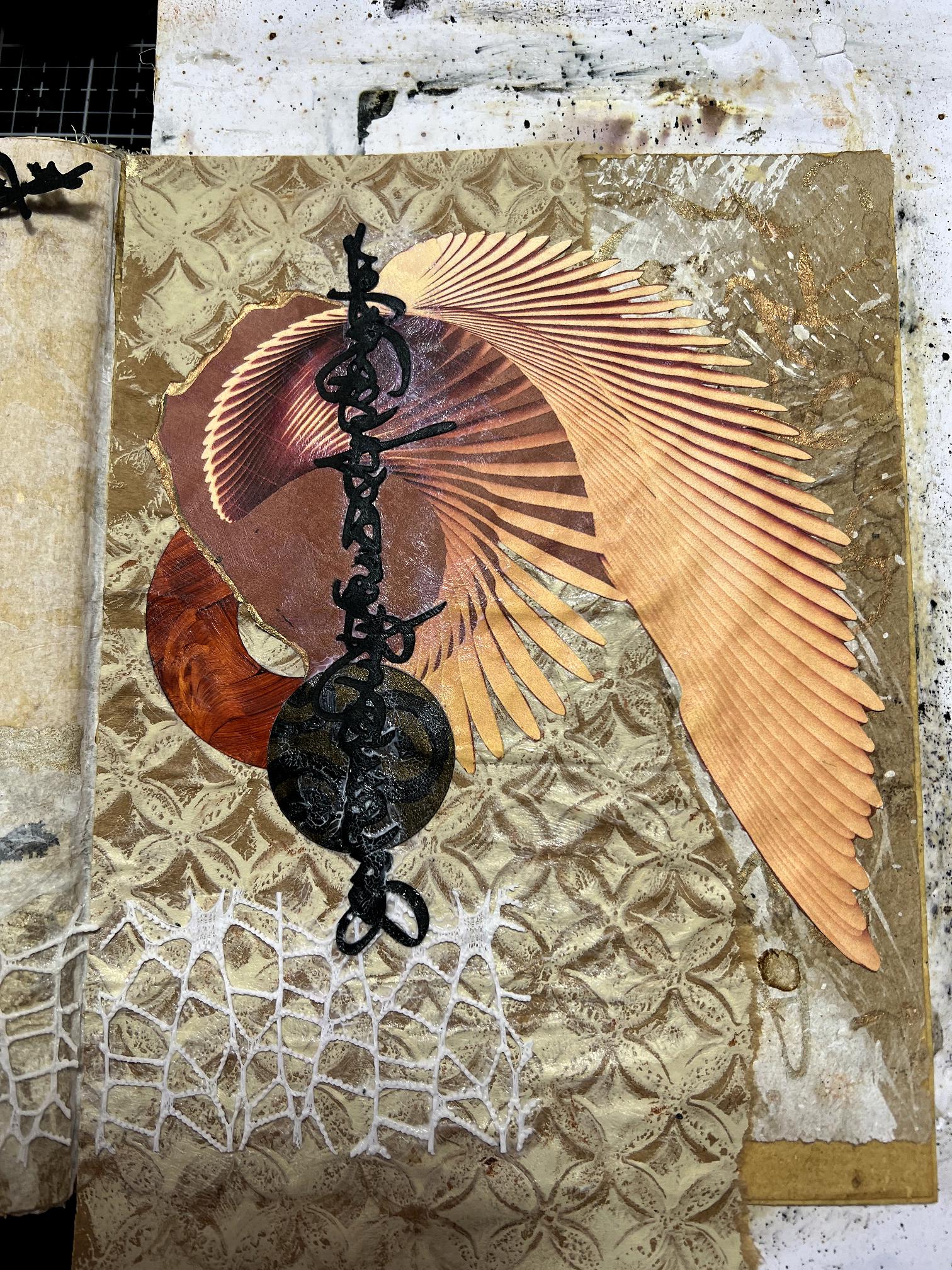
I noticed there was a blank area at the bottom right of the page, so I decided to cover it with a scrap of paper mesh – that fascinating packaging material that I have been working with recently – I thought I might give it another try and see if I could be more successful sticking this down as a collage element.

It is very springy and won’t lie flat once it is expanded. It went down pretty well with the heavy body gel medium, though. Once it was dry, I gently rubbed a little gilding wax over the raised surface.
Is it a mistake to start rummaging in one’s scrap folder at this stage? It’s fatal – I always find a little scrap of this or that that I just have to include! One has to know when to stop… Like a bag of treats – can you just eat one or two? You have to be firm, close the bag and put it away before they all come out! Anyway, I found a scrap of this paper:
This is one of the flimsy, slightly shiny cream sheets which were used as interleaves between my acetates. I dribbled ink on it with a pipette and loved the result – it takes the ink really well and I love the colour and finish of the paper. I don’t know what I shall do when I run out, because I have no idea what it is! I haven’t got much left of that particular sheet now. I tore uneven edges along the scrap and laid it down on the left-hand page between the strip of tissue and the floral gift wrap.
I also pulled out what was left of my medication leaflet that I had punched and then unfolded. I really love this paper! You can tear it along the perforations for an instant uneven and really yummy edge.
I stuck down a couple of small pieces of this, one on each page.
The next photo shows the page spread with all the collage elements in place, drying. Behind them are the various paints and media I used for this project.
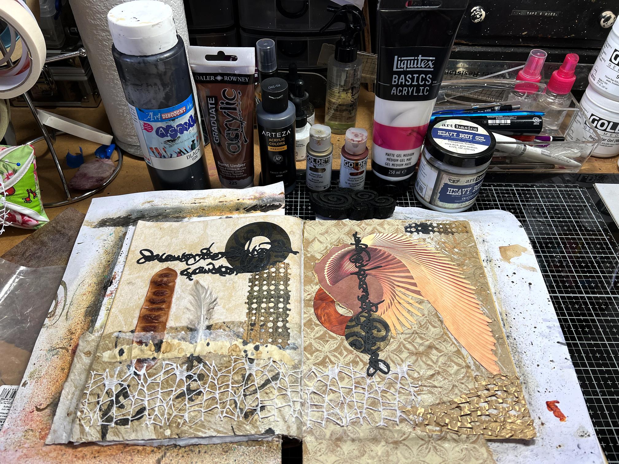
Now for the photos of the finished spread, after it was dry and I had trimmed off any excess overhanging the edges of the pages.
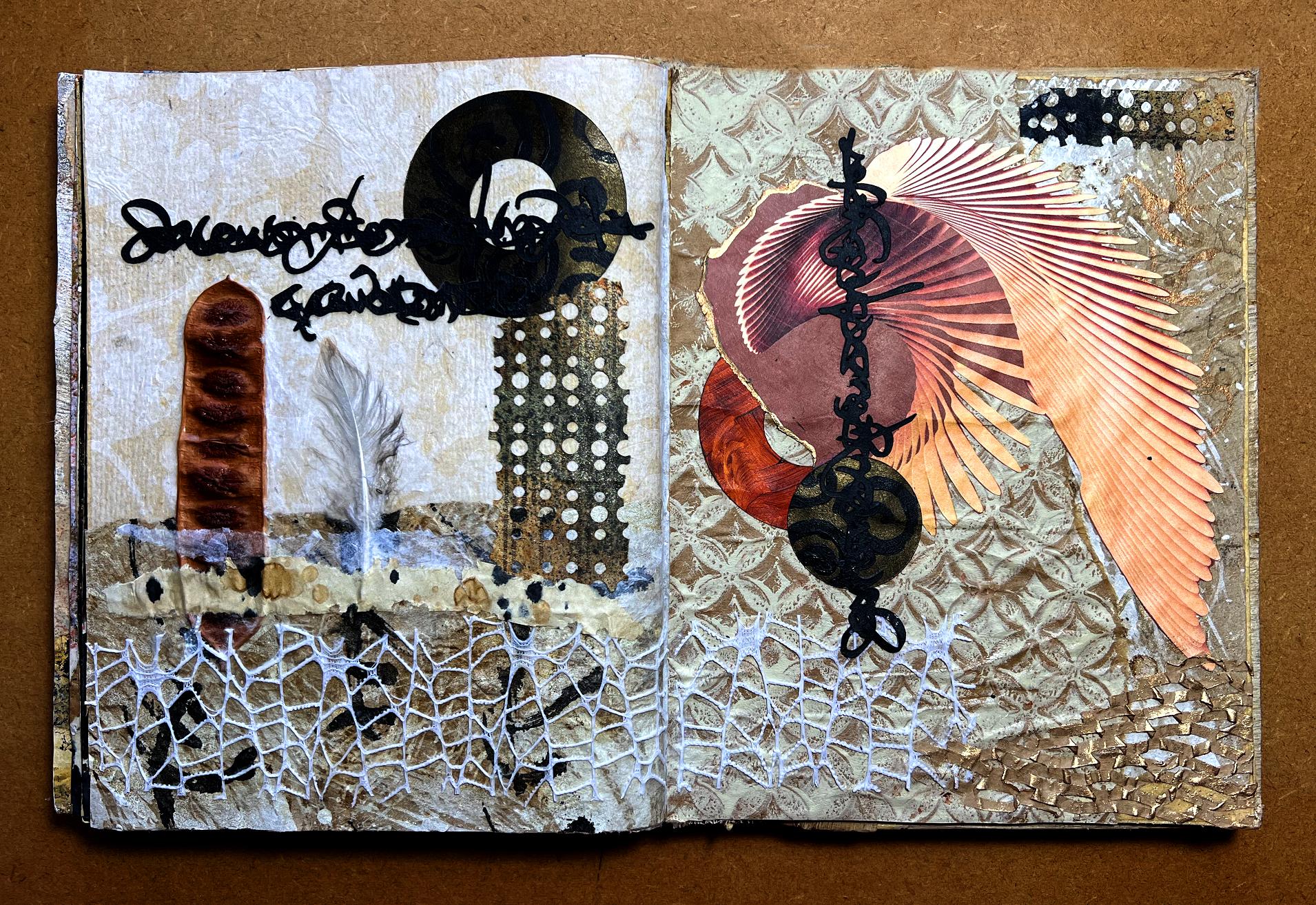
I am super-thrilled with how this page turned out. I love all the mixed media elements and the found objects. Looking at it again, I see that part of the vertical script on the right-hand page looks like an eye, making the point of the wings print-out resemble the beak of an eagle! That was completely serendipitous! Also, how the line of the smaller wing continues into the brown circle. Not intentional! The addition of the scraps across the left-hand page add further dimensional layers, and I am also super-pleased with how the scrap of paper mesh turned out, especially with the touch of gold on it. I’m not sure this isn’t my favourite page spread of all, so far!
Some close-up shots to show a bit more of the detail. First, each page in turn, then the detail.
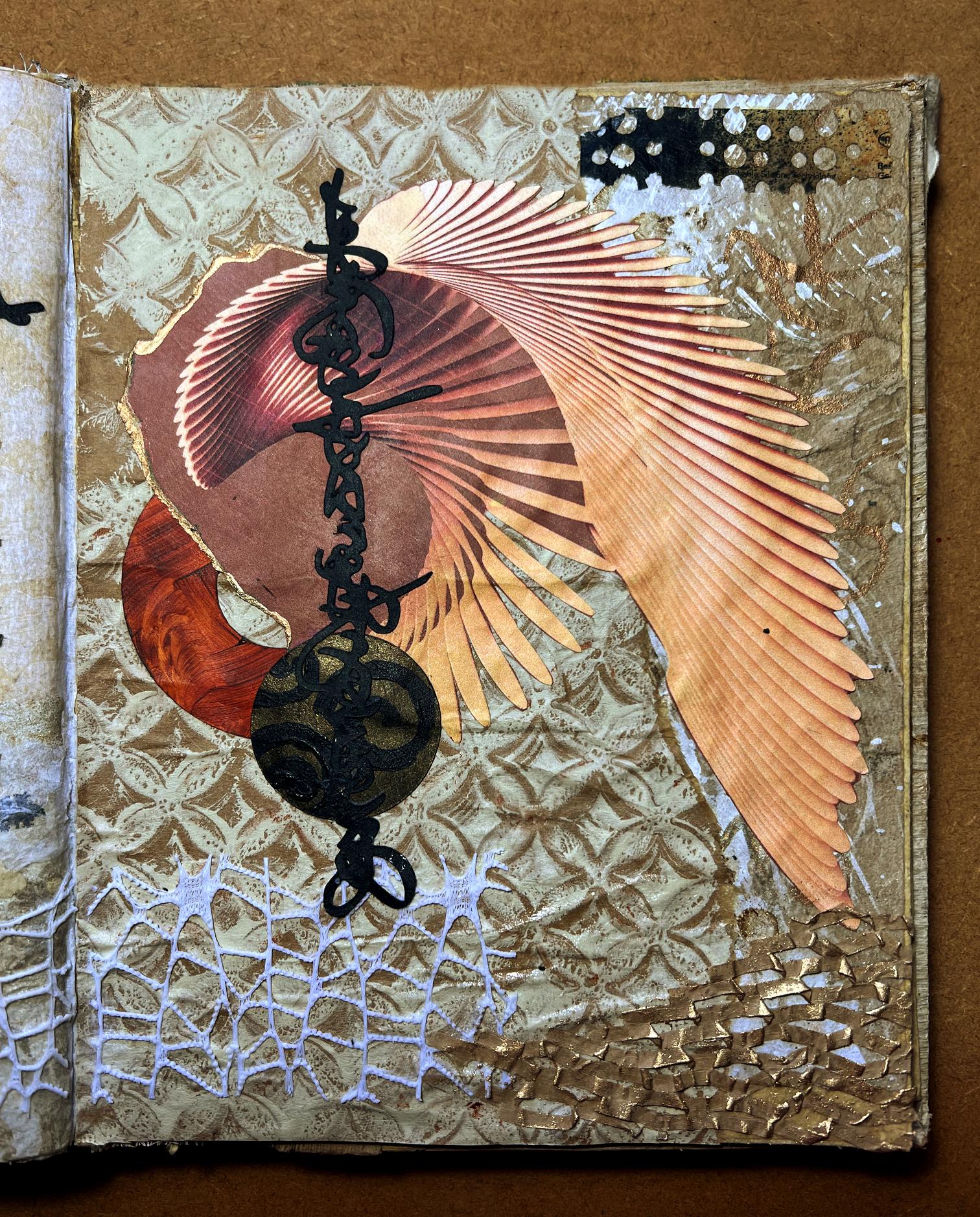
I love the texture of the sink mat ghost print of the background paper.
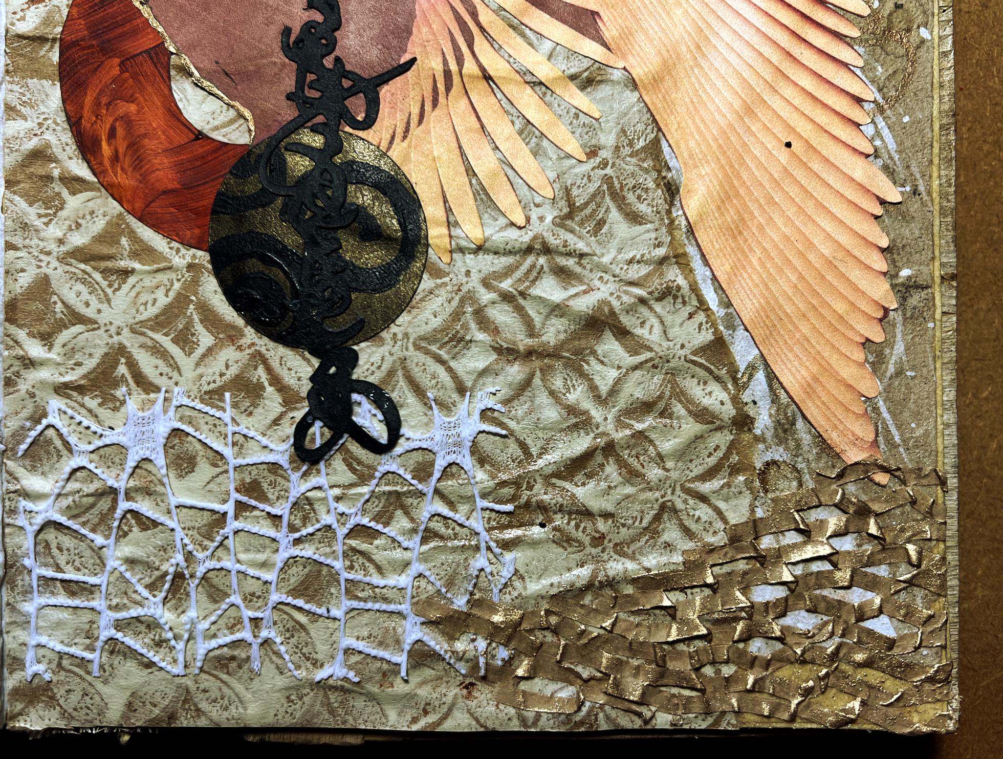
The pattern of the expanded and then squashed paper mesh ties in very nicely with the pattern of the floral gift-wrap.
A final view of the finished page spread once more.