PHOTOSHOP AND FAUX CYANOTYPE, AND MORE ON MY CURIOUS CABINETS
Photoshop Elements 2023
For more years than I can remember, I have been using Serif PhotoPlus as my photo editor. This software has been unavailable for several years, and I did venture into their replacement software for a while but never got on with it very well. Using ancient software for which there are no recent updates may cause security problems etc., but I was more worried about updates to Windows causing it eventually to become incompatible. I have had this problem with other software in the past.
I was working on something last night (more later) and every time I attempted to do a particular procedure, the program crashed. I tried restarting the computer, but to no avail.
My Premium Membership subscription to the Graphics Fairy contains numerous excellent tutorials on Photoshop techniques, and while I have been able to do work-arounds with PhotoPlus, it’s taken a while as the interface is different. Also, PhotoPlus being so old, and Photoshop being plumb up to date, the latter is going to have a lot more features than I have had at my fingertips before. I was unable to carry out several procedures in the tutorials I had been following and last night, PhotoPlus continually crashing caused me finally to bite the bullet and purchase Photoshop – something I vowed I would never do, as PhotoPlus always used to do everything the earlier versions of Photoshop did, and at a fraction of the cost.
One does have to move with the times on occasion, and since Photoshop appears to be the gold standard, and the most popular image editing software around, for which there are many tutorials and plug-ins available, I decided the time was right for the move.
It’s taking me a bit of time to navigate around as the interface is still unfamiliar to me – in PhotoPlus, many features were accessible through a menu bar at the top of the screen, but in Photoshop some of these are hidden. This isn’t really an inconvenience, because it does allow for a less cluttered workspace, and I am sure I shall soon be using it like a pro.
Graphics Fairy tutorials
The Graphics Fairy Premium Membership section has so many first-class tutorials, with step-by-step instructions accompanied by screen shots. I am sure these are going to help me to learn to navigate around Photoshop’s unfamiliar interface more quickly. In addition, the “bundles” from the Graphics Fairy have collections of images, printables ready made for use, svg images (I haven’t explored these yet but they will be useful for cutting) and also Photoshop brushes, so obtaining Photoshop will enable me to plug these in.
I have been doing photo editing for many years. After weeding out any rejects from the camera, I put every single photo through the editor, adjusting the levels, contrast, colour balance, straightening perpendiculars, etc., before renaming them and filing them in appropriate folders on my hard drive. I can do all these procedures pretty much in my sleep, but there are other features which have always remained a mystery to me, such as adjustment layers, gradient map and so on. I just a few days I am gaining knowledge in how to use these features and understand how they work.
What I love about life in general is that however much you think you know about something, there is always something new to learn, and new skills to acquire! Life is never dull, and every day presents some new adventure to explore and enjoy. How anyone can say they are bored is beyond me…
Faux Cyanotype
Scrolling through the tutorials last night, I came across one on how to create a faux cyanotype effect digitally, using Photoshop Elements. For those who are unfamiliar with it, cyanotype is a photographic method whereby a certain chemical is applied to a surface, and then objects or stencils, or perhaps a photo transparency, are laid on top, and the whole thing is placed out in the sun. Alternatively, it can be placed under an ultra-violet lamp. This develops the chemical, turning it a rich blue colour, and when you remove the objects and wash off the surface to prevent it developing further, you are left with white images where the light was unable to reach the surface. This is how the original blueprints were made, for industrial design. The images have a beautiful ethereal quality, particularly if the objects used to mask the surface have allowed some light to creep in at the edges – this often happens with things like leaves, which are difficult to lay exactly flat on the surface. I have always loved the results, and I did buy some of the chemical at a craft show a couple of years ago but I’ve never got around to trying it.
Last night I worked through the tutorial on Faux Cyanotype, trying it first with Serif PhotoPlus. I could not get it to work. I tried several work-arounds and eventually did get somewhere, but when I tried to apply colour to the gradient map, this is what caused the program to crash every time. This is when I decided to just get on with it, and buy Photoshop!
Working on this tutorial was the first thing I did on my newly acquired software, and following the tutorial step by step, I ended up with a perfect result, which I think is absolutely gorgeous. She gave three different versions which I worked through, all of which were based on a base layer of a vintage French document, with different ferns laid on top. Here is the result, which I made up into a triptych.
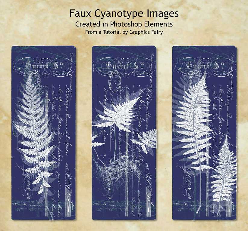
I am super-thrilled with this result, and am keen to try some more, and also to follow more tutorials in order to familiarise myself further with Photoshop.
Curious Cabinets
This is the name I have chosen for my revamp of the no-longer available Graphics 45 “Olde Curiosity Shoppe” papers.
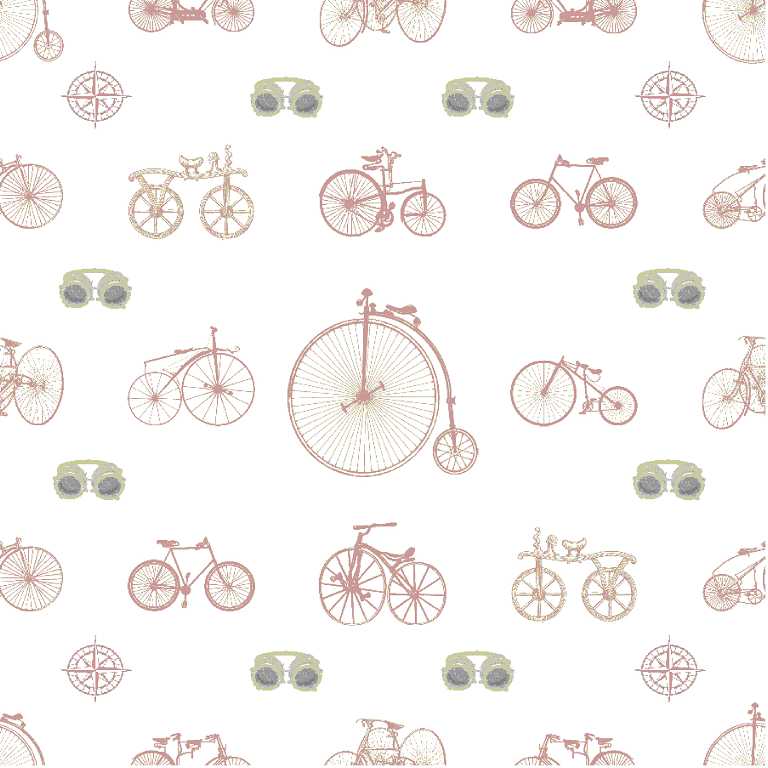
Bicycles
I love vintage bicycles, and all the funny and different shapes they came in, until the designers settled upon a more standard form which was more efficient and comfortable. These images were mostly free downloads from the Internet.
In order to make a repeating pattern, it is necessary to create an initial tile, making sure you put the same images in the corners and on the edges where the pieces will join up, cutting them in half so they match. I followed a Graphics Fairy tutorial for this. I discovered it was easier to create the grid in my desktop publishing software, another old Serif program called PagePlus, rather than in the photo editor – you work with frames, and it is very easy to line things up.
This is the initial tile I created for the vintage bicycles, adding some goggles and compass roses as smaller images to intersperse between the larger ones. Aren’t the shapes fun? I have also got some images of steampunky men riding them, which I shall be using as stand-alone images for embellishments.
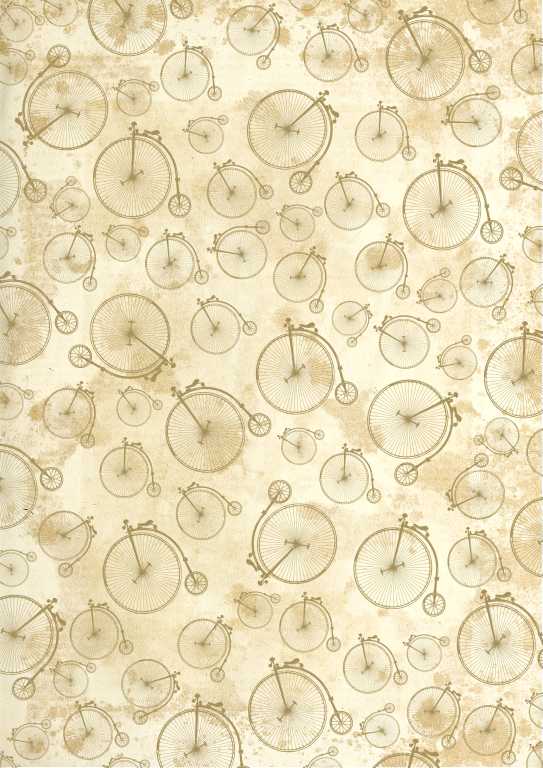
After I’d created a large 12 x 12 in square repeating design, I cut it down to A4 size, and placed it over a vintage paper image.
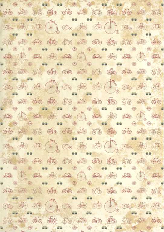
I took the same penny-farthing bicycle image and placed it randomly all over a sheet, also over the vintage paper background.
This is the bottles grid pattern I created, placed over a green version of the vintage paper background. For smaller images I chose magnifying glasses and pince-nez spectacles, and pocket watches.
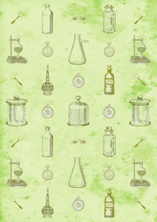
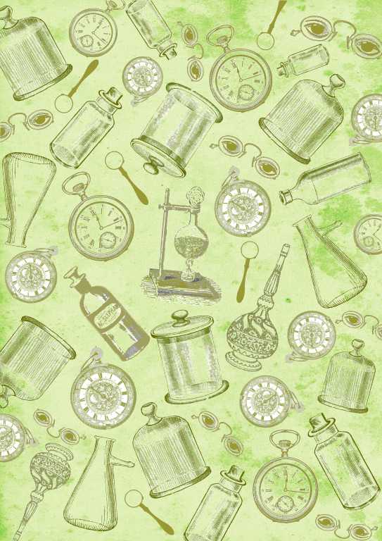
Here’s a version with all the images mixed up randomly.
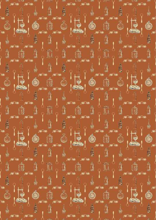
A smaller version of the bottles grid, this time with the images in beige on a brown background.
This time on a green background.
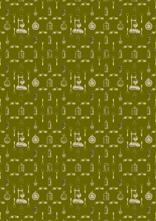
As you will gather, you can choose whatever colours you want in combination with one another, and add texture. You can get some interesting effects with layers in Photoshop, and with blending modes, which can completely alter the effect. The variations are infinite!
For strictly directional grids, like the bottles and bicycles, I have also created a landscape A4 version. The pieces with the randomly arranged images can, of course, be used in any direction.
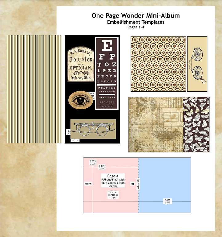
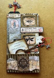
One Page Wonder Mini-Album
I watched a video recently where someone created a small 3 x 3-inch mini-album from a single 12 x 12 in piece of black cardstock, scoring, cutting and folding it to form a little book with pockets. I have made this up (not much point in photographing it at present as it just looks like a black square!) and I am now working on the papers to apply to the pages. In PagePlus, the desktop publisher, I have created several pages of templates of the various pages, following the video tutorial, so that I know what pieces to cut and apply. Here is a montage of some screen grabs of a few pages.
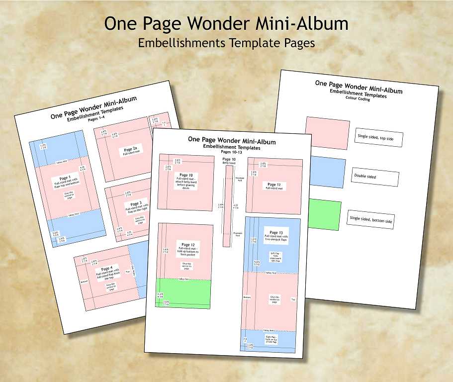
Work in progress, designing and placing various papers to cover the pages, and additional embellishments, using the templates.
It won’t be necessary to print all the papers out, as I will be able to cut some of them from existing printouts, but this will give me a guide as to what is necessary.
These templates will be useable for further 3 x 3 in mini-albums in the future. If the scale of pattern on some of my Curious Cabinets papers that I have designed is not correct for the piece to which it will be applied, it will be easy to alter digitally, and then print out all the various elements on a series of sheets to be cut out. With a book this small, the full-sized patterns may be too large.
This is turning into a really fun project. Watch this space for more.
The curious cabinets sounds such fun – I loved the penny farthing bike!!! Looking forward to see this project develop Shoshi!