STEAMPUNK CLOCKS BOOKLET
Another gorgeous little project from VectoriaDesigns. It’s actually more of a mini-folio than a booklet. It is one of her free printable downloads, and I made it over the past couple of days.
Steampunk Clocks Booklet
Here is the video showing how this little project is made. This time I am pleased to say that I didn’t make any mistakes!
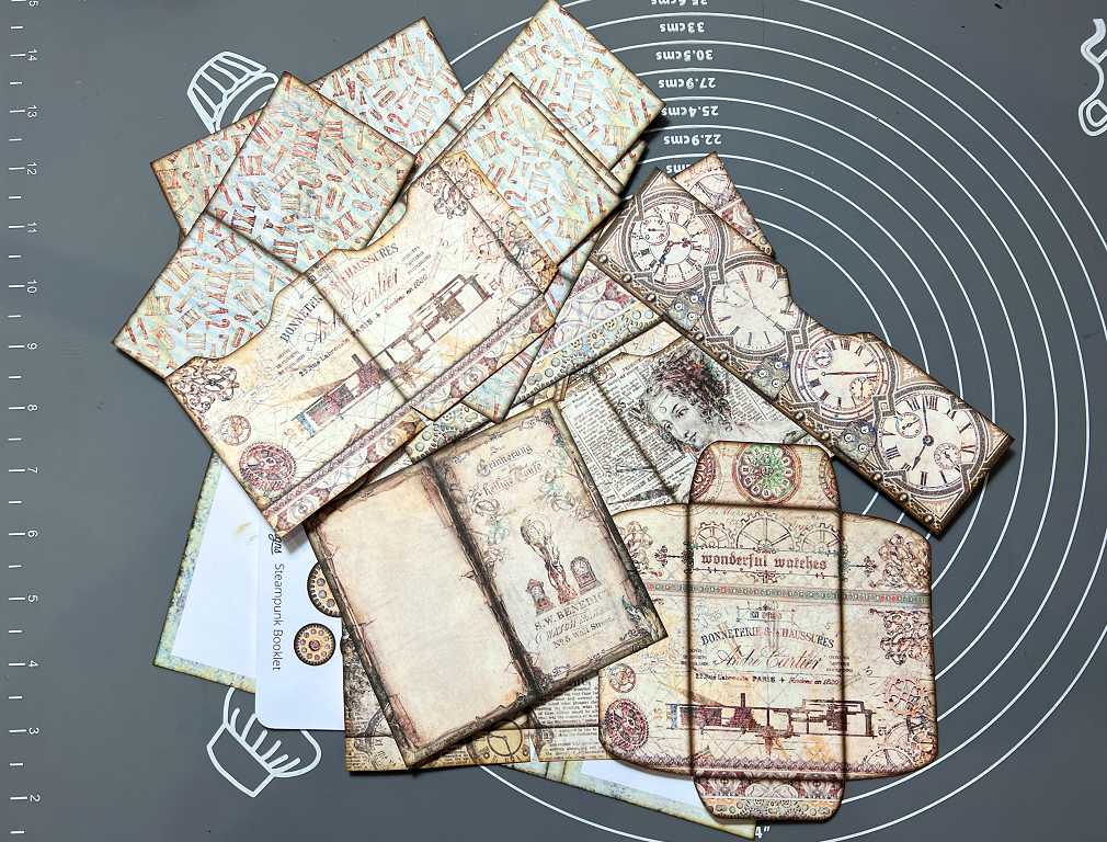
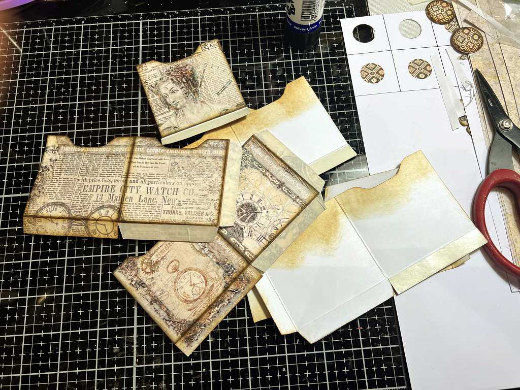
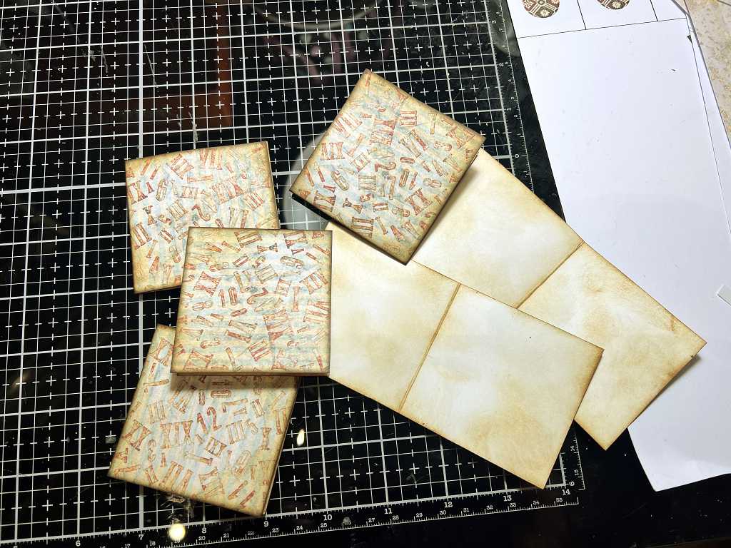
Yesterday I printed the sheets and cut them out, and then inked them, ready for assembly.
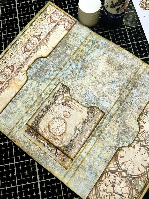
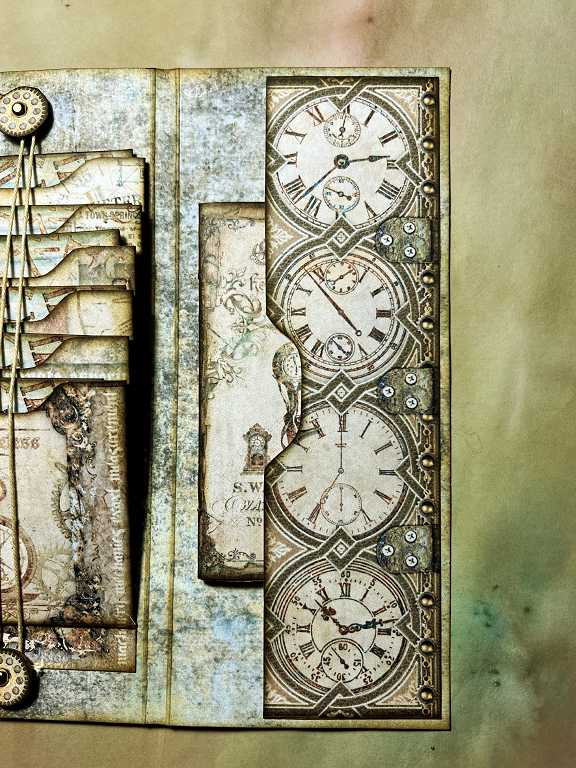
Working on the cover
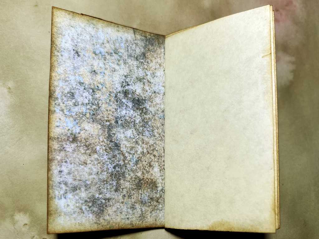
This is a relatively simple project, although it includes a lot of small parts. I began, according to the instructions, by adding the end panels on the outside of the cover, and attaching the first closure. This has to be done early so that the back of the brad doesn’t show on the inside of the folio.
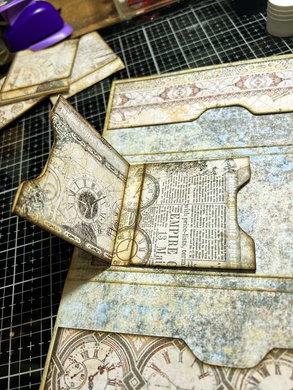
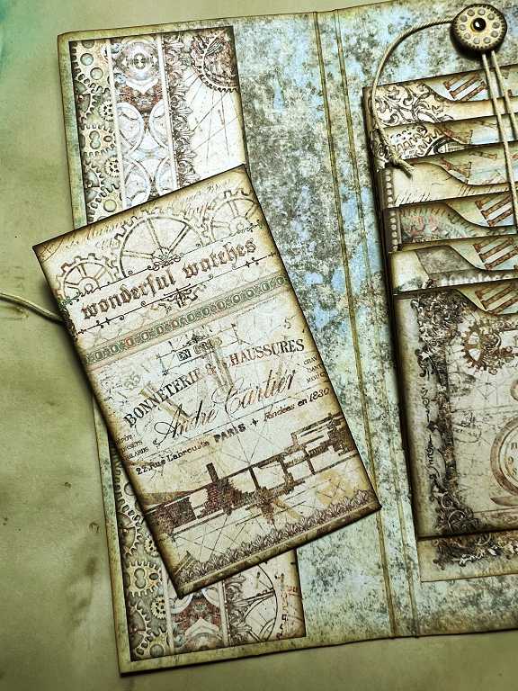
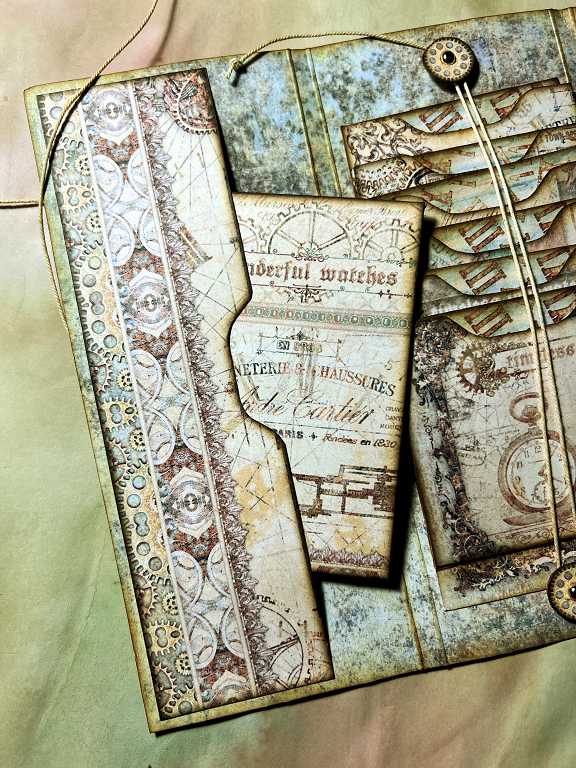
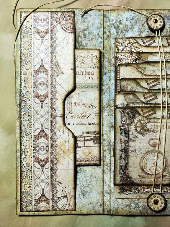
The next stage is to add the long pockets on either side of the inside. Aren’t these papers gorgeous?
The waterfall pockets
The most complicated part of the project is the waterfall pockets down the centre. Here are the six pockets, duly folded and inked on the outside, ready to be assembled.
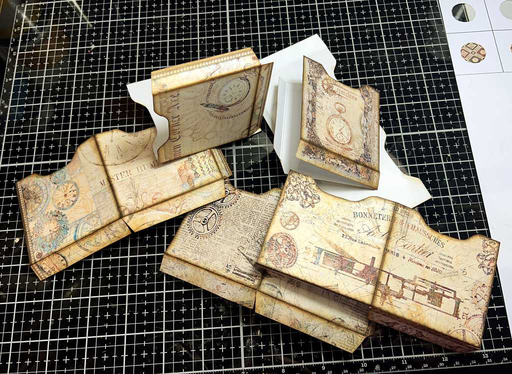
The tops of the insides of the pockets have to be inked, because the backs are plain white, and you don’t want this to show when the pockets are assembled. Tinne is very sensible about saving printer ink and doesn’t require every piece to be printed on the back when a touch of Distress Ink will do the trick.

Adding the double-sided tape to the tabs on the pockets. You have to concentrate at this stage, because if would be very easy to put the glue on the wrong side of the tabs – all of them are glued on the printed side except one. This means that the pocket can be assembled, and the remaining tab is used to stick each pocket inside the folio.
Sticking the pockets into the centre of the folio also requires some concentration. Once you have measured and marked where the first one goes, it is relatively easy to stick in the remaining pockets, but it is very important to get them in exactly straight, or the waterfall will wander off in a rather disconcerting fashion! I didn’t do too badly but it veered off a little!
Sticking in the second pocket, lining it up against the first one.
Here are all six pockets stuck in place.
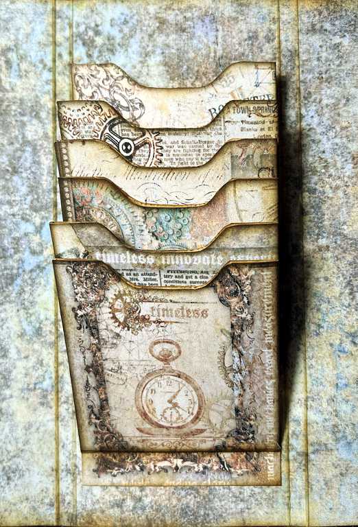
There are six little cards that are folded and inserted into the waterfall pockets. I inked the insides with Vintage Photo Distress Ink in a mottled fashion, to tone down the stark white of the card.
The next photo shows the waterfall effect, with the little cards inserted into the pockets.
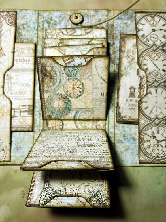
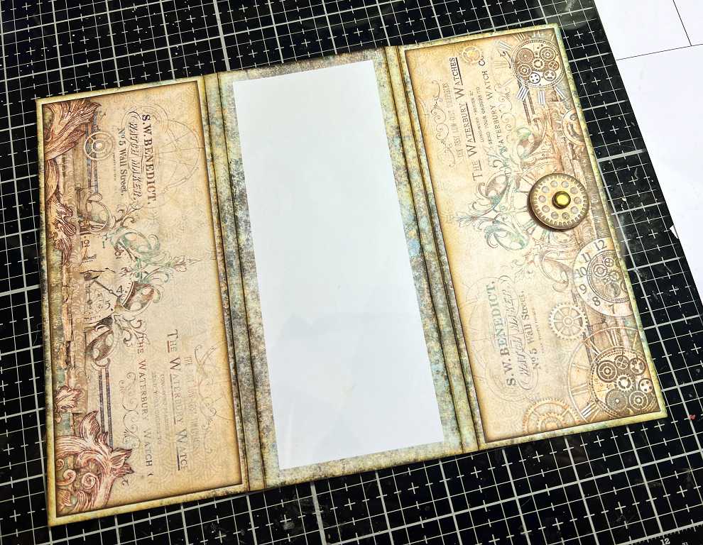
You can see that in the meantime I have added the internal closures as well. These are two smaller circles attached with small brass brads (hence the middle panel of the outside of the cover not yet being attached). The twine winds between the circles, holding the waterfall pockets in place neatly.
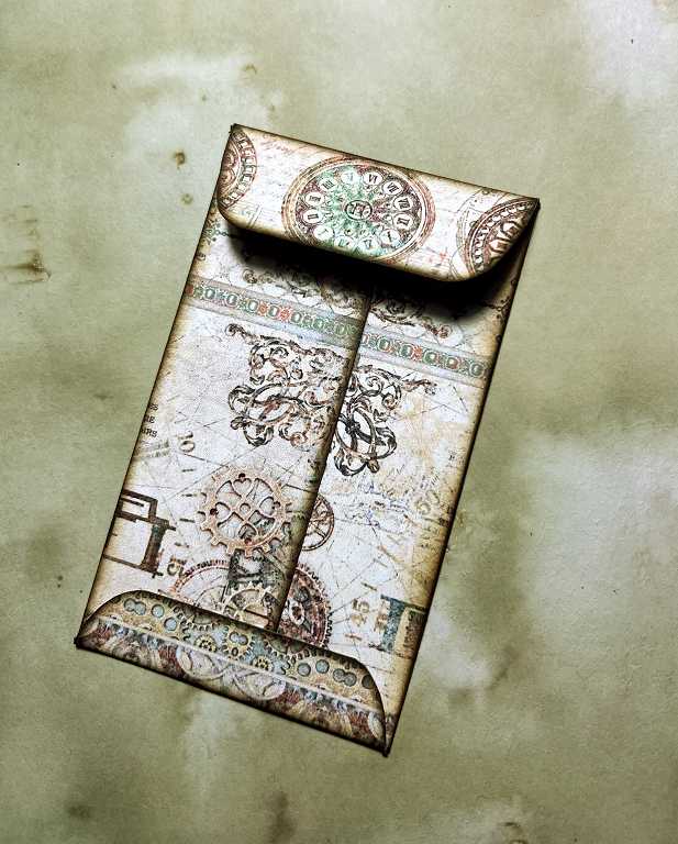
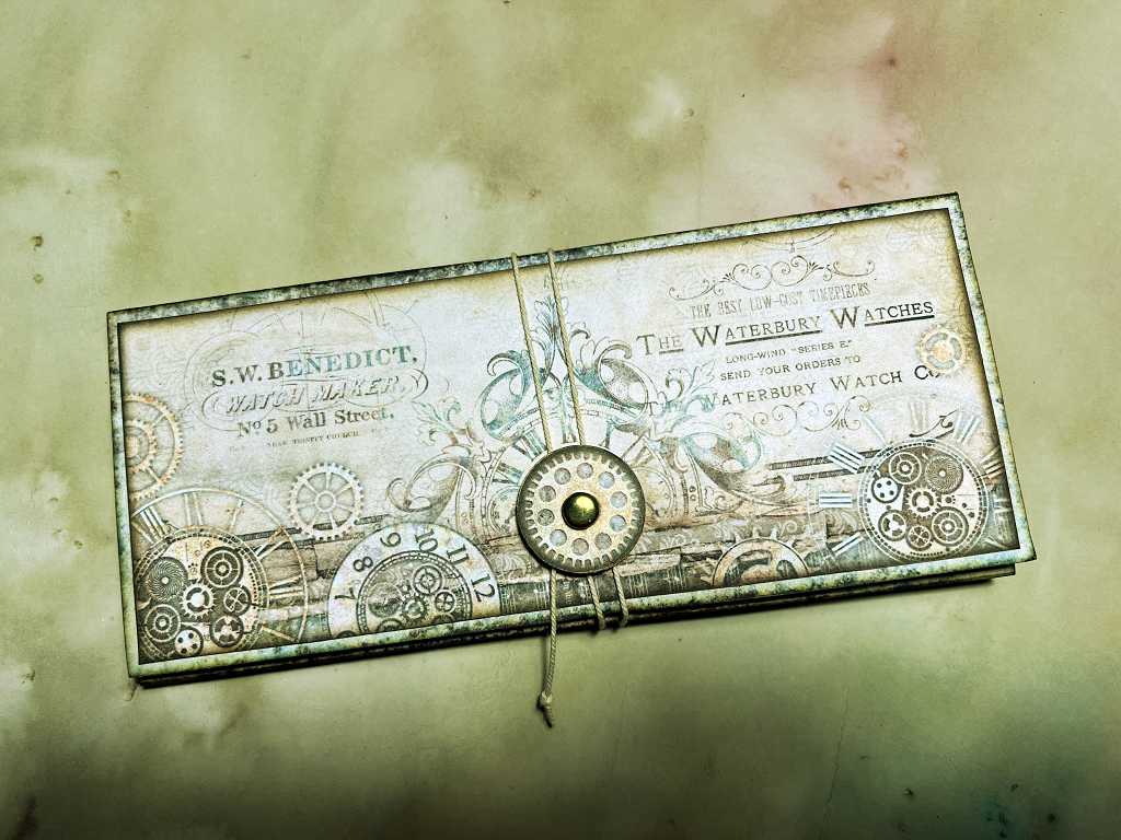
Coin envelope
There’s a little coin envelope to make, which slips into the long pocket on the left of the folio. The above photo shows it face up, lying on top of the long pocket.
Like the waterfall pockets, this coin envelope also needs to be inked inside the flap and just inside at the top, to cover the stark white card. In the photo, this has come out black as it’s in shadow, but it is actually the same colour (Vintage Photo Distress Ink) as the inside of the envelope that is visible. I love the curved shapes on the back of this piece.
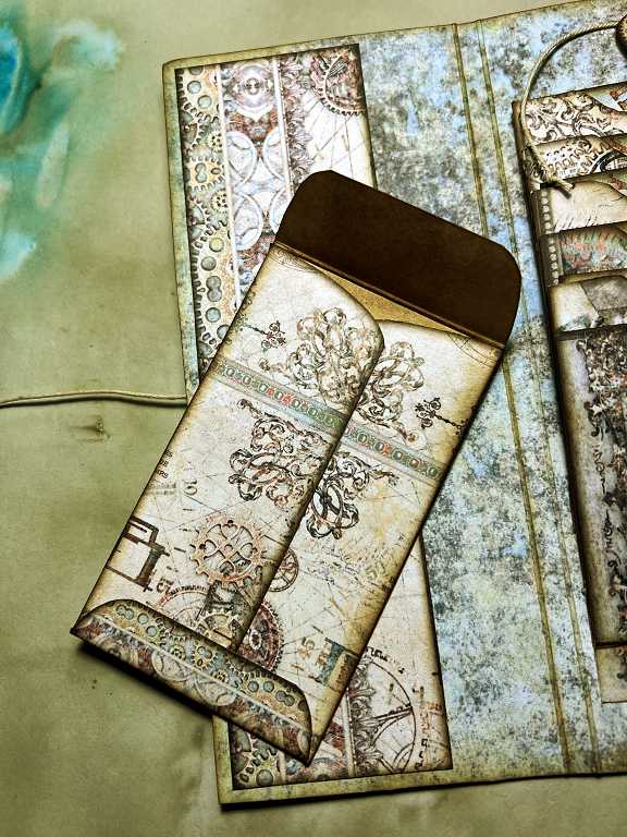
The outside of the envelope flap is also most attractive.
Here is the coin envelope partially inserted in the side pocket…
…and fully inserted.
Notebook
To go in the pocket on the right-hand side, there is a little notebook. There are two parts to make this – two rectangles (almost square), one with the outer cover design and the other to match the lining of the folio. Once these are glued together and folded, they make a nice sturdy little cover for the notebook. The pages are cut from any paper you have in your stash. I had some yellow-ish cream paper with a slight mottled pattern on it, and I inked the edges after cutting the pages out and then inserted them into the cover.
The back of the notebook. I love those distressed edges – it is similar to the edges in the Forgotten Library Accordion Folder.
Inside the front cover of the notebook.
The centrefold, showing the hand-inserted staples.
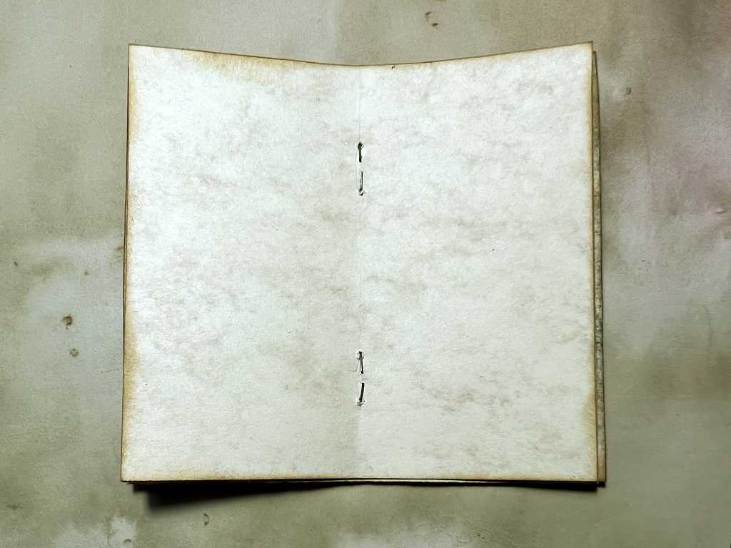
This is a very clever idea of Tinne’s, but I found it to be terribly fiddly and I don’t think I will be doing this again. Somewhere we’ve got a long-reach stapler and I might use that in future (it’s probably hiding somewhere in my hubby’s study, but we won’t go there!…!!!). Alternatively, I would use a three-hole pamphlet binding, stitched with buttonhole thread, as I did for the notebook in the Forgotten Library project. I think I probably spent less time doing that than I did fiddling about with the staples in this one! Part of the problem is that my eyesight is so poor these days with my cataracts (I wish they would agree to get them done but apparently they are STILL not bad enough… they aren’t looking through them like I am so how would they know! That’s another story… rant over!) Anyway, far too fiddly for me, and this is, after all, meant to be FUN!! (Sorry, Tinne – brilliant idea but not for me! – but I’ll try anything once!)
Here is the notebook partially inserted in the right-hand pocket…
…and fully inserted.
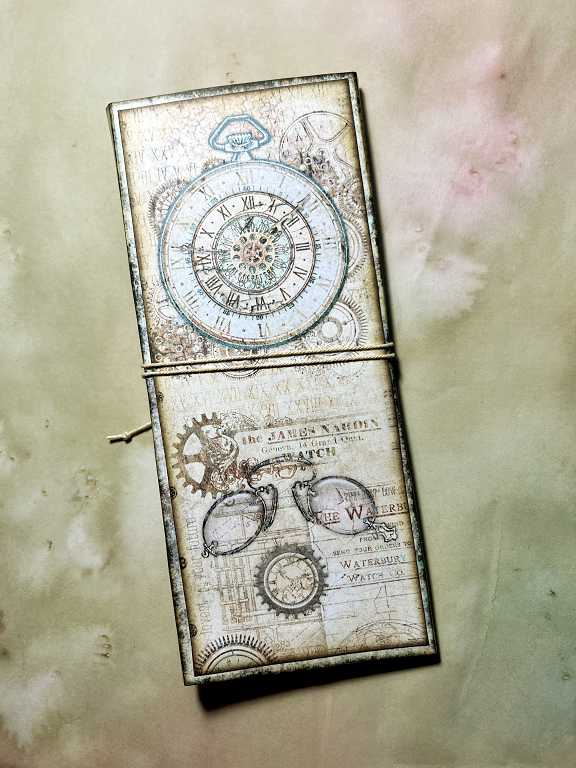
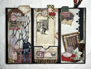
The completed project
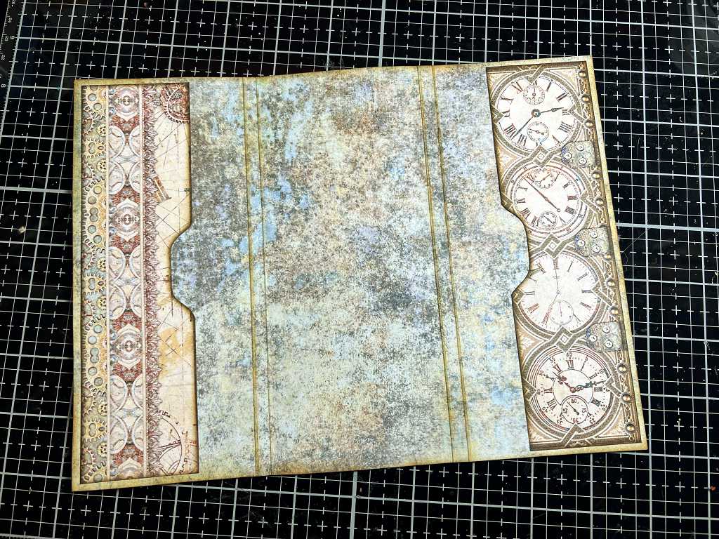
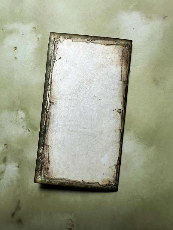
Here is the fnished folio, showing the front cover, complete with its closure. I used some plain twine for this, and the circle is attached with a brass paper fastener.
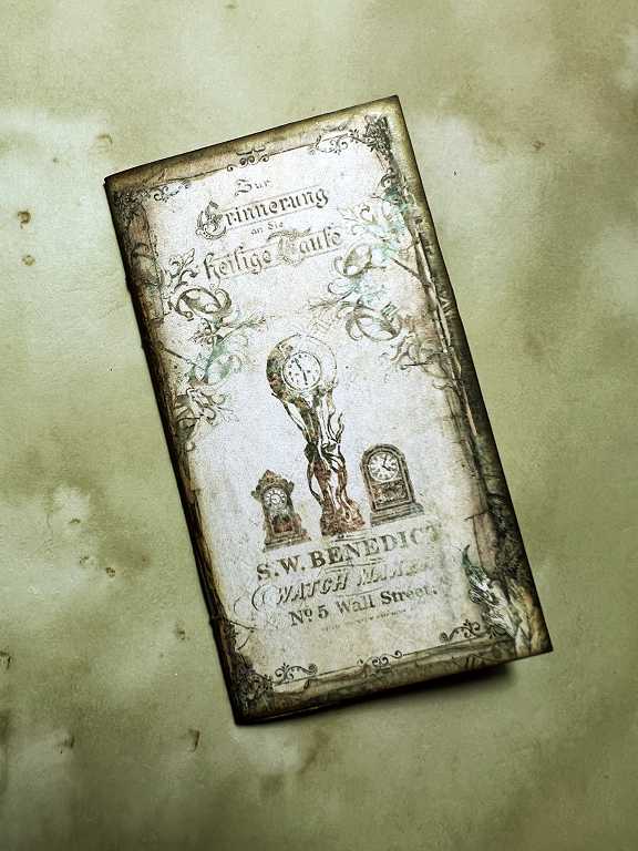
The back of the folio. Gorgeous clock design, and I love the pince-nez. This is the final panel to be glued in place, covering the backs of the small brads of the waterfall closure.
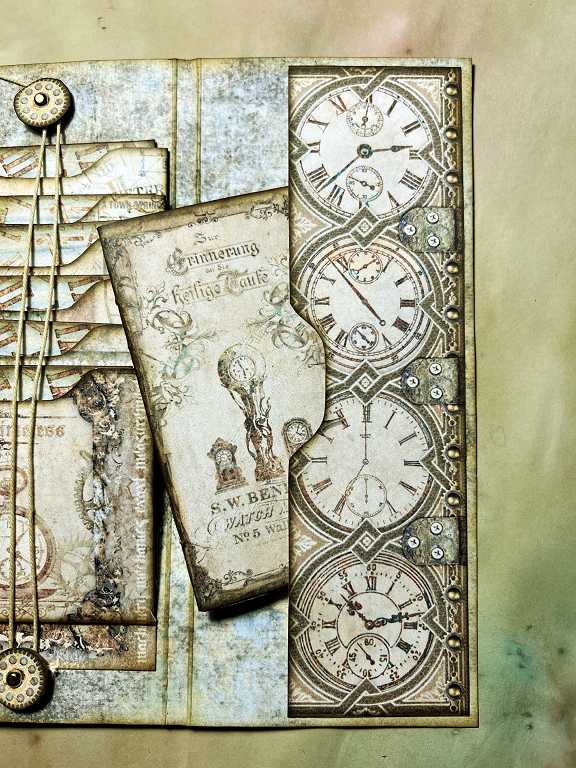
The complete folio, open and showing all the elements.
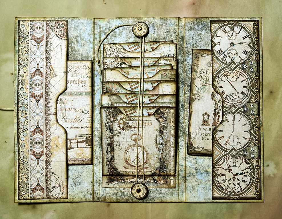
This is another delightful little project and the interactive elements are really fun.
I could see something like this being made into a phone case! It would have to be made of more robust materials, or perhaps it could be laminated – and you’d have to have windows for the camera and ports etc.
Beautifully intricate, interesting and unique. It’s a work of art as is all your work Shoshi.