TYPEWRITER ALBUM PART 12 – VINTAGE PHOTO TRANSPARENT FRAME PART 2
I had a much better session in the studio today, and managed to put right everything that seemed to go wrong yesterday.
Replacing the tag pull tab
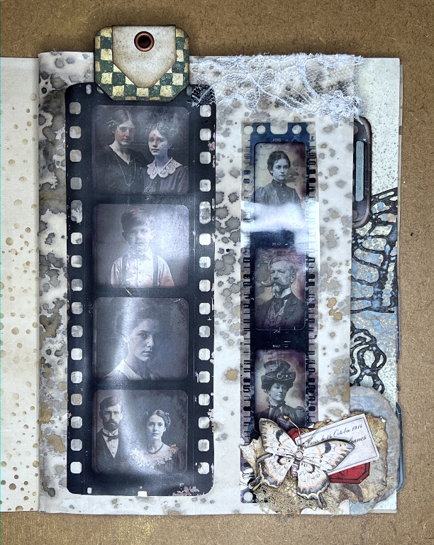
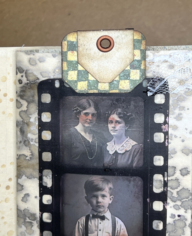
I was unable to remove the original brown tab which was too tall. I selected another from my stash, this time in green. The colour was better. I was able to trim down the original one and stick the new one on top. I had to trim that one down a bit as well, and while I was at it, I added another single layer of card between the two. The whole thing was much more robust. I punched the hole at the top again, and added an eyelet.
The tag itself was also much easier to slip into the pocket. I think what happened yesterday was that some of the glue was not quite dry. Double-sided tape is instant-stick – once down, it’s down. If you run a glue stick over it before adding the second component, it makes the glue slippery, and gives you a bit of wiggle room so that you can place the second piece accurately with greater ease. If some of this glue stick had gone beyond the double-sided tape, this would have made the inside of the pocket sticky and the tag wouldn’t go in easily. The glue obviously dried overnight, and now, the tag goes in and out as intended.
I also rounded the corners at the bottom of the tag.
Co-ordinating tabs
Here is a picture of the page in question beside the opposite page in the signature.
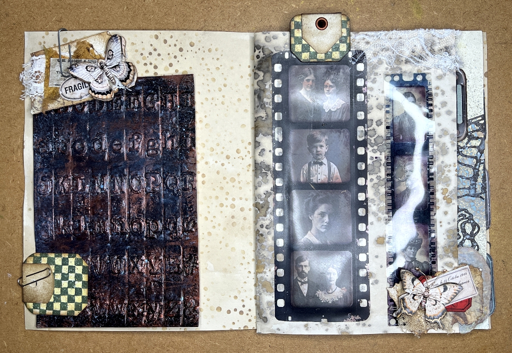
I had already decided to add a page tab on the outer edge, and you can see it temporarily attached with a paper clip. I had not thought about this when I replaced the tab on the next page and it was entirely accidental that they made from the same paper!
The opposite page
This is just a mock-up of the beginning of an idea for this page.
I have slipped in one of the embossed pieces I made ages ago with a Tim Holtz embossing folder of typewriter typebars. I had altered the card to look like metal. I shan’t be using the whole sheet, but just placed it there with one of my small clusters and a Luise Heinzl butterfly. There’s obviously a lot of work to do on this page but I wanted to see what would go with the page I have been working on.
The first page of the signature
Turning that page to close the signature, this is the first page as it is now. I obviously haven’t started work on this one yet. You can see the other side of the tab at bottom right, and the new tab on the tag peeping out above the top edge. I am very pleased with the choice of the green, and the fact that this tab is now not so tall.
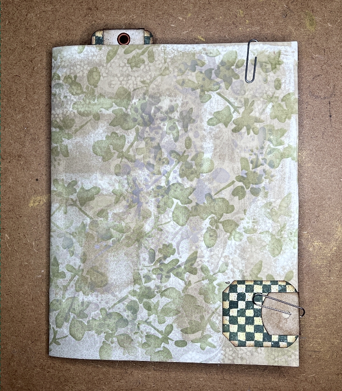
Here is a detail shot of the new tab. I also stuck down a fragment of lace across the top of the page.
Another set of vintage photos
I took this photo at an angle to minimise the reflection from my lamp.
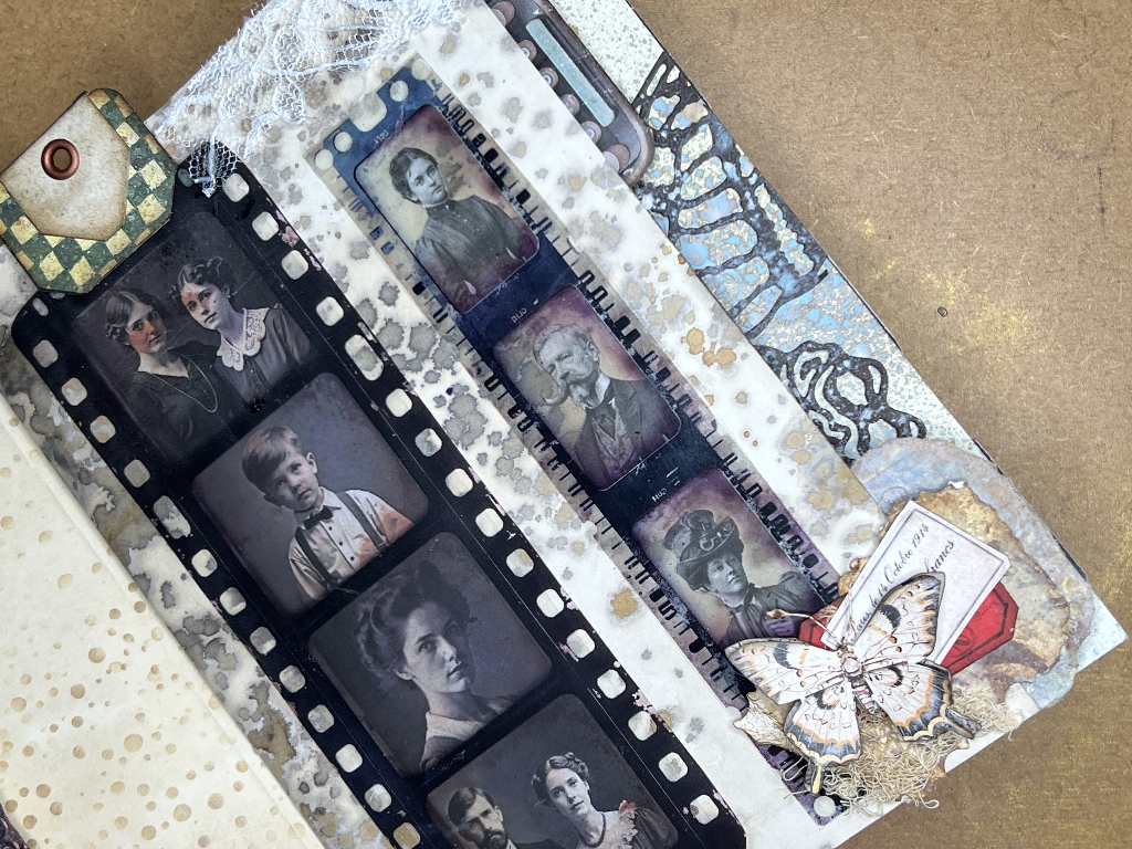
I chose a smaller film strip from Margareth of SevenPlaza’s acetate print-outs and stuck this down over some more vintage photos. These pictures were a freebie from Paper Peculiar, again cut down to fit the frames. This is not interactive. I have added another of my small clusters and another of Luise Heinzl’s butterflies in the corner.
The edge of the cluster extends beyond the page edge, and the back was untidy and mostly white. This did not look good on the following page, so I inked up a scrap of card and stuck this behind it so that it forms the rest of the page edge tab on the following page.
The layering of the pages is showing up quite nicely now. The wider pages underneath are co-ordinating with this page and creating an interesting extension to the page. The new page tab cluster does not extend beyond the widest page, so when the signature is closed, it will not be visible. Here it is in detail.
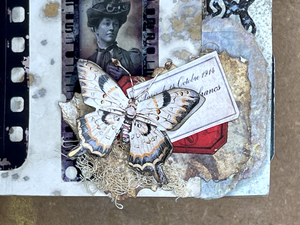
The butterfly is multi-layered and the upper layers can be pulled up slightly for a 3-D effect.
The following page spread
Turning the page you can see the back of the tag window and also the other side of the page edge tab, and the work I have done on the next page.
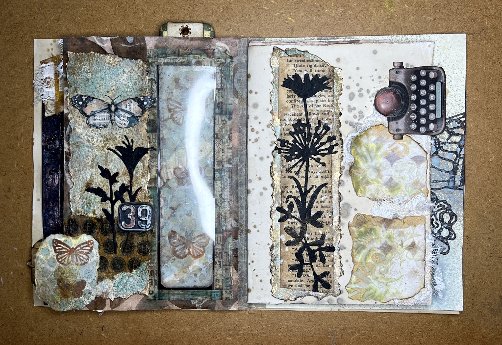
You can see that I have altered the back of the tag to make it more interesting.
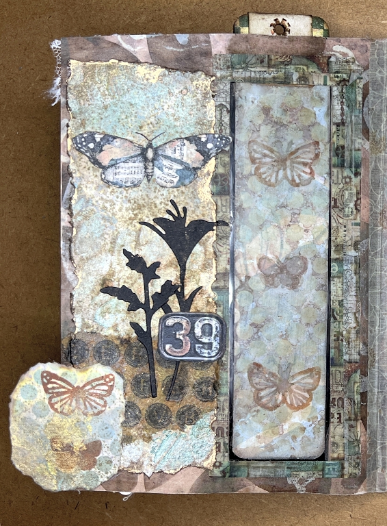
I used some tiny butterfly stamps and some sepia archival (permanent) ink, and then used my circles stencil with some Speckled Egg Distress Oxide for some more textural interest. This covered up the butterflies a bit too much so I lifted the ink with a water brush and then painted over them again with a mixture of inks from some Kuretake Smoky Colours pens scribbled onto a palette and applied with a wet brush. I quite like the more hand-painted effect as a result of this.
The back of the page edge tab was torn from a scrap of the watercolour collage paper I created when I was making the new brush holder. I wanted to experiment before committing myself to embellishing the tag, and this paper seemed the best equivalent colour-wise to give the right impression with the butterfly stamping and the stencilling. I liked it so much that I decided to tear it down to shape and use it. I am very pleased with how this particular page has turned out.
The opposite page
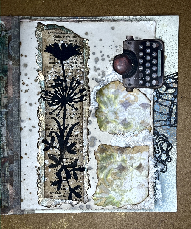
This is the page with the piece which is visible when the tag is removed from the photo frame. I have filled in the right-hand side with some pieces torn from one of the collage fragments I created using inks and moulding paste in my mixed media scrap-busting project back in September. I stuck them down over some fragments of lace, and then stuck down the little typewriter page tab on top. This page still needs something, and I will return to it in due course.
Conclusion
This has all been rather difficult to describe, using words and still photos. When the album is completed, I shall be doing a flip-through video and all of this will become a lot clearer. It is hard to describe an interactive 3-D project in this way. Video is certainly best.
Although this pair of posts has been primarily about a single page – the page with the transparent photo frame element – the page does not stand alone. It is part of the whole, and the neighbouring pages co-ordinate with it and enhance it. None of the pages in this book will stand alone. As I work on these other pages, this flow will become more apparent.