WATERCOLOUR FLORAL DOODLE
Following on from my recent watercolour doodle, I thought I’d have another go at this gorgeous technique. Building it up layer by layer, the result is deceptively complex, when it is actually really easy to do.
Layer 1 – Creating the grid
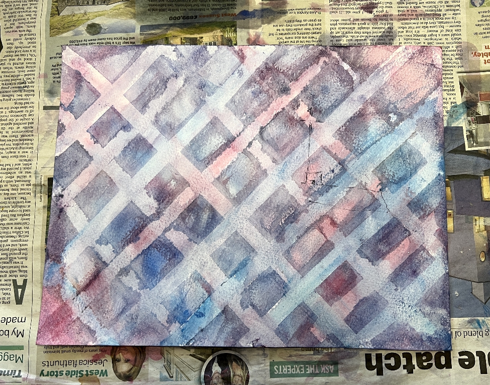
I began as before by creating a grid with tape on some scrap watercolour paper. The YouTuber who inspired me to try this technique used a narrower masking tape than I had available and I felt that the initial grid was a bit too dominant in my first piece. Thinking outside the box, I knew I had a roll of narrow surgical tape somewhere, in a handy little dispenser. I eventually found it, and after sticking each piece of tape to my clothing briefly to reduce the stickiness a bit, I began to apply it, this time in a diamond pattern. I soon ran out of the tape and had to go back to my blue painter’s tape. This time I cut it in half along the length. I didn’t manage a very straight cut but the layers obscured it so it didn’t matter.
I found an identical spool of surgical tape on Amazon, complete with dispenser. It was pretty expensive so I searched for the equivalent width of tape and found a pack of six rolls and ordered it. I couldn’t find out what the internal diameter measurement of these rolls was and had to trust that they would fit in my existing dispenser. It was an extremely tight fit and the roll wouldn’t turn. With some difficulty I prised it off the dispenser. I managed to peel the printed layer of paper off the inside of the roll and it then fitted perfectly and unrolled easily. I have other surgical tape in my bathroom cupboard so this narrow one can now live in the studio with the box of refills. It’s nice to have a narrower tape. It actually worked better than the painter’s tape! In the above photo, the stripes with the irregular edges where the watercolour paint has bled underneath were made with the painter’s tape, and the better defined ones were done with the surgical tape.
You can see that I have chosen a more limited initial palette this time, confining myself to pinks, purples and blues.
Layer 2 – Drawing the circles
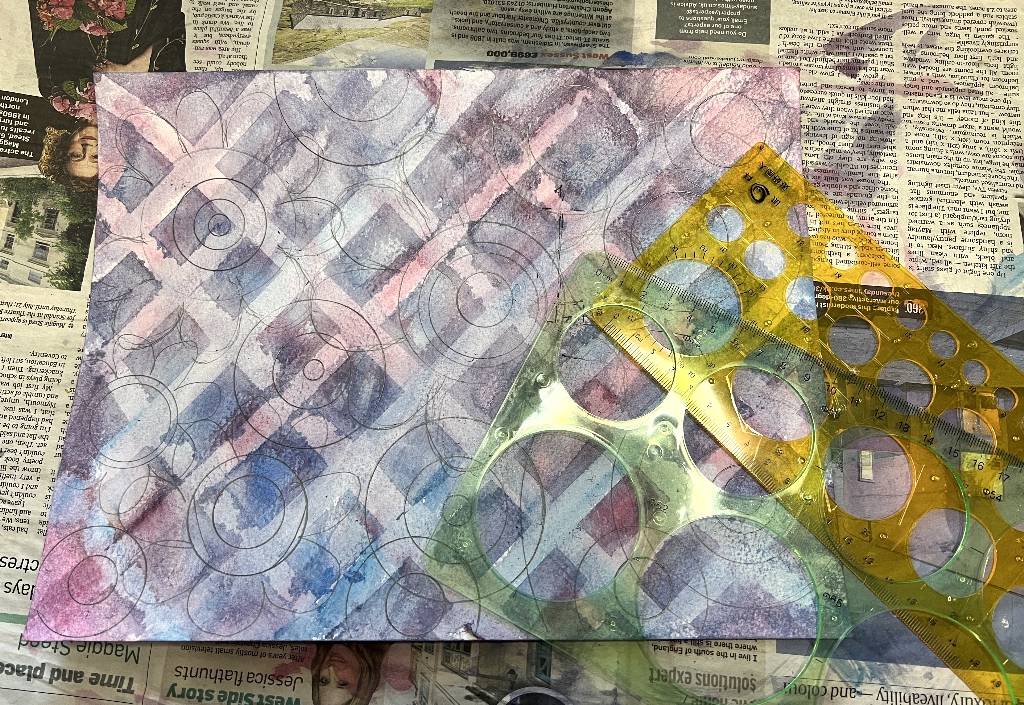
This time, to save time and effort, I got out my circle templates. The largest circles were drawn around different objects in my studio.
Layer 3 – Painting the shapes
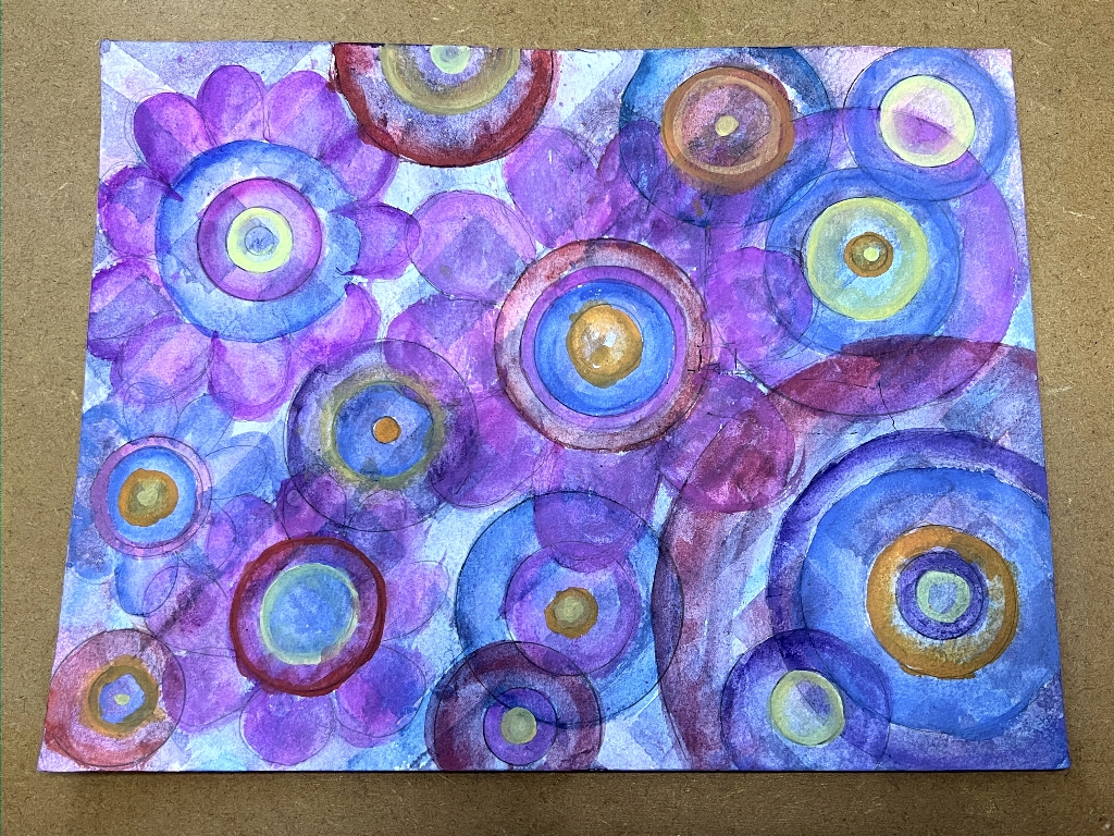
This time I picked out some of the circles as large flowers. I thought the whole thing looked a bit too bland and demanded some complimentary colours to be thrown in, so I added yellows and oranges and a bit of bright red, especially in the centres of the motifs.
Layer 4 – Doodles
As before, I didn’t photograph every stage of this but just went with the flow and filled in all the areas with different doodles and Zentangle patterns. This took place over several evenings.
The completed design
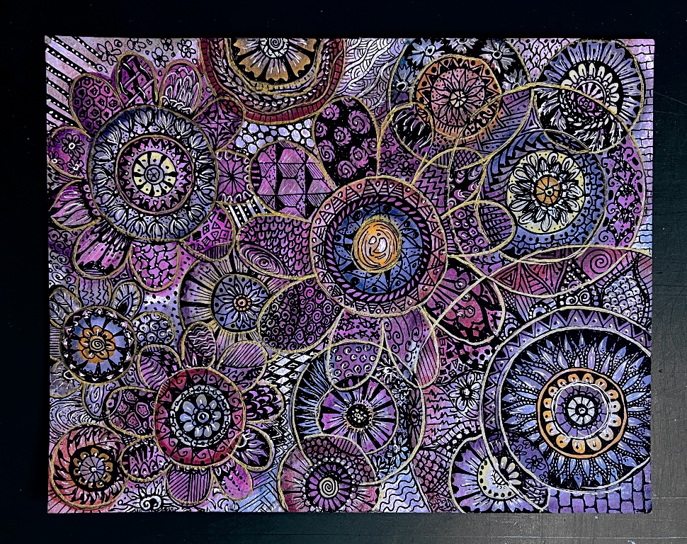
It was quite difficult getting the colour of the photo accurate and it’s still not quite right, despite my photo editing attempts, but it is close enough – in real life it is a bit brighter. It does rather depend on the lighting for the photo, and one’s computer screen as well.
As with the previous design, I added some white highlights and gold outlines, using the same Artistro markers.













This is beautiful! It reminds me of some of the silk Turkish rugs! 🙂
~Mondo