MASTERBOARD BOOK – INKED KITCHEN PAPER
Another stash-busting project!
Cleaning up operations
When I work with inks and paints, I don’t like washing left-over media down the sink. For paints I usually wipe off the brushes onto various scratch papers which mature nicely with time and make good collage fodder or backgrounds for photographing stuff. The palette gets wiped with kitchen paper. With inks, if there is any residue on the glass media mat on the desk, I also wipe this up with kitchen paper. I try to keep the colours on separate sheets so that when the kitchen paper is sufficiently covered to be useful, I’m not ending up with mud. The trouble is, when I’m in a hurry I don’t bother searching through the box for a maturing sheet but tend to grab a new one and this is the result.
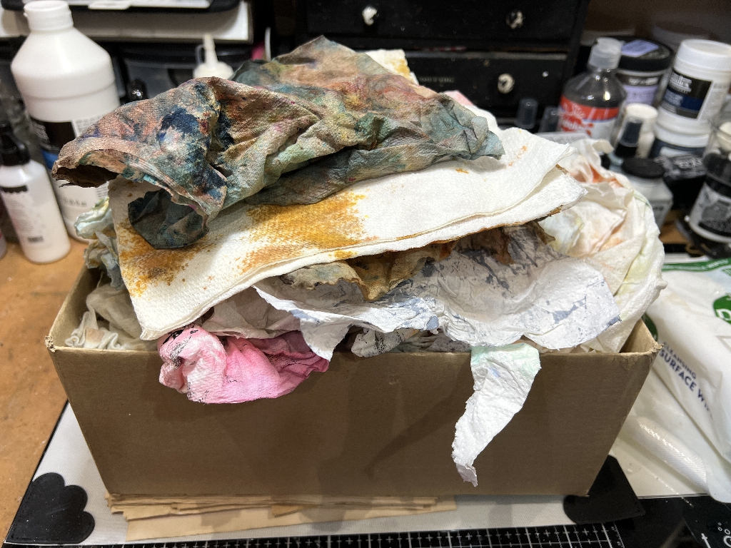
Definitely time to do something about this.
I already have a pizza box full of completely inked papers which are gorgeous – I have made some into faux washi tape and I do use them for collage occasionally, and this is another full box that needs to be attacked in due course!
In the meantime, I decided that many of the papers in this particular box, even though they are not completely covered, are still interesting enough to use, hence this project.
Preparing the papers
Most kitchen paper is 2-ply, but some is 3-ply. When they are inked, this means that you get double (or triple) for your money if you split the plies and use them separately. If they are merely inked, they separate easily, but acrylic paint tends to stick the layers together, and the papers often rip when you try to separate them. It all adds texture!
Having separated the layers, they need to be ironed. Over to my ironing station in the corner of my studio (which is still in a terrible mess).
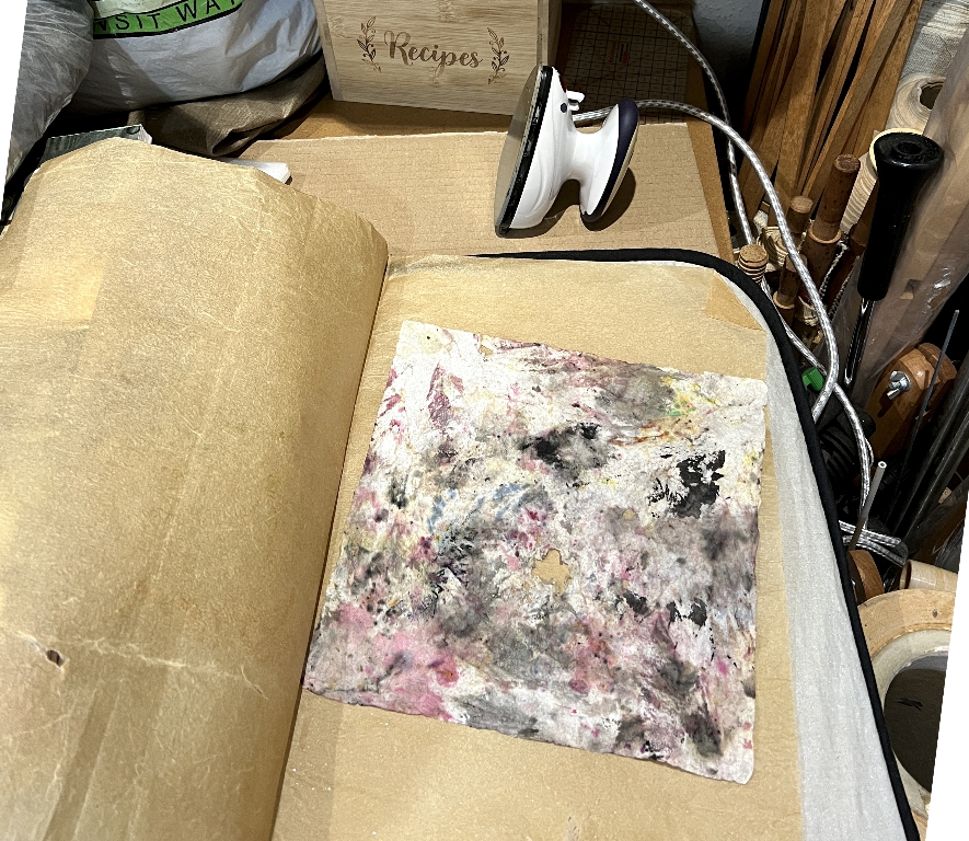
The papers are ironed between baking parchment, in case there is any acrylic paint on them which would melt and stick to the iron.
Am I the only person who irons used baby wipes?
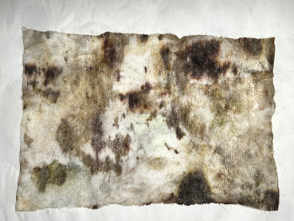
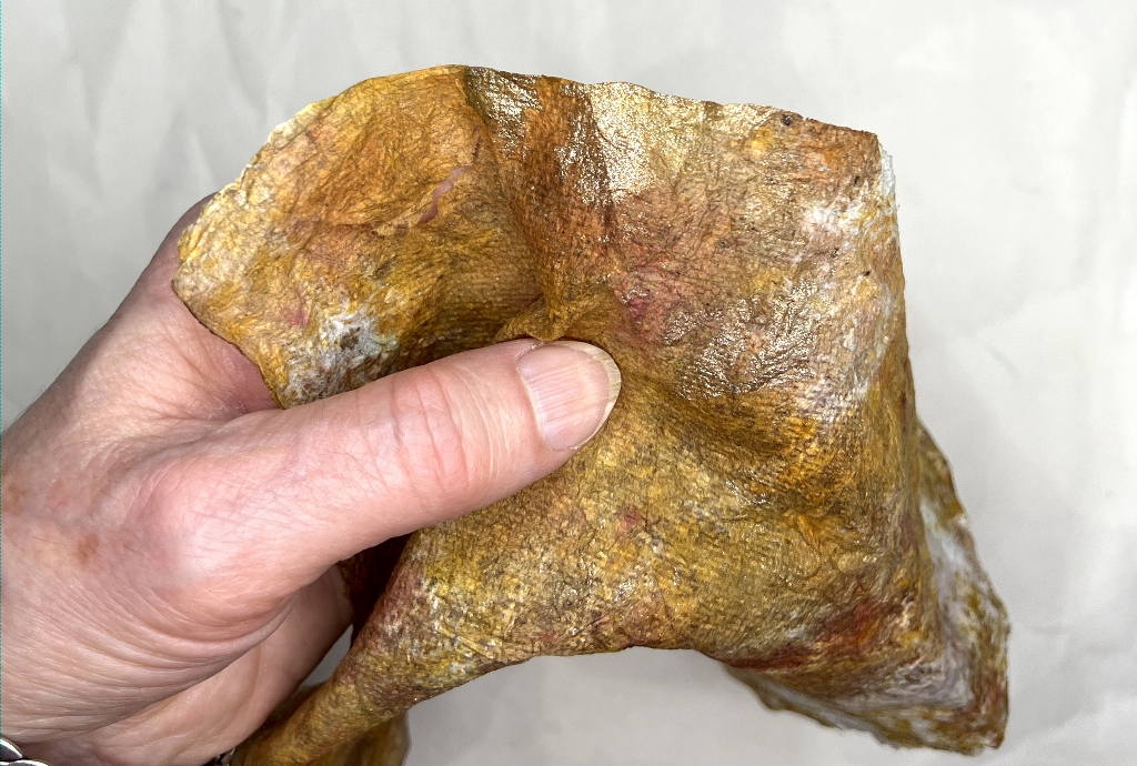
Who could resist this one, though. Not only is it utterly gorgeous with the brown staining, but it feels like soft silk. I think I may use this for the cover of a tiny album one day.
Papers for this project
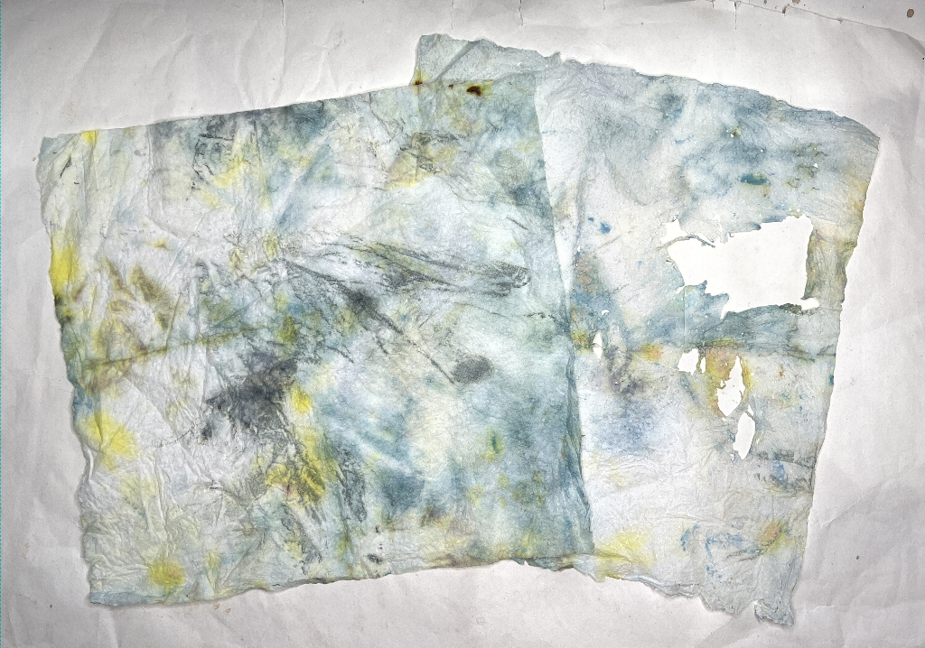
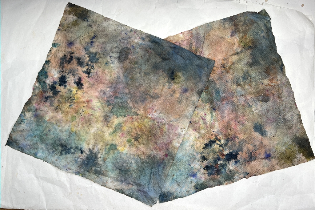
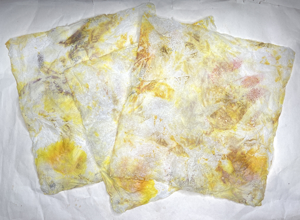
Here are the papers separated and ironed and ready for use.
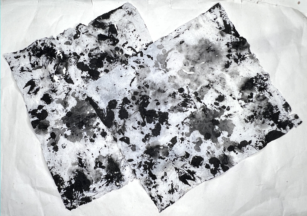
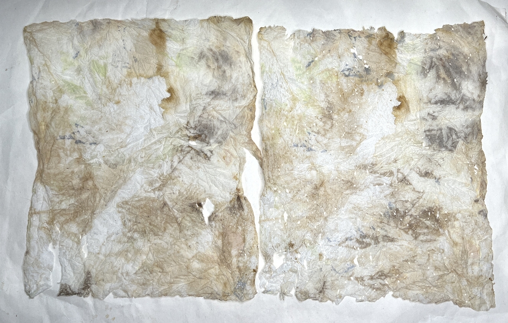
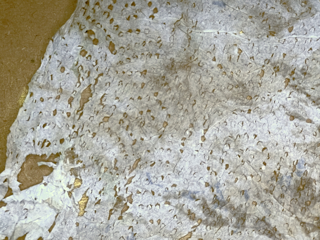
Here is a detail of the right-hand piece in the above photo – this paper is very worn and has holes which just add to the interest. The corner of this piece has worn where the embossed pattern of the kitchen paper is, which is intriguing.
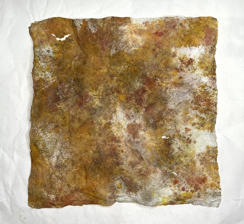
This brown one has touches of gold on it – I am not sure what medium this is.
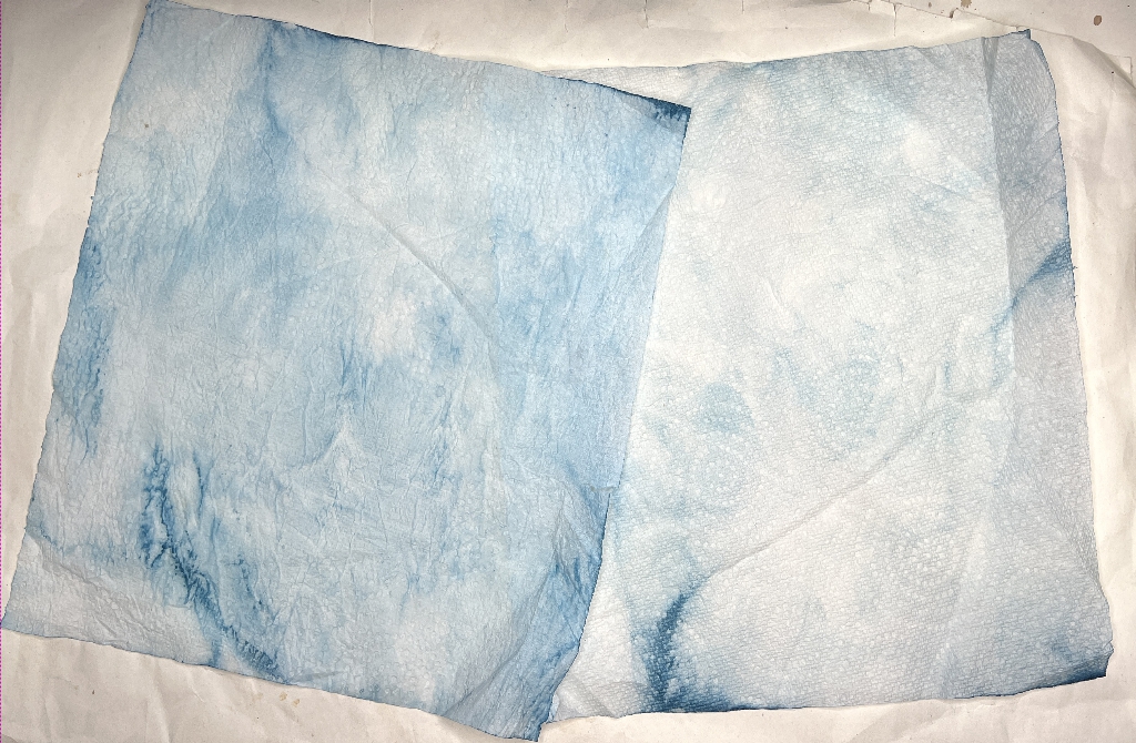
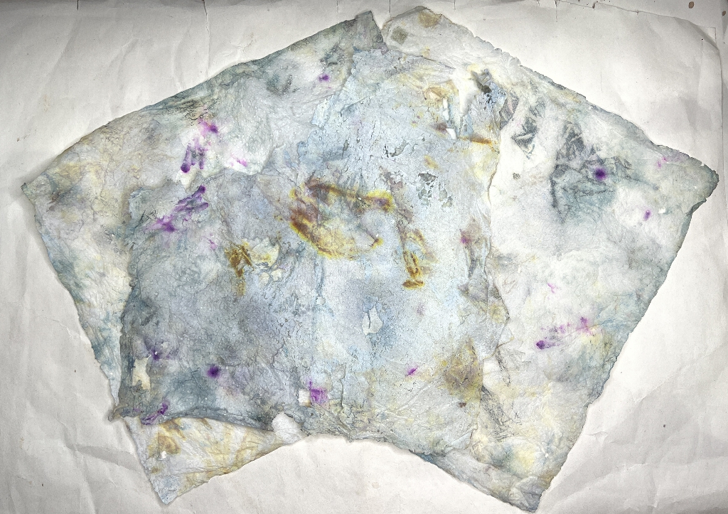
This pale blue one is interesting because it’s so subtle, and on the right-hand layer, the embossed pattern of the kitchen paper is showing.
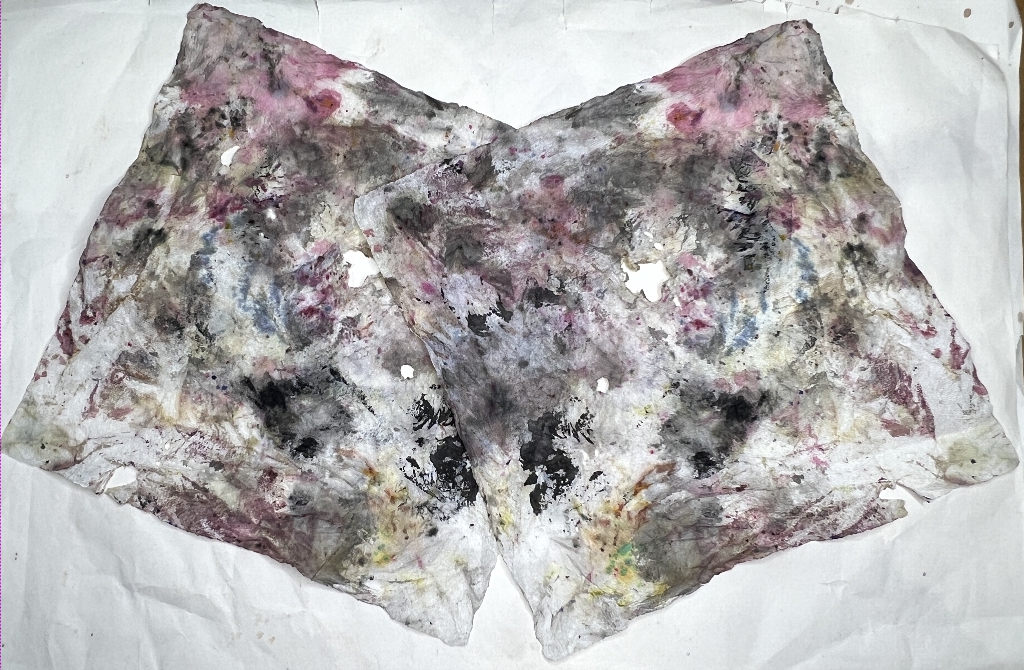
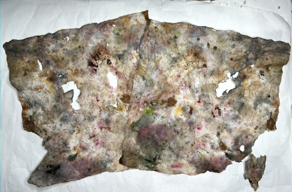
The following papers are 3-ply ones.
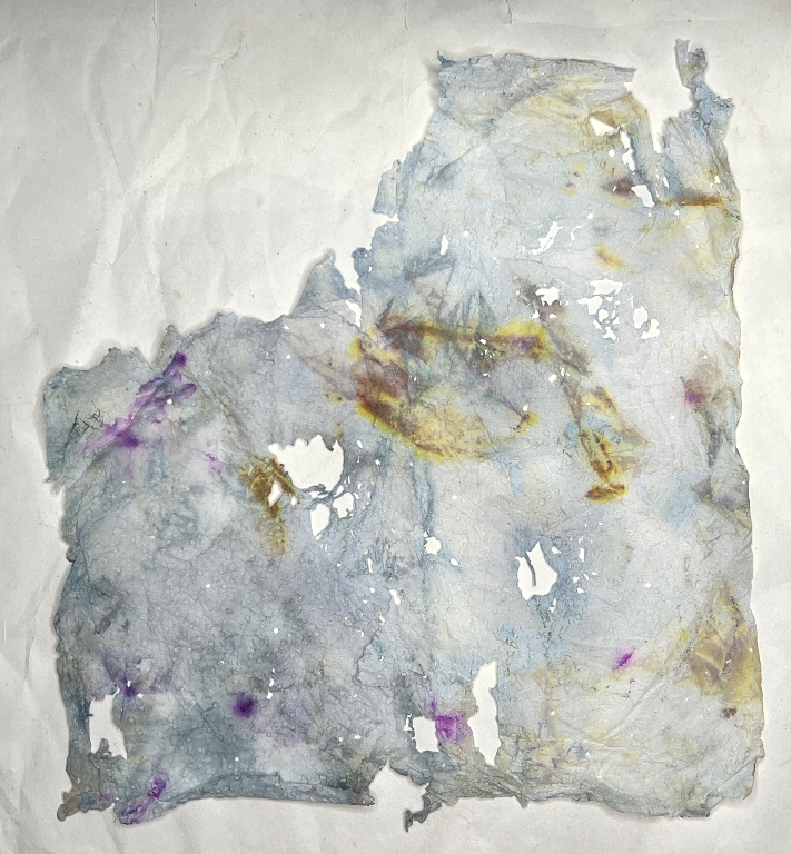
Here is a detail of one of the layers from the above photo – very ripped but this just makes it more interesting in my book.
Adding the papers to my masterboard book
Here is the set-up for the process.
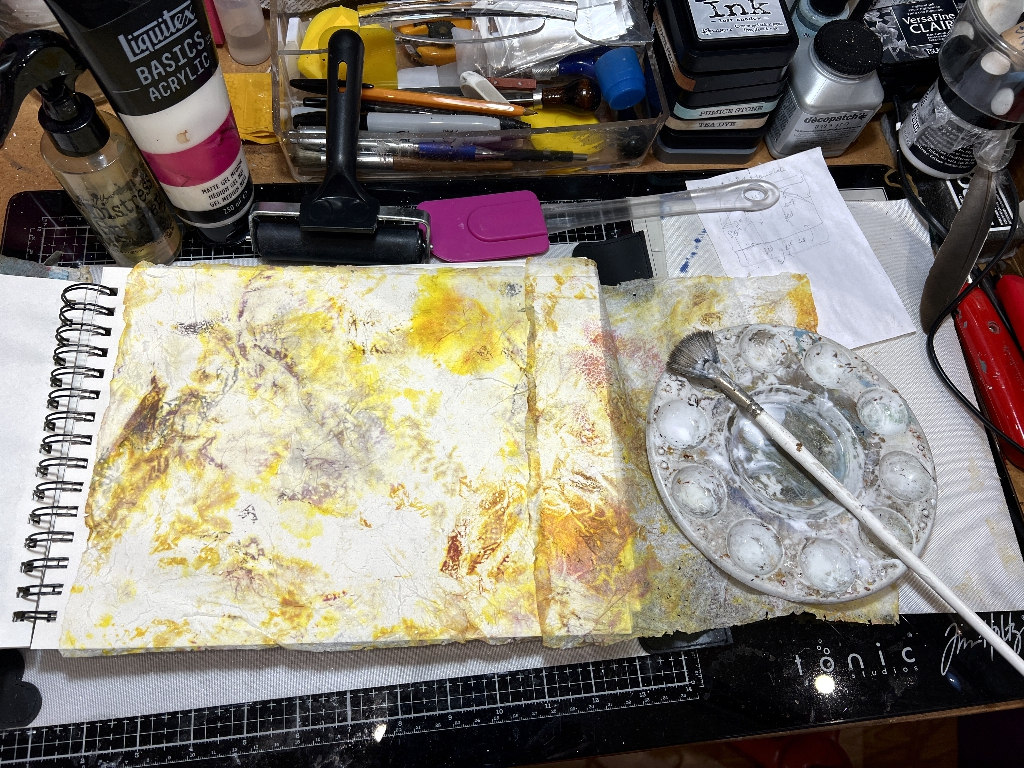
Unfortunately the papers aren’t big enough to cover the whole page so I’ve joined another piece on. Once completed, any excess was trimmed off around all sides of the page.
Materials and technique:
- Matte medium (basically acrylic paint with no pigment in it) which acts as a glue and sealant.
- Water spray bottle to dilute the matte medium a bit so it goes on better onto the delicate papers without ripping them.
- Brayer for flattening the paper before the second layer of matte medium is applied.
- Silicone kitchen spatula – this is the best tool for spreading the matte medium on top of the kitchen paper to seal it – if you use a brush or your fingers it tends to move and rip. The spatula, laid pretty flat, glides over the surface and spreads the medium without moving the paper.
- Palette and brush for applying the matte medium.
- Heat tool (not shown) for drying the page.
The pages
I didn’t use all the papers I prepared. I have used some of the rest, and bits and pieces left over, to make further pages with a patchwork effect, which will be the subject of another post.
After the pages were fully dry, I trimmed the rough edges and put the masterboard book under a pile of heavy books overnight which flattened everything out nicely.
For this first one, the black and white one, I didn’t add any further embellishment because it’s great as it is. I like the variations of grey in it.
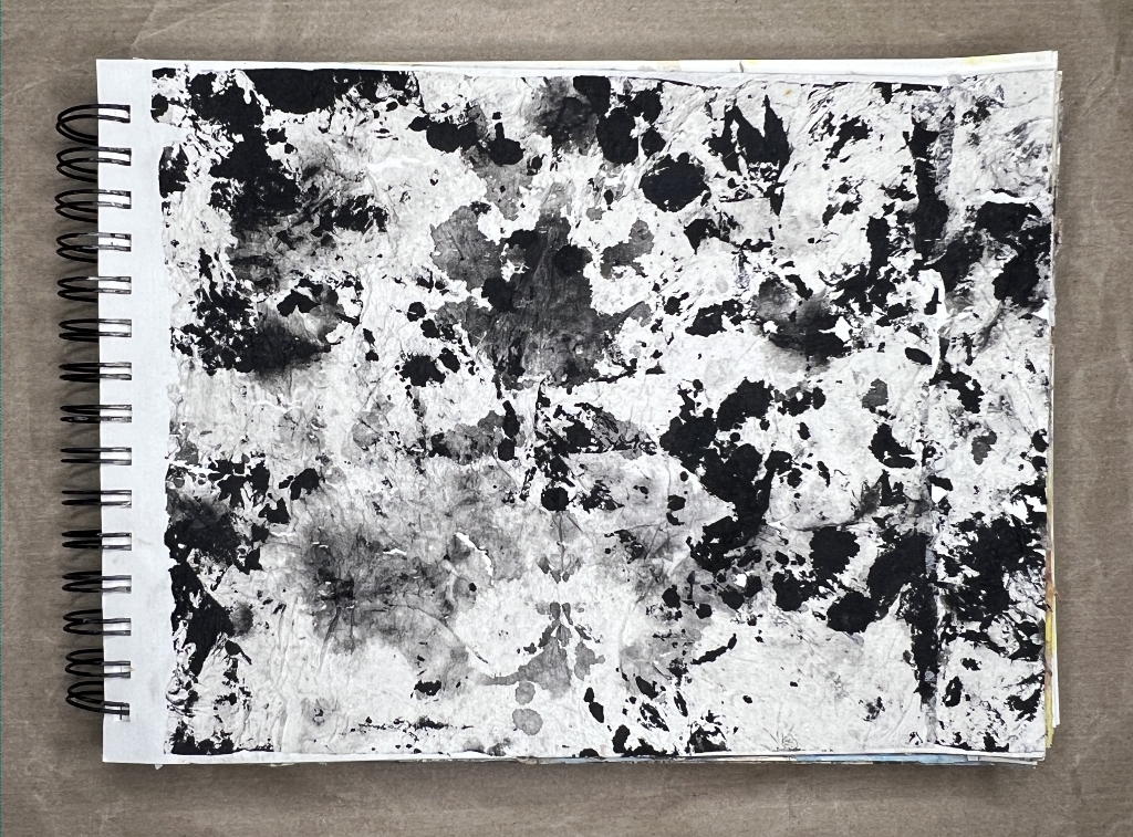
Stencilling with acrylic paint.
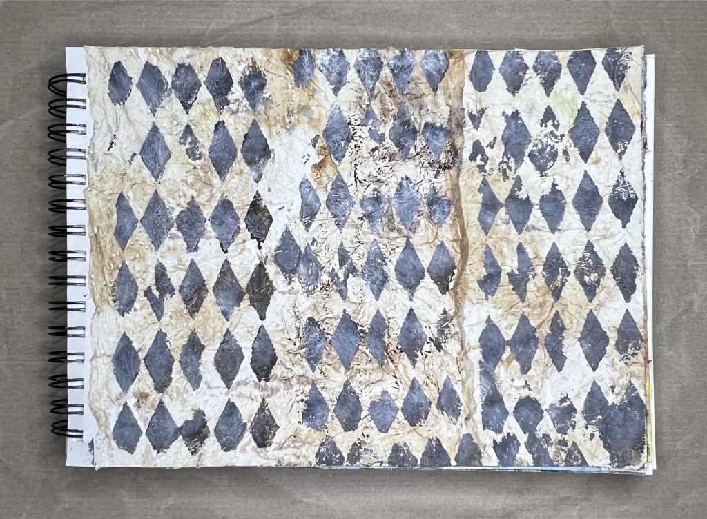
I really didn’t like this next one until I’d added the stencilling! Now I love it!
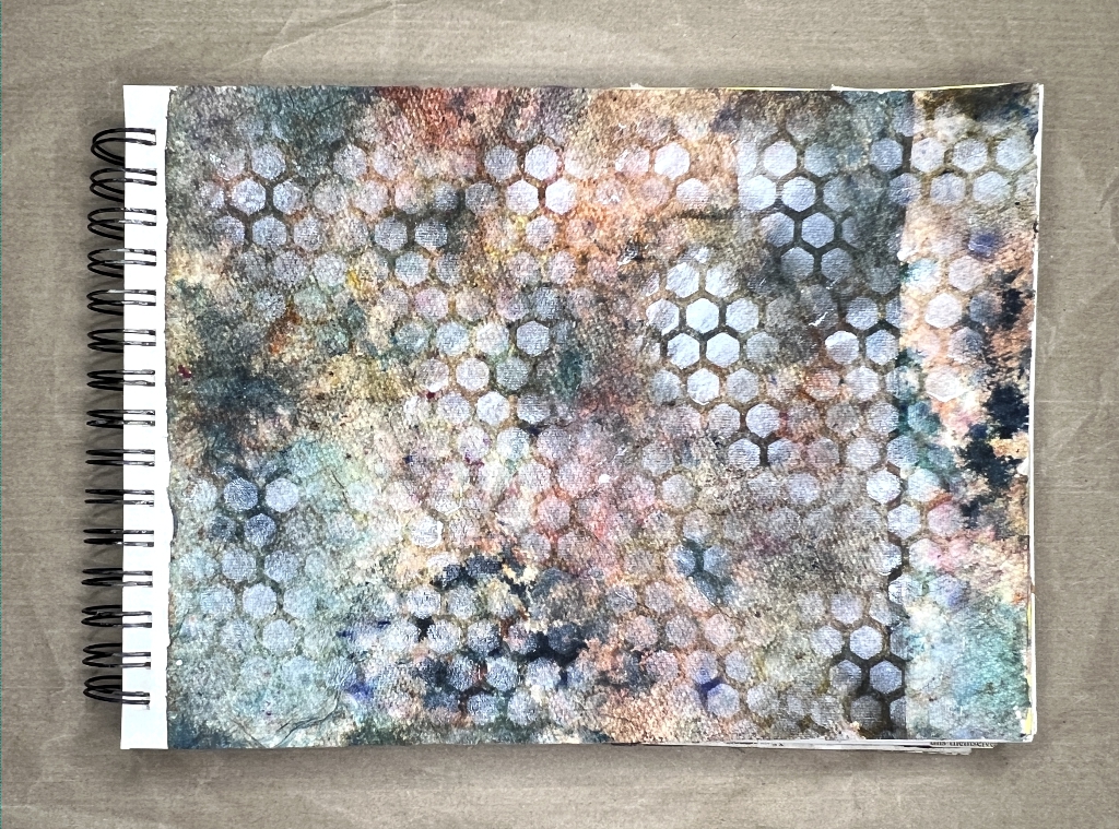
Again, I left this pale blue one as it was. It looks like the waves of the sea, and I think this masterboard may come in handy when I eventually make the sea-themed album that’s in the back of my mind.
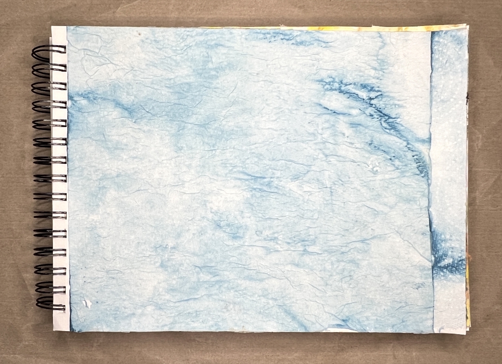
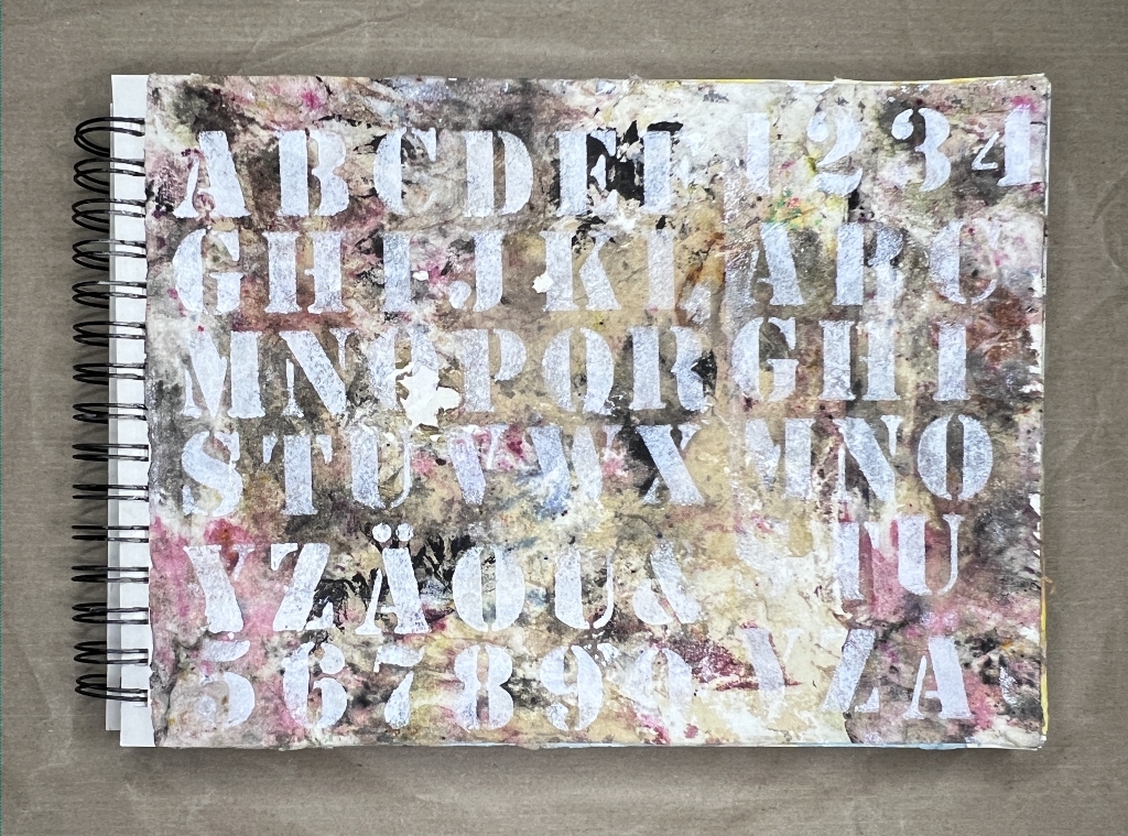
Stencilled letters using white acrylic paint. I sprayed a bit of coffee over the top of this one once it was done.
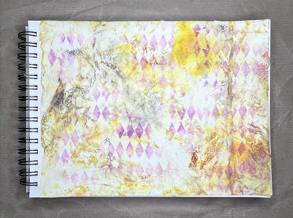
There was a touch of purple on this yellow one, so I stencilled a bit more on with Distress Oxide ink.
Waste not, want not!
My hubby always tries to wind me up about my Scottish ancestry, saying “so there’s nae waste” every time I try to save anything. (The Scots are not mean – they are just careful!!) However, when you look at all these papers, there’s a heck of a lot of medium locked up in them, all of which costs money, and it would be a terrible waste just to wipe up your messes and chuck the papers in the bin. They are also beautiful and deserve a new lease of life, wouldn’t you agree?