TYPEWRITER ALBUM PART 13 – GLASSINE PAGE AND WORK ON PAGE 1
After my successful experiments with laser print transfers, I was keen to get back to working on the album again. The transfers I have done have formed the basis for a couple more pages which I shall work on in due course.
Glassine page and pocket
It seems appropriate to begin with the glassine piece I made, having just written about the laser print transfers.
Because I didn’t line up the typewriter transfer correctly, I had to rotate the paper in order to straighten it up. This left me with an incomplete piece and I couldn’t form the rectangle needed to make a regular folio for the album. I decided instead to cut the right-hand part into a straight diagonal, and to use this to form a pocket on the other side of the signature once the pages were bound. This piece of glassine is an extra folio and is going in the third signature of the book.
To make the glassine more interesting and vintage-looking, I sprayed it with coffee. When this was dry, I spattered it with some rust water and then dried it with my heat gun. The rust water has darkened after contact with the coffee – it has this reaction with anything organic.
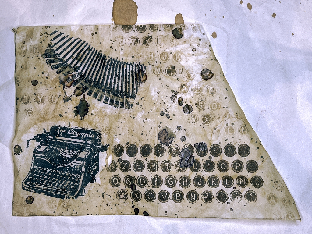
After this, I chose the typewriter keys stamp from Tim Holtz’s “Deconstructed” stamp set and did one clear impression using sepia archival ink, and several ghost stamps done without reapplying ink from the ink pad. I am pleased with the effect. I folded it down the centre. The triangular part is now on the front of the third signature, and the larger part now forms the final page of the book.
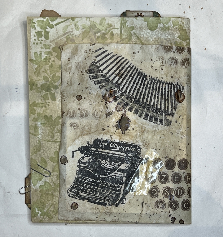
When I was rubbing away the paper transfer, I made a slight hole in the glassine to the right of the typewriter. I decided to make a feature of this by adding a bit of my DIY faux vintage tape. The glassine has a delicious crunchy texture and it crackles as you handle it – quite different from glassine in its raw form! I love how the addition of moisture transforms it.
Turning the piece of glassine over, it wasn’t very attractive. The triangular part doesn’t matter because it will be glued down to form a pocket, but I had to do something with the back of what would be a page.
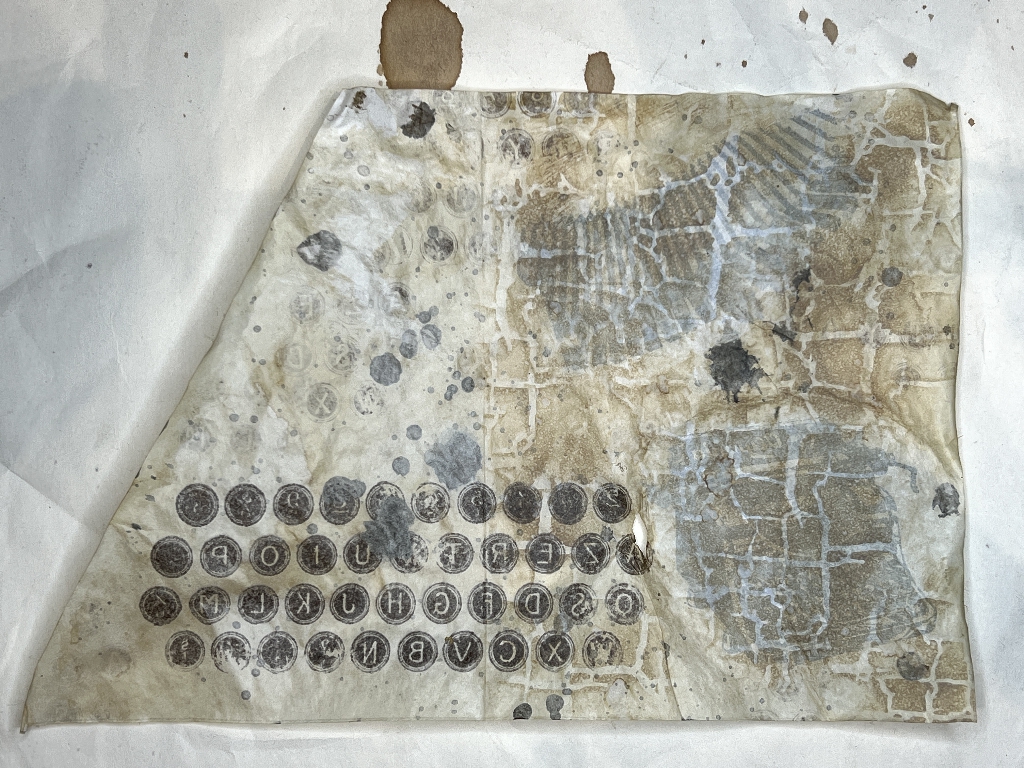
I added some stencilling with Frayed Burlap Distress Oxide, brushing it on from the ink pad with an ink blending brush. I am not worried that the letters of the typewriter keys are now reversed – it all adds to the texture! You can see that I masked off the triangular section when I did the stencilling, so that it didn’t extend onto the pocket. You can see the fold line.
Most of this got covered up with the images I stuck down onto the page.
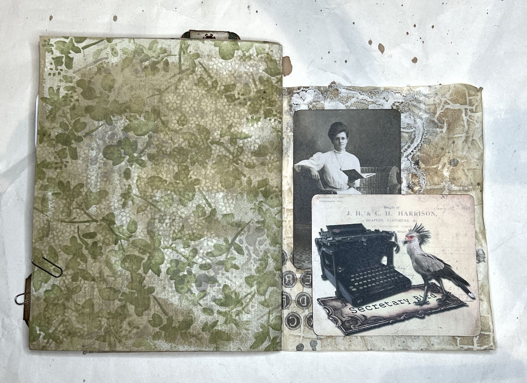
The lady was a digital download, and the other image, the Secretary Bird, was my own digital design.
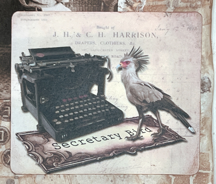
I took a typewriter image in png format (transparent background) and also a copyright-free image of a secretary bird (yes, such a species does exist!) and made the mat with the text from another image, and superimposed them in a series of layers, using a vintage ledger page as a background. I desaturated the bird and just left the little flash of red around the beak and eye. Using the perspective tool in my image editor I was able to distort the label image so it appeared like a flat surface for the bird to stand on.
I printed it out at the size I wanted and rounded the corners before sticking it down.
During this session I also worked on a couple of other pages.
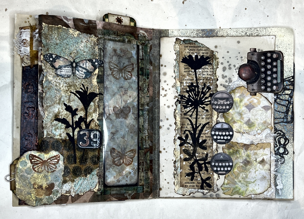
Completing the page following the vintage photo frame page
I felt that this page lacked something.
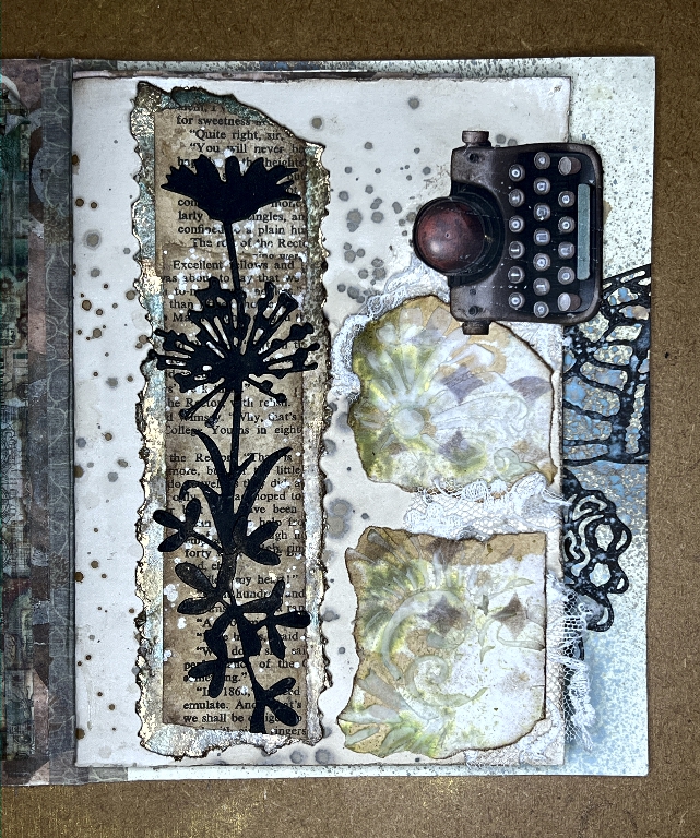
I rummaged through Luise Heinzl’s Vintage Typewriter Ephemera kit pieces that I’d cut out, and found three more of the mini-typewriter disks, and stuck these down. This links the elements of the page together better, and I am happy with it now. Here is the photo of the completed spread.
Working on page 1 of the first signature
I dulled down the frame of the picture of this lady a little and stuck her down in the centre of the page. I stuck down a bit of lace across the bottom and attached the little cluster I’d made, at the bottom right-hand corner of the page, forming a page tab.
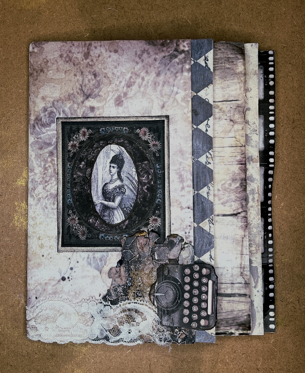
I particularly like how the diamond pattern of the following page shows to the right of the first page, and also how the layering of the pages continues the muted colour scheme throughout the signature.
The first two-page spread of the album
Turning the first page, this is what you see.
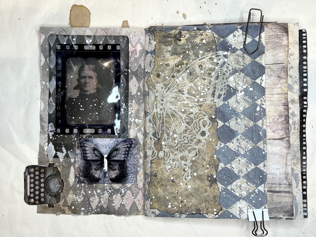
I thoroughly enjoyed making this page. You can see the other side of the typewriter page tab at bottom left. I chose another photo of a lady and stuck her down. Somehow it was a bit boring just to have a photo stuck down, so I added some stencilling with light moulding paste. This was too stark white so I sprayed it with Hickory Smoke Distress Oxide Spray and spritzed it with some water so that the ink ran down and blended with the background. The stencilling did not extend across the whole page but left our lady clear – I was careful not to let any of the ink run down her face.
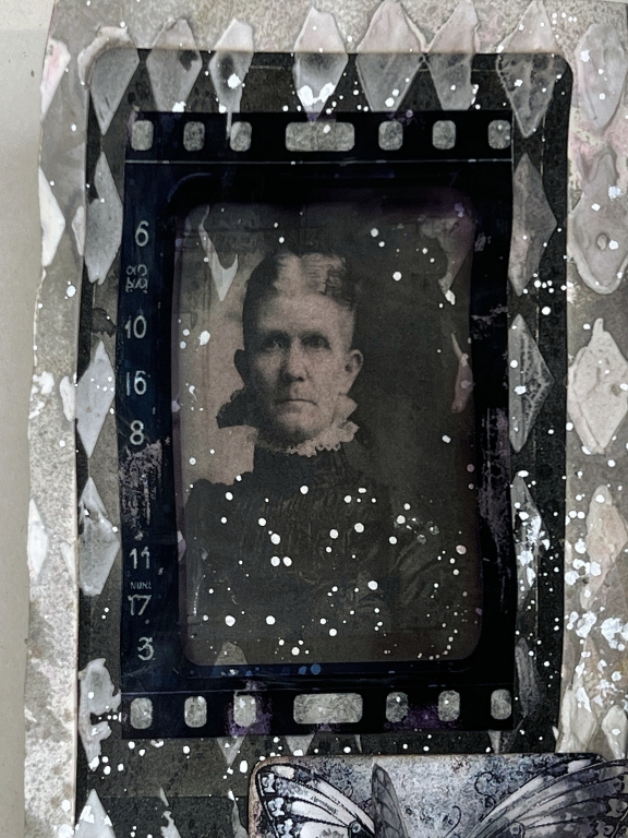
Once this was dry, I spattered the whole thing with watered-down Dr. Ph. Martin’s Bleed-Proof White, masking off the lady’s face with a bit of post-it note so that she didn’t end up with white paint on her nose! When this was dry, I gave her a vintage photo frame printed on acetate.
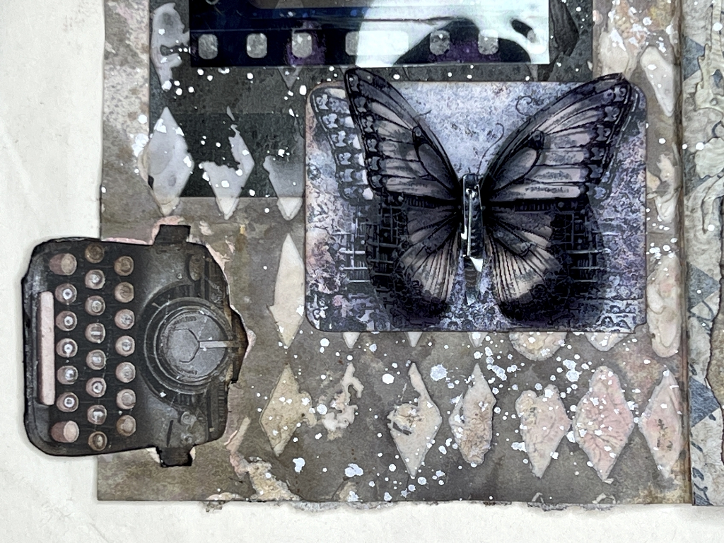
The embellishment underneath was one of Luise Heinzl’s Typewriter Ephemera Kit pieces scaled down. I cut out one of the butterflies I’d printed on acetate – this image was originally identical to the base layer – and stapled the butterfly onto the base layer. I bent the wings up for a 3-D effect.
Here is a detail of the lady in question.
A detail of the butterfly embellishment.
On the right-hand side of the spread, I laid down one of my tattered butterfly die-cuts (from Tim Holtz’s Perspective Butterfly die) but it didn’t show up sufficiently on the grey diamond-patterned background. I grabbed a piece of my altered cicada wing paper, ripped the edges to get rid of the straight edges and glued it down as a background. The butterfly did show up better then. I applied it by painting matte medium over the substrate and then laying the butterfly carefully in place on top. Once I was satisfied it was properly stuck down, I went over the whole thing with the matte medium to seal it, and let it dry. Further white spatters over the whole page gave the spread coherence.
Here is a closer look at this page.
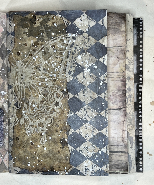
I think this page may still be lacking something – there is a lot of contrast on the previous page and I need to add a bit of something to this page to balance things out.
Things are now progressing nicely.