ALTERED BOOK: “THE JOURNEY” – PAGE 4: SOUTHERN SPAIN AND MOROCCO
Interesting factoid: while editing and naming my photos for this book page, I vacillated between two spellings – is it Marocco, or Morocco? I finally settled on Marocco, but before writing this post, I thought I’d better check. Ooops. I was right the first time – it’s Morocco. Ah well. Amazing what you learn when you are making art, isn’t it.
Anyway, to business.
Page 4 of my altered book
Originally I was going to dedicate a whole spread to Spain, and in some ways I regret my decision not to do so, but I only have twelve spreads in this book, and I’ve already dedicated two pages to France, so I thought I’d better rein myself in a bit!
I decided to make a page spread covering two countries, both of which have a distinctly Moorish influence – Spain (particularly the south) and Morocco. I adore the decorations found in both countries. I had the privilege of spending a wonderful holiday in southern Spain with my hubby a number of years ago and was overwhelmed by the beauty and intricacy of the plasterwork, the tiles, the fountains – also the music and dance, and the food. I have not had the opportunity to visit Morocco but I adore Moroccan design in all its forms. The two pages side by side do complement each other, I think, although the expression of their cultures is different.
Preparing the pages
This page spread has been a long time coming, after I made the initial preparations, because I had other things to do in the meantime. This weekend I finally had time to get back in my studio (which hadn’t been that inviting recently because it was freezing in there – we are trying to heat the minimum number of rooms at the moment because of the ridiculously high energy prices to which we are all being subjected).
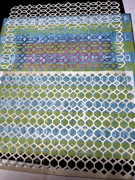
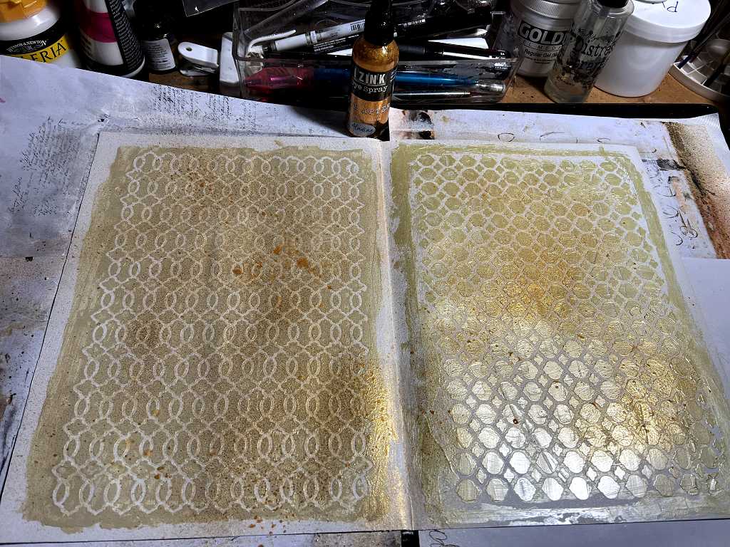
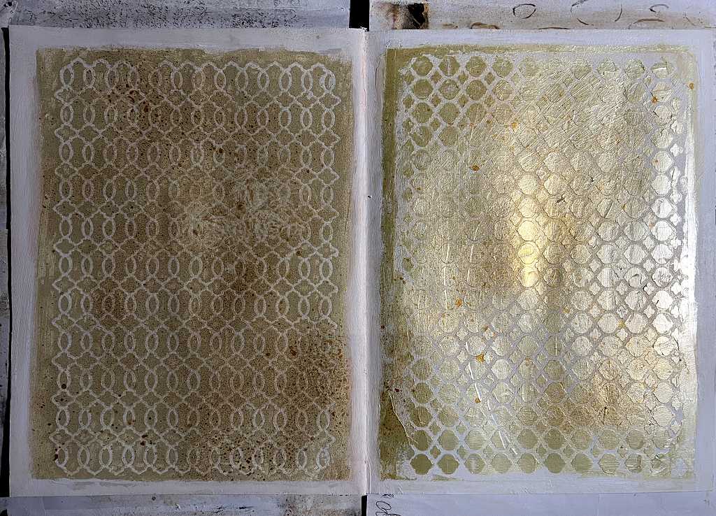
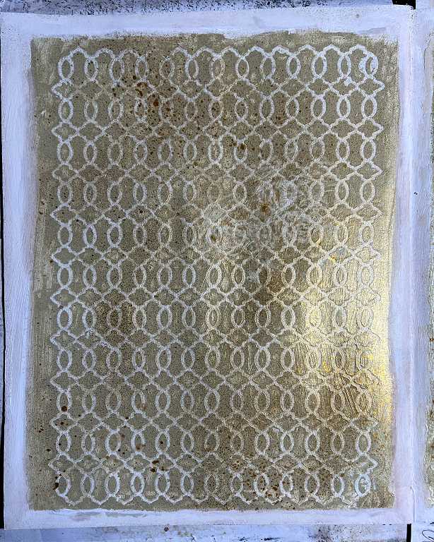
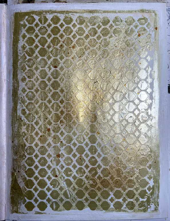
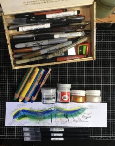
I chose two of the stencils I made (cut from Tyvek) to create the backgrounds for the pages. Both of them are stained with paint.
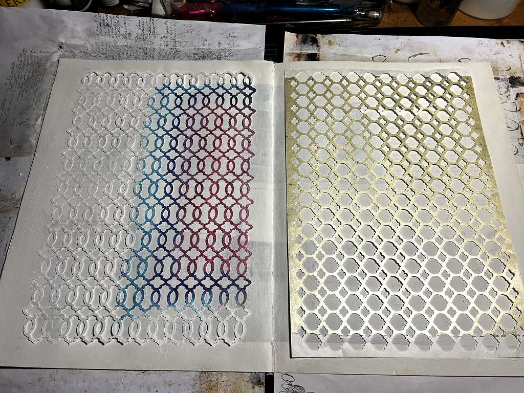
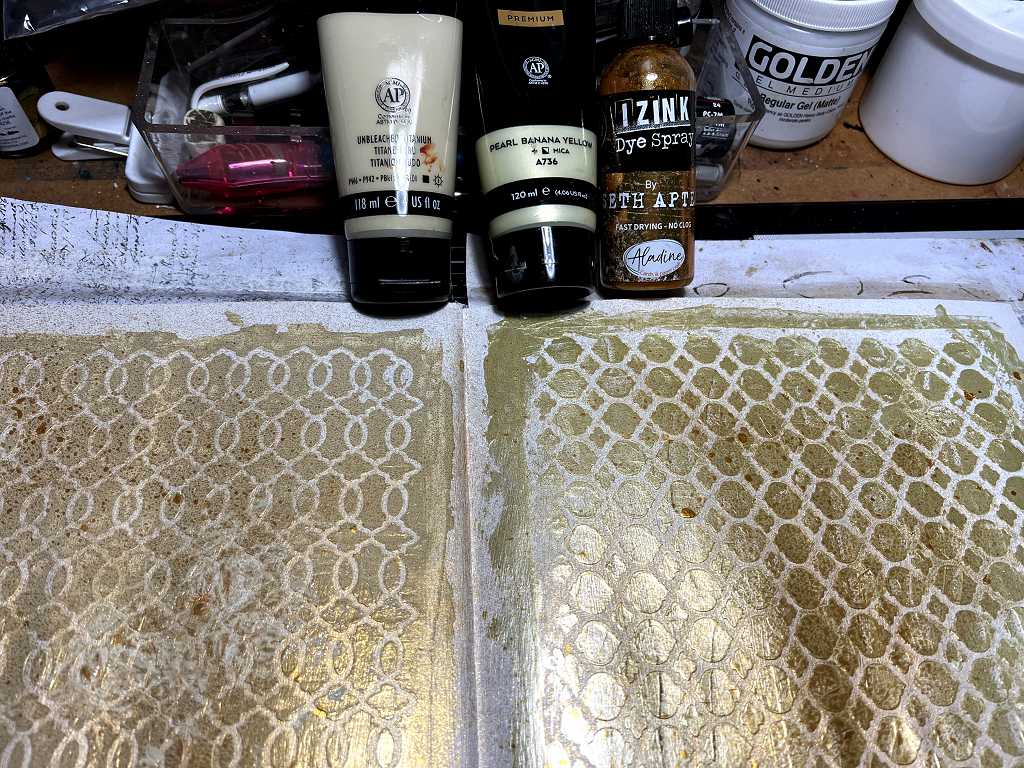
I used a card to spread unbleached titanium acrylic paint through the stencil on the left-hand page. I love this colour.
For the right-hand page I used another favourite acrylic paint: Arteza’s Pearl Banana Yellow. This is gorgeous – really metallic and shimmery.
Stencilling on some scrapbook paper
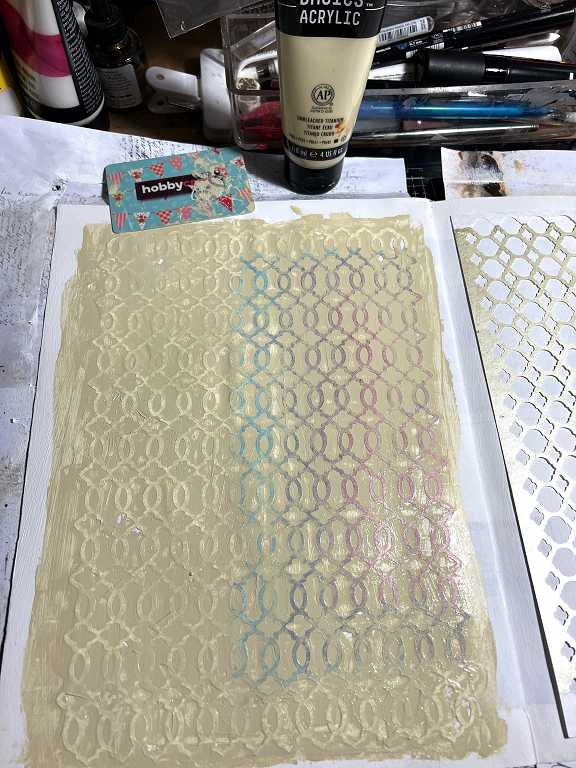
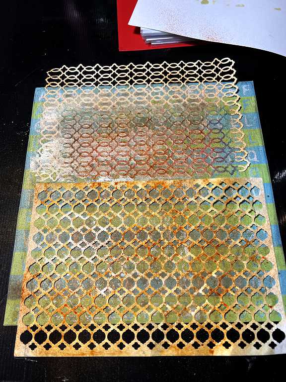
While I had the stencils out, I decided to use them on some of the remaining sheets of that grotty 12 x 12 pad of scrapbooking paper that has been the bain of my life for so many years! Most of the pages were horrible and all of them have a nasty slightly waxy surface which doesn’t take ink very well. I used a lot of it when I made an album about Mum and a decorated box to keep it in, but there are some remaining pages, some of which I am making into paper beads.
Both stencils laid on the sheet.
I had a bit of paint left over from the book page so I used that, and also sprayed some Seth Apter Izink in Honey through the stencils.
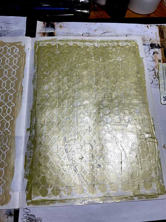
Unfortunately I left the stencils in contact with the paper for too long, and when I pulled them off, the paper was damaged. The surface of it is awful so I wasn’t really surprised.
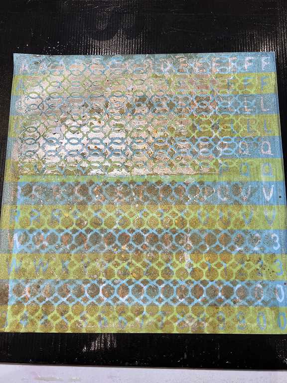
I added some Izink Gold Mine spray.
A close-up of the damaged area. I shall still use most of this paper, I am sure. It’s quite shimmery.
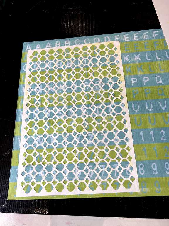
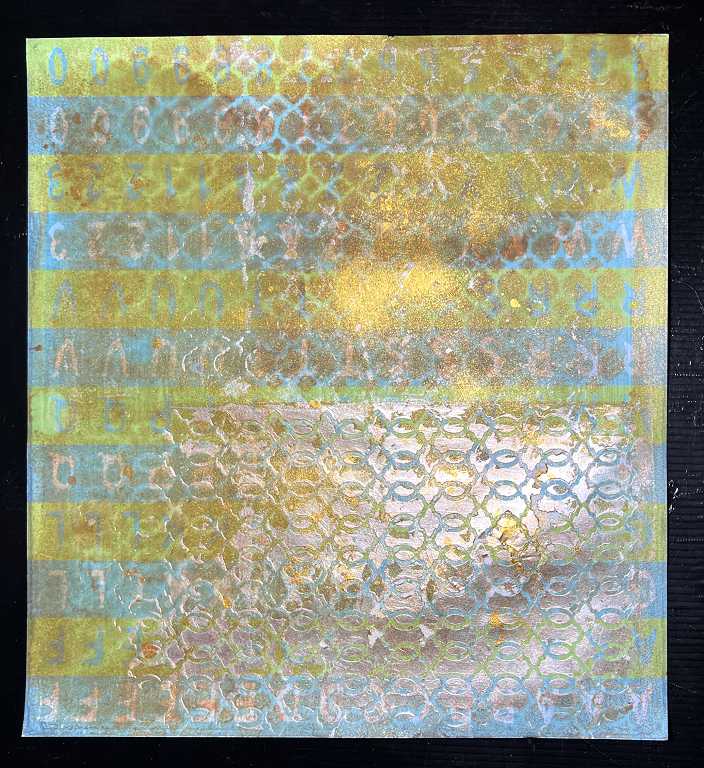
This is the second sheet from that 12 x 12 pad. Again I used Izink sprays and added some blots.
Back to the altered book
After that little digression, a return to the job at hand.
The page spread with the stencils removed. The edges turned out pretty messy and in need of some tidying up.

I added some Gold Mine Izink spray for added shimmer and richness on both pages.
The completed backgrounds with the edges tidied up a bit with some white acrylic paint.
A bit of a leap forward now, to last weekend.
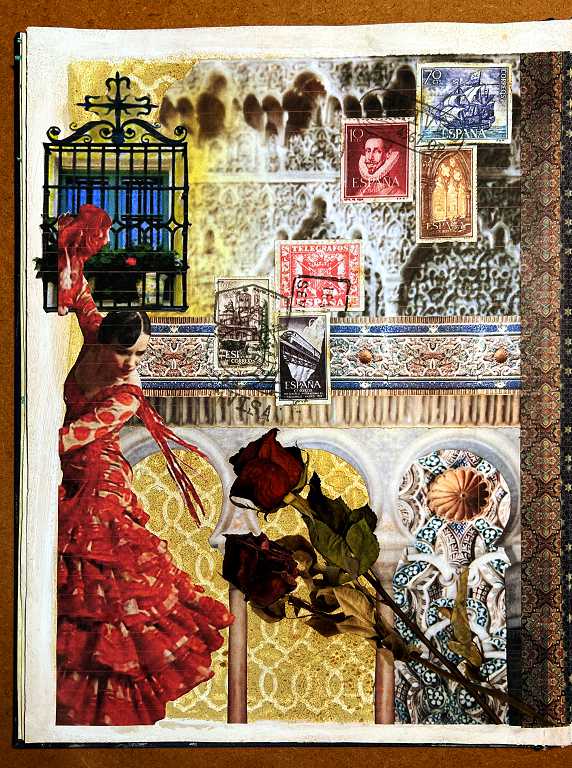
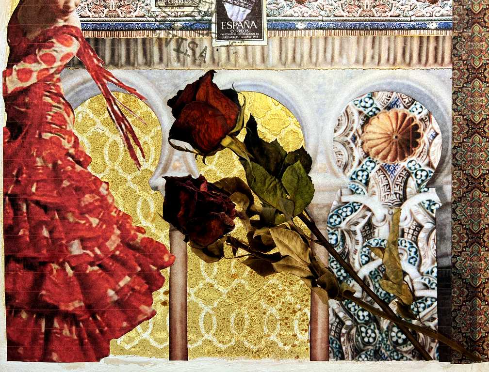
The left-hand page, on Spain, is pretty much completed in this photo.
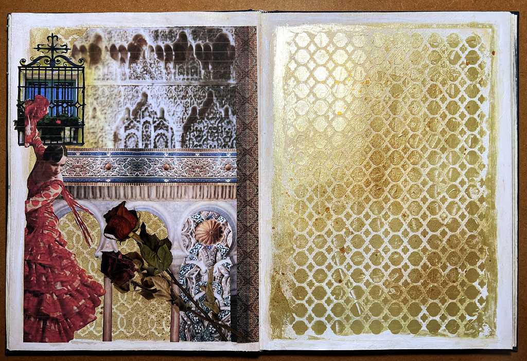
The collage consists of a mixture of my own photos and some free downloadable images. The plasterwork at the top was an edited photo of my own. The border across the middle was created from a small section of decorative tile work that I photographed, and edited to form a repeating pattern. The border underneath with the corrugated effect is an enlargement of the border on this piece. The roses are from the “dried flowers” collection that I recently purchased from Taperlogy – these stick-ons are absolutely fabulous – really large, and very realistic. The only problem with them is that it is extremely difficult to peel the backing sheet off, in order to expose the sticky surface! I was tearing my hair over this…
The completion of the spread
I finished this today. The Moroccan themed page on the right consists almost entirely of downloaded images which were fussy cut and stuck down.
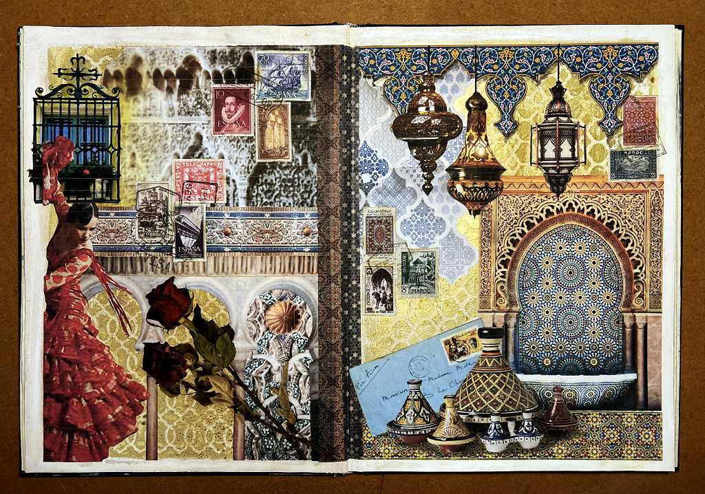
The larger blue tile pattern on the left was manipulated on the computer in order to make it less prominent. The top border was created from a single motif which I formed into a repeating pattern. I was originally going to use another tiled pattern to form part of the background:
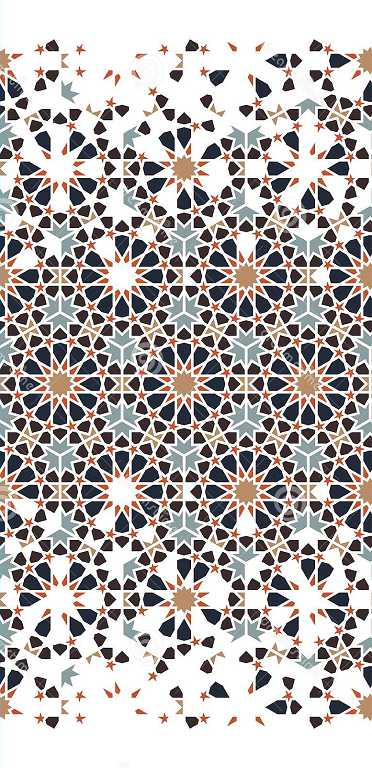
I had reduced the opacity and saturation of this, and spent some time fussy cutting the bottom edge to retain as much as possible of the “exploded” effect, but in the end I decided it was too busy, and anyway, what was the point of my creating a stencilled background for the page if I was just going to cover the whole thing up! So I abandoned that plan.
The completed Spain page
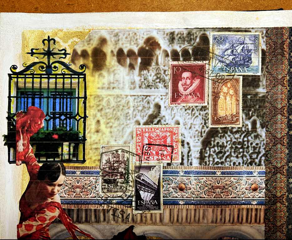
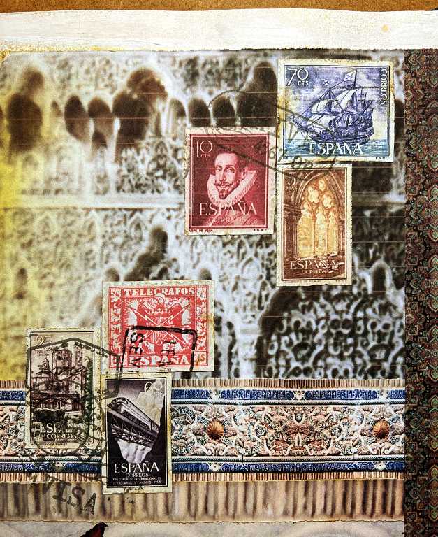
I added some postage stamp images that I’d downloaded and printed, and stamped some postmarks on them, in order to continue the mail art/travel theme of the book.
When I cut out the postage stamps, I used a distressing tool to roughen the edges (they were far too small to use my fancy scissors to create the perforations), and inked the edges with some brown Distress Ink.
I also added some washi tape down the right-hand side, from the stash I got from Taperlogy recently.
The top half of the page.
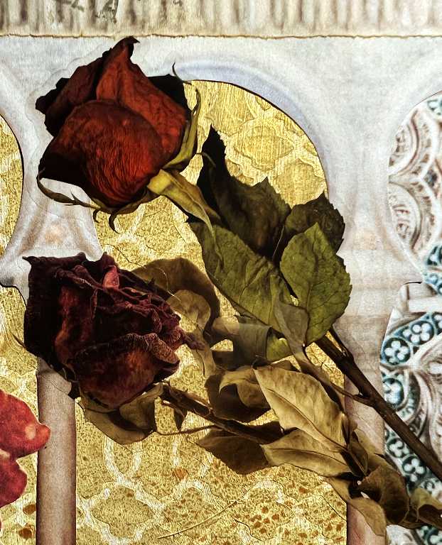
The bottom half, showing the rose stickers, and some of the original image showing through the right-hand arch, from which I created the repeating pattern border across the centre of the page.
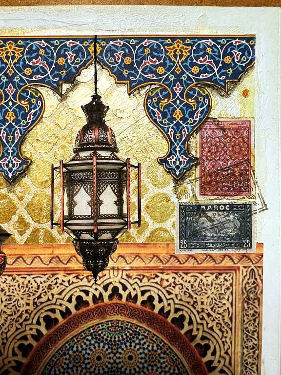
The top-right hand corner of the page, showing some of the postage stamps and the centre border in more detail.
The rose stickers. They really do look incredibly real!
The top right-hand corner, showing the cut-out of a typical Spanish window grille. I loved seeing these all over southern Spain, often adorned with pots of bright geraniums which made a lovely contrast with the black metalwork.
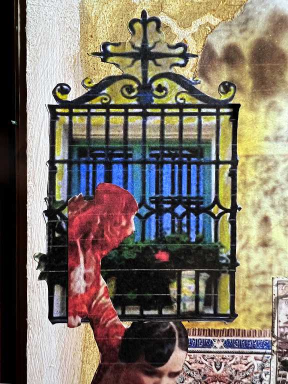
This was very difficult to fussy-cut and I couldn’t manage to do all the detail. I used Distress Inks to paint over where I wanted the background to show through. The colour is not exact but from a distance it’s not too bad. I was also a bit fed up with my wretched printer which tends to print thin white lines horizontally across images – it doesn’t do this all the time, and the problem is not remedied with the cleaning routine, unfortunately. They really only show in close-up so I’m not too bothered.
You can also see that I have used the Distress Inks to colour the edge of the print of my photo of the plasterwork, so that I could blend it gradually with the colour of the stencilled background.
The completed Morocco page
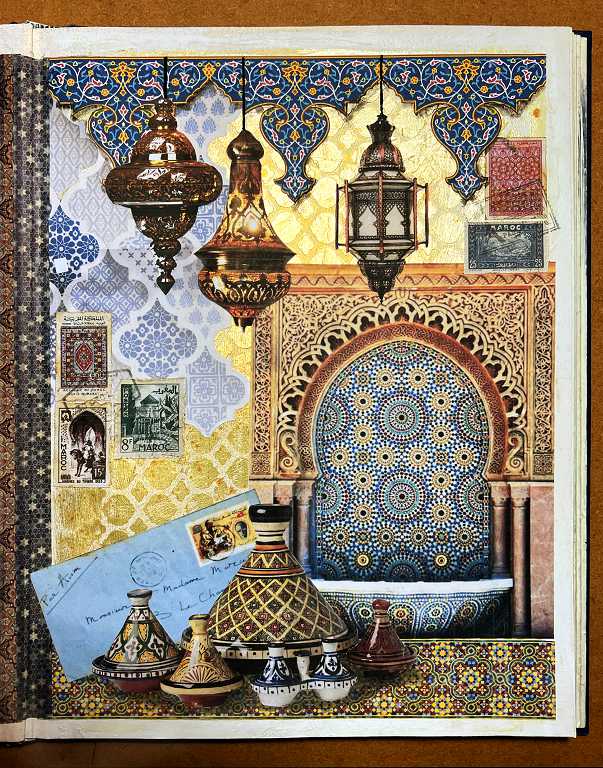
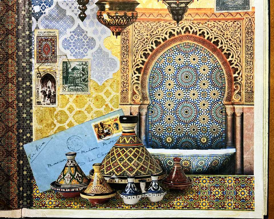
The mail-art theme was continued with the addition of some Moroccan postage stamp print-outs and an envelope with a Moroccan stamp, addressed to someone in France from French Morocco. I am particularly fond of Moroccan lamps and tagines which feature in this page. I am very glad I didn’t cover up my stencilled background.
Now for some detail.
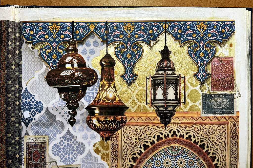
The top half of the page, showing the repeating border created from the single motifs, and the lamps. I added some shading to the stuck-down border in order to create the illusion of depth. The cables from which the fussy-cut lamps are suspended were drawn with a black Posca pen and a ruler. The lamp on the right was very fiddly to fussy-cut because of the metal framework surrounding it – it was very delicate and had to be handled with great care especially when applying the glue. (By the way, all of the images were stuck down using a Giotto glue stick – recommended by Robyn McClendon. This is very much more sticky than normal office-style glue sticks. I have discovered that if I stick down my ink-jet printed images with gel medium, the colour changes because of some kind of reaction with the ink.)
The bottom half of the page.
I wanted the blue envelope to look as if it was propped up behind the tagines.
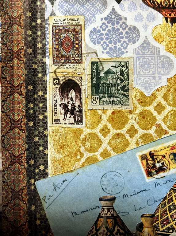
A detail shot of this part of the page, showing the second strip of washi tape from the Taperlogy collection that I added, and showing the postage stamps. I particularly love the one illustrating the carpet.
The top right-hand corner of the page, again showing the postage stamps, and the intricacy of the lamp. Those side pieces were incredibly difficult to cut!
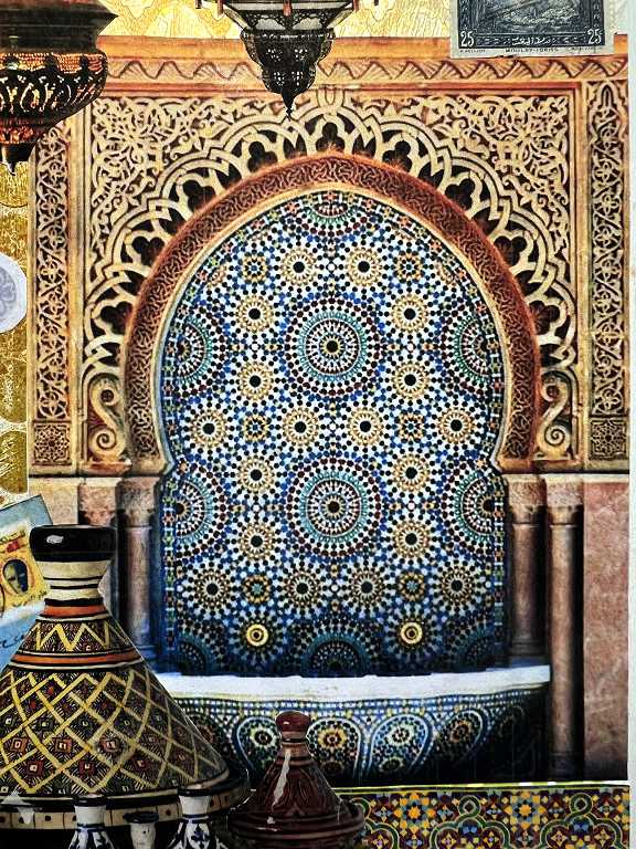
The bottom right of the page. This image was cut down from a larger one which showed three ritual washing fountains. I chose the centre one. The intricacy of the designs is very pleasing.
The tagines. I love these stylish ceramic serving dishes with their characteristic conical lids.
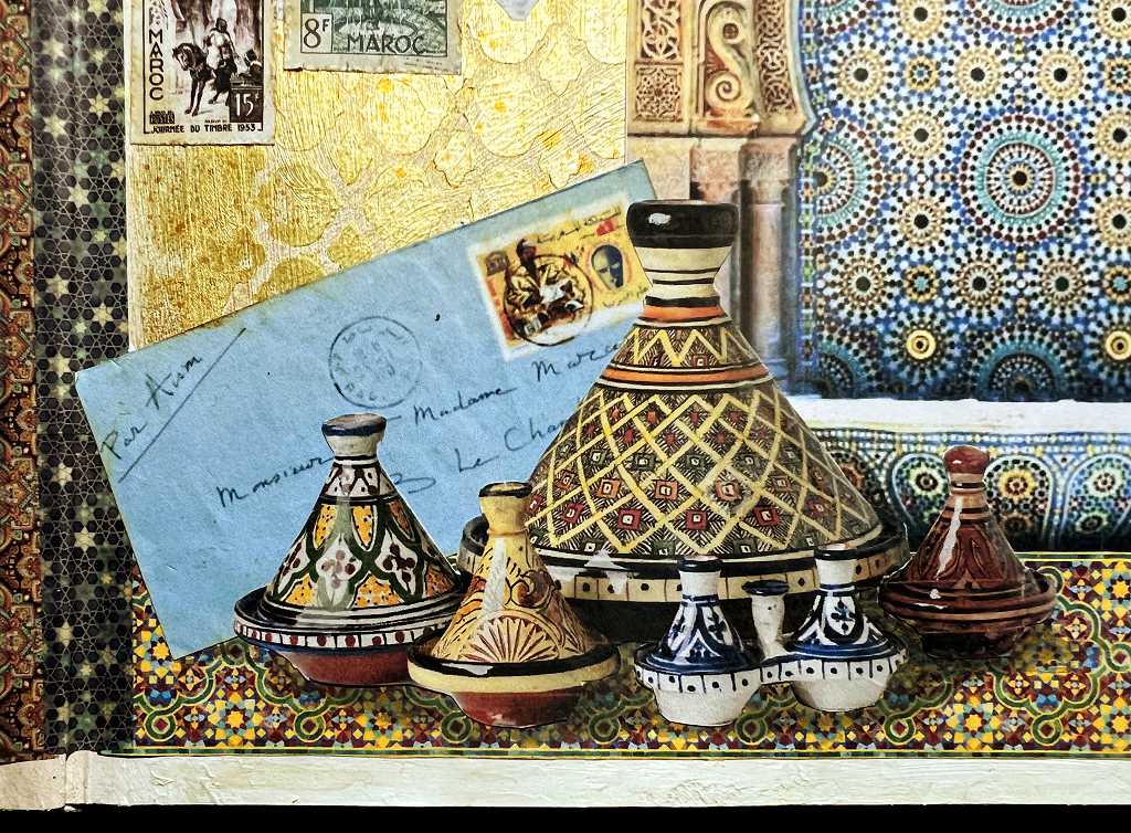
The image had printed shadows beneath the tagines but these didn’t look right when cut out, so I removed them, and added my own shadows, using watered down black acrylic paint.
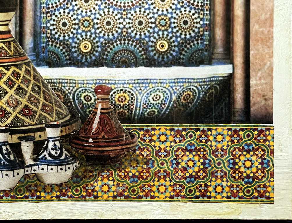
A detail shot of the border piece which I stuck down to create a surface on which the tagines could stand. Again, I created a repeating pattern from a shorter section, editing the image on the computer.
I hope I have captured something of the atmosphere and artistry of these two remarkable countries. Their designs and characteristic artefacts are something I have always admired, and it’s nice to make a rich montage from them for my travel book.
A final look at the completed spread.
Love the Morocco page.