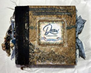
DRAW AWESOME ALBUM PART 4 – END PAPERS, COVER BOARDS AND TITLES
End papers
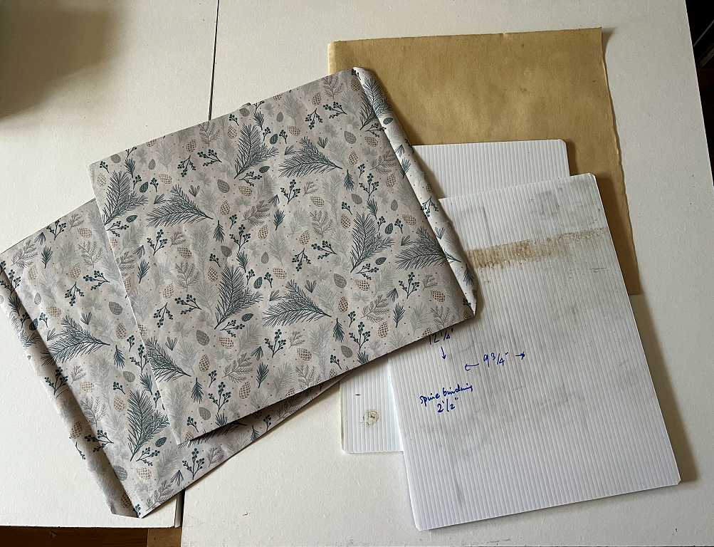
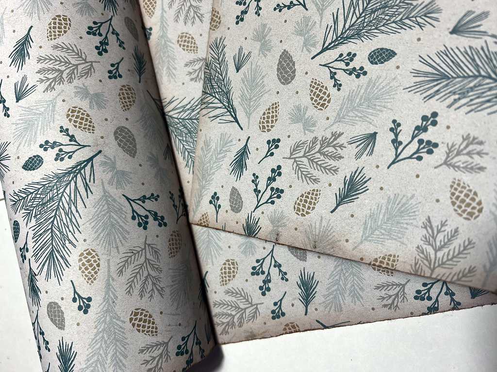
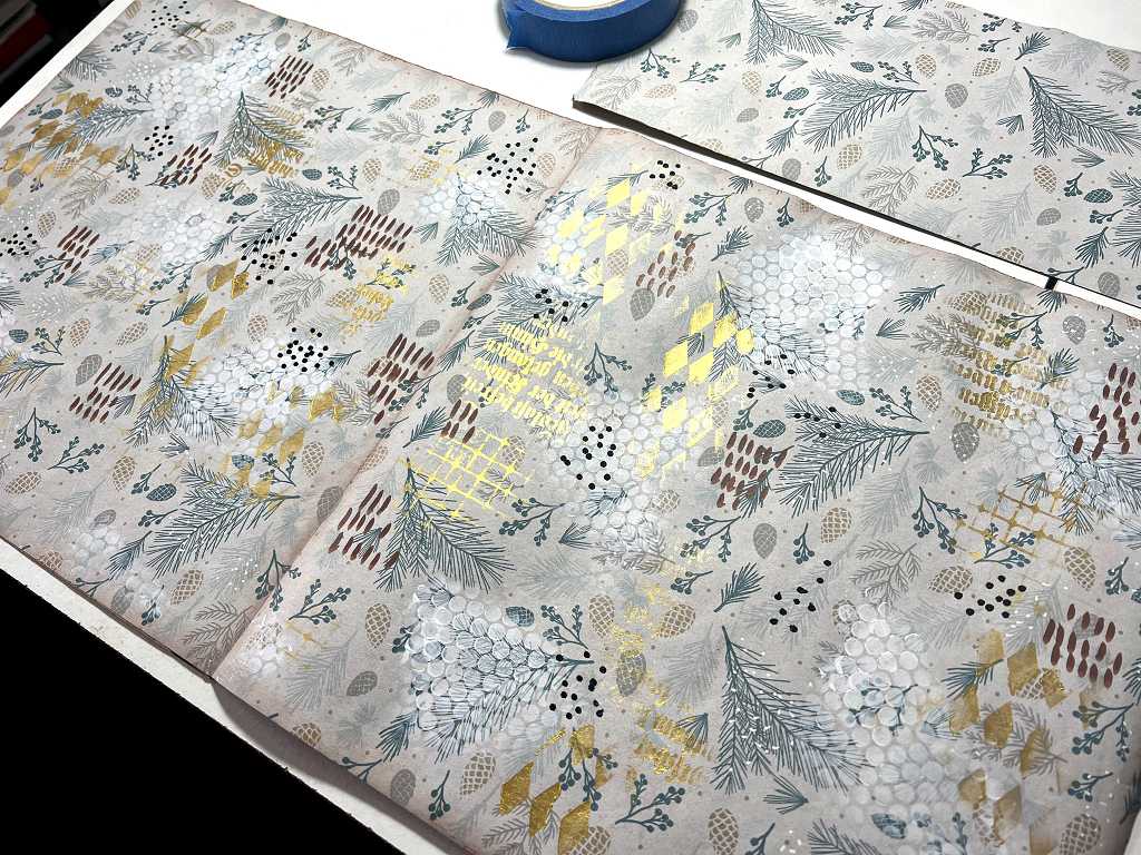
These are the papers which line the inside of the cover and back the first and last pages of the book. The pages of this book are 12 x 12 inches and I needed large enough paper. My hubby had bought a roll of this attractive gift-wrap for my birthday present, and he gave me the rest of the roll. It was a pain to work with because it wouldn’t lie flat but kept rolling up, but eventually I managed to measure and cut it, holding it down with various weighty boxes and other objects.
The paper itself is good quality gift-wrap, but a bit too flimsy for my purpose, so I cut a piece the height of the pages and three times the width, plus 3/4 in to act as the tab to attach to the binding. I folded it into three, accordion style, and glued two of these pieces together. I would therefore be able to attach the left-hand piece onto the inside of the front cover, and the doubled-over piece would act as the right-hand end-paper, with its tab inserted into the binding.
This procedure was followed for the end-papers at the back of the book. I noticed in time that the design on the paper has a definite right way up, so the first end paper I made had to be for the back of the book.
To give them a more vintage look, I inked around every edge of the end papers with Tea Dye Distress Ink.
Embellishing the end papers
To make this my own, and to add some interest and texture to the end papers, I added some stencilling and mark making. This was tremendous fun to do, and I am very pleased with the result.
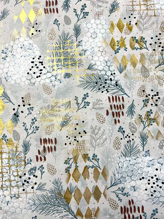
Today in the post I received the bottle of Kuretake Gold Mica Paste which I’d ordered. I’ve seen Denise Love using this and it is absolutely fabulous for stencilling. It is a nice bright metallic gold and is thick enough to apply with a blending brush, adding golden accents where required on a background.
I made a small test piece first, to make sure I wasn’t going to ruin the end papers with a whole lot of arbitrary mark making!
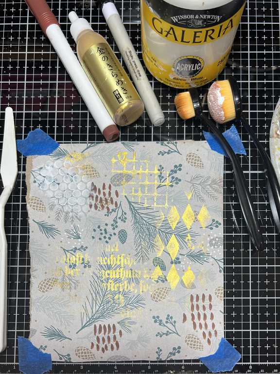
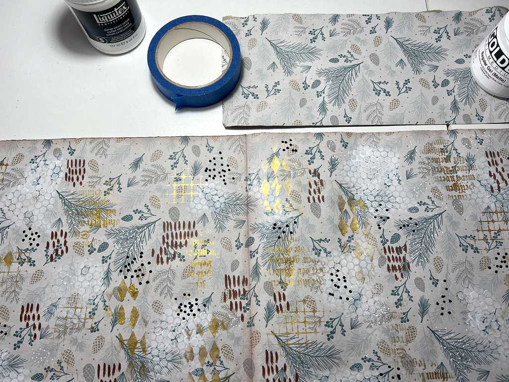
I used the gold mica paste with three different stencils. The areas of soft white circles were done with white acrylic paint through a piece of punchinella. Mark making was added with various acrylic markers – brush strokes and dots, including some larger black dots on the end papers, done with a large bullet-tipped Posca marker. I’ve left a scrap of the original gift wrap paper in the shot so you can compare the difference.
Some further more detailed shots of the end papers.
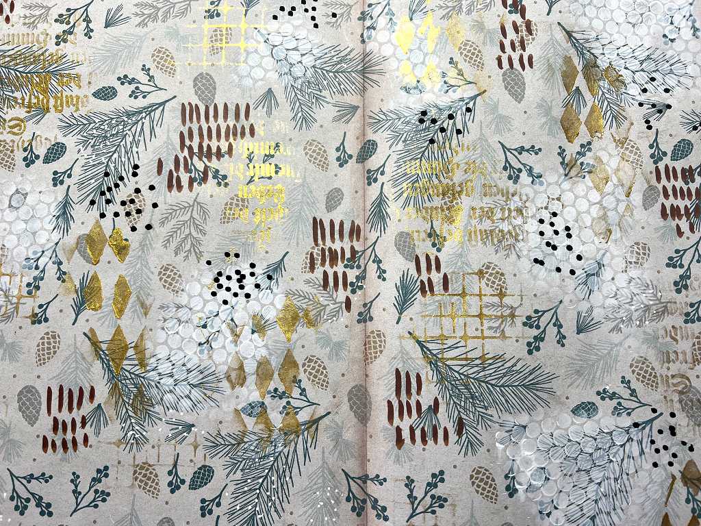
Getting the angle of the shot correct really brings out some of the gold.
Title page
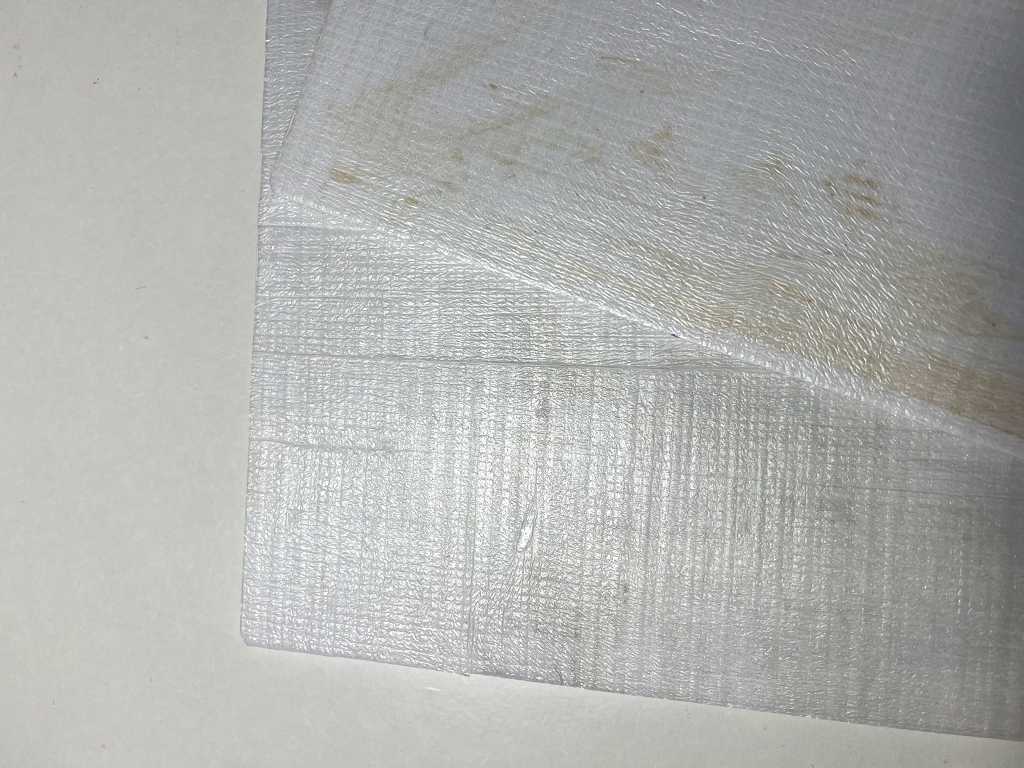
I cut a piece 12 x 12 in, the same size as the pages, plus a 3/4-in tab to go into the binding. I chose a piece off a roll of what looks like wallpaper lining paper. It’s very old and has genuine age spots on it. I was unsure how porous it would be so I painted on a couple of coats of Golden Satin Glazing Liquid to seal it, in readiness for adding the title. Its tab will be glued to the tab of the end paper and they will be inserted together into the binding and glued in place.
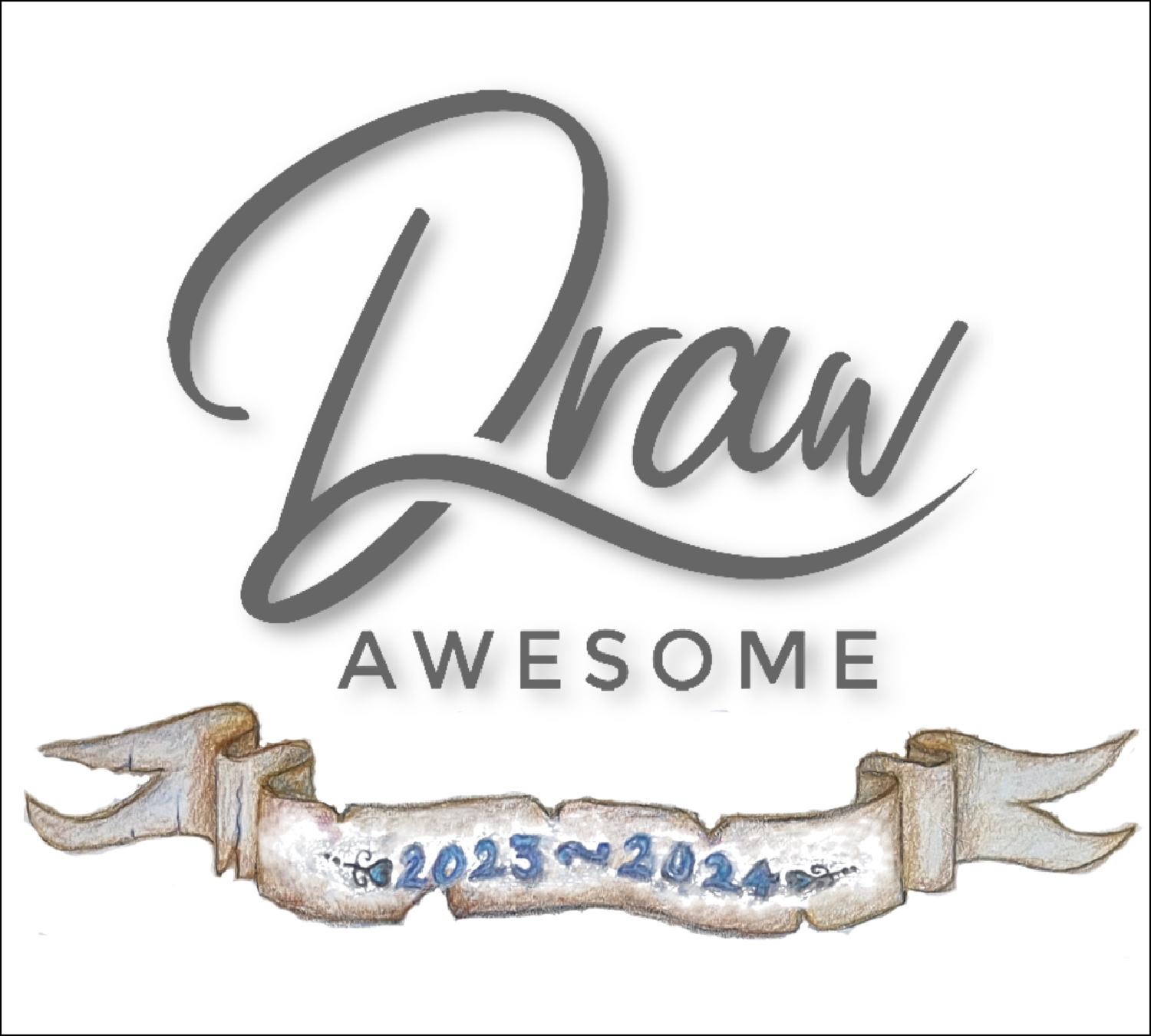
I had some fun and games adding the text to the title page. On the previous day I spent some considerable time on the computer, creating a digital image of the DrawAwesome logo and the scroll with the dates. I have a HP colour laser printer and sometimes it is an absolute pain to use – it’s hyper complicated and seems to have a mind of its own. I set the measurements for the design so they would fit comfortably on the 12 x 12 in title page and printed it out. It came out much too large. When I tried again, I got “Error. The image could not be printed.” I hate those messages – it would be really nice to know why the image couldn’t be printed. I tried everything, even restarting both the computer and the printer, and the result was the same. The only format this printer seems to be happy printing is pdf, so I opened it in my desktop publisher which is capable of exporting to pdf, and all was well.
In order to get this onto the title page, I decided the best method would be tracing. The title page itself is too large to fit in the printer, and anyway I don’t think the printer would take this paper, especially as it has already been coated with acrylic medium. Being relatively thick and darker than white, I couold not use my light panel to trace. My new white transfer paper didn’t show up, either. I began scribbling on the back with a 3B pencil, anticipating a tracing in the normal way, until I remembered an email I had received earlier in the day. This was the regular Graphics Fairy free version newsletter, which always includes a couple of tutorials, and in this one, there was a tutorial on how to transfer a laser printed image onto your art work using a liquid acrylic medium. I clicked the link for this, to see exactly what they recommended, but the link was dead. They specified “liquid matte medium,” and the only one I had which fitted the descripton was Golden Satin Glazing Liquid, which I had already used to prime the page.
I marked where I wanted the image to be placed, and proceeed to paint the medium within this area. I had to re-print the image as a mirror image or it would have come out back to front. I laid it down on the wet medium and burnished it with a plastic card, squeezing out the excess medium and mopping up as I went. I left it for the recommended two minutes and then peeled back the paper to see how it was getting on. Some of it had been transferred, so I put the paper back and did some more burnishing and left it again.
When I came back to it, it was pretty much dry, so I removed the paper. Quite a lot of the printer toner had remained on the paper, but there was enough on the title page for me to trace over the lines and paint it. As instructed, I removed any remaining paper fibres from the sheet by rubbing with a dry finger.
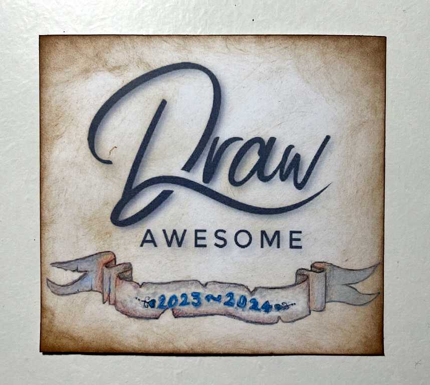
To paint the image, I used a combination of my new ArtGraf Tailor Shapes, and filled the dates with indigo Kuretake watercolour. Here is the result. I also emphasised the two edges of the fine square outline with more paint, following the direction of the drop shadows in the image. We did this with one of our final pieces on the DrawAwesome course, and it looks as if it is a separate piece of paper of the same colour, laid on top of the background. I really like this illusion.
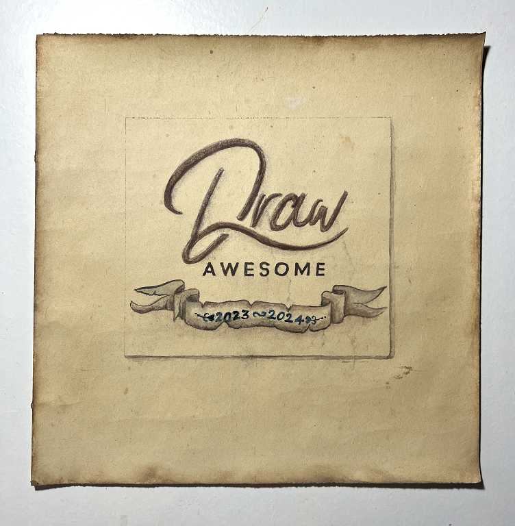
Here’s a detail shot of the title. The numbers are actually indigo blue and not black, but it is hard to get the colours exactly right when photographing stuff like this.
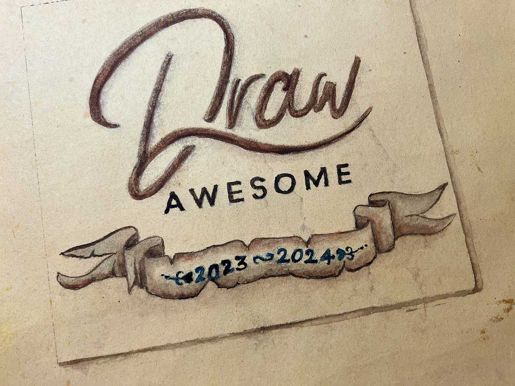
I inked around the edge of the whole page with Distress Ink to age it, and I really like its somewhat crinkly appearance and the genuine age spots.
The cover
I originally planned a soft cover for this book, but eventually decided on something rigid as the pages themselves are stiff.
When we moved house, the estate agents dealing with its sale to us were having a brand change. This involved making an entire new set of “for sale” boards with their new logo. When we went to pick up the keys, I saw a stack of the old boards at the back of the shop, and asked what they were going to do with them. They told us they would be dumping them. I asked if I could have a few, and they readily handed them over. They are made of lightweight corrugated plastic. They are a bit difficult to cut but eventually I managed, with the aid of my extra-long metal ruler and Stanley knife with a nice new sharp blade.
I have cut two pieces, 12 1/4 in high and 9 3/4 in wide. This will make the cover 1/8 in larger top and bottom than the pages, and 1/8 in wider than the fore-edges of the pages. The flexible spine binding will extend onto the front and back of the book by 2 1/2 in and will but against the cover panels. These will all be backed with a 12 1/4 x 12 1/8 in piece of cardstock, for front and back of the book, for stability.
To soften the cover panels slightly, I covered them with a thin piece of plastic packaging foam. After glueing it down and squeegee-ing out any air bubbles with a large plastic card, I trimmed away the excess close to the edges of the boards.
At this stage the final design of the front cover is undecided, apart from a smaller version of the DrawAwesome logo and dates that appear on the title page inside.
I managed to print this out without difficulty once I’d converted it to a pdf. It looked very stark and white on the white 160 gsm card I printed it on, so I inked the background to age it. Apart from this, I did not need to add any further colour.
The covering will wrap around all the sides of the cover panel and will be covered by the end-paper inside. If I decide to add some sort of closure to the book, this would have to be added before the backing cardstock was added if I wanted the attachment of the closure hidden, or applied to the surface of the cover otherwise. One has to think ahead when constructing the cover so that everything appears as it should when the book is complete.
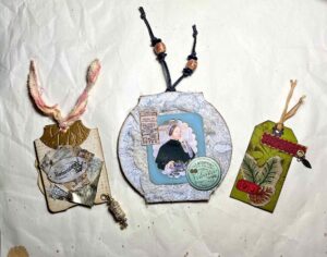
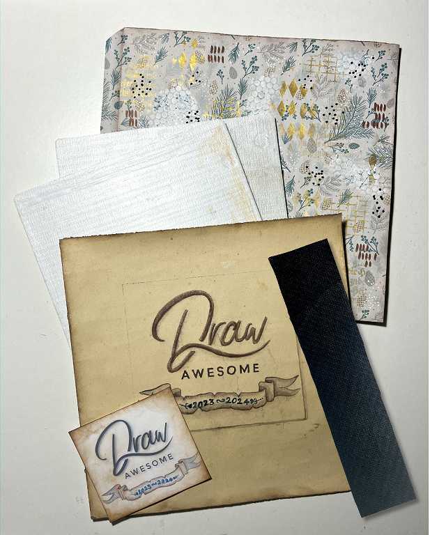
Here is the total work done in this session.
The curved spine of the cover will not be attached to the spine of the book itself, but should float free above it. The book should lie flat when opened. Before I attach it, I may add an eyelet at the top if I decide to add a detachable embellishment as a finishing touch.
The next step is to insert the tabs of the end papers and the title page into the final open slit between the pages at the beginning and end of the book, and then glue the reinforcing strip of roofing felt onto the hidden hinge binding. Then I shall need to “cover the cover” and embellish it, and maybe add a closure.