Venetian plaster/Fortuny-like backgrounds
This is an attempt to follow what Robyn McClendon has been doing as a development of her passion for old walls. You can see the video here.
I absolutely fell in love with this technique and the beautiful result and knew I just had to do it. The problem is, very often products in the USA are not readily available to us here in the UK, and if you can get them, the shipping is so ridiculously high as to make the whole venture untenable. In this case, the product is Patti Pockets Stainz, and the shipping cost was utterly ridiculous, and although I may have enough cash to pay it, it goes completely against the grain to fund a postal service that must be making an absolute mint out of this level of exploitation! After all, I have managed to buy US products on Ebay with free postage, and the price of the product hasn’t been unduly high to cover this. (Rant over.)
I have no idea what this product is made of. It looks a bit gloopy and gel-like, and I knew I had something in the house that it looked just like, but at the time I couldn’t think what it was. Robyn did go on to show, later in her video, how you can get a similar but slightly different effect, with inks alone, and this is what I decided to try. A couple of posts ago I showed a failed experiment using emulsion paint to create the initial background, and while this may have done the trick in producing this effect, I didn’t like how it behaved on the plate and I was afraid of causing damage, so I abandoned that idea.
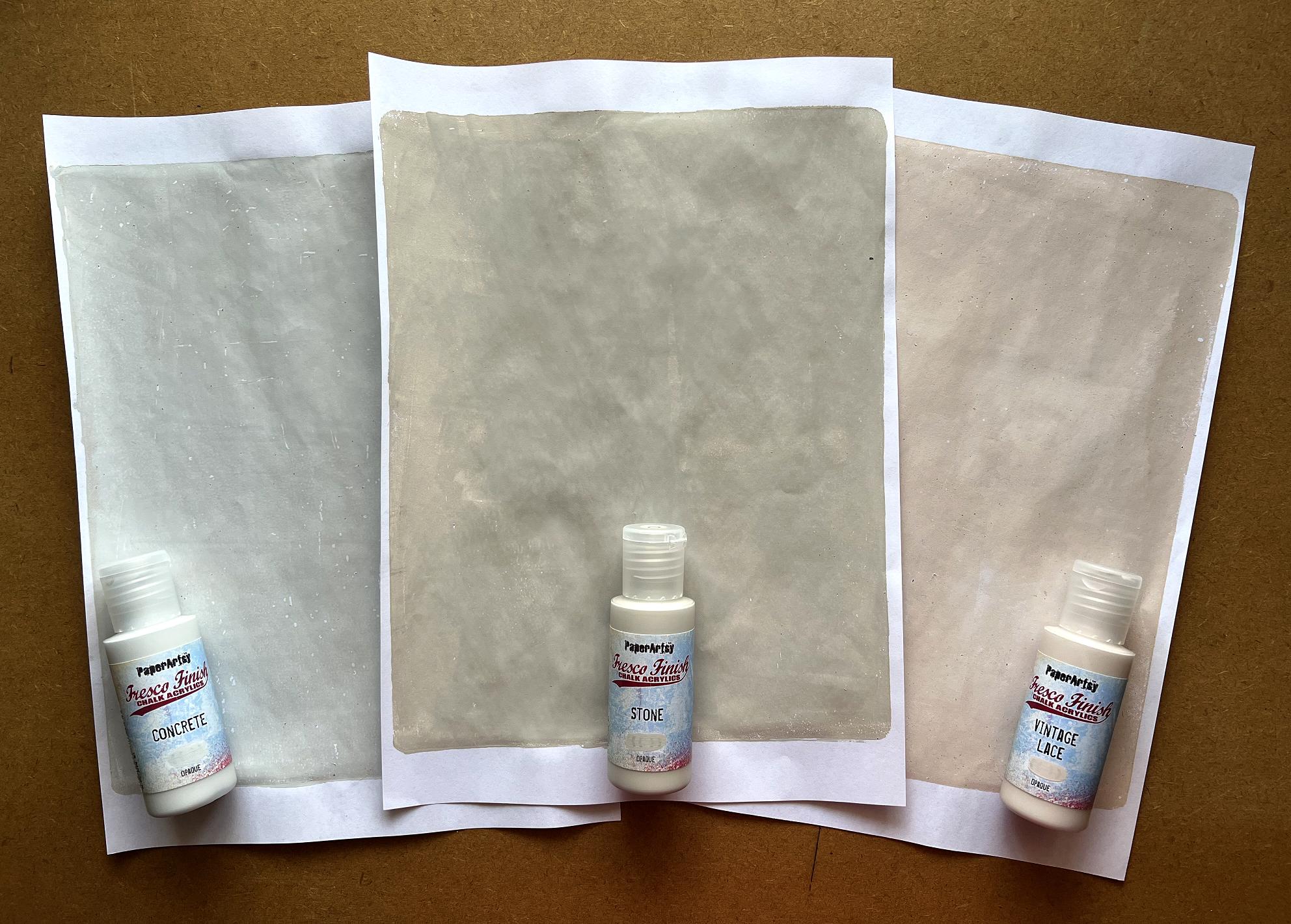
I hadn’t got any matt acrylic paint, and this, or chalk paint, is what is required for the technique because it absorbs the ink you add afterwards. I had a terrible job tracking down anything decent. I’ve followed various people over the years who use PaperArtsy paint which is a completely matt, chalky paint and comes in a vast range of gorgeous colours. I decided to get half a dozen in earthy natural and pastel colours, and then had another terrible job trying to find a site that actually stocked the colours I wanted! I eventually found a lovely online shop called Loobi Crafts, run by two ladies, and they stock a whole range of goodies for mixed media art, including almost the complete range of the PaperArtsy Fresco paints, so I ordered them. These two ladies were absolutely charming to deal with and sent such a sweet confirmation-of-order email, and when the parcel arrived, they’d slipped in a little bar of chocolate!
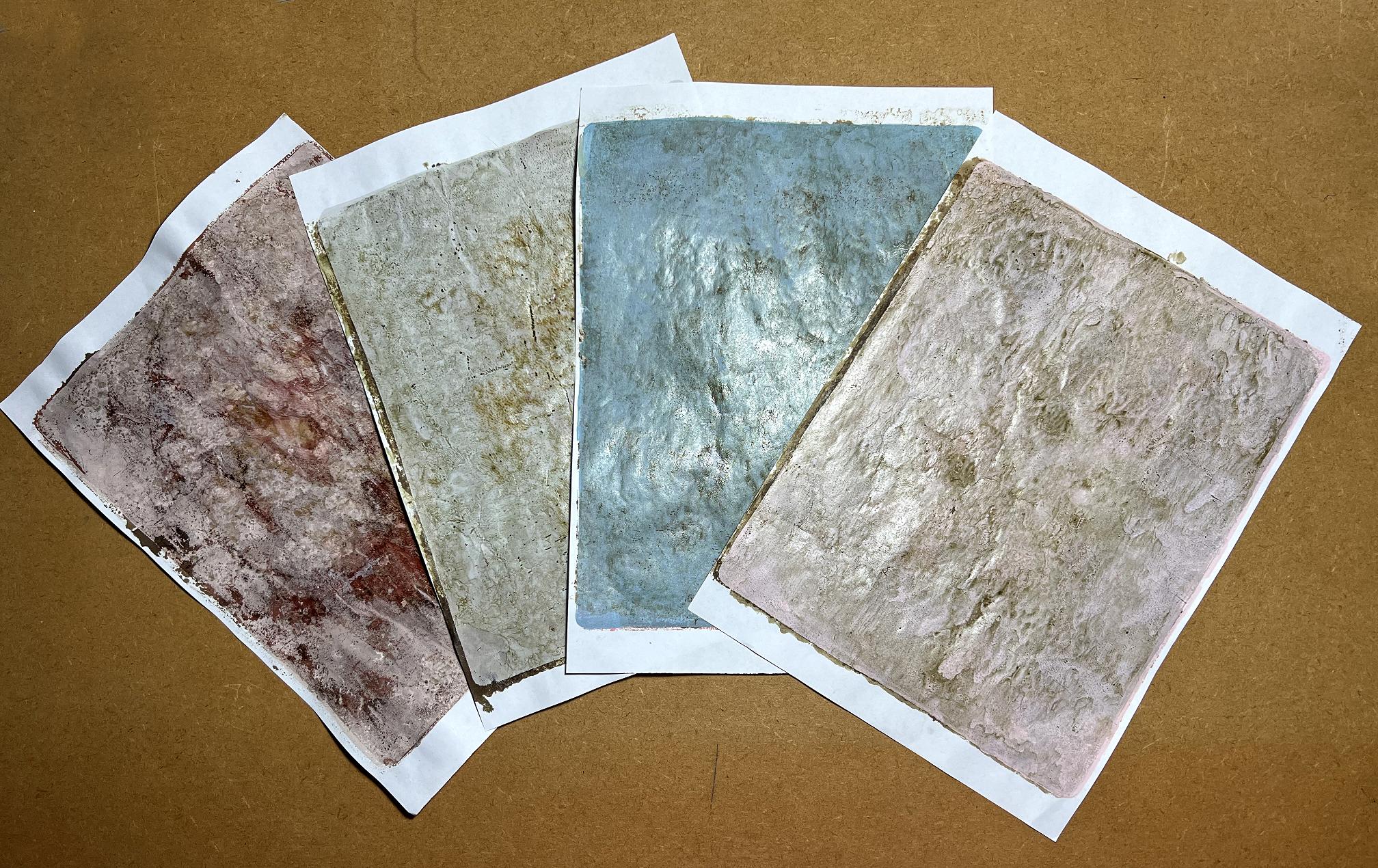
The paints are utterly gorgeous, as I knew they would be. I began by creating a background with each of the six colours. Here are the naturals.
These are the three pastel shades I chose.
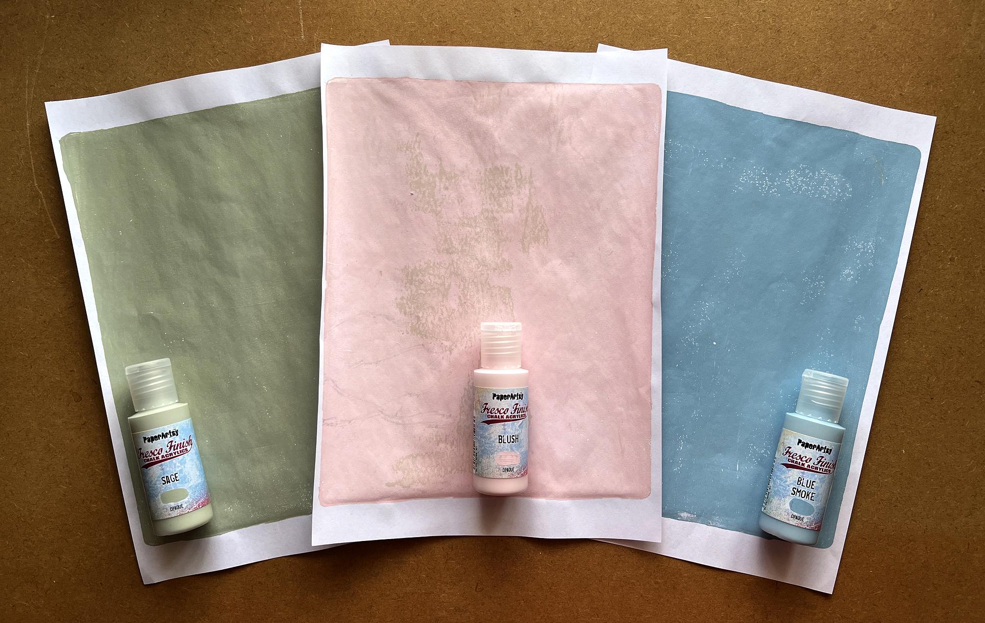
I have recently become quite fond of pink, which has surprised me. I don’t like it in a pretty-pretty kind of way, but it tones in very well with the palette that it attracting me very much at the moment – the browns and greys and golds with touches of rusty red – all the colours I am using in my Organic Journal. It is a good foil for the stronger colours and adds warmth.
I bought a couple of other pinks recently – the Arteza Playful Pink which is part of their iridescent range, and Windsor and Newton’s Peach Pink (called Portrait Pink in the USA) which Robyn McClendon is always recommending. All these pinks, including the PaperArtsy Fresco Blush, are subtle and go well with many different palettes.
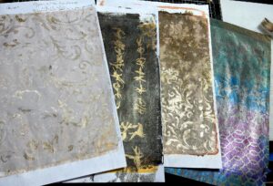
Here is my first attempt at the new technique. I sprayed Frayed Burlap Distress Spray Stain onto the plate and smooshed it around with the brayer – it immediately beads up – and pulled the print, and the ink seemed to vanish completely! I obviously didn’t put enough on.
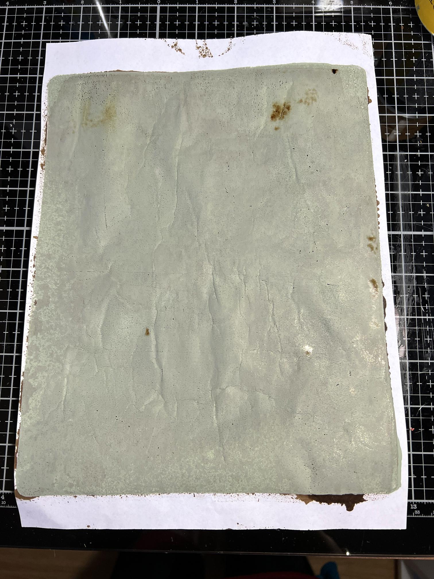
This was my next attempt, adding a lot more ink. Throughout the experiment I used various spray inks. It all soaked right through to the back and while quite a lot remains on the front side, it is clumped up and not producing that gorgeous mottled effect I was after.
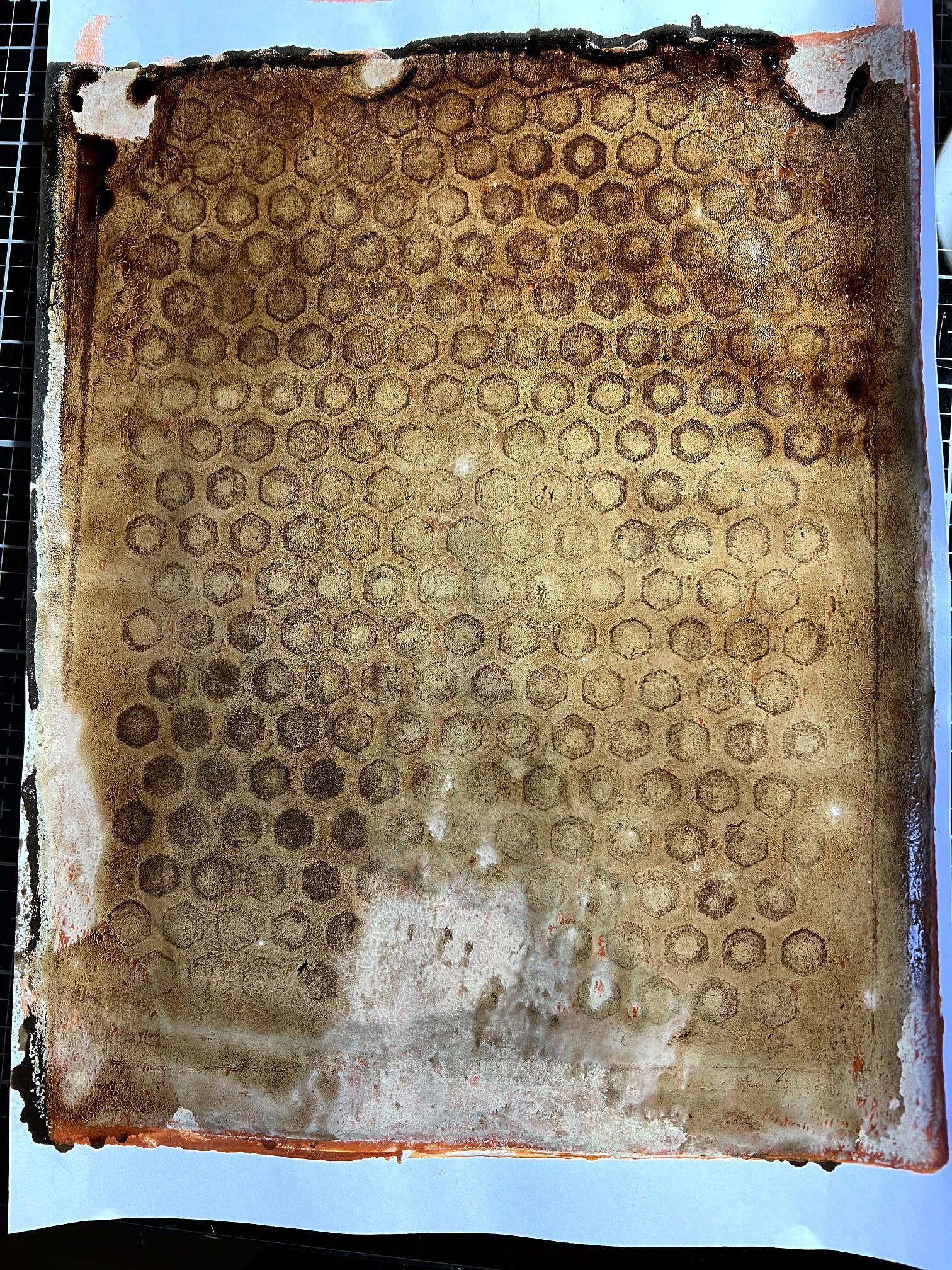
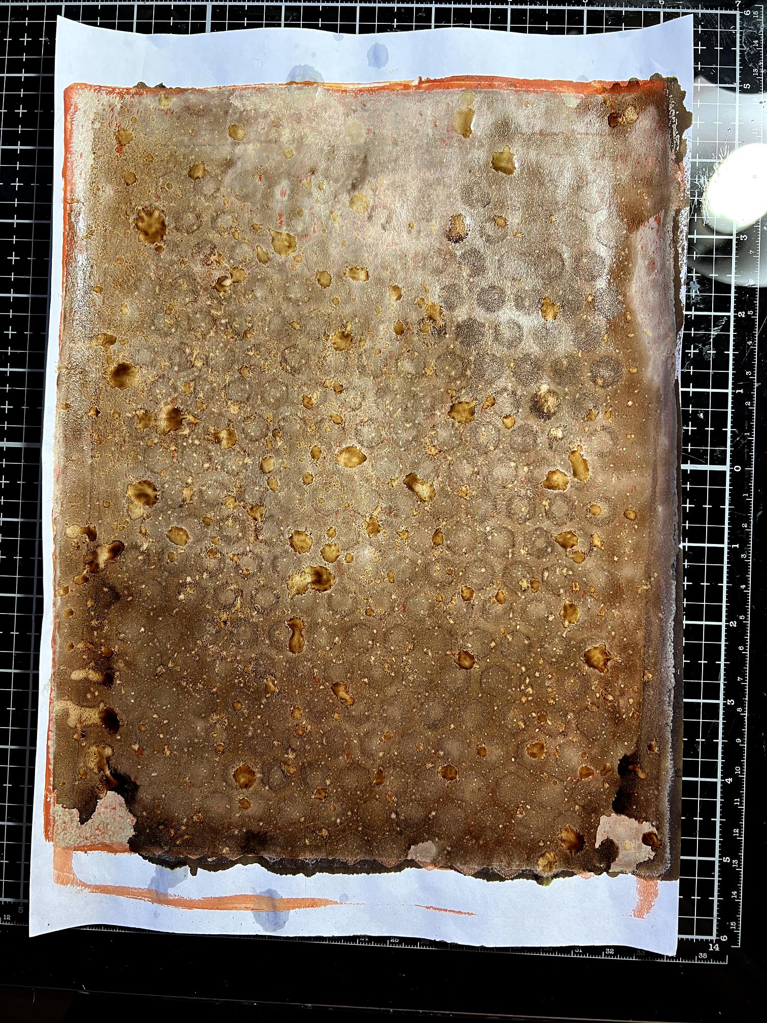
Just to see what would happen, and to compare the result with the matt acrylic, I tried the technique on one of my original gel prints which had been done with the honeycomb stencil. As expected, the ink all remained on the surface, giving a pretty much uniform coverage.
To add interest and texture, I added water spatters and let it sit for a few minutes…
and then blotted it off (blotting off paper beside it):
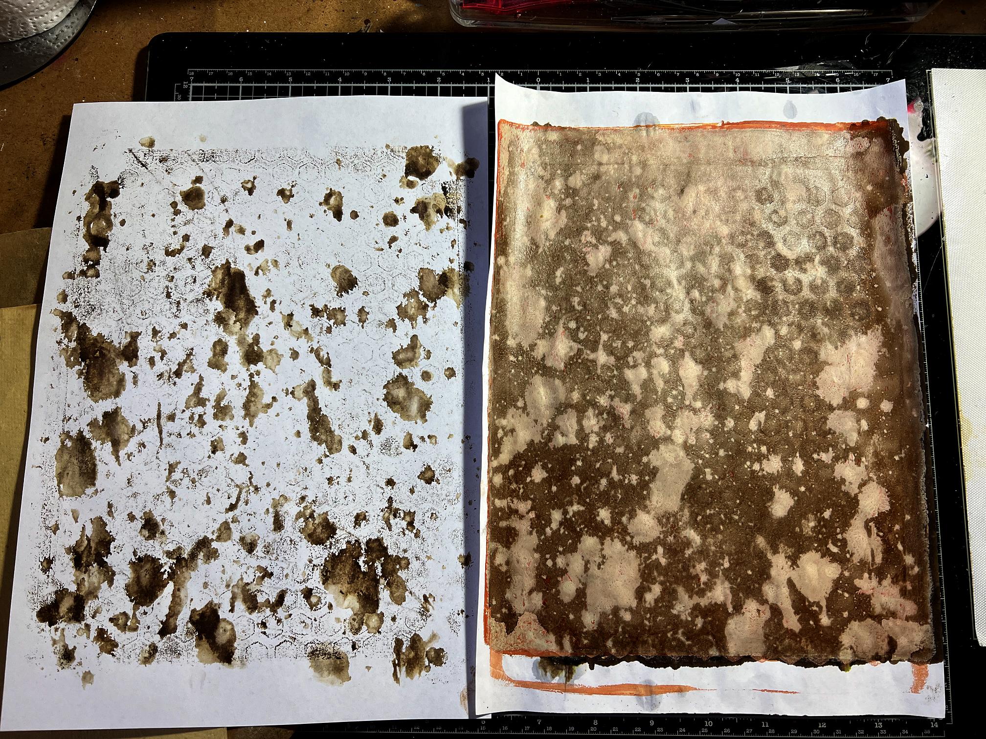
Quite an interesting effect. The blot-off sheet will be added to in due course and once there are enough layers and I am happy with it, it will be a usable sheet.
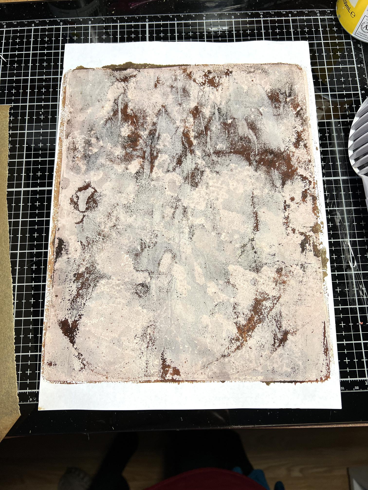
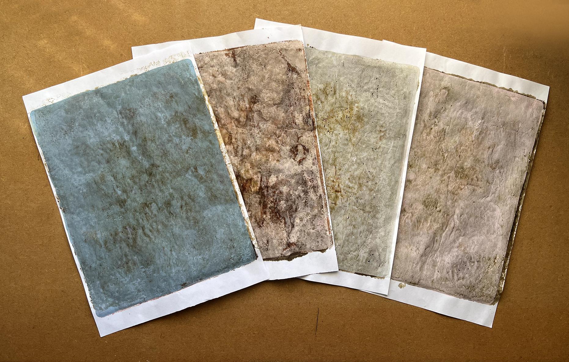
Another attempt at the technique. Again, just a slight darkening of the background, but with here-and-there a few patches approximating what I was looking for.
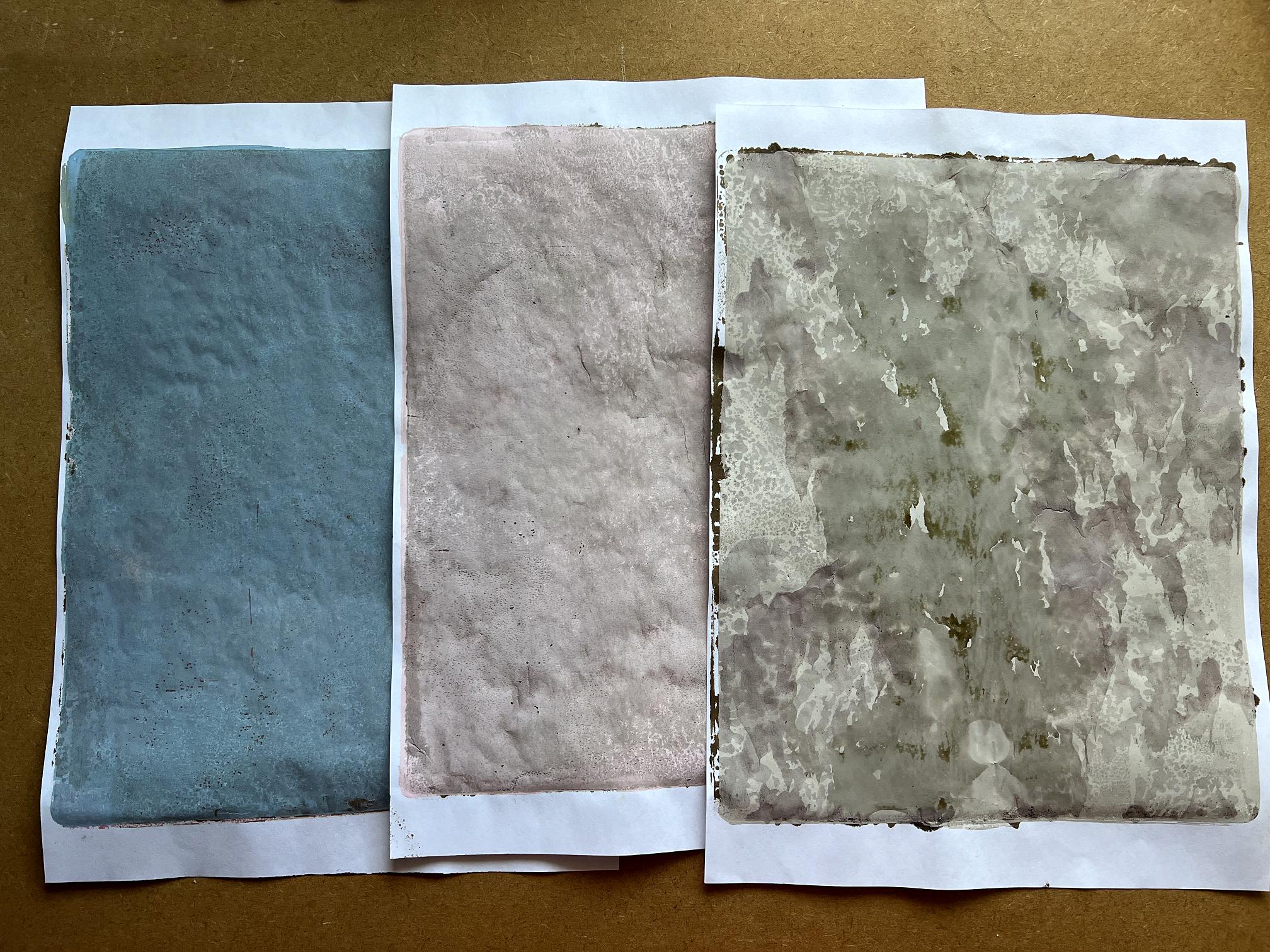
Some of my early attempts.
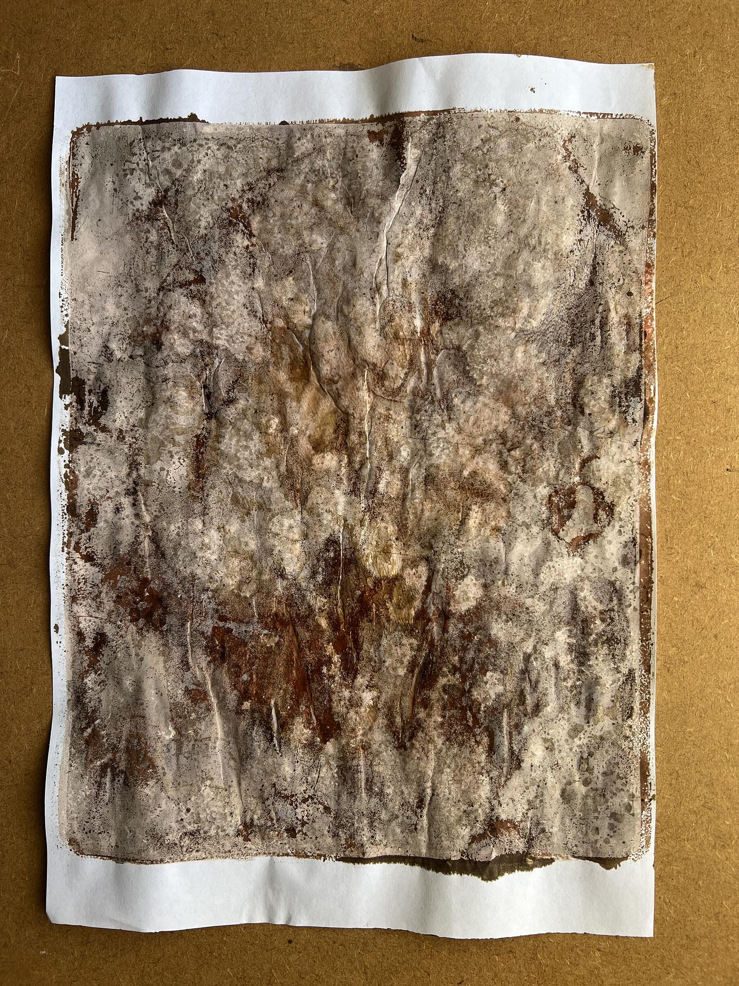
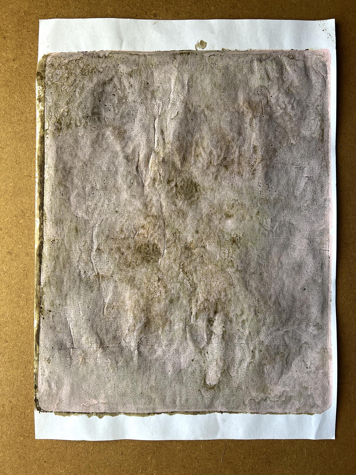
Adding further layers of ink. All this moisture caused the papers to buckle and wrinkle quite a bit.
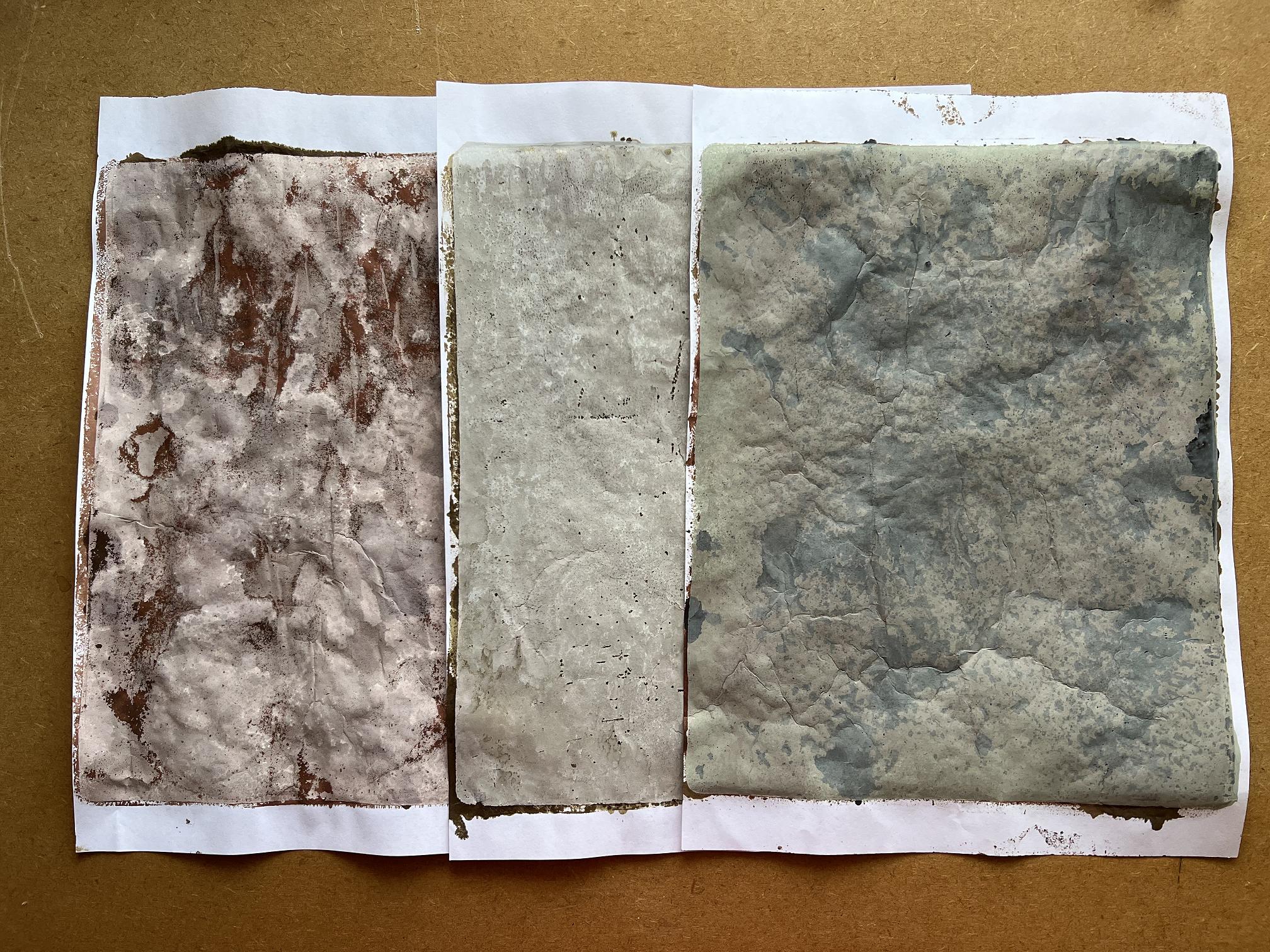
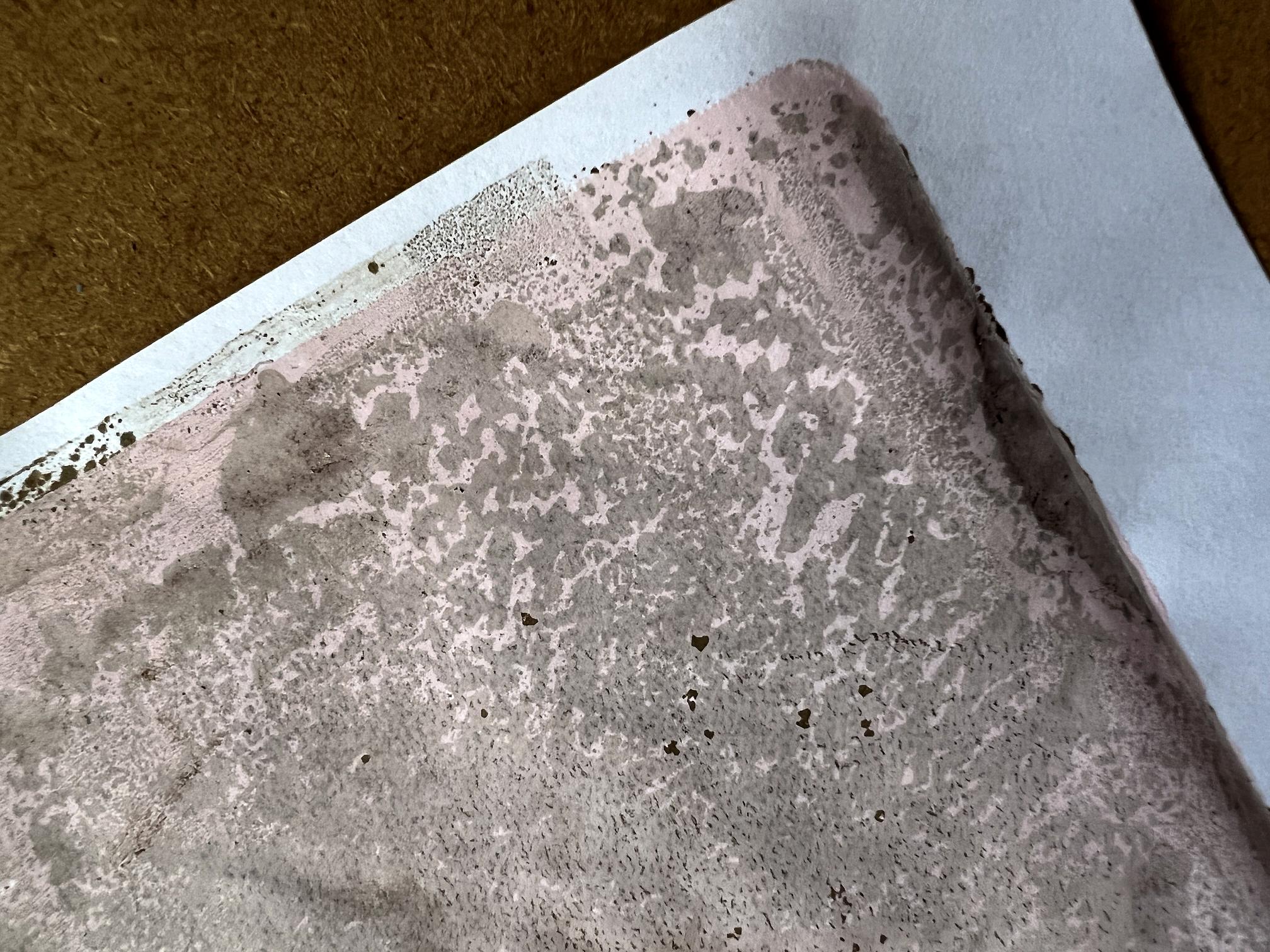
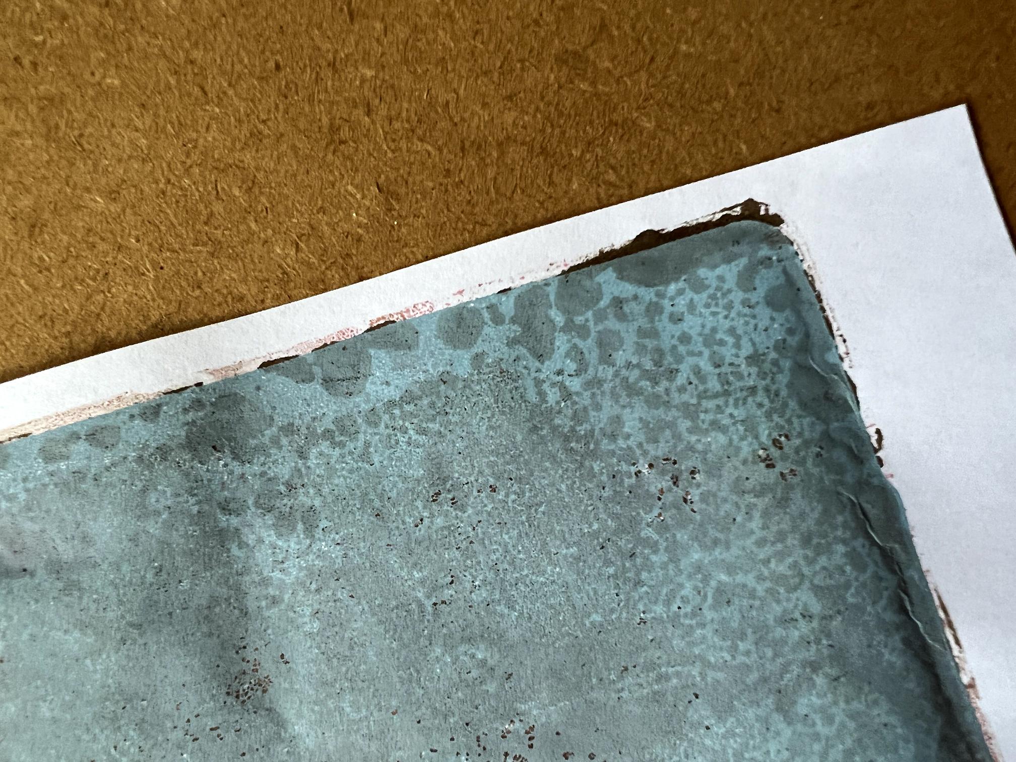
A couple of examples of patches where the technique did work – near the corners of the sheets.
Another sheet with extra layers of ink. There are a few patches, mostly near the edges, where the technique has worked.
At this point I remembered what the gloopy consistency of the Patti Pockets Stainz product reminded me of – vanilla paste! I hastened down to the kitchen and brought up the little pot and gave it a try, adding ink as well.
It didn’t work. Vanilla paste is clearly not the main ingredient in Patti Pockets Stainz. Back to the drawing board.
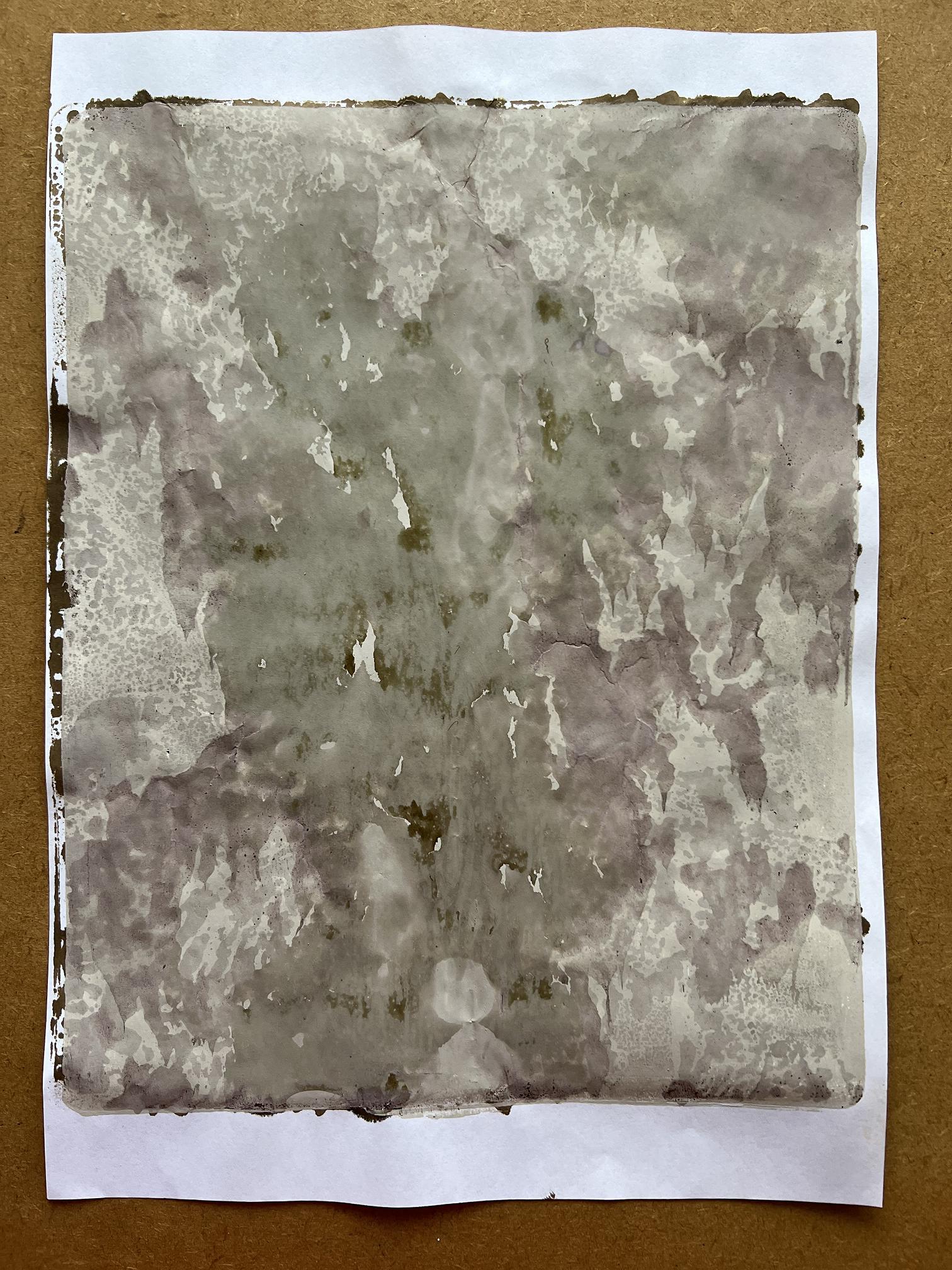
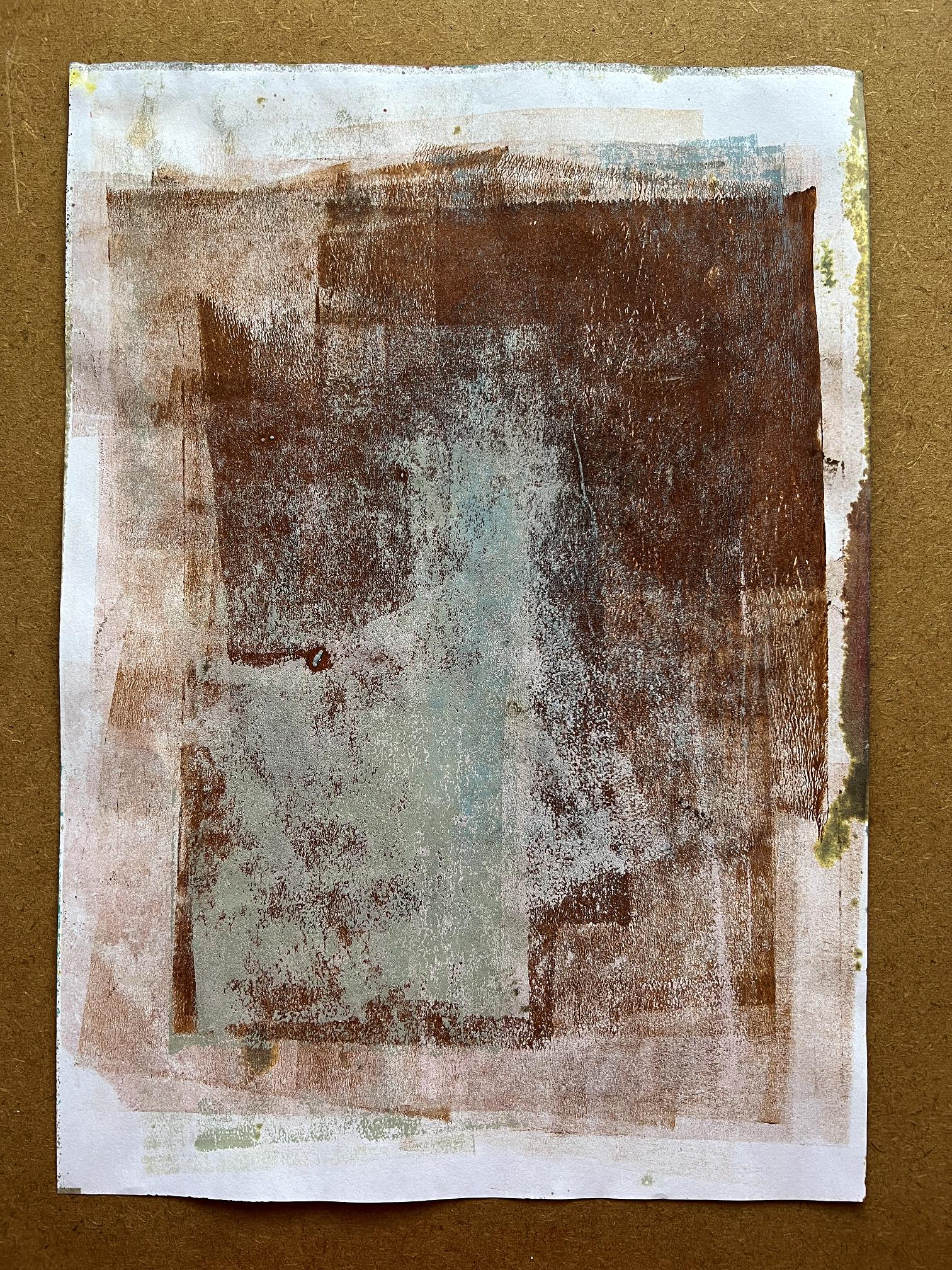
At the end of that session, this was the sheet I used throughout to clean off the brayer between prints. I think this is probably the most successful background so far!
I went back into the studio later, having given the matter further thought. I wondered whether Golden tar gel would work. This has a gloopy consistency. It is colourless, unlike the Patti Pockets Stainz, but I thought with the addition of lots of ink, it might work.
It didn’t. Also, that stuff is shiny, so I was losing the matt effect.
What about matt gel medium? Worth a try.
That didn’t work either. There was some residual shininess from what was left of the tar gel on the plate.
One of the tar gel ones with extra ink. You can see how creased the paper has become.
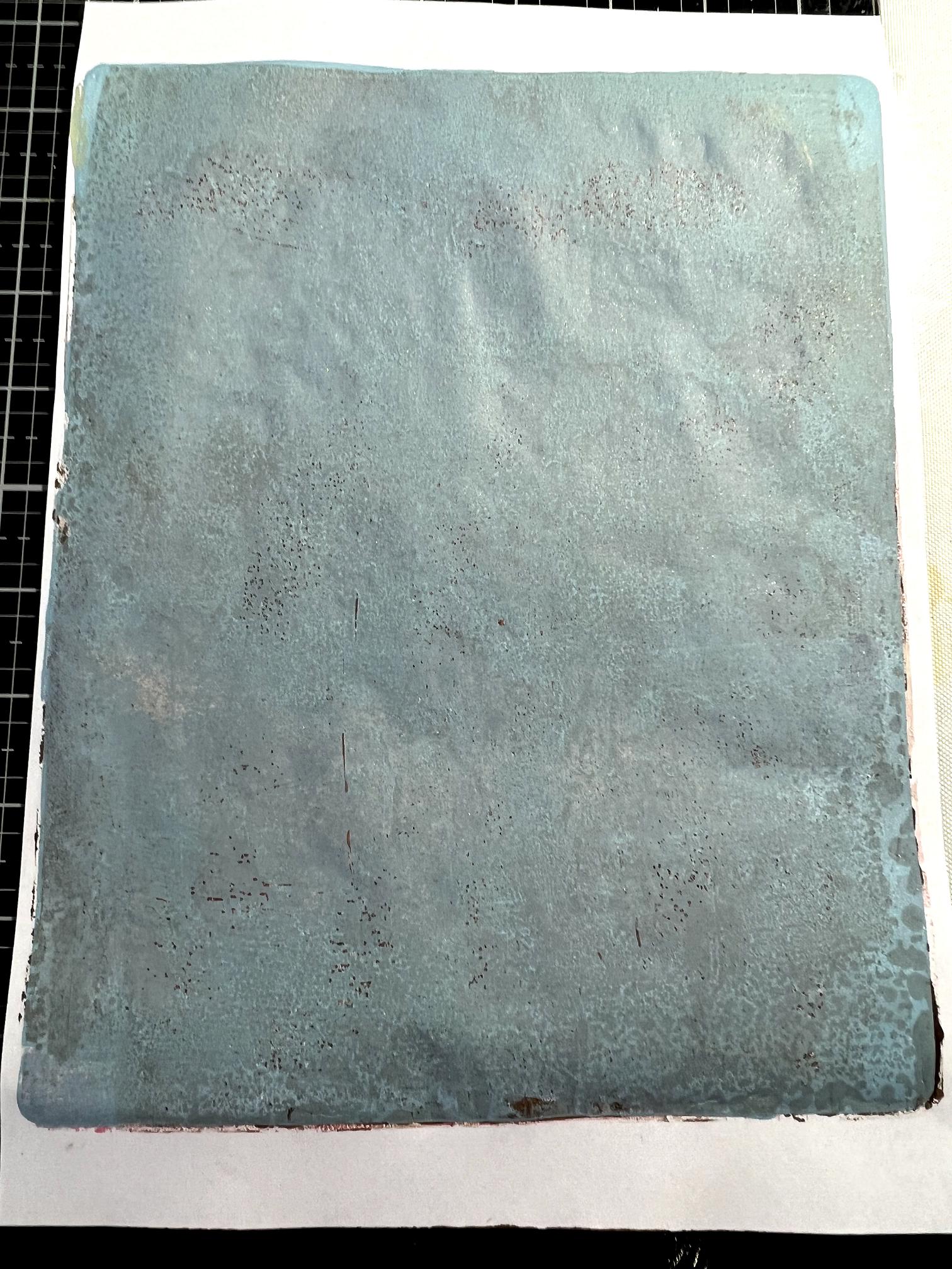
A couple of the matt gel medium ones, with extra ink.
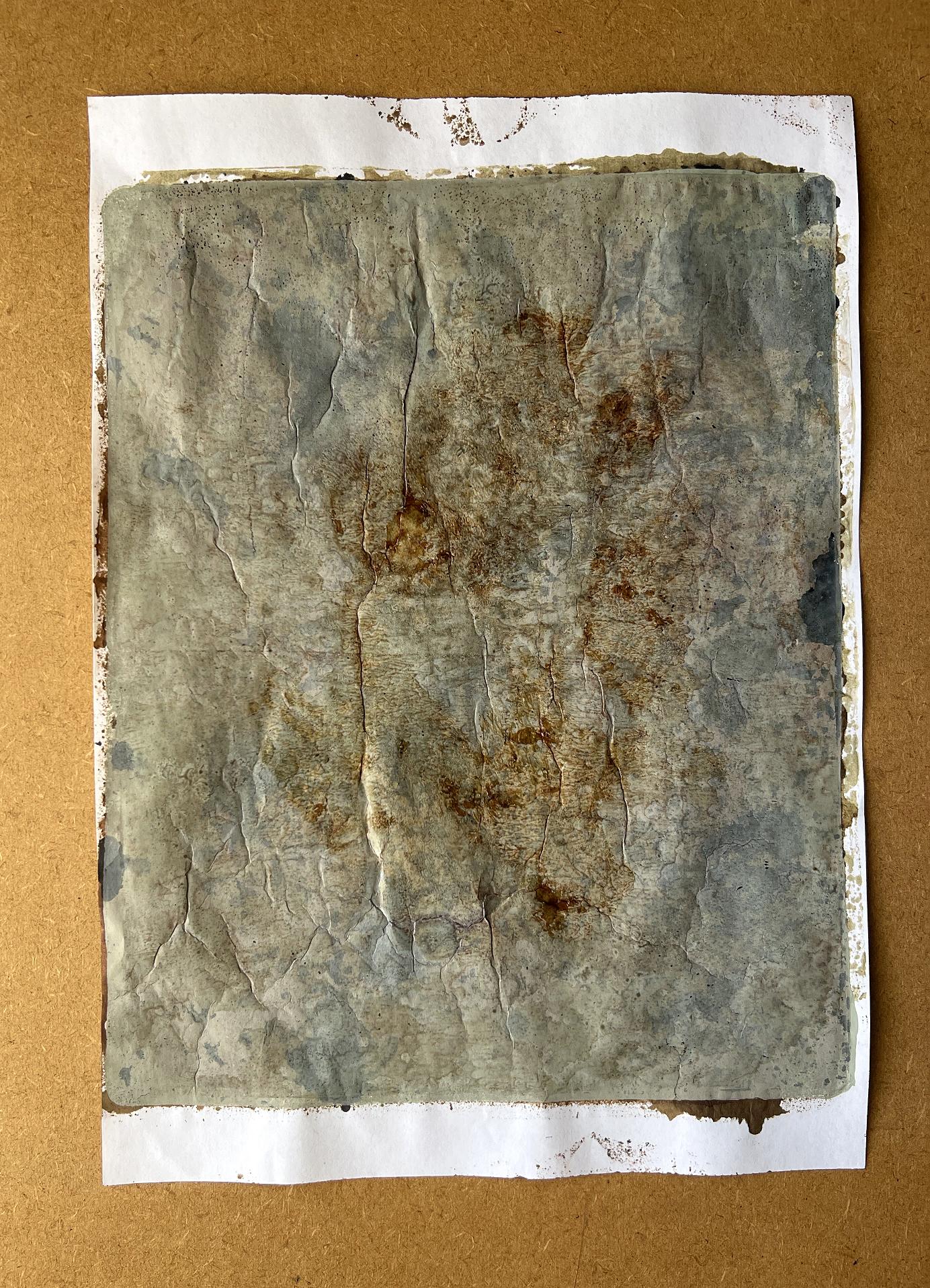
Very wrinkly papers!
Although none of these samples has worked as it should, they are all interesting and will be useful backgrounds. I am determined to get this right. I have left a comment under Robyn’s YouTube video explaining what I did and asking what I’m doing wrong. She is usually very good about replying to people’s comments, so I hope she will have some suggestions.
One of the things she used as well as the Tim Holtz Distress Spray Stains was Seth Apter’s Izinks, which are a permanent dye ink. I haven’t got these. It may be that they contain a necessary ingredient to make this technique work. She regularly uses three of his colours – honey, tea and coffee, and it may be worth my while investing in these. She also used his gold spray. I forgot to mention that I did add a bit of the Tim Holtz Distress Mica Spray (Tarnished Brass) at the early stage of my experiments.
When I had finished, there was quite a bit of ink left on the plate.
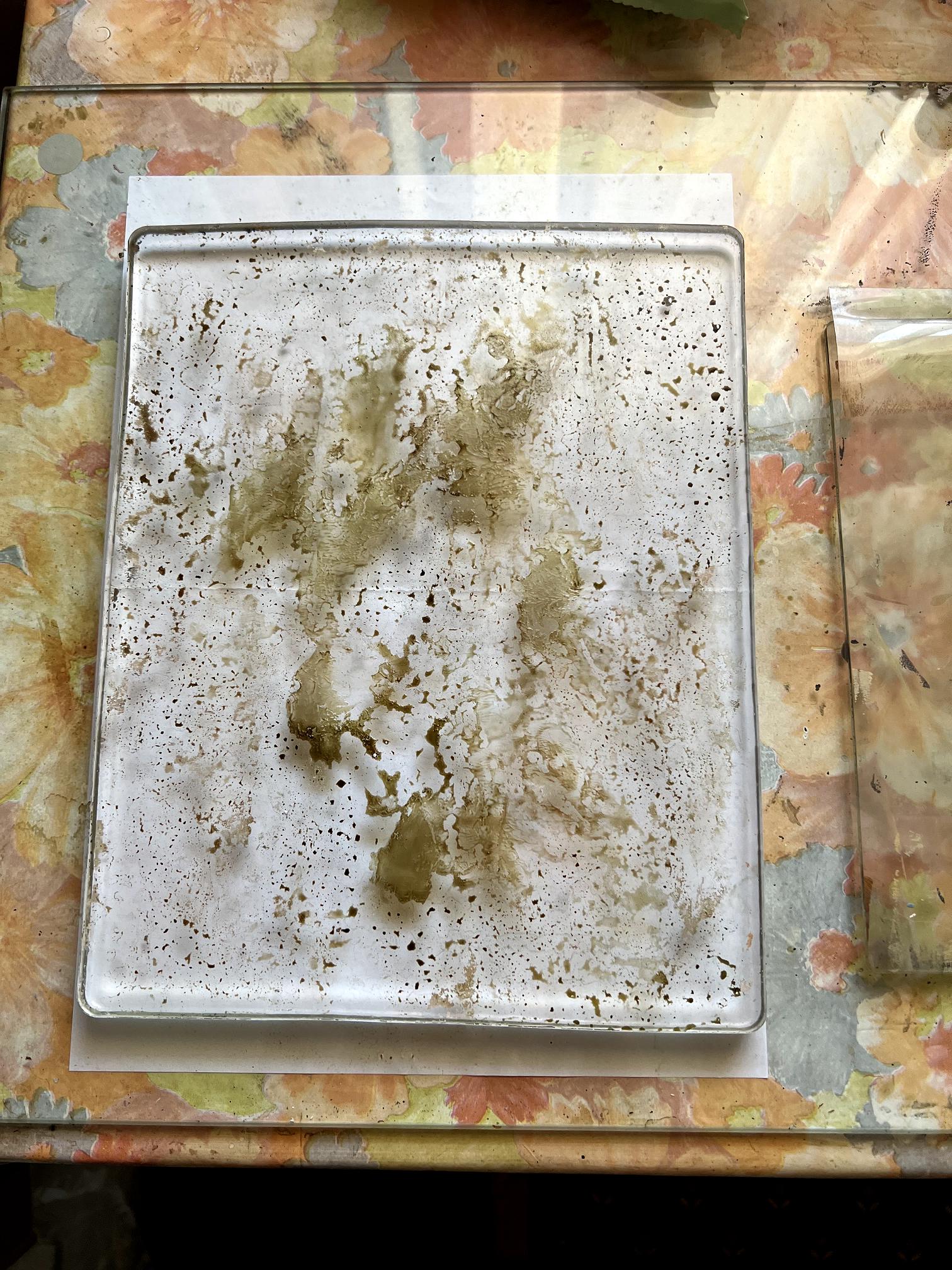
I left this to dry and came back later, thinking I would pull a final print to clean the plate.
I brayered on a thin layer of the Concrete PaperArtsy Fresco paint, taking care not to be too vigorous as I thought it might reactivate the ink too much and cause it to blend into the paint. I had a terrible job pulling the print and it ended up tearing the top layer of the paper, and leaving a lot of residue behind. I pulled another print with the same sheet, this time with the Windsor and Newton Peach Pink, and a bit more came up, but I was obviously going to have to pull several prints.
This is when I decided to use Golden paints – they have a high concentration of binder which makes them very good at lifting any residue and cleaning the plate. The first pull was with Titan Green Pale, which is a translucent paint, and I finished with another of their translucent paints, Zinc White.
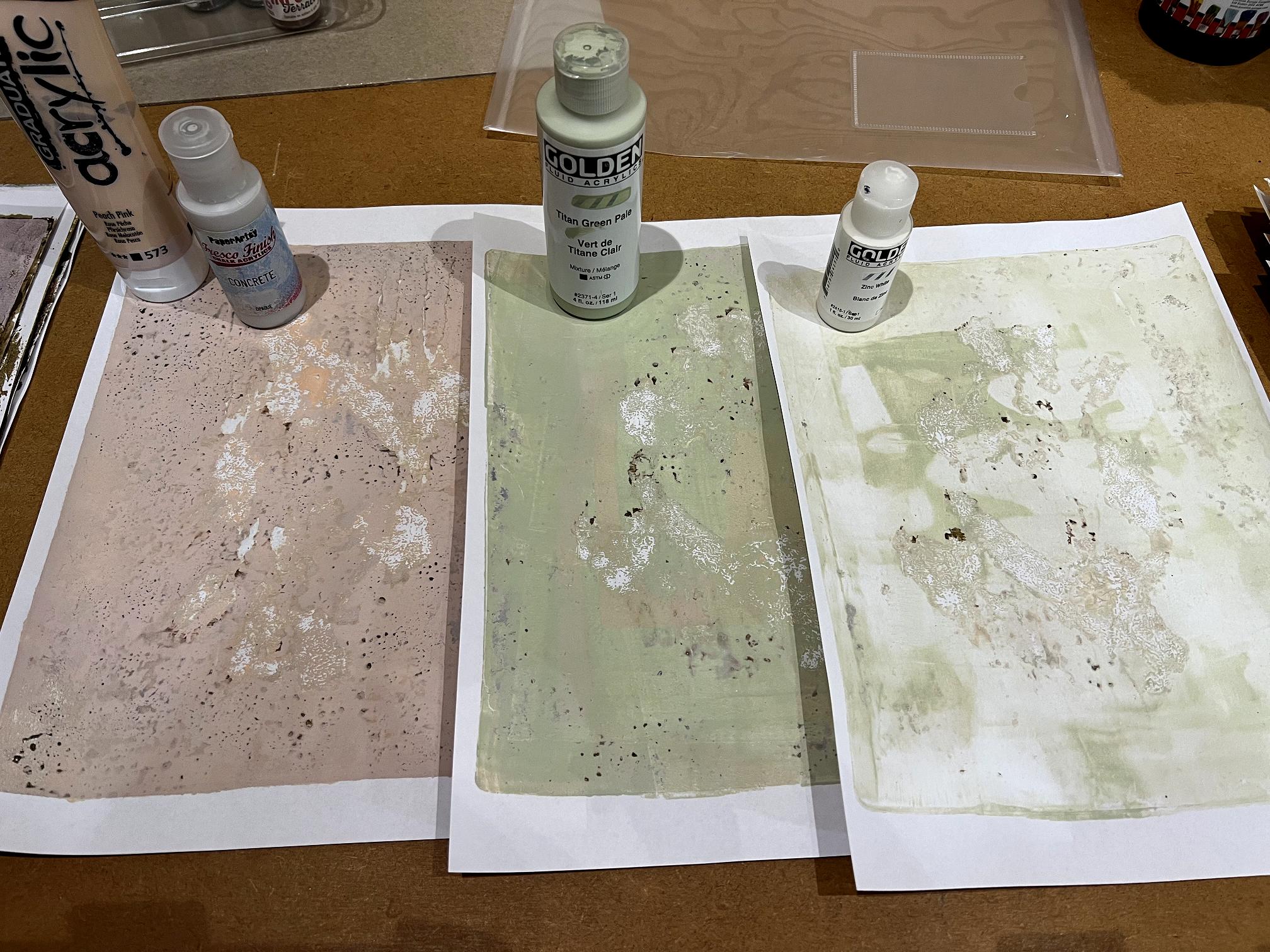
Once I’d repaired the ripped strips on the first one (which did leave a few white patches), I really liked these prints with their subtle variations. I didn’t clean the brayer between each colour. All will be usable.
However, the plate remained stubbornly dirty with patches of mixed paper and ink and paint that I had a job to clean off. My first attempt with a baby wipe didn’t work at all. I spritzed the surface with water and gradually worked it into the residue with my fingertips, being careful not to damage the surface of the plate, wiping off any loose particles. Eventually the edges of the patches lifted a little, and I was able to peel most of it off. I finished it with a damp sponge and then dried the plate with a dish towel before putting it back into its clamshell.
So – NOT a very successful experiment, but I have been left with some interesting backgrounds! Watch this space – I may get a reply from Robyn with some helpful suggestions. I also asked if she knew of any alternative product that might approximate the Patti Pocket Stainz which would perhaps be available in the UK.
I don’t consider this venture to have been a waste of time at all. I’ve ended up with some useful papers, and I have learnt what doesn’t work, which is almost as valuable as learing what does work, and this has to be progress of a sort! I have also ended up with a nice set of six beautiful matt acrylics which are going to be a tremendous asset in my growing arsenal of gel printing materials. These PaperArtsy Fresco paints are just stunning.