NEW INSPIRATION IN DIGITAL DOWNLOADS, MY NEW PRINTER, AND STEAMPUNK ASLAN
Graphics Fairy
For several years I have availed myself of the many beautiful free images downloadable from the Graphics Fairy website, and was aware that there was a Premium Membership section for paid content but never took much notice of that. The other day I was watching YouTube and came across a video where someone was making a project from one of their themed bundles (which include individual images, backgrounds, collage sheets, labels, pdf printables…) and thought I would investigate further, as I was very impressed with what I was watching. For a small monthly fee you have access to absolutely everything on the site, without limit, and they are constantly uploading new material. There are also tutorials, both for crafting and for image editing with PhotoShop (I don’t have PhotoShop but I use an old Serif photo editor called PhotoPlus which does virtually everything that PhotoShop does – and I got it for a fraction of the price!!).
So – I signed up, and am blown away by the quantity and quality of the material, and have already downloaded quite a few of the bundles with their conveniently small zip files which can be unpacked at your leisure. All this downloaded material remains yours even if you cancel your membership.
Graphics 45 “The Olde Curiosity Shoppe”
This was something else that came up in my YouTube feed last week. It was the most amazing and beautiful pad of 12 x 12-inch printed card and I fell in love with it and knew I wanted to get it. However… the video was five years old, and of course, as is the habit with these companies, they had “retired” this design and it is no longer available. I find this sort of thing mega-frustrating!
Not to be defeated, though, I decided to design my own version of this collection, using images and backgrounds from the Graphics Fairy Premium Membership section. The Graphics Fairy are very generous with terms of use of their materials and encourage you to adapt them to your own needs, and mix and match, and blend items together digitally, etc. I must say this is rare in my experience and most designers are very proprietorial about how you use their designs (which of course is their prerogative as they have put all the work in). Nobody wants their work stolen and re-sold to benefit someone else.
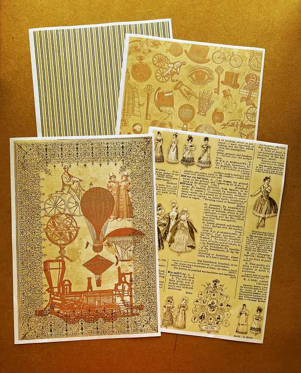
I am using the same basic colour scheme as the original, and following a similar theme, which is vintage, quite grungey but with bold dark colours like dark brown, terracotta and green, with touches of other bright or lighter colours thrown in. There is a slight steampunk vibe to the original which I am emphasising. I am not copying things exactly, unless it is something that anyone could make, like simple stripes, polka-dots or harlequin diamonds which one sees everywhere, and the images, textured pages, text and script backgrounds and so on are all original from the Graphics Fairy. The result will have a similar vibe, inspired by the original, but with my own unique take, so I do not think I shall be violating any copyright issues. The original is, after all, no longer available anyway, and it will be for my own personal use only, unless this goes viral and I am suddenly overwhelmed by requests for it – which is most unlikely!
I am omitting some of the elements that I wasn’t so keen on, and will be adding other things that I want to include. One of the disadvantages of packs like that is that the papers are printed on both sides, so you often end up not being able to use everything as things get stuck down. I am making my full-sized papers A4 because this is what I can print, and for the sort of things I want to make, I probably shan’t miss the larger 12 x 12 size, and I can also print on whatever sort of paper I choose.
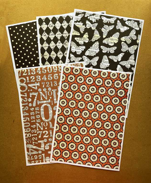
Here are the backgrounds I have created so far, working with mostly the brown, terracotta, beige and cream colours.
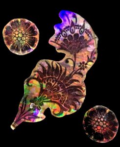
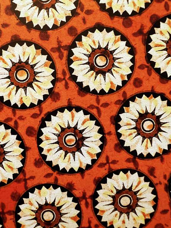
I used a floral medallion from the Graphics Fairy for the repeating circles design, and the addition of a blending mode has given the petals a nice blotchy grungey look, which adds some dimension.
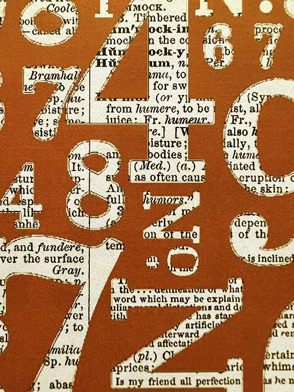
For the numbers background, I chose a nice bold thick font, and used a dictionary page from the Graphics Fairy.
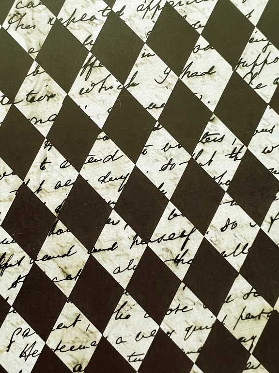
More text and script backgrounds and adjustment layers for texture.
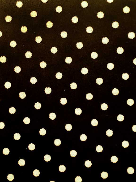
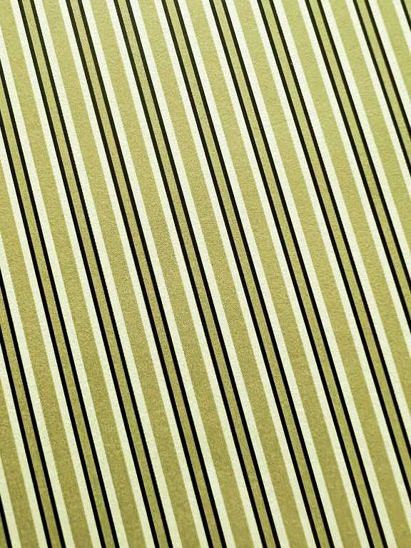
A simple polka-dot repeating background design.
Another advantage of making up these sheets myself is that I can alter the colours if I want, and the scale of the elements, allowing a lot more freedom in their useage.
Another set of backgrounds, emphasising the steampunk vibe.
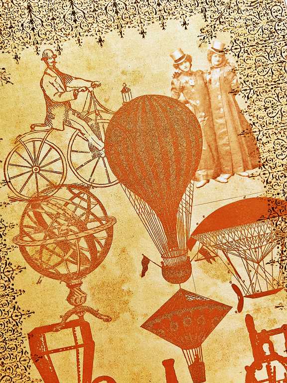
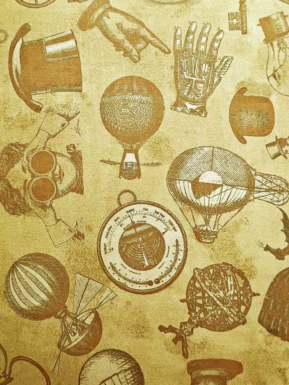
Some detail shots of these pages.
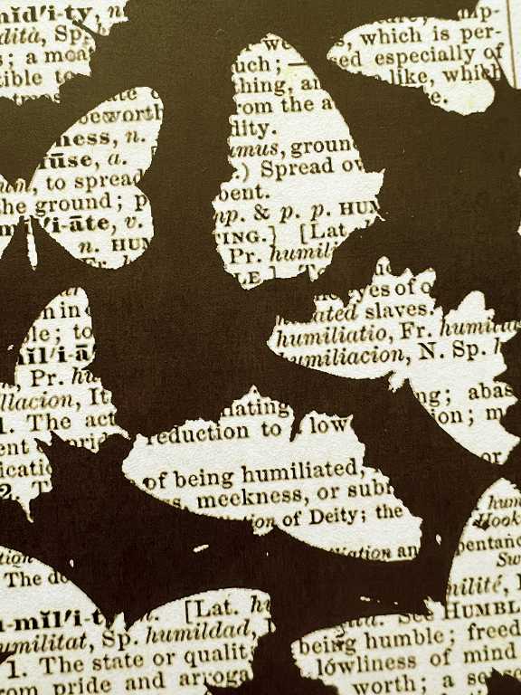
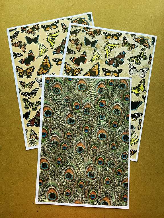
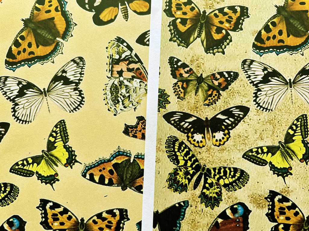
The final sheets. The two butterfly backgrounds are identical, except that the upper one has a textured paper under the butterfly images.
The following photo shows the difference this makes.
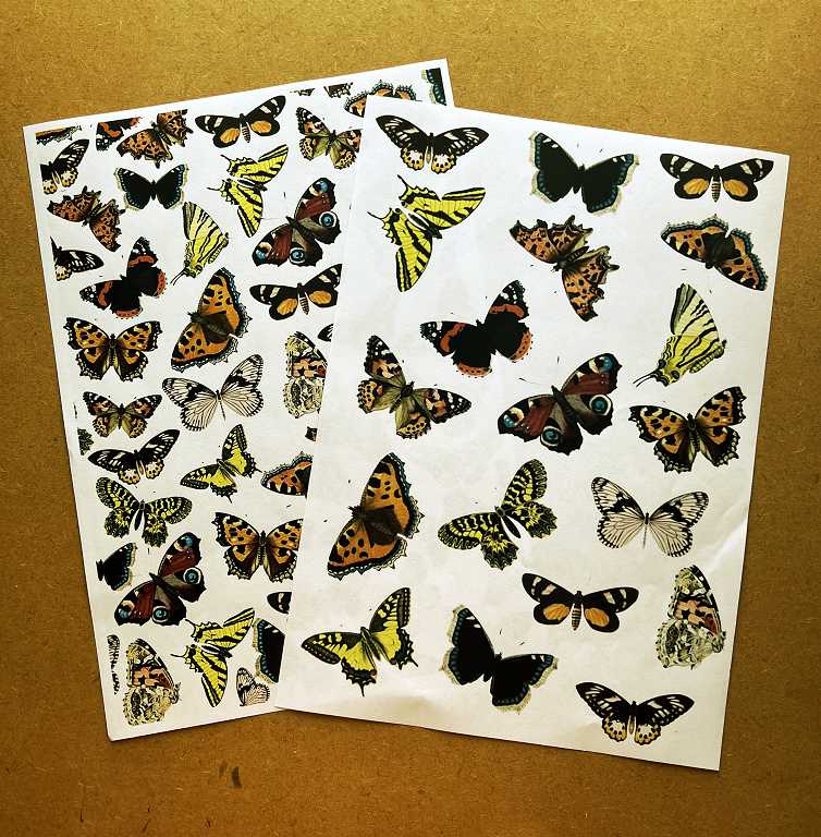
I also made two more sheets of butterflies, both large and small, on a plain white background, for fussy cutting. The Graphics Fairy butterflies are so beautiful, and I am blown away by the detail and crispness in the images.
Finally, my peacock feather beackground. I had a terrible time photographing this as the combination of my lighting and the iPhone camera do produce pictures too far along the blue spectrum and I spent some considerable time adjusting the colour of this picture to approximate the original, and only partially succeeded, I’m afraid. The smaller version of it in the photo above is a better rendering of the original.
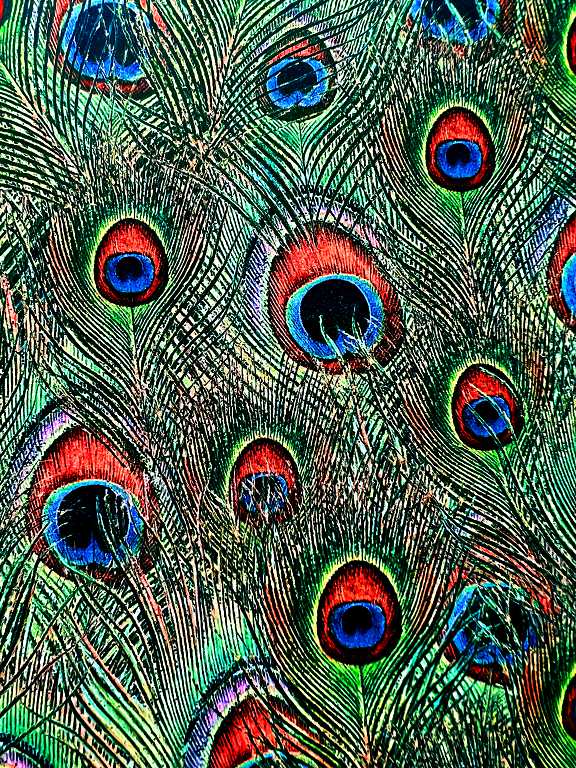
I created this page by taking a Graphics Fairy image of several peacock feathers laid side by side in a variety of sizes, dividing them out into separate images, and applying them in layers which could be moved and adjusted (size and angle, and where they appeared in the layer stack, etc.) until I got the result I wanted.
Some of the editing on the more complex of these pages took many hours. Probably someone more expert than I am would have achieved the result in a much shorter time, but I don’t mind – even after using PhotoPlus for so many years, I am learning new techniques I’ve never tried before, while working on his project!
I am currently working on a green colour scheme, making a montage of vintage apothecary bottles from the Graphics Fairy. This is proving to be quite difficult and I am still wrestling with the concept of colour adjustment or replacement, adding adjustment layers, recolouring images, etc. but I’ll get there in the end, and I will upload the results in due course.
There will also be individual images and elements to be created, to be used as embellishments, pockets, borders, etc., in any projects where I want to use these papers.
My new printer
For over two years at least, I have been considering, on and off, getting myself a colour laser printer. Every time I settled down to make a decision about it, I got overwhelmed by the amount of choice, and the lack of information on any number of sites, about the full capabilities of any particular model. For several years I have been using an inkjet printer (never had a laser printer before) and as I am using a printer more and more these days in my art, I have been restricted by several drawbacks:
- Inkjet prints are not water-resistant. Even when sprayed with inkjet fixative, they are not safe. I have also found that adhering inkjet printed elements down with gel medium, there is some sort of reaction with the ink (or possibly the fixative) which radically alters the colour.
- Unless you use at least 100 gsm paper, the ink will bleed through enough to be visible, making it impossible to use both sides.
- I have always found inkjet printers to be temperamental, with the print heads getting blocked and producing inconsistent results, and even when printing at 300 dpi, my current inkjet priner’s definition wasn’t that great.
- My current inkjet printer won’t print on acetate. I know nobody much uses overhead projectors these days so the printer manufacturers probably think printing on acetate is a fond nostalgic memory along with audio cassette tapes and cheque books, but for artists it can be very useful. The printer is pretty fussy in general about what it won’t print on, which has been pretty limiting for me.
- The cartridges are expensive when you start producing A4 sheets of full colour. This particular printer wasn’t so bad because it is an “eco-tank” printer where you fill separate tanks rather than having to purchase new cartridges all the time.
What finally gave me the push to make the decision to get on with this and get myself a decent colour laser printer was that my hubby’s old inkjet has finally decided to give up the ghost. I said I would get myself a new printer that would be more useful for me, and he could have my inkjet one. This helps both of us!
Rather than aimlessly trawling the Internet to find something that might work for me, I searched for “best colour laser printer for crafters” (“crafters” rather than “artists” because the former are probably more likely to want to print on stuff like cardstock) and several sites came up with their top ten/five/etc. favourites, and the HP Color LaserJet Pro MFP M283fdw was at the top of the list.
Here’s the beast. It arrived from Amazon on Friday, weighs a ton, but takes up a remarkably small space compared with many laser printers. It fits where the other printer was, with the removal of a small triangular shelf unit it used to sit on. Under this was a space to keep things, but it was just a glory-hole for collecting junk, which I have now cleared away!

The advantages of this colour laser printer, from my point of view, are:
- Water-fastness.
- No bleed through, even on 80 gsm paper.
- Prints on acetate! Also on cardstock, and even “rough” paper by which I assume they mean hand-made. The printer has two paper feeds, one for regular printer paper and the other for individual feed fancy stuff.
- Although the toner cartridges are expensive (and HP has jealously stopped letting people use other-brand alternatives because of the cartridge chip/firmware upgrade combination so that the printer will only print using their over-priced cartridges), they last for ages.
- Wireless capability! I can print from any room in the house! All I had to do was download the app onto my devices, and once I’d got the printer to be recognised on the network (which was a bit of a pain), all is well. The printer even has its own email address (weird, or what? “Dear Printer, thank you for your recent email, and I am glad to hear that you are settling in well…” etc.) so if I wanted, I could print stuff while away from home, although I can’t see why I would actually want to do that!
- Foiling. You can’t foil with an inkjet print, but with the laminator and a laser print, you can. At the moment, using the ToDo machine, I can foil using special foiling stamps, but with the new printer, I shall be able to foil anything I want – text – images of my choice etc.
- Image transfers. Much easier and better results than with an inkjet print, by all accounts, according to all the videos I’ve watched on the subject.
There are probably many more advantages still to be discovered! I have yet to explore all its functions, and have only just downloaded the user manual, but I did manage to print the above images using it, and I am mega-impressed with the great colour, sharpness etc.
Watch this space for further adventures with this great new printer. It was well worth waiting for because I think it ticks all the boxes – apart from one – I am fed up to discover thaat laser printers won’t print borderless. This means all my full-sized backgrounds will be just shy of A4. I suppose I can live with that, given all the other plusses. Oh, there is one other major disadvantage. This wonderful printer will probably do whatever I want it to do, but it won’t make me a nice cup of tea when I’m busy in the studio. Sorry, Hubby, can’t let you off that particular hook!
Steampunk Aslan
The other day our nephew and his wife visited us. He is a professional musician and extremely tech-savvy. He has recently started using AI art – something I came across not long ago and was amazed at what it could produce. He showed me some album covers he had designed, and some other really fun stuff – a kid he knows loves the seaside and also dinosaurs, so he made him a picture of Polzeath beach (in Cornwall) with dinosaurs wandering all over it! The whole concept is somewhat creepy because it looks sooo real… I am pretty freaked out by the whole AI/quantum computers/digital ID stuff but we both agreed that like many things, the Internet and technology are actually neutral – they are only evil when in evil hands belonging to people with evil intent. I agreed, and said that on the Internet you can find porn and violence and all sorts of horrific stuff, but you can also find the Gospel of salvation through our Lord Jesus Christ.
He offered to make me a picture, and asked me to suggest two things that I liked, which wouldn’t normally go together – this put me on the spot a bit and it took me a while to come up with anything! I said, “What about Narnia?” and added that I also really like the steampunk style in art, and he said, “Steampunk Aslan?” We both laughed, and he keyed it in. In a shockingly short period of time (around 30 seconds), the following four pictures emerged. I wasn’t sure what to expect, and thought they might be horrific and ugly, and certainly not the amazing and extraordinary images that appeared.
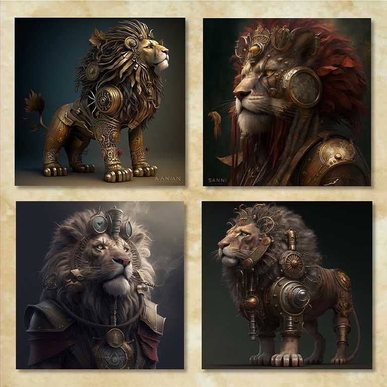
Impressive, aren’t they.
Apparently if you don’t like the results that the AI throws up, you can reject them, and add more key words to indicate more clearly what you want.
He asked me if I would like to join the group (by invitation only, to a subscription-based site) but I said I’d hold off for a while, because I have only just subscribed to the Graphics Fairy and need to get stuck into that for a while, before starting something else! I can see that this would be a lot of fun, though. Over the years I have had many paintings in my imagination, and they have never come to fruition because I lack the skill to make them. Maybe this tool would work to bring my inspirations to life!