Yesterday I made my first intuitive collage in the Organic Journal. I couldn’t think of a title for it so it’s just “Intuitive Collage 1.”
I didn’t take any photos at the beginning as I was just sorting through my various papers to decide what to include in this project. Here is the work in progress with most of the main elements glued down and the edges as yet untrimmed.
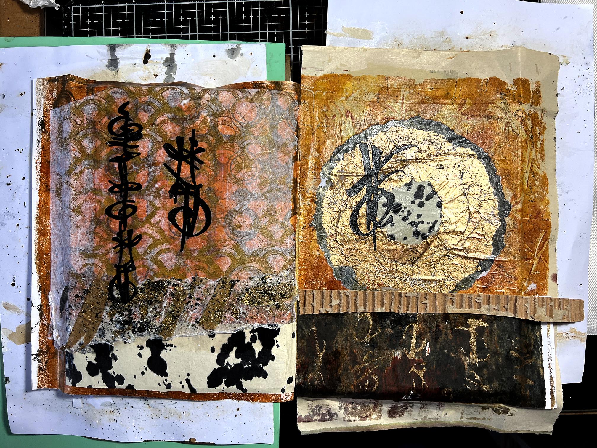
This is the finished spread.
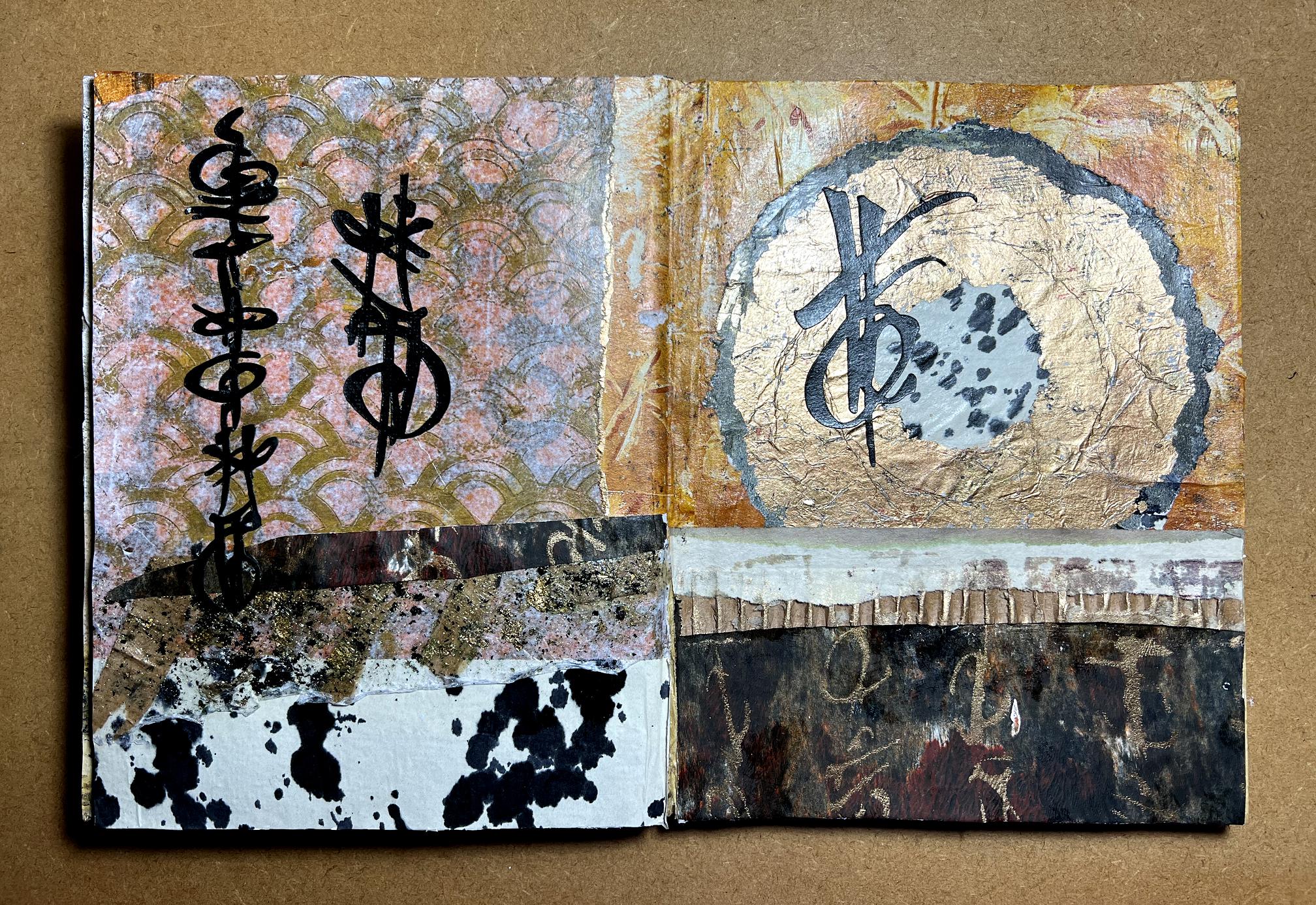
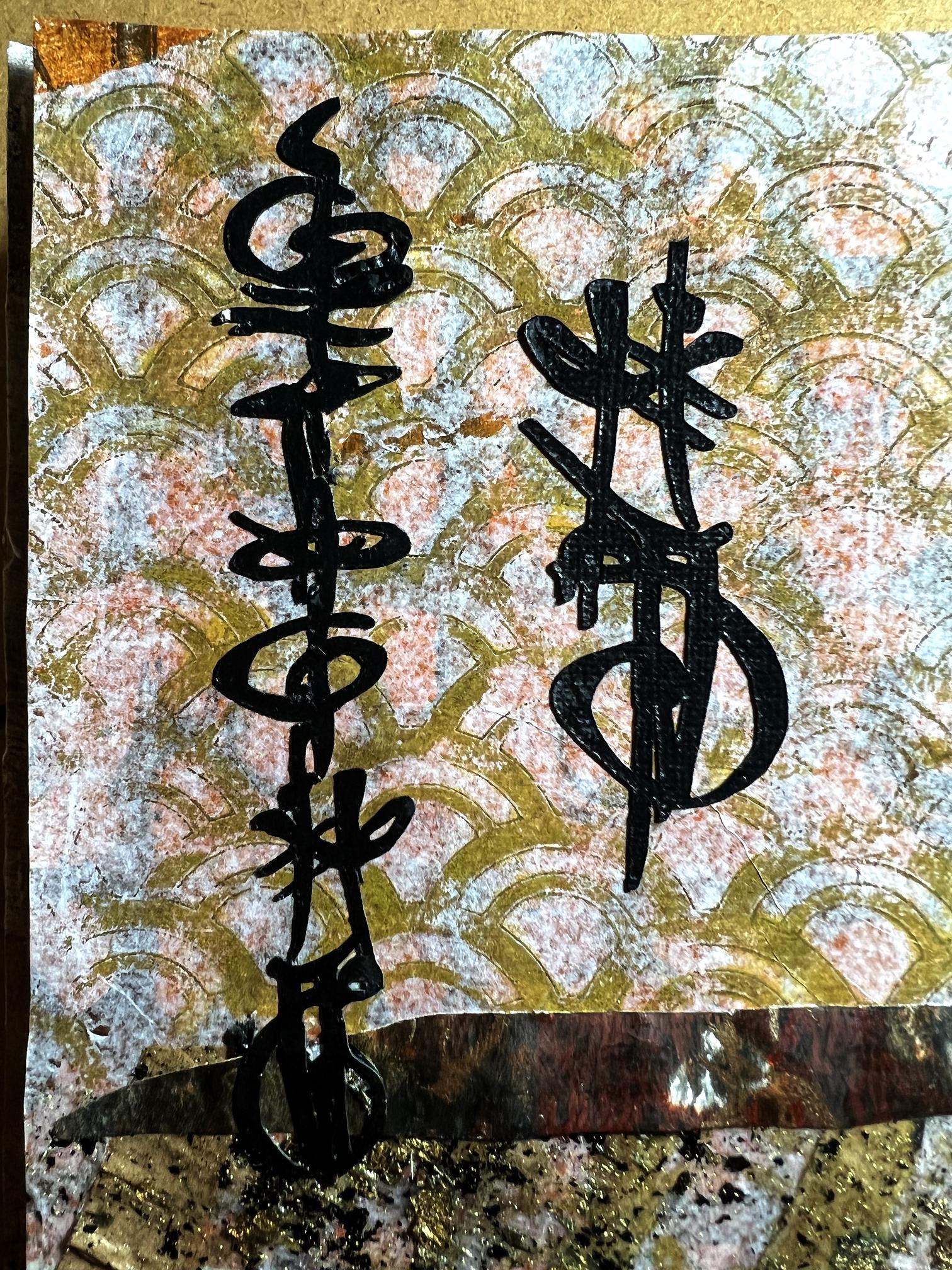
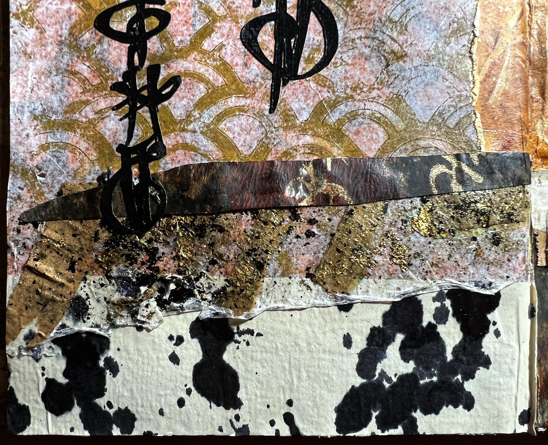
Now for a little more detail. The background for the left hand page was one of my bathmat gel prints, overlaid with a tissue gel print using my Scallops stencil. I had hoped that the tissue would become more transparent and that more of the bathmat print would show through, but it has added more subtlety of colour and if you look closely you can see elements of the underlying print in places.
I added two of my Oriental script cuts that I made from the mask files, cutting them from black cardstock on my cutting machine. I cut quite a lot of these elements some time ago when I was cutting the masks, and filed them away ready for use, with my other die cuts.
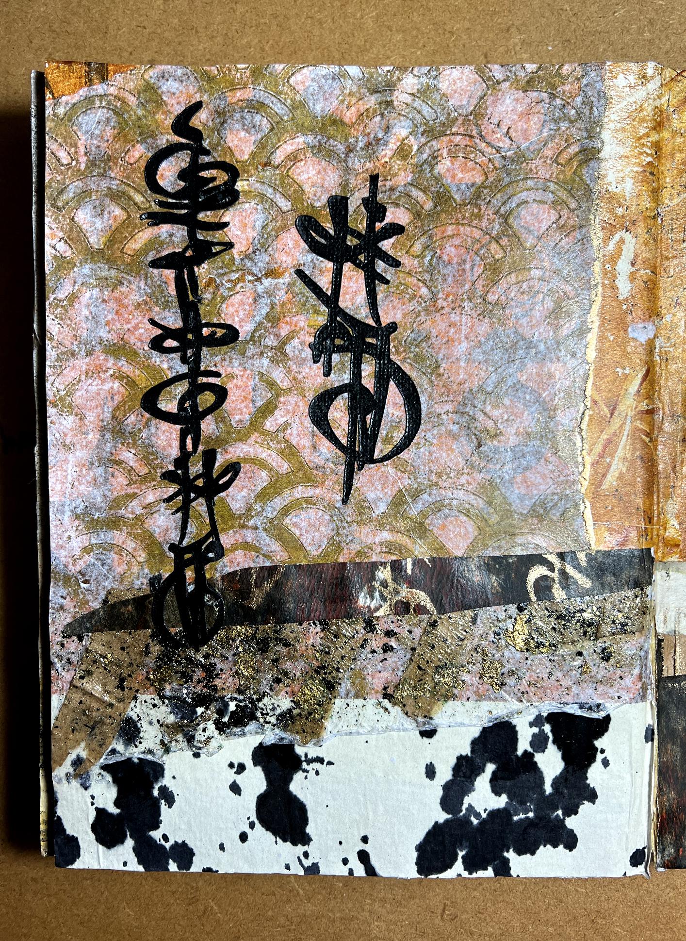
The pointed dark strip with fragments of gold script on it was from the same paper that I used for the bottom section of the right hand page. Under this strip is a piece I tore from the transparent sheet I made recently, embedding scraps of paper and gilding flakes in acrylic polymer on a substrate of tissue paper. I like the slightly curled edge at the bottom. I did this deliberately when I was making the sheet, to enable me to peel it off more easily from the plastic sheet underneath, once it was dry.
The background sheet at the bottom of the page was one of the ink blot pieces I made when I had a mark making session, using various papers including Amazon packaging paper, and in this case, one of the papers that were between the acetate sheets I used for storing my masks. This paper is quite flimsy and cream coloured (not quite as white as it shows in the photo) and has a slightly shiny surface. It takes the ink really well, which bleeds right through, so you get a double whammy if you work with another sheet underneath.
Moving over to the right hand page, the background was a gel print I made, creating the star or flower-like impressions with my new silicone whisk. I tore a couple of circles from tissue gel prints, the gold one being a gel print that came out completely covered with gold, and which I knew I wouldn’t use in its entirety but would cut or tear out collage elements from it. The outer circle was from a very dark gel print.
A tip I learnt recently was to paint a line of water where you want to tear the paper, and it almost falls apart along the line, leaving a lovely organic feathered edge. So much more interesting than a shape cut out with scissors.
I tore a circle of the paper with the black ink spots on it to go in the centre of this circular embellishment, and overlaid one of my larger individual Oriental characters, also cut from a mask file on my cutting machine.
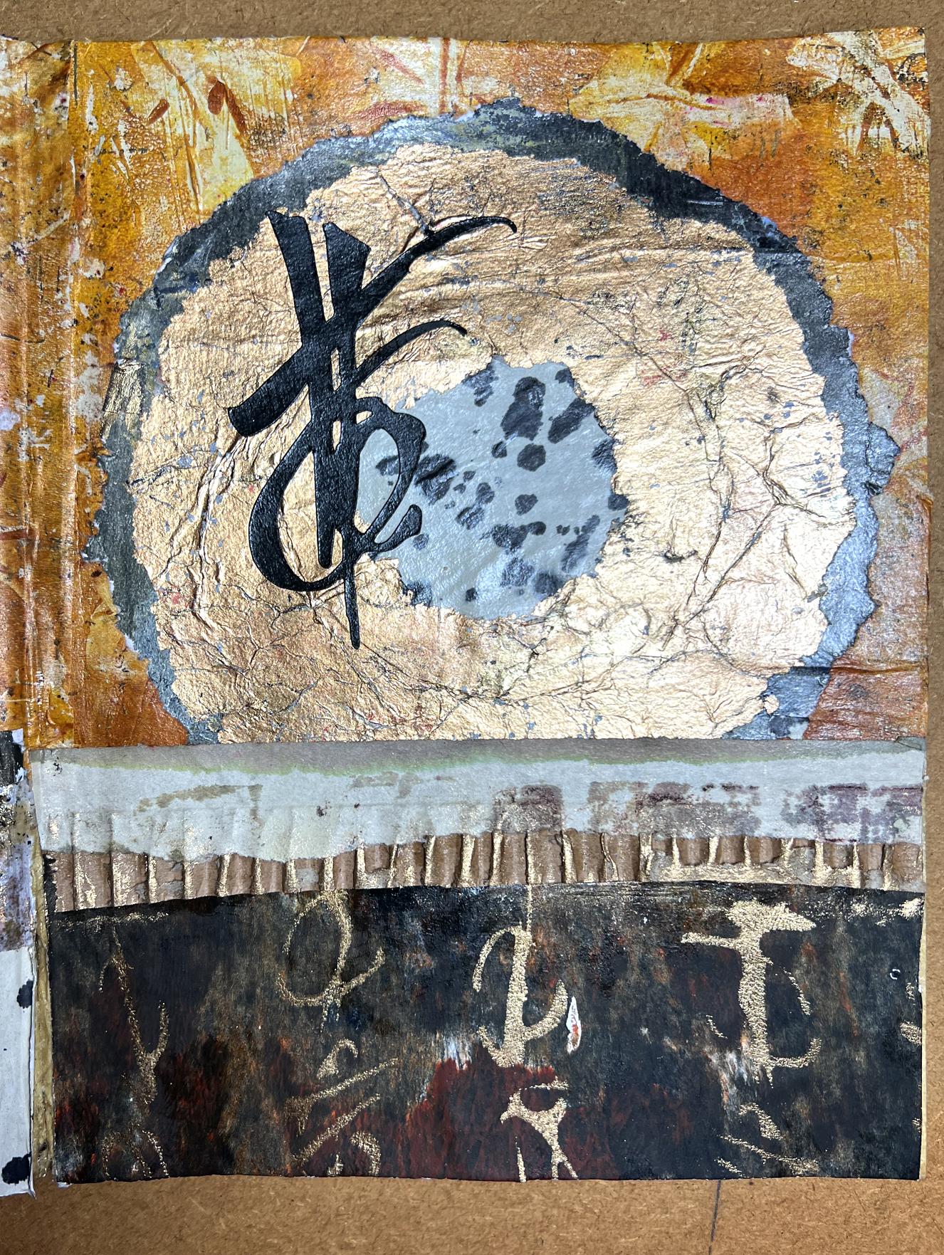
A small scrap of the edge of a gel print was laid down towards the bottom of the page, covering the bottom of the circle. This overlaid a scrap of peeled off corrugated cardboard which I rubbed with gilding wax. The final background at the bottom was a dark gel print with the Oriental Script stencil in gold.
The gold paint I am using for most things now is Golden iridescent bronze fine. This paint is expensive, but it is fabulous and well worth the investment. Many cheap paints work very well on the gel press but for certain things, a quality paint like the Golden brand are best as they contain a lot of binder and are very rich in pigment. This particular gold paint gives the most intense metallic finish I’ve ever come across, and a little goes a long way.
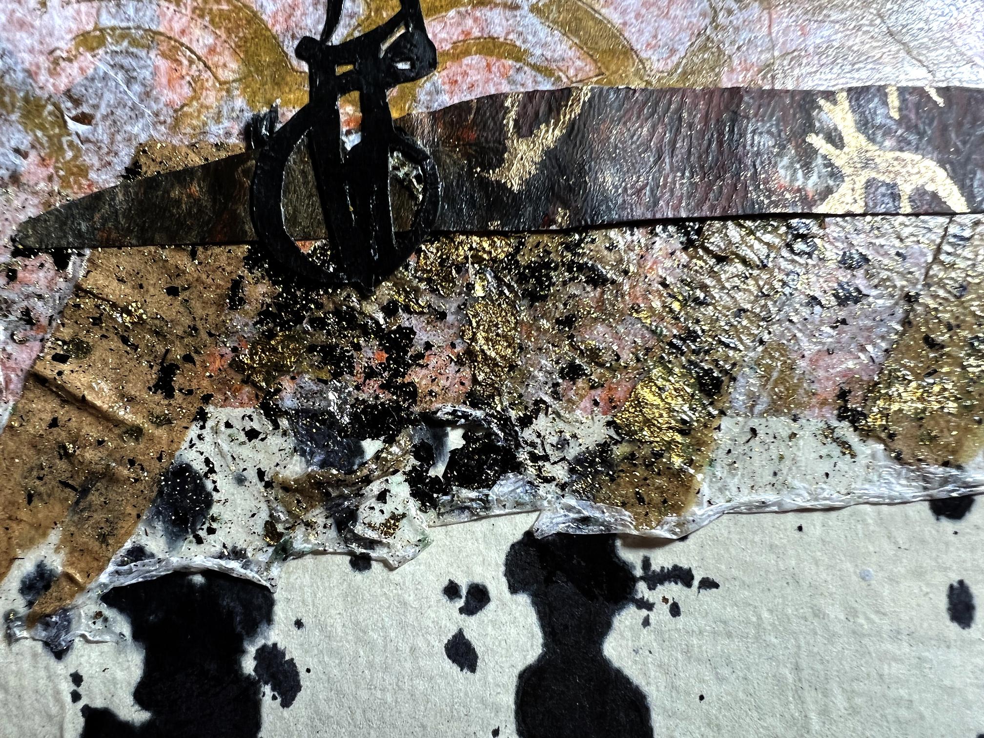
Here’s a detail of the left hand page again, showing the upper portion.
This is the lower portion. The dark strip looks almost like leather.
Here is a detail of the polymer skin piece with the scraps of brown paper and gilding flakes embedded in it. You can see that it is quite transparent.
Here again is the completed double page spread.
Intuitive collage
These pages are surprisingly quick to complete, once you’ve pulled out a selection of papers and narrowed them down to the ones that will finally go in the page. I think the decision making part takes the longest! The project develops as it goes. You don’t start out with any really fixed idea of the finished result, at least not in the details, beyond the overall composition and colour palette. I arranged and rearranged the papers until I decided where each background should go, and built it up from there. As this page progressed, I would stand back and look at it, and decide it needed a bit more definition here or there, and rummage in my scraps bag to pull out something suitable! As you trim down various elements, the offcuts go in the bag. It’s surprising how even the smallest scrap can come in useful on a future page, so everything gets kept.
Intuitive collage is a very relaxing pursuit, with no stress. If something doesn’t look right, you can always change it by pulling it off, if you realise quickly enough before the glue has set, or otherwise you can simply cover it with another layer. More layers = more texture = more interest! At the end of the day it really doesn’t matter anyway because it’s just paper and it is your own personal journal and if you really don’t like what you have done, you don’t have to show anyone else!
It is a brilliant opportunity, also, to use up all those papers that we all have, that have been sitting around in our studios for years gathering dust because we don’t like them. Small portions of them may be just the thing in a particular project, or they can be gel printed, sprayed with ink or painted over. Nothing is beyond redemption!
All these tips I have learnt from Froyle. She has me hooked now! I shall definitely be doing a lot more of this type of collage, in this particular journal and in others in the future, I am sure.