TYPEWRITER ALBUM PART 6 – FROM DISASTER IN PINK TO IN THE PINK
In mixed media, there is no such thing as a mistake. There are only more layers!
Background
Yesterday I began work on the outside of the wings of the centrefold typewriter image in the second signature. I made a mistake initially in using a printout of this image on paper which really isn’t robust enough for the purpose – just 160 gsm basic printer card, not designed for wet media. I was already becoming concerned that the folds were not going to be strong enough. I am still very much on the nursery slopes where junk journaling is concerned, and am learning that the pages need to be of good enough quality paper to support what you add to them.
Beginning work on the outside of the wings, I used some Distress Spray Stain and my worst fears were realised – the stuff bled through to the other side. Nothing daunted, I decided to make a feature of this, and proceeded to add some colour to the central image. I think the result is now better than before.
Before:
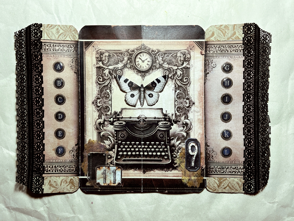
and after:
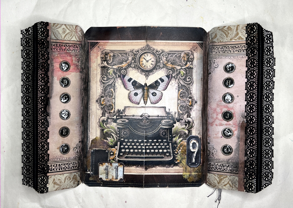
Here are a couple of detail shots of the wings with the bled-through ink.
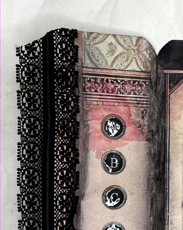
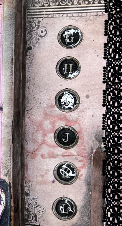
On the right-hand wing it has bled through with a rather interesting texture. There was already a pinkish tinge to this spread and I don’t think the addition of more pink has adversely affected it.
I added some narrow plain washi tape to the folds on the inner surface of this folio, and after experimenting with black Distress Ink and black watercolour pencil which were not successful, I got out my Stabilo Woodies. These thick pencils with water-soluble wax crayon cores don’t get used very often but for adding colour to the final layer and for finger-blending and blending with a wet brush, they can be very useful. I rubbed the black one over the washi tape and just next to it and blended it out. The washi tape looks worn and old, which is in keeping with the rest of the design.
With the additional pink, I felt that the typewriter image needed a little colour as well, so I added touches with the Stabilo Woodies in appropriate places in the decorative border, and also on the 3-D butterfly in the centre. I think this produces a more cohesive whole.
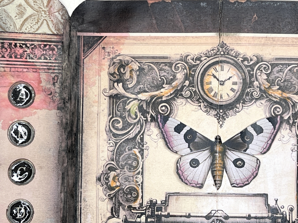
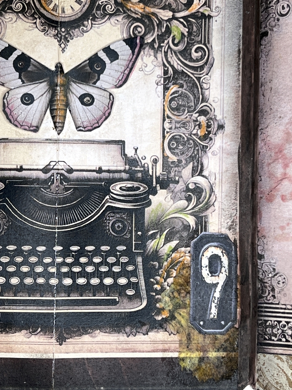
The touches of orange in the foliage in the above photo blend nicely with the translucent inked kitchen paper under the metallic number.
I am actually more pleased with how it looks now, then when I originally thought it was completed and before the disaster with the ink!
The root of the problem – decorating the outside of the wings
Here are the wings closed over the centrefold typewriter image.
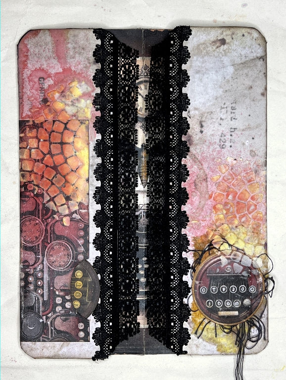
I used the Tim Holtz Mosaic stencil to add some Polyfilla (my preferred texture paste!) to the top and bottom of the folded piece. It is very strange, but the Polyfilla dries yellow – I have no idea why! In this case it isn’t a problem as there are already yellowish accents on the image inside. I need to do some experimenting to see if I can prevent this from happening, or whether I can cover it up if necessary. I don’t remember this happening in the past. Papers, glues, media and paints all react with each other in different ways, sometimes interestingly but sometimes disastrously! In this case I am delighted with the result.
Before doing the stencilling, I stuck down one of the pockets from the Typewriter Ephemera kit at bottom left, and made a tiny circular tag to go in the bottom part of it. This was one of the circular images in the kit. I backed it with some stiff card, inked the back and added a small amount of brown stencilling, and coloured the first row of keys on the front with a Stabilo Woodie. It blends in with the background but can be removed.
I also added another of the circles on the right-hand flap before stencilling, this time glueing it down over some threads. I keep a little bowl beside the sewing machine and collect the trimmings which can be used for extra embellishment on projects like this.
I like the way the stencilling echoes all the circles with the added ephemera and the typewriter keys printed on them, and even the small circular motifs in the lace. Much of this was unintentional but I really like how it’s turned out.
After the stencilling was dry, I sprayed it with Worn Lipstick Distress Spray Stain and spritzed it with water to make it move and run. I wanted the drips to go to the top of the piece. I sprayed slightly less on the right-hand side and again spritzed it lightly with water. It was then that I remembered what poor quality this paper was, and my worst fears were confirmed when I opened it up, and lo and behold, the pink ink had bled through. Remedial tactics then ensued and I think I have rescued it more than adequately!!
When the book is bound, this folio will be folded in the centre so that none of this is visible until the final page of the first half of the signature is turned, revealing the outside of the central folded folio.
This is the left-hand side of this outer part, which I have begun to decorate.
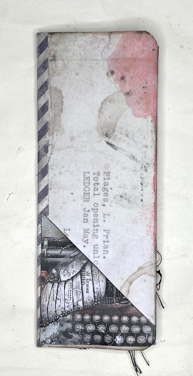
So far all I have done is to add one of the Typewriter Ephemera kit triangular pockets, into which I will put a tag eventually. You can also see the extra strip of washi tape glued down the fold, which reinforces this rather weak centre fold where the binding will be. You can also see some pink ink bleeding at the top but I don’t mind this. I shall probably echo that elsewhere with some form of pink decoration as we make progress. I like the pink and grey.
Projects like this have a habit of making themselves up as they go along, and the results are often quite different from what one sets out to achieve. That’s what makes it such a great adventure.